The Instagram logo and how the company created its brand image
Instagram is one of the most famous ways to share photos after Facebook. It was born from the idea of having a place dedicated to multimedia content on Smartphones, so much so that it can be seen reflected in the Instagram logo where a camera for snapshots shows.
Instagram’s success story is an exceptional case. Launched in 2010 by Mike Krieger and Kevin Systrom, in just 2 years they managed to revolutionize the way Smartphone users communicated. Even Facebook did not hesitate to acquire it in 2012 for 1 billion dollars.
The application has improved greatly since its first appearance. Not only can you share photos, but also small videos. As with Twitter or Facebook, Instagram allows you to identify images by using Hashtags and geotags, share your posts with your followers, and perhaps what is the most important claim, to be able to edit photos and videos with many filters before publishing them.
Being an application that is oriented to a fashion market, it is logical to think that they must renew their logo from time to time to remain at the forefront. Despite the short time the application has, the Ig logo has already undergone several changes. Let’s look at its history and meaning.
The birth of Instagram
The young Kevin and Mike began with the development of an application that was very similar to Foursquare. However, at one point in its development, they twisted it so that the application had its own identity, making it exclusively compatible with photos.
In fact, in the same name, we can see this intention to devote to photographs since Instagram is a mixture between “Telegram” and “Instant camera”.
It was not until 2013, after being acquired by Facebook, which the application allowed to share 15-second videos. In 2015, they expanded the compatible sizes of photos and videos, and in 2016, they extended the duration of the videos to 60 seconds.
The Instagram logo and its image changes
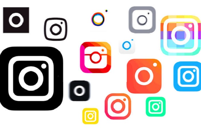
A nine-year-old application is relatively new, but in the case of Instagram, these years have been enough to change its image 3 times. This is something we should keep in mind, especially when we look for an Instagram logo png to promote our account somewhere.
The original with a detailed image
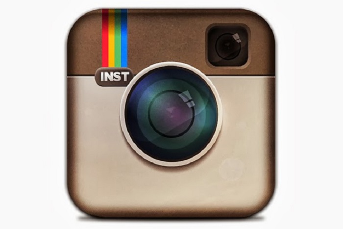
Many people do not remember the first Instagram symbol today, although it was a very detailed one. It was the lens of a Polaroid camera with no borders or other details. It looked like an image of a camera on the home screen.
It had some aesthetic elements, such as a rainbow stripe at the top (many believe it was to refer to filters), a division of colors, and an area for the flashlight.
Although today it is not so recognized, this first logo is still extremely popular among the media, being the origin of Instagram.
Here we can see some initial logo designs. The Instagram CEO, Kevin Systrom, conceived the first test. Soon after, an APP’s beta tester, Cole Rise, proposed a change to make it more similar to a Bell & Howell camera from the 40s, which Systrom liked.
Something that represents Instagram
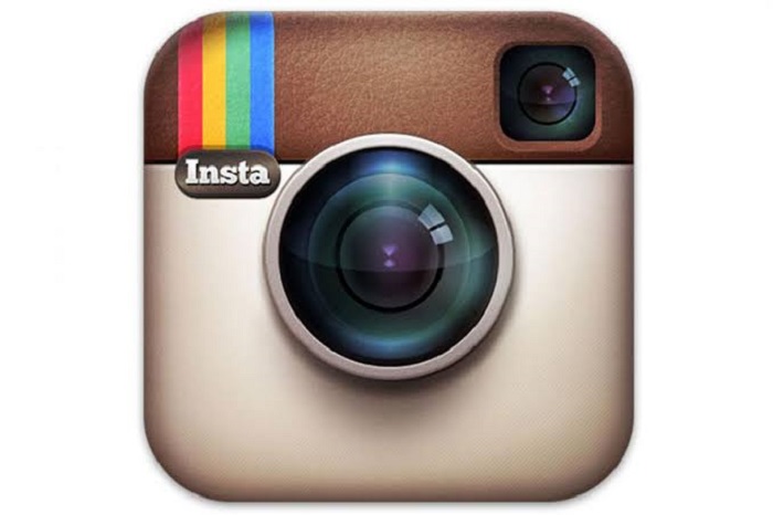
It didn’t take them long to replace the original logo since in 2010 they realized that it didn’t evoke what the application was. To solve this inconsistency, they decided to give the logo project completely to Cole Rise.
Not only was it a beta tester, but Rise also serves as a photographer and designer, so he had an idea of what the Instagram logo should be. A curious anecdote is that the new logo was ready in just 45 minutes, although later it took 6 months with the entire Instagram team to perfect it.
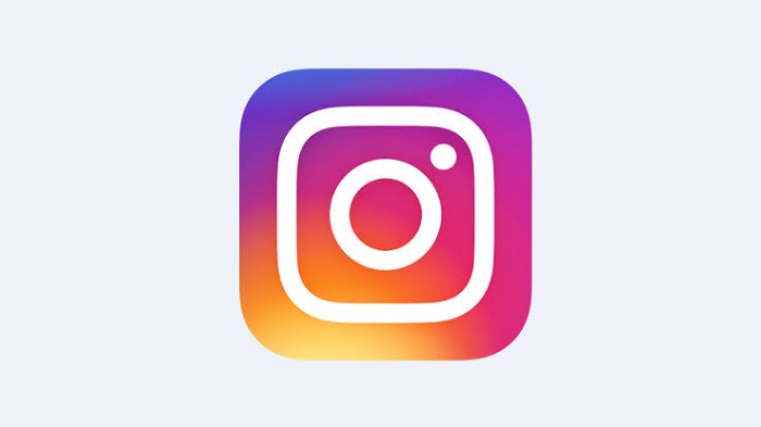
The current era of the third logo
The third logo was born in 2016 and had a somewhat heated reception by users. It turns out that to the great majority, this change seemed a downgrade with respect to what they had since they chose to eliminate the details and adopt the current minimalist tendency.
In this way, the detailed camera would only be a couple of lines that adopt part of the original idea. Additionally, the entire range of colors, including the rainbow stripe, would be replaced by a 3-tone gradient.
The number of negative comments to the logo from users who indicated that they could do a better job with less money and in less time was amazing. However, the reality is that this makeover was a success since it fulfilled the main purpose of a logo, which is to make people talk about it.
From social networks to large news networks, there was no place where the change that had the characteristic Instagram camera had not been commented on. Many cataloged it as the change that nobody wanted. Acceptance was very limited, but it is still preserved now a day.
Along with the change of the logo, Instagram also polished the application’s interface, removing almost every trace of color so that it only highlighted the user’s content. We can say that they took minimalism to the next level.
Quick Instagram identity analysis
– Symbol: adopting the new minimalist trend, the Instagram logo uses the Polaroid camera but with white geometric lines and a gradient background.
– Colors: the intention of creating the transition of colors from light orange to twilight blue is to give the feeling of progress. As if it were a sunrise, the logo wants to imply that a bright future full of changes is coming.
The Instagram identity is more than a logo
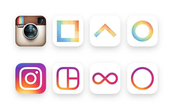
The original change of the first logo occurred because it was not related to the visual identity of the application. In fact, in total Instagram consists of three services, each with its corresponding image.
The first one is the main one of the application, the second one is that of Hyperlapse (its tool for creating business content), and finally, there is the Boomerang app icon (which allows us to create loops of our videos).
Each icon was different, which is why since 2016 they were unified in a unique pattern for people to recognize that they were from the same company.
Moved by trends
It is undeniable how much the Instagram logo changed to meet current design trends. At that time, many applications were making this transition to simpler patterns with flat colors. Instagram could not be left behind if they wanted to remain as a modern application. Of course, at the time its reception was not very good, but little by little other companies adopted this pattern.
The changes in the logos are a representation of the world
Technology is changing the way we live too fast, which is why when it comes to applications, companies constantly update logos. Staying with the same design can mean being stuck on a planet that is evolving. Nobody knows what tomorrow’s trend will be like, but they can try to get ahead by imposing their brand, just like it happened with Instagram in 2016.
Users want to feel the security of seeing their application constantly receiving updates, and nothing better than a face-lift to show that they are in their best shape.
If you enjoyed reading this article on the Instagram logo, you should read these as well:
- The Amazon logo: Its meaning and the history behind it
- The Pepsi Logo: The old, the new, its meaning and history
- The Disney logo: All there is to know about the Walt Disney brand
- How to create a logo & branding questionnaire (Templates included)
- What font does Instagram use? Check them out in here
- Cool Instagram filters for Photoshop (20+ Actions)
- Check out these FREE Instagram Mockup Templates to download
Bogdan Sandu, a seasoned designer with 15 years of diverse experience, has been designing websites since 2008.
Renowned for his expertise in logo design and visual branding, Bogdan has developed a multitude of logos for various clients.
His skills extend to creating posters, vector illustrations, business cards, and brochures. Additionally, Bogdan's UI kits were featured on marketplaces like Visual Hierarchy and UI8.
Latest posts by Bogdan Sandu (see all)