


The Real Madrid logo stands as one of the most recognized sports emblems on the planet. It represents more than a football club. It carries over a century of royal heritage, European dominance, and Spanish identity.
Within the world of sports branding, few marks hold as much weight. The crest has undergone multiple redesigns since 1902, yet its core elements remain intact.
The current version was introduced in 2001. It features a crowned shield with intertwined initials, gold trim, and the signature white background that earned the club its nickname, Los Blancos.
What is the Real Madrid Logo?
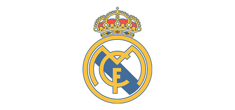
The Real Madrid logo is a circular emblem featuring the letters M, C, and F wrapped around each other, topped by a golden crown, set against a white background with a blue and gold border. It was officially standardized in 2001 and represents royal patronage granted in 1920.
Design Attributes
- Design Type: Combination mark (emblem style with monogram and symbolic crown)
- Primary Elements: Intertwined MCF initials, Crown of Castile, circular shield border
- Official Introduction Date: Current version adopted in 2001
- Designer/Agency: In-house club design team (original 1920 crown addition by royal decree)
- Trademark Status: Registered trademark of Real Madrid Club de Futbol
- Color Palette: White (#FFFFFF), Gold (#FEBE10), Navy Blue (#00529F)
- Usage Context: Match kits, Santiago Bernabeu stadium, merchandise, digital platforms, official correspondence
How Has the Real Madrid Logo Evolved Over Time?

The crest has gone through roughly nine distinct versions since 1902. Each change reflected shifts in Spanish politics, club status, and design trends.
The most dramatic alterations happened in 1920 and 1941. These weren’t just cosmetic updates. They carried political weight.
Original Madrid FC Logo (1902-1908)
- Years Active: 1902-1908
- Design Description: Simple dark blue MFC letters arranged vertically on a white background
- Color Scheme: Navy blue and white
- Designer: Club founders
- Context: The club was founded as Madrid Football Club. No crown, no shield. Just initials.
- Key Changes from Previous: First logo, no predecessor
- Cultural Significance: Marked the birth of organized football in the Spanish capital
First Circular Emblem (1908-1920)
- Years Active: 1908-1920
- Design Description: MCF initials placed inside a circular border for the first time
- Color Scheme: Blue and white
- Designer: Club committee
- Context: Football grew in Spain. The club needed something more official looking.
- Key Changes from Previous: Introduction of the circular frame
- Cultural Significance: Established the shield concept that persists today
Royal Crown Addition (1920-1931)
- Years Active: 1920-1931
- Design Description: Crown of Castile added above the circular emblem after King Alfonso XIII granted royal patronage
- Color Scheme: Blue, white, and gold (crown)
- Designer: Modified by royal decree
- Context: The king bestowed the “Real” (Royal) title. The crown became permanent. Well, almost.
- Key Changes from Previous: Crown addition, name change from Madrid FC to Real Madrid
- Cultural Significance: Linked the club forever to Spanish monarchy
Republican Era Logo (1931-1941)
- Years Active: 1931-1941
- Design Description: Crown removed entirely, replaced by a dark mulberry stripe across the emblem
- Color Scheme: Blue, white, and mulberry purple
- Designer: Mandated by Second Spanish Republic
- Context: Monarchy fell. Royal symbols became politically dangerous. The crown had to go.
- Key Changes from Previous: No crown, added regional stripe
- Cultural Significance: Reflected the political turmoil of 1930s Spain
Crown Restoration (1941-2001)
- Years Active: 1941-2001
- Design Description: Crown restored after Franco’s regime. Purple stripe removed. Gold trim refined over decades.
- Color Scheme: White, gold, and blue
- Designer: Club administration
- Context: Post-Civil War Spain. Monarchy symbols returned under Franco.
- Key Changes from Previous: Crown back, mulberry gone, cleaner lines introduced gradually
- Cultural Significance: Restoration of pre-republican identity
Modern Standardized Logo (2001-Present)
- Years Active: 2001-present
- Design Description: Digitally optimized version with refined proportions, sharper crown details, and standardized colors
- Color Scheme: White (#FFFFFF), Gold (#FEBE10), Navy (#00529F)
- Designer: In-house with digital adaptation
- Context: Internet age demanded cleaner reproduction across screens and merchandise
- Key Changes from Previous: Digital optimization, standardized color codes, improved scalability
- Cultural Significance: Prepared the brand for global digital expansion
What Do the Design Elements of the Real Madrid Logo Mean?
Every piece of the crest carries meaning. The crown signals royal heritage. The intertwined letters represent club identity. The colors connect to both tradition and Spanish national pride.
Nothing here is accidental. This badge was built to communicate status.
Why Did Real Madrid Choose These Specific Colors?

White dominates because the club was founded wearing white shirts. Simple as that. The founders chose what they had available, and it stuck.
Gold represents royalty. When King Alfonso XIII granted patronage, gold became the natural choice for the crown and trim elements. Understanding color theory helps explain why gold reads as prestigious across cultures.
Navy blue provides contrast. It makes the white pop. The psychology behind color choices in sports branding often prioritizes visibility, and blue against white delivers that.
- White: #FFFFFF – Purity, tradition, the “Los Blancos” identity
- Gold: #FEBE10 – Royalty, prestige, excellence, crown symbolism
- Navy Blue: #00529F – Stability, trust, Spanish heritage
What Typography Style Is Used in the Real Madrid Logo?
The MCF letters use a custom interlocking design. They’re not based on any commercial font.
The letterforms feature decorative serifs with curved flourishes. This style dates back to early 20th century European heraldry.
Readability wasn’t the priority here. Recognition was. The tangled letters force you to study them, which actually helps memorability.
What Are the Hidden Meanings in the Real Madrid Logo?
The Crown of Castile isn’t generic. It specifically references the historical kingdom that included Madrid. That’s deliberate regional pride baked into the design.
Some fans see the intertwined letters as representing team unity. The designers probably didn’t intend this, but meaning develops over time.
The circular shape creates a sense of completeness. According to the psychology of shapes, circles suggest community and protection.
How Does the Real Madrid Logo Compare to Competitor Logos?
FC Barcelona also uses a shield format with regional stripes. But their design feels busier. More elements fighting for attention.
Real Madrid’s crest achieves balance through restraint. Fewer colors. Cleaner hierarchy. The crown creates an immediate focal point that Barcelona’s badge lacks.
Against other European giants like Manchester United or Bayern Munich, Real Madrid’s logo stands out for its royal connection. Not many clubs can claim actual monarchical endorsement in their badge.
The visual hierarchy works well. Crown on top, initials centered, border containing everything. Your eye knows exactly where to look first.
What Are the Technical Specifications of the Real Madrid Logo?

Official Color Codes
- Primary (White): Hex: #FFFFFF | RGB: (255, 255, 255) | CMYK: (0, 0, 0, 0)
- Secondary (Gold): Hex: #FEBE10 | RGB: (254, 190, 16) | CMYK: (0, 28, 95, 0) | Pantone: 7406 C
- Tertiary (Navy Blue): Hex: #00529F | RGB: (0, 82, 159) | CMYK: (100, 65, 0, 15) | Pantone: 293 C
Dimensions and Proportions
- Aspect Ratio: Approximately 1:1.15 (width to height including crown)
- Minimum Size: 15mm width for print applications
- Clear Space: Minimum padding equal to the height of the crown on all sides
- File Formats: Available as vector graphics (AI, EPS, SVG) and raster formats (JPEG, PNG)
- Resolution Requirements: Minimum 300 DPI for print, 72 DPI for digital
What Cultural Impact Has the Real Madrid Logo Had?

This badge appears on merchandise in every continent. It’s tattooed on millions of fans. It hangs in bedrooms from Tokyo to Buenos Aires.
The logo represents more than football to many supporters. It symbolizes a particular idea of excellence and tradition.
During the Galacticos era, the crest became associated with global superstardom. Signing players like Zidane, Beckham, and Ronaldo turned it into shorthand for elite status.
How Does the Real Madrid Logo Fit Into the Overall Brand Identity?
The crest anchors everything. Kit designs, stadium architecture, digital presence, partner communications. It all flows from this central mark.
Real Madrid’s brand guidelines maintain strict consistency. The club understands that recognition depends on repetition.
Sponsors like Adidas and Emirates must follow precise rules when displaying the logo. Placement, sizing, color relationships. Everything gets specified.
How Should the Real Madrid Logo Be Used?

Official Usage Guidelines
- Do: Maintain original proportions when scaling
- Do: Use official color codes for reproduction
- Do: Preserve minimum clear space around the emblem
- Don’t: Rotate, stretch, or distort the logo
- Don’t: Apply unauthorized color variations
- Don’t: Place on busy backgrounds that reduce visibility
Where to Access Official Logos
Licensed partners receive assets directly from Real Madrid’s brand department. Public use without permission violates trademark.
The club provides media kits for accredited journalists. These include approved logo files for editorial purposes only.
Trademark Protection
Real Madrid aggressively protects its intellectual property. Unauthorized merchandise gets seized regularly.
The logo is registered across multiple international trademark classes covering apparel, sporting goods, entertainment, and digital media.
FAQ on The Real Madrid Logo
What Does the Real Madrid Logo Mean?
The Real Madrid emblem represents royal heritage and football excellence. The Crown of Castile honors King Alfonso XIII’s 1920 patronage.
The intertwined MCF initials stand for Madrid Club de Futbol. White and gold colors signal purity and prestige.
This crest tells a story of Spanish monarchy meeting European football dominance.
Why Does Real Madrid Have a Crown on Their Logo?
King Alfonso XIII granted the club royal patronage in 1920. That’s when “Real” (meaning Royal) joined the name.
The crown isn’t decorative. It’s a genuine royal title emblem earned through official decree.
Few football clubs worldwide can claim actual monarchical endorsement in their badge design.
When Was the Real Madrid Logo Created?
The original logo appeared in 1902 when Madrid Football Club was founded. Just simple MFC letters back then.
The current version dates to 2001. That’s when digital optimization refined the classic club crest for modern reproduction.
Nine distinct versions exist across the club’s logo history.
What Are the Official Colors of the Real Madrid Logo?
White (#FFFFFF), gold (#FEBE10), and navy blue (#00529F). These form the official color palette.
White earned Los Blancos their famous nickname. Gold represents the royal crown.
Blue provides definition and connects to Spanish football heritage. The combination appears across all club merchandise and the Santiago Bernabeu Stadium.
How Many Times Has the Real Madrid Logo Changed?
Nine major redesigns since 1902. Some changes were political, not aesthetic.
The 1931 version removed the crown entirely during Spain’s Republican era. It returned in 1941.
The crest evolution timeline reflects Spanish history as much as design trends. Each version tells a different chapter.
What Do the Letters in the Real Madrid Logo Stand For?
MCF means Madrid Club de Futbol. The initials in the logo intertwine in a decorative monogram style.
Originally it was MFC for Madrid Football Club. The Spanish spelling replaced the English version over time.
These letterforms use custom typography with ornate serifs.
Can I Download the Real Madrid Logo for Free?
Official logo files require licensing from Real Madrid CF. The club protects its trademark aggressively.
Fan sites offer PNG downloads for personal use. But commercial use without permission violates intellectual property law.
Media outlets receive approved assets through official press channels. Always check usage rights first.
Why Did Real Madrid Remove the Crown From Their Logo in 1931?
Spain’s monarchy fell. The Second Spanish Republic banned royal symbols.
A mulberry purple stripe replaced the crown. This wasn’t a design choice. It was political survival.
The club had no option. Displaying monarchical imagery during that period carried serious risk. Franco’s regime restored it in 1941.
Who Designed the Real Madrid Logo?
No single famous designer claims credit. Club founders created the original 1902 version themselves.
The crown addition came through royal decree, not a design agency. Later refinements happened in-house.
The 2001 digital update involved internal teams optimizing for pixel-perfect reproduction across screens.
What Is the Difference Between the Old and New Real Madrid Logo?
The current 2001 version has sharper lines and standardized colors. Older versions showed subtle variations in gold accents and crown details.
Vintage logo styles featured hand-drawn imperfections. The modern crest works at any scale and proportion.
Core elements remain unchanged since 1920. Crown, shield, initials. The formula works.
Conclusion
The Real Madrid logo carries more weight than most football club emblems ever will. It documents Spanish monarchy, political upheaval, and over a century of Champions League dominance.
Few crests tell such a complete story. The crown, the shield, the intertwined initials. Each element earned its place.
From Santiago Bernabeu to merchandise shelves worldwide, this badge represents La Liga excellence and European football prestige.
The club identity design hasn’t changed dramatically since 1920. It didn’t need to. Some symbols just work.
That’s the mark of iconic sports branding done right.

Renowned for his expertise in logo design and visual branding, Bogdan has developed a multitude of logos for various clients.
His skills extend to creating posters, vector illustrations, business cards, and brochures. Additionally, Bogdan's UI kits were featured on marketplaces like Visual Hierarchy and UI8.
He also wrote in the past years on sites like Design Your Way, WebDesignerDepot, WPDean, Designmodo, Speckyboy, Slider Revolution, and more.
- The Cursor Logo History, Colors, Font, And Meaning - 24 September 2026
- Top 7 Web Design Subscription Services That Replace Full-Time Hires - 24 September 2026
- Canva vs PowerPoint: Which Is Better for Presentations? - 22 September 2026

Bogdan Sandu is a seasoned designer who has been designing websites since 2008. Renowned for his expertise in logo design and visual branding, Bogdan has developed a multitude of logos for various clients. His skills extend to creating posters, vector illustrations, business cards, and brochures. Additionally, Bogdan's UI kits were featured on marketplaces like Visual Hierarchy and UI8. He also wrote in the past years on sites like Design Your Way, WebDesignerDepot, WPDean, Designmodo, Speckyboy, Slider Revolution, and more.
You Might Also Like


