


The Real Betis logo is the official emblem of Real Betis Balompie, a professional football club based in Seville, Spain, competing in La Liga. It features a vertically divided shield combining green and white stripes with the city of Seville’s coat of arms. Founded in 1907, the club has used several crest iterations over its history, with the current version representing over a century of Andalusian football identity. Few Spanish club badges carry as much civic weight as this one.
What Is the Real Betis Logo?

The Real Betis logo is a heraldic shield emblem combining green and white vertical stripes with Seville’s city coat of arms. The current version has been used in its modern form since the 1990s, designed internally by the club, and serves as the primary symbol of the club’s identity across all platforms.
- Design Type: Heraldic emblem / shield crest
- Primary Elements: Divided shield, green and white vertical stripes, Seville coat of arms (featuring a lion, castle, and the word “NO8DO”), crown at the top
- Official Introduction Date: Current crest form established in the 1990s; shield design rooted in the 1930s
- Designer/Agency: Developed internally by the club; no single credited external designer
- Trademark Status: Registered trademark owned by Real Betis Balompie S.A.D.
- Color Palette: Verde Betis (Green) #00954C, White #FFFFFF, Gold #C8A84B
- Usage Context: Match kits, stadium signage, merchandise, digital platforms, marketing materials, official club communications
How Has the Real Betis Logo Evolved Over Time?

The Real Betis crest has gone through several distinct phases since 1907, shifting from simple early designs to a more structured heraldic shield, gradually incorporating Seville’s civic symbols and refining proportions through the late 20th century.
Original Real Betis Logo (1907-1930s)
- Years Active: 1907 to early 1930s
- Design Description: A basic circular badge with minimal graphic elements; early versions were simple and typical of early 20th-century Spanish football clubs
- Color Scheme: Green and white, though inconsistently applied across different uses
- Designer: Unknown
- Context: The club was founded in 1907 in the Triana and Betis neighborhoods of Seville. Early identity design was functional rather than strategic.
- Key Changes from Previous: N/A (founding version)
- Cultural Significance: Marked the birth of a club rooted in working-class Seville neighborhoods, distinct from rivals Sevilla FC
Shield Introduction Era (1930s-1970s)
- Years Active: 1930s to 1970s
- Design Description: Adoption of the divided heraldic shield shape; green and white vertical stripes became the dominant graphic element alongside early incorporation of Seville civic symbols
- Color Scheme: Green, white, and gold accents
- Designer: Unknown
- Context: Post-Civil War Spain saw clubs formalizing their visual identities. Real Betis used the shield to signal civic pride and permanence.
- Key Changes from Previous: Shift from circular to shield format; introduction of heraldic elements
- Cultural Significance: Tied the club more closely to Andalusian and Sevillian identity
Mid-Century Refinement (1970s-1990s)
- Years Active: 1970s to 1990s
- Design Description: The shield proportions were refined; the Seville coat of arms (featuring the NO8DO symbol, lion, and castle) became more clearly integrated into the right half of the badge
- Color Scheme: Verde Betis green, white, gold
- Designer: Internal club design
- Context: Spanish football was growing commercially. Clubs needed cleaner, more reproducible badges for broadcast and merchandise.
- Key Changes from Previous: Cleaner lines, more consistent color application, crown formalized at the top
- Cultural Significance: Solidified the crest as a recognizable La Liga symbol
Current Logo (1990s-Present)
- Years Active: 1990s to present
- Design Description: The modern version features a clearly defined shield split vertically. The left half carries the green and white stripes. The right half displays Seville’s full coat of arms. A gold crown sits at the top. Proportions are clean and suitable for digital reproduction.
- Color Scheme: Verde Betis #00954C, White #FFFFFF, Gold #C8A84B
- Designer: Internal refinement
- Context: Modernization for the professional football era, TV broadcasting, and merchandise licensing
- Key Changes from Previous: Improved digital compatibility, cleaner geometry, standardized color values
- Cultural Significance: Now one of the most recognizable badges in Spanish football, worn by millions of fans globally
What Do the Design Elements of the Real Betis Logo Mean?
Every element in the Real Betis crest connects directly to the club’s geographic and civic roots. The shield is not decorative. It is a direct reference to Seville’s centuries-old heraldry, making this one of the more historically grounded badges in European football.
The vertical split of the shield is the core visual decision. On the left, the green and white stripes represent the club’s traditional kit colors. On the right, Seville’s coat of arms anchors the club to the city itself, not just a neighborhood or fan base. The crown at the top references the club’s “Real” (Royal) designation, granted by King Alfonso XIII in 1914.
Why Did Real Betis Choose These Specific Colors?
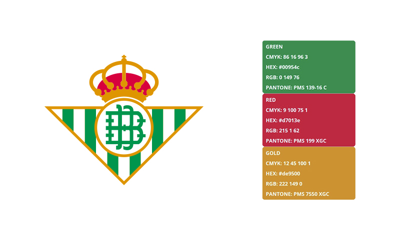
- Verde Betis (Green)
- Hex: #00954C
- Pantone: Approximately Pantone 354 C
- Symbolic meaning: Rooted in the club’s origins; green has been the primary color since founding
- Psychological impact: Associated with growth, identity, and Andalusian nature. To understand how color psychology shapes fan perception, green signals consistency and belonging.
- Brand connection: Instantly distinguishes Betis from rivals Sevilla FC, who use red and white
- White
- Hex: #FFFFFF
- Symbolic meaning: Clarity, tradition, balance in the vertical stripe pattern
- Psychological impact: Creates strong visual contrast against the green
- Brand connection: The green-white combination is one of the most recognized kit color pairings in La Liga
- Gold
- Hex: #C8A84B
- Symbolic meaning: References the royal designation and heraldic tradition
- Psychological impact: Adds prestige and weight to the overall crest. It works similarly to how gold in logos generally signals heritage and authority.
- Brand connection: Common in Spanish football heraldry; connects to Seville’s civic coat of arms
What Typography Style Is Used in the Real Betis Logo?

The Real Betis crest does not use standalone typography as a primary design element. The “NO8DO” inscription appears within the Seville coat of arms section, rendered in a traditional serif style consistent with civic heraldry. It is not a custom typeface but rather a reproduction of historical lettering tied to Seville’s official symbols. No external wordmark typically accompanies the badge in standard usage.
What Are the Hidden Meanings in the Real Betis Logo?
The most discussed element is the “NO8DO” symbol from Seville’s coat of arms. The “8” in the sequence represents a skein of wool in Spanish (“madeja”), making the phrase read as “No me ha dejado” (“She has not abandoned me”), a phrase linked to King Alfonso X and his loyalty to Seville. This is not subliminal. It is historically explicit but unfamiliar to most non-Spanish audiences. The crown is sometimes overlooked but carries real significance: it directly references the 1914 royal patronage, something very few Spanish clubs hold.
How Does the Real Betis Logo Compare to Competitor Logos?
Within La Liga, Real Betis sits in a group of clubs that use civic heraldry as the foundation of their badge design. This sets it apart from more abstract or modernized crests in European football. The badge prioritizes historical depth over graphic simplicity, which is both a strength and a limitation in digital contexts.
Here is how it stacks up against comparable Spanish clubs:
- Sevilla FC: Also uses a shield with civic references, but leans on a more symmetrical, cleaner layout. Red and white color scheme creates an immediate contrast with Betis’s green identity.
- Valencia CF: Features a bat on a shield, more unusual symbolism. Cleaner negative space, easier to reproduce at small sizes.
- Athletic Club Bilbao: Another heraldic shield rooted in regional pride. Red and white stripes mirror a similar structure to Betis but with a Basque identity focus.
- Villarreal CF: More minimal crest, easier to scale. Less civic symbolism, more brand-forward design.
- Real Sociedad: Shield format with regional Basque references. More geometric in recent updates compared to Betis’s traditional approach.
The Betis badge is one of the denser, more complex crests in La Liga. That complexity tells a story, but it does create challenges at small display sizes, especially on mobile screens and app icons.
What Are the Technical Specifications of the Real Betis Logo?
Official Color Codes
- Primary Color: Verde Betis (Green)
- Hex: #00954C
- RGB: (0, 149, 76)
- CMYK: (100, 0, 49, 42)
- Pantone: 354 C (approximate)
- Secondary Color: White
- Hex: #FFFFFF
- RGB: (255, 255, 255)
- CMYK: (0, 0, 0, 0)
- Pantone: White
- Accent Color: Gold
- Hex: #C8A84B
- RGB: (200, 168, 75)
- CMYK: (0, 16, 63, 22)
- Pantone: 7562 C (approximate)
Dimensions and Proportions
- Aspect ratio: Approximately 3:4 (width to height), consistent with traditional heraldic shield proportions
- Minimum size requirements: The club recommends a minimum display width of 25mm in print to preserve legibility of the coat of arms detail
- Clear space specifications: A clear space equal to roughly half the shield width on all sides is standard for official use
- Official usage guidelines: The badge should not be stretched, recolored, or used without the crown element. Vector graphics formats (SVG, EPS, AI) are preferred for print reproduction. For digital use, PNG files with transparent backgrounds are standard. Print files should use a minimum of 300 DPI to avoid the pixelation issues common with bitmap formats at high sizes.
What Cultural Impact Has the Real Betis Logo Had?

The Real Betis badge is more than a football identifier. It functions as a symbol of Andalusian working-class identity, civic pride, and local resistance to the cultural dominance of Madrid-based clubs in Spanish football.
The green and white crest has appeared on murals across Seville’s neighborhoods. It shows up in flamenco culture references, political rallies, and local art. Betis fans, known as Beticos, have an unusually intense emotional connection to the badge, which regularly ranks among the most recognized club crests in Spain outside of the “Big Two.”
Internationally, the logo gained wider recognition through UEFA Europa League and Europa Conference League campaigns in the 2010s and 2020s. The badge now regularly appears on green-dominated sports branding roundups, cited as one of the more distinctive color identity choices in European football.
Among NFL, NBA, and European football badge discussions, Real Betis consistently comes up as an example of how civic heraldry can work as modern brand identity without redesign, which is genuinely rare.
How Does the Real Betis Logo Fit Into the Overall Brand Identity?
The crest is the center point of everything Real Betis produces visually. Kit design, stadium branding, digital content, and merchandise all build outward from the green, white, and gold palette established by the badge. The logo’s role here is foundational rather than decorative.
The club’s brand guidelines keep the badge consistently applied across contexts. The color palette derived from the crest appears in social media templates, matchday graphics, and partner communications. Typography used alongside the badge in official materials tends to be clean and modern, creating a contrast with the traditional nature of the shield itself. This is a deliberate tension: heritage symbol, contemporary application.
The relationship between the crest and the club’s broader visual system is tight. Unlike some clubs that have diluted their badge through sub-brands and alternate marks, Real Betis keeps the primary crest central. There is no simplified icon version or modernized alternate mark for digital use, which is a notable choice given current trends in sports rebranding. Whether that’s a strength or a missed opportunity depends on who you ask.
How Should the Real Betis Logo Be Used?

Official Usage Guidelines
- Do: Use the official vector files provided through official club licensing channels
- Do: Maintain correct proportions and full color whenever possible
- Do: Apply adequate clear space around the badge in all layouts
- Do: Use the high-resolution JPEG or PNG versions for digital editorial use when vector is unavailable
- Don’t: Stretch, rotate, or distort the shield shape
- Don’t: Remove the crown or alter individual elements of the coat of arms
- Don’t: Reproduce the badge in unofficial colorways, including all-black or single-color versions, without express permission
- Don’t: Use the crest on commercial products without a licensing agreement with Real Betis Balompie S.A.D.
Where to Access Official Logo Files
- Official media requests go through the Real Betis press office at realbetisBalonpie.es
- Licensed partners receive asset packages through the club’s commercial department
- Editorial media can request approved assets directly; fan-use files are not officially distributed
Licensing and Trademark
- The Real Betis badge is a registered trademark of Real Betis Balompie S.A.D.
- Commercial reproduction requires a formal licensing agreement
- Unauthorized merchandise use is an infringement under Spanish and EU trademark law
- Fan art and non-commercial use exist in a grey area; the club has historically been tolerant of grassroots fan-created content that does not compete commercially
FAQ on The Real Betis Logo
What does the Real Betis logo look like?
It is a heraldic shield split vertically. The left side carries green and white stripes. The right side displays Seville’s coat of arms, including the NO8DO symbol, a lion, and a castle. A gold crown sits at the top.
What do the colors in the Real Betis badge mean?
Green and white come from the club’s founding kit colors, established in 1907. The gold references the royal designation granted in 1914. Together, the Betis logo colors reflect both club tradition and Andalusian civic identity.
When was the current Real Betis crest introduced?
The modern version of the Real Betis emblem was standardized in the 1990s. The shield format itself dates back to the 1930s. Minor refinements have been made since, mostly for cleaner digital reproduction and merchandise use.
What is the NO8DO symbol in the Betis shield?
It comes from Seville’s official coat of arms. The “8” represents a wool skein (“madeja” in Spanish), making the phrase read “No me ha dejado” (“She has not abandoned me”). It references King Alfonso X’s loyalty to Seville.
Who designed the Real Betis logo?
No single external designer or agency is officially credited. The crest evolved internally over decades. Most refinements were handled by the club directly, particularly during updates in the 1990s aimed at improving the badge’s reproducibility across broadcast and print.
What is the Real Betis logo in vector format?
The official Betis logo vector files are in SVG and EPS formats. These are available through the club’s commercial and press departments. Using vector files keeps the badge sharp at any size, avoiding the quality loss common with low-resolution bitmap exports.
How does the Real Betis badge compare to the Sevilla FC crest?
Both use heraldic shields with Seville references. But the Atletico Madrid logo aside, the Betis-Sevilla rivalry is the sharpest visual contrast in Spanish football: green and white versus red and white, traditional complexity versus a cleaner layout.
Can I download the Real Betis logo for free?
Officially, no. The badge is a registered trademark of Real Betis Balompie S.A.D. Editorial and media use requires approval through official channels. Unauthorized commercial use of the Betis club symbol is an infringement under Spanish and EU trademark law.
What are the official Real Betis logo color codes?
Verde Betis green is #00954C. White is #FFFFFF. Gold is #C8A84B. For print, the green converts to approximately Pantone 354 C. These values apply across the Betis official crest in all standard usage contexts.
Has the Real Betis logo ever been fully redesigned?
No full rebrand has happened. The Betis logo evolution has been gradual: sharper lines, standardized color values, better digital scaling. The core shield structure and civic symbolism have stayed consistent since the 1930s, which is unusual for a club of this size.
Conclusion
The Real Betis logo is one of the more honest badge designs in La Liga: no rebranding exercises, no simplified alternate marks, just a consistent heraldic shield that has carried the same civic symbolism for decades.
The Betis crest design connects the club directly to Seville’s coat of arms, the green and white kit tradition, and the royal designation earned in 1914.
For anyone studying logo design principles through the lens of Spanish football, the Betis emblem history is worth paying attention to. Longevity without reinvention is rarer than it looks.

Renowned for his expertise in logo design and visual branding, Bogdan has developed a multitude of logos for various clients.
His skills extend to creating posters, vector illustrations, business cards, and brochures. Additionally, Bogdan's UI kits were featured on marketplaces like Visual Hierarchy and UI8.
He also wrote in the past years on sites like Design Your Way, WebDesignerDepot, WPDean, Designmodo, Speckyboy, Slider Revolution, and more.
- The Windsurf Logo History, Colors, Font, And Meaning - 10 October 2026
- How to Remove Background From Product Photos (No Photoshop) - 10 October 2026
- How Designers can Build a Stronger Online Creative Identity - 9 October 2026

Bogdan Sandu is a seasoned designer who has been designing websites since 2008. Renowned for his expertise in logo design and visual branding, Bogdan has developed a multitude of logos for various clients. His skills extend to creating posters, vector illustrations, business cards, and brochures. Additionally, Bogdan's UI kits were featured on marketplaces like Visual Hierarchy and UI8. He also wrote in the past years on sites like Design Your Way, WebDesignerDepot, WPDean, Designmodo, Speckyboy, Slider Revolution, and more.
You Might Also Like


