


The Atletico Madrid logo is one of the most recognized crests in Spanish football. It represents Club Atletico de Madrid, a professional football club founded in Madrid, Spain, in 1903. The badge has gone through multiple redesigns over more than a century, each version reflecting shifts in the club’s identity, history, and visual direction. Today’s crest is a direct product of that long evolution, balancing tradition with a cleaner, more modern look suited for digital and merchandise use.
In the broader context of football club branding, Atletico Madrid’s badge sits among Europe’s most storied crests alongside rivals like Bayern Munich and Borussia Dortmund. The club has introduced roughly seven distinct logo versions since its founding, making it one of the more active redesigners among top-tier European clubs.
What Is the Atletico Madrid Logo?

The Atletico Madrid logo is a shield-shaped emblem featuring the bear and strawberry tree symbol of Madrid, vertical red and white stripes, a castle, a crowned top, and the club’s founding year. The current version was introduced in 2017 and was developed through a collaboration between the club and external design consultants.
- Design Type: Emblem / shield crest
- Primary Elements: Bear and strawberry tree (Madrid city symbol), vertical red and white stripes, a seven-pointed crown, a castle motif, the star of the Comunidad de Madrid, and the club name
- Official Introduction Date: 2017
- Designer/Agency: Developed in-house with external design input (no single agency publicly credited)
- Trademark Status: Registered trademark owned by Club Atletico de Madrid SAD
- Color Palette:
- Atletico Red: #CE3524
- White: #FFFFFF
- Navy Blue: #003087
- Gold: #FFB81C
- Usage Context: Match kits, official merchandise, digital platforms, stadium signage, marketing materials, and licensing products
How Has the Atletico Madrid Logo Evolved Over Time?
The Atletico Madrid crest has changed significantly since 1903, moving from a simple circular badge to a refined shield design. Major redesigns occurred in 1917, 1939, 1949, 1971, 1984, and 2017, each reflecting different eras in the club’s history and visual identity.
Original Atletico Madrid Logo (1903-1917)
- Years Active: 1903-1917
- Design Description: A basic circular badge borrowed heavily from Athletic Bilbao’s visual identity, reflecting the club’s early connection to Basque founders
- Color Scheme: Blue and white stripes with red diagonal sash
- Designer: Unknown
- Context: The club was founded in 1903 as a Madrid branch of Athletic Bilbao, so early visual references were directly borrowed
- Key Changes from Previous: N/A (first version)
- Cultural Significance: Represented the club’s Basque origins and early amateur status
Second Atletico Madrid Logo (1917-1939)
- Years Active: 1917-1939
- Design Description: A shield shape was introduced, incorporating the bear and strawberry tree for the first time, establishing Madrid identity over Basque roots
- Color Scheme: Red and white stripes with blue accents
- Designer: Unknown
- Context: The club became fully independent from Athletic Bilbao and needed its own distinct identity
- Key Changes from Previous: Shift from circular badge to shield; introduction of city symbolism
- Cultural Significance: First crest to firmly plant the club’s identity in Madrid rather than the Basque Country
Third Atletico Madrid Logo (1939-1949)
- Years Active: 1939-1949
- Design Description: A post-Civil War redesign reflecting the political climate of Francoist Spain. The club was briefly renamed “Atletico Aviacion” during this period, and the crest reflected aeronautical elements
- Color Scheme: Red, white, and blue
- Designer: Unknown
- Context: Spain’s Civil War ended in 1939 and the club merged with the Air Force sports club, Aviacion Nacional
- Key Changes from Previous: Added aeronautical references; politically shaped redesign
- Cultural Significance: One of the most unusual periods in the club’s history, with forced political associations embedded in the badge
Fourth Atletico Madrid Logo (1949-1971)
- Years Active: 1949-1971
- Design Description: Returned to a cleaner shield with the bear and strawberry tree recentered as the main motif, dropping the aeronautical elements
- Color Scheme: Red, white, blue, and gold
- Designer: Unknown
- Context: Post-war stabilization and the club’s return to civilian status
- Key Changes from Previous: Removed aviation references; restored traditional Madrid city imagery
- Cultural Significance: A visual reset that reconnected the club to its pre-war identity
Fifth Atletico Madrid Logo (1971-1984)
- Years Active: 1971-1984
- Design Description: A more refined shield featuring the red and white vertical stripes more prominently alongside the bear and strawberry tree
- Color Scheme: Red, white, and blue with gold crown
- Designer: Unknown
- Context: Modernization push during a competitive era for the club in La Liga and European competitions
- Key Changes from Previous: Cleaner layout; stripes given more visual weight
- Cultural Significance: The version associated with some of the club’s strongest domestic performances
Sixth Atletico Madrid Logo (1984-2017)
- Years Active: 1984-2017
- Design Description: The most widely recognized pre-2017 version. A rounded shield with the bear and strawberry tree at center, crowned top, vertical stripes, castle motif, and the Comunidad de Madrid star
- Color Scheme: Red, white, navy blue, and gold
- Designer: Unknown
- Context: Introduced during a major commercial expansion period in European football
- Key Changes from Previous: More detailed illustration; added the seven-pointed crown and Comunidad star
- Cultural Significance: The version that defined modern Atletico Madrid globally, used through Champions League finals and the Simeone era
Current Atletico Madrid Logo (2017-Present)
- Years Active: 2017-present
- Design Description: A simplified, modernized shield retaining all core elements but with cleaner lines, flatter illustration style, and improved scalability for digital use
- Color Scheme: Red (#CE3524), white (#FFFFFF), navy blue (#003087), gold (#FFB81C)
- Designer: Club-led redesign with external design input
- Context: Digital-first era demanding logos that work at small sizes on screens and apps
- Key Changes from Previous: Flatter style, reduced detail complexity, improved legibility at small sizes
- Cultural Significance: Controversial at launch among some fans, but now widely accepted as a successful modernization
What Do the Design Elements of the Atletico Madrid Logo Mean?
Each element in the Atletico Madrid crest carries a specific meaning tied to Madrid’s history, Spanish heraldry, and the club’s identity. The shield shape itself signals strength and competition, a common choice in football logo design going back to the sport’s earliest clubs.
The bear and strawberry tree (el oso y el madroño) is Madrid’s official city symbol, appearing on the city’s coat of arms since medieval times.
The vertical red and white stripes reference the club’s traditional kit colors, instantly connecting the badge to what fans see on the pitch.
The castle represents the Castile region, a nod to the broader cultural and geographic identity of central Spain.
The seven-pointed crown signals royal status, common in Spanish heraldry for cities and institutions with historical royal ties.
The star of the Comunidad de Madrid is an administrative symbol representing the autonomous community in which the club operates.
Why Did Atletico Madrid Choose These Specific Colors?
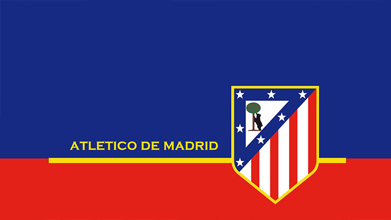
The red and white stripes date back to the club’s early kits, chosen partly due to the influence of Southampton FC (whose kit was imported to Spain in the early 1900s).
Red signals intensity, passion, and competitive aggression. In color psychology, it is strongly associated with energy and determination.
White provides visual contrast and balance, making the stripes readable at distance in stadium settings.
Navy blue appears in the badge’s border and background elements, adding depth without competing with the dominant red and white.
Gold (used in the crown and fine details) signals prestige and historical authority.
- Red: Hex #CE3524 | Pantone 485 C | Symbolizes passion, competition, strength
- White: Hex #FFFFFF | Clean contrast, neutrality, balance
- Navy Blue: Hex #003087 | Pantone 287 C | Depth, stability, tradition
- Gold: Hex #FFB81C | Pantone 7549 C | Prestige, history, achievement
What Typography Style Is Used in the Atletico Madrid Logo?
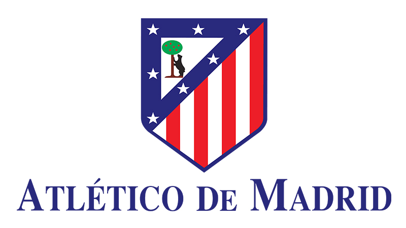
The wordmark inside the current crest uses a condensed, bold sans-serif style, chosen for legibility at small badge sizes.
The lettering is custom-adapted rather than pulled from a standard off-the-shelf font, giving it a proprietary feel while remaining clean and direct.
Earlier versions used more decorative, serif-influenced lettering that felt formal but was harder to read when reproduced small on kits or merchandise.
The shift to condensed sans-serif in 2017 was a practical decision driven by digital display requirements, where thin serifs and ornate letterforms tend to break down at low resolutions.
What Are the Hidden Meanings in the Atletico Madrid Logo?
The bear and strawberry tree combination carries a debated historical interpretation. One common reading is that the tree represents a tax dispute between Madrid’s clergy and the city council, with the council keeping the bear and the church keeping the deer that once accompanied it.
The seven points on the crown are not arbitrary. They correspond to the seven “cuadrillas” (districts) of old Madrid, a deliberate piece of civic heraldry embedded in the design.
The stripes, while visually straightforward, carry an unintentional layer of meaning for many fans: they visually distinguish the club from crosstown rival Real Madrid, whose all-white kit creates an immediate contrast.
How Does the Atletico Madrid Logo Compare to Competitor Logos?
Atletico Madrid’s shield crest sits within a wider tradition of complex European football emblems that prioritize heraldic symbolism over minimalist branding. Compared to rivals and regional clubs, it occupies a middle ground between historical complexity and modern simplicity.
Real Madrid uses a much simpler crown-and-initials crest, prioritizing elegance and restraint over narrative symbolism.
Barcelona’s crest carries similar complexity to Atletico’s, with regional flags, stripes, and city symbols all packed into a single shield.
Among La Liga clubs, the Sevilla and Valencia crests follow comparable heraldic shield structures, though with different symbolic content.
Outside Spain, clubs like FC St. Pauli and Hamburger SV show how German football crests tend toward simpler, bolder geometric forms compared to the narrative-heavy Spanish approach.
What sets Atletico’s badge apart is the density of civic symbolism. Most clubs pick one or two city references. Atletico stacks the bear, the castle, the crown, the stripes, and the regional star into a single cohesive design, and somehow makes it work.
What Are the Technical Specifications of the Atletico Madrid Logo?
Official Color Codes
- Primary Color: Atletico Red
- Hex: #CE3524
- RGB: (206, 53, 36)
- CMYK: (0, 74, 83, 19)
- Pantone: 485 C
- Secondary Color: Navy Blue
- Hex: #003087
- RGB: (0, 48, 135)
- CMYK: (100, 64, 0, 47)
- Pantone: 287 C
- Accent Color: Gold
- Hex: #FFB81C
- RGB: (255, 184, 28)
- CMYK: (0, 28, 89, 0)
- Pantone: 7549 C
- White
- Hex: #FFFFFF
- RGB: (255, 255, 255)
- CMYK: (0, 0, 0, 0)
Dimensions and Proportions
- Aspect Ratio: Approximately 4:5 (portrait-oriented shield)
- Minimum Size Requirements: 25px height for digital use; 10mm height for print to maintain legibility of interior detail
- Clear Space: Minimum clear space equal to the width of the bear figure on all sides
- File Formats: Official use requires vector graphics (SVG, EPS, AI) for scalable reproduction; JPEG and PNG for digital display contexts
- Resolution: Minimum 300 DPI for print applications; bitmap formats acceptable for screen use at 72-96 DPI
What Cultural Impact Has the Atletico Madrid Logo Had?

The Atletico Madrid crest has become a symbol that extends well beyond football. In Madrid, the bear and strawberry tree combination is so deeply embedded in civic identity that the club’s badge and the city’s official coat of arms are often discussed together by locals.
The 2017 redesign generated significant public debate in Spain. Fan reaction was split, with many feeling the simplified version stripped away visual richness built up over decades.
That reaction itself says something about the badge’s cultural weight. People don’t argue about logos they don’t care about.
Globally, the crest has grown in recognition through the club’s Champions League campaigns in 2014 and 2016, both of which brought the badge into millions of homes that had never previously followed Spanish football.
On merchandise, the badge has appeared on everything from traditional scarves to high-end streetwear collaborations, showing its crossover from sport into broader popular culture.
Among sports league crests worldwide, Atletico’s badge is frequently cited in design discussions as an example of how to modernize a complex heraldic mark without gutting its character.
How Does the Atletico Madrid Logo Fit Into the Overall Brand Identity?
The crest functions as the anchor of a broader visual system that includes kit design, typography, color application, stadium branding, and digital assets. Everything the club publishes visually references the same red, white, navy, and gold color palette established by the badge.
The club’s brand guidelines govern how the crest is reproduced across all official channels, from the Wanda Metropolitano stadium to the club’s app and social media.
Kit manufacturer Nike works within those guidelines, using the badge colors as the primary reference point for each season’s strip design.
The typography used in club communications takes cues from the condensed, bold style seen in the crest’s wordmark, creating a consistent brand style that feels unified across print and digital.
Compared to clubs that treat their crest as isolated from their wider visual identity, Atletico Madrid has built a relatively tight system where the badge genuinely drives downstream design decisions rather than sitting separately from them.
How Should the Atletico Madrid Logo Be Used?
Official Usage Guidelines (Do’s):
- Use only official files downloaded from the club’s official media portal or licensing partners
- Reproduce on backgrounds with sufficient contrast (white, light gray, or dark navy work well)
- Maintain proportions when resizing; never stretch or compress the shield shape
- Use the full-color version as default; use the monochrome version only when color reproduction is not possible
- Keep the minimum clear space around the badge free from text or other graphic elements
Do Not:
- Alter, recolor, or modify the badge in any way without written permission from Club Atletico de Madrid SAD
- Use the crest for commercial purposes without a valid licensing agreement
- Reproduce the logo below minimum size thresholds where interior details become unreadable
- Place the crest on busy photographic backgrounds that reduce legibility
- Combine the badge with competitor branding or use it in contexts that could imply official club endorsement without authorization
Where to Access Official Logo Files:
- Atletico Madrid’s official press and media portal (atleticodemadrid.com)
- Licensed merchandise and partner channels
- Official kit manufacturer (Nike) assets for approved media use
Trademark and Licensing: The Atletico Madrid crest is a registered trademark of Club Atletico de Madrid SAD. Unauthorized commercial use constitutes trademark infringement under Spanish and EU intellectual property law. Licensing inquiries should be directed to the club’s commercial department.
FAQ on the Atletico Madrid Logo
What does the Atletico Madrid logo represent?
The crest represents the club’s deep connection to Madrid as a city.
The bear and strawberry tree come directly from Madrid’s official coat of arms. The red and white stripes reference the club’s traditional kit colors, while the castle and crown reflect Spanish regional heraldry.
When was the current Atletico Madrid badge introduced?
The current version of the club crest was introduced in 2017.
It replaced the previous badge that had been in use since 1984. The redesign simplified the illustration style to work better across digital platforms and small-scale merchandise reproduction.
How many times has the Atletico Madrid crest changed?
The badge has gone through approximately seven distinct versions since the club was founded in 1903.
Each redesign reflected a specific moment in the club’s history, from post-Civil War political changes to modern logo evolution driven by digital branding needs.
What colors are used in the Atletico Madrid logo?
The official logo color palette includes Atletico Red (hex #CE3524), white, navy blue (#003087), and gold (#FFB81C).
Red and white are the dominant colors, tied to the club’s iconic vertical stripe kit. Navy and gold appear mainly in the badge’s border, crown, and detail elements.
What is the bear and strawberry tree symbol in the badge?
The bear and strawberry tree is Madrid’s official city symbol, dating back to medieval times.
It appears on the city’s coat of arms and has been part of the Atletico Madrid shield since the club established its own independent identity, separate from its early Basque roots, in the early 20th century.
Is the Atletico Madrid logo a vector file?
Yes. The official badge is available in vector format for licensed use.
Vector files allow the club emblem to scale from a small shirt badge to a stadium banner without any loss in quality. Bitmap formats like PNG and JPEG are used for standard digital display contexts.
What font is used in the Atletico Madrid logo?
The lettering inside the current crest uses a condensed, bold sans-serif style.
It is custom-adapted rather than a standard off-the-shelf typeface. The shift toward this cleaner logo font style happened during the 2017 redesign, prioritizing legibility at small sizes across screens and merchandise.
How does the Atletico Madrid badge compare to Real Madrid’s crest?
The two Madrid clubs take very different visual approaches.
Real Madrid’s crest is minimal, built around initials and a simple crown. Atletico’s official badge is far more detailed, stacking civic symbols, heraldic elements, and stripe patterns into a single shield design.
Can the Atletico Madrid logo be used for commercial purposes?
No, not without a valid licensing agreement from Club Atletico de Madrid SAD.
The badge is a registered trademark. Unauthorized commercial use constitutes infringement under Spanish and EU intellectual property law. Official logo files are accessible through the club’s press portal and licensed partner channels only.
Why did Atletico Madrid redesign their logo in 2017?
The main driver was digital usability. The previous badge, used since 1984, had fine details that broke down at small screen sizes.
The 2017 logo redesign simplified the illustration style while keeping all core heraldic elements intact. Fan reaction was mixed initially, but the updated crest is now widely accepted as the club’s modern visual identity.
Conclusion
The Atletico Madrid logo is more than a club badge. It is a compressed version of Madrid’s civic history, Spanish heraldry, and over a century of football identity packed into a single shield.
From the bear and strawberry tree to the red and white stripes, every element earns its place.
The 2017 redesign proved that a club crest can modernize without losing its character. At its core, the escudo remains exactly what it always was: a visual identity built to last.

Renowned for his expertise in logo design and visual branding, Bogdan has developed a multitude of logos for various clients.
His skills extend to creating posters, vector illustrations, business cards, and brochures. Additionally, Bogdan's UI kits were featured on marketplaces like Visual Hierarchy and UI8.
He also wrote in the past years on sites like Design Your Way, WebDesignerDepot, WPDean, Designmodo, Speckyboy, Slider Revolution, and more.
- The Windsurf Logo History, Colors, Font, And Meaning - 10 October 2026
- How to Remove Background From Product Photos (No Photoshop) - 10 October 2026
- How Designers can Build a Stronger Online Creative Identity - 9 October 2026

Bogdan Sandu is a seasoned designer who has been designing websites since 2008. Renowned for his expertise in logo design and visual branding, Bogdan has developed a multitude of logos for various clients. His skills extend to creating posters, vector illustrations, business cards, and brochures. Additionally, Bogdan's UI kits were featured on marketplaces like Visual Hierarchy and UI8. He also wrote in the past years on sites like Design Your Way, WebDesignerDepot, WPDean, Designmodo, Speckyboy, Slider Revolution, and more.
You Might Also Like


