


The FC St. Pauli logo is one of the most recognizable symbols in world football. It’s a skull and crossbones, and unlike most club badges, it didn’t come from a boardroom. It came from the streets. That distinction matters more than people realize when you look at how logos typically get built for sports organizations.
Within the broader history of football club branding, very few badges carry the kind of cultural weight this one does. Most clubs work within predictable visual systems: shields, crests, animals, local heraldry. FC St. Pauli went a different direction entirely, and it wasn’t even planned. The skull was fan-adopted first, officially registered later. That sequence alone sets it apart from almost every comparable club identity in European football.
The current version of the logo traces its official roots to 1999, when the club purchased the trademark from Hamburg screen printer Steph Braun. The design itself was created in 1989. The club was founded in 1910, meaning the visual identity people recognize worldwide didn’t arrive until nearly 90 years into the club’s existence. There have been two main logo systems in use: the traditional coat of arms crest, and the skull and crossbones emblem.
What Is the FC St. Pauli Logo?
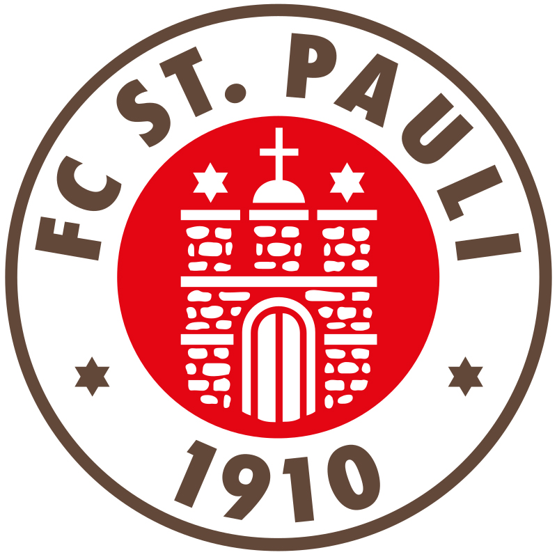
The FC St. Pauli logo is a skull and crossbones emblem, originally designed by Hamburg screen printer Steph Braun in 1989 and officially adopted by the club in September 1999. It represents the club’s anti-establishment identity, rooted in Hamburg’s St. Pauli district and its punk and alternative fan culture.
- Design Type: Emblem / standalone icon (used alongside a traditional coat of arms crest)
- Primary Elements: Anatomically detailed skull, two crossed bones, “ST. PAULI” wordmark beneath
- Official Introduction Date: September 1999 (official club adoption); design created 1989
- Designer/Agency: Steph Braun, owner of Texmen screen printing company, Hamburg
- Trademark Status: Registered trademark filed 02.07.1996 by Steph Braun; sold to FC St. Pauli Marketing GmbH in September 1999 under DE-Marke 396 10 901
- Color Palette: Primary brown (#6B3A2A approx.), white (#FFFFFF), black (#000000)
- Usage Context: Kits, merchandise, digital platforms, marketing materials, stadium signage, fan products worldwide
How Has the FC St. Pauli Logo Evolved Over Time?

The FC St. Pauli visual identity has two parallel tracks: a conventional coat of arms that dates back decades, and the skull emblem that emerged organically in the 1980s before being officially registered in the 1990s. The skull design itself has changed very little since 1989.
That stability is actually unusual. Most clubs redesign their badges every decade or so. FC St. Pauli kept the skull almost exactly as Braun drew it.
Early Club Crest (Pre-1980s)
- Years Active: Mid-20th century onward (parallel to skull emblem after 1999)
- Design Description: Traditional coat of arms featuring Hamburg civic heraldry elements, castle motif, club name
- Color Scheme: Brown, white, red
- Designer: Unknown
- Context: Standard German football club badge format, designed to represent local Hamburg identity
- Key Changes from Previous: N/A (original identity)
- Cultural Significance: Represented the club as a conventional local sports organization before the alternative fan culture took hold
Unofficial Fan Skull Emblem (1986-1998)
- Years Active: 1986 (first flag appearance) through late 1990s as unofficial symbol
- Design Description: Skull and crossbones flag first brought to Millerntor-Stadion by fan “Doc Mabuse” around 1986; Steph Braun’s refined version with anatomical skull and crossed bones created 1989
- Color Scheme: Black and white
- Designer: Doc Mabuse (flag concept, 1986); Steph Braun (finalized design, 1989)
- Context: Grew from Hamburg’s squatter community, punk scene, and anti-establishment culture around the Hafenstrasse housing area near the stadium
- Key Changes from Previous: Complete departure from traditional heraldic crest format
- Cultural Significance: Represented the fan takeover of the club’s identity; became a worldwide symbol of alternative football culture before the club officially recognized it
Official Skull Logo (1999-Present)
- Years Active: September 1999 to present
- Design Description: Anatomically detailed skull with two crossed bones underneath, “ST. PAULI” text mark below. Clean, high-contrast design with no gradients or decorative border
- Color Scheme: Black and white primary; appears in brown/white on branded merchandise
- Designer: Steph Braun (Texmen, Hamburg)
- Context: Club purchased trademark rights from Braun to protect against widespread plagiarism and gain control of merchandising
- Key Changes from Previous: No visual changes to the design itself. Change was purely legal and commercial: the club now owned and controlled the mark
- Cultural Significance: Formalized what fans had already decided. Became one of the best-selling football merchandise symbols globally, worn by people with no direct connection to German football
What Do the Design Elements of the FC St. Pauli Logo Mean?
The skull and crossbones is a direct reference to pirate imagery, specifically the Jolly Roger flag. At FC St. Pauli, it signals defiance against football’s mainstream, against corporate ownership models, against right-wing politics in stadiums, and against the idea that a club’s value is determined by its trophy cabinet.
It’s a simple shape. Two bones, one skull, a text mark. But the context loads it with meaning that most deliberately designed logos never achieve.
What Is the Symbolic Meaning Behind the Skull and Crossbones?
Pirates historically operated outside established authority. That’s exactly the identity St. Pauli fans claimed for themselves in the 1980s.
The club played near Hamburg’s Reeperbahn, in a district known for nightlife, sex work, and working-class culture. The surrounding community identified as outsiders.
The skull fit. It wasn’t chosen after a brand strategy session. It was chosen because it felt true.
What Are the Historical Roots of This Visual Choice?
Hamburg has deep maritime history. Piracy is part of that, particularly the legend of Klaus Störtebeker, a 14th-century pirate celebrated locally as a kind of Robin Hood figure.
When Doc Mabuse brought a skull flag to the Gegengerade stand around 1986, he was pulling from that tradition.
Steph Braun then took an anatomical skull from an old medical textbook and combined it with crossed bones originally intended for an anti-Batman shirt. That combination, sold through Hamburg record shops, became something neither creator could have predicted.
Why Did FC St. Pauli Choose These Specific Colors?

- Brown
- Hex: Approximately #6B3A2A (no single universally published exact code)
- Symbolic meaning: The club’s traditional kit color, dating back decades. Earthy, unglamorous, working-class. Not a color most clubs would choose.
- Psychological impact: Warm but grounded. Doesn’t signal wealth or corporate polish.
- Brand connection: The “Boys in Brown” nickname is central to club identity. Brown in logo design is rare, which makes it instantly distinctive.
- White
- Hex: #FFFFFF
- Symbolic meaning: Contrast and clarity. Works with brown to create high legibility.
- Psychological impact: Openness, which aligns with the club’s stated values around tolerance and inclusion.
- Black
- Hex: #000000
- Symbolic meaning: The skull emblem in its raw form. Connects to punk aesthetics, counterculture, and the club’s anti-establishment stance.
- Psychological impact: Authority, edge, and permanence. Black logos carry a certain weight that other colors don’t.
Understanding how these colors interact comes down to basic color theory. Brown and white create warmth; black and white create tension. Together they communicate both the club’s community roots and its defiant edge.
What Typography Style Is Used in the FC St. Pauli Logo?

The “ST. PAULI” text beneath the skull uses a bold, condensed sans-serif style. It’s all caps, tightly set, and sits cleanly below the bone structure without competing with the skull itself.
The sans-serif approach keeps things direct. No flourishes. No decorative terminals. It matches the bluntness of the skull above it.
The typography has remained consistent with the original Braun design. No custom typeface has been publicly documented. The condensed weight ensures the wordmark reads clearly at small sizes, which matters a lot on kit badges and stickers, the two surfaces where this logo actually lives most of the time.
What Are the Hidden Meanings in the FC St. Pauli Logo?
The skull came from an anatomy textbook. That’s about as literal as design gets. There was no hidden meaning in the original creation.
What’s interesting is the meaning that accumulated afterward. The logo wasn’t designed to represent left-wing politics, LGBT inclusion, or anti-fascism. Those associations developed because of who wore it and why.
Braun’s intent was neighbourhood pride. A shirt for the St. Pauli district of Hamburg. The football club connection was secondary at first.
The crossbones were initially drawn for an unrelated project. The combination was practical, not symbolic. Yet it became one of the most politically loaded sports symbols in the world. That’s not design doing the work. That’s community doing the work.
How Does the FC St. Pauli Logo Compare to Competitor Logos?
German football club badges generally follow a shield or roundel format with local heraldic elements. FC St. Pauli sits completely outside that system with the skull, which is part of why it travels so well internationally.
Direct rivals and comparable clubs make for an interesting contrast.
- Hamburger SV – The Hamburger SV logo is a conventional diamond badge in blue, white, and black. Classic structure, professional, forgettable outside of football contexts. St. Pauli’s skull is the opposite: recognizable to people who’ve never watched a Bundesliga match.
- Hansa Rostock – The Hansa Rostock logo uses a ship and maritime references, which actually shares Hamburg’s port heritage. But the execution is traditional crest format. Nothing approaching the cultural reach of the skull.
- Borussia Dortmund – The Borussia Dortmund logo is a strong roundel design, well-executed, and globally recognized through Champions League exposure. Recognition built on success. St. Pauli’s recognition built on identity. Different mechanisms entirely.
- FC Schalke 04 – The FC Schalke 04 logo follows the traditional German crest model with royal blue and white. Strong working-class fan identity, similar to St. Pauli in that regard, but the visual language is conventional.
- Eintracht Frankfurt – The Eintracht Frankfurt logo uses an eagle, a powerful symbol that has also crossed over into broader cultural use. Probably the closest comparison in terms of a club badge that functions as a stand-alone cultural icon. Still, the eagle operates within traditional heraldic systems. The skull doesn’t.
The pattern is clear. St. Pauli’s logo works because it breaks every convention that other German clubs follow. That’s not accidental. It reflects exactly who the club and its supporters are.
What Are the Technical Specifications of the FC St. Pauli Logo?
Exact official specifications are controlled by FC St. Pauli Marketing GmbH and are not fully published publicly. The following are the best-documented values based on available brand and merchandise references.
Official Color Codes
- Primary Color: Brown – Hex: #6B3A2A (approximate), RGB: (107, 58, 42), CMYK: approx. (0, 46, 61, 58), Pantone: not officially published
- Secondary Color: White – Hex: #FFFFFF, RGB: (255, 255, 255), CMYK: (0, 0, 0, 0)
- Accent Color: Black – Hex: #000000, RGB: (0, 0, 0), CMYK: (0, 0, 0, 100)
Dimensions and Proportions
- Aspect ratio: The skull emblem is roughly square in proportion; the full lockup with “ST. PAULI” text is slightly taller than wide
- Minimum size requirements: Not officially published; standard best practice for emblem logos suggests no smaller than 20px height in digital use
- Clear space specifications: Not officially published; standard practice recommends clear space equal to the height of the “ST. PAULI” text on all sides
- Official usage guidelines: Governed by FC St. Pauli Marketing GmbH; unauthorized commercial use of the trademark is actively enforced
- File formats available: Official vector graphics are available to licensed partners; bitmap versions including JPEG and PNG are available through official channels; high-DPI versions for print are licensed separately
What Cultural Impact Has the FC St. Pauli Logo Had?

The skull has become one of the most globally recognized football symbols, which is remarkable for a club that has spent most of its history outside the top division of German football.
Punk bands like Anti-Flag have worn it in music videos. Artists across Europe and North America wear it with no knowledge of the Bundesliga.
It was part of a global surge in what people now call “cult club” merchandise. Long before the era of brand style guides and carefully managed visual identities, FC St. Pauli accidentally built one of the most powerful sports brands in the world by letting fans lead.
The logo also carries political weight. Wearing it signals something. Anti-racism, anti-fascism, support for LGBTQ+ communities, general hostility to corporate football. That’s a lot of meaning for a skull a screen printer made in 1989 for neighbourhood pride.
In 2009, the club passed a formal resolution codifying its values, including tolerance, social responsibility, and respect. The logo had already been communicating those values for two decades before anyone wrote them down.
How Does the FC St. Pauli Logo Fit Into the Overall Brand Identity?

The skull doesn’t operate alone. It sits within a network of connected identity elements that reinforce each other: the brown kit, the Millerntor-Stadion atmosphere, the Reeperbahn location, the club’s political stances, and the Fanladen, an independent fan project that predates the club’s own organized merchandise operation.
The brand guidelines that govern the skull are relatively tight given how loosely the symbol emerged. The club actively pursues plagiarism cases.
The traditional coat of arms crest and the skull coexist within the same identity system. The crest appears on official UEFA documentation and some formal contexts. The skull appears everywhere else. Most fans don’t even register the crest. The skull is the brand.
This dual-logo system is unusual. Compare it to how single-mark clubs like Bayern Munich operate with one dominant crest across all touchpoints. St. Pauli runs two systems in parallel, and somehow both feel authentic because each serves a different contextual purpose.
Color palette consistency across both systems (brown, white, black) holds the identity together. The visual hierarchy in any St. Pauli branded piece reliably puts the skull or the brown color at the top of the recognition chain.
How Should the FC St. Pauli Logo Be Used?

Official Usage Guidelines
- Do: Use official files obtained through FC St. Pauli Marketing GmbH or licensed partners
- Do: Maintain the skull’s proportions; do not stretch, compress, or distort
- Do: Use on approved background colors only (typically brown, white, or black)
- Don’t: Add gradients, drop shadows, or visual effects not present in the official file
- Don’t: Recolor the skull outside of officially sanctioned color variations
- Don’t: Use the skull in any context that contradicts the club’s stated values (racist, fascist, or discriminatory use)
- Don’t: Reproduce the trademark for commercial purposes without a license
Where to Access Official Logos
- Licensed partners can request files directly through FC St. Pauli Marketing GmbH
- Press and media can contact the club’s communications department for approved press assets
- Fan use for non-commercial personal projects typically falls outside active enforcement, but commercial reproduction without a license is actively pursued
Licensing and Trademark Protection
- The skull and crossbones is a registered trademark under DE-Marke 396 10 901
- Owned by FC St. Pauli Marketing GmbH since September 1999
- The club has a documented history of pursuing plagiarism cases, dating back to the mid-1990s when Steph Braun first filed the trademark specifically to defend against copying
- Any commercial use of the skull, even modified versions that are clearly derivative, requires a formal licensing agreement
FAQ on The FC St. Pauli Logo
What Does the FC St. Pauli Logo Represent?
The skull and crossbones, known in German as the Totenkopf, represents defiance, community, and anti-establishment identity.
It grew from Hamburg’s punk and squatter scene in the 1980s. It was never a corporate decision. Fans chose it, and the club eventually followed.
When Was the FC St. Pauli Skull Logo Officially Adopted?
The club officially adopted the skull emblem in September 1999, purchasing the trademark from Steph Braun’s Texmen company.
Braun had registered the trademark in 1996 to prevent plagiarism. Fans had already been using it informally for over a decade by that point.
Who Designed the FC St. Pauli Skull Logo?
Steph Braun, owner of the Texmen screen printing company in Hamburg, created the design in 1989.
He based the skull on an image from an old anatomy textbook. The crossed bones were originally drawn for an unrelated anti-Batman shirt. The combination became one of football’s most iconic symbols.
What Are the Official Colors of the FC St. Pauli Logo?
The club’s colors are brown and white, with black used prominently in the skull emblem itself.
Brown is rare in football branding, which is part of why it works so well. It gives the club an immediately distinct visual identity. The skull in black and white carries its own separate visual weight.
Is the FC St. Pauli Skull a Registered Trademark?
Yes. The skull and crossbones is a registered trademark under DE-Marke 396 10 901, owned by FC St. Pauli Marketing GmbH since September 1999.
Commercial use without a license is actively enforced. The club has a long history of pursuing plagiarism cases dating back to when Braun first filed the trademark.
What Is the Difference Between the FC St. Pauli Crest and the Skull Logo?
The club uses two symbols. The traditional coat of arms crest features Hamburg heraldry and appears in formal and UEFA contexts.
The skull emblem is the fan-adopted pirate symbol used on merchandise, kits, and marketing. Most supporters identify entirely with the skull. The crest is almost invisible by comparison.
Why Did FC St. Pauli Fans Choose a Pirate Symbol?
Hamburg has deep maritime history, including the legend of pirate Klaus Störtebeker, a local folk hero.
The Jolly Roger flag also fit the identity of the fan base: outsiders, punks, squatters, and left-leaning activists who saw themselves as operating outside football’s mainstream. The symbol felt honest rather than manufactured.
Where Can I Download the Official FC St. Pauli Logo?
Official vector graphics and high-resolution files are available to licensed partners through FC St. Pauli Marketing GmbH.
Press assets can be requested via the club’s communications department. Unauthorized commercial reproduction of the skull and crossbones is a trademark violation, regardless of how the file was obtained.
Has the FC St. Pauli Logo Ever Been Redesigned?
The skull design has stayed remarkably consistent since Steph Braun created it in 1989. No major visual redesign has been documented.
The only significant change was legal: the club acquiring ownership of the trademark in 1999. The anatomy, proportions, and “ST. PAULI” wordmark beneath the skull remain essentially unchanged.
Why Is the FC St. Pauli Logo So Popular Outside of Football?
The skull and crossbones travels far beyond football because it functions as a political and cultural statement, not just a sports badge.
Punk bands, activists, and people with no connection to the Bundesliga wear it to signal anti-racism, anti-fascism, and general hostility to corporate culture. That kind of meaning is something most deliberately designed logos never manage to build.
Conclusion
The FC St. Pauli logo is proof that the most powerful visual identities aren’t always built by design agencies. This one came from a Hamburg neighbourhood, an anatomy textbook, and a fan base that knew exactly who they were.
The skull and crossbones emblem now functions as a globally recognized symbol of anti-establishment football culture, worn far beyond the Millerntor-Stadion by people who connect with what it stands for.
Brown kit, pirate flag, Reeperbahn roots. Everything about the Kiezkicker brand identity points in the same direction: a club that built its identity from the ground up, not the top down.
That’s what makes it worth studying.

Renowned for his expertise in logo design and visual branding, Bogdan has developed a multitude of logos for various clients.
His skills extend to creating posters, vector illustrations, business cards, and brochures. Additionally, Bogdan's UI kits were featured on marketplaces like Visual Hierarchy and UI8.
He also wrote in the past years on sites like Design Your Way, WebDesignerDepot, WPDean, Designmodo, Speckyboy, Slider Revolution, and more.
- The Webflow Logo History, Colors, Font, And Meaning - 10 September 2026
- Your Highest-Paying Design Project Might Be Your Least Profitable One… Without You Noticing - 10 September 2026
- Free Browser 3D Tools for Designers Who Refuse to Install Anything - 9 September 2026

Bogdan Sandu is a seasoned designer who has been designing websites since 2008. Renowned for his expertise in logo design and visual branding, Bogdan has developed a multitude of logos for various clients. His skills extend to creating posters, vector illustrations, business cards, and brochures. Additionally, Bogdan's UI kits were featured on marketplaces like Visual Hierarchy and UI8. He also wrote in the past years on sites like Design Your Way, WebDesignerDepot, WPDean, Designmodo, Speckyboy, Slider Revolution, and more.
You Might Also Like


