


The Athletic Bilbao logo is one of Spanish football’s most recognizable crests, built around a heraldic shield that carries deep Basque cultural roots. It is not just a sports emblem. It is a visual statement about regional identity, pride, and an unbroken commitment to a unique footballing philosophy. The current version combines traditional heraldic elements with clean, modern presentation, making it stand out among red-dominant logos in European football.
Within the broader history of football club branding, Athletic Club de Bilbao sits in a rare category. Few clubs have maintained this level of visual and cultural consistency across more than a century. The crest has changed in details but never in spirit, which puts it in a different league from clubs that have gone through full rebrands.
The club was founded in 1898, making it one of the oldest in Spain. The logo has gone through several iterations over the decades, each one refining rather than replacing what came before. The current version has been in active use since 2017.
What Is the Athletic Bilbao Logo?

The Athletic Bilbao logo is a heraldic shield emblem featuring vertical red and white stripes, the Basque cross (Cruz de San Andres), a wolf, and an oak tree. Officially updated in 2017, it was refined in-house by the club. The design reflects Basque heritage and the club’s Basque-only player policy.
- Design Type: Heraldic shield emblem
- Primary Elements: Divided shield with red and white vertical stripes, Cruz de San Andres (diagonal cross), a wolf, an oak tree (Guernica oak), and the initials “ACB”
- Official Introduction Date: Current version introduced 2017
- Designer/Agency: Refined internally by Athletic Club de Bilbao
- Trademark Status: Registered trademark under Athletic Club de Bilbao; protected by the Spanish Patent and Trademark Office (OEPM)
- Color Palette: Red (#EF2B2D), White (#FFFFFF), Black (#000000), with gold accent (#F5A623) on select applications
- Usage Context: Match kits, stadium signage, official merchandise, digital platforms, print materials, and club communications
How Has the Athletic Bilbao Logo Evolved Over Time?

The Athletic Bilbao crest has gone through gradual refinements since the late 1800s, always keeping its heraldic shield structure and core Basque symbols intact. No full rebrand has ever happened. Each update tightened proportions, clarified details, or modernized the linework without erasing what was already there.
Original Athletic Bilbao Logo (1901-1910s)
- Years Active: Approximately 1901 to early 1910s
- Design Description: A basic shield shape with red and white vertical stripes, loosely based on the coat of arms of Bilbao
- Color Scheme: Red and white
- Designer: Unknown
- Context: Introduced as the club formalized its identity in the early years of Spanish football
- Key Changes from Previous: N/A (first formal crest)
- Cultural Significance: Established the visual link between the club and Bilbao city heraldry from day one
Mid-Century Athletic Bilbao Logo (1910s-1940s)
- Years Active: 1910s to 1940s
- Design Description: Shield retained stripes; additional heraldic elements including the wolf and the oak tree were gradually incorporated, drawing directly from the official Bilbao coat of arms
- Color Scheme: Red, white, and black linework
- Designer: Unknown
- Context: Spanish football was growing in prestige; clubs began formalizing crests to reflect civic and regional identity
- Key Changes from Previous: Introduction of the wolf and oak tree motifs
- Cultural Significance: The wolf and oak became permanent symbols of Basque resistance and identity
Post-War Athletic Bilbao Logo (1940s-1990s)
- Years Active: 1940s to 1990s
- Design Description: More structured shield with cleaner heraldic divisions, better-defined cross motif, and refined typography for “ACB”
- Color Scheme: Red, white, black
- Designer: Unknown
- Context: Post-Franco Spain saw a revival of Basque cultural expression, and the crest reflected this renewed pride
- Key Changes from Previous: Improved symmetry and cleaner linework; typography became more legible
- Cultural Significance: The crest took on added weight as a symbol of Basque cultural survival during politically difficult decades
Modern Athletic Bilbao Logo (2017-Present)
- Years Active: 2017 to present
- Design Description: Cleaner, more geometric version of the classic shield; sharper lines, better digital scalability, and refined proportions throughout
- Color Scheme: Red (#EF2B2D), White (#FFFFFF), Black (#000000)
- Designer: Refined internally by Athletic Club de Bilbao
- Context: Updated to work across digital platforms and modern merchandise without losing the historic character
- Key Changes from Previous: Tighter geometry, improved scalability, modernized linework on the wolf and oak symbols
- Cultural Significance: Proved the club could update its identity for the digital age without betraying its roots
What Do the Design Elements of the Athletic Bilbao Logo Mean?
Every element in the Athletic Bilbao crest traces back to either the city of Bilbao’s heraldic history or Basque cultural identity. Nothing in the design is decorative without purpose. The shield structure, the symbols inside it, and even the color split all carry specific meaning tied to place and history.
What Does the Shield Shape Represent in the Athletic Bilbao Logo?
The heraldic shield format connects Athletic Club directly to Bilbao’s official coat of arms.
This was a deliberate choice from the club’s earliest days, signaling that the team represented not just a sport, but the city itself.
The shield communicates civic pride and permanence. It says the club belongs to this specific place, which matters a lot given Athletic’s strict Basque-only player policy.
What Does the Oak Tree Symbolize in the Athletic Bilbao Logo?
The oak tree (specifically the Guernica oak) is one of the most powerful symbols in all of Basque culture.
It represents the traditional meeting place of Basque leaders and the preservation of Basque law and autonomy for centuries.
Including it in the crest was never just a design decision. It was a political and cultural statement, especially during periods when Basque identity was suppressed.
What Does the Wolf Represent in the Athletic Bilbao Logo?
The wolf comes directly from Bilbao’s city coat of arms and has appeared in the city’s heraldry since the medieval period.
It traditionally symbolized strength, loyalty, and the fierce protection of community. In the context of the football club, it reinforces the same values the Basque-only policy represents: defending your own.
Why Did Athletic Bilbao Choose These Specific Colors?

- Red (#EF2B2D)
- Symbolic meaning: Passion, strength, fighting spirit
- Psychological impact: Energizes and signals aggression and determination; one of the most attention-grabbing colors in sports branding
- Brand connection: Shared with the Basque flag (Ikurrina) which features red prominently; also ties to Bilbao city colors
- White (#FFFFFF)
- Symbolic meaning: Clarity, honesty, tradition
- Psychological impact: Balances the intensity of red; creates strong visual contrast on the kit stripes
- Brand connection: Part of the club’s original kit colors; reflects the clean, no-frills identity Athletic projects
- Black (#000000)
- Symbolic meaning: Structure, authority, permanence
- Psychological impact: Grounds the crest; gives the linework and heraldic details definition and weight
- Brand connection: Used as an outline and structural color throughout the shield to maintain heraldic integrity
What Typography Style Is Used in the Athletic Bilbao Logo?
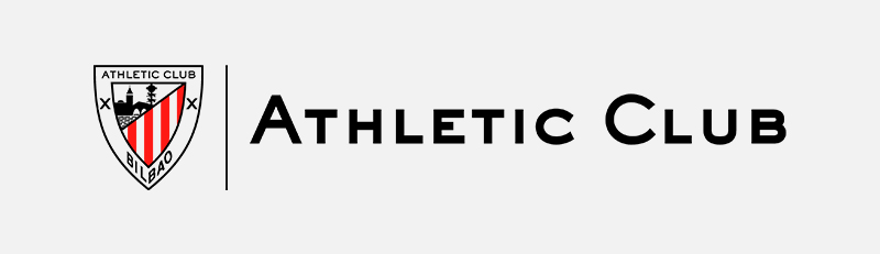
The “ACB” lettering inside the crest uses a bold, upright style with strong serifs, consistent with traditional heraldic typography.
The letterforms are sturdy and legible even at small sizes, which matters when the crest appears on kit badges or small digital icons.
The typography has been refined over the decades for better clarity but has never shifted toward modern sans-serif styles. That would feel wrong for a crest this historically grounded. The club clearly understands that serif-style lettering carries the weight of tradition in a way that geometric fonts simply cannot.
What Are the Hidden Meanings in the Athletic Bilbao Logo?
The most significant “hidden” meaning is the connection between the crest and the club’s transfer policy.
The Basque symbols (the oak, the cross, the wolf) collectively communicate the same message as the policy itself: Athletic Club belongs to the Basque Country, full stop.
The Cruz de San Andres (the diagonal cross dividing the shield) is less immediately obvious to non-Basque viewers, but it directly mirrors the cross on the Basque flag, reinforcing regional identity at a symbolic level most casual observers miss.
How Does the Athletic Bilbao Logo Compare to Competitor Logos?
Athletic Bilbao’s crest sits firmly in the traditional heraldic category, unlike many modern La Liga clubs that have simplified toward flat, minimal marks. It is one of the most complex shields in Spanish football, which actually works in its favor as a differentiator.
Compared to clubs like Real Sociedad, whose crest shares some Basque visual references, Athletic’s badge is denser and more historically layered.
The Sevilla logo and the Villarreal logo both lean toward cleaner shield formats with fewer internal elements, making Athletic’s multi-symbol approach noticeably more traditional by comparison.
Look at the Valencia logo and you see a similar commitment to heraldic tradition, though Valencia uses a bat motif rather than regional cultural symbols.
Within European football more broadly, Athletic Bilbao’s crest resembles the approach taken by clubs like Bayern Munich (which also draws from regional civic heraldry) rather than the trend toward simplified geometric marks seen across newer club rebrands. The Bayern Munich logo, for reference, also uses a divided shield format with regional color coding, making the structural parallel fairly clear.
What makes Athletic’s crest genuinely unusual is that its complexity is driven by cultural necessity rather than design preference. The symbols are not decorative. They justify the club’s entire identity.
What Are the Technical Specifications of the Athletic Bilbao Logo?
Official Color Codes
- Primary Color: Red
- Hex: #EF2B2D
- RGB: (239, 43, 45)
- CMYK: (0, 82, 81, 6)
- Pantone: 485 C
- Secondary Color: White
- Hex: #FFFFFF
- RGB: (255, 255, 255)
- CMYK: (0, 0, 0, 0)
- Pantone: White
- Accent Color: Black
- Hex: #000000
- RGB: (0, 0, 0)
- CMYK: (0, 0, 0, 100)
- Pantone: Black C
Dimensions and Proportions
- Aspect ratio: Approximately 4:5 (width to height), consistent with traditional heraldic shield proportions
- Minimum size requirements: The crest should not be reproduced below 20mm in height in print to maintain heraldic detail legibility
- Clear space specifications: A minimum clear space equal to the width of the “A” in “ACB” should be maintained around all sides of the crest
- Official usage guidelines: The crest must always appear on approved backgrounds; distortion, color alteration, or partial cropping is not permitted under club trademark guidelines. The club distributes official vector graphics files for licensed partners to ensure consistent reproduction across all formats.
What Cultural Impact Has the Athletic Bilbao Logo Had?

The Athletic Bilbao crest functions as a Basque cultural symbol well beyond the football world. It is one of the few football badges that carries genuine political and regional identity weight, recognized internationally as a marker of Basque pride rather than just club affiliation.
During the Franco era, openly displaying Basque cultural symbols was restricted or outright dangerous in parts of Spain.
The crest, worn on kits in front of thousands, became a quiet but visible act of cultural resistance. The oak tree and the cross carried meanings that went far beyond sport.
Today, the badge appears on flags, murals, and street art across the Basque Country in contexts entirely separate from football. That kind of cultural reach is rare for any sports logo.
It has also influenced how other Basque institutions present themselves visually, reinforcing the idea that regional symbols belong in modern design without needing to be softened or abstracted for broader appeal.
Among NFL logos, NBA logos, and other major sports crests worldwide, few carry this level of direct cultural and political significance in their actual design elements. Most sports logos are visual shorthand for a team. The Athletic Bilbao crest is visual shorthand for an entire people.
How Does the Athletic Bilbao Logo Fit Into the Overall Brand Identity?
The crest is the center of everything Athletic Club communicates visually. The red and white stripes from the shield carry directly into the kit. The Basque symbols connect to the club’s transfer policy. The typography style echoes throughout official communications. Everything points back to the same core idea: this club is from the Basque Country, run for the Basque Country, and not trying to be anything else.
The club’s brand guidelines build outward from the crest.
Kit design, stadium branding at San Mames, merchandise, and digital presence all use the red-white-black palette established by the badge. There is no separate “modern” visual identity running alongside the traditional one. They are the same thing.
This consistency is actually unusual in professional football, where commercial pressures often push clubs toward building separate lifestyle brand identities alongside their sporting ones. Athletic resists that.
The result is a brand identity with very high recognition and very low confusion. You always know exactly what you are looking at and what it stands for. That kind of clarity is something many clubs spend enormous amounts trying to achieve and rarely do.
How Should the Athletic Bilbao Logo Be Used?

Official Usage Guidelines
- Do’s:
- Use only official files provided by Athletic Club de Bilbao for licensed applications
- Maintain the approved color palette at all times
- Preserve clear space requirements around the crest
- Use the crest at sizes that maintain legibility of internal detail
- Apply the crest on approved background colors only (white, black, or official red)
- Don’ts:
- Do not distort, stretch, or alter the proportions of the crest
- Do not recolor any element of the shield
- Do not use the crest as part of unofficial merchandise or commercial products without a license
- Do not crop, overlay text on, or partially obscure the crest
- Do not recreate the crest from memory or from low-resolution sources
Where to Access Official Logo Files
Official logo assets are available to licensed partners and media outlets through Athletic Club de Bilbao’s official press and communications department. The club’s official website (athletic-club.eus) provides some press resources directly. Unauthorized downloads from third-party sites do not guarantee file accuracy or legal compliance.
Licensing and Trademark Protection
The Athletic Bilbao crest and all associated visual marks are registered trademarks of Athletic Club de Bilbao, protected under Spanish intellectual property law and EU trademark regulations. Commercial use of the crest requires a formal licensing agreement with the club. Unauthorized reproduction for commercial gain is a trademark infringement. Fan art and non-commercial use exist in a gray area, but any use that implies official affiliation or generates revenue requires proper licensing.
FAQ on the Athletic Bilbao Logo
What does the Athletic Bilbao logo represent?
The crest represents Basque cultural identity and the city of Bilbao through heraldic symbols including a wolf, an oak tree, and the Cruz de San Andres.
Every element connects directly to either the city’s coat of arms or broader Basque heritage.
When was the current Athletic Bilbao badge introduced?
The current version of the Athletic Club shield was introduced in 2017.
It refined the proportions and linework of the previous crest for better digital scalability, without changing any of the core symbols or colors.
What colors are in the Athletic Bilbao crest?
The official colors are red (#EF2B2D), white (#FFFFFF), and black (#000000).
Red and white come from both the city of Bilbao’s heraldry and the club’s iconic red and white stripes, worn on the kit since the club’s earliest years.
What is the oak tree in the Athletic Club logo?
The oak tree is the Guernica oak, a defining symbol of Basque autonomy and the traditional meeting place of Basque leaders for centuries.
Its presence in the crest is a direct political and cultural statement, not a decorative choice.
Has the Athletic Bilbao badge ever been fully rebranded?
No. The club badge history shows consistent refinement rather than reinvention.
The heraldic shield format, core symbols, and red-white color scheme have remained intact across every iteration since the club formalized its visual identity in the early 1900s.
What does the wolf symbolize in the Athletic Bilbao emblem?
The wolf is borrowed directly from Bilbao’s city coat of arms and has appeared in the city’s heraldry since the medieval period.
It traditionally represents strength and fierce protection of community, values that align closely with the club’s Basque-only player policy.
How does the Athletic Bilbao logo compare to other La Liga crests?
It is one of the most complex heraldic shields in Spanish football.
Clubs like Real Betis and Espanyol also use shield formats, but Athletic’s crest carries more internal symbolic density tied directly to regional cultural identity rather than civic or royal history.
What font or typography is used in the Athletic Bilbao crest?
The “ACB” initials use a bold, upright serif style consistent with classical heraldic typeface conventions.
The letterforms prioritize legibility at small sizes, which matters for kit badges and digital icon use.
Is the Athletic Bilbao logo trademarked?
Yes. The Athletic Club de Bilbao insignia is a registered trademark protected under Spanish intellectual property law and EU trademark regulations.
Commercial use requires a formal licensing agreement. Unauthorized reproduction for commercial purposes is a trademark infringement.
Where can I download the official Athletic Bilbao logo?
Official logo files are available to licensed partners and media through Athletic Club’s press department at athletic-club.eus.
Third-party downloads are unreliable for accuracy and carry legal risk. For anything commercial, you need a proper club licensing agreement directly from Athletic Club de Bilbao.
Conclusion
The Athletic Bilbao logo is one of the few football crests where every design decision carries cultural weight.
The Guernica oak, the wolf, the Cruz de San Andres, the red and white stripes – none of it is accidental. This is Basque football visual heritage compressed into a shield.
Few La Liga club emblems come close to this level of symbolic consistency across more than a century.
If you want to understand what makes a sports badge genuinely meaningful, the Atletico Madrid logo and others come close, but Athletic Club de Bilbao sets the standard.

Renowned for his expertise in logo design and visual branding, Bogdan has developed a multitude of logos for various clients.
His skills extend to creating posters, vector illustrations, business cards, and brochures. Additionally, Bogdan's UI kits were featured on marketplaces like Visual Hierarchy and UI8.
He also wrote in the past years on sites like Design Your Way, WebDesignerDepot, WPDean, Designmodo, Speckyboy, Slider Revolution, and more.
- The Webflow Logo History, Colors, Font, And Meaning - 10 September 2026
- Your Highest-Paying Design Project Might Be Your Least Profitable One… Without You Noticing - 10 September 2026
- Free Browser 3D Tools for Designers Who Refuse to Install Anything - 9 September 2026

Bogdan Sandu is a seasoned designer who has been designing websites since 2008. Renowned for his expertise in logo design and visual branding, Bogdan has developed a multitude of logos for various clients. His skills extend to creating posters, vector illustrations, business cards, and brochures. Additionally, Bogdan's UI kits were featured on marketplaces like Visual Hierarchy and UI8. He also wrote in the past years on sites like Design Your Way, WebDesignerDepot, WPDean, Designmodo, Speckyboy, Slider Revolution, and more.
You Might Also Like


