


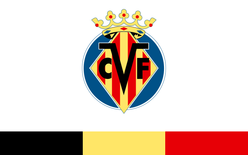
The Villarreal logo is the official crest of Villarreal CF, a professional football club based in Villarreal, Castellon, Spain. It functions as the club’s core visual identity, appearing on kits, merchandise, and all official communications. Founded in 1923, the club has gone through several badge iterations, with the current emblem reflecting both regional heritage and modern logo design standards. The crest sits alongside other well-known Spanish football badges and carries a century of club history within its design.
What Is the Villarreal CF Logo?

The Villarreal CF logo is a shield-shaped emblem featuring a castle, a bat, and the club’s yellow and navy color scheme. The current version was refined in the early 2000s. It uses no external design agency credit publicly, and serves as a registered trademark of Villarreal CF.
- Design Type: Emblem / crest (shield-based)
- Primary Elements: Shield shape, castle tower, bat figure, horizontal color bands, club name lettering
- Official Introduction Date: Current version formalized circa 2001-2002
- Designer/Agency: Developed internally by the club; no external agency publicly credited
- Trademark Status: Registered trademark of Villarreal CF SAD
- Color Palette: Yellow (#FFD700 approximate), Navy Blue (#1A1F5E approximate), Black (#000000), White (#FFFFFF)
- Usage Context: Match kits, stadium signage, digital platforms, merchandise, official documents, marketing materials
How Has the Villarreal CF Logo Evolved Over Time?

The Villarreal CF badge has gone through gradual changes since the club’s founding in 1923, moving from basic early designs toward a more refined, structured crest. Each version kept core regional symbols intact while updating proportions and color application.
Original Villarreal CF Logo (1923-1940s)
- Years Active: 1923 to late 1940s
- Design Description: A basic shield shape with minimal detail, early lettering, and regional coat of arms references
- Color Scheme: Yellow and blue, though application was inconsistent in early print use
- Designer: Unknown
- Context: Club was freshly founded; the badge served a purely functional identification role
- Key Changes from Previous: N/A (first version)
- Cultural Significance: Established the club’s connection to the Castellon region and its heraldic symbols
Mid-Century Villarreal CF Logo (1950s-1980s)
- Years Active: 1950s through 1980s
- Design Description: More defined shield shape; castle element became clearer; bat figure more prominent
- Color Scheme: Yellow and navy blue, more consistently applied
- Designer: Unknown
- Context: Club was building its identity through lower Spanish football divisions
- Key Changes from Previous: Cleaner lines, more structured layout, improved typography on the badge
- Cultural Significance: Cemented the bat as a recurring symbol tied to the Valencia region’s heraldry
Modern Villarreal CF Logo (1990s-2001)
- Years Active: 1990s to circa 2001
- Design Description: Transitional version with tighter proportions; lettering updated; shield outline refined
- Color Scheme: Yellow, navy, black outlines
- Designer: Internal club design
- Context: Club rising through Spanish football; needed a more professional-looking badge as visibility grew
- Key Changes from Previous: Typography modernized; overall crest proportions tightened
- Cultural Significance: Reflected the club’s growing ambition ahead of its eventual La Liga consolidation
Current Villarreal CF Logo (2001-Present)
- Years Active: Circa 2001 to present
- Design Description: Clean shield crest with castle, bat, horizontal yellow and navy bands, bold black outline, and “Villarreal CF” lettering
- Color Scheme: Yellow, navy blue, black, white
- Designer: Internal club development
- Context: Coincided with the club’s sustained presence in La Liga and European competition
- Key Changes from Previous: More balanced alignment of elements; sharper rendering suited for digital and broadcast use
- Cultural Significance: The badge that appeared during UEFA Cup and Champions League campaigns, giving it global recognition
What Do the Design Elements of the Villarreal CF Logo Mean?
Each element in the Villarreal CF crest connects to regional history and club identity. The castle references the town’s historical coat of arms. The bat is a traditional symbol across the Valencia region. The yellow and navy bands reflect the club’s official kit colors and their century-long association with the team.
What Does the Castle Symbol Represent in the Villarreal CF Logo?
The castle is drawn directly from the historical coat of arms of Villarreal town.
It signals the club’s deep roots in the local community and the municipality’s medieval heritage.
This kind of heraldic borrowing is common in Spanish football, where clubs use civic symbols to reinforce local identity.
For Villarreal CF, the castle grounds the badge in place. It tells you exactly where this club comes from without needing words.
What Is the Significance of the Bat in the Villarreal CF Logo?
The bat is a recurring symbol across the Valencia region’s heraldry, appearing in the coats of arms of several local towns and clubs.
Its origin is tied to legend. One story links it to King James I of Aragon, who reportedly saw a bat land on his tent before a victorious battle.
Whether historically accurate or not, the bat became a regional emblem. Its presence on the Villarreal crest connects the club to that broader Valencian identity.
Why Did Villarreal CF Choose These Specific Colors?
- Yellow
- Hex: Approximately #FFD700
- Pantone: Pantone 116 C (approximate)
- Symbolic meaning: Primary club color, tied to the nickname “Yellow Submarine”
- Psychological impact: High visibility, energy, optimism
- Brand connection: Instantly identifies the club on the pitch and in merchandise
- Navy Blue
- Hex: Approximately #1A1F5E
- Pantone: Pantone 2766 C (approximate)
- Symbolic meaning: Secondary club color, provides strong contrast against yellow
- Psychological impact: Stability, authority, professionalism
- Brand connection: Common in Spanish football crests; keeps the badge grounded visually
- Black
- Hex: #000000
- Symbolic meaning: Outline and definition element
- Psychological impact: Strength, clarity
- Brand connection: Sharpens the crest for both print and digital use
Understanding how color psychology works in sports branding helps explain why yellow-dominant clubs tend to stand out in crowded visual environments like broadcast graphics and NFL logos or NBA logos comparisons.
What Typography Style Is Used in the Villarreal CF Logo?

The lettering on the Villarreal CF crest uses a bold, condensed style.
It reads cleanly at small sizes, which matters a lot for kit badges and digital thumbnails.
The font appears to be a custom or heavily modified version of a standard bold sans-serif, though no official typeface name has been publicly confirmed by the club.
Earlier versions used slightly different letterforms. The current version standardized the text for better reproduction across materials.
What Are the Hidden Meanings in the Villarreal CF Logo?
There are no widely confirmed subliminal design tricks in the Villarreal badge. What you see is largely what it means.
That said, the combination of bat and castle creates an unspoken narrative about regional pride and historical roots that goes deeper than pure decoration.
Some supporters read the yellow-dominant palette as a reference to sunshine and the Mediterranean climate of the Castellon area, though this isn’t a stated design intention.
The overall structure follows traditional heraldic balance, which gives the badge an authoritative, established feel without needing to explain itself.
How Does the Villarreal CF Logo Compare to Competitor Logos?

Among La Liga club crests, Villarreal’s badge sits in the traditional shield-and-symbol category alongside clubs like Valencia and Athletic Bilbao. Its yellow-dominant palette makes it one of the more visually distinct badges in Spanish football, where blue and red tend to dominate.
The Valencia logo also uses a bat symbol, which creates an interesting overlap. Both clubs share Valencian heraldic roots, though their crests differ clearly in color and overall composition.
The Real Betis logo and Sevilla logo follow similar traditional shield formats but rely on green-and-white and red-and-white palettes respectively, making Villarreal’s yellow stand out sharply by comparison.
The Athletic Bilbao logo takes a more complex heraldic approach, while Villarreal keeps things relatively clean and readable, which works well at the small sizes required for modern digital and broadcast use.
Compared to Real Sociedad’s logo, Villarreal’s crest feels warmer and more community-rooted, whereas Real Sociedad leans into a slightly more geometric, modern direction.
What Are the Technical Specifications of the Villarreal CF Logo?
Official Color Codes
- Primary Color: Yellow
- Hex: #FFD700 (approximate)
- RGB: (255, 215, 0) approximate
- CMYK: (0, 16, 100, 0) approximate
- Pantone: 116 C (approximate)
- Secondary Color: Navy Blue
- Hex: #1A1F5E (approximate)
- RGB: (26, 31, 94) approximate
- CMYK: (72, 67, 0, 63) approximate
- Pantone: 2766 C (approximate)
- Accent Color: Black
- Hex: #000000
- RGB: (0, 0, 0)
- CMYK: (0, 0, 0, 100)
- Pantone: Black C
Note: Exact brand color codes are not officially published by Villarreal CF for public use. The values above are widely cited approximations. For exact specifications, contact the club directly or refer to official brand guidelines.
Dimensions and Proportions
- Aspect Ratio: Approximately 3:4 (portrait shield orientation)
- Minimum Size: Recommended no smaller than 20px height for digital; 10mm for print
- Clear Space: Minimum clear space equal to the width of the bat element on all sides
- Official Usage Guidelines: The logo should not be stretched, recolored, or have elements removed; full-color version is preferred for most applications
For any production work requiring exact files, using vector graphics is the standard approach. A bitmap version works for screen display, but vector formats keep the crest sharp at any size. When preparing files for print, understanding DPI requirements is worth checking early to avoid quality issues.
What Cultural Impact Has the Villarreal CF Logo Had?
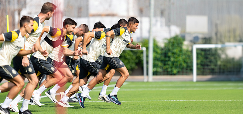
The Villarreal CF badge became internationally recognized during the club’s Europa League and Champions League campaigns in the 2000s and 2010s.
Before that, it was largely a regional symbol. The 2006 UEFA Cup semi-final run and the 2021 Europa League title changed that completely.
Suddenly this yellow crest was showing up in broadcast graphics alongside some of Europe’s biggest clubs. That kind of exposure does something to a badge. It stops being just a local identifier and starts carrying weight on a broader stage.
The “Yellow Submarine” nickname, borrowed from the Beatles song, added a layer of international pop culture attachment that made the club and its logo more memorable to casual fans outside Spain.
Among yellow logos in sports, Villarreal’s stands out as one of the more heraldically traditional uses of the color, unlike the flat, geometric yellow approaches seen in some modern rebrands.
How Does the Villarreal CF Logo Fit Into the Overall Brand Identity?

The logo anchors a broader identity that includes the yellow kit, the Yellow Submarine nickname, the Estadio de la Ceramica name (itself a nod to the local ceramics industry), and a community-first club culture.
These elements connect tightly. The badge isn’t operating in isolation.
The ceramics industry reference in the stadium name links to the economic and cultural fabric of the Castellon region. The logo, by carrying the castle and bat from local heraldry, reinforces that same sense of place.
From a brand style guide perspective, the club’s visual identity is straightforward: yellow is the dominant color, the crest is the central mark, and regional pride is the underlying message. Everything supports that.
The visual hierarchy of the badge itself reflects this. The castle sits prominently. The bat reinforces regional belonging. The color fills anchor recognition instantly.
Compare this approach to how other clubs in the same league handle identity. The Getafe logo and Celta Vigo logo follow different regional storytelling paths, but the principle is the same: the badge should tell you where the club is from and what it stands for before you read a single word.
How Should the Villarreal CF Logo Be Used?
Official Usage Guidelines
- Do: Use the full-color version on white or light backgrounds for best clarity
- Do: Maintain clear space around the crest at all times
- Do: Use the official color palette when reproducing the badge
- Do: Download official files from the Villarreal CF press area for media use
- Don’t: Stretch, squish, or alter the badge proportions
- Don’t: Recolor the logo or remove individual elements
- Don’t: Place the crest on busy backgrounds that reduce legibility
- Don’t: Use the badge for commercial purposes without written authorization from Villarreal CF SAD
Where to Access Official Logo Files
- The official Villarreal CF website (villarrealcf.es) provides press resources including badge files
- Media and press requests can be submitted directly through the club’s communications department
- For JPEG versions suitable for web editorial use, the official press area is the correct source
Licensing and Trademark Protection
- The Villarreal CF logo is a registered trademark of Villarreal CF SAD
- Unauthorized commercial use, reproduction on merchandise, or modification is prohibited without formal licensing agreement
- Fan-made and editorial uses fall under standard press and fan content norms, but commercial exploitation requires club approval
- Clubs typically enforce trademark protection actively, especially on merchandise, so any use beyond editorial or personal reference should go through official channels
FAQ on The Villarreal Logo
What does the Villarreal CF logo look like?
The Villarreal CF crest is a shield-shaped emblem featuring a castle, a bat, and horizontal yellow and navy bands.
The club name appears at the bottom. Black outlines define the edges. It’s a traditional heraldic badge, not a modern abstract mark.
What do the colors in the Villarreal logo mean?
Yellow is the dominant color and the foundation of the club’s identity, directly tied to the Yellow Submarine nickname.
Navy blue provides contrast and stability. Together they’ve been the official Villarreal CF color scheme since the club’s early decades.
Why is Villarreal called the Yellow Submarine?
The nickname comes from the Beatles song. Supporters adopted it as a nod to the club’s all-yellow kit.
It stuck. These days it’s inseparable from the Villarreal CF badge and club identity, showing up on merchandise and fan culture worldwide.
What does the bat on the Villarreal crest represent?
The bat is a traditional symbol from Valencian regional heraldry, shared with several clubs and towns across the area.
Legend links it to King James I of Aragon. For Villarreal, it signals regional identity and belonging to the broader Valencian community.
When was the current Villarreal logo introduced?
The current version of the Villarreal CF emblem was formalized around 2001-2002.
It coincided with the club’s growing presence in La Liga and European competition, giving the badge significantly more international visibility than earlier versions had.
How has the Villarreal logo changed over the years?
The core symbols, castle and bat, have stayed consistent across all versions since 1923.
What changed over time was refinement: cleaner lines, tighter symmetry, updated typography, and better rendering suited for digital and broadcast environments.
What font is used in the Villarreal CF logo?
No official typeface has been publicly confirmed by the club.
The lettering appears to be a bold, condensed sans-serif style, possibly custom. It reads clearly at small sizes, which matters for kit badges and digital thumbnails alike.
How does the Villarreal logo compare to other Spanish football club badges?
Most La Liga crests rely on blue or red. Villarreal’s yellow-dominant badge stands out immediately.
The Espanyol logo and Rayo Vallecano logo follow different color directions entirely, making Villarreal’s club crest one of the more visually distinct in Spanish football.
Where can I download the official Villarreal CF logo?
Official logo files are available through the press section of the Villarreal CF website at villarrealcf.es.
For editorial and media use, that’s the right source. Commercial use requires direct authorization from Villarreal CF SAD. The registered trademark is actively protected.
What file formats are available for the Villarreal logo?
For most professional applications, the crest should be used as a pixel-perfect vector file to maintain sharpness at any size.
PNG versions with transparent backgrounds are standard for digital use. Always source files from official club channels to ensure you’re working with the correct, current version.
Conclusion
The Villarreal logo is more than a club crest. It’s a century of Castellon identity compressed into a shield, a bat, a castle, and a dominant yellow that makes the Yellow Submarine instantly recognizable across La Liga and European competition.
Every element earns its place. The Valencian heraldry, the official color scheme, the clean typography all work together without waste.
For anyone studying logo design principles through sports branding, Villarreal CF is a solid example of how a football club emblem can stay rooted in local history while scaling to a global audience.

Renowned for his expertise in logo design and visual branding, Bogdan has developed a multitude of logos for various clients.
His skills extend to creating posters, vector illustrations, business cards, and brochures. Additionally, Bogdan's UI kits were featured on marketplaces like Visual Hierarchy and UI8.
He also wrote in the past years on sites like Design Your Way, WebDesignerDepot, WPDean, Designmodo, Speckyboy, Slider Revolution, and more.
- The Windsurf Logo History, Colors, Font, And Meaning - 10 October 2026
- How to Remove Background From Product Photos (No Photoshop) - 10 October 2026
- How Designers can Build a Stronger Online Creative Identity - 9 October 2026

Bogdan Sandu is a seasoned designer who has been designing websites since 2008. Renowned for his expertise in logo design and visual branding, Bogdan has developed a multitude of logos for various clients. His skills extend to creating posters, vector illustrations, business cards, and brochures. Additionally, Bogdan's UI kits were featured on marketplaces like Visual Hierarchy and UI8. He also wrote in the past years on sites like Design Your Way, WebDesignerDepot, WPDean, Designmodo, Speckyboy, Slider Revolution, and more.
You Might Also Like


