


The Rayo Vallecano logo is the official crest of Rayo Vallecano de Madrid, a professional football club from the Puente de Vallecas district of Madrid. It works as the club’s primary visual identity mark, built around a red diagonal lightning bolt on a white shield. The crest has gone through roughly a dozen documented versions since the club’s founding in 1924, with the current iteration in use since 2012. No external design agency is credited publicly for the most recent version.
Within the broader history of Spanish football badge design, Rayo’s crest is a relatively rare case of a club that has kept its core visual concept unchanged for a century. The bolt has been there from the beginning. That kind of consistency is harder to find than you’d think, especially compared to clubs that have gone through full rebrands or dropped traditional shield shapes entirely.
What Is the Rayo Vallecano Logo?

The Rayo Vallecano logo is a shield-shaped emblem featuring a bold red diagonal lightning bolt on a white background, gold border, the Vallecas coat of arms, and the initials RVM. The current version has been in use since 2012 and was developed in-house without a publicly named design agency.
- Design Type: Emblem / combination mark (shield shape with graphic elements and letterforms)
- Primary Elements: White Swiss-style shield, red diagonal lightning bolt, gold outer border, Vallecas coat of arms (upper left), initials R, V, M (right side)
- Official Introduction Date: Current version adopted in 2012
- Designer/Agency: Not publicly credited
- Trademark Status: Registered trademark of Rayo Vallecano de Madrid, S.A.D.
- Color Palette: Crimson red (#E53027), white (#FFFFFF), gold/amber (#EBB200), black (#1C1C1A)
- Usage Context: Match kits, stadium signage, official merchandise, digital platforms, social media, marketing materials
How Has the Rayo Vallecano Logo Evolved Over Time?

The crest has gone through around 13 versions since 1924, moving from a basic shield with the initials “RV” to the more structured emblem seen today. The most significant additions came in 1947 and 1995, when the Vallecas coat of arms was added and the initials were updated to RVM respectively.
Original Rayo Vallecano Logo (1924-1931)
- Years Active: 1924-1931
- Design Description: Simple shield shape with the initials “RV” and an early version of the lightning bolt
- Color Scheme: Red and white
- Designer: Unknown
- Context: The club was founded on 29 May 1924 as Agrupacion Deportiva El Rayo. The name “Rayo” means thunderbolt in Spanish, so the bolt was present from day one.
- Key Changes from Previous: N/A – first version
- Cultural Significance: Established the lightning bolt as the club’s permanent visual anchor
Second Era Logo (1931-1947)
- Years Active: 1931-1947
- Design Description: Refined shield form, still built around the diagonal bolt and club initials
- Color Scheme: Red and white
- Designer: Unknown
- Context: The club was competing in regional divisions during this period
- Key Changes from Previous: Minor structural adjustments to shield shape and letter placement
- Cultural Significance: Reflected the early working-class identity of the Vallecas neighborhood
Vallecas Coat of Arms Addition (1947-1955)
- Years Active: 1947-1955
- Design Description: The Vallecas municipal coat of arms was placed in the upper left quarter of the shield
- Color Scheme: Red, white, green, gold
- Designer: Unknown
- Context: The club was renamed Agrupacion Deportiva Rayo Vallecano on 13 November 1947. The coat of arms addition tied the club firmly to its district.
- Key Changes from Previous: Introduction of the Vallecas heraldic element, adding green and additional gold tones
- Cultural Significance: Deepened the club’s connection to the Puente de Vallecas community
Mid-Century Development (1955-1995)
- Years Active: Multiple sub-versions between 1955-1995
- Design Description: The shield became more refined across several iterations. The bolt grew bolder and more prominent. Initials “RV” remained on the right side.
- Color Scheme: Red, white, gold, black
- Designer: Unknown across versions
- Context: The club moved between La Liga and Segunda Division repeatedly during the 1980s and 1990s. Each version reflected a club still searching for stability.
- Key Changes from Previous: Progressive sharpening of the bolt graphic, bolder gold border
- Cultural Significance: The logo became increasingly associated with working-class Madrid football identity
RVM Update (1995-2012)
- Years Active: 1995-2012
- Design Description: The initials on the right side were updated from “RV” to “RVM” to reflect the full official name: Rayo Vallecano de Madrid
- Color Scheme: Red, white, gold, black
- Designer: Unknown
- Context: The name change to Rayo Vallecano de Madrid S.A.D. prompted this update
- Key Changes from Previous: Addition of the letter “M” below R and V on the right side of the shield
- Cultural Significance: Formally tied the club’s identity to Madrid as a city, not just the Vallecas district
Current Logo (2012-Present)
- Years Active: 2012-present
- Design Description: Cleaned-up version of the 1995 badge. The gold border is crisper, the bolt is rendered with sharper angles, and the overall geometry of the shield is more consistent.
- Color Scheme: Crimson red (#E53027), white (#FFFFFF), gold (#EBB200), black (#1C1C1A)
- Designer: Not publicly credited
- Context: Modernized for use across digital platforms and high-resolution print without altering the fundamental design
- Key Changes from Previous: Cleaner lines, updated proportions, more consistent gold treatment
- Cultural Significance: Confirmed the lightning bolt as an untouchable element of the club’s identity
What Do the Design Elements of the Rayo Vallecano Logo Mean?
Every element in the crest connects directly to either the club’s name, its location, or its history. Nothing in the design is decorative without reason.
The diagonal lightning bolt is the most immediate symbol. “Rayo” means thunderbolt in Spanish, so the bolt is literally a visual translation of the club’s name. It runs from top-left to bottom-right across the shield face, creating strong directional energy.
The Vallecas coat of arms in the upper left corner anchors the club to its specific neighborhood. This is more than local pride – Vallecas has a distinct working-class identity within Madrid, and the heraldic element signals that the club belongs to that community specifically, not to Madrid at large.
The initials RVM stand for Rayo Vallecano de Madrid. The placement on the right side of the shield, with R and V stacked above M, follows a clear visual hierarchy that keeps the letterforms readable without competing with the bolt.
Why Did Rayo Vallecano Choose These Specific Colors?
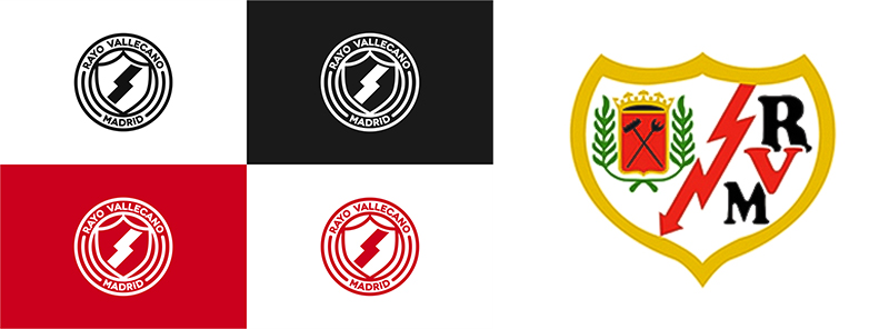
The red and white are the club’s kit colors, established early in the club’s history and influenced in part by a 1949 agreement with Atletico Madrid that introduced the red diagonal stripe to the kit. The gold border adds a traditional heraldic quality common to Spanish football crests. Black appears in the lettering for contrast and legibility.
- Crimson Red (#E53027)
- Symbolic meaning: Energy, passion, speed – connects directly to the lightning bolt concept
- Psychological impact: High-arousal color associated with urgency and excitement. Among red logos in football, this shade sits at the more intense end of the spectrum.
- Brand connection: Kit color, used consistently since the mid-20th century
- White (#FFFFFF)
- Symbolic meaning: Clarity, contrast, the traditional base of the home kit
- Psychological impact: Creates maximum contrast with the red bolt. Among white logos, this use as a background field is a standard heraldic approach.
- Brand connection: Home kit base color
- Gold/Amber (#EBB200)
- Symbolic meaning: Prestige, tradition, quality – standard in Spanish heraldic football design. Shares visual territory with gold logos across European football.
- Psychological impact: Adds perceived value and heritage to the crest
- Brand connection: Shield border and Vallecas coat of arms detailing
- Black (#1C1C1A)
- Symbolic meaning: Clarity and authority in letterform rendering
- Psychological impact: The near-black keeps the RVM initials legible at small sizes without adding visual weight to the overall crest
- Brand connection: Typography only. Not a kit color.
What Typography Style Is Used in the Rayo Vallecano Logo?
The RVM letterforms in the crest are bold, uppercase, and built for legibility at small sizes rather than for personality expression. The letters are not drawn from a standard retail typeface. They appear to be custom-drawn or heavily modified characters specific to the crest.
The typography approach here is functional. The letters R, V, and M need to identify the club when the bolt alone might not be enough context. There’s no attempt to make the letterforms expressive or stylistic – they sit on the shield and do a straightforward identification job.
Over the crest’s history, the letterforms have been updated alongside each major redesign, but the basic characteristics have stayed the same: uppercase, bold weight, no serifs, high legibility. The 1995 update from RV to RVM kept the same visual treatment, just adding the third character.
What Are the Hidden Meanings in the Rayo Vallecano Logo?
There’s no documented evidence of intentional subliminal design in the Rayo Vallecano crest. The design is direct rather than layered with hidden meaning. That said, the diagonal orientation of the bolt does create a natural reading direction from top-left to bottom-right, which mirrors the way Western readers scan visual content.
The focal point of the crest is clearly the bolt. Everything else (the coat of arms, the initials, the border) sits in a supporting role. That hierarchy is intentional and well-executed, but it’s not hidden – it’s quite obvious once you look at it for a few seconds.
Some fans read the bolt’s aggressive diagonal as a symbol of the club’s fighting spirit and its position as a perpetual underdog relative to Real Madrid and Atletico Madrid. That interpretation feels earned, even if the original designers were simply drawing the club’s name.
How Does the Rayo Vallecano Logo Compare to Competitor Logos?
Within La Liga, Rayo’s crest is one of the more stripped-back designs. It uses fewer decorative elements than many Spanish club badges, and its core concept – a single bold shape crossing a shield – is immediately readable at any size.
Comparing it directly to its Madrid neighbors: the Atletico Madrid logo uses a more complex bear-and-tree composition with a striped shield. It carries more heraldic information but is harder to reduce to a small icon. Rayo’s bolt reads clearly even at 16px.
Looking at other La Liga clubs with similar working-class identities, the Athletic Bilbao logo takes a comparable approach: a traditional shield format with strong regional heraldic elements and consistent colors over many decades. Both clubs have resisted the temptation to modernize toward flat, wordmark-only designs.
The Getafe logo and Levante logo represent the other end of the spectrum – smaller clubs that have updated toward cleaner, more simplified crests. Rayo sits between those clubs and the big European clubs that have moved to fully abstracted marks.
Across all Spanish La Liga crests, the shield format is standard. What makes Rayo’s distinctive is the single dominant graphic element (the bolt) doing almost all the visual work. Most other clubs distribute visual weight across multiple elements.
What Are the Technical Specifications of the Rayo Vallecano Logo?
Official Color Codes
- Primary Color: Crimson Red
- Hex: #E53027
- RGB: (229, 48, 39)
- CMYK: (0, 79, 83, 10)
- Pantone: Pantone 485 C (approximate)
- Secondary Color: White
- Hex: #FFFFFF
- RGB: (255, 255, 255)
- CMYK: (0, 0, 0, 0)
- Pantone: White
- Accent Color: Gold/Amber
- Hex: #EBB200
- RGB: (235, 178, 0)
- CMYK: (0, 24, 100, 8)
- Pantone: Pantone 7549 C (approximate)
- Supporting Color: Near-Black
- Hex: #1C1C1A
- RGB: (28, 28, 26)
- CMYK: (0, 0, 7, 89)
- Pantone: Pantone Black C (approximate)
Dimensions and Proportions
- Aspect ratio: Approximately 1:1.08 (slightly taller than wide), matching standard Swiss-style shield proportions
- Minimum size: Generally recommended no smaller than 25mm in print or 72px on screen to maintain legibility of the RVM initials and coat of arms details
- Clear space: A minimum clear space equal to the width of the letter “R” in the crest on all sides is standard practice for club badge usage
- Official usage guidelines: Available through the club’s official communications department. The crest is a registered trademark and cannot be reproduced commercially without authorization.
- File formats available: SVG (preferred for digital), PNG with transparent background, EPS for print production
- Resolution for print: Minimum 300 DPI for any printed materials
What Cultural Impact Has the Rayo Vallecano Logo Had?

The crest carries meaning well beyond football in Spain. Rayo Vallecano is closely identified with left-wing, anti-fascist politics in Madrid, and the logo appears regularly in that context at protests, social campaigns, and community events in Vallecas.
The bolt specifically has become a shorthand for the working-class identity of the Puente de Vallecas district. You’ll find it on murals around the neighborhood. It shows up on merchandise worn by people who have never attended a match but identify with what the club represents politically and socially.
The ultras group Bukaneros, known for being one of the most politically active supporter groups in European football, regularly incorporate the crest into protest artwork and banners. In that context, the logo functions as a political symbol as much as a sports one.
Internationally, the club gained attention partly through its association with socially progressive policies – at one point the club briefly owned a stake in Oklahoma City FC in the US market. The logo traveled with that story, introducing it to audiences that had no prior connection to La Liga.
Among football badge collectors and design-focused audiences, the crest is respected for its longevity and consistency. It’s a case study in not fixing what isn’t broken.
How Does the Rayo Vallecano Logo Fit Into the Overall Brand Identity?
The crest sits at the center of a brand identity that extends across kit design, stadium presentation, merchandise, digital channels, and the club’s social and political positioning. These elements all reinforce each other.
The red and white of the crest match the home kit directly. The bolt on the badge and the red diagonal stripe on the shirt are the same visual concept expressed in two different formats. That’s good brand consistency – the kit and the crest tell the same story.
The club’s stadium, Campo de Futbol de Vallecas, uses the crest extensively in signage and seating design. The gold and red color scheme from the badge runs throughout the venue’s visual presentation.
On digital platforms, the crest is often used as a standalone icon – the shield shape and bolt work well as a social media profile image without additional text. That scalability is a real practical advantage.
The broader brand identity also connects to the club’s storytelling around community and working-class values. The logo alone doesn’t communicate that politics directly, but it functions as the visual anchor for a brand narrative that does. Everything from match-day programs to the club’s foundation work uses the crest as a consistent reference point.
How Should the Rayo Vallecano Logo Be Used?
Official Usage Guidelines
- Do: Use official files downloaded from the club’s authorized sources or reputable logo repositories in SVG or high-resolution PNG format
- Do: Maintain the original proportions – do not stretch or distort the shield shape
- Do: Keep the required clear space around the crest in any layout
- Do: Use the crest on editorial, educational, and news content under standard fair use principles
- Don’t: Alter the colors, remove elements, or reconstruct the crest from memory
- Don’t: Place the crest on backgrounds that reduce contrast to the point where the bolt or lettering becomes hard to read
- Don’t: Use the crest on commercial merchandise, products, or promotional materials without written authorization from Rayo Vallecano de Madrid, S.A.D.
- Don’t: Apply drop shadows, gradients, or effects to the crest that are not part of the official artwork
Where to Access Official Logo Files
- Official source: Rayo Vallecano’s official website (rayovallecano.es) and press/media section
- Vector formats: Available through the club’s media department on request for press and editorial use
- Third-party repositories: Sites like Brandfetch and logotyp.us host SVG and PNG versions for reference and editorial use
Licensing and Trademark Protection
The Rayo Vallecano crest is a registered trademark of Rayo Vallecano de Madrid, S.A.D. Any commercial use – including on clothing, print products, digital goods, or promotional materials – requires explicit written permission from the club. Editorial and educational use (news articles, analysis, historical references) is generally covered under standard fair use provisions, but this does not extend to monetized reproduction of the crest on physical or digital products.
Unauthorized commercial use of the trademark is subject to standard intellectual property enforcement. If you’re unsure whether your intended use qualifies as editorial or requires a license, contact the club directly through their official communications channels.
FAQ on The Rayo Vallecano Logo
What does the Rayo Vallecano logo look like?
It’s a white shield with a gold border, crossed by a bold red diagonal lightning bolt.
The Vallecas coat of arms sits in the upper left. The initials RVM run down the right side. Clean, direct, and immediately recognizable.
What does the lightning bolt mean on the Rayo Vallecano crest?
It’s a direct visual translation of the club’s name. “Rayo” means thunderbolt in Spanish.
The bolt has been part of the badge since the 1924 founding emblem. It signals speed, energy, and aggression – qualities the club has always leaned into.
What are the official Rayo Vallecano logo colors?
The primary colors are crimson red (#E53027), white (#FFFFFF), gold (#EBB200), and near-black (#1C1C1A).
Red and white come from the club’s kit. Gold is used for the shield border. Black appears only in the RVM letterforms.
How many times has the Rayo Vallecano badge been redesigned?
Roughly 13 documented versions since 1924. Most changes were refinements rather than full redesigns.
The core elements – white shield, diagonal bolt, gold border – have stayed consistent throughout. The biggest structural addition was the Vallecas coat of arms, introduced in 1947.
When did Rayo Vallecano last update their logo?
The current version has been in use since 2012.
It cleaned up the proportions and sharpened the bolt geometry from the previous version, but introduced no new design elements. The club crest evolution has always been gradual rather than disruptive.
What do the letters RVM stand for on the Rayo Vallecano emblem?
They stand for Rayo Vallecano de Madrid, the club’s full official name.
The initials were updated from “RV” to “RVM” in 1995 when the club formalized its name. R and V sit stacked above M on the right side of the shield.
Is the Rayo Vallecano logo available as a vector file?
Yes. The badge is available in vector format – SVG and EPS – through the club’s official media channels and several logo repositories.
SVG is the preferred format for digital use. It scales to any size without quality loss, which matters for both web and print applications.
How does the Rayo Vallecano logo compare to other La Liga crests?
It’s simpler than most. One dominant graphic element – the bolt – carries almost all the visual weight.
Clubs like Real Betis and Sevilla use more complex heraldic compositions. Rayo’s Spanish club badge is more restrained and arguably more scalable because of it.
Can I use the Rayo Vallecano crest on my website or project?
Editorial and news use is generally fine under standard fair use rules. Commercial use is a different matter entirely.
The crest is a registered trademark of Rayo Vallecano de Madrid, S.A.D. Reproducing it on products, merchandise, or monetized content without written club authorization is not permitted.
What font is used in the Rayo Vallecano logo?
The RVM letterforms appear to be custom-drawn rather than pulled from a standard typeface.
They are bold, uppercase, and built purely for legibility at small sizes. No publicly available font family has been officially credited by the club for the crest lettering.
Conclusion
The Rayo Vallecano logo has stayed recognizable for a century because the core concept was right from the start – a bold red lightning bolt on a white shield, built around the club’s own name.
The 2012 crest update refined the geometry without changing the idea. That kind of restraint is rare in football badge design.
What makes the emblem work is its clarity. The club visual identity – RVM initials, Vallecas coat of arms, gold border, diagonal bolt – packs genuine meaning into a compact shield format that scales from a 16px favicon to a stadium wall without losing anything.
For a working-class Madrid club competing in the shadow of Real Madrid and Atletico, the crest punches well above its weight.

Renowned for his expertise in logo design and visual branding, Bogdan has developed a multitude of logos for various clients.
His skills extend to creating posters, vector illustrations, business cards, and brochures. Additionally, Bogdan's UI kits were featured on marketplaces like Visual Hierarchy and UI8.
He also wrote in the past years on sites like Design Your Way, WebDesignerDepot, WPDean, Designmodo, Speckyboy, Slider Revolution, and more.
- The Windsurf Logo History, Colors, Font, And Meaning - 10 October 2026
- How to Remove Background From Product Photos (No Photoshop) - 10 October 2026
- How Designers can Build a Stronger Online Creative Identity - 9 October 2026

Bogdan Sandu is a seasoned designer who has been designing websites since 2008. Renowned for his expertise in logo design and visual branding, Bogdan has developed a multitude of logos for various clients. His skills extend to creating posters, vector illustrations, business cards, and brochures. Additionally, Bogdan's UI kits were featured on marketplaces like Visual Hierarchy and UI8. He also wrote in the past years on sites like Design Your Way, WebDesignerDepot, WPDean, Designmodo, Speckyboy, Slider Revolution, and more.
You Might Also Like


