The Espanyol logo is the official emblem of RCD Espanyol, a professional football club based in Barcelona, Catalonia, Spain. It functions as a visual identity mark that distinguishes the club from rivals and communicates its history to fans worldwide. The crest has gone through multiple redesigns since the club’s founding in 1900, with each version reflecting shifts in the club’s identity, ownership, and competitive standing. The current badge is the most refined iteration yet, balancing tradition with a cleaner, more modern look suited for digital and merchandise applications.
What Is the Espanyol Logo?

The Espanyol logo is a shield-shaped emblem featuring a blue and white vertical stripe pattern, a parrot mascot, and the club’s initials. The current version was updated in 2022 and uses a simplified, bold design approach intended for modern digital platforms and kit applications.
- Design Type: Emblem / crest (shield-based combination mark)
- Primary Elements: Shield shape, blue and white vertical stripes, parrot figure (Pericos mascot), club initials “RCD”
- Official Introduction Date: Current version introduced 2022
- Designer/Agency: Developed in-house with the club’s branding team; no external agency publicly credited
- Trademark Status: Registered trademark under RCD Espanyol de Barcelona, S.A.D.
- Color Palette: Royal Blue (#003DA5), White (#FFFFFF), with gold accent (#C8A84B) used in select applications
- Usage Context: Match kits, official merchandise, stadium signage, digital platforms, broadcast graphics, and marketing materials
How Has the Espanyol Logo Evolved Over Time?
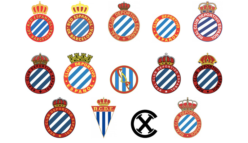
The Espanyol crest has changed considerably since 1900, moving from complex heraldic designs to a streamlined modern badge. Key shifts happened in the 1970s, 1990s, and most recently in 2022.
Original Espanyol Logo (1900-1940s)
- Years Active: 1900 to late 1940s
- Design Description: Early badge featured a basic shield with the Spanish flag colors and minimal graphic elements
- Color Scheme: Red, yellow, blue, and white
- Designer: Unknown
- Context: Club founded in 1900 by Spanish university students as a counterpoint to the foreign-dominated FC Barcelona; the badge reflected strong Spanish nationalist identity
- Key Changes from Previous: N/A (founding version)
- Cultural Significance: Emphasized the club’s Spanish identity in a city with a Catalan-dominant football culture
Mid-Century Espanyol Logo (1940s-1970s)
- Years Active: Late 1940s to early 1970s
- Design Description: Shield retained but with added detail; blue and white stripes became more prominent
- Color Scheme: Blue and white, with red and yellow accents
- Designer: Unknown
- Context: Post-Civil War Spain saw clubs standardize their visual identities
- Key Changes from Previous: Stripe pattern became the dominant visual element
- Cultural Significance: The blue and white began cementing the club’s color identity, still recognized today
Classic Crest Era (1970s-2004)
- Years Active: Early 1970s to 2004
- Design Description: More detailed shield with the parrot mascot (Pericos) introduced as a formal crest element; ornate styling with cross and crown details
- Color Scheme: Royal blue, white, and gold
- Designer: Unknown
- Context: Club competed in La Liga and built its most recognizable supporter identity during this period
- Key Changes from Previous: Parrot symbol formally integrated; crest became more heraldic and detailed
- Cultural Significance: This era’s badge is still the most nostalgic version for long-term supporters
Modern Redesign (2004-2022)
- Years Active: 2004 to 2022
- Design Description: Cleaner shield shape, simplified parrot, updated typography, reduced ornamental detail
- Color Scheme: Royal blue and white, reduced gold usage
- Designer: Internal branding team
- Context: Club moved to the new RCDE Stadium in Cornella-El Prat in 2009; rebranding supported the stadium transition
- Key Changes from Previous: Removed crown and cross elements; flatter, more graphic approach
- Cultural Significance: Marked a shift toward commercial and broadcast-ready branding
Current Logo (2022-Present)
- Years Active: 2022 to present
- Design Description: Refined shield with bold vertical blue and white stripes, modernized parrot illustration, clean sans-serif lettering
- Color Scheme: Royal Blue (#003DA5), White (#FFFFFF), gold accent (#C8A84B)
- Designer: RCD Espanyol branding team
- Context: Introduced following the club’s return to La Liga after promotion from Segunda Division
- Key Changes from Previous: Bolder stroke weights, updated parrot proportions, improved digital legibility
- Cultural Significance: Signals a fresh chapter while preserving the core visual DNA fans expect
What Do the Design Elements of the Espanyol Logo Mean?
Each element in the Espanyol badge carries specific meaning tied to the club’s history, location, and identity. The shield shape, parrot, stripes, and color choices all connect back to the club’s roots in Barcelona and its Spanish nationalist founding story.
The parrot is not decorative. It directly references the club’s nickname, “Pericos,” which translates to parakeets in Spanish.
The blue and white stripes mirror the club’s traditional kit colors, which have stayed consistent for over a century.
The shield format places the club within a long tradition of European football heraldry, linking sport to civic and regional identity.
Why Did Espanyol Choose These Specific Colors?

- Royal Blue
- Hex: #003DA5
- Symbolic meaning: Loyalty, stability, and Spanish sporting tradition
- Psychological impact: Builds trust and communicates seriousness on the pitch
- Brand connection: Blue is one of the most common colors across Spanish football, but Espanyol’s specific shade distinguishes it from rivals. If you look at how blue is used in logos broadly, it consistently signals credibility and endurance.
- White
- Hex: #FFFFFF
- Symbolic meaning: Purity, clarity, and the club’s “Blanc-i-blaus” (blue and whites) identity
- Psychological impact: Creates strong visual contrast against the royal blue, making the badge readable at small sizes
- Brand connection: White stripes have appeared on Espanyol kits since the early 20th century
- Gold Accent
- Hex: #C8A84B
- Symbolic meaning: Prestige and achievement
- Psychological impact: Adds a premium feel to merchandise and formal communications
- Brand connection: Used selectively, not as a dominant color, keeping the badge from feeling cluttered
What Typography Style Is Used in the Espanyol Logo?

The lettering in the current Espanyol badge uses a bold, condensed sans-serif style.
It prioritizes legibility over decorative flair, which makes sense given how often the badge appears at small sizes on kits and digital screens.
Earlier versions used more stylized, serif-influenced lettering that looked better in print but struggled at smaller scales. The shift to sans-serif aligns with what most European clubs have done over the past 15 years.
No publicly confirmed custom typeface has been announced. The lettering appears to be a modified version of a geometric sans-serif, adjusted for crest proportions. Understanding broader typography principles helps explain why this kind of condensed, upright lettering works well within a shield boundary.
What Are the Hidden Meanings in the Espanyol Logo?
The parrot’s positioning within the shield is deliberate. It sits centrally, functioning as the visual focal point of the entire composition.
The vertical stripes behind it create a subtle sense of structure and order, reinforcing the visual balance of the design.
Some fans read the parrot’s upright, alert stance as symbolic of the club’s fighting spirit, particularly relevant given Espanyol’s history of competing in the shadow of FC Barcelona.
There are no officially confirmed hidden elements, but the color proportions (more blue than white) subtly reinforce blue as the dominant identity color.
How Does the Espanyol Logo Compare to Competitor Logos?
Within La Liga, Espanyol’s badge is one of the more traditional shield-based crests. It shares the emblem format with most Spanish clubs but stands out through its parrot mascot, which is unusual in European football branding.
Compared to the Atletico Madrid badge, Espanyol’s design is simpler and less layered.
The Valencia crest uses a bat symbol with similar historic roots, showing how Spanish clubs often anchor mascots in regional folklore.
The Sevilla badge leans heavily on heraldic complexity. Espanyol, by contrast, has moved toward graphic simplicity while keeping its mascot prominent.
Look at the Villarreal logo for another example of a Spanish club that uses a mascot-forward approach, though their submarine icon reads more abstract than Espanyol’s literal parrot.
The Athletic Bilbao crest is the most comparable in terms of regional identity emphasis, even if the visual language is completely different.
Among non-Spanish comparisons, Celta Vigo’s logo also uses a clean, modernized approach to a traditional shield. Both clubs have simplified in recent years, though Espanyol’s parrot gives it a more distinctive mascot presence.
What Are the Technical Specifications of the Espanyol Logo?
Official Color Codes
- Primary Color: Royal Blue
- Hex: #003DA5
- RGB: (0, 61, 165)
- CMYK: (100, 63, 0, 35)
- Pantone: 286 C
- Secondary Color: White
- Hex: #FFFFFF
- RGB: (255, 255, 255)
- CMYK: (0, 0, 0, 0)
- Pantone: White
- Accent Color: Gold
- Hex: #C8A84B
- RGB: (200, 168, 75)
- CMYK: (0, 16, 63, 22)
- Pantone: 7409 C
Dimensions and Proportions
- Aspect ratio: Approximately 4:5 (portrait-oriented shield)
- Minimum size requirements: Not publicly specified, but standard sports branding practice recommends no smaller than 20px in height for digital use
- Clear space specifications: Standard practice requires clear space equal to the height of the “R” in “RCD” on all sides
- Official usage guidelines: Available through RCD Espanyol’s official media and press portal; unauthorized commercial use of the badge is prohibited under trademark law
What Cultural Impact Has the Espanyol Logo Had?
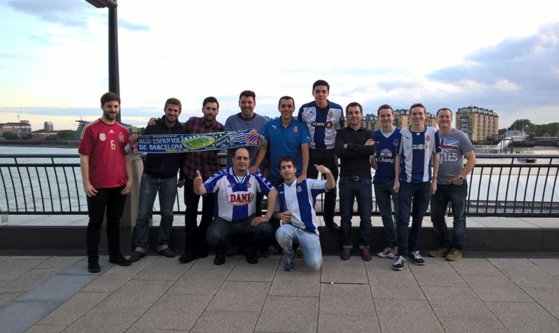
The Espanyol badge carries meaning well beyond football. For a significant portion of Barcelona’s population, it represents a working-class, Spanish-identity counterpoint to the Catalan nationalism associated with FC Barcelona.
The parrot symbol has become genuinely iconic among supporters. You see it on murals, tattoos, and street art across the Cornella-El Prat area.
When the club was relegated to Segunda Division in 2020, discussions around whether to redesign the badge became a real flashpoint. Many fans pushed back hard against any changes, showing how deeply the crest is tied to supporter identity.
The 2022 refresh was accepted fairly well, partly because the club handled the transition carefully and partly because the core elements (parrot, stripes, shield) remained intact. That kind of fan relationship with a badge is not something you can manufacture. It builds over decades.
Internationally, Espanyol’s badge is less recognized than those of Real Madrid or Barcelona, but within Spain it is immediately legible as a marker of a specific kind of footballing culture.
How Does the Espanyol Logo Fit Into the Overall Brand Identity?
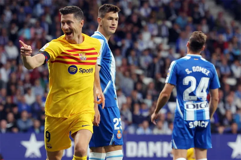
The badge anchors a broader visual system that includes kit design, stadium branding, digital assets, and merchandise. Every touchpoint references the same blue, white, and parrot elements.
The club’s brand guidelines (not publicly released in full) govern how the badge appears across contexts.
Kit supplier Puma works within those color and proportion rules when producing match and training gear.
The RCDE Stadium itself uses the blue and white palette throughout, from seat colors to wayfinding signage, creating a consistent environment that reinforces the badge’s colors at scale.
Digitally, the badge appears across social media, the club’s official app, and broadcast lower thirds. The 2022 redesign was partly motivated by how poorly some earlier details rendered at small digital sizes. The parrot’s line weight and the stripe contrast were both improved specifically for screen legibility.
Merchandise uses the badge as a standalone mark on most products. The wordmark “RCD Espanyol” appears separately in many contexts, functioning as a complementary text-based identity element rather than always being embedded in the crest itself.
How Should the Espanyol Logo Be Used?
Official Usage Guidelines
- Do’s:
- Use the badge at sufficient size to maintain legibility of all internal elements
- Reproduce the badge only in approved color versions (full color, white-on-blue, monochrome)
- Source official files from RCD Espanyol’s press and media portal for any legitimate editorial or commercial use
- Maintain clear space around the badge at all times
- Don’ts:
- Do not stretch, skew, or alter the proportions of the badge
- Do not apply unauthorized color variations or gradients over the crest
- Do not use the badge in contexts that imply club endorsement without written permission
- Do not reproduce the badge at sizes where the parrot or stripe detail becomes illegible
Where to Access Official Files
- The official RCD Espanyol press portal provides authorized high-resolution badge files for media use
- Vector graphic versions (SVG, EPS, AI) are available to licensed commercial partners through official club channels
- For editorial use, press images can typically be accessed via Getty Images or the club’s official media center
Licensing and Trademark Protection
- The Espanyol badge is a registered trademark of RCD Espanyol de Barcelona, S.A.D.
- Commercial use on merchandise, apparel, or digital products requires a formal licensing agreement with the club
- Fan art and non-commercial use occupy a gray area; the club has historically been less aggressive in pursuing individual fan creators than commercial operators
- Any reproduction that could be confused with official merchandise is likely to trigger a trademark claim
FAQ on The Espanyol Logo
What does the Espanyol logo represent?
The badge represents RCD Espanyol’s identity as a Spanish football club in Barcelona.
The parrot symbol references the club’s “Pericos” nickname. The blue and white stripes reflect over a century of kit tradition and regional identity.
What is the parrot on the Espanyol crest?
It’s the club’s official mascot, the Perico (parakeet).
The bird has appeared on the badge in various forms since the mid-20th century. It sits at the center of the shield as the primary visual element of the Espanyol crest design.
When was the current Espanyol badge introduced?
The current version was introduced in 2022.
It followed the club’s return to La Liga after a spell in Segunda Division. The redesign focused on improving digital legibility while keeping the core blue and white football crest intact.
What colors are used in the Espanyol logo?
The badge uses Royal Blue (#003DA5), White (#FFFFFF), and a Gold accent (#C8A84B).
Blue and white are the dominant colors, directly tied to the club’s traditional color palette and kit history going back to the early 1900s.
How many times has the Espanyol crest changed?
The badge has gone through at least five significant iterations since the club’s founding in 1900.
Major shifts happened in the 1940s, 1970s, 2004, and 2022. Each redesign adjusted detail levels and proportions without abandoning the core shield design format.
Who designed the Espanyol logo?
No external agency has been publicly credited for any version of the badge.
The current 2022 redesign was handled by the club’s internal branding team. This is fairly common among Spanish football club logo updates at this level.
What font is used in the Espanyol badge?
The lettering uses a bold, condensed sans-serif style, likely a modified geometric typeface.
No custom typeface has been officially announced. The choice prioritizes legibility at small sizes, which matters a lot for kit embroidery and digital use.
How does the Espanyol logo compare to other La Liga badges?
It’s one of the cleaner, mascot-forward crests in Spanish football.
Compared to the Real Betis badge or the Real Sociedad crest, Espanyol’s design is more graphic and less heraldically complex. The parrot makes it immediately distinct.
Can I download the official Espanyol logo?
Official high-resolution files are available through the RCD Espanyol press portal for media use.
The club holds a registered trademark on the badge. Commercial use requires a formal licensing agreement. Unauthorized reproduction on merchandise is not permitted.
What is the Espanyol logo’s cultural significance?
For many supporters, the badge represents a working-class, Spanish identity in a city dominated by Catalan football culture.
The emotional weight fans attach to the Pericos emblem runs deep. Proposals to change it significantly have historically met strong resistance from the supporter base.
Conclusion
The Espanyol logo is more than a club badge. It’s a direct reflection of over 120 years of Spanish football identity, built around the Pericos emblem and a blue and white visual language that has stayed consistent through every redesign.
From the founding crest in 1900 to the 2022 refresh, each iteration has balanced tradition with practical branding needs.
The parrot, the shield shape, and the RCD Espanyol color palette all work together as a coherent visual identity system that functions equally well on a La Liga kit and a digital platform.
Few Spanish football club crests carry this much symbolic weight in such a compact design.

Renowned for his expertise in logo design and visual branding, Bogdan has developed a multitude of logos for various clients.
His skills extend to creating posters, vector illustrations, business cards, and brochures. Additionally, Bogdan's UI kits were featured on marketplaces like Visual Hierarchy and UI8.
He also wrote in the past years on sites like Design Your Way, WebDesignerDepot, WPDean, Designmodo, Speckyboy, Slider Revolution, and more.
- The Webflow Logo History, Colors, Font, And Meaning - 10 September 2026
- Your Highest-Paying Design Project Might Be Your Least Profitable One… Without You Noticing - 10 September 2026
- Free Browser 3D Tools for Designers Who Refuse to Install Anything - 9 September 2026

Bogdan Sandu is a seasoned designer who has been designing websites since 2008. Renowned for his expertise in logo design and visual branding, Bogdan has developed a multitude of logos for various clients. His skills extend to creating posters, vector illustrations, business cards, and brochures. Additionally, Bogdan's UI kits were featured on marketplaces like Visual Hierarchy and UI8. He also wrote in the past years on sites like Design Your Way, WebDesignerDepot, WPDean, Designmodo, Speckyboy, Slider Revolution, and more.
You Might Also Like