


The Levante logo is the official crest of Levante UD, a professional football club based in Valencia, Spain. It functions as the club’s primary visual identifier across kits, merchandise, and official communications. The badge is one of the more recognizable crests in Spanish football, largely because of its distinctive frog mascot, a symbol deeply tied to the club’s identity and regional culture.
Within the broader history of Spanish football club branding, Levante’s crest sits in an interesting place. It never chased the sleek, modernized redesigns that swept through top-tier clubs in the 2000s and 2010s. It stayed grounded, keeping its traditional shield shape and regional symbolism intact while clubs like Barcelona and Real Madrid moved toward cleaner, more corporate-looking marks.
The current version of the crest features the club’s blue and red color scheme, the granota (frog) figure, and the Valencian regional flag bars. It was last formally updated in the early 2000s. Levante UD itself was founded in 1909, making it one of the older clubs in the Valencia region, and the badge has gone through several iterations since then, though the core elements have remained largely consistent.
What is the Levante UD Logo?
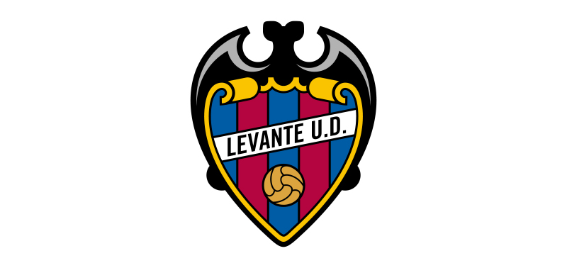
The Levante UD logo is a traditional shield-shaped emblem featuring the club’s blue and red colors, the granota frog mascot, Valencian flag stripes, and the club name. It was formally introduced in its current form in the early 2000s and was developed internally by the club rather than by an external design agency.
- Design Type: Emblem / shield crest with mascot element
- Primary Elements: Shield shape, granota (frog) figure, Valencian regional stripes (gold and red), club name “Levante UD,” blue and red color field
- Official Introduction Date: Current version introduced circa 2003-2004
- Designer/Agency: Developed internally by Levante UD
- Trademark Status: Registered trademark of Levante Union Deportiva, S.A.D.
- Color Palette: Primary blue (#003DA5 approx.), primary red (#E4002B approx.), gold/yellow from Valencian stripes (#F5A800 approx.), white (#FFFFFF)
- Usage Context: Match kits, official merchandise, stadium signage, digital platforms, club communications, and marketing materials
How Has the Levante UD Logo Evolved Over Time?

The Levante UD crest has gone through roughly five to six distinct versions since the club’s founding in 1909, moving from simple early shield designs toward the more detailed emblem used today.
The granota frog has been part of the identity for decades, though its visual treatment has changed considerably. Early versions were more stylized and abstract. Later versions rendered it with more detail and character.
The Valencian regional stripes were incorporated at various points to strengthen the club’s ties to local identity, a move that reflected broader trends in Spanish regional football branding during the mid-20th century.
Original Levante UD Logo (1909-1930s)
- Years Active: 1909 to approximately mid-1930s
- Design Description: Simple shield outline with basic initials or club name; minimal graphic detail
- Color Scheme: Blue and red, consistent with the club’s founding colors
- Designer: Unknown
- Context: Introduced at the club’s founding in Valencia; design reflected the amateur, community-driven nature of early Spanish football clubs
- Key Changes from Previous: First iteration; no prior version
- Cultural Significance: Established the blue and red identity that the club has maintained for over a century
Mid-Century Levante UD Logo (1940s-1970s)
- Years Active: Approximately 1940s through 1970s
- Design Description: Shield shape with early incorporation of Valencian regional elements; the frog figure began appearing in this era in a simplified form
- Color Scheme: Blue, red, and gold from the Valencian stripes
- Designer: Unknown
- Context: Post-Civil War Spain saw many clubs reassert regional identities through visual branding; Levante followed this pattern
- Key Changes from Previous: Introduction of the granota motif and Valencian flag reference
- Cultural Significance: Cemented the frog as a core club symbol, tying the badge to local Valencia folklore and community identity
Late 20th Century Levante UD Logo (1980s-2000s)
- Years Active: Approximately 1980s through early 2000s
- Design Description: More refined shield with cleaner typography for “Levante UD,” a more detailed frog illustration, and defined color fields
- Color Scheme: Blue, red, gold, white
- Designer: Unknown; likely internal club design work
- Context: Spanish football’s growing commercialization through the 1980s and 1990s pushed clubs to sharpen their visual identities for merchandise and television
- Key Changes from Previous: Cleaner line work, more consistent color application, improved typography legibility
- Cultural Significance: This version was what many fans grew up with during the club’s Segunda Division years
Current Levante UD Logo (2003-Present)
- Years Active: Approximately 2003 to present
- Design Description: Polished shield emblem with a detailed granota frog at center, blue upper field, red lower field, Valencian gold and red stripes on one side, “Levante UD” text, and a clean outer border
- Color Scheme: Blue (#003DA5), red (#E4002B), gold (#F5A800), white (#FFFFFF)
- Designer: Internal club development
- Context: Introduced around the time of the club’s promotion push back into La Liga; needed a crest that read well on broadcast television and modern merchandise
- Key Changes from Previous: More refined frog illustration, improved digital rendering, better proportions for small-scale use
- Cultural Significance: The version most associated with Levante’s La Liga years and the period of the club’s highest domestic profile
What Do the Design Elements of the Levante UD Logo Mean?
Each element in the Levante UD crest carries a specific meaning tied to regional identity, club history, or local culture.
The shield shape is standard across Spanish football, signaling tradition and institutional legitimacy.
The granota frog is the most distinctive element. It references the club’s long-standing nickname “Els Granotes” (The Frogs), which comes from the wetlands and rice fields surrounding Valencia, where frogs were historically common.
The Valencian stripes connect the club directly to its regional home, a deliberate statement of local pride that separates Levante’s identity from rival Valencia CF.
Why Did Levante UD Choose These Specific Colors?

- Blue
- Hex: approximately #003DA5
- Symbolic meaning: Loyalty, stability, and working-class solidarity; blue has been one of Levante’s founding colors since 1909
- Psychological impact: Communicates trustworthiness and consistency
- Brand connection: Shared with the broader Valencian football tradition, though Levante uses a deeper, darker blue than Valencia CF
- Red
- Hex: approximately #E4002B
- Symbolic meaning: Passion, energy, and competitive spirit
- Psychological impact: Adds visual energy and intensity to the crest; pairs strongly with the blue
- Brand connection: Common across Spanish football clubs; here it references the club’s combative, underdog identity
- Gold/Yellow
- Hex: approximately #F5A800
- Symbolic meaning: Directly references the Valencian regional flag (Senyera); a declaration of local identity
- Psychological impact: Adds warmth and contrast; makes the crest visually distinct from purely blue-red designs
- Brand connection: Ties the club to Valencia as a place, not just a football market
What Typography Style Is Used in the Levante UD Logo?

The “Levante UD” text in the crest uses a bold, serif-influenced style that reads clearly at small sizes.
It prioritizes legibility over personality, which makes sense for a badge that needs to work on a shirt collar or a small screen.
The typography has gradually tightened over the years, moving from slightly looser letterforms in earlier versions toward the more compact, controlled spacing in the current design.
It is not a widely recognized commercial typeface. Most indicators suggest it is either a custom lettering job or a heavily modified version of a standard serif font.
What Are the Hidden Meanings in the Levante UD Logo?
The frog is the most layered symbol. On the surface, it is just the club mascot. But Els Granotes as a nickname carries class and geographic connotations, connecting the club to the working-class neighborhoods of northern Valencia and the agricultural wetlands of the region.
The placement of the Valencian stripes on the left side of the shield (from the viewer’s perspective) subtly mirrors heraldic tradition where the dexter (right) side of a shield is the position of honor in European heraldry.
There are no confirmed subliminal geometric tricks in the design. What you see is largely what it is. The symbolism is direct rather than hidden.
How Does the Levante UD Logo Compare to Competitor Logos?
Compared to other Spanish club crests, Levante’s badge sits firmly in the traditional camp. It shares the shield format and regional color references with clubs like Valencia, Villarreal, and Granada, but the frog mascot gives it a more character-driven identity than most.
Valencia CF’s badge is cleaner and more modernized. Villarreal’s yellow submarine concept is more conceptually bold. By contrast, Levante’s crest leans into regional folk symbolism rather than abstract or architectural references.
Against clubs like Getafe or Real Valladolid, Levante’s badge actually has more visual personality. The granota gives it a memorable anchor that purely typographic or geometric crests lack.
Among the broader category of blue logos in football, Levante’s specific combination of deep blue with red and gold reads as distinctly Valencian rather than generic.
Compared to non-Spanish football crests, like Eintracht Frankfurt or Borussia Dortmund, Levante’s badge is more complex in its symbolic layering but less refined in its graphic execution.
What Are the Technical Specifications of the Levante UD Logo?
Official Color Codes
- Primary Color: Blue
- Hex: #003DA5
- RGB: (0, 61, 165)
- CMYK: (100, 63, 0, 35)
- Pantone: approximately PMS 286 C
- Primary Color: Red
- Hex: #E4002B
- RGB: (228, 0, 43)
- CMYK: (0, 100, 81, 11)
- Pantone: approximately PMS 185 C
- Accent Color: Gold
- Hex: #F5A800
- RGB: (245, 168, 0)
- CMYK: (0, 31, 100, 4)
- Pantone: approximately PMS 1235 C
- Accent Color: White
- Hex: #FFFFFF
- RGB: (255, 255, 255)
- CMYK: (0, 0, 0, 0)
Note: These are close approximations based on visual analysis. Official Pantone and exact production values should be verified directly with Levante UD’s brand team for commercial or print use.
Dimensions and Proportions
- Aspect ratio: Approximately 4:5 (portrait orientation, taller than wide)
- Minimum size requirements: Should not be reproduced smaller than 20mm in height for print; 40px height minimum for digital use to maintain frog detail legibility
- Clear space specifications: A clear space equal to roughly 10% of the badge height on all sides is standard practice for Spanish football club crests
- Official usage guidelines: Full color version is primary; single-color versions (all white or all dark) are used for specific kit applications and secondary branding contexts
- File formats in use: Vector graphics (SVG, AI, EPS) for scalable use; PNG with transparent background for digital; high-DPI raster formats for print production
What Cultural Impact Has the Levante UD Logo Had?

The granota is more than a mascot. In Valencia, it is a genuinely affectionate symbol. Supporters identify with it in a way that goes beyond football, connecting to a working-class, northern Valencia neighborhood identity that contrasts sharply with the more affluent associations of Valencia CF.
The badge has become a point of local pride precisely because it never tried to be something sleeker or more internationally marketable.
During Levante’s La Liga seasons (particularly the strong run in 2011-2013 when they qualified for European football), the crest gained wider recognition across Spain and in European football circles. Fans of other clubs who had barely heard of Levante suddenly knew the frog badge.
It also functions as a clear marker of regional identity within Valencia. Wearing the Levante badge is a statement about which part of the city and which community you belong to.
How Does the Levante UD Logo Fit Into the Overall Brand Identity?

The badge is the center of everything. Kit designs, stadium graphics, official merchandise, and social media assets all pull from the same blue, red, and gold palette established by the crest.
The granota figure has been extended into a full mascot character used in match-day promotions and youth engagement programs. This gives the badge a life beyond static branding, which not every club manages to achieve.
Levante’s broader brand guidelines (at least from what is publicly visible through their official channels) keep the badge central and avoid overcomplicating secondary graphic elements. The typography on official communications tends to use clean sans-serif fonts that contrast with the more traditional serif feel of the badge lettering itself.
The club’s brand style overall reads as: traditional at its core, community-focused, and unapologetically local. The logo communicates all of that without needing anything else.
How Should the Levante UD Logo Be Used?

Official Usage Guidelines
- Do: Use the full-color version as the primary form of the badge in all official contexts
- Do: Maintain the correct aspect ratio at all times; do not stretch or distort the shield shape
- Do: Use the white or single-color version only where full color reproduction is not possible (e.g., embossing, single-color print)
- Do: Maintain clear space around the badge; crowding it with other graphic elements reduces its visual authority
- Don’t: Alter the colors outside of officially approved monochrome versions
- Don’t: Recreate or redraw the crest from scratch; always use official files provided by the club
- Don’t: Use the badge in any context that implies commercial endorsement without written permission from Levante UD
- Don’t: Place the crest on backgrounds that reduce contrast to the point where the frog or text becomes illegible
Where to Access Official Logo Files
Official high-resolution versions of the Levante UD badge are available through the club’s official website at levanteud.com. Press and media requests for official assets should be directed to the club’s communications department. Third-party logo databases often carry outdated or incorrectly colored versions, so always go to the source for anything that will be published or printed.
Licensing and Trademark Protection
The Levante UD crest is a registered trademark of Levante Union Deportiva, S.A.D. Commercial use of the badge, including on merchandise, print materials, or digital products, requires a licensing agreement with the club. Unauthorized reproduction for commercial purposes is a trademark infringement. Fan art and non-commercial personal use exist in a grayer area, but any use that generates revenue or implies official affiliation requires explicit club approval.
FAQ on The Levante Logo
What does the Levante UD crest represent?
It represents the club’s identity, regional roots, and community ties in northern Valencia.
The granota frog is the defining symbol, referencing the wetlands surrounding Valencia and the club’s long-standing nickname, Els Granotes.
What are the official colors of the Levante UD badge?
The primary colors are blue and red, consistent with the club’s founding identity since 1909.
Gold from the Valencian regional flag also appears, giving the escudo its three-color character and strong local flavor.
What shape is the Levante UD logo?
It uses a traditional shield shape, standard across Spanish football club crests.
The portrait-oriented design follows a roughly 4:5 aspect ratio, taller than wide, which is typical for European football emblems.
When was the current Levante logo introduced?
The current version was introduced around 2003-2004, ahead of the club’s push back into La Liga.
It refined earlier iterations without abandoning the core visual elements fans had known for decades.
Who designed the Levante UD crest?
No external design agency is credited. The badge was developed internally by the club.
This is fairly common among Spanish football clubs outside the top tier, where budgets for formal brand identity work have historically been limited.
How many times has the Levante logo changed?
The crest has gone through roughly five to six distinct versions since the club’s founding in 1909.
Each iteration kept the blue and red base, but the granota illustration and typography evolved considerably over time.
What font is used in the Levante UD logo?
The lettering appears to be either a custom design or a heavily modified serif typeface.
It prioritizes legibility at small sizes, which matters for kit badge applications and digital use across club platforms.
How does the Levante crest compare to other Spanish club badges?
It sits firmly in the traditional camp alongside clubs like Real Sociedad and Espanyol.
The frog mascot gives Levante’s badge more visual character than most mid-tier Spanish club crests, which tend to rely on purely heraldic or typographic elements.
What do the Valencian stripes mean on the Levante badge?
They reference the Senyera, the Valencian regional flag, with its gold and red horizontal bars.
Including them was a deliberate statement of local identity, distinguishing Levante from Valencia CF while connecting both clubs to the same regional home.
Where can I download the official Levante UD logo?
Official files are available through the club’s website at levanteud.com.
For print or commercial use, always request assets directly from the club’s communications team. Third-party sources frequently carry outdated or color-inaccurate versions of the Levante escudo.
Conclusion
The Levante logo is more than a football club badge. It is a complete expression of Valencian regional identity, working-class community pride, and over a century of club history packed into a single shield.
The granota escudo never chased trends. While other clubs updated their crests for global markets, Levante kept the frog, the Senyera stripes, and the blue and red color scheme that supporters have recognized since the club’s early years.
For anyone studying Spanish football club branding, the Levante UD crest is a solid case study in staying true to local symbolism without sacrificing visual clarity.

Renowned for his expertise in logo design and visual branding, Bogdan has developed a multitude of logos for various clients.
His skills extend to creating posters, vector illustrations, business cards, and brochures. Additionally, Bogdan's UI kits were featured on marketplaces like Visual Hierarchy and UI8.
He also wrote in the past years on sites like Design Your Way, WebDesignerDepot, WPDean, Designmodo, Speckyboy, Slider Revolution, and more.
- The Windsurf Logo History, Colors, Font, And Meaning - 10 October 2026
- How to Remove Background From Product Photos (No Photoshop) - 10 October 2026
- How Designers can Build a Stronger Online Creative Identity - 9 October 2026

Bogdan Sandu is a seasoned designer who has been designing websites since 2008. Renowned for his expertise in logo design and visual branding, Bogdan has developed a multitude of logos for various clients. His skills extend to creating posters, vector illustrations, business cards, and brochures. Additionally, Bogdan's UI kits were featured on marketplaces like Visual Hierarchy and UI8. He also wrote in the past years on sites like Design Your Way, WebDesignerDepot, WPDean, Designmodo, Speckyboy, Slider Revolution, and more.
You Might Also Like


