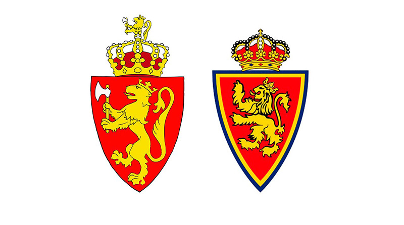
The Real Zaragoza logo is a heraldic shield emblem representing one of Spain’s most historically significant football clubs, founded in 1932 in Zaragoza, Aragon. The crest combines regional symbols with club identity, making it one of the more distinctive badges in Spanish football.
Within Spanish football branding, Real Zaragoza’s emblem sits in a long tradition of clubs drawing from civic coats of arms and regional heraldry. Unlike purely typographic or abstract marks common in modern rebranding efforts, Zaragoza has kept a crest-based identity that ties directly to the city and Aragon’s history. The current version retains that classic structure while being refined for modern use across digital and print contexts.
The club was founded on March 18, 1932. The logo has gone through several iterations over the decades, though the core heraldic structure has remained consistent. No single external design agency is publicly credited for the current version.
What Is the Real Zaragoza Logo?
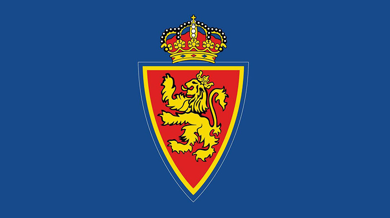
The Real Zaragoza logo is a heraldic shield emblem featuring vertical blue and white stripes, a crown at the top, and symbols drawn from the Aragon regional coat of arms. The current version has been in use in its modern refined form since the early 2000s. No specific designer or agency has been officially credited.
- Design Type: Heraldic emblem / shield crest
- Primary Elements: Divided shield with vertical blue and white stripes, royal crown, Aragon cross, and the letters “RZ” in some versions
- Official Introduction Date: Current refined version in use since approximately 2001-2002; original crest dates to the club’s early years post-1932
- Designer/Agency: Not publicly credited
- Trademark Status: Registered trademark of Real Zaragoza SAD
- Color Palette: Royal Blue (#003DA5), White (#FFFFFF), Black (#000000), Gold (#FFD700)
- Usage Context: Match kits, official merchandise, stadium signage, digital platforms, marketing materials, and broadcast graphics
How Has the Real Zaragoza Logo Evolved Over Time?
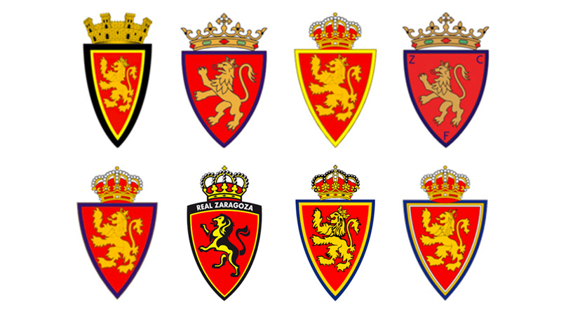
The Real Zaragoza crest has gone through gradual refinements since the club’s founding in 1932, moving from a simpler early badge toward a more detailed heraldic shield. The core blue-and-white striped structure has stayed constant, though proportions, crown details, and color depths have shifted across versions.
Original Real Zaragoza Logo (1932-1950s)
- Years Active: 1932 to approximately mid-1950s
- Design Description: A basic shield shape with vertical stripes and minimal heraldic detail
- Color Scheme: Blue and white, with limited additional colors
- Designer: Unknown
- Context: Introduced at the club’s founding, reflecting the city’s civic identity
- Key Changes from Previous: First version, no predecessor
- Cultural Significance: Established the blue-and-white identity that would define the club for decades
Mid-Century Real Zaragoza Logo (1950s-1970s)
- Years Active: Mid-1950s to approximately 1970s
- Design Description: More detailed heraldic shield with clearer crown and regional symbols added
- Color Scheme: Blue, white, and gold crown details
- Designer: Unknown
- Context: Refined during the club’s rise through Spanish football, including first La Liga seasons
- Key Changes from Previous: Crown became more prominent, shield proportions adjusted
- Cultural Significance: Aligned with the club’s growing ambitions and Copa del Rey success
Modern Real Zaragoza Logo (1990s-Present)
- Years Active: Early 1990s to present, with refinements around 2001-2002
- Design Description: Clean, well-proportioned heraldic shield with vertical blue and white stripes, detailed crown, Aragon cross motif, and black outline for definition
- Color Scheme: Royal blue, white, black, and gold
- Designer: Not publicly credited
- Context: Updated for modern broadcast and digital requirements; the 2001-2002 refinement coincided with the club’s presence in professional football’s increasingly visual media landscape
- Key Changes from Previous: Cleaner lines, more precise proportions, better contrast for screen use
- Cultural Significance: Represents the club’s identity across both its top-flight history and its current Segunda Division era
What Do the Design Elements of the Real Zaragoza Logo Mean?
The shield shape itself is a direct reference to Aragon’s heraldic tradition, connecting the club to centuries of regional identity rather than just football history.
The vertical blue and white stripes mirror the club’s famous kit, creating a direct visual link between the badge and how players appear on the pitch.
The crown signals the “Real” (Royal) designation in the club’s name, a title granted by Spanish royal authority.
The Aragon cross references the broader Crown of Aragon, one of medieval Spain’s most powerful regional kingdoms, giving the crest genuine historical depth.
What Does the Shield Shape Represent in the Real Zaragoza Logo?
The heraldic shield is the standard format for Spanish football club crests, rooted in medieval European coat of arms traditions.
For Zaragoza specifically, it connects the club to the city’s own civic shield, which draws from Aragon’s royal history.
This format places the club within a long lineage of regional identity rather than presenting itself as a modern commercial brand.
It also aligns with how most traditional Spanish clubs, from Athletic Bilbao to Valencia, have approached their visual identity for over a century.
Why Did Real Zaragoza Choose These Specific Colors?
- Royal Blue
- Hex: #003DA5
- Pantone: Approximately Pantone 286 C
- Symbolic Meaning: Royalty, loyalty, and regional pride in Aragon
- Psychological Impact: Conveys trust and stability; well understood in sports contexts as a strong, authoritative color
- Brand Connection: Directly mirrors the blue in the club’s playing kit, one of the most recognizable in Spanish football
- White
- Hex: #FFFFFF
- Symbolic Meaning: Purity and clarity; standard pairing with blue in Spanish regional heraldry
- Psychological Impact: Creates strong contrast, improving legibility at small sizes
- Brand Connection: Part of the iconic blue-and-white vertical stripe kit the club has worn for most of its history
- Gold
- Hex: #FFD700
- Symbolic Meaning: Reflects the royal crown and Aragon’s historical prestige
- Psychological Impact: Adds visual richness to the crest without overwhelming the primary blue and white
- Brand Connection: Used specifically on crown and border details, reinforcing the “Real” (Royal) status of the club
- Black
- Hex: #000000
- Symbolic Meaning: Used structurally for outlines and definition
- Psychological Impact: Grounds the crest visually, especially important at small sizes on kits and merchandise
- Brand Connection: Part of the traditional color set the club has used across its kits and visual materials
What Typography Style Is Used in the Real Zaragoza Logo?
The current Real Zaragoza crest is primarily emblem-based rather than typographic, meaning the wordmark is not the focal point.
When text appears in or near the badge, it typically uses a bold, serif-influenced style consistent with traditional Spanish football club typography.
The club name in full (“Real Zaragoza”) appears on official materials in a clean, legible format that prioritizes clarity over decorative styling.
No proprietary custom typeface has been publicly documented for the club’s logo, unlike larger clubs with fully developed brand systems.
What Are the Hidden Meanings in the Real Zaragoza Logo?
The Aragon cross embedded in the crest is easy to overlook but carries significant weight. It references the Cross of Aragon, a symbol tied to the medieval Crown of Aragon and the region’s Catholic heritage.
The crown is not purely decorative. It directly references the royal patronage behind the club’s “Real” designation, something many Spanish clubs carry but not all visually represent so clearly in their badge.
The vertical stripe structure of the shield mirrors the playing kit so closely that the two reinforce each other. Supporters reading the badge instinctively connect it to the team on the pitch, which is actually a smart piece of brand coherence, whether intentional or not.
How Does the Real Zaragoza Logo Compare to Competitor Logos?
Among Spanish football club crests, Real Zaragoza’s badge sits clearly in the traditional heraldic category. It shares structural DNA with clubs like Real Betis, Real Valladolid, and Real Oviedo, all of which use shield-based crests drawing from regional heraldry.
Compared to Atletico Madrid, whose badge has been modernized more aggressively, Zaragoza’s crest retains more of the traditional complexity that older Spanish clubs favored.
The Valencia badge uses a bat symbol, and Sevilla’s crest features the city’s patron saint, showing how each club pulls from its own specific regional or civic identity. Zaragoza does the same through Aragon’s heraldic symbols.
Where Zaragoza differs from many mid-table Spanish clubs is in the clarity of its color story. The blue-and-white stripes are immediately recognizable, which gives the badge stronger recall than crests relying on more complex multi-color arrangements.
Looking beyond Spain, the approach is comparable to clubs like Espanyol or Getafe, where the badge functions as a straightforward representation of regional pride rather than a modernized brand asset.
What Are the Technical Specifications of the Real Zaragoza Logo?
Official Color Codes
- Primary Color: Royal Blue
- Hex: #003DA5
- RGB: (0, 61, 165)
- CMYK: (100, 63, 0, 35)
- Pantone: Approximately 286 C
- Secondary Color: White
- Hex: #FFFFFF
- RGB: (255, 255, 255)
- CMYK: (0, 0, 0, 0)
- Pantone: White
- Accent Color: Gold
- Hex: #FFD700
- RGB: (255, 215, 0)
- CMYK: (0, 16, 100, 0)
- Pantone: Approximately 109 C
- Structural Color: Black
- Hex: #000000
- RGB: (0, 0, 0)
- CMYK: (0, 0, 0, 100)
- Pantone: Black C
Dimensions and Proportions
- Aspect Ratio: Approximately 4:5 (width to height), consistent with standard heraldic shield proportions
- Minimum Size Requirements: The badge should not be reproduced smaller than 20mm in height in print contexts to maintain legibility of interior heraldic details
- Clear Space: A minimum clear space equal to the width of the crown element should surround the badge on all sides
- File Formats: Official use requires vector graphics formats (SVG, AI, EPS) for print; PNG with transparent background for digital. Raster formats like JPEG are acceptable for editorial web use only
- Resolution: Print applications require a minimum of 300 DPI; digital use at standard screen resolution is acceptable for most contexts
- Color Mode: RGB for digital platforms, CMYK for print production, Pantone spot colors for merchandise requiring color accuracy
What Cultural Impact Has the Real Zaragoza Logo Had?
For supporters in Aragon, the Real Zaragoza badge carries weight well beyond football. It functions as a regional symbol in a part of Spain that has historically felt underrepresented relative to Madrid and Barcelona.
The crest appeared on the European stage during the club’s 1995 UEFA Cup Winners’ Cup victory, a moment that brought the badge to a much wider international audience and remains the defining moment in the club’s history.
In Zaragoza itself, the badge is present in the city in ways that go beyond matchdays. You see it on murals, in bars, on clothing. It has the kind of everyday presence that marks a club genuinely embedded in local culture rather than just commercially visible.
The blue-and-white vertical stripes, reflected in both the kit and the badge, are immediately recognizable to Spanish football fans even outside Aragon. That consistency between badge and kit has helped the visual identity stay coherent across decades of varying league fortunes.
There is also something worth noting about the badge’s role during the club’s difficult financial periods. Through relegations, financial crises, and ownership changes, the crest itself never changed dramatically. For supporters, that stability matters. The badge became a constant when much else was uncertain.
How Does the Real Zaragoza Logo Fit Into the Overall Brand Identity?
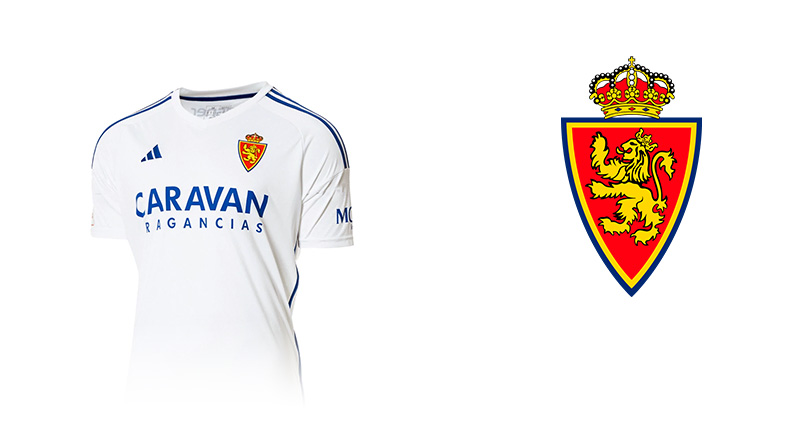
The Real Zaragoza badge is the anchor of a broader identity system that connects the club to its city, its region, and its history.
The blue and white of the crest directly matches the home kit, which is one of the more recognizable strip designs in Spanish football. That coherence between badge and kit is something clubs sometimes lose when they rebrand, but Zaragoza has kept it.
The club’s brand guidelines (as applied across official communications) treat the crest as the primary mark, supported by the wordmark “Real Zaragoza” in secondary positions on documents, merchandise packaging, and digital channels.
Merchandising uses the crest consistently across scarves, shirts, training wear, and stadium materials. The gold crown details translate well to embroidery, which matters for kit production.
The overall brand identity leans traditional rather than modernized, which suits the club’s identity as a historic Spanish club with deep regional roots. Unlike some clubs that have pushed toward a more stripped-back minimalist design approach in recent years, Zaragoza has held onto the complexity of heraldic detail that its supporters associate with authenticity.
How Should the Real Zaragoza Logo Be Used?
Official Usage Guidelines
- Do use the official vector file provided by the club for any reproduction
- Do maintain the full color version as the primary mark wherever color reproduction is available
- Do preserve the minimum clear space around the badge at all times
- Do use the monochrome version only when color reproduction is not possible
- Do not stretch, distort, or alter the proportions of the badge
- Do not change the official colors or substitute unofficial color values
- Do not place the badge on backgrounds that reduce contrast or legibility
- Do not add effects such as drop shadows, outlines, or gradients to the official mark
- Do not reproduce the badge at sizes below the minimum threshold where heraldic detail becomes illegible
Where to Access Official Logo Files
- Official press and media assets are available through the club’s official website media section
- Kit manufacturers (the current technical partner) may have licensed versions for product use
- Third-party asset sites carrying the badge may not have the current approved version; always request files directly from the club’s communications department for official use
Licensing and Trademark Protection
- The Real Zaragoza crest is a registered trademark of Real Zaragoza SAD
- Commercial use of the badge requires written permission from the club
- Unauthorized reproduction on merchandise, printed materials, or digital products constitutes trademark infringement
- Fan-made content for non-commercial personal use typically falls outside enforcement, but commercial fan merchandise requires a licensing agreement
- Media outlets reproducing the badge for editorial coverage (match reporting, news articles) generally operate under standard editorial use provisions, but should use official supplied assets where possible
FAQ on The Real Zaragoza Logo
What does the Real Zaragoza logo look like?
It’s a heraldic shield split into sections with vertical blue and white stripes.
A royal crown sits at the top. The design includes symbols drawn from the Aragon coat of arms, making it one of the more historically grounded crests in Spanish football.
What do the colors in the Real Zaragoza badge mean?
Royal blue and white reflect the club’s iconic striped kit, worn since the early decades of the club’s history.
Gold appears on the crown, referencing the “Real” (Royal) designation. Black outlines provide structural contrast, keeping the crest legible at small sizes.
When was the Real Zaragoza crest first introduced?
The original badge dates to the club’s founding on March 18, 1932.
It has been refined several times since, with the most notable modern update arriving around 2001-2002. The core heraldic structure has remained largely unchanged throughout.
What is the crown symbol on the Real Zaragoza emblem?
The crown directly references the club’s royal status. “Real” means Royal in Spanish, a title officially granted by the Spanish monarchy.
It’s a common feature across Spanish football club crests carrying the Real designation, including Real Betis and Real Sociedad.
What are the official colors of the Real Zaragoza logo?
The primary colors are royal blue (hex #003DA5) and white (#FFFFFF).
Gold (#FFD700) and black (#000000) serve as supporting colors, used on crown details and outlines respectively. These match the club’s official Pantone references for merchandise production.
How has the Real Zaragoza logo changed over the years?
The badge evolution has been gradual rather than dramatic. Early versions were simpler, with less heraldic detail.
Over time, the crown became more prominent and the Aragon cross was refined. The overall shield proportions were also tightened for better performance in broadcast and digital contexts.
What is the Aragon cross in the Zaragoza football badge?
It references the Cross of Aragon, tied to the medieval Crown of Aragon and the region’s Catholic heritage.
This makes the club crest a genuine historical document, not just a sports logo. Few badges at this level of football carry that kind of regional depth.
How does the Real Zaragoza crest compare to other Spanish football club logos?
It sits firmly in the traditional heraldic category alongside clubs like Celta Vigo and Athletic Bilbao.
Unlike clubs that have moved toward simplified, modernized marks, Zaragoza has kept the complexity of its regional heraldry intact, which longtime supporters tend to prefer.
Where can I download the official Real Zaragoza logo PNG or vector file?
Official files are available through the club’s media section on their website.
For press use, contact the club’s communications team directly. Third-party sites often carry outdated versions, so it’s worth going to the source for anything requiring high-resolution or print-ready formats.
Is the Real Zaragoza logo trademarked?
Yes. The crest is a registered trademark of Real Zaragoza SAD.
Commercial reproduction requires written permission from the club. Editorial use for match reporting or news coverage generally falls under standard provisions, but merchandise production without a licensing agreement constitutes infringement.
Conclusion
The Real Zaragoza logo is more than a club badge. It’s a direct expression of Aragon’s regional identity, carried through decades of Spanish football history.
From the Aragon cross to the royal crown, every element in the crest design serves a purpose rooted in the city’s civic heritage and the club’s official history since 1932.
The blue and white stripes, the heraldic shield structure, the gold crown details – all of it holds together as a coherent visual identity that has stayed recognizable through promotions, relegations, and a European trophy.
For a club currently in the Segunda Division, that kind of badge consistency still carries real weight with supporters across Aragon and beyond.

Renowned for his expertise in logo design and visual branding, Bogdan has developed a multitude of logos for various clients.
His skills extend to creating posters, vector illustrations, business cards, and brochures. Additionally, Bogdan's UI kits were featured on marketplaces like Visual Hierarchy and UI8.
He also wrote in the past years on sites like Design Your Way, WebDesignerDepot, WPDean, Designmodo, Speckyboy, Slider Revolution, and more.
- The Windsurf Logo History, Colors, Font, And Meaning - 10 October 2026
- How to Remove Background From Product Photos (No Photoshop) - 10 October 2026
- How Designers can Build a Stronger Online Creative Identity - 9 October 2026

Bogdan Sandu is a seasoned designer who has been designing websites since 2008. Renowned for his expertise in logo design and visual branding, Bogdan has developed a multitude of logos for various clients. His skills extend to creating posters, vector illustrations, business cards, and brochures. Additionally, Bogdan's UI kits were featured on marketplaces like Visual Hierarchy and UI8. He also wrote in the past years on sites like Design Your Way, WebDesignerDepot, WPDean, Designmodo, Speckyboy, Slider Revolution, and more.
You Might Also Like