

The Real Oviedo logo is the official emblem of Real Oviedo, a professional football club based in Oviedo, the capital of Asturias in northern Spain. It functions as a heraldic badge that represents the club’s identity, regional roots, and history dating back to 1926. The crest sits at the intersection of Spanish football tradition and Asturian cultural heritage, making it one of the more symbolically loaded badges in the Segunda Division.
Spanish football club crests have historically drawn from regional coats of arms, royal symbolism, and local iconography. Real Oviedo’s badge fits squarely in that tradition, carrying visual references to the Asturian cross and the royal designation embedded in the club’s name. The current version has stayed largely consistent for decades, with only minor refinements over time.
The club was founded on March 21, 1926, and the logo has gone through several iterations since then, though the core heraldic structure has remained intact across most versions.
What Is the Real Oviedo Logo?

The Real Oviedo logo is a shield-shaped heraldic emblem featuring the Cruz de la Victoria (Cross of Victory), blue and white coloring, and the club’s name. The current version has been in use since the 1990s, designed in-house by the club, and represents Asturian royal heritage and regional pride.
- Design Type: Heraldic emblem / shield crest
- Primary Elements: Shield shape, Cruz de la Victoria, blue and white stripes, crown, club name lettering
- Official Introduction Date: Current version introduced circa 1991
- Designer/Agency: Developed internally by the club
- Trademark Status: Registered trademark of Real Oviedo SAD
- Color Palette: Royal Blue (#003399), White (#FFFFFF), Gold (#FFD700)
- Usage Context: Match kits, official merchandise, stadium signage, digital platforms, marketing materials
How Has the Real Oviedo Logo Evolved Over Time?
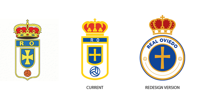
The Real Oviedo crest has evolved gradually since 1926, moving from a simpler badge design toward a more refined heraldic emblem. Each iteration has kept the core blue and white identity intact while refining the shield shape, typography, and symbolic elements.
Original Real Oviedo Logo (1926-1940s)
- Years Active: 1926 to late 1940s
- Design Description: Basic oval or round badge with club initials and minimal heraldic detail
- Color Scheme: Blue and white, limited color reproduction
- Designer: Unknown
- Context: Created at the club’s founding during a period when Spanish football clubs were adopting formal identities
- Key Changes from Previous: First official badge
- Cultural Significance: Established the blue and white color identity tied to Asturian regional colors
Mid-Century Real Oviedo Logo (1940s-1970s)
- Years Active: Late 1940s to early 1970s
- Design Description: Shield shape introduced, early incorporation of the Cruz de la Victoria symbol
- Color Scheme: Blue, white, with gold accents emerging
- Designer: Unknown
- Context: Spanish football clubs standardized heraldic crests during the Franco era, and Oviedo followed suit
- Key Changes from Previous: Shift from circular to shield format, addition of regional cross
- Cultural Significance: Tied the club visually to Asturian royal history and the Reconquista symbol
Modernized Real Oviedo Logo (1970s-1991)
- Years Active: Early 1970s to 1991
- Design Description: More detailed shield with cleaner lines, crown added above the badge, refined cross placement
- Color Scheme: Royal blue, white, gold crown
- Designer: Unknown
- Context: Coincided with the club’s stronger presence in La Liga during this period
- Key Changes from Previous: Crown element added, overall proportions refined
- Cultural Significance: The crown reinforced the “Real” (Royal) designation granted by Spanish royalty
Current Real Oviedo Logo (1991-Present)
- Years Active: 1991 to present
- Design Description: Clean heraldic shield with vertical blue and white stripes, Cruz de la Victoria in the upper section, crown on top, “REAL OVIEDO” lettering at the base
- Color Scheme: Royal blue (#003399), white (#FFFFFF), gold (#FFD700)
- Designer: Internal club design
- Context: Refreshed as the club consolidated its visual identity for merchandise and broadcast use
- Key Changes from Previous: Cleaner execution, better suited for screen reproduction and kit embroidery
- Cultural Significance: The version most recognized by current fans globally, including the club’s international supporter base that helped save it from bankruptcy in 2012
What Do the Design Elements of the Real Oviedo Logo Mean?
Each element in the Real Oviedo crest carries a specific reference to Asturian history, royal heritage, or the club’s identity. The shield shape, the cross, the crown, and the color stripes are not decorative choices.
They are direct references to the region’s past and the club’s formal status as a royal institution in Spanish football.
What Does the Shield Shape Represent in the Real Oviedo Logo?
The shield format is standard across Spanish football crests, rooted in heraldic tradition.
For Real Oviedo, it signals institutional legitimacy and connects the club to Asturias’s role as the birthplace of the Spanish Reconquista.
It also places the club visually alongside historically significant Spanish sides, reinforcing its identity as a serious, long-standing football institution rather than a newer franchise.
What Is the Historical Context Behind the Logo’s Symbols?
The Cruz de la Victoria is the most historically loaded element in the badge.
It appears on the coat of arms of Asturias and is one of the oldest Christian symbols in Spain, dating back to the 9th century.
Its inclusion directly links the club to the regional identity of Asturias, making Real Oviedo’s crest one of the few football badges with a genuine medieval historical reference rather than a decorative one.
What Cultural References Are Embedded in the Logo?
The “Real” prefix and the crown above the shield both reference the royal patronage the club received.
This was a formal designation, not a marketing choice. The blue coloring ties the club to Asturian regional identity.
Blue is the dominant color across Asturian institutions, and Real Oviedo’s use of it is as much a regional statement as it is a sporting one.
Why Did Real Oviedo Choose These Specific Colors?
- Royal Blue
- Hex: #003399 / Pantone: 286 C
- Symbolic meaning: Royal authority, loyalty, Asturian regional identity
- Psychological impact: Conveys trust, stability, and institutional permanence
- Brand connection: Directly tied to the club’s royal designation and regional roots
- White
- Hex: #FFFFFF
- Symbolic meaning: Clarity, purity, balance against the dominant blue
- Psychological impact: Improves readability and visual contrast on the badge
- Brand connection: Part of the home kit’s vertical stripe pattern, directly mirrored in the badge
- Gold
- Hex: #FFD700 / Pantone: 116 C
- Symbolic meaning: Royal prestige, the crown element, historical significance
- Psychological impact: Adds a premium, formal quality to the crest
- Brand connection: Reinforces the “Real” (Royal) designation and differentiates the badge from purely regional crests
What Typography Style Is Used in the Real Oviedo Logo?
The lettering in the Real Oviedo badge uses a serif-influenced, capitalized typeface consistent with traditional Spanish football crest design.
It prioritizes legibility at small sizes, which matters for kit embroidery and badge reproduction.
The typography has stayed broadly consistent across recent versions, avoiding the kind of font swaps that have caused backlash for other clubs. It reads as formal and institutional rather than modern or geometric, which fits the crest’s overall tone.
What Are the Hidden Meanings in the Real Oviedo Logo?
The Cruz de la Victoria doubles as both a religious and political symbol. Its presence is intentional but its full historical weight is not immediately obvious to non-Spanish audiences.
The vertical stripes on the shield mirror the club’s home kit pattern, creating a visual link between the badge and the jersey.
The crown’s placement above the shield, rather than integrated into it, is a deliberate heraldic choice that signals royal patronage rather than simply decorative intent. Most fans read it as a standard crest element, but its positioning follows formal heraldic rules.
How Does the Real Oviedo Logo Compare to Competitor Logos?
Real Oviedo’s crest sits within a specific category of traditional Spanish football badges that prioritize regional heraldry over modern graphic design. It shares visual DNA with several other Spanish clubs but has distinguishing elements that set it apart.
Compared to the Athletic Bilbao logo, which also leans into Basque regional identity, Oviedo’s badge is more overtly heraldic and less stylized.
The Real Sociedad logo takes a similar approach to incorporating regional symbolism but uses a more contemporary shield shape. Oviedo’s version feels deliberately older in its visual language.
The Real Betis logo and the Real Valladolid logo both share the royal crown and “Real” designation with Oviedo, but Betis incorporates a more complex color scheme while Valladolid uses a more simplified modern crest.
The Celta Vigo logo and the Rayo Vallecano logo lean away from heraldic tradition entirely, making Oviedo’s badge stand out as one of the more historically grounded crests in the Spanish football pyramid.
Within the Segunda Division, where Oviedo currently competes, the badge carries more historical weight than most of its direct rivals, many of whom have modernized or simplified their crests in recent years.
What Are the Technical Specifications of the Real Oviedo Logo?
Official Color Codes
- Primary Color: Royal Blue
- Hex: #003399
- RGB: (0, 51, 153)
- CMYK: (100, 67, 0, 40)
- Pantone: 286 C
- Secondary Color: White
- Hex: #FFFFFF
- RGB: (255, 255, 255)
- CMYK: (0, 0, 0, 0)
- Pantone: N/A (process white)
- Accent Color: Gold
- Hex: #FFD700
- RGB: (255, 215, 0)
- CMYK: (0, 16, 100, 0)
- Pantone: 116 C
Dimensions and Proportions
- Aspect Ratio: Approximately 3:4 (width to height), consistent with a standard heraldic shield format
- Minimum Size Requirements: Not less than 20px height for digital use; 15mm for print applications to maintain legibility of the cross and lettering
- Clear Space: Minimum clear space equal to the height of the crown element on all sides
- Official Usage Guidelines: The club requires use of the official vector graphics file for all reproduction. Rasterized versions should meet a minimum DPI of 300 for print. Digital formats include SVG for scalable web use and PNG with transparent background for on-screen applications.
What Cultural Impact Has the Real Oviedo Logo Had?
The Real Oviedo crest became a symbol of collective resilience in 2012 when the club faced bankruptcy and dissolution.
A crowdfunding campaign, one of the first of its kind in professional football, attracted thousands of international shareholders who bought stakes in the club to keep it alive. Many of those supporters had never attended a match in Oviedo.
What they were buying into, partly, was the badge. The crest carried enough historical and emotional weight to motivate people across Europe and the Americas to invest real money in keeping a second-division Spanish club alive.
That moment shifted the logo from a regional football symbol into something with genuine international recognition. It now appears on merchandise sold globally, and its visual connection to Asturian heritage has become a selling point rather than a niche detail.
Within Asturias itself, the badge functions as a marker of local identity in the same way that regional coats of arms do. It appears on murals, street art, and public displays in Oviedo city center, well beyond the context of football.
How Does the Real Oviedo Logo Fit Into the Overall Brand Identity?
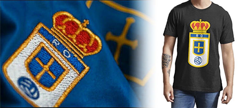
The crest is the anchor of Real Oviedo’s entire visual identity. The kit design, stadium signage, social media presence, and official merchandise all build outward from the blue, white, and gold palette established by the badge.
The club’s brand guidelines treat the crest as a fixed element, meaning the logo itself does not adapt or animate in the way that some modern football clubs have experimented with.
This consistency is deliberate. Real Oviedo’s identity is built on stability and history rather than trend-following, and the logo reflects that.
The typography used across club communications mirrors the formal, serif-leaning style of the badge lettering. The color palette is applied consistently across digital and physical touchpoints, from the club’s website to kit packaging.
The badge also connects directly to the club’s storytelling. The 2012 crowdfunding campaign built its visual language around the crest, using it as the primary symbol in campaign materials. That association between the logo and the club’s survival story has become part of the brand’s identity in a way that few football clubs can claim.
How Should the Real Oviedo Logo Be Used?
Official Usage Guidelines
- Do’s:
- Use the official vector file provided by Real Oviedo for all commercial or editorial reproduction
- Maintain the clear space requirements around the badge on all applications
- Reproduce the logo in its full color version wherever possible
- Use approved monochrome versions only when full color is not technically possible
- Don’ts:
- Do not alter the proportions, colors, or elements of the crest
- Do not place the logo on backgrounds that reduce contrast or legibility
- Do not use the badge as part of unofficial merchandise without licensing approval
- Do not reproduce the logo below minimum size thresholds where detail is lost
Where to Access Official Logos
Official logo files are available through Real Oviedo’s press office and media relations department. Journalists and licensed partners can request high-resolution files directly from the club. Unofficial downloads from third-party sites are not licensed for commercial use.
Licensing and Trademark Protection
The Real Oviedo crest is a registered trademark of Real Oviedo SAD. Any commercial use of the badge, including on merchandise, apparel, or promotional materials, requires explicit written authorization from the club. Unauthorized use is subject to trademark enforcement under Spanish and EU intellectual property law.
Fan-made content for non-commercial personal use exists in a grey area, but the club actively monitors and pursues unauthorized commercial reproduction of its badge.
FAQ on The Real Oviedo Logo
What does the Real Oviedo logo look like?
It’s a heraldic shield crest featuring vertical blue and white stripes, the Cruz de la Victoria at the top, a royal crown above the shield, and “REAL OVIEDO” lettered at the base.
The official colors are royal blue, white, and gold.
What is the Cruz de la Victoria on the Real Oviedo badge?
The Cruz de la Victoria is a 9th-century Christian cross tied to Asturian royal history and the Reconquista.
It appears on the Asturias coat of arms and its presence in the crest directly connects the club to the region’s medieval heritage.
What do the colors in the Real Oviedo crest mean?
Royal blue represents loyalty and Asturian regional identity. White provides contrast and mirrors the club’s home kit stripes.
Gold reinforces the royal designation embedded in the name “Real,” meaning the club carries formal recognition from Spanish royalty.
When was the current Real Oviedo logo introduced?
The current version of the Real Oviedo emblem has been in use since approximately 1991.
It refined the proportions and cleaned up the heraldic details of earlier iterations while keeping the core shield structure and Cruz de la Victoria intact.
How many times has the Real Oviedo badge changed?
The crest has gone through roughly four main iterations since the club’s founding in 1926.
Each version kept the blue and white club colors and shield format. The changes were mostly refinements rather than full redesigns, which is fairly typical for traditional Spanish football clubs.
What is the Real Oviedo logo’s color code?
The primary blue is #003399 (Pantone 286 C). White is #FFFFFF. The gold accent used for the crown is #FFD700 (Pantone 116 C).
These are the official values used across kit design, digital platforms, and printed merchandise.
Is the Real Oviedo logo available as a PNG or SVG?
Official high-resolution files, including transparent PNG and SVG formats, are available through the club’s press office.
Third-party downloads exist widely online but are not licensed for commercial use. For anything beyond personal use, go directly to the club.
How does the Real Oviedo crest compare to other Spanish football club logos?
It sits firmly in the traditional heraldic category alongside clubs like Sevilla and Espanyol.
Unlike more modernized Spanish football badges, Oviedo’s crest has resisted simplification, keeping its historical symbols visible rather than abstracting them for contemporary design trends.
Why is the Real Oviedo logo internationally recognized?
The 2012 crowdfunding campaign that saved the club from bankruptcy brought global attention to the badge.
Thousands of international shareholders bought into the club, and the Oviedo crest became a symbol of that collective effort, giving it recognition well beyond Asturias or Spanish football circles.
Can I use the Real Oviedo logo on merchandise or designs?
No, not without explicit written permission from Real Oviedo SAD.
The club badge is a registered trademark protected under Spanish and EU intellectual property law. Unauthorized commercial use, including on apparel or promotional items, is subject to enforcement action by the club.
Conclusion
The Real Oviedo logo is more than a football club badge. It carries nearly a century of Asturian identity, royal symbolism, and regional history in a single heraldic shield.
The Cruz de la Victoria, the blue and white stripes, the gold crown. None of it is accidental.
What makes this crest genuinely interesting is how it held up through the club’s near-collapse in 2012, becoming a symbol of collective ownership recognized far outside Spain.
For anyone studying Spanish football club emblems or the deeper side of sports visual identity, Oviedo’s badge is worth looking at closely.

Renowned for his expertise in logo design and visual branding, Bogdan has developed a multitude of logos for various clients.
His skills extend to creating posters, vector illustrations, business cards, and brochures. Additionally, Bogdan's UI kits were featured on marketplaces like Visual Hierarchy and UI8.
He also wrote in the past years on sites like Design Your Way, WebDesignerDepot, WPDean, Designmodo, Speckyboy, Slider Revolution, and more.
- The Windsurf Logo History, Colors, Font, And Meaning - 10 October 2026
- How to Remove Background From Product Photos (No Photoshop) - 10 October 2026
- How Designers can Build a Stronger Online Creative Identity - 9 October 2026

Bogdan Sandu is a seasoned designer who has been designing websites since 2008. Renowned for his expertise in logo design and visual branding, Bogdan has developed a multitude of logos for various clients. His skills extend to creating posters, vector illustrations, business cards, and brochures. Additionally, Bogdan's UI kits were featured on marketplaces like Visual Hierarchy and UI8. He also wrote in the past years on sites like Design Your Way, WebDesignerDepot, WPDean, Designmodo, Speckyboy, Slider Revolution, and more.
You Might Also Like


