The Disney logo stands as one of the most recognized corporate symbols on the planet. It represents more than a media company. It carries nearly a century of entertainment history, childhood memories, and cultural influence.
Within the landscape of film company logos, Disney’s mark holds a unique position. Few brands trigger such immediate emotional responses.
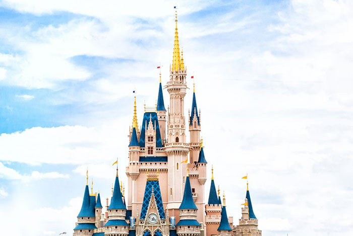
The current version features Walt Disney’s signature-inspired wordmark paired with the iconic Cinderella Castle silhouette. This combination was refined over decades, with the castle element becoming standard in 2006. The Walt Disney Company was founded in 1923, and the logo has gone through roughly twelve significant iterations since then.
What Is the Disney Logo?
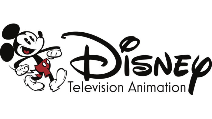
The Disney logo is a combination mark featuring a stylized script wordmark reading “Disney” alongside the Cinderella Castle silhouette. Officially standardized in 2006, the design reflects Walt Disney’s actual signature and connects to the company’s theme park legacy. It symbolizes magic, imagination, and family entertainment.
Design Attributes
- Design Type: Combination mark (wordmark plus symbol)
- Primary Elements: Custom script font wordmark, castle silhouette, arc of stars, shooting star animation
- Official Introduction Date: Current version standardized in 2006
- Designer: Based on Walt Disney’s signature; castle element evolved through internal Disney teams
- Trademark Status: Registered trademark of The Walt Disney Company, heavily protected globally
- Color Palette: Primary blue (#0057B8), white, and gold accents for premium applications
- Usage Context: Film openings, theme parks, merchandise, streaming platforms, corporate communications
How Has the Disney Logo Evolved Over Time?
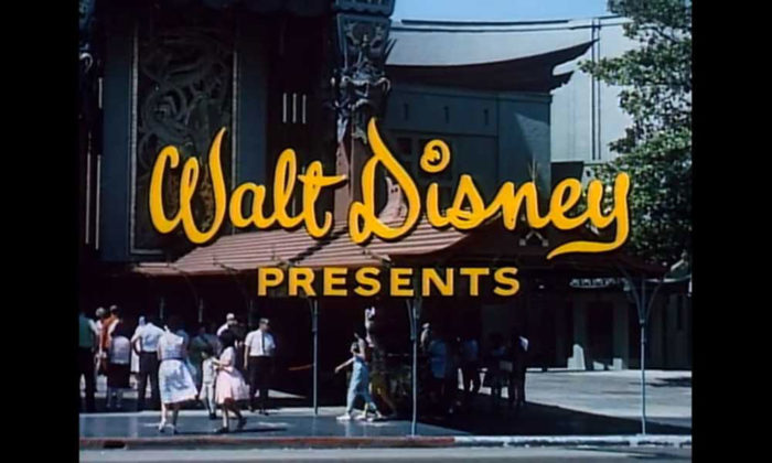
The Disney logo transformed from simple text treatments in the 1920s to the castle-centered icon we know today. Each version reflected the company’s growth from animation studio to global entertainment conglomerate.
The signature-style wordmark appeared early. The castle came much later.
Original Disney Brothers Cartoon Studio Logo (1923-1926)
- Years Active: 1923-1926
- Design Description: Simple text reading “Disney Brothers Cartoon Studio” in basic serif lettering
- Color Scheme: Black text on white backgrounds, typical for the era
- Designer: Unknown, likely created in-house
- Context: Walt and Roy Disney founded their studio in their uncle’s garage. Branding wasn’t a priority yet.
- Key Changes from Previous: First formal company identification
- Cultural Significance: Humble beginnings of an empire
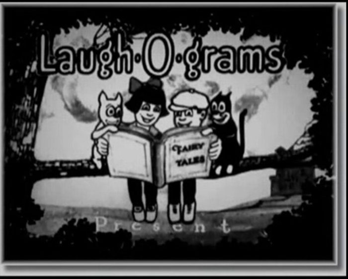
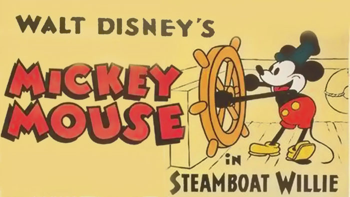
Walt Disney Productions Logo (1929-1948)
- Years Active: 1929-1948
- Design Description: “Walt Disney” in early script lettering, beginning the signature-inspired approach
- Color Scheme: Black, occasionally with color backgrounds for specific films
- Designer: Derived from Walt Disney’s handwriting
- Context: Mickey Mouse had arrived. The company needed stronger brand identity.
- Key Changes from Previous: Shift to personal signature style
- Cultural Significance: Connected the brand directly to its founder’s personality
Classic Script Era (1948-1985)
- Years Active: 1948-1985
- Design Description: Refined script wordmark with the distinctive “D” that became iconic
- Color Scheme: Primarily black, with variations for different media
- Designer: Internal refinements over time
- Context: Disneyland opened in 1955. Television brought Disney into homes weekly.
- Key Changes from Previous: More polished, professional execution of the signature concept
- Cultural Significance: This version shaped what people think of as “the Disney font”
Castle Introduction Era (1985-2006)
- Years Active: 1985-2006
- Design Description: Script wordmark began appearing with castle imagery in film openings
- Color Scheme: Blue backgrounds became standard, white and gold elements
- Designer: Various internal teams and external agencies
- Context: Disney Renaissance in animation. Theme parks expanding globally.
- Key Changes from Previous: Castle silhouette started accompanying the wordmark
- Cultural Significance: Merged two powerful brand assets into one identity
Modern Disney Logo (2006-Present)
- Years Active: 2006-present
- Design Description: Unified combination mark with castle, arc of stars, and script wordmark
- Color Scheme: Blue (#0057B8), white, occasional gold
- Designer: Standardized by Disney’s internal brand team
- Context: Pixar acquisition, Marvel and Lucasfilm to follow. Disney+ would come later.
- Key Changes from Previous: Formal standardization of castle as permanent element
- Cultural Significance: Represents Disney as a complete entertainment ecosystem
What Do the Design Elements of the Disney Logo Mean?
Every piece of the Disney logo carries weight. The castle represents aspiration and wonder. The script wordmark connects to Walt’s personal touch. The arc of stars suggests magic and wishes coming true.
Nothing here happened by accident.
Why Did Disney Choose These Specific Colors?
Blue dominates the Disney color palette for good reason.
It reads as trustworthy and calm. Parents feel safe. Kids feel wonder.
- Primary Blue: #0057B8 – Evokes night skies, dreams, and fantasy. Color psychology research shows blue increases trust perception.
- White: #FFFFFF – Purity, magic, and clean presentation. Creates strong contrast against the blue.
- Gold (accent): #C9B037 – Premium feel, used sparingly for special occasions and anniversary editions.
What Typography Style Is Used in the Disney Logo?
The Disney wordmark isn’t a standard font. It’s a custom script based on Walt Disney’s signature.
That distinctive “D” with its backward-facing flourish? Taken directly from how Walt signed documents.
The typography feels personal and handwritten rather than corporate. It maintains readability while suggesting creativity and warmth. Over the years, designers cleaned up the letterforms without losing their hand-drawn character.
What Are the Hidden Meanings in the Disney Logo?
People see things in the Disney logo that may or may not be intentional.
The arc of stars? Some count them and assign meaning. Others see it as simply decorative.
The castle silhouette combines elements from both Cinderella Castle (Florida) and Sleeping Beauty Castle (California). This wasn’t always obvious to viewers. The shooting star in animated versions suggests wishes, tying into the “When You Wish Upon a Star” legacy. Whether every detail was planned or emerged organically, Disney keeps some things mysterious.
How Does the Disney Logo Compare to Competitor Logos?
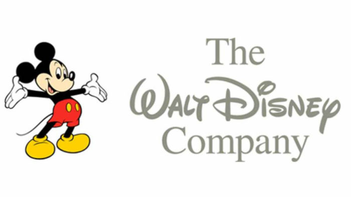
Most major studio logos use bold, architectural imagery. Mountains, globes, shields. Disney went softer.
The castle and script combination feels approachable rather than imposing.
Compare this to the Paramount logo with its mountain peak or the Universal Pictures logo featuring a spinning globe. Those communicate scale and power. Disney communicates warmth and imagination instead.
Among streaming competitors, Netflix uses stark red and white. Amazon Prime goes minimal. The Hulu logo stays simple and green. Disney+ kept the castle, betting that emotional connection beats modern minimalism.
What Are the Technical Specifications of the Disney Logo?
Official Color Codes
- Primary Blue: Hex: #0057B8, RGB: (0, 87, 184), CMYK: (100, 53, 0, 28), Pantone: 293 C
- White: Hex: #FFFFFF, RGB: (255, 255, 255), CMYK: (0, 0, 0, 0)
- Gold (Anniversary/Premium): Hex: #C9B037, RGB: (201, 176, 55), CMYK: (0, 12, 73, 21), Pantone: 117 C
Dimensions and Proportions
- Aspect Ratio: Approximately 2.5:1 for full horizontal lockup
- Minimum Size: Wordmark should never appear smaller than 0.5 inches in print
- Clear Space: Minimum clearance equal to the height of the “D” on all sides
- File Formats: Available in vector graphics (AI, EPS, SVG) and raster formats for licensed partners
What Cultural Impact Has the Disney Logo Had?
The Disney logo triggers instant recognition across generations and continents. It appears on everything from movie screens to lunchboxes to cruise ships.
Kids who grew up seeing that castle opening now show it to their own children.
The motion graphics version, with its shooting star and swelling music, has become a cultural moment in itself. People in theaters quiet down when it appears. That’s rare for a corporate logo.
How Does the Disney Logo Fit Into the Overall Brand Identity?
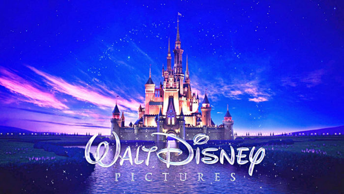
Disney operates multiple sub-brands, each with distinct identities. Marvel has its comic-book flip. Pixar has its bouncing lamp. Star Wars has its crawling text.
The main Disney logo sits above them all as the parent symbol.
It creates visual hierarchy in the brand architecture. When the castle appears before a Marvel film, viewers understand the corporate relationship without explanation. The logo also anchors storytelling in design across all platforms, from theme park signage to streaming interfaces.
How Should the Disney Logo Be Used?
Official Usage Guidelines
- Do: Use official files from Disney’s brand portal
- Do: Maintain clear space requirements
- Do: Use approved color variations only
- Don’t: Stretch, rotate, or alter proportions
- Don’t: Add effects, shadows, or outlines
- Don’t: Place on busy backgrounds that reduce legibility
Accessing Official Logos
Licensed partners receive logo files through Disney’s brand management system. Public use requires explicit written permission. Unauthorized use triggers legal action quickly.
Trademark Protection
Disney aggressively protects its trademarks. The logo, wordmark, and castle silhouette are all registered. Even fan projects face scrutiny. The company maintains dedicated legal teams monitoring unauthorized usage worldwide.
For official brand guidelines and licensing inquiries, contact Disney’s corporate communications or visit their official brand resources portal.
FAQ on The Disney Logo
What Font Is Used in the Disney Logo?
The Disney wordmark uses a custom script based on Walt Disney’s actual signature. It’s not a publicly available typeface.
The distinctive cursive lettering was refined over decades by internal design teams.
Several commercial fonts attempt to replicate it, but none are official. The letterforms follow specific logo design principles that balance readability with personality.
Who Designed the Disney Logo?
No single designer created it. The signature-style wordmark evolved from Walt Disney’s handwriting starting in the 1940s.
Internal teams refined it over time.
The castle element emerged through collaborative work at Walt Disney Imagineering and corporate brand departments. Unlike logos from famous graphic designers, this one grew organically.
When Was the Disney Logo Created?
The company started using branded marks in 1923. The signature-inspired script appeared around 1937.
The castle silhouette joined film openings in the 1980s.
The current standardized combination mark dates to 2006. That’s when Disney unified their brand identity across all platforms and media.
What Does the Disney Logo Represent?
It represents imagination, magic, and family entertainment. The castle symbolizes fairy tales and theme park experiences.
The script wordmark connects to Walt’s personal legacy.
Together they create a focal point for brand recognition. The psychology of shapes here triggers nostalgic emotional responses.
Why Does the Disney Logo Have a Castle?
The castle references Cinderella Castle at Walt Disney World and Sleeping Beauty Castle at Disneyland. These structures became symbols of the Disney experience.
Adding the castle to the logo merged entertainment and theme park identities.
It creates visual unity across the brand.
What Are the Official Disney Logo Colors?
Primary blue (#0057B8) dominates. White provides contrast. Gold accents appear on premium and anniversary materials.
The blue hue suggests night skies and dreams.
Understanding color theory explains why this palette works. Blue builds trust while feeling magical, not corporate.
How Has the Disney Logo Changed Over the Years?
It evolved through roughly twelve versions since 1923. Early marks were simple text treatments.
The signature script emerged mid-century.
The castle appeared in the 1980s. Each update reflected company growth, from animation studio to global entertainment conglomerate with streaming, theme parks, and merchandise.
Is the Disney Logo Based on Walt Disney’s Signature?
Yes. The wordmark directly references how Walt signed documents. That backward-curving “D” came from his actual handwriting.
Designers cleaned up the forms for reproduction.
The personal touch remains intentional. It applies font psychology to feel warm rather than corporate.
What Is the Castle in the Disney Logo?
It’s a stylized composite of Cinderella Castle (Florida) and Sleeping Beauty Castle (California). The silhouette blends elements from both structures.
Neither park’s castle appears exactly as built.
The simplified form works at any scale and proportion while remaining instantly recognizable worldwide.
Can I Use the Disney Logo for My Project?
No. Not without explicit written permission. Disney aggressively protects its trademarks through dedicated legal teams.
Fan projects face scrutiny. Commercial use triggers immediate action.
Licensed partners access official files through Disney’s brand management system. Everyone else needs to contact corporate communications for licensing inquiries first.
Conclusion
The Disney logo stands as proof that brand identity works best when it connects emotionally. A signature. A castle. Blue skies and shooting stars. Simple elements, really.
But they combine into something people recognize instantly across the globe.
What makes it effective isn’t complexity. It’s repetition across decades and consistency in execution.
The Walt Disney Company built their visual identity through patience, not trends. They followed core graphic design principles while staying true to their founder’s handwriting.
Few entertainment brands achieve this level of recognition. Fewer still maintain it for nearly a century.

Renowned for his expertise in logo design and visual branding, Bogdan has developed a multitude of logos for various clients.
His skills extend to creating posters, vector illustrations, business cards, and brochures. Additionally, Bogdan's UI kits were featured on marketplaces like Visual Hierarchy and UI8.
He also wrote in the past years on sites like Design Your Way, WebDesignerDepot, WPDean, Designmodo, Speckyboy, Slider Revolution, and more.
- Canva vs Photoshop: When Does Each Make Sense? - 12 September 2026
- Briefing 3D Game Animation: Rigs, Clip Lists and Engine Handoffs - 11 September 2026
- The Webflow Logo History, Colors, Font, And Meaning - 10 September 2026

Bogdan Sandu is a seasoned designer who has been designing websites since 2008. Renowned for his expertise in logo design and visual branding, Bogdan has developed a multitude of logos for various clients. His skills extend to creating posters, vector illustrations, business cards, and brochures. Additionally, Bogdan's UI kits were featured on marketplaces like Visual Hierarchy and UI8. He also wrote in the past years on sites like Design Your Way, WebDesignerDepot, WPDean, Designmodo, Speckyboy, Slider Revolution, and more.
You Might Also Like