The Juventus logo stands as one of the most recognizable symbols in world football. It represents over 125 years of Italian sporting heritage based in Turin.
The current version, introduced in January 2017, marked a dramatic departure from traditional football club crests. Interbrand designed this minimalist approach that shocked fans and designers alike.
Founded in 1897, Juventus has used approximately ten different logo variations throughout its history. The club’s visual identity shifted from ornate heraldic shields to a stark, modern lettermark that prioritizes global brand recognition over traditional football aesthetics.
What is the Juventus Logo?
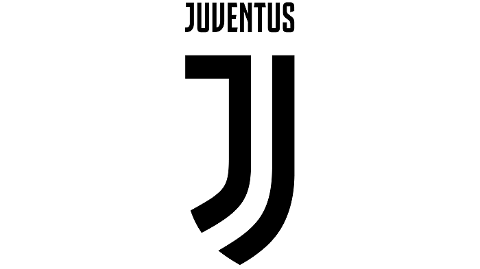
The Juventus logo is a stylized letter “J” composed of two vertical black stripes meeting at a point, with the club name written below. Introduced on January 16, 2017, and created by Interbrand, it symbolizes the iconic black and white stripes of the Bianconeri.
Design Type: Abstract lettermark (monogram)
Primary Elements: A geometric “J” formed by two angular shapes that reference the team’s striped jersey, plus wordmark
Official Introduction Date: January 16, 2017
Designer/Agency: Interbrand Milan
Trademark Status: Registered trademark owned by Juventus Football Club S.p.A.
Color Palette: Black (#000000) and White (#FFFFFF), with occasional gold accents for special editions
Usage Context: Stadium branding, official merchandise, digital platforms, marketing campaigns, kit badges, and corporate communications
How Has the Juventus Logo Evolved Over Time?
Juventus has undergone roughly ten logo changes since 1897. The evolution moved from detailed crests featuring bulls and crowns to today’s stripped-down lettermark.
Each redesign reflected the club’s ambitions and the design trends of its era.
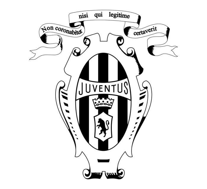
Original Juventus Logo (1897-1905)
Years Active: 1897-1905
Design Description: The earliest Juventus badge featured an oval shape with the club’s founding name. Pink was actually the original jersey color, not black and white.
Color Scheme: Pink and black elements
Designer: Unknown, likely club founders
Context: The club formed when students from the Massimo D’Azeglio Lyceum in Turin decided to create a football team. The name “Juventus” means “youth” in Latin.
Key Changes from Previous: This was the first official emblem
Cultural Significance: Represented the youthful, academic origins of the club
Early Shield Designs (1905-1921)
Years Active: 1905-1921
Design Description: Shield-shaped badges emerged during this period. The black and white stripes became official in 1903 after a jersey mix-up with Notts County inspired the color change.
Color Scheme: Black and white vertical stripes
Designer: Club administration
Context: The club was establishing its identity and the stripes became their signature look
Key Changes from Previous: Shift from pink to the now-famous black and white
Cultural Significance: Birth of the “Bianconeri” (black and whites) identity
The Charging Bull Era (1921-1971)
Years Active: 1921-1971
Design Description: A charging bull (the symbol of Turin) became central to the crest. The oval shape contained the bull silhouette with “Juventus” text above.
Color Scheme: Black bull on white/gold background
Designer: Unknown
Context: The bull referenced Turin’s heraldic symbol, connecting the club firmly to its home city
Key Changes from Previous: Introduction of the charging bull as a central element
Cultural Significance: Showed regional pride and the club’s physical, aggressive playing style
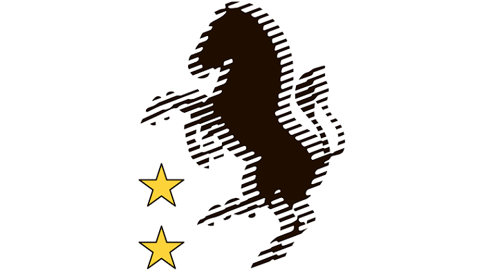
The Crowned Oval (1971-2004)
Years Active: 1971-2004
Design Description: An oval badge featuring a zebra (representing the stripes), a crown on top, and the club name. Some versions included gold accents and stars representing league titles.
Color Scheme: Black, white, and gold
Designer: Club design team
Context: The Agnelli family’s influence grew, and the logo reflected increasing commercial ambitions
Key Changes from Previous: The zebra replaced the bull as the primary animal symbol
Cultural Significance: The crown suggested royalty and dominance in Italian football
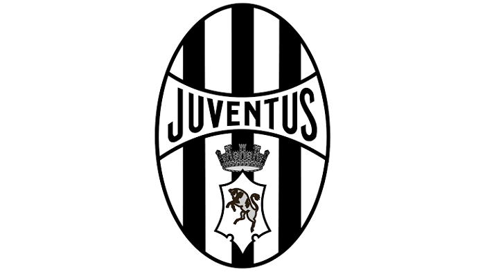
The Traditional Crest (2004-2017)
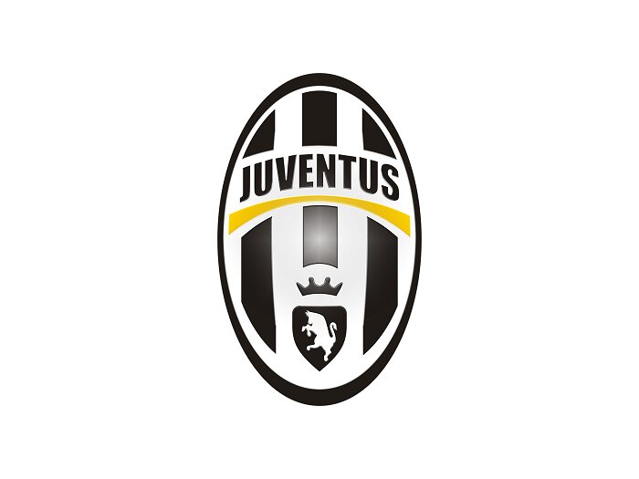
Years Active: 2004-2017
Design Description: A more polished oval crest with the charging bull returning. Featured a black and white striped background, gold crown, and “Juventus” in an arc. Stars above indicated Scudetto wins.
Color Scheme: Black, white, gold
Designer: In-house design team
Context: Introduced during a period of rebuilding after the Calciopoli scandal
Key Changes from Previous: Return of the bull, more refined execution
Cultural Significance: Balanced tradition with modern polish
The Modern “J” Logo (2017-Present)
Years Active: 2017-present
Design Description: A stark black and white “J” formed by two geometric shapes that resemble the club’s striped jersey. The word “JUVENTUS” appears below in a custom sans-serif font.
Color Scheme: Pure black (#000000) and white (#FFFFFF)
Designer: Interbrand Milan
Context: Part of a broader rebranding effort to position Juventus as a global lifestyle brand, not just a football club
Key Changes from Previous: Complete departure from traditional football crest design. No animals, no shield, no crown.
Cultural Significance: Polarizing but influential. Other clubs have since adopted simpler designs.
What Do the Design Elements of the Juventus Logo Mean?
The current Juventus logo carries meaning in every line. The “J” shape directly references the black and white striped jerseys worn since 1903.
Those two converging shapes create a letter while honoring tradition. The pointed bottom suggests forward momentum and ambition.
Why Did Juventus Choose These Specific Colors?
Black represents power, sophistication, and authority. In color psychology, it signals prestige and timelessness.
White provides contrast and clarity. It suggests purity and clean execution.
Together, they create the “Bianconeri” identity that has defined the club for over a century. The combination works across all media and scales beautifully from stadium signage to mobile apps.
Black: Hex #000000, RGB (0,0,0), symbolizes elegance and dominance
White: Hex #FFFFFF, RGB (255,255,255), represents clarity and balance
Gold (accent): Hex #B4A269, used sparingly for premium applications and championship editions
What Typography Style Is Used in the Juventus Logo?
Juventus uses a custom typeface called “Juventus Fans” for the wordmark below the J symbol.
It features clean, geometric letterforms with no serifs. The letters have consistent stroke widths and slightly condensed proportions.
This typography choice supports legibility at small sizes. It also feels modern without being trendy, which helps the logo age well.
What Are the Hidden Meanings in the Juventus Logo?
The two shapes forming the “J” deliberately echo the jersey stripes. Look closely and you see the kit pattern abstracted into a letter.
The pointed base resembles a shield tip, a subtle nod to traditional heraldic crests the club used for decades.
Interbrand designed the negative space between the shapes to feel dynamic. The gap creates visual tension and suggests forward motion, reflecting the club’s attacking philosophy.
How Does the Juventus Logo Compare to Competitor Logos?
Most European football clubs stick with traditional crests. Barcelona, Real Madrid, and Manchester United all use detailed emblems with multiple colors and elements.
Juventus broke from this pattern completely. The 2017 rebrand positioned them closer to fashion brands like Chanel or sports brands like Nike than to other football club logos.
Inter Milan updated their crest in 2021 with a simplified version, possibly influenced by Juventus. AC Milan has kept their traditional approach but refined the execution.
In terms of pure logo design principles, the Juventus mark outperforms most football badges. It works at any size, reproduces cleanly in one color, and remains instantly recognizable. Traditional crests often lose detail when scaled down for digital use.
What Are the Technical Specifications of the Juventus Logo?
Official Color Codes:
Primary Black: Hex #000000, RGB (0, 0, 0), CMYK (0, 0, 0, 100), Pantone Black 6 C
Primary White: Hex #FFFFFF, RGB (255, 255, 255), CMYK (0, 0, 0, 0)
Accent Gold: Hex #B4A269, RGB (180, 162, 105), used for special editions
Dimensions and Proportions:
The J symbol uses approximately a 1:1.5 aspect ratio (width to height). The complete logo with wordmark is closer to 1:2.
Minimum size requirements specify the J symbol should never appear smaller than 10mm in print or 30 pixels on screen.
Clear space around the logo equals the width of one stripe in the J mark. This ensures the logo breathes and maintains impact.
The brand guidelines prohibit stretching, rotating, adding effects, or placing the logo on busy backgrounds that reduce legibility.
What Cultural Impact Has the Juventus Logo Had?
The 2017 rebrand sparked massive debate in football and design communities. Fans initially rejected it. Many felt the club abandoned its heritage for commercial interests.
But the logo influenced a broader conversation about football branding. It proved clubs could think beyond traditional crests.
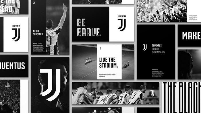
Fashion collaborations followed. Juventus partnered with Palace Skateboards and other streetwear brands, using the clean logo as a foundation. The design appeared on products that had nothing to do with football.
Other clubs took notice. Several have since simplified their badges, though none went as far as Juventus.
How Does the Juventus Logo Fit Into the Overall Brand Identity?
The logo anchors a complete visual system. Black and white stripes appear everywhere, from the stadium architecture to the training ground to social media templates.
The custom typeface extends beyond the logo into all communications. Jersey numbers, signage, and marketing materials share consistent letterforms.
Juventus positions itself as more than a football club. The brand competes for attention with entertainment companies, fashion houses, and lifestyle brands. The logo supports this ambition by not looking like a typical sports crest.
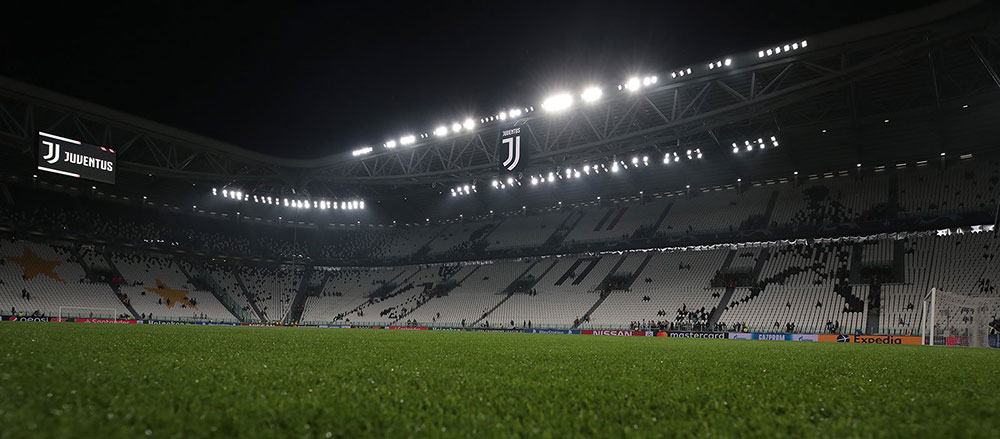
Allianz Stadium features the J prominently throughout. The training facility, merchandise shops, and digital platforms all use the mark consistently. This repetition builds recognition and reinforces the brand at every touchpoint.
How Should the Juventus Logo Be Used?
Official Usage Guidelines:
Always use official logo files from Juventus brand resources. Never recreate the logo manually or trace it from images.
Maintain the required clear space around the mark. Do not crowd it with other elements.
Use only approved color combinations. The logo works in full color (black on white), reversed (white on black), or single color for special applications.
Never alter proportions, add shadows, apply gradients, or modify the logo in any way.
Where to Access Official Logos:
Licensed partners receive brand assets through Juventus directly. Media outlets can access approved imagery through official press channels.
Trademark Protection:
The Juventus logo is a registered trademark. Unauthorized commercial use violates intellectual property law. Fan art and editorial use typically falls under fair use, but commercial products require licensing agreements with the club.
FAQ on The Juventus Logo
What Does the Juventus Logo Represent?
The Juventus logo represents the Bianconeri identity through its stylized J shape. Those two black stripes meeting at a point mirror the iconic black and white jersey pattern.
It symbolizes the Turin club’s ambition to become a global lifestyle brand beyond traditional football.
When Did Juventus Change Their Logo?
Juventus unveiled their current emblem on January 16, 2017. The club badge redesign replaced a traditional oval crest that featured a charging bull and crown.
This made them the first major European football club to adopt such a dramatic minimalist approach.
Who Designed the Current Juventus Logo?
Interbrand Milan created the modern Juventus crest. The agency spent months studying the club’s heritage and fan culture.
Their goal was building a visual hierarchy that would work across stadiums, merchandise, and digital platforms equally well.
Why Did Juventus Change Their Traditional Crest?
The Agnelli family wanted Juventus to compete with global entertainment brands. Traditional football badges don’t scale well for web design or app icons.
The old Serie A team badge looked dated on social media. A cleaner symbol solved that problem.
What Are the Official Juventus Logo Colors?
Pure black (#000000) and white (#FFFFFF) form the official color palette. Gold appears occasionally for special editions and championship celebrations.
This monochrome color scheme keeps the Juventus brand identity versatile and timeless.
What Does the J in the Juventus Logo Mean?
The J stands for Juventus, obviously. But its shape does more work than just forming a letter.
Those two angular pieces recreate the famous striped jersey. The pointed bottom suggests forward motion and the club’s attacking style of play.
Can I Use the Juventus Logo for Personal Projects?
Fan art and non-commercial use typically falls under fair use. But selling products with the Juventus symbol requires licensing.
The trademark belongs to Juventus Football Club S.p.A. Commercial violations can result in legal action. When in doubt, don’t.
How Many Logos Has Juventus Had?
Juventus FC has used approximately ten different logo versions since 1897. Early designs featured simple ovals. Later crests added the Turin bull, crowns, and zebras.
The Juventus logo evolution reflects changing design trends and business ambitions over 125 years.
Why Is There No Bull in the Current Juventus Logo?
The charging bull represented Turin’s heraldic symbol. Interbrand removed it to create something universally recognizable.
Global audiences didn’t connect with regional Italian symbolism. The simplified J communicates faster and translates across cultures without explanation.
Where Can I Download the Official Juventus Logo?
Licensed partners receive assets directly from the club. Media outlets access approved files through official press channels.
Random PNG files online often have wrong colors or proportions. For accurate Juventus visual identity materials, contact the club directly.
Conclusion
The Juventus logo stands as a turning point in football club branding. What Interbrand created in 2017 changed how Serie A clubs and European teams think about their visual identity.
Some fans still miss the charging bull and crown. That’s fair.
But the modern J works everywhere. From Allianz Stadium signage to smartphone screens to Nike merchandise, the mark scales without losing impact.
The Juventus rebrand proved that Italian football clubs can compete with global lifestyle brands. Whether you love it or hate it, you remember it. And that’s exactly what good team brand identity should do.
Renowned for his expertise in logo design and visual branding, Bogdan has developed a multitude of logos for various clients.
His skills extend to creating posters, vector illustrations, business cards, and brochures. Additionally, Bogdan's UI kits were featured on marketplaces like Visual Hierarchy and UI8.
He also wrote in the past years on sites like Design Your Way, WebDesignerDepot, WPDean, Designmodo, Speckyboy, Slider Revolution, and more.
- The Airtable Logo History, Colors, Font, And Meaning - 12 July 2026
- How to Blur Background in Canva: A Quick Tutorial - 11 July 2026
- Typography Trends - 10 July 2026
Bogdan Sandu is a seasoned designer who has been designing websites since 2008. Renowned for his expertise in logo design and visual branding, Bogdan has developed a multitude of logos for various clients. His skills extend to creating posters, vector illustrations, business cards, and brochures. Additionally, Bogdan's UI kits were featured on marketplaces like Visual Hierarchy and UI8. He also wrote in the past years on sites like Design Your Way, WebDesignerDepot, WPDean, Designmodo, Speckyboy, Slider Revolution, and more.
You Might Also Like