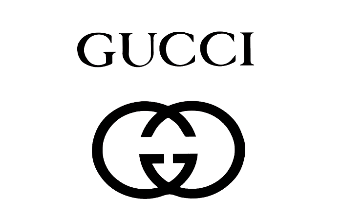
The Gucci logo stands as one of the most recognized symbols in luxury fashion. Two interlocking G letters facing opposite directions. Simple, yet instantly identifiable across the globe.
This Italian fashion house has built an empire partly on the strength of that visual mark. The double G monogram represents founder Guccio Gucci’s initials, introduced during the 1960s when the brand was cementing its place among elite shoe and accessory brands.
Gucci was founded in Florence in 1921. Since then, the brand has used several logo variations, though the interlocking G design remains the primary identifier. The current version maintains the original concept while adapting to modern applications across products, digital platforms, and global marketing campaigns.
What is the Gucci Logo?
The Gucci logo features two interlocking letter G’s arranged in a mirrored, overlapping pattern. Aldo Gucci designed it in the 1960s as a tribute to his father Guccio Gucci. The symbol represents heritage, craftsmanship, and Italian luxury fashion excellence.
Design Attributes:
- Design Type: Combination mark (monogram with wordmark)
- Primary Elements: Two capital G letters interlocked and facing opposite directions, often paired with the GUCCI wordmark
- Official Introduction Date: 1960s (exact year varies by source, commonly cited as 1963-1969)
- Designer: Aldo Gucci (son of founder Guccio Gucci)
- Trademark Status: Registered trademark globally, actively protected against counterfeiting
- Color Palette: Primary black (#000000), gold accents (#C9A227), with green-red-green web stripe as secondary brand element
- Usage Context: Leather goods, clothing, accessories, fragrances, retail environments, digital platforms, packaging
How Has the Gucci Logo Evolved Over Time?
The Gucci logo has gone through several changes since the brand’s founding in 1921.
Early versions featured a simple wordmark. The iconic double G appeared in the 1960s.
Recent decades brought refinements to spacing and proportions while keeping the core design intact.
Original Gucci Wordmark (1921-1960s)
- Years Active: 1921 to early 1960s
- Design Description: Simple text-based logo spelling GUCCI in capital letters
- Color Scheme: Black on white, occasionally gold
- Designer: Unknown (likely Guccio Gucci himself)
- Context: The brand started as a leather goods shop in Florence. A straightforward wordmark suited a local business focused on quality craftsmanship.
- Cultural Significance: Established the brand name recognition before the monogram era
Introduction of the Double G Monogram (1960s-1980s)
- Years Active: Mid-1960s to 1980s
- Design Description: Two interlocking G letters in a symmetrical arrangement, one facing forward, one reversed
- Color Scheme: Black, brown, gold variations
- Designer: Aldo Gucci
- Context: The brand was expanding internationally. A distinctive symbol helped establish global recognition beyond the Italian market.
- Key Changes from Previous: First use of a graphic symbol rather than text alone
- Cultural Significance: Created an instantly recognizable mark that signaled luxury status
Modern Refinements (1990s-2010s)
- Years Active: 1990s through 2010s
- Design Description: Cleaner lines, standardized proportions, often paired with updated wordmark
- Color Scheme: Predominantly black, with gold reserved for premium applications
- Designer: Various creative directors including Tom Ford’s influence on brand presentation
- Context: Digital age required adaptable logos. Refinements improved reproduction across print and screen.
- Key Changes from Previous: Streamlined geometry, improved scalability
- Cultural Significance: Maintained heritage while modernizing for contemporary consumers
Contemporary Version (2015-Present)
- Years Active: 2015 to present
- Design Description: The double G remains central, with flexible applications including vintage-inspired treatments and new colorways
- Color Scheme: Classic black, plus expanded palette under Alessandro Michele’s creative direction (pastels, metallics)
- Designer: Brand team under various creative directors
- Context: Maximalist fashion trends allowed more expressive logo usage while core identity stayed consistent
- Key Changes from Previous: Greater flexibility in application, vintage revivals, playful variations
- Cultural Significance: Balances heritage appeal with relevance to younger luxury consumers
What Do the Design Elements of the Gucci Logo Mean?
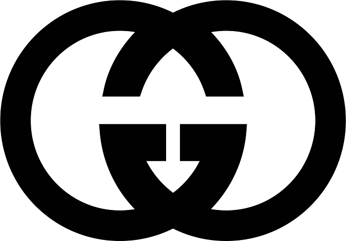
The interlocking G design carries multiple layers of meaning.
At its most basic level, the letters honor founder Guccio Gucci.
The mirrored arrangement suggests reflection, duality, and the meeting of tradition with innovation.
It also creates a sense of balance that feels stable and timeless.
Why Did Gucci Choose These Specific Colors?
Black dominates the Gucci logo for good reason. It communicates sophistication without trying too hard.
The psychology behind color choices matters here. Black signals authority and exclusivity.
Gold accents add warmth and suggest wealth. Together, they create a palette that feels expensive.
- Black (#000000): Authority, sophistication, timelessness. Works across all applications and never feels dated.
- Gold (#C9A227): Luxury, quality, prestige. Used selectively to highlight premium products and special editions.
- Green-Red-Green Web Stripe: A secondary brand element referencing the brand’s equestrian heritage. The stripe adds color without overwhelming the core logo identity.
What Typography Style Is Used in the Gucci Logo?
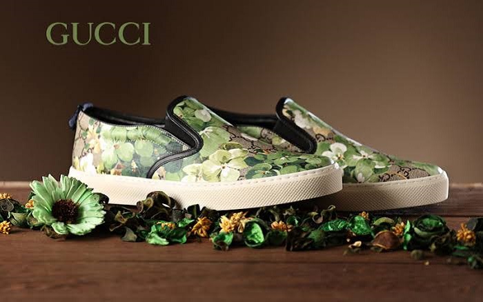
The GUCCI wordmark uses a custom serif typeface. Clean and classical.
The letters have moderate stroke contrast with refined serifs. Nothing flashy.
This typographic approach supports the brand’s positioning as established and trustworthy rather than trendy.
Spacing between letters (what designers call tracking) is generous. It gives the wordmark room to breathe and feel unhurried.
What Are the Hidden Meanings in the Gucci Logo?
The interlocking G’s create a shape resembling a chain link. This connects to Gucci’s equestrian roots.
Horses, bridles, metal hardware. The brand started making leather goods for riders.
Some see the overlapping letters as representing unity or partnership. Aldo Gucci never confirmed specific hidden symbolism, but the design invites interpretation. That ambiguity keeps people talking about it.
How Does the Gucci Logo Compare to Competitor Logos?
Luxury fashion brands share certain visual traits. Most favor clean lines and restrained color palettes.
Gucci’s interlocking monogram puts it alongside Louis Vuitton’s LV and Chanel’s interlocking C’s.
These brands all use founder initials as graphic devices. It works.
Comparative Analysis:
- Chanel: Interlocking C’s face outward (opposite of Gucci’s arrangement). More angular geometry. Both achieve instant recognition through initial-based monograms.
- Louis Vuitton: LV monogram stacks letters vertically rather than interlocking them. Different approach, same goal of creating an ownable symbol.
- Hermes: Uses a carriage and horse illustration rather than initials. More literal reference to equestrian heritage compared to Gucci’s abstract approach.
- Prada: Relies primarily on wordmark with minimal graphic element. Less monogram-focused than Gucci.
- Versace: Uses Medusa head as primary symbol. More figurative and mythology-based compared to Gucci’s typographic solution.
Among brands using black as their primary logo color, Gucci maintains distinctiveness through its specific letterform treatment.
What Are the Technical Specifications of the Gucci Logo?
Official Color Codes:
- Primary Black
- Hex: #000000
- RGB: (0, 0, 0)
- CMYK: (0, 0, 0, 100)
- Pantone: Black 6 C
- Signature Gold
- Hex: #C9A227
- RGB: (201, 162, 39)
- CMYK: (0, 19, 81, 21)
- Pantone: 117 C (approximate)
- Web Stripe Green
- Hex: #006633
- RGB: (0, 102, 51)
- CMYK: (100, 0, 50, 60)
- Web Stripe Red
- Hex: #CC0000
- RGB: (204, 0, 0)
- CMYK: (0, 100, 100, 20)
Dimensions and Proportions:
- Aspect Ratio: The double G symbol is approximately 1:1 (square). The wordmark varies based on application.
- Minimum Size: Gucci specifies minimum reproduction sizes to maintain legibility, typically no smaller than 10mm for print applications
- Clear Space: A protected area around the logo equal to the height of one G letter on all sides
- File Formats: Official assets provided in vector formats (AI, EPS, SVG) for scalability, plus raster formats for specific uses
What Cultural Impact Has the Gucci Logo Had?
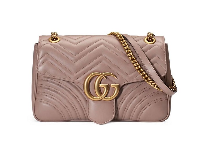
The double G has transcended fashion to become a cultural symbol.
Hip-hop artists embraced Gucci in the 1980s and 1990s. The logo appeared in lyrics, music videos, and became shorthand for success.
Counterfeiting, ironically, proves its cultural power. People want to display those interlocking letters whether real or fake.
The brand has collaborated with artists, appeared in films, and influenced streetwear. Its visual identity carries meaning beyond the products themselves.
How Does the Gucci Logo Fit Into the Overall Brand Identity?
The logo anchors a larger system of visual elements. Green-red-green stripes. The horsebit hardware. Flora prints.
All these pieces work together following brand guidelines that ensure consistency.
A Gucci product is recognizable even without the logo visible. That’s the mark of strong identity design.
The double G serves as the primary identifier, but it doesn’t carry the entire brand alone. Supporting elements create depth and flexibility across categories from handbags to home decor.
How Should the Gucci Logo Be Used?
Official Usage Guidelines:
- Do: Maintain clear space around the logo. Use approved color variations. Reproduce from official files only.
- Don’t: Stretch, rotate, or distort the logo. Add effects like shadows or gradients. Place on busy backgrounds that reduce legibility. Recreate the logo from scratch.
Accessing Official Assets:
Gucci provides logo files to authorized partners and press through dedicated portals. Unauthorized use constitutes trademark infringement.
Licensing:
Commercial use requires explicit permission from Gucci. The brand actively monitors and pursues unauthorized usage, particularly counterfeiting operations.
Trademark Protection:
The interlocking G design is registered in major markets worldwide. Gucci maintains legal teams dedicated to intellectual property protection. This includes monitoring online marketplaces, pursuing counterfeiters, and defending against dilution of the trademark.
FAQ on The Gucci Logo
What Does the Gucci Logo Mean?
The interlocking G design represents founder Guccio Gucci’s initials. Two letters mirror each other, creating a symmetrical monogram.
The symbol connects to the brand’s Florence origins and Italian craftsmanship heritage.
It signals luxury status and authentic quality to consumers worldwide.
Who Designed the Gucci Logo?
Aldo Gucci created the double G monogram in the 1960s. He was Guccio Gucci’s son and helped expand the brand internationally.
The design honored his father’s legacy while establishing a recognizable brand mark.
No external design agency was involved.
When Was the Gucci Logo Created?
The iconic GG symbol appeared during the mid-1960s. Before that, the Italian fashion house used a simple wordmark.
The exact year varies by source. Most cite 1963 to 1969 as the introduction period.
Why Does Gucci Use Two G’s?
The letters stand for Guccio Gucci, the founder who started the company in Florence in 1921.
Using initials as a luxury brand symbol was common among high-end fashion houses.
It created instant recognition and a distinctive visual identity.
What Font Does Gucci Use?
Gucci uses a custom typeface for its wordmark. The letters are serif-based with clean, classical proportions.
Some compare it to Granjon or similar traditional fonts.
The generous letter spacing gives it an unhurried, luxurious feel.
What Are the Official Gucci Colors?
Black serves as the primary logo color. It communicates sophistication and authority.
Gold appears on premium products and special editions.
The famous green-red-green web stripe acts as a secondary brand element, referencing equestrian heritage.
How Can I Tell if a Gucci Logo is Real?
Authentic Gucci logos have precise, even spacing between the interlocking G’s. The letters should be perfectly symmetrical.
Counterfeits often show uneven lines or incorrect proportions.
Check stitching quality and materials too. Real Gucci products meet strict standards.
Has the Gucci Logo Changed Over Time?
Yes. The logo evolution spans multiple decades.
Early versions featured only text. The double G monogram arrived in the 1960s.
Recent refinements improved digital reproduction while preserving the core design. The fundamental shape remains unchanged since Aldo Gucci’s original creation.
What Is the Gucci Web Stripe?
The green-red-green stripe originated from the brand’s equestrian roots. It references saddle girths and horse blankets.
This pattern appears alongside the GG canvas on many products.
It’s become as recognizable as the interlocking G itself.
Can I Use the Gucci Logo?
No. The Gucci trademark is protected worldwide.
Unauthorized commercial use constitutes infringement. The House of Gucci, now owned by Kering, actively pursues counterfeiters.
Only authorized partners receive official logo files through dedicated brand portals.
Conclusion
The Gucci logo remains a defining symbol in luxury fashion. Those interlocking G’s have represented Italian craftsmanship and premium quality for over six decades.
Aldo Gucci’s original design still works. It scales from tiny hardware to massive store signage without losing impact.
The brand identity extends beyond the monogram. Green-red-green stripes, the horsebit, GG canvas patterns. These elements create a complete visual system that consumers recognize instantly.
Few fashion house logos achieve this level of brand recognition. The double G earned its place among the most iconic designer emblems in history.

Renowned for his expertise in logo design and visual branding, Bogdan has developed a multitude of logos for various clients.
His skills extend to creating posters, vector illustrations, business cards, and brochures. Additionally, Bogdan's UI kits were featured on marketplaces like Visual Hierarchy and UI8.
He also wrote in the past years on sites like Design Your Way, WebDesignerDepot, WPDean, Designmodo, Speckyboy, Slider Revolution, and more.
- Versatile Work Sans Font Pairing for Every Project - 16 September 2026
- Organize Digital Files Like a Pro Before Your Next Client Handoff - 16 September 2026
- How to Set Up a Digital Menu Board: Hardware to Layout - 15 September 2026

Bogdan Sandu is a seasoned designer who has been designing websites since 2008. Renowned for his expertise in logo design and visual branding, Bogdan has developed a multitude of logos for various clients. His skills extend to creating posters, vector illustrations, business cards, and brochures. Additionally, Bogdan's UI kits were featured on marketplaces like Visual Hierarchy and UI8. He also wrote in the past years on sites like Design Your Way, WebDesignerDepot, WPDean, Designmodo, Speckyboy, Slider Revolution, and more.
You Might Also Like