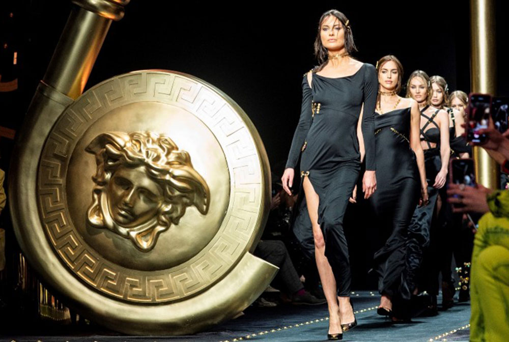
The Versace logo stands as one of fashion’s most recognized symbols. That golden Medusa head staring back at you from handbags, perfume bottles, and runway pieces? It’s been turning heads since 1978.
Gianni Versace built his Italian fashion house on boldness. The logo he chose reflects that perfectly. While other luxury brands played it safe with monograms and subtle crests, Versace went straight to Greek mythology.
The brand has gone through ownership changes, creative director shifts, and market fluctuations. Through all of it, that Medusa head remains unchanged. It’s become shorthand for a very specific kind of glamour: loud, confident, and unapologetically luxurious.
What is the Versace Logo?
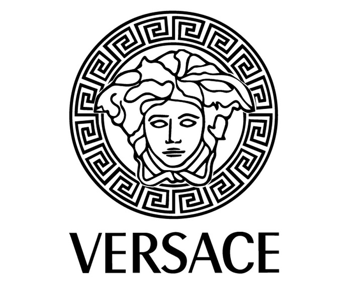
The Versace logo features the head of Medusa, a figure from Greek mythology, centered within a circular frame. Gianni Versace personally selected this design when founding his fashion house in 1978. The symbol represents the brand’s core philosophy of captivating beauty and bold confidence.
Design Attributes
- Design Type: Combination mark (symbol with wordmark)
- Primary Elements: Medusa head illustration, circular border, “VERSACE” wordmark
- Official Introduction Date: 1978
- Designer: Gianni Versace (personal selection and direction)
- Trademark Status: Registered trademark owned by Gianni Versace S.r.l., now under Capri Holdings
- Color Palette: Primary gold (#D4AF37), black (#000000), white (#FFFFFF)
- Usage Context: Apparel labels, accessories, fragrances, home goods, retail environments, digital platforms, advertising campaigns
How Has the Versace Logo Evolved Over Time?
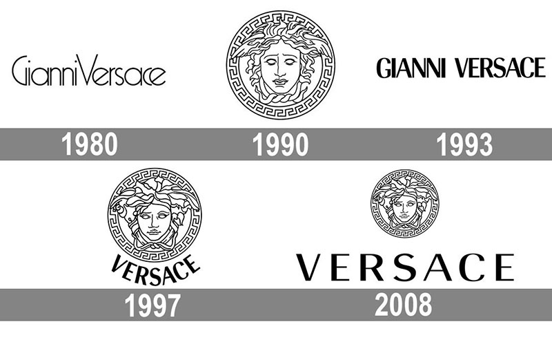
The Versace logo has remained remarkably consistent since 1978. Unlike many fashion houses that undergo periodic redesigns, Versace kept its Medusa virtually untouched.
Minor refinements occurred over the decades. These changes focused on proportions and rendering quality rather than conceptual shifts.
The wordmark saw slight typographic adjustments. But the core identity stayed intact through ownership transitions and creative leadership changes.
Original Versace Logo (1978-1993)
- Years Active: 1978-1993
- Design Description: Hand-drawn Medusa head with flowing serpent hair, set within a Greek key circular border, paired with bold sans-serif wordmark
- Color Scheme: Gold on black, black on white variations
- Designer: Gianni Versace with influence from classical Greek art
- Context: Launched alongside the brand’s founding in Milan, Italy
- Cultural Significance: Established immediate differentiation from conservative European luxury houses
Refined Versace Logo (1993-2008)
- Years Active: 1993-2008
- Design Description: Cleaned-up Medusa illustration with sharper details, refined circular frame
- Color Scheme: Maintained gold and black palette
- Key Changes from Previous: Improved line quality for better reproduction across media
- Context: Adapted for emerging digital applications while maintaining print quality
- Cultural Significance: Period of global brand expansion and celebrity associations
Contemporary Versace Logo (2008-Present)
- Years Active: 2008-Present
- Design Description: Digitally optimized Medusa with precise geometric construction, modernized wordmark spacing
- Color Scheme: Gold, black, white (expanded usage across colorways)
- Key Changes from Previous: Vector optimization for digital platforms, consistent proportions across all applications
- Context: Maintained through 2018 acquisition by Michael Kors (now Capri Holdings)
- Cultural Significance: Symbol of brand continuity despite corporate restructuring
What Do the Design Elements of the Versace Logo Mean?
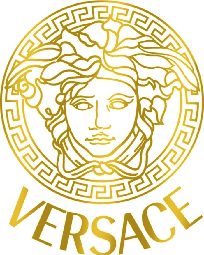
The Medusa head carries deep symbolic weight. In Greek mythology, Medusa possessed beauty so striking that viewers became paralyzed.
Gianni Versace interpreted this as the ultimate fashion compliment. He wanted people wearing his designs to stop others in their tracks.
The circular Greek key border adds historical gravitas. It connects the brand to classical Mediterranean heritage and timeless artistic traditions.
Why Did Versace Choose These Specific Colors?
Gold dominates the Versace visual identity. This choice aligns with the brand’s focus on opulence and luxury positioning.
Understanding color psychology explains why this works. Gold signals wealth, success, and premium quality across cultures.
- Gold (#D4AF37): Represents luxury, prosperity, and timeless elegance. Creates immediate premium perception.
- Black (#000000): Provides sophistication, power, and dramatic contrast. Grounds the gold elements.
- White (#FFFFFF): Offers versatility for varied applications. Maintains readability across backgrounds.
What Typography Style Is Used in the Versace Logo?
The wordmark uses a custom sans-serif font with generous letter spacing.
Characters appear bold yet refined. The letterforms have subtle curves that soften the overall impression.
This typography choice balances modernity with classical influences. It reads clearly at small sizes while maintaining elegance at large scales.
What Are the Hidden Meanings in the Versace Logo?
Gianni Versace grew up near ancient Greek ruins in Calabria, Italy. Those childhood experiences shaped his aesthetic sensibilities.
The Medusa selection was personal. He saw her as misunderstood, powerful, and unforgettable.
Some interpret the serpent hair as representing transformation and rebirth. Others see it as a warning against underestimating beauty’s power. The psychology of shapes in the circular border suggests completeness and protection.
How Does the Versace Logo Compare to Competitor Logos?
Most luxury fashion houses rely on monograms or founder initials. Think Chanel’s interlocking Cs or Louis Vuitton’s LV pattern.
Versace broke from this convention entirely. The Medusa head has more in common with car logos like Ferrari’s prancing horse than typical fashion branding.
This differentiation works. You can spot a Versace piece across a crowded room. That immediate recognition carries significant brand value.
Gucci eventually introduced animal motifs. Burberry has its knight. But Versace did it first in the modern luxury era, and the Medusa remains more visually striking than most competitors.
What Are the Technical Specifications of the Versace Logo?
Official Color Codes
- Versace Gold
- Hex: #D4AF37
- RGB: (212, 175, 55)
- CMYK: (0, 17, 74, 17)
- Pantone: 873 C
- Versace Black
- Hex: #000000
- RGB: (0, 0, 0)
- CMYK: (0, 0, 0, 100)
- Pantone: Black 6 C
Dimensions and Proportions
- Aspect Ratio: The Medusa emblem maintains a 1:1 ratio (circular)
- Minimum Size: 15mm width for print applications, 50px for digital
- Clear Space: Minimum padding equal to the height of the “V” in the wordmark on all sides
- Wordmark Placement: Centered below emblem with specific spacing ratios
What Cultural Impact Has the Versace Logo Had?
The Medusa head transcended fashion. It became a status symbol in hip-hop culture during the 1990s.
Artists from 2Pac to Bruno Mars have referenced Versace in lyrics. The logo appears in countless music videos and red carpet moments.
That green jungle dress Jennifer Lopez wore to the 2000 Grammys? It helped launch Google Images. The Versace Medusa was there, small but unmistakable.
The logo’s influence extends to streetwear collaborations, interior design, and even architecture. Palazzo Versace hotels use the Medusa as a unifying design element throughout their properties.
How Does the Versace Logo Fit Into the Overall Brand Identity?
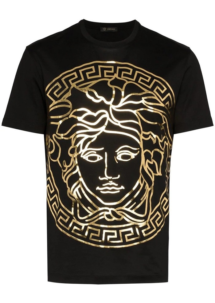
The Medusa works as an anchor point. Every Versace product, campaign, and retail space references this central symbol.
Their brand guidelines build outward from the logo. The Baroque patterns, bold prints, and golden hardware all connect back to that mythological foundation.
Store interiors feature Medusa motifs in flooring, fixtures, and architectural details. Packaging design consistently incorporates the emblem.
This creates what marketers call a “brand world.” Step into any Versace touchpoint, and you immediately know where you are.
How Should the Versace Logo Be Used?
Official Usage Guidelines
- Do: Maintain minimum clear space around the logo
- Do: Use only approved color combinations (gold/black, black/white, white/gold)
- Do: Scale proportionally without distortion
- Don’t: Alter the Medusa illustration in any way
- Don’t: Apply effects like shadows, gradients, or outlines
- Don’t: Place on busy backgrounds that reduce legibility
Accessing Official Assets
Authorized partners receive logo files through Versace’s brand portal. Press inquiries go through their media relations team.
The Medusa head and wordmark are registered trademarks. Unauthorized commercial use violates intellectual property law.
For editorial purposes, media outlets typically source approved imagery from official press releases or licensed image databases.
FAQ on The Versace Logo
What Does the Versace Logo Represent?
The Versace logo represents captivating beauty and bold confidence. The Medusa head symbol from Greek mythology embodies the brand’s philosophy.
Gianni Versace wanted his designs to mesmerize viewers. The logo captures that intent perfectly.
It signals luxury, power, and Italian fashion heritage.
Who Designed the Versace Logo?
Gianni Versace personally selected and directed the logo design in 1978. He drew inspiration from ancient Greek ruins near his childhood home in Calabria, Italy.
No external design agency created it. The founder’s vision shaped every detail of this luxury brand identity.
Why Did Versace Choose Medusa for Their Logo?
Medusa possessed beauty so powerful that onlookers turned to stone. Versace saw this as the ultimate fashion metaphor.
He wanted people wearing his clothes to stop others in their tracks. The Gorgon represents unforgettable allure.
It also connects to his Mediterranean roots.
When Was the Versace Logo Created?
The logo debuted in 1978 when Gianni Versace founded his Milan fashion house. It has remained virtually unchanged for over four decades.
Minor refinements improved reproduction quality. But the core Medusa head design stayed consistent through ownership changes and creative shifts.
What Colors Are in the Official Versace Logo?
Gold, black, and white form the primary color palette. Gold dominates most applications, appearing on products from fragrances to home goods.
These colors align with gold logos across the luxury sector. The combination signals premium positioning and timeless elegance.
Has the Versace Logo Changed Over Time?
The logo has stayed remarkably stable since 1978. Most Italian fashion houses redesign periodically. Versace resisted that trend.
Technical refinements occurred for digital optimization. Proportions were adjusted for better scaling.
The Medusa illustration itself? Essentially untouched.
What Is the Meaning Behind the Medusa Head?
In Greek mythology, Medusa was a Gorgon with serpent hair. Her gaze paralyzed anyone who looked at her.
Versace reframed this as positive. The logo suggests irresistible attraction rather than danger.
It represents transformation, power, and enduring beauty in fashion branding.
Is the Versace Logo Trademarked?
Yes. The Medusa emblem and wordmark are registered trademarks owned by Gianni Versace S.r.l., now under Capri Holdings.
Unauthorized commercial use violates intellectual property law. The brand actively protects its visual identity across global markets.
Why Is the Versace Logo So Recognizable?
The Medusa creates a strong focal point. Most luxury brands use monograms or initials. Versace chose a striking mythological figure instead.
This differentiation works. You can identify a Versace piece instantly.
Consistent application across decades built powerful brand recognition.
What Font Does Versace Use in Their Logo?
The wordmark uses a custom typeface with bold, clean letterforms. Generous spacing between characters adds sophistication.
The font balances modern simplicity with classical influences. It reads clearly at any size while maintaining the brand’s luxurious feel.
Conclusion
The Versace logo has done something rare in fashion branding. It turned a mythological figure into a globally recognized symbol of luxury.
From Milan runways to streetwear collaborations, the Medusa emblem maintains its power. Donatella Versace has preserved her brother’s vision while expanding the brand’s reach.
The golden Medusa works because it breaks conventions. While competitors rely on monograms, Versace chose storytelling.
That 1978 design decision still pays off. The logo remains a defining piece of haute couture visual identity and premium fashion heritage.

Renowned for his expertise in logo design and visual branding, Bogdan has developed a multitude of logos for various clients.
His skills extend to creating posters, vector illustrations, business cards, and brochures. Additionally, Bogdan's UI kits were featured on marketplaces like Visual Hierarchy and UI8.
He also wrote in the past years on sites like Design Your Way, WebDesignerDepot, WPDean, Designmodo, Speckyboy, Slider Revolution, and more.
- Versatile Georgia Font Pairing for Timeless Layouts - 24 October 2026
- How to Turn Inconsistent UI into One Design System (Without a Full Redesign) - 24 October 2026
- Beautiful Fonts Similar to Poppins You Should Try - 22 October 2026

Bogdan Sandu is a seasoned designer who has been designing websites since 2008. Renowned for his expertise in logo design and visual branding, Bogdan has developed a multitude of logos for various clients. His skills extend to creating posters, vector illustrations, business cards, and brochures. Additionally, Bogdan's UI kits were featured on marketplaces like Visual Hierarchy and UI8. He also wrote in the past years on sites like Design Your Way, WebDesignerDepot, WPDean, Designmodo, Speckyboy, Slider Revolution, and more.
You Might Also Like