


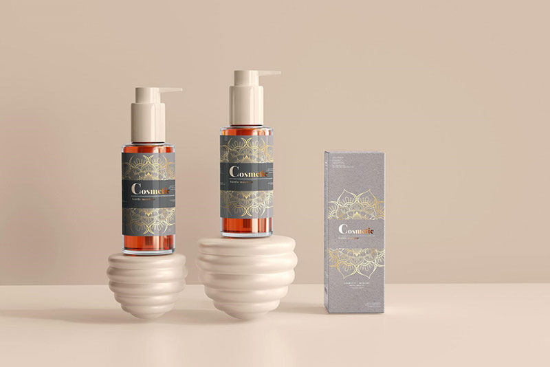
How to Create Wrap-Around Label Designs for Tube-Shaped Packaging: 7 Tips
Crafting a captivating label design for tube-shaped packaging can be as exhilarating as it is challenging. As your product hits the shelves, its packaging is the first point of communication with potential buyers, playing a vital role in telling your brand’s story.
In this ever-competitive market, your tube’s label must not only look exceptional but also meet practical considerations and comply with legal standards. From understanding your canvas to embracing the elegance of negative space, we’ll explore how to combine aesthetic appeal with functional savvy to create a design that truly stands out in crowded retail spaces.
How to Create Label Designs for Tube-Shaped Packaging
Dive into the art of label designs for tube-shaped packaging with these insightful tips that blend practicality and compliance, ensuring your product stands out while meeting industry standards.
1. Understand Your Canvas
Creating a label for a tube presents unique challenges and opportunities that you must account for in your design process. A tube doesn’t offer a flat, straightforward surface, meaning that your design needs to be flexible enough to accommodate this shape without distorting the image.
Consider the entire surface area as a potential space for your messaging, from the cap down to the seam where it ends. The seam is particularly important as it’s often the least attractive part of your package. It’s possible to make your packaging unique, you just need some creativity.
2. Choose the Right Material
When deciding on the right material for your labels, it’s vital to match functionality with visual appeal. If you’re packaging items that need to be secured from children, such as child-resistant pre roll tubes, choosing a durable material that can handle frequent handling is key. These materials also need to accommodate necessary safety features like tamper-evidence.
For an aesthetically striking finish, glossy or matte options can highlight your design while resonating with the product’s branding. Always consider how the texture and sheen of a wrap-around label’s material will affect both user experience and shelf presence.
3. Know What Information is Important
When designing your tube-shaped packaging label, prioritizing information is crucial. You must identify the most vital details that need to stand out to consumers at first glance. Brand name, product type, and key features or benefits often take center stage for this reason.
Besides the captivating elements, there’s essential information that shouldn’t be overlooked, like ingredients, usage instructions, company contact details, and regulatory compliance symbols. These must be perfectly legible and accessible upon closer inspection by interested consumers.
4. Factor in Legal Requirements
Regardless of how creative or eye-catching your label is, it must adhere to industry-specific regulations and legal requirements. These often include listing ingredients, providing usage instructions, and ensuring that any claims made on the packaging are truthful and substantiated.
Incorporate space in your design for required information such as barcodes, expiration dates, and company contact details. Check with a legal expert or regulatory body before finalizing your design to ensure that all bases are covered and prevent future complications with the law.
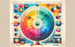
5. Use Colors Wisely
Choosing the right color palette is a pivotal decision in label design for tube-shaped packaging. Colors have the power to evoke emotions and convey brand identity, making it essential to select hues that align with your product’s ethos and appeal to your target customer.
Beyond aesthetics, consider functionality, as different colors behave differently when printed. Testing prints beforehand ensures reliability in production runs. Make sure to factor in how colors will wrap around the tube, maintaining consistency from every angle on display.
6. Embrace Negative Space
Negative space, or the ’empty’ areas around design elements, is a powerful tool in label design. It helps to avoid a cluttered look and can be used to draw attention to certain components of your label. Proper use of negative space gives your packaging a clean, professional look.
Taking advantage of negative space also allows for better flexibility in your designs, offering relief where detailed imagery or dense text could overwhelm the senses. This intentional use of emptiness often communicates sophistication that can elevate your product’s perception.
7. Work with a Professional Printing Company
Selecting the right printing partner is quintessential to bringing your label design to fruition. A professional printing company possesses not only the machinery capable of high-quality prints but also a wealth of knowledge regarding materials and processes that suit your product.
A reliable printer will guide you through selecting the best materials and finishes for your design, considering factors like durability, texture, and application technique. They can provide proofs to fine-tune color accuracy and catch potential issues before mass production.
In Conclusion…
Now that you’re equipped with these tips on creating label designs for tube-shaped packaging, it’s time to turn your creative vision into reality. Remember, every decision from color to typography will speak volumes about your brand. Never discount the power of a well-designed label, as it can captivate your target audience, and set your product apart from competitors.
Bogdan Sandu, a seasoned designer with 15 years of diverse experience, has been designing websites since 2008.
Renowned for his expertise in logo design and visual branding, Bogdan has developed a multitude of logos for various clients.
His skills extend to creating posters, vector illustrations, business cards, and brochures. Additionally, Bogdan's UI kits were featured on marketplaces like Visual Hierarchy and UI8.
Latest posts by Bogdan Sandu (see all)
- The Amstel Logo History, Colors, Font, And Meaning - 3 May 2024
- Deep Dive: Sea Color Palettes for Tranquil Designs - 3 May 2024
- The Stella Artois Logo History, Colors, Font, And Meaning - 2 May 2024