Imagine your fingertips grazing the surface of your smartphone, summoning the potential for romance with a mere swipe.
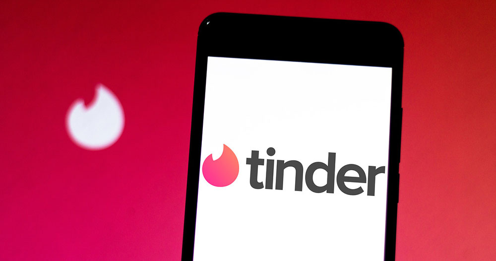
That’s where the Tinder font-an unsung hero-dances on the pixel stage, shaping first impressions and unseen desires. In this digital theater, typography wields a silent power, swaying decisions before a single word is spoken aloud.
In the canvas of online encounters, visual identity carves the first whispers of connection.
I’ll guide you through a tapestry woven from the sans-serif family, shedding light on how typography influences the user experience design within a Graphical User Interface. We’ll delve into the alchemy where font readability meets the urgency of love and likeness.
By article’s end, an exploration of font choice will have unfolded-a journey across the landscape of mobile app typography, holding the key to understanding why every curve and line of the Tinder font commands attention, setting hearts aflutter in the kingdom of mobile user interface design.
The Tinder font
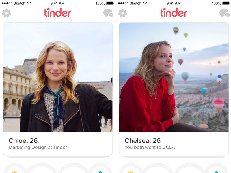
The font used is actually the Gotham Rounded font. This is a version of the well-known Gotham typeface. It has rounded corners that make it warm and friendly compared with the strong and authoritative. It is available in 4 weights. The number is lower compared with the eight weights that are available in the non-rounded version.
The main Gotham Family is a sans-serif typeface. The designer behind it is Tobias Frere Jones and he released it back in 2000. Gotham’s letterforms are inspired by architectural designs from the twentieth century.
It is a very big family that can be used for different kinds of projects. Back in 2007, a rounded version was also added because of a commission from a print magazine. So, this is the short history of the Tinder font.
Tinder font alternatives that you can try
Montserrat
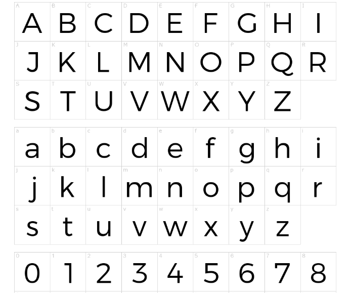
This Tinder font alternative was designed by Julieta Ulanovsky. She is an Argentinian designer and her inspiration was her own neighborhood from Buenos Aires. Monsterrat is also used by designers when they want something familiar like Gotham and Proxima Nova. But we do consider that it has a more one of a kind typeface compared with the other two.
Proxima Nova
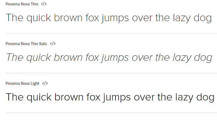
As it was released in 2005 Proxima Nova is still a new font. It gained a lot of popularity and the designer behind is Mark Simonson. Graphic designers consider it a hybrid that has a geometric style together with modern proportions.
As it is so used sometimes you get the feeling that this Tinder font is quite overused. However, there is no denying the fact that it can be an excellent choice. This is for sure the reason why it is so popular.
The font is available in seven weights – thin, light, regular, semibold and black. Each of them has also the italics in small caps styles.
Quicksand Bold font




If you are still wondering what font tinder uses well the answer is that a similar one to Quicksand. We do like this version because of its geometric-style and clearness. You can use it for sure in logo design projects but also for printing. If you don’t believe us, download it now and see how it is going to look in your designs.
Multicolore font
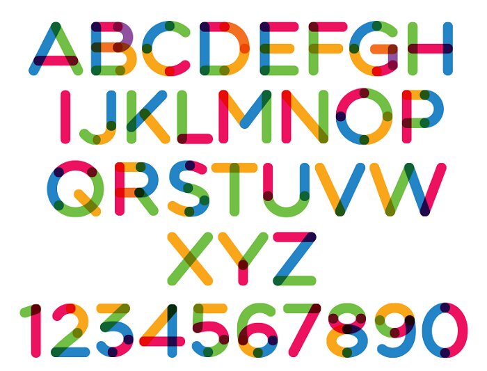
Having a Tinder logo font that looks more or less the same is a great advantage. Multicolore really looks similar and it can be used in your design projects right away!
Ebnor Bold font




Get this Tinder font alternative if you want one that is easy to install. It works great in various design projects.
Nunito-Regular font
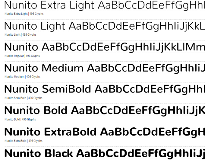
This is another sans serif typeface font that comes with 2 versions to choose from. You will love them both and you will be closer to get a matching flames font like in the Tinder logo.
Scramble Mixed font



A modern looking font that can be spotted easily due to its similarity to the Tinder font. Download it and see for yourself.
Geogrotesque
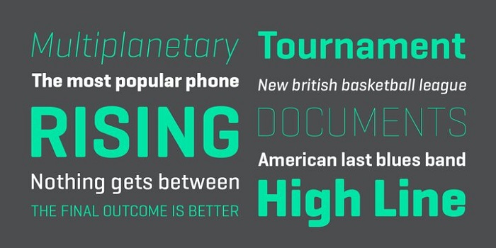
This is a modular font that has a rounded typeface. All of its characters adapt easily to different texts. Because of the rounded style, you feel a warmer appearance coming from it.
It’s easy to install and you shouldn’t waste any time with it. It also has 14 styles together with 7 weights that wait to be used. Go for it right away and see how you can adapt it.
Armitage
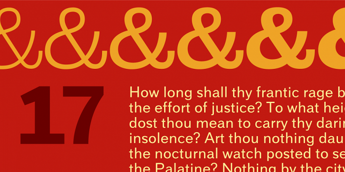
This is a sans-serif typeface that was made by James Puckett. It got launched back in 2010 and the design was inspired by vintage lettering from the nineteenth century!
It has multi-language support together with Greek and Cyrillic. You also get different alternate characters to use. What you will enjoy a lot are also the weights you get with it from think to black.
Proxima Soft
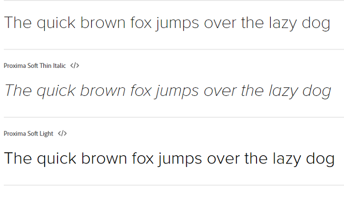
The Proxima Soft is a similar Tinder font that can be used in your projects. You can also combine it with other ones when you want to get a more unique look. It includes Greek and Cyrillic and it also alternates characters that can let you customize it.
Bryant
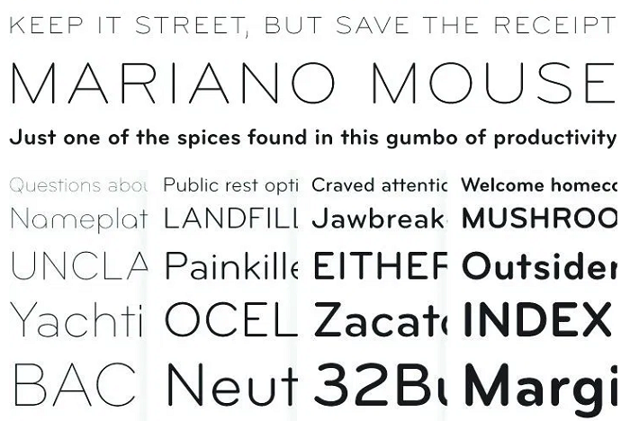
Consider Bryan a geometric sans-serif typeface that was created by Eric Olson. If you want to make designs that include similar Tinder font it can be a real option for you to choose.
DIN Round
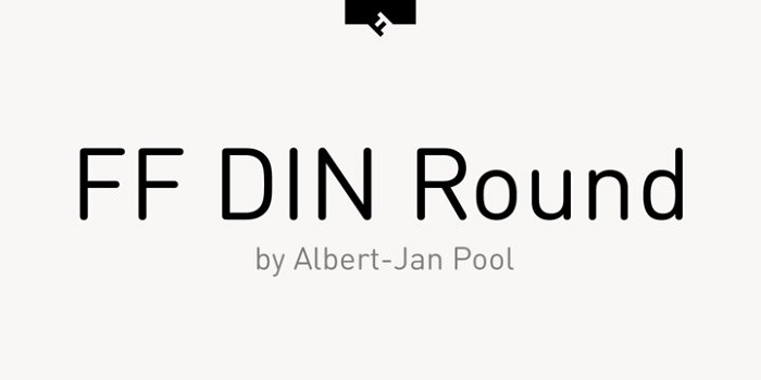
Let’s check this version of Tinder font that seems to be quite good looking. It gives warmth to your designs and it comes in five weights.
Gibson
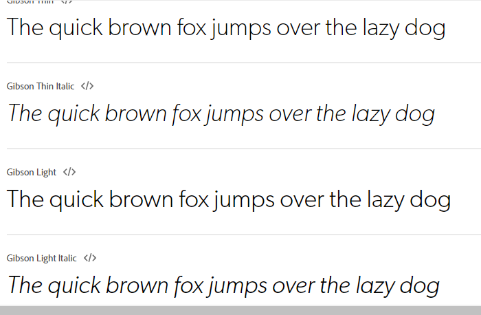
We conclude our Tinder font alternatives with the Gibson. This is a sans-serif typeface that was created in 2011 by Canadian designer Rod McDonald. It includes four weights that are very useful and you can download it at any time.
FAQ On The Tinder Font
What Typeface Does Tinder Use?
The heart of Tinder’s visual dialogue beats with a bespoke version of the sans-serif typeface. You can’t snag it off the digital shelves-it’s tailored, cut from the cloth of exclusivity for Tinder’s brand. It’s a nod to modern aesthetics with a flare for legible, inviting character design.
Is Tinder’s Font Available for Public Use?
Regretfully, for typography enthusiasts, Tinder’s font isn’t up for grabs. The one you see in the app is custom-made-a suit that fits only Tinder’s brand identity. It doesn’t sit among freely available web fonts, instead it serves the unique visual identity of Tinder.
What Makes Tinder’s Typeface Distinct?
Just like the spark of a new romance, Tinder’s typeface is sleek and approachable. Custom-made, its uniqueness lies in the balance between font readability and personality, presenting an uncluttered user interface optimized for brisk, intuitive interactions.
It’s the backbone of a seamless user experience design.
Can I Use a Similar Font for My Project?
Absolutely, there’s a variety of accessible sans-serif fonts out there, akin to Tinder’s bubbly vibe. Fonts like Open Sans or Montserrat share that clean and modern feel, and they’re versatile contenders ready to slip into the role across various digital branding and design projects.
How Does Tinder’s Typography Affect User Experience?
Every letter in Tinder’s typeface is a silent conductor, orchestrating a mobile user interface that’s intuitive. It utilizes the principles of typographic branding-symmetry, clarity, and simplicity.
They’re the unsung heroes that enhance usability, tailoring a digital experience that’s as smooth as swiping right.
Is There a Reason for Tinder Using a Sans-Serif Font?
Sans-serif fonts spell out today’s digital language-crisp, clean, distraction-free. They embody simplicity and readability, quintessential in Tinder’s environment, where seconds decide fates.
It’s about maintaining clarity, optimizing for scale on various devices, ensuring that typographic hierarchy is maintained-key to any mobile app development.
How Do I Optimize Font Selection for a Dating App Like Tinder?
Imagine crafting a heartfelt message, the font is your penmanship. Font choice is critical-it conveys mood, tone, brand ethos. Opt for legibility and personality.
Consider how font pairing aligns with your app’s character. And remember, in the online dating market, where impressions race, your typeface is your handshake.
How Can Typography Influence Brand Recognition in Apps?
It whispers the values of a brand without a sound. Digital typography weaves a story, indulges emotions, breeds familiarity.
When you scroll Tinder, the font is a subtle guide through your journey of match-matching-effortlessly reinforcing brand recognition, imprinting on memory with every swipe.
What’s the Impact of Font Licensing in App Development?
Font licensing matters. It’s the legal compass guiding use of typefaces. With Tinder’s font being exclusive, it’s a reminder to tread thoughtfully in the forest of font download options.
Always pilot your app’s typographic course with respect to the creators-honor their craft, protect your project.
Will Tinder’s Font Change Over Time?
Change is the only constant, and that might hold true for a font’s lifespan. Trends evolve, app design aesthetics shift.
Should Tinder’s font transform, it’ll likely be to refine user interface design or adapt to new technological realms like Web Font Performance. Only time will tell.
Conclusion
In the tapestry of user interfaces, the Tinder font stands as a beacon of modernity and elegance. Weaving through the very fabric of human interaction, it partners with the app’s mechanics to foster connections with a grace that’s both seen and felt.
- It’s a marriage of form and function.
- It demonstrates how a bespoke typeface can set the pace for brand identity.
- It shows the power of typography to craft an experience that goes beyond mere visuals.
As we conclude, let it be a reminder: typography isn’t just a vehicle of text. It’s a translator of emotion, a silent orator of the brand’s tale. In the world of swipes and fleeting digital encounters, the right font choice is the whisper that lingers. Always choose wisely, for in the realm of digital branding and app development, these choices are the stitches in the seams of user experience design.
If you enjoyed reading this article about the Tinder fonts, you should read these as well:
- Google font pairings: Font combinations that look good
- Best free fonts for logos: 72 modern and creative logo fonts
- Fun happy birthday fonts you can download with a click

Renowned for his expertise in logo design and visual branding, Bogdan has developed a multitude of logos for various clients.
His skills extend to creating posters, vector illustrations, business cards, and brochures. Additionally, Bogdan's UI kits were featured on marketplaces like Visual Hierarchy and UI8.
He also wrote in the past years on sites like Design Your Way, WebDesignerDepot, WPDean, Designmodo, Speckyboy, Slider Revolution, and more.
- The Windsurf Logo History, Colors, Font, And Meaning - 10 October 2026
- How to Remove Background From Product Photos (No Photoshop) - 10 October 2026
- How Designers can Build a Stronger Online Creative Identity - 9 October 2026

Bogdan Sandu is a seasoned designer who has been designing websites since 2008. Renowned for his expertise in logo design and visual branding, Bogdan has developed a multitude of logos for various clients. His skills extend to creating posters, vector illustrations, business cards, and brochures. Additionally, Bogdan's UI kits were featured on marketplaces like Visual Hierarchy and UI8. He also wrote in the past years on sites like Design Your Way, WebDesignerDepot, WPDean, Designmodo, Speckyboy, Slider Revolution, and more.
You Might Also Like