The Wegmans logo is the official visual mark of Wegmans Food Markets, a family-owned supermarket chain headquartered in Rochester, New York. It functions as a wordmark-based brand identifier that communicates quality, trust, and regional pride. The logo has remained largely consistent for decades, reflecting the company’s stability and deep customer loyalty across the northeastern United States.
Within grocery retail branding history, Wegmans occupies an unusual position. Most large chains have gone through aggressive rebrands. Wegmans hasn’t needed to. The logo has evolved subtly rather than dramatically, which actually says a lot about how confident the brand is in its identity.
The current logo uses a clean, custom-styled wordmark in green. It was refined in the early 2000s and has been in consistent use since. No external design agency has been publicly credited. The Wegman family has historically kept brand decisions in-house. The company was founded in 1916 by John Wegman in Rochester, and the logo has gone through roughly three to four distinct iterations over its century-long history.
What Is the Wegmans Logo?
The Wegmans logo is a green wordmark featuring the company name in a custom rounded typeface. Introduced in its current refined form in the early 2000s, it uses a deep green as the primary color. The design reflects freshness, quality food retail, and the brand’s family-owned heritage.
- Design Type: Wordmark (text-only logotype)
- Primary Elements: Custom rounded sans-serif typography, no standalone icon or symbol
- Official Introduction Date: Current version refined circa early 2000s; original wordmark dates to mid-20th century
- Designer/Agency: Developed internally; no public third-party agency credit
- Trademark Status: Registered trademark of Wegmans Food Markets, Inc.
- Color Palette: Primary green (#006938 approximately), white for reverse applications
- Usage Context: Store signage, product packaging, digital platforms, marketing materials, uniforms, and private-label goods
How Has the Wegmans Logo Evolved Over Time?
![]()
The Wegmans logo has gone through several quiet updates since the chain’s founding in 1916. Each version moved toward cleaner, more modern typography while keeping green as the core color. No single redesign was dramatic, but the cumulative shift from ornate lettering to today’s streamlined wordmark is significant.
Original Wegmans Logo (1916-1950s)
- Years Active: 1916 to approximately the 1950s
- Design Description: Script-influenced lettering with decorative styling typical of early 20th-century retail signage
- Color Scheme: Limited color, primarily used in black and red for print applications
- Designer: Unknown; likely produced by a local sign or print shop
- Context: John Wegman opened the original Rochester Fruit and Vegetable Company in 1916. Branding at this stage was purely functional
- Key Changes from Previous: N/A, first iteration
- Cultural Significance: Represented a small local grocer with no regional ambitions yet
Mid-Century Wegmans Logo (1950s-1970s)
- Years Active: 1950s to approximately the 1970s
- Design Description: Bolder block lettering, moving away from script toward a more structured wordmark
- Color Scheme: Green begins appearing consistently as the brand color during this period
- Designer: Unknown
- Context: Wegmans was expanding beyond Rochester. The brand needed something more scalable for larger store formats
- Key Changes from Previous: More legible at scale, less ornamental
- Cultural Significance: Marked Wegmans’ growth from neighborhood store to regional chain
Transitional Wegmans Logo (1970s-1990s)
- Years Active: 1970s to approximately the 1990s
- Design Description: A more defined sans-serif wordmark with slight stylization in the letterforms
- Color Scheme: Green solidified as the dominant brand color
- Designer: Unknown
- Context: Wegmans was establishing itself as a premium grocery experience, differentiating from discount chains
- Key Changes from Previous: Cleaner letterforms, more consistent application across signage and print
- Cultural Significance: The green-first identity started building real recognition across New York and Pennsylvania
Current Wegmans Logo (Early 2000s-Present)
- Years Active: Early 2000s to present
- Design Description: Refined custom rounded wordmark in deep green. Clean, approachable, and highly legible
- Color Scheme: Deep green (#006938 approx.), white reverse version for dark backgrounds
- Designer: Internal brand team
- Context: Wegmans was growing into new Mid-Atlantic markets and needed a logo that held up across digital platforms as well as large-format store facades
- Key Changes from Previous: Smoother letterforms, more consistent weight, better digital adaptability
- Cultural Significance: This version became the face of one of the most beloved grocery brands in the U.S., consistently ranking as a top employer and customer favorite
What Do the Design Elements of the Wegmans Logo Mean?
![]()
The Wegmans logo communicates quality and approachability through minimal means. The rounded letterforms avoid feeling corporate or cold. The green signals freshness and a connection to food and nature. There’s no symbol or icon, which puts full weight on the name itself as the brand asset.
That’s actually a deliberate choice. When your name carries enough recognition, you don’t need a mascot or abstract mark to do the work.
What Does the Shape and Style of the Wegmans Logo Represent?
The rounded edges in the custom typeface make the logo feel welcoming rather than rigid.
It avoids the sharp geometry you see in discount retail branding.
The wordmark-only approach places full trust in the Wegmans name itself as the primary brand signal.
This is consistent with design emphasis principles, where one element carries all the visual weight.
Why Did Wegmans Choose These Specific Colors?
- Deep Green
- Hex: Approximately #006938
- Pantone: Close to Pantone 349 C
- Symbolic meaning: Freshness, nature, healthy food
- Psychological impact: Builds trust, signals organic and quality associations
- Brand connection: Green is heavily used across grocery store logos, but Wegmans’ specific deep shade reads as more premium than the bright greens used by budget competitors
- White (reverse application)
- Hex: #FFFFFF
- Symbolic meaning: Cleanliness, simplicity
- Psychological impact: Reinforces a sense of freshness and hygiene, both relevant in food retail
- Brand connection: Used on green backgrounds across store signage and uniforms
What Typography Style Is Used in the Wegmans Logo?
The Wegmans wordmark uses a custom rounded typeface that doesn’t match any widely available retail font exactly.
The letterforms have consistent stroke weight with slightly softened terminals. It reads as a sans-serif font family, leaning toward humanist rather than geometric.
The typography prioritizes legibility at large scale, which makes sense for a brand that appears primarily on building facades and store signage.
Over time, the letterforms have gotten cleaner and slightly more uniform, losing some of the hand-crafted irregularity of earlier versions.
What Are the Hidden Meanings in the Wegmans Logo?
There are no confirmed hidden symbols or subliminal elements in the Wegmans logo.
Unlike logos that embed arrows, smiles, or faces into negative space, the Wegmans mark is straightforward.
The main intentional signal is in the color. Deep green in food retail is shorthand for quality and freshness, and Wegmans has used that association consistently for decades.
Some customers read the rounded letterforms as a nod to warmth and family, which aligns with the company’s family-owned positioning. Whether that was intentional or just a byproduct of the style choice is hard to say.
How Does the Wegmans Logo Compare to Competitor Logos?
Wegmans uses a clean green wordmark with no icon. Most major grocery competitors rely on a combination mark or symbol alongside text. Wegmans’ restraint actually sets it apart, signaling confidence in name recognition rather than needing a visual shorthand.
Here’s how Wegmans stacks up against key competitors in terms of logo design approach:
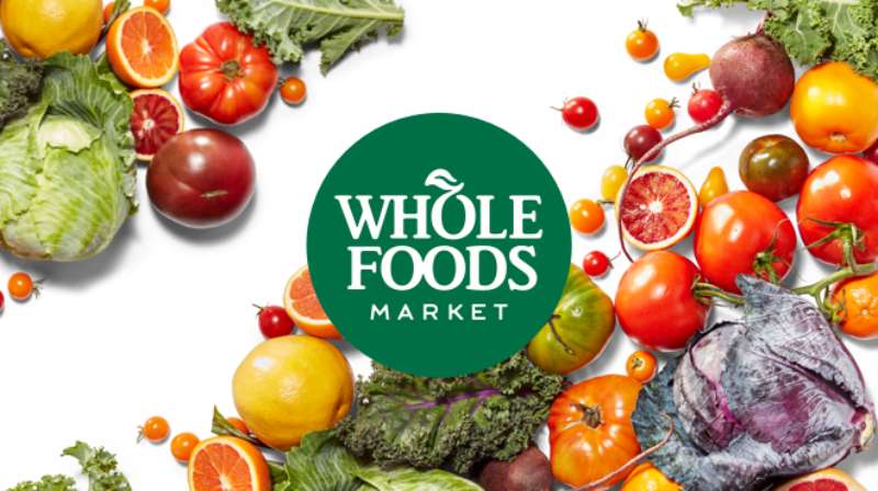
- Wegmans vs. Whole Foods Market: Both use green and wordmark-forward designs. Whole Foods adds a leaf motif to reinforce its organic positioning. Wegmans skips the icon entirely, relying purely on typography
- Wegmans vs. Kroger: Kroger uses a combination mark with a stylized “K” and a sweeping underline. More dynamic, but also busier. Wegmans is quieter by comparison
- Wegmans vs. Publix: Publix uses a green wordmark too, with a distinctive script-influenced font. The two logos share color territory but differ sharply in typographic tone
- Wegmans vs. Trader Joe’s: Trader Joe’s leans into a hand-drawn, almost vintage aesthetic. Wegmans is more polished and corporate by comparison, which suits its larger store format
- Wegmans vs. Safeway: Safeway has leaned into red and black in recent years, a deliberate move away from grocery-green. Wegmans has stayed the course with green, doubling down on the association
The pattern across the industry is clear. Green dominates grocery branding because of its food and freshness associations. Within that crowded space, Wegmans differentiates through the depth of its green and the simplicity of its wordmark-only approach.
What Are the Technical Specifications of the Wegmans Logo?
Official Color Codes
- Primary Color: Deep Green
- Hex: #006938
- RGB: (0, 105, 56)
- CMYK: (100, 0, 47, 59) approximately
- Pantone: Approx. 349 C
- Secondary Color: White
- Hex: #FFFFFF
- RGB: (255, 255, 255)
- CMYK: (0, 0, 0, 0)
- Used in reverse logo applications on green backgrounds
Dimensions and Proportions
- Aspect ratio: Horizontal wordmark; wider than tall, roughly 4:1 width-to-height ratio
- Minimum size: Not publicly documented, but standard brand practice suggests no smaller than 1 inch wide in print to maintain legibility
- Clear space: Typically one cap-height of clear space on all sides recommended for wordmark logos of this type
- File formats available: Wegmans provides press assets including vector graphics formats (EPS, SVG) and raster formats (JPEG, PNG) through media request channels
- Resolution: Print files are supplied at 300 DPI minimum; digital assets at 72-96 PPI
- Official usage guidelines: Wegmans does not publish a fully open brand guide. Logo assets are available to press and partners through official media contacts
What Cultural Impact Has the Wegmans Logo Had?
The Wegmans logo has become shorthand for a grocery experience that goes beyond commodity shopping. It signals a store where people actually want to spend time. That’s unusual in food retail, and the logo carries that association every time it appears.
Wegmans regularly tops “best places to work” and “favorite grocery store” lists in the U.S. The logo appears on merchandise that customers actively buy, which is something very few grocery brands can say.
When Wegmans opens a new location, it generates genuine public excitement. The logo shows up on social media, local news, and community forums before the store even opens. That kind of brand energy doesn’t come from advertising alone. It comes from years of the logo being associated with a consistently good experience.
The green wordmark has also become a regional identity marker in New York, Pennsylvania, New Jersey, and Virginia. For people who grew up shopping at Wegmans, seeing the logo triggers strong nostalgic associations. That’s the kind of color psychology and brand memory that most retailers spend decades trying to build.
How Does the Wegmans Logo Fit Into the Overall Brand Identity?
The Wegmans logo sits at the center of a tightly controlled brand system. The deep green from the wordmark runs through store interiors, staff uniforms, private-label packaging, and digital platforms. Everything connects back to that single color anchor.
The brand guidelines extend beyond the logo into how departments are signed, how products are shelved, and how the prepared foods sections are presented. The logo is just the entry point.
Wegmans’ private-label line, which covers hundreds of products, uses the wordmark consistently across packaging. That repetition builds enormous recognition at the shelf level.
The digital presence, including the Wegmans app and website, keeps the same green-and-white palette. The logo scales cleanly from a small app icon to a 20-foot building sign, which is a real test of how well a wordmark actually works.
Compared to competitors, Wegmans has unusually strong brand style guide consistency for a privately held company. Most family-owned regional chains show cracks in their visual identity over time. Wegmans has avoided that.
How Should the Wegmans Logo Be Used?
Official Usage Guidelines
- Do: Use the logo in its approved green or white reverse versions only
- Do: Maintain clear space around the wordmark at all times
- Do: Use vector files for print and large-format applications to avoid quality loss
- Do not: Alter the color, stretch the proportions, add drop shadows, or place the logo on busy photographic backgrounds without proper contrast
- Do not: Recreate the logo from scratch using a similar-looking font. The wordmark is custom and trademarked
- Do not: Use the logo to imply endorsement or partnership without written authorization from Wegmans Food Markets, Inc.
Where to Access Official Logo Files
- Media and press logo assets can be requested through the Wegmans corporate communications team via their official website
- Vendor and partner usage requires written brand approval from Wegmans directly
- Unofficial sources offering Wegmans logo downloads (third-party stock sites, fan sites) are not authorized and may not provide current or accurate files
Trademark and Licensing
- The Wegmans name and logo are registered trademarks of Wegmans Food Markets, Inc.
- Unauthorized commercial use of the logo, including on merchandise, social media ads, or third-party packaging, is a trademark violation
- Editorial and journalistic use (such as news articles or design analysis) generally falls under fair use, but commercial applications require explicit permission
- Font licensing is not applicable here since the Wegmans wordmark uses a custom typeface, not a commercially available font
FAQ on The Wegmans Logo
What colors does the Wegmans logo use?
The Wegmans logo uses a deep green, approximately hex #006938.
A white reverse version exists for use on dark backgrounds. No other official colors are part of the Wegmans color scheme. The palette is intentionally minimal.
What font is used in the Wegmans logo?
The Wegmans wordmark uses a custom rounded typeface. It is not a publicly available font.
The letterforms read as a humanist typeface, with consistent stroke weight and softened terminals. You cannot replicate it with standard retail fonts.
Has the Wegmans logo ever changed?
Yes, several times. The Wegmans logo evolution spans from ornate mid-century lettering to today’s clean wordmark.
Each update was subtle. No single redesign was dramatic, but the cumulative shift over roughly four iterations is clear if you compare early signage to the current version.
Who designed the Wegmans logo?
No external design agency has been publicly credited for the current logo.
Wegmans has historically kept brand decisions internal. The Wegmans corporate identity is managed in-house, which is consistent with the company’s family-owned operating philosophy.
What does the Wegmans logo symbolize?
The deep green signals freshness, quality, and a connection to food and nature.
The rounded wordmark adds warmth. Together, these choices reflect the brand’s positioning as a premium but approachable color palette within the food retail sector.
Is the Wegmans logo trademarked?
Yes. The Wegmans name and logo are registered trademarks of Wegmans Food Markets, Inc.
Commercial use without written authorization is a violation. Editorial and journalistic use generally falls under fair use, but anything involving merchandise or advertising requires direct approval from the company.
Where can I download the official Wegmans logo?
Official logo files are available through Wegmans’ corporate communications team via a direct media request.
Third-party sites offering Wegmans logo downloads are not authorized. For accurate, current files, always go to the source. Using unofficial versions risks using outdated or incorrect Wegmans logo variations.
What file formats is the Wegmans logo available in?
Press assets typically include vector formats like EPS and SVG for print, plus raster formats like PNG and JPEG for digital use.
Print files are supplied at 300 DPI minimum. The pixel-based versions work for web and app contexts where vector is not supported.
How does the Wegmans logo compare to other grocery store logos?
Most major grocery chains pair a wordmark with an icon or symbol. Wegmans uses a wordmark only, which is less common at this scale.
The Wegmans visual identity relies entirely on name recognition, similar in confidence to brands like Walmart, though the two logos differ sharply in color and tone.
Why does Wegmans use green in its logo?
Green is the dominant color in food retail branding because of its association with freshness and nature.
Wegmans uses a darker, richer shade than most competitors, which reads as more premium. This ties directly into color theory principles around saturation and perceived brand value in the grocery sector.
Conclusion
The Wegmans logo is a clear example of how grocery store branding can stay consistent and still feel current across decades.
No mascot, no icon, no gimmick. Just a clean green wordmark that has built genuine recognition across every market Wegmans has entered.
The Wegmans brand identity system works because it’s disciplined. The logo color, typography, and usage guidelines all point in the same direction, reinforcing the same message at every touchpoint.
For anyone studying food retail logo design or supermarket visual branding, Wegmans is worth looking at closely. Sometimes the most effective approach is also the simplest one.
Renowned for his expertise in logo design and visual branding, Bogdan has developed a multitude of logos for various clients.
His skills extend to creating posters, vector illustrations, business cards, and brochures. Additionally, Bogdan's UI kits were featured on marketplaces like Visual Hierarchy and UI8.
He also wrote in the past years on sites like Design Your Way, WebDesignerDepot, WPDean, Designmodo, Speckyboy, Slider Revolution, and more.
- The Best Fonts for Real Estate Branding and Marketing - 15 July 2026
- Hosting in the USA: How to Choose Dedicated Servers for the North American Market - 15 July 2026
- NHL Team Color Codes - 14 July 2026
Bogdan Sandu is a seasoned designer who has been designing websites since 2008. Renowned for his expertise in logo design and visual branding, Bogdan has developed a multitude of logos for various clients. His skills extend to creating posters, vector illustrations, business cards, and brochures. Additionally, Bogdan's UI kits were featured on marketplaces like Visual Hierarchy and UI8. He also wrote in the past years on sites like Design Your Way, WebDesignerDepot, WPDean, Designmodo, Speckyboy, Slider Revolution, and more.
You Might Also Like