The Kroger logo is the official visual mark of The Kroger Co., one of the largest supermarket chains in the United States. It functions as a wordmark-based identity that communicates the brand across thousands of store locations, packaging lines, and digital platforms. Kroger has refined its logo multiple times since the company’s founding in 1883, with each version reflecting shifts in retail culture and consumer expectations.
Within grocery store branding, Kroger’s identity stands as one of the most recognized in American retail history. The brand’s visual mark sits alongside other major players in the food retail space, and its design choices have often tracked broader movements in corporate identity design, from ornate Victorian styles to the clean, sans-serif wordmarks that dominate retail today.
What Is the Kroger Logo?
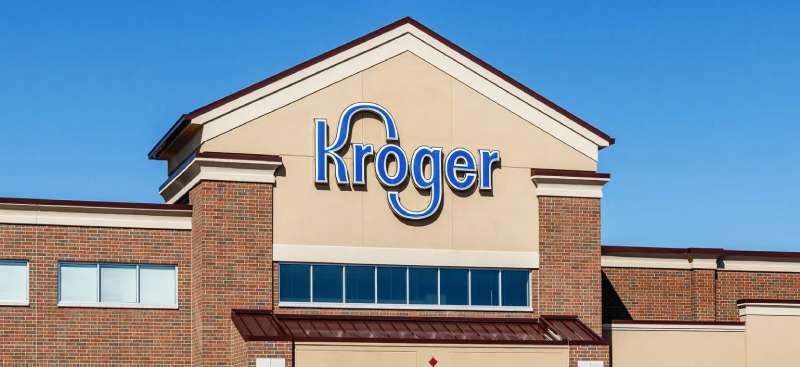
The Kroger logo is a custom blue wordmark spelling out “Kroger” in a rounded, slightly italicized sans-serif typeface. The current version was introduced in the early 2000s and uses a bright blue as its primary color. It represents approachability, value, and everyday reliability for millions of American grocery shoppers.
Design Type: Wordmark (logotype)
Primary Elements: Stylized custom lettering, no standalone icon or symbol
Official Introduction Date: Current wordmark iteration introduced circa 2001-2006 (incremental refinements)
Designer/Agency: Developed through internal brand teams; specific agency attribution is not publicly confirmed
Trademark Status: Registered trademark of The Kroger Co., protected under US trademark law
Color Palette:
- Primary Blue: approximately #00539B
- White (for reversed applications)
Usage Context: Store signage, private label packaging, grocery bags, digital platforms, loyalty program materials, advertising, and employee uniforms
How Has the Kroger Logo Evolved Over Time?
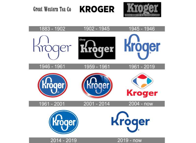
Kroger’s visual identity has gone through at least five distinct phases since 1883, moving from decorative Victorian scripts to simplified modern wordmarks.
Each redesign tracked a shift in either retail culture or Kroger’s own growth strategy.
The jump from ornate to clean took decades, but the direction was consistent.
Original Kroger Logo (1883-1930s)
- Years Active: 1883-1930s
- Design Description: Ornate serif lettering typical of late 19th-century retail signage. Decorative flourishes, high contrast strokes.
- Color Scheme: Black and white (print-era limitations)
- Designer: Unknown; likely hand-lettered by a commercial sign painter
- Context: Barney Kroger founded the company in Cincinnati, Ohio in 1883. The identity reflected general Victorian commercial lettering norms rather than any distinct brand strategy.
- Key Changes from Previous: N/A (first version)
- Cultural Significance: Represented a single-city grocery operation at a time when chain retail was just beginning to emerge in America
Mid-Century Kroger Logo (1930s-1960s)
- Years Active: 1930s-1960s
- Design Description: Cleaner serif or semi-serif lettering. Less decorative, more utilitarian. Some versions incorporated basic geometric framing.
- Color Scheme: Red and white appeared in some applications
- Designer: Unknown
- Context: Kroger was expanding aggressively through acquisitions. The logo needed to work across growing print advertising and early supermarket signage.
- Key Changes from Previous: Reduced decorative elements; more consistent lettering weight
- Cultural Significance: Reflected the post-Depression era push toward no-frills, value-focused retail presentation
Kroger Logo (1960s-1980s)
- Years Active: 1960s-1980s
- Design Description: Bold, blocky lettering. Some versions used a red color scheme. The letterforms became heavier and more assertive, fitting the era’s preference for strong, legible retail marks.
- Color Scheme: Red prominently featured
- Designer: Unknown
- Context: Supermarket competition intensified. Brands needed to stand out on large-format store signage from a distance.
- Key Changes from Previous: Shift to bolder weight; reduction of any remaining ornate details
- Cultural Significance: The aggressive, high-visibility design matched Kroger’s positioning as a dominant regional and national grocery player
Transition Kroger Logo (1980s-2000s)
- Years Active: 1980s-early 2000s
- Design Description: A rounded, friendlier wordmark began to take shape. The sharp edges softened. Blue started replacing red as the dominant color.
- Color Scheme: Blue and white
- Designer: Unknown
- Context: Kroger was becoming a national force with dozens of subsidiary banners. A warmer, more approachable visual tone aligned with broader grocery retail trends of the era.
- Key Changes from Previous: Color shift from red to blue; rounder letterforms; less aggressive visual tone
- Cultural Significance: Blue signaled trustworthiness, a deliberate move away from the urgency of red toward everyday reliability
Current Kroger Logo (2000s-Present)
- Years Active: Early 2000s to present
- Design Description: Rounded, slightly italicized custom wordmark in bright blue. Clean, modern, and immediately legible at any size. No supporting icon.
- Color Scheme: Bright blue (#00539B approximately) on white
- Designer: Internal brand team; specific agency not confirmed publicly
- Context: Digital expansion, private label growth, and the launch of Kroger Plus loyalty programs required a mark that scaled well across screens and physical environments.
- Key Changes from Previous: Further refinement of letter curves; more consistent spacing; cleaner digital performance
- Cultural Significance: Represents Kroger’s positioning as a modern, tech-forward grocery retailer while still feeling familiar to long-time customers
What Do the Design Elements of the Kroger Logo Mean?
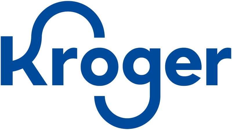
The Kroger logo’s design centers on clarity and familiarity. Every element, from the color to the letterform style, was chosen to communicate reliability and accessibility to everyday shoppers.
There’s nothing flashy about it, and that’s intentional.
For a brand that serves tens of millions of customers weekly, the logo needs to feel like a constant, not a statement.
What Symbolic Meaning Does the Kroger Wordmark Carry?
The rounded letterforms suggest approachability. Sharp angles in logos tend to read as aggressive or premium; Kroger’s curves say the opposite.
The slight italic lean adds a sense of movement without being dynamic in an obvious way.
It reads as efficient, reliable, and unpretentious. Which, honestly, matches exactly what most people want from a grocery store.
What Is the Historical Context Behind the Logo’s Design Direction?
The shift to a clean blue wordmark happened as grocery retail became increasingly competitive in the 1990s and 2000s.
Kroger needed to look modern but not alienating. The current style draws from the same design thinking that influenced much of corporate America during that period.
Sans-serif wordmarks replaced complex emblems across industries, and Kroger followed that direction.
What Cultural References Are Built Into the Logo?
There aren’t many overt cultural references baked into the Kroger wordmark. It doesn’t use Americana imagery or food iconography.
The blue is the closest thing to a cultural signal. Blue dominates American grocery and retail branding because it reads as clean, safe, and dependable.
Kroger leans into that association fully.
Why Did Kroger Choose These Specific Colors?

Blue (#00539B approximately)
- Color Name: Kroger Blue
- Symbolic Meaning: Trust, reliability, cleanliness
- Psychological Impact: Calming and confidence-building. Studies consistently show blue increases consumer trust in retail contexts.
- Brand/Industry Connection: Blue is the dominant color in American grocery and food retail. Walmart, Sam’s Club, and multiple pharmacy chains use similar blue tones. Kroger fits within that visual ecosystem naturally.
Among brands that use blue in their logos, the shade Kroger chose sits in the mid-range: not as dark as navy corporate marks, not as bright as tech brands. It lands exactly where a grocery retailer should.
White
- Color Name: White
- Symbolic Meaning: Clarity, simplicity, openness
- Psychological Impact: Creates contrast that improves legibility; reinforces a clean, uncluttered brand feel
- Brand/Industry Connection: White backgrounds and reversed white logos are standard in grocery retail environments where visual noise is already high
What Typography Style Is Used in the Kroger Logo?
The Kroger wordmark uses a custom rounded sans-serif typeface. It’s not a direct pull from any publicly available font family, though it shares characteristics with humanist sans-serif styles.
The letters have consistent stroke weight with subtle optical corrections at the joints.
Readability at large sign scale was clearly a priority. The rounded terminals help the letterforms stay distinct even at a distance or in low-contrast environments.
The slight italic angle is held consistently across all letters, giving the word a unified forward momentum without feeling aggressive. It’s a practical choice as much as an aesthetic one.
What Are the Hidden Meanings in the Kroger Logo?
Honestly, the Kroger logo isn’t hiding much. There’s no embedded arrow like FedEx, no hidden bear like the Toblerone mountain.
What’s intentional: the rounded forms, the blue, the italic angle. All of those were deliberate choices to project warmth and efficiency.
Some designers note that the “K” and “r” in the wordmark create a subtle rhythm that makes the word feel balanced even though “Kroger” is an asymmetric string of letters.
That’s probably the closest thing to a hidden design decision in there.
How Does the Kroger Logo Compare to Competitor Logos?
Kroger’s wordmark is simpler than most of its direct competitors. It doesn’t use icons, shields, or descriptive taglines baked into the mark itself.
That minimalism actually works in its favor at scale.
When you’re putting a logo on 2,700+ stores, thousands of private label products, and a major app, a clean wordmark is easier to manage than a complex emblem.
Here’s how it stacks up against key competitors:
- Walmart: Uses a yellow spark icon alongside its wordmark, adding a layer of symbolism Kroger avoids. Walmart’s identity is more visually complex but also more icon-dependent.
- Target: The bullseye icon is one of the most recognizable retail marks in America. Target’s strategy relies heavily on that standalone symbol. Kroger has no equivalent.
- Costco: Bold red and blue with a straightforward wordmark. Similar simplicity to Kroger, though Costco’s color use is more aggressive. Both brands prioritize legibility over visual complexity.
- Albertsons: Uses a stylized “A” mark alongside its wordmark, giving it a dual-element identity that Kroger doesn’t have. The Albertsons identity feels slightly more designed, for better or worse.
- Whole Foods Market: Green, nature-forward, and deliberately organic-looking. The contrast with Kroger is sharp. Whole Foods signals premium and natural; Kroger signals everyday and accessible.
- Publix: Green color scheme with a distinctive “P” mark. More regionally specific in its visual identity. Publix’s mark carries more of a “local” feeling despite its size.
- Trader Joe’s: Handcrafted, almost rustic lettering. The complete opposite of Kroger’s clean wordmark. Trader Joe’s identity is built around personality and quirkiness.
- Aldi: Simple, modern, and color-blocked. Similar minimalist thinking to Kroger, though Aldi uses a red and blue combination that reads as more European in its design sensibility.
Across the board, Kroger’s mark is one of the least icon-dependent in the category. That’s a strategic choice that reflects confidence in the name recognition the brand has built over 140 years.
What Are the Technical Specifications of the Kroger Logo?
Official Color Codes (approximate, based on publicly available brand usage):
Primary Color: Kroger Blue
- Hex: #00539B
- RGB: (0, 83, 155)
- CMYK: (100, 46, 0, 39)
- Pantone: PMS 293 C (closest match)
Secondary Color: White
Dimensions and Proportions:
- Aspect Ratio: Approximately 4:1 (width to height) for the standard horizontal wordmark
- Minimum Size Requirements: Kroger does not publish official minimum size guidelines publicly, but standard retail brand practice requires legibility at no smaller than 0.5 inches in height for print applications
- Clear Space: Standard practice for the Kroger mark follows a clear space equal to the cap-height of the wordmark on all sides
- Official Usage Guidelines: Available internally through Kroger’s brand team; not publicly distributed. Vendors and partners must request brand assets through official Kroger channels.
- File Formats Available: Vector formats (EPS, SVG) for scalable applications; JPEG and PNG for digital use
- Resolution Requirements: For print, assets should be prepared at minimum 300 DPI to avoid quality loss
What Cultural Impact Has the Kroger Logo Had?
Kroger’s logo isn’t a cultural icon in the way that the Nike swoosh or the Apple mark is. But that undersells its actual reach.
For millions of Americans, particularly in the Midwest and Southeast, the Kroger wordmark is one of the most frequently encountered brand marks in daily life.
It appears on grocery bags, store facades, private label products, fuel center signage, pharmacy counters, and mobile apps.
The logo has become a background fixture of American domestic life. Not glamorous, but deeply embedded. That kind of quiet ubiquity is its own form of cultural impact.
The brand’s private label lines, including Simple Truth and Kroger-branded products, have extended the visual identity into product design contexts where the logo competes directly with national brands on shelf. That’s a significant step beyond simple store signage.
Among food and retail brand marks in the US, Kroger’s sits in a category of “trusted background presence” rather than aspirational icon. For a company serving 60+ million households annually, that’s exactly the right position to occupy.
How Does the Kroger Logo Fit Into the Overall Brand Identity?
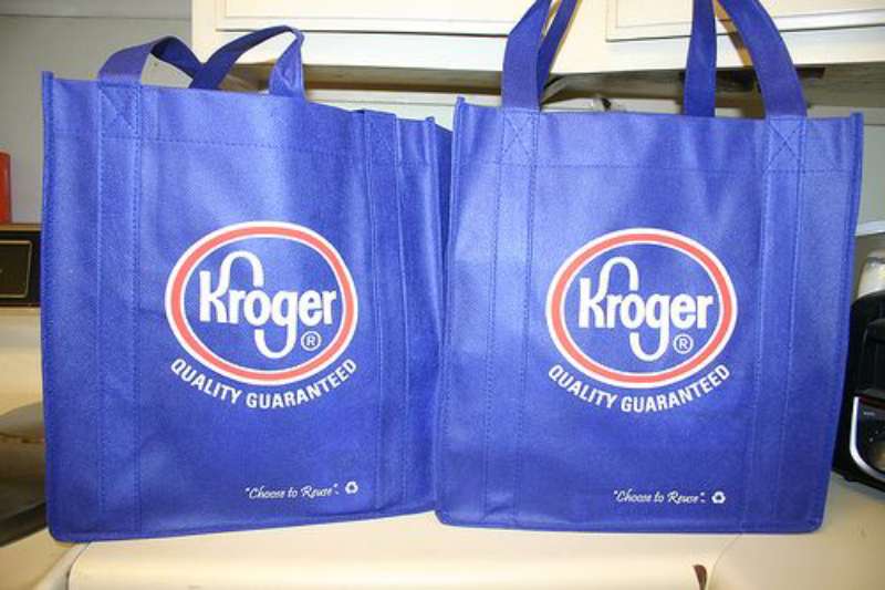
The Kroger logo doesn’t work alone. It functions as the anchor of a broader identity system that includes subsidiary store banners, private label packaging, digital properties, and the Kroger Plus loyalty program.
The wordmark is the constant across all of those touchpoints.
Kroger’s subsidiary banners, including Ralphs, Fred Meyer, Harris Teeter, King Soopers, and Dillons, each maintain their own separate visual identities. Kroger doesn’t force its wordmark onto those banners. That’s a deliberate brand architecture decision: Kroger operates as a “house of brands” rather than a “branded house.”
The logo’s role within the parent company identity is therefore more corporate than consumer-facing in many markets. It appears prominently in Kroger-bannered stores, investor materials, and on owned brands, but stays in the background when subsidiary brands are the customer touchpoint.
Understanding the principles behind brand guidelines helps explain why this kind of structured separation matters. A consistent parent mark with flexible sub-brand identities allows Kroger to serve different regional markets and customer segments without diluting either the parent or subsidiary identities.
The color choices across the brand system stay relatively consistent: blue and white dominate Kroger-branded environments, while subsidiary brands operate with their own color systems that don’t necessarily mirror the parent.
How Should the Kroger Logo Be Used?
Official Usage Guidelines:
- Do: Use official Kroger-supplied logo files only. Maintain the correct blue and white color values. Keep clear space around the mark. Use vector files for any printed application above business card size.
- Don’t: Stretch, distort, recolor, or add effects to the wordmark. Don’t place the logo over busy backgrounds without sufficient contrast. Don’t recreate the logo from scratch using approximate fonts.
Where to Access Official Logos:
Kroger does not maintain a public brand asset portal. Vendors, suppliers, and media partners must contact Kroger’s corporate communications or brand team directly to request official logo files. Unauthorized use of the trademark is subject to legal action.
Licensing Information:
The Kroger name and logo are registered trademarks of The Kroger Co. Any commercial use requires explicit written permission from Kroger’s legal or brand team. Editorial and journalistic use (news, commentary, review) generally falls under fair use in the US, but commercial applications do not.
Trademark Protection Details:
The Kroger wordmark is registered with the US Patent and Trademark Office. Kroger actively monitors and enforces its trademark rights across physical and digital channels. Using the Kroger mark in a way that implies endorsement, partnership, or affiliation without authorization is a trademark violation.
For editorial reference or journalistic use, it’s standard practice to source logo images from official press kits or clearly identified press materials rather than user-uploaded databases, which often host outdated or altered versions of the mark.
FAQ on The Kroger Logo
What does the Kroger logo look like?
The Kroger logo is a clean blue wordmark with rounded, slightly italicized custom lettering.
No icon, no emblem. Just the name in a humanist sans-serif style on a white background. It’s one of the more minimal marks in American grocery retail.
What color is the Kroger logo?
The primary Kroger brand color is blue, approximately #00539B in hex.
White is used as the background or for reversed applications. The blue sits in the mid-range, warmer than navy, less electric than tech blues. It signals trust and everyday reliability.
Has the Kroger logo changed over the years?
Yes. The Kroger logo evolution spans over 140 years, starting with ornate Victorian lettering in 1883.
It moved through bold serif and blocky mid-century styles before landing on the clean, rounded wordmark used today. Each version tracked broader shifts in retail and corporate identity design.
What font does the Kroger logo use?
Kroger uses a custom rounded sans-serif typeface. It’s not pulled directly from any publicly available font family.
The letterforms share characteristics with humanist sans-serif styles. Consistent stroke weight, rounded terminals, and a slight italic angle define the Kroger wordmark typography.
What is the meaning behind the Kroger logo?
The rounded letterforms communicate approachability. The blue conveys trust. The italic lean adds subtle forward energy without aggression.
There’s no hidden symbol or complex iconography. The logo’s meaning is mostly in what it doesn’t do: it stays quiet, consistent, and familiar across thousands of touchpoints.
How does the Kroger logo compare to other grocery store logos?
Kroger’s mark is more minimal than most competitors. Walmart adds an icon. Target built an entire identity around a standalone symbol. Publix uses a “P” mark.
Kroger relies entirely on the wordmark. Among retail brand identities, that kind of pure typographic approach is less common than you’d think at this scale.
Where can I download the official Kroger logo?
Kroger doesn’t maintain a public brand asset portal. Official logo files are not freely available for download.
Vendors and media partners need to contact Kroger’s corporate communications team directly. Using unofficial versions from third-party databases risks working with outdated or altered files that don’t match current Kroger brand guidelines.
What are the Kroger logo color codes?
The primary blue is approximately Hex #00539B, RGB (0, 83, 155), CMYK (100, 46, 0, 39), and Pantone PMS 293 C.
These are based on publicly observed brand usage. Kroger has not officially published its full color palette specifications for external use.
Is the Kroger logo trademarked?
Yes. The Kroger name and logo are registered trademarks of The Kroger Co., protected under US trademark law.
Commercial use without written permission is a violation. Editorial and journalistic use generally falls under fair use, but any application implying partnership or endorsement requires explicit authorization from Kroger’s legal team.
Why did Kroger switch from red to blue in its logo?
The shift happened gradually through the 1980s and 1990s as Kroger expanded nationally and updated its corporate visual identity.
Red tends to signal urgency and price aggression. Blue communicates stability and trust, a better fit for a brand positioning itself as a reliable everyday grocery destination rather than a discount-first retailer.
Conclusion
The Kroger logo is a textbook case of retail branding that prioritizes function over flash. A clean wordmark, a dependable blue, and 140 years of incremental refinement have produced a corporate visual identity that most Americans recognize without thinking about it.
That kind of quiet recognition is genuinely hard to build.
From its Victorian origins to the current rounded logotype, the Kroger brand identity has stayed consistent in purpose even as the visual form changed. It doesn’t try to be exciting. It tries to be trusted. For a supermarket chain serving tens of millions of households, that’s the right call.

Renowned for his expertise in logo design and visual branding, Bogdan has developed a multitude of logos for various clients.
His skills extend to creating posters, vector illustrations, business cards, and brochures. Additionally, Bogdan's UI kits were featured on marketplaces like Visual Hierarchy and UI8.
He also wrote in the past years on sites like Design Your Way, WebDesignerDepot, WPDean, Designmodo, Speckyboy, Slider Revolution, and more.
- Canva vs PowerPoint: Which Is Better for Presentations? - 22 September 2026
- How to Install Fonts on Mac (Step-by-Step Guide) - 20 September 2026
- From Mockup to Code: How AI-Augmented Development Speeds Up the Design Handoff - 19 September 2026

Bogdan Sandu is a seasoned designer who has been designing websites since 2008. Renowned for his expertise in logo design and visual branding, Bogdan has developed a multitude of logos for various clients. His skills extend to creating posters, vector illustrations, business cards, and brochures. Additionally, Bogdan's UI kits were featured on marketplaces like Visual Hierarchy and UI8. He also wrote in the past years on sites like Design Your Way, WebDesignerDepot, WPDean, Designmodo, Speckyboy, Slider Revolution, and more.
You Might Also Like