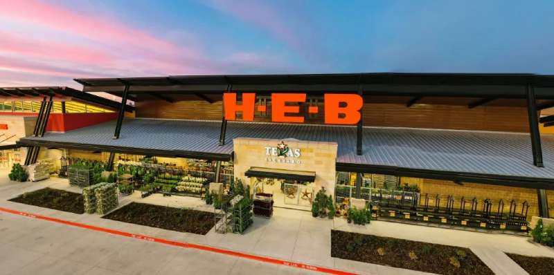
The HEB logo is the official visual mark of H-E-B Grocery Company, one of the largest privately held retailers in the United States. It functions as the primary brand identifier across hundreds of stores throughout Texas and Mexico. The logo has gone through several updates since the company’s founding in 1905, each reflecting shifts in the brand’s positioning and scale.
Within grocery retail branding, HEB sits alongside chains like Kroger, Publix, and Walmart as one of the most recognizable regional identities in American retail. Its logo is a case study in how a regional brand can build genuine loyalty without relying on a global design overhaul.
Florence Butt founded the company in Kerrville, Texas in 1905. The brand has carried at least five distinct logo iterations since then, with the current version being the most stripped-back and direct of all of them.
What Is the HEB Logo?
The HEB logo is a bold red wordmark featuring the letters “H-E-B” in a clean, custom sans-serif typeface. It was introduced in its current form in the early 2000s and represents the company’s Texas roots, community focus, and no-frills approach to retail branding.
- Design Type: Wordmark (lettermark variant)
- Primary Elements: The three letters “H,” “E,” and “B” set in a heavy, custom-style sans-serif font with a solid red background block in some applications
- Official Introduction Date: Current iteration refined circa 2000s; foundational wordmark structure established in the 1980s
- Designer/Agency: Developed internally by HEB’s marketing team; no single external agency is publicly credited for the current version
- Trademark Status: Registered trademark of H-E-B Grocery Company, LP
- Color Palette: Primary red (#E31837), white (#FFFFFF)
- Usage Context: Store signage, shopping bags, uniforms, delivery vehicles, digital platforms, private label packaging, and marketing materials
How Has the HEB Logo Evolved Over Time?
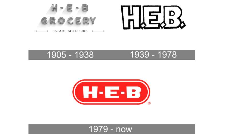
The HEB logo has changed significantly since 1905, moving from script-style lettering tied to the Butt family name through to today’s clean red wordmark. Each version reflected where the company was at the time, operationally and culturally.
Original HEB Logo (1905-1940s)
- Years Active: 1905 to approximately the 1940s
- Design Description: Script-based lettering referencing “Butt Grocery” or “Mrs. C.C. Butt Staple and Fancy Groceries,” reflecting the store’s origin as a single family-run shop
- Color Scheme: Black and white (print era)
- Designer: Unknown
- Context: Florence Butt opened the first store in Kerrville with a $60 investment. Branding was minimal and functional.
- Key Changes from Previous: N/A (first iteration)
- Cultural Significance: Tied directly to the family name; personal and local in character
Mid-Century HEB Logo (1940s-1970s)
- Years Active: 1940s to approximately the 1970s
- Design Description: The “H-E-B” abbreviation became standard during this period as Howard E. Butt expanded the chain across South Texas. Typography was bolder and more suited to signage.
- Color Scheme: Red and white, early adoption of the brand’s signature color
- Designer: Unknown
- Context: Rapid store expansion demanded a more scalable, recognizable identity
- Key Changes from Previous: Shift from full family name to initialism; move toward standardized signage
- Cultural Significance: Marked HEB’s transition from a regional grocery to a Texas institution
Modernized HEB Logo (1970s-1990s)
- Years Active: 1970s to 1990s
- Design Description: A more structured wordmark with sharper letterforms. Some versions included a starburst or shield element alongside the “H-E-B” text.
- Color Scheme: Red and white, occasionally with yellow accents
- Designer: Unknown
- Context: Retail branding was professionalizing across the industry; HEB followed suit
- Key Changes from Previous: Introduction of supporting graphic elements; more structured typographic treatment
- Cultural Significance: Reflected HEB’s growing presence and competition with national chains
Current HEB Logo (2000s-Present)
- Years Active: Early 2000s to present
- Design Description: A clean, bold red wordmark. The letters “H-E-B” appear in white or red depending on the application, set in a custom heavy sans-serif. Simple, direct, and high-contrast.
- Color Scheme: Red (#E31837) and white (#FFFFFF)
- Designer: Internal HEB brand team
- Context: Aligned with a broader brand refresh as HEB grew into a Fortune 500 company
- Key Changes from Previous: Removed decorative elements; doubled down on the wordmark alone
- Cultural Significance: Reflects confidence. A brand secure enough to let three letters do all the work.
What Do the Design Elements of the HEB Logo Mean?
The HEB logo is built on simplicity as a deliberate choice, not a limitation. The bold lettermark communicates scale and reliability, while the red signals energy and presence in a crowded retail environment.
What Does the HEB Lettermark Represent?
The three initials “H-E-B” stand for Howard Edward Butt, the son of founder Florence Butt who drove the company’s major expansion through the mid-20th century.
Using initials rather than a full name gives the mark flexibility. It works at two inches on a receipt or twenty feet on a storefront without losing legibility.
There’s also something quietly proud about it. The name stayed in the logo even as the company scaled past most regional competitors.
Why Did HEB Choose These Specific Colors?

- Red (#E31837)
- Color Name: HEB Red
- Pantone: Approximately Pantone 185 C
- Symbolic Meaning: Energy, urgency, passion
- Psychological Impact: Red is proven to stimulate appetite and draw attention in retail settings. It’s not an accident that so many red logos belong to food and grocery brands.
- Brand Connection: Consistent with HEB’s bold, no-nonsense Texas identity
- White (#FFFFFF)
- Color Name: White
- Symbolic Meaning: Cleanliness, clarity, trust
- Psychological Impact: Creates contrast against red; improves readability at distance
- Brand Connection: Standard in retail and grocery store logos for legibility across environments
What Typography Style Is Used in the HEB Logo?
The HEB logo uses a custom heavy sans-serif wordmark. The letterforms are wide, with consistent stroke weight and minimal contrast between thick and thin strokes.
This makes it function well at large sizes on signage and small sizes on packaging without any degradation in clarity.
There’s no serif detailing, no decorative flourishes. Just solid, readable letters. Honestly, it’s the kind of typography choice that seems obvious in hindsight but takes real discipline to commit to.
Earlier versions of the logo experimented with more expressive letterforms. The current direction moved firmly toward utility.
What Are the Hidden Meanings in the HEB Logo?
There are no confirmed subliminal elements in the HEB logo. The design is intentionally transparent, which is itself a kind of statement.
Some brand analysts note that the hyphenated format “H-E-B” reinforces the initialism’s readability and prevents it from being misread as a single syllable or acronym.
The consistent use of red across decades also functions as a memory anchor. Shoppers across Texas associate that specific red with HEB before they even process the letters.
How Does the HEB Logo Compare to Competitor Logos?
Among major U.S. grocery chains, HEB’s logo is one of the more restrained. Competitors like Whole Foods lean on green to signal organic values, while Trader Joe’s uses illustrated, handcrafted aesthetics. HEB goes the opposite direction: bold, red, and direct.
The Target logo is perhaps the closest comparison in terms of strategy. Both use a single strong color and minimal graphic elements to achieve instant recognition.
Compare this to the Albertsons logo or the Safeway logo, which carry more visual complexity. HEB’s stripped-back approach actually stands out more in a store environment, which is the point.
The Costco logo and Aldi logo also share this no-frills philosophy. There’s a pattern here: brands confident in their value proposition don’t need elaborate marks.
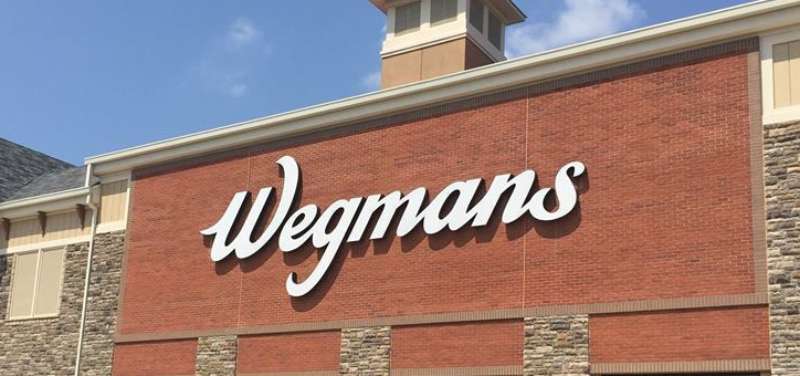
Regionally, the Wegmans logo and Publix identity both carry more typographic personality. HEB’s mark is blunter. That difference maps pretty accurately onto how each brand positions itself in its home market.
What Are the Technical Specifications of the HEB Logo?
Official Color Codes
- Primary Color: HEB Red
- Hex: #E31837
- RGB: (227, 24, 55)
- CMYK: (0, 89, 76, 11)
- Pantone: 185 C (approximate)
- Secondary Color: White
- Hex: #FFFFFF
- RGB: (255, 255, 255)
- CMYK: (0, 0, 0, 0)
Dimensions and Proportions
- Aspect Ratio: Approximately 3:1 (width to height) in standard horizontal lockup
- Minimum Size: Not officially published; standard brand practice recommends no smaller than 1 inch wide in print applications
- Clear Space: Typically a margin equal to the cap-height of the lettermark on all sides
- File Formats Available: PNG, SVG, EPS (through official brand requests); vector formats preferred for scalable applications
- Usage Guidelines: Official assets available through HEB’s corporate communications department; unauthorized reproduction is prohibited under trademark law
What Cultural Impact Has the HEB Logo Had?
In Texas, the HEB logo carries weight that extends well beyond grocery retail. It became a symbol of community resilience, particularly after the company’s response to Hurricane Harvey in 2017 and the 2021 winter storm Uri.
HEB deployed its disaster relief infrastructure before state agencies in both events.
That kind of action transferred directly to the logo. When Texans see that red mark, there’s a layer of trust attached that no branding campaign could manufacture.
The logo appears on HEB-sponsored community events, school programs, and food bank donations across the state. It’s genuinely embedded in Texas public life in a way that most regional grocery brands never achieve.
There’s also a strong local pride element. “HEB” appears on social media, in Texas-pride merchandise, and in conversations about Texas identity in a way that competitors like Kroger simply don’t generate in the same markets.
How Does the HEB Logo Fit Into the Overall Brand Identity?
The HEB logo anchors a broader brand system that includes Central Market (HEB’s upscale grocery format), HEB Plus (expanded big-box stores), and Joe V’s Smart Shop (discount format). Each sub-brand has its own identity, but the parent HEB mark provides the credibility layer behind all of them.
The logo connects to HEB’s brand guidelines, which govern how the mark appears across packaging, uniforms, vehicles, and digital platforms.
Color consistency is strict. That specific red shows up the same way whether you’re looking at a store sign in San Antonio or an HEB grocery bag in Austin.
The wordmark also works within HEB’s private label packaging system. Hundreds of store-brand products carry the HEB logo, which means the mark needs to work across wildly different packaging contexts without losing its identity. It handles that well, mostly because of how simple it is.
How Should the HEB Logo Be Used?
Official Usage Guidelines
- Do use: Official files sourced directly from HEB’s corporate communications or press kit
- Do use: The logo at sufficient size to maintain legibility; avoid scaling below recommended minimums
- Do use: Approved color versions (red on white, white on red) without modification
- Don’t use: Unofficial redraws, low-resolution screenshots, or bitmap raster versions in large-format print contexts
- Don’t use: The logo on materials implying HEB endorsement without written authorization
- Don’t use: Altered color versions, stretched proportions, or the mark with added drop shadows or gradients
Where to Access Official Files
- HEB’s official press kit (available via newsroom.heb.com)
- Direct request through HEB corporate communications for media and editorial use
Licensing and Trademark Details
- The HEB logo is a registered trademark of H-E-B Grocery Company, LP
- Commercial use without authorization is a trademark violation
- Editorial and journalistic use generally falls under fair use, but commercial reproduction requires explicit written permission from HEB’s legal department
- Third-party sellers offering “HEB logo” files for download are not official sources; use those at your own legal risk
FAQ on The HEB Logo
What Does the HEB Logo Look Like?
The HEB logo is a bold red wordmark. It displays the three letters “H-E-B” in a heavy, custom sans-serif font.
The design is minimal. Red and white are the only colors used, making it instantly recognizable on store signage, packaging, and uniforms.
What Color Is the HEB Logo?
The primary HEB brand color is red, with a hex code of #E31837.
White is used as the secondary color for contrast. The Pantone equivalent is approximately 185 C. These two colors appear consistently across all HEB marketing materials and store branding.
What Font Does the HEB Logo Use?
HEB uses a custom heavy sans-serif typeface in its logo. It is not a publicly available retail font.
The letterforms have consistent stroke weight and wide proportions. This makes the wordmark legible at any size, from small product labels to large storefront signs.
Who Designed the HEB Logo?
No external agency has been officially credited for the current HEB logo design. It was developed by HEB’s internal brand and marketing team.
Earlier logo iterations evolved organically as the company grew from a single Kerrville, Texas store into a major Texas supermarket chain and Fortune 500 company.
How Old Is the HEB Logo?
The HEB corporate identity dates to 1905 when Florence Butt founded the original store. The current red wordmark has been in use in its modern form since the early 2000s.
The logo has gone through at least five distinct iterations over its history.
What Does HEB Stand for in the Logo?
HEB stands for Howard Edward Butt, the son of founder Florence Butt. He led the company’s major expansion across South and Central Texas during the mid-20th century.
The initialism replaced the full family name as the brand scaled beyond its regional roots.
Is the HEB Logo Trademarked?
Yes. The HEB logo is a registered trademark of H-E-B Grocery Company, LP. Commercial use without written authorization is a trademark violation.
Editorial and media use generally falls under fair use, but any reproduction implying HEB endorsement requires explicit approval from their legal department.
How Does the HEB Logo Compare to Other Grocery Store Logos?
Compared to chains like Meijer or Sprouts Farmers Market, the HEB logo is more stripped back.
Most competing grocery brands add supporting graphic elements or descriptive taglines. HEB relies entirely on the lettermark, which reflects the brand’s confidence in its Texas market recognition.
Where Can I Download the Official HEB Logo?
Official HEB logo files are available through HEB’s corporate newsroom at newsroom.heb.com. Media and press requests can also go through HEB’s corporate communications team.
Third-party sites offering HEB logo PNG or vector downloads are not authorized sources. Use those files at your own legal risk.
Has the HEB Logo Ever Been Redesigned?
Yes, several times. The logo started as script-based lettering tied to the Butt family name and gradually shifted toward the clean red wordmark used today.
The biggest change was dropping decorative graphic elements entirely. The current version, refined in the early 2000s, is the most minimal the logo has ever been.
Conclusion
The HEB logo is a clear example of how a Texas supermarket brand can build deep recognition through consistency rather than complexity.
The red wordmark, custom sans-serif letterforms, and strict HEB brand color codes have stayed remarkably stable across decades of logo evolution.
What makes it work is the trust behind it. HEB corporate identity is backed by real community presence, not just good logo design.
For anyone studying logo design principles or retail brand identity, the HEB visual identity is worth paying attention to. Simple, direct, and built to last.

Renowned for his expertise in logo design and visual branding, Bogdan has developed a multitude of logos for various clients.
His skills extend to creating posters, vector illustrations, business cards, and brochures. Additionally, Bogdan's UI kits were featured on marketplaces like Visual Hierarchy and UI8.
He also wrote in the past years on sites like Design Your Way, WebDesignerDepot, WPDean, Designmodo, Speckyboy, Slider Revolution, and more.
- How to Install Fonts on Mac (Step-by-Step Guide) - 20 September 2026
- From Mockup to Code: How AI-Augmented Development Speeds Up the Design Handoff - 19 September 2026
- The Beehiiv Logo History, Colors, Font, And Meaning - 18 September 2026

Bogdan Sandu is a seasoned designer who has been designing websites since 2008. Renowned for his expertise in logo design and visual branding, Bogdan has developed a multitude of logos for various clients. His skills extend to creating posters, vector illustrations, business cards, and brochures. Additionally, Bogdan's UI kits were featured on marketplaces like Visual Hierarchy and UI8. He also wrote in the past years on sites like Design Your Way, WebDesignerDepot, WPDean, Designmodo, Speckyboy, Slider Revolution, and more.
You Might Also Like