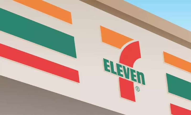
The 7-Eleven logo is one of the most recognized retail identities in the world. It represents a convenience store chain with over 85,000 locations across more than 20 countries. The logo has gone through several changes since the brand’s early days, but its core color scheme and typographic character have stayed remarkably consistent.
Within fast food and convenience retail branding, 7-Eleven sits in an unusual position. It’s neither purely a food brand nor a purely functional service brand. That in-between identity is actually reflected in the logo’s design choices. Bold, friendly, and very hard to miss.
Current version: Introduced in 1969 (refined over subsequent decades). Designer: In-house development, with updates managed by corporate design teams under Seven & I Holdings. Logo iterations: Roughly six distinct versions since the brand was founded in 1927 as the Southland Ice Company.
What Is the 7-Eleven Logo?
The 7-Eleven logo is a wordmark combining the numerals “7” and “Eleven” in a bold, custom-style typeface set against a green, red, and orange color palette. The current version has been in active use since 1969 and was developed internally. It functions as both a brand identifier and a storefront sign system recognized globally.
- Design Type: Wordmark with a stylized numeral
- Primary Elements: The numeral “7” integrated with the word “Eleven” in mixed-case lettering; notably, the “n” at the end of “Eleven” is lowercase while all other letters are uppercase
- Official Introduction Date: 1969 (current core design); the brand itself dates to 1946 when the “7-Eleven” name was officially adopted
- Designer/Agency: Developed in-house; no single external agency is credited for the defining version
- Trademark Status: Registered trademark of 7-Eleven Inc., a subsidiary of Seven & I Holdings Co., Ltd.
- Color Palette: Green (#007341), Red (#E31837), Orange (#F47920)
- Usage Context: Storefront signage, product packaging, digital platforms, marketing materials, uniforms, and franchise documentation
How Has the 7-Eleven Logo Evolved Over Time?
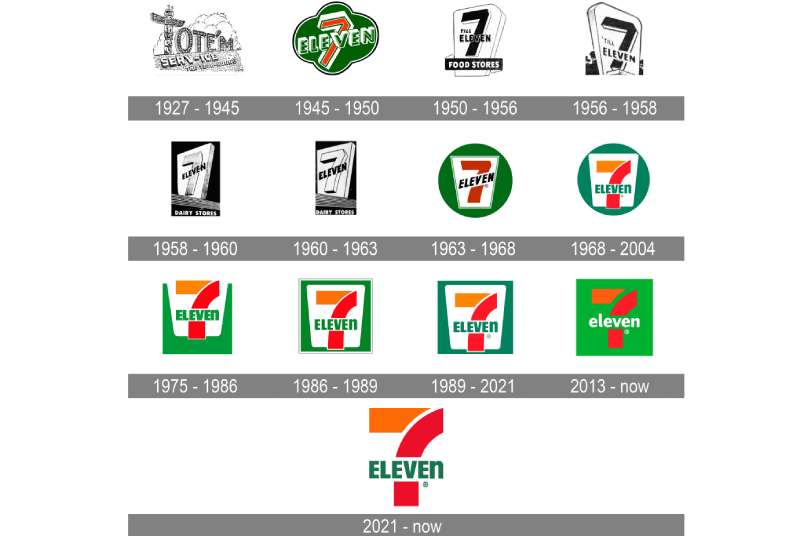
The logo has gone through roughly six major versions since the 1920s.
Early designs were simple and utilitarian, focused on the ice dock and convenience store concept. The shift to a color-coded wordmark in the late 1960s marked the biggest transformation in the brand’s visual history.
From that point forward, changes have been refinements rather than full rebrands. The proportions, colors, and letterforms have been adjusted, but the core identity established in 1969 is still recognizable in the logo used today.
Original 7-Eleven Logo (1927-1946)
- Years Active: 1927-1946
- Design Description: Simple text-based signage representing the Southland Ice Company. No unified logo system in the modern sense.
- Color Scheme: Black and white
- Designer: Unknown
- Context: The business started as an ice and convenience goods operation in Dallas, Texas. Branding was minimal and functional.
- Key Changes from Previous: Starting point; no prior version
- Cultural Significance: Represented a new type of American retail, the neighborhood stop-in store, before the concept had a widely recognized visual language
7-Eleven Name Adoption Logo (1946-1950s)
- Years Active: 1946 through the early 1950s
- Design Description: The “7-Eleven” name was officially adopted, referencing store hours (7 AM to 11 PM). Signage used basic serif lettering.
- Color Scheme: Limited, mostly black and white with some red
- Designer: In-house
- Context: Post-war America saw a boom in suburban retail. The name change was a direct marketing decision tied to operating hours, which were longer than most competitors at the time.
- Key Changes from Previous: Introduction of the “7-Eleven” name as the central identity
- Cultural Significance: The name itself became the brand. Practical and memorable.
Early Wordmark Era (1950s-1968)
- Years Active: 1950s to 1968
- Design Description: Various iterations of the “7-Eleven” wordmark with block lettering. Green and orange began appearing in signage.
- Color Scheme: Green, orange, and red introduced progressively
- Designer: In-house design teams
- Context: Franchise expansion across the United States required a more consistent visual system.
- Key Changes from Previous: Introduction of color and more structured typography
- Cultural Significance: Established the color language that would define the brand going forward
Defining Logo Version (1969-1980s)
- Years Active: 1969 onward (with refinements)
- Design Description: The recognizable striped wordmark with the large “7” and “Eleven” text. The lowercase “n” at the end of “ELEVEn” appears here. Green, red, and orange stripes frame the numeral.
- Color Scheme: Green, red, orange
- Designer: In-house development
- Context: The brand was expanding internationally and needed a bold, scalable identity that worked across signage formats.
- Key Changes from Previous: Fully unified system, distinctive color blocking, the iconic lowercase “n”
- Cultural Significance: This is the version most people think of when they picture the brand. It became shorthand for “convenience store” in popular culture.
Modern Refined Logo (1990s-Present)
- Years Active: 1990s to present
- Design Description: Cleaner proportions, smoother letterforms, optimized for digital and environmental applications. The core design remains consistent with 1969.
- Color Scheme: Green (#007341), Red (#E31837), Orange (#F47920)
- Designer: Seven & I Holdings corporate design
- Context: Digital storefronts, app icons, and global franchise consistency required tighter control over logo reproduction.
- Key Changes from Previous: Technical refinements; no conceptual overhaul
- Cultural Significance: Demonstrates that the 1969 design was strong enough to carry the brand into the digital age with minimal changes
What Do the Design Elements of the 7-Eleven Logo Mean?
The logo communicates speed, accessibility, and familiarity through its design choices.
The large numeral “7” acts as the dominant visual anchor. “Eleven” sits beneath or beside it depending on the application format.
The three-color system isn’t arbitrary. Each color was chosen to trigger specific associations tied to energy, freshness, and urgency. Together they create a high-contrast combination that reads clearly at distance, which matters a lot when you’re a storefront competing for attention on a busy street.
What Does the Numeral “7” Symbolize in the Logo?
The “7” references the original store opening hour of 7 AM.
Over time it became less about literal hours and more about the brand itself. The numeral is oversized relative to “Eleven,” which creates a natural visual hierarchy.
It also makes the logo work as a symbol on its own. In app icons and small-format usage, the “7” alone is enough to identify the brand.
What Is the Historical Context Behind the Logo’s Design?
The 1969 design came out of a period when American retail chains were competing hard for franchise growth.
Bold, color-coded signage was a practical tool. It helped franchisees maintain consistency and helped customers identify locations quickly.
The design reflects influences from mid-century American commercial signage, which favored strong colors, simple shapes, and legibility over elegance. Less Bauhaus design, more roadside America.
What Cultural References Are Embedded in the Logo?
The three-color combination of green, red, and orange doesn’t directly reference any single cultural symbol.
But it does tap into color associations tied to energy drinks, food packaging, and traffic signals. These are colors that prompt action.
The lowercase “n” in “ELEVEn” is the most-discussed detail. It’s often cited as a mistake that stuck, though some accounts suggest it was a deliberate choice by the sign painter who created early versions. Either way, it became a distinctive quirk that makes the logo instantly identifiable.
Why Did 7-Eleven Choose These Specific Colors?
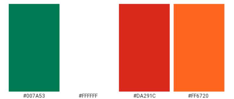
- Green
- Hex: #007341
- Pantone: Pantone 356 C (approximate)
- Symbolic meaning: Freshness, nature, availability
- Psychological impact: Calming but visible; associated with food safety and “go” signals
- Brand connection: Grounds the logo, prevents the red and orange from feeling overwhelming
- Red
- Hex: #E31837
- Pantone: Pantone 185 C (approximate)
- Symbolic meaning: Urgency, energy, appetite stimulation
- Psychological impact: Increases attention and pulse rate slightly; widely used in fast food and convenience retail branding
- Brand connection: Creates urgency aligned with the “quick stop” nature of the business
- Orange
- Hex: #F47920
- Pantone: Pantone 151 C (approximate)
- Symbolic meaning: Warmth, friendliness, approachability
- Psychological impact: Less aggressive than red, more energetic than yellow; bridges the gap between the two
- Brand connection: Adds warmth to what could otherwise be a harsh color combination. You can see how differently orange logos work across different retail brands.
The combination creates what color theory would describe as a high-energy triad. The saturation levels are kept high across all three, which is why the logo reads well even at small sizes or on backlit signs.
What Typography Style Is Used in the 7-Eleven Logo?
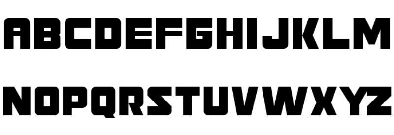
The typeface used in the logo is a custom-modified letterform, not a standard commercial font.
It shares characteristics with bold sans-serif fonts of the mid-20th century. Thick strokes, minimal contrast between thick and thin lines, and rounded terminals on some characters.
The typography prioritizes legibility at large sizes. This makes sense given that the primary use case is a building-mounted sign viewed from a moving vehicle.
The mixed-case treatment (uppercase letters except for the final “n”) creates a subtle irregularity that actually helps with recognition. The brain notices the anomaly and remembers it. That’s the font doing branding work without anyone consciously registering it.
What Are the Hidden Meanings in the 7-Eleven Logo?
The most discussed “hidden” element is the lowercase “n” in “ELEVEn.”
The most widely accepted explanation is that an early sign painter used a lowercase “n” because the uppercase version looked too wide or awkward in the available space. The design stuck, and eventually became intentional by default.
Some brand historians suggest it was kept deliberately after the 1969 redesign because it made the wordmark feel less rigid. Whether that’s true or post-hoc rationalization is hard to say.
There are no confirmed subliminal elements in the logo design. The numeral “7” is sometimes noted for its cultural associations with luck in Western contexts, which may have been a factor in the original naming decision, though the brand’s own history ties the name strictly to store hours.
How Does the 7-Eleven Logo Compare to Competitor Logos?
Within convenience retail, the 7-Eleven logo stands out for its age and consistency.
Most direct competitors have updated their visual identities more aggressively over the past two decades. The 7-Eleven logo’s longevity is actually a differentiator at this point.
Where competitors like Circle K use a single-color geometric mark and Speedway leaned into a more utilitarian approach, 7-Eleven’s three-color wordmark occupies more visual space and demands more attention. It’s busier, but that busyness is part of the brand personality.
Compared to QuikTrip, which uses a simpler QT mark, 7-Eleven prioritizes full name recognition over iconographic shorthand. That reflects the brand’s confidence in its name as the primary equity asset.
Looking at broader grocery store logos and convenience retail in general, the 7-Eleven logo is one of the few that uses three distinct, high-saturation colors successfully. Most brands in this space stick to one or two. The three-color approach increases production complexity but also increases memorability.
What Are the Technical Specifications of the 7-Eleven Logo?
Official Color Codes
- Primary Color: Green
- Hex: #007341
- RGB: (0, 115, 65)
- CMYK: (100, 0, 43, 55)
- Pantone: 356 C (approximate)
- Secondary Color: Red
- Hex: #E31837
- RGB: (227, 24, 55)
- CMYK: (0, 89, 76, 11)
- Pantone: 185 C (approximate)
- Accent Color: Orange
- Hex: #F47920
- RGB: (244, 121, 32)
- CMYK: (0, 50, 87, 4)
- Pantone: 151 C (approximate)
Dimensions and Proportions
- Aspect ratio: Approximately 2:1 (width to height) in standard horizontal lockup
- Minimum size requirements: Not publicly specified; standard brand practice suggests no smaller than 1 inch wide in print applications
- Clear space specifications: Typically one “x-height” of the logo lettering on all sides; see guidelines on x-height for context on how this measurement works
- Official usage guidelines: Governed by 7-Eleven Inc. franchise and brand standards documentation; not publicly distributed
- File formats available: Vector graphics formats (EPS, SVG) for scalable applications; JPEG and PNG for digital use
- Resolution requirements: For print, a minimum of 300 DPI is standard
What Cultural Impact Has the 7-Eleven Logo Had?
The 7-Eleven logo has become cultural shorthand for the late-night convenience stop.
It appears in films, TV shows, and music videos as a background detail that immediately communicates urban American life. You don’t need to read the sign. The green, red, and orange block is enough.
The brand’s Slurpee product has its own cultural moment in pop culture, and the logo is always part of that imagery. It’s one of the few retail logos that carries genuine nostalgic weight for multiple generations.
Internationally, particularly in Japan where Seven & I Holdings is headquartered, the logo represents a more premium convenience retail experience than it does in North America. Same logo, different cultural context. That’s actually a branding achievement worth noting. Most logos don’t survive that kind of contextual flexibility.
The logo has also appeared in collaborations with streetwear brands, limited-edition merchandise, and pop-up experiences. That kind of cultural participation isn’t something you can manufacture. It comes from decades of consistent presence.
How Does the 7-Eleven Logo Fit Into the Overall Brand Identity?
The logo is the anchor of a larger brand system that includes store environment design, product packaging, staff uniforms, and digital interfaces.
The three colors pull through across all of these touchpoints. Walk into a 7-Eleven and the green, red, and orange are on the floors, the cups, the bags, and the signage.
The brand guidelines for a franchise system this large have to be extremely specific. Any inconsistency at the storefront level breaks the recognizability that the logo has built over 50-plus years.
The logo also connects to a broader set of brand elements: the Slurpee cup design, the Big Gulp branding, private-label product packaging. Each of these has its own visual identity, but all of them reference the core logo’s color system. That’s what a strong brand style guide actually does. It makes sub-brands feel related without being identical.
In terms of related brand entities, 7-Eleven sits within a network that includes Seven & I Holdings, Speedway (acquired 2021), Stripes, and various regional convenience chains absorbed through acquisition. The 7-Eleven logo has remained the dominant identity across this network.
How Should the 7-Eleven Logo Be Used?
Official Usage Guidelines
- Do: Use approved logo files from 7-Eleven’s official franchise documentation or press kit
- Do: Maintain the correct color values when reproducing the logo in print or digital formats
- Do: Preserve clear space around the logo on all sides
- Don’t: Alter the proportions, colors, or letterforms of the logo
- Don’t: Use the logo on backgrounds that reduce legibility or contrast
- Don’t: Combine the logo with other brand marks without explicit authorization
- Don’t: Use the logo to imply endorsement or partnership without written approval from 7-Eleven Inc.
Where to Access Official Logo Files
- Franchisees receive official brand assets through 7-Eleven’s internal franchise portal
- Media professionals can request press assets through the 7-Eleven corporate press contact
- The logo is not freely licensed for commercial use by third parties
Licensing and Trademark Details
- The 7-Eleven name and logo are registered trademarks of 7-Eleven Inc.
- 7-Eleven Inc. is a wholly owned subsidiary of Seven & I Holdings Co., Ltd., based in Tokyo, Japan
- Use of the logo outside of franchise agreements or press coverage requires written licensing approval
- Unauthorized reproduction of the logo, particularly in commercial contexts, is subject to trademark enforcement
- Fan art and non-commercial references typically fall under fair use, but this is not a guaranteed protection
FAQ on The 7-Eleven Logo
What font does the 7-Eleven logo use?
The logo uses a custom-modified letterform, not a commercially available typeface.
It shares traits with bold mid-century sans-serif fonts thick strokes, minimal variation between thick and thin lines, and strong legibility at large sizes. No standard font matches it exactly.
What do the colors in the 7-Eleven logo mean?
Green signals freshness, red creates urgency, and orange adds warmth.
Together they form a high-energy combination that reads clearly on storefront signage from a distance. The logo color palette was designed for visibility first, symbolism second.
Why is the “n” lowercase in the 7-Eleven logo?
The most accepted explanation is that an early sign painter used a lowercase “n” because the uppercase version looked awkward in the available space.
It stuck. Over time it became a deliberate part of the 7-Eleven brand identity, one of the most recognized quirks in retail logo design history.
When was the 7-Eleven logo created?
The core logo design was established in 1969.
The brand itself dates to 1927 as the Southland Ice Company, with the “7-Eleven” name adopted in 1946. The current logo evolution reflects roughly six distinct versions over nearly a century.
What are the official 7-Eleven logo color codes?
The three official colors are green (#007341), red (#E31837), and orange (#F47920).
In RGB, those are (0,115,65), (227,24,55), and (244,121,32). For print production, CMYK values and Pantone references should be sourced from official franchise documentation.
Has the 7-Eleven logo ever been fully redesigned?
Not in any dramatic way since 1969.
The updates have been refinements, adjusting proportions, smoothing letterforms, and optimizing for digital applications. The logo redesign history shows a brand that found its identity early and largely committed to it.
What type of logo is the 7-Eleven logo?
It is a wordmark, meaning the brand name itself is the logo with no separate icon or symbol.
The oversized numeral “7” functions almost like a standalone mark in smaller applications, but the full design is classified as a wordmark within standard logo design principles.
Who owns the 7-Eleven logo trademark?
7-Eleven Inc. owns the trademark, operating as a wholly owned subsidiary of Seven & I Holdings Co., Ltd., based in Tokyo.
The trademark status covers both the name and visual identity. Unauthorized commercial use of the logo is subject to enforcement under standard intellectual property law.
How does the 7-Eleven logo compare to other convenience store logos?
Most competitors use simpler, single-color marks.
The three-color wordmark approach gives 7-Eleven more visual presence than brands like Circle K or Speedway. It is busier, but that complexity has become a recognizable part of the brand’s retail logo design identity over decades.
Where can I download the official 7-Eleven logo?
Franchisees access official logo files through 7-Eleven’s internal brand portal.
Media and press requests go through 7-Eleven’s corporate communications team. The logo is not freely licensed. For design reference, vector graphics versions exist in official press kits but are not available for public commercial download.
Conclusion
The 7-Eleven logo is a case study in what happens when a wordmark gets the fundamentals right and then mostly leaves it alone.
Strong color psychology, a memorable typographic quirk, and decades of consistent franchise application have turned a 1969 convenience store sign into one of the most recognized pieces of retail brand identity on the planet.
The logo’s longevity isn’t an accident. It comes from a color palette built for visibility, a typeface built for signage, and a brand that understood its own visual equity well enough not to discard it.

Renowned for his expertise in logo design and visual branding, Bogdan has developed a multitude of logos for various clients.
His skills extend to creating posters, vector illustrations, business cards, and brochures. Additionally, Bogdan's UI kits were featured on marketplaces like Visual Hierarchy and UI8.
He also wrote in the past years on sites like Design Your Way, WebDesignerDepot, WPDean, Designmodo, Speckyboy, Slider Revolution, and more.
- Best Visual Regression Testing Tools for Web and App Design in 2026 - 13 October 2026
- Jujutsu Kaisen Font Generator - 12 October 2026
- The Windsurf Logo History, Colors, Font, And Meaning - 10 October 2026

Bogdan Sandu is a seasoned designer who has been designing websites since 2008. Renowned for his expertise in logo design and visual branding, Bogdan has developed a multitude of logos for various clients. His skills extend to creating posters, vector illustrations, business cards, and brochures. Additionally, Bogdan's UI kits were featured on marketplaces like Visual Hierarchy and UI8. He also wrote in the past years on sites like Design Your Way, WebDesignerDepot, WPDean, Designmodo, Speckyboy, Slider Revolution, and more.
You Might Also Like