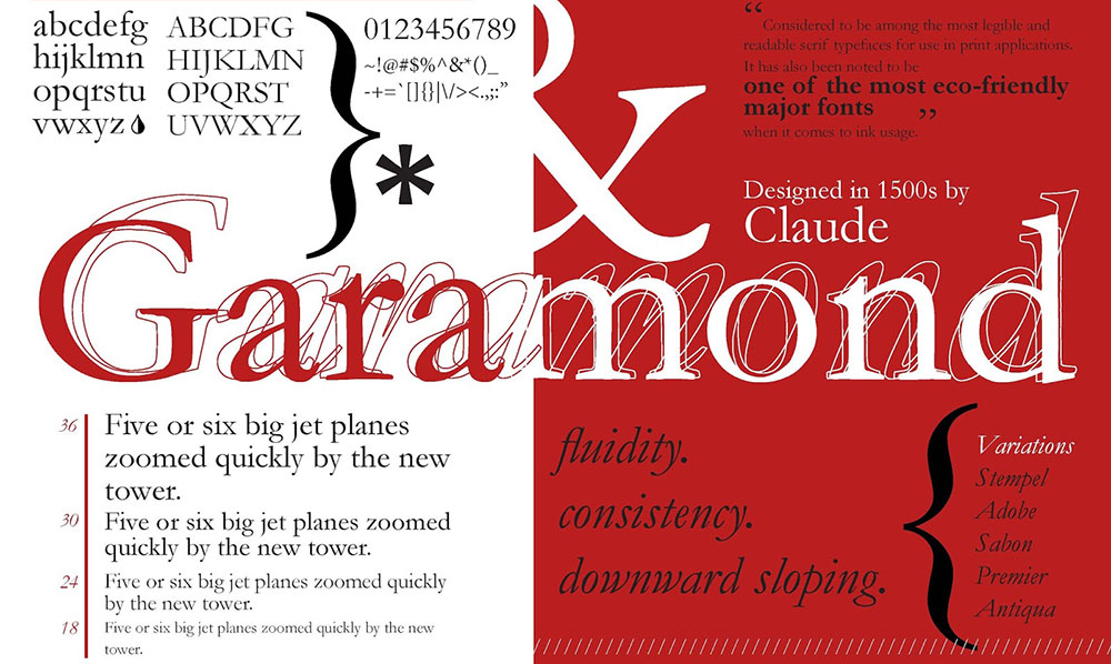
Garamond’s timeless elegance has dominated book design and editorial layouts for centuries, but relying on a single typeface limits creative possibilities. Modern designers need versatile alternatives that capture similar sophistication while offering distinct character.
Exploring fonts similar to Garamond opens doors to richer typographic solutions. Each alternative brings unique strengths to different applications, from corporate branding to digital publishing.
This comprehensive guide examines nine classical serif fonts that share Garamond’s humanist DNA while solving specific design challenges. You’ll discover how Sabon bridges historical accuracy with technical precision, why Bembo predates yet influences modern typography, and when Caslon delivers superior readability.
By understanding these alternatives’ distinct characteristics, you’ll make informed choices that elevate your projects beyond generic solutions. Each font comparison includes practical applications, readability assessments, and direct visual relationships to help you select the perfect match for your specific needs.
Fonts similar to Garamond
Sabon

Jan Tschichold’s 1967 masterpiece bridges historical authenticity with modern technical requirements. Created for consistent reproduction across different typesetting systems, Sabon represents a harmonized typeface that eliminates traditional production variations.
Typography Characteristics
- Roman letterforms maintain classical proportions with improved stroke consistency
- Baseline alignment shows remarkable stability across production methods
- X-height sits slightly higher than original Garamond cuts
- Moderate old-style stroke contrast with natural thick-thin transitions
- Italic designs inspired by Robert Granjon’s flowing curves
Readability Properties
Text performance excels in extended reading situations. Academic publications frequently choose Sabon for scholarly articles and book typesetting.
Screen rendering maintains clarity at standard web sizes. Size range accommodates 8-point footnotes through 18-point headings without losing definition.
Design Applications
Editorial design benefits from Sabon’s balanced appearance. Corporate communications gain sophistication while maintaining approachability.
Book design represents Sabon’s strongest application – both fiction and non-fiction achieve excellent readability with minimal reader fatigue.
Garamond Comparison
Stroke uniformity distinguishes Sabon from traditional Garamond variants. Modern production requirements influenced these technical improvements while maintaining sixteenth-century aesthetic principles.
Character spacing shows more consistency than historical specimens. Contemporary relevance exceeds original Garamond in practical applications.
Bembo
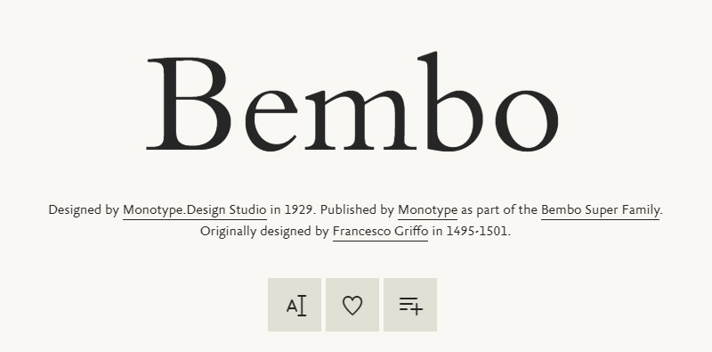
Francesco Griffo’s 1495 Venetian masterpiece predates Garamond yet influences virtually every subsequent old-style serif design. Originally cut for Aldus Manutius, Bembo establishes fundamental principles that define humanist typography.
Typography Characteristics
Letter construction emphasizes calligraphic origins over mechanical precision. Stroke modulation follows natural pen movement patterns without artificial delicacy.
- Capital proportions reflect Roman inscriptional models
- Lowercase shows subtle curves and organic shapes
- Characters like ‘e’ and ‘c’ push slightly forward, creating visual movement
- Hand-cut characteristics translate beautifully into digital formats
Readability Properties
Extended reading comfort surpasses many transitional serif alternatives. Print optimization works exceptionally well at traditional book sizes (9-12 point).
Screen performance requires careful size management. Digital adaptations work best at larger display sizes rather than body text.
Design Applications
Book typography represents Bembo’s natural habitat. Museum publications and cultural materials gain appropriate historical context.
Brand guidelines for luxury products often incorporate Bembo’s prestigious associations. Academic formatting meets institutional requirements while providing visual distinction.
Garamond Comparison
Historical precedence gives Bembo priority in pure classical typography. Visual texture appears more organic than systematized Garamond variants.
Contemporary applications favor Bembo when maximum historical authenticity matters. Practical considerations sometimes favor Garamond’s later refinements for modern printing.
Caslon
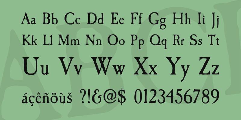
William Caslon I’s eighteenth-century London foundry produced what many consider the most readable serif fonts ever created. American colonial printers used Caslon extensively, including the original Declaration of Independence.
Typography Characteristics
- Letter spacing achieves exceptional optical balance
- Stroke weight follows practical rather than theoretical principles
- Character proportions emphasize functionality over pure aesthetics
- Italic variants complement roman weights without competing for attention
Real-world printing conditions influenced every design decision. Individual characters harmonize perfectly in continuous text settings.
Readability Properties
Extended reading represents Caslon’s greatest strength. Hours of continuous reading produce minimal eye fatigue.
Print quality remains consistent across various paper stocks. Size flexibility accommodates footnotes through display applications with maintained letter clarity.
Design Applications
Book design benefits from Caslon’s proven track record. Corporate materials gain trustworthy, established associations.
Packaging design for traditional products works exceptionally well. Editorial layouts achieve professional results with minimal design effort.
Garamond Comparison
Readability advantages distinguish Caslon from more decorative Garamond applications. Historical context differs between French and English typographic traditions.
Design flexibility makes Caslon more adaptable to varied contemporary requirements. Broader application range accommodates diverse project needs.
Baskerville
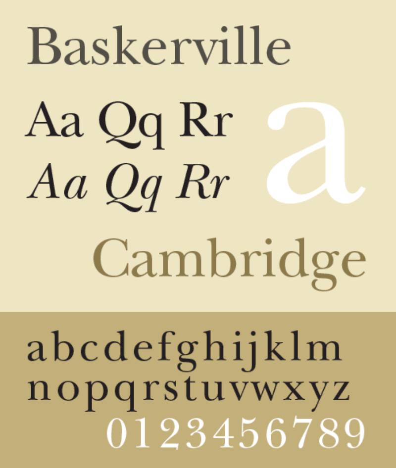
John Baskerville’s 1757 transitional serif bridges old-style traditions with modern systematic approaches. This Birmingham industrialist revolutionized both typeface design and printing technology.
Typography Characteristics
Stroke contrast increases dramatically compared to earlier designs. Mathematical precision begins replacing calligraphic interpretation.
- Letter axis shifts toward vertical orientation
- Serif shapes become sharper and more geometric
- Character spacing follows systematic principles
- Traditional bracketing gives way to architectural forms
Readability Properties
Large size applications showcase Baskerville’s refined elegance. Small text performance varies depending on printing quality – fine strokes require careful production management.
Screen rendering works well at appropriate sizes. Reading comfort depends on adequate line spacing to compensate for increased contrast.
Design Applications
Corporate identity systems benefit from Baskerville’s professional authority. Academic publications gain scholarly credibility through historical associations.
Luxury branding works when sophistication matters more than warmth. Editorial design for serious subjects suits Baskerville’s inherent gravity.
Garamond Comparison
Historical period differences create distinct aesthetic associations. Eighteenth-century rationalism contrasts with Renaissance humanism.
Technical approach emphasizes systematic design over organic development. Contemporary applications often favor Baskerville for institutional contexts.
Minion
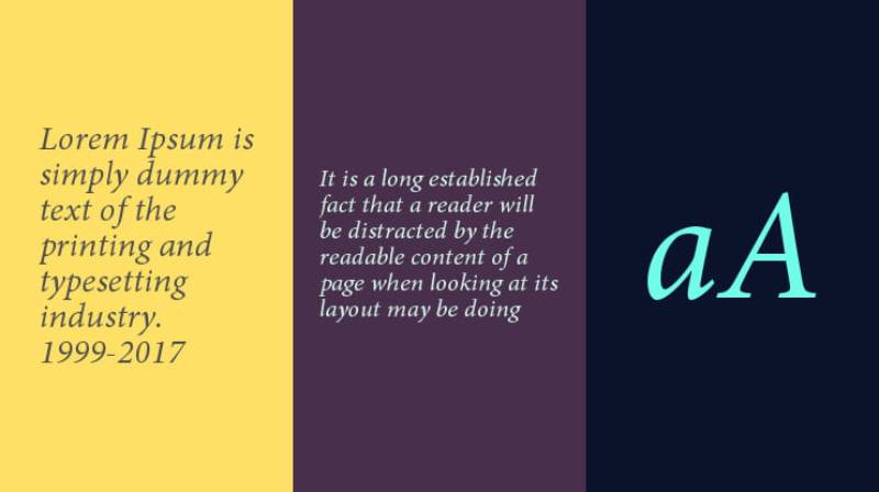
Robert Slimbach’s 1990 Adobe design captures late Renaissance typography while addressing contemporary technical requirements. Digital-native development ensures optimal performance across modern applications.
Typography Characteristics
- Letter proportions follow historical models without slavish imitation
- Stroke relationships maintain classical modulation patterns
- Character spacing achieves perfect optical balance
- Multiple weights and styles provide comprehensive family coverage
Renaissance principles guide contemporary interpretation. Organic variation prevents mechanical appearance while maintaining consistency.
Readability Properties
Text settings excel across print and digital applications. Carefully calibrated spacing works at standard body text sizes without adjustment.
Language support includes extensive international character sets. OpenType features provide sophisticated typography control.
Design Applications
Corporate communications benefit from Minion’s professional yet approachable character. Academic publishing frequently specifies Minion for scholarly work.
Web typography performs excellently with proper implementation. Print design achieves elegant results across varied applications.
Garamond Comparison
Modern technical development gives Minion advantages in digital environments. Contemporary relevance often exceeds historical Garamond variants.
Design consistency across weights and styles surpasses most Garamond families. Professional applications favor Minion’s systematic development.
Palatino
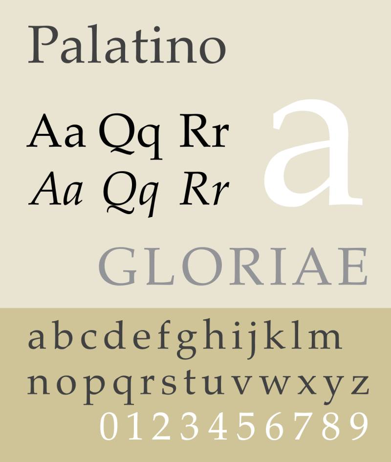
Hermann Zapf’s 1948 masterpiece combines Renaissance inspiration with mid-century design sensibilities. Palatino achieves remarkable readability while maintaining distinctive calligraphic character.
Typography Characteristics
Broad letter proportions distinguish Palatino from narrower Renaissance models. Generous character width improves legibility at smaller sizes.
- Strong vertical emphasis balances horizontal expansion
- Stroke contrast remains moderate yet distinctive
- Calligraphic details enhance without overwhelming
- Robust construction handles varied printing conditions
Readability Properties
Small size performance excels due to generous proportions. Text settings maintain clarity across different media and production methods.
Screen applications work better than many classical alternatives. Digital versions preserve essential character while optimizing technical performance.
Design Applications
Book design benefits from Palatino’s proven readability. Corporate materials gain sophistication without sacrificing approachability.
Educational publishing frequently chooses Palatino for textbooks. International applications benefit from extensive language support.
Garamond Comparison
Letter width provides practical advantages over traditional Garamond proportions. Contemporary design elements update classical foundations effectively.
Versatility across applications often exceeds Garamond’s more specialized character. Modern requirements favor Palatino’s systematic approach.
Goudy Old Style

Frederic Goudy’s 1915 American interpretation of Renaissance principles creates a distinctly personal take on classical serif design. Eccentricities like upward-curved ear details and diamond-shaped dots provide unique character.
Typography Characteristics
- Relatively light color compared to contemporary designs
- Short descenders accommodate tight line spacing
- Distinctive italic based on sixteenth-century models
- Hand-drawn quality preserved in digital versions
Letter construction emphasizes individual character over systematic consistency. Personal interpretation guides design decisions rather than historical accuracy.
Readability Properties
Text applications work best at moderate sizes. Light stroke weight requires careful contrast management in production.
Print optimization favors quality paper stocks. Digital applications benefit from size increases to maintain readability.
Design Applications
Editorial design suits Goudy’s warm, personal character. Academic institutions frequently adopt Goudy for official materials.
Cultural publications benefit from American typographic heritage associations. Book design works particularly well for literary content.
Garamond Comparison
American interpretation differs significantly from European Garamond traditions. Personal style creates more distinctive character than systematic historical revival.
Contemporary applications often favor Goudy when warmth matters more than pure classical authority.
Perpetua
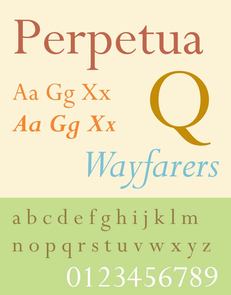
Eric Gill’s 1925 design combines classical proportions with modernist sensibilities. Carved letter origins create unique character that bridges traditional and contemporary approaches.
Typography Characteristics
Stone-cutting origins influence every design decision. Sharp, precise details reflect carving tools rather than pen-drawn models.
- Narrow proportions maximize text efficiency
- Clean, geometric serif treatment
- Strong vertical emphasis
- Minimal stroke contrast with consistent weight
Readability Properties
Extended text performance requires careful spacing adjustments. Narrow proportions demand adequate leading for optimal reading comfort.
Print applications showcase Perpetua’s distinctive character. Screen use works better at display sizes than body text.
Design Applications
Institutional materials benefit from Perpetua’s authoritative character. Cultural organizations frequently choose Perpetua for official communications.
Monument and memorial applications suit stone-carving associations. High-end printing projects showcase Perpetua’s unique qualities.
Garamond Comparison
Modernist interpretation contrasts with Garamond’s Renaissance humanism. Geometric precision replaces organic calligraphic character.
Contemporary relevance often favors Perpetua for institutional contexts requiring gravitas.
Times New Roman
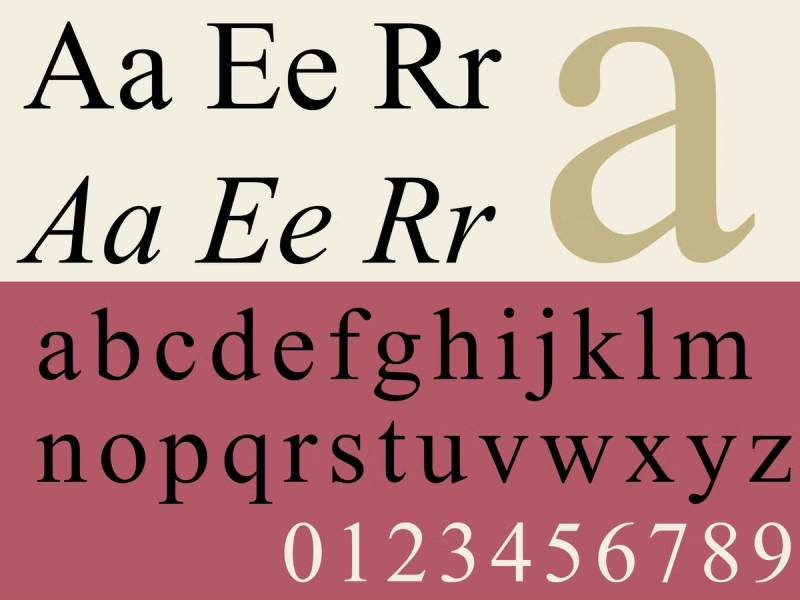
Stanley Morison’s 1932 newspaper design became the world’s most ubiquitous serif font. Originally created for The Times of London, Times New Roman balances economy with readability.
Typography Characteristics
- Condensed proportions maximize text efficiency
- High x-height improves small-size legibility
- Sharp serifs maintain definition under varied printing conditions
- Systematic design ensures consistent performance
Newspaper column requirements influenced character width. Technical printing considerations guided every design decision.
Readability Properties
Universal compatibility makes Times New Roman the safest choice across platforms. Familiar appearance reduces reading friction for most audiences.
Size flexibility accommodates diverse applications. Proven performance across countless publications validates effectiveness.
Design Applications
Academic formatting often requires Times New Roman by institutional mandate. Business communications benefit from universal recognition and acceptance.
Legal documents frequently specify Times New Roman. Default system installation ensures consistent appearance across environments.
Garamond Comparison
Practical considerations favor Times New Roman for utilitarian applications. Universal availability contrasts with Garamond’s more specialized character.
Contemporary relevance differs significantly – Times suits efficiency while Garamond emphasizes elegance. Project requirements determine optimal choice.
FAQ on Fonts Similar To Garamond
What makes a font similar to Garamond?
Humanist serif characteristics define Garamond-like fonts. Old-style stroke modulation, calligraphic origins, and moderate contrast create the family resemblance.
Classical proportions and Renaissance-era design principles connect these typefaces. Low x-height and diagonal stress patterns maintain historical authenticity while supporting modern readability requirements.
Which font is closest to Adobe Garamond?
Sabon provides the most faithful interpretation of Garamond’s original designs. Jan Tschichold based his 1967 creation directly on sixteenth-century specimens.
EB Garamond offers another authentic alternative for digital applications. Both fonts preserve historical accuracy while meeting contemporary technical standards effectively.
Are there free alternatives to Garamond?
EB Garamond delivers professional quality at no cost through Google Fonts. This open-source revival matches commercial Garamond variants in most applications.
Crimson Text provides another excellent free option. Both fonts include complete character sets with OpenType features for advanced typography control.
What’s the difference between Garamond and Times New Roman?
Times New Roman prioritizes practical efficiency over classical elegance. Designed for newspaper columns, it features condensed proportions and higher x-height.
Garamond emphasizes Renaissance aesthetics with organic curves and calligraphic details. Times suits utilitarian applications while Garamond serves more expressive design contexts.
Which Garamond alternative works best for books?
Sabon dominates academic publishing due to its exceptional readability in extended text. Bembo works excellently for literary content and cultural publications.
Caslon provides the ultimate reading comfort for long-form content. Historical book printers chose these fonts for proven performance in sustained reading situations.
Can I use Garamond alternatives for web design?
Minion performs excellently in digital environments with proper size adjustments. Web-optimized versions maintain character while ensuring screen legibility.
Sabon works well for editorial websites requiring sophisticated appearance. Both fonts need careful implementation to preserve their classical character across devices.
What’s the best Garamond substitute for corporate use?
Minion balances professional authority with approachable character for business communications. Its systematic design works across varied corporate applications effectively.
Palatino offers another versatile choice for corporate identity systems. Both fonts provide sophistication without appearing overly decorative or academic.
How do I choose between similar classical serifs?
Consider your project’s primary function and audience expectations. Editorial work favors readable options like Caslon or Sabon.
Cultural institutions benefit from historically authentic choices like Bembo. Corporate applications work best with systematically designed alternatives like Minion or Palatino.
Which fonts pair well with Garamond alternatives?
Sans-serif font combinations work best for typographic hierarchy. Neutral choices like Univers or Helvetica complement classical serifs effectively.
Avoid mixing different classical serifs in single projects. The subtle differences create confusion rather than intentional contrast between elements.
What licensing considerations apply to Garamond alternatives?
Commercial fonts like Sabon and Minion require proper font licensing for business use. Adobe Fonts subscriptions cover most professional applications.
Free alternatives like EB Garamond allow unlimited commercial use. Always verify licensing terms before implementing fonts in client projects or commercial applications.
Conclusion
Choosing fonts similar to Garamond transforms ordinary projects into sophisticated typographic experiences. Each alternative offers distinct advantages while maintaining the classical elegance that makes Garamond enduringly popular.
Sabon excels in academic publishing through technical precision. Bembo brings unmatched historical authenticity to cultural projects.
Caslon delivers superior readability for extended text applications. Baskerville suits corporate environments requiring professional authority.
Modern alternatives like Minion and Palatino solve contemporary design challenges while preserving Renaissance character. Digital-native development ensures optimal performance across print and web applications.
The key lies in matching font characteristics to project requirements. Editorial work benefits from readable choices, while luxury branding demands historical authenticity.
Understanding stroke contrast, x-height relationships, and character spacing helps designers make informed decisions. Proper font pairing with complementary sans-serif options creates effective typographic hierarchies.
These classical serif alternatives prove that typography extends far beyond simple text display. They communicate brand values, enhance reading experiences, and connect contemporary design with centuries of printing tradition.

Renowned for his expertise in logo design and visual branding, Bogdan has developed a multitude of logos for various clients.
His skills extend to creating posters, vector illustrations, business cards, and brochures. Additionally, Bogdan's UI kits were featured on marketplaces like Visual Hierarchy and UI8.
He also wrote in the past years on sites like Design Your Way, WebDesignerDepot, WPDean, Designmodo, Speckyboy, Slider Revolution, and more.
- Versatile Georgia Font Pairing for Timeless Layouts - 24 October 2026
- How to Turn Inconsistent UI into One Design System (Without a Full Redesign) - 24 October 2026
- Beautiful Fonts Similar to Poppins You Should Try - 22 October 2026

Bogdan Sandu is a seasoned designer who has been designing websites since 2008. Renowned for his expertise in logo design and visual branding, Bogdan has developed a multitude of logos for various clients. His skills extend to creating posters, vector illustrations, business cards, and brochures. Additionally, Bogdan's UI kits were featured on marketplaces like Visual Hierarchy and UI8. He also wrote in the past years on sites like Design Your Way, WebDesignerDepot, WPDean, Designmodo, Speckyboy, Slider Revolution, and more.
You Might Also Like