The Google Maps font: What font does Google Maps use?
Imagine this. You’re racing through a dense urban jungle, your eyes flicking between reality and screen, relying deeply on Google Maps to shepherd you to that hot new bistro everyone’s buzzing about.
Here’s the thing, though—beyond the pinpoint precision of locations, there’s a silent guide at play: the Google Maps font. It’s the unsung hero, making or breaking your navigational experience with its subtle, yet powerful presence.
Diving into the digital typography in mapping, we uncover font choices that aren’t just random; they’re calculated moves by savvy designers tailoring your journey down to each character.
By the end of this journey, unlock the secrets behind why that Roboto Typeface doesn’t just guide you but shapes how you feel about the terrain you traverse.
Brace for an expedition across user interface typography, explore the matrix of map readability, and decode the impact of navigational aesthetics.
Get ready, it’s not just about finding your way, it’s about the harmony of visual cues paving it.
What font does Google Maps use?
Pull out your digital compass and prepare for a journey into the intricate realm of typography. It’s time to decode the linguistic landscape of Google Maps.
The Basic Guide – Arial
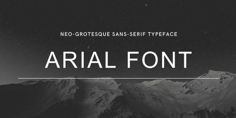
Let’s start with the basics, the one that’s like a familiar friend guiding you on your digital detours, the font named Arial. This little champ is like the workhorse of web design, ensuring every signpost, every street, and every city on Google Maps is visible and easy to comprehend.
Arial’s beauty lies in its simplicity and clarity. It’s a sans-serif typeface, meaning there are no small projecting features called “serifs” at the end of strokes. This makes Arial highly legible even at smaller sizes, ideal for something as detail-heavy as a map.
The Brand Beacon – Product Sans

However, the Google Maps logo stands apart, as the harbinger of Google’s unique brand personality. Here, we have Product Sans. Introduced in 2015, it represents Google’s distinctive identity, breathing life into the logo with its geometric precision and subtle rounding.
Product Sans is different from the myriad of fonts out there. It’s uniquely Google, a symbolic beacon representing the tech giant in the crowded digital sea.
Alternatives to the Google Maps font
Typography, like any form of design, is not a one-size-fits-all solution. There are other options, other fonts that can offer a fresh take on digital mapping.
Roboto
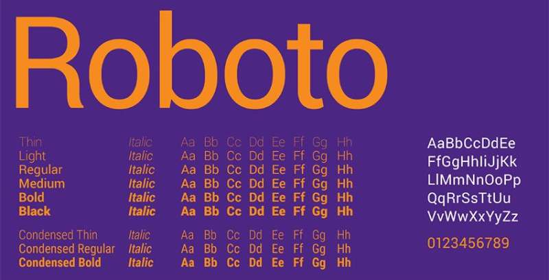
Roboto is another brainchild of Google, designed with mobile devices in mind. It’s modern, approachable, and friendly, all the while maintaining a professional appeal.
With its wide array of font weights, Roboto provides flexibility and adaptability, making it an excellent alternative to Arial.
Open Sans
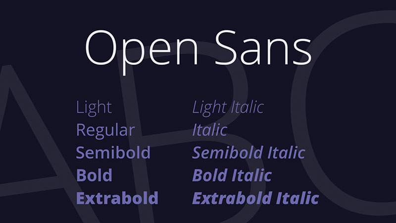
Next up, we have Open Sans, a font lauded for its incredible readability and clean design. Open Sans was designed with an upright stress, open forms, and a neutral appearance, making it highly versatile for all web interfaces, including digital maps.
The Importance of Font Choice
What’s the big deal with fonts anyway? Imagine a world where all books, signs, and screens use the same font. Boring, right?
Visual Hierarchy
Fonts contribute to visual hierarchy. They tell you where to look first, what’s important, and how to navigate the information presented to you.
In the case of Google Maps, Arial is like the foot soldier, guiding you through the labyrinth of roads and locations, while Product Sans acts like the flag bearer, representing the Google brand.
User Experience
The right font improves readability, ensuring users can process the map data efficiently. Too fancy, and the map becomes a riddle. Too bland, and it’s just dull to look at.
Fonts like Arial and Product Sans strike the right balance, making your Google Maps journey as smooth as possible.
The Evolution of Google Maps Fonts
Like any technology, Google Maps hasn’t stayed stagnant. Its fonts have evolved over time, adapting to user needs and technological advancements.
From Lucida to Arial
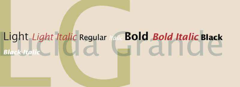
In its early days, Google Maps used Lucida Grande, a font loved for its clarity and simplicity. However, as Google sought a more universal and consistent look across platforms, Arial took the lead, primarily due to its universal compatibility and recognizability.
The Birth of Product Sans
The introduction of Product Sans in 2015 marked a new era for Google branding. This custom-designed font was a big leap from the previous logo font, giving Google a more modern and approachable look.
Fonts as Part of Google’s Branding Strategy
Behind every font choice lies a strategic decision. For Google, these choices revolve around user experience and brand consistency.
A Cohesive Ecosystem
Google aims for consistency across all its products, hence the usage of the same font family across various platforms. This consistency creates a sense of familiarity, enabling users to navigate different Google products effortlessly.
A Balance of Function and Form
The fonts used in Google Maps, Arial, and Product Sans, represent a fine balance of function and form. Arial is all about functionality, ensuring clear and legible map data.
In contrast, Product Sans adds an element of style, subtly reinforcing the Google brand every time you glance at the logo.
In conclusion, the fonts in Google Maps might seem like a minor detail, but they carry immense significance in shaping user experience and promoting brand identity.
FAQ On The Google Maps Font
What font does Google Maps use?
The font you see on Google Maps is Roboto. It’s crisp, easy on the eyes, designed by Christian Robertson, and it’s as ubiquitous as the app itself.
It was forged in the fires of Material Design to create a seamless user interface experience across devices—and it does its job quite brilliantly.
Can the Google Maps font be customized?
Actually, in the standard Google Maps app, no dice. There’s no direct way for users to tweak the font style or size.
But, for developers using the Google Maps API, the doors are open. You can totally change the aesthetics, including the fonts, when embedding maps into your own app or website.
Is the Google Maps font designed for better readability?
You bet. Legibility is king in map design. That’s why Google chose Roboto: it pairs clean lines with open curves, aiming to be as legible at 2 pm on a bright day as it is at midnight during a downpour, whether on desktop or squeezed into your smartphone screen.
What’s the history behind the Google Maps font?
Roboto wasn’t born with Google Maps; it actually debuted alongside Android Ice Cream Sandwich. The goal? Unify Google’s language across platforms.
Over time, it became part and parcel of the Google Maps experience, lending a consistent, navigational aesthetics that users around the globe rely on.
Does the font affect the loading speed of Google Maps?
Sure does, but probably less than you’d think. Google has it optimized. Roboto’s designed to load swiftly, so your maps are ready stat. That’s essential for that UX Design—because whether you’re tracking your ride or dodging traffic, every microsecond counts.
Are there any licensing issues with using the Google Maps font?
Ah, an area where there’s good news! Roboto is open-source, so it’s ready for personal or commercial use without tangling you in legal spiderwebs. Just swing by the Google Fonts repository, and it’s all yours. Google’s own way of spreading the typographic love.
How do I change the font size on Google Maps?
Resizable fonts on the fly? Sorry, folks, not a feature—not directly in-app, anyway. But there’s a workaround: you can adjust your device’s overall font settings, and Google Maps will follow suit, matching the text size you’ve set for that user-friendly experience.
Does the Google Maps font support all languages?
It’s quite the polyglot—Roboto boasts a vast character set supporting multiple scripts, which includes Latin, Cyrillic, and Greek. For the global audience that Google caters to, that’s not just necessary; it’s downright mandatory. Multilingual maps? That’s how we roll.
How do I report a problem with the Google Maps font?
Stumbled on a typographic hiccup while navigating? Report it straight to Google. There’s an option in the Google Maps menu to report issues. And Google’s pretty solid with fixing bugs, so your voice will be heard—one of the perks of dealing with a titan like Google LLC.
Are there alternatives to the Google Maps font for web developers?
Certainly, for those crafting their own maps with the Google Maps API, the font universe is your oyster. Want to mesh with your branding or kick up digital map legibility a notch? Pick an alternative from Google Fonts or any modern Web Fonts API to customize away.
Conclusion
Wrapping up, diving deep into the Google Maps font landscape uncovered some rich insights, huh? The power of Roboto—looks simple on the surface but has more layers than an onion. This font does more than just point North; it shapes the entire journey.
We strolled through the boulevards of typography in mapping and tiptoed around the alleys of navigational aesthetics. Took a peek behind the curtain at the API magic allowing for a customized look and even covered the legal ease of using Roboto. The takeaways?
- Readability—It’s not just graphics; it’s the compass guiding the eye.
- Customization—In your own digital space, tailor fonts to mirror your style.
- Accessibility—Roboto speaks a global language, connecting cultures.
Your map’s not just a tool; it’s an experience shaped by typeface choices. So next time you launch Google Maps to chase down your next destination, throw a nod to Roboto. That subtle guide? Deserves a bit of the spotlight.
If you enjoyed reading this article about Google Maps fonts, you should read these as well:
- The Best Travel Fonts for Your Design Projects
- Google font pairings and combinations that look good
- Discover the Best Quirky Fonts for Your Designs
- The Bethesda Logo History, Colors, Font, And Meaning - 28 April 2024
- Out of This World: Space Color Palettes for Cosmic Designs - 28 April 2024
- The Bungie Logo History, Colors, Font, And Meaning - 27 April 2024


