Gmail uses Google Sans as its primary interface typeface, a proprietary geometric sans-serif font developed by Google’s in-house design team. For email composition, Gmail defaults to Arial as the fallback body font, with Roboto serving as the secondary UI font across Android and desktop surfaces.
Google Sans replaced Arial as Gmail’s interface font in 2018, introduced as part of the Material Design overhaul that reshaped Google’s entire product ecosystem.
—
What Type of Font Is Google Sans?

Google Sans is a geometric sans-serif typeface. It belongs to the same broad category as fonts like Futura and Montserrat, built on circular, mathematically structured letterforms rather than the organic proportions of humanist designs.
A few things set it apart visually:
- Double-story lowercase “a” (carried over from Product Sans)
- Stroke terminals cut at roughly 45 degrees
- High x-height, which improves legibility at smaller sizes
- Consistent stroke contrast with minimal variation between thick and thin strokes
- Open counters that prevent crowding on high-DPI screens
The typeface sits in an interesting middle ground. It’s geometric enough to feel precise and on-brand, but it has subtle softness that keeps it from feeling sterile. That balance matters when you’re designing for an email client used by over 1.8 billion people across wildly different screen sizes.
Understanding why geometric sans-serifs dominate digital UI design comes down to typography basics: consistent stroke width and open apertures reduce eye strain during long reading sessions on screens.
Who Designed Google Sans?
Google Sans was developed by Google’s Brand Studio in collaboration with Colophon Foundry, the London-based type foundry.
The font launched in 2018 as a size-optimized derivative of Product Sans, Google’s earlier proprietary typeface created for the 2015 logo redesign. Product Sans was only intended for product logos, not body text or UI use. Google Sans filled that gap by refining the letterforms specifically for display text and interface surfaces.
In 2020, Google and Colophon also released Google Sans Text, a companion cut optimized for smaller point sizes where the original Google Sans showed readability issues, particularly in distinguishing “a” from “o”.
Most recently, in November 2025, Google released Google Sans Flex, a variable font evolution of the typeface, under the SIL Open Font License. This is the first publicly licensed version of the Google Sans family.
Is Google Sans Free to Use?
The original Google Sans is proprietary. It cannot be purchased, downloaded, or licensed by third parties. It is reserved exclusively for Google’s own products and marketing materials.
There is one important exception: Google Sans Flex, released in November 2025, is available on Google Fonts under the SIL Open Font License 1.1, which permits free personal and commercial use.
For anyone looking to replicate the Gmail aesthetic in their own projects, the practical options are the free alternatives covered below.
What Font Did Gmail Use Before?
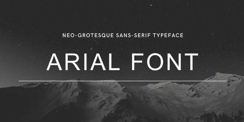
Before 2018, Gmail’s default interface font was Arial, a neo-grotesque sans-serif font designed by Robin Nicholas and Patricia Saunders, released in 1982.
Arial worked well enough for desktop web, but it wasn’t built with mobile screens in mind. As Gmail’s mobile usage grew, the font’s heavier strokes and tighter spacing became a problem on smaller displays.
The 2018 shift introduced Google Sans to Gmail’s interface as part of Google’s broader Material Design refresh, which aimed to unify typography across the entire Google product suite. Roboto, originally created by Christian Robertson in 2012 for Android, was also adopted across Gmail’s mobile app during this period.
The sequence looks roughly like this:
- Pre-2018: Arial (default interface and compose font)
- 2018: Google Sans introduced for Gmail interface; Roboto adopted for mobile
- 2022: Material You redesign reinforced Google Sans across Gmail web
- 2025: Google Sans Flex released publicly under open license
What Are the Best Free Alternatives to Google Sans?
Since Google Sans itself isn’t publicly available, these are the closest free options that hold up well in UI and email design:
| Font | Similarity | License | Source |
| Inter | Screen-optimized; matches the technical “UI” feel. | OFL (Free) | Google Fonts |
| DM Sans | Similar low-contrast and “friendly” geometric curves. | OFL (Free) | Google Fonts |
| Poppins | Heavily circular; mimics the “Playful” Google vibe. | OFL (Free) | Google Fonts |
| Plus Jakarta Sans | Modern geometric; designed for high-end digital. | OFL (Free) | Google Fonts |
| Montserrat | The closest open-source DNA to Product Sans. | OFL (Free) | Google Fonts |
Inter is the closest overall match, scoring around 85% visual similarity. It shares Google Sans’s screen-first design philosophy and is available as a variable font, which makes it practical for both UI and email use.
If you want to explore these options or find pairings, the font pairing generator is useful for testing combinations before committing to one. You can also check the full list of best free Google Fonts to see how these alternatives compare in real-world use.
How to Use Google Sans Alternatives in Gmail and Email Templates
In Gmail’s Compose Window
Gmail lets you set a default compose font under Settings → General → Default text style. The available options are a curated list of web-safe fonts including Arial, Verdana, Georgia, and Times New Roman.
You cannot set Google Sans or Inter as your default compose font through Gmail’s UI. Those fonts are not part of the standard compose dropdown.
In HTML Email Templates
This is where it gets a bit tricky. Gmail only natively supports 2 web fonts: Roboto and Google Sans. Any other web font you embed will be stripped or fall back to the device default.
A practical font stack for Gmail-compatible HTML emails:
“ font-family: 'Roboto', Arial, Helvetica, sans-serif; `
If Roboto doesn’t load, Gmail falls back to Arial. That fallback chain keeps the email readable across clients without breaking the layout.
For marketers building campaigns, sticking to web-safe fonts is still the safest approach for consistent rendering across Gmail, Outlook, and Apple Mail.
In Figma or Design Tools
Inter and DM Sans are both available as Google Fonts and can be loaded directly into Figma, Sketch, or any browser-based design tool. They’re solid stand-ins for mocking up Gmail-style interfaces without needing access to the proprietary Google Sans files.
If you’re working with web-based design prototyping and want to dig deeper into how these typefaces behave at different weights and sizes, it helps to understand leading, tracking, and kerning – all three interact differently across geometric sans-serifs at body vs. display sizes.
Why Did Gmail Choose Google Sans?
The short version: brand consistency and mobile readability.
Before 2018, Google’s products used a mix of typefaces with no cohesive thread connecting them. Gmail had Arial. Android had Roboto. Marketing used Product Sans. It felt fragmented.
According to Google’s design team, the goal was to give the brand a “typographic voice” that worked from a smartwatch screen to a billboard. Google Sans was the solution: geometric enough to feel distinctly Google, but practical enough for UI use at multiple sizes.
There’s also the screen rendering angle. Google Sans was designed with high-DPI displays in mind, with open counters and refined stroke contrast that holds up well on both 1080p monitors and OLED phone screens. Arial, by comparison, was engineered for lower-resolution environments and doesn’t benefit as much from modern rendering engines.
The psychology of fonts plays a role here too. Geometric sans-serifs tend to read as clean, modern, and trustworthy – attributes Google actively wants associated with its communication tools. A serif font would have felt out of place; a heavier grotesque would have felt cold.
From a visual hierarchy standpoint, Google Sans also scales well across heading sizes and body text – something Roboto and Arial don’t do as fluidly across all surface types. That flexibility made it the right choice for a product that needs to look good in an inbox header, a subject line preview, and a notification badge simultaneously.
Other major apps have made similar font decisions for similar reasons. The Notion font and the WhatsApp font both follow comparable logic: pick a clean, screen-optimized sans-serif that keeps the interface feeling neutral and readable without demanding attention from the content itself.
FAQ on What Font Does Gmail Use
What is Gmail’s default font?
Gmail’s interface uses Google Sans. For email composition, the default fallback is Arial, a web-safe sans-serif font. Gmail officially supports only two web fonts natively: Roboto and Google Sans.
Is Gmail’s font the same on mobile and desktop?
Not exactly. Desktop Gmail uses Google Sans for the interface. On Android, Roboto is the dominant system font. iOS renders Gmail using the device’s default system font, typically San Francisco.
Can I change the font in Gmail?
Yes. Go to Settings → General → Default text style. You can choose from a fixed list including Arial, Verdana, Georgia, and Times New Roman. Custom web fonts are not available through this menu.
What font does Gmail use for email body text?
Arial is Gmail’s default compose font. Recipients see whatever font their email client defaults to, unless the sender has specified formatting. Most email clients fall back to Arial or Helvetica when no font is declared.
What font does the Gmail logo use?
The capital “G” in the Gmail logo is set in Catull BQ Regular, a serif typeface designed by German typographer Gustav Jaeger in 1982. It is separate from Gmail’s interface font entirely.
Is Google Sans available to download for free?
The original Google Sans is proprietary and not publicly available. However, Google Sans Flex, a variable font version released in November 2025, is free on Google Fonts under the SIL Open Font License.
What fonts does Gmail support in HTML emails?
Gmail natively supports Roboto and Google Sans as web fonts. All other web fonts will be stripped and replaced by the device default. For reliable rendering, stick to email-safe fonts like Arial or Verdana.
Why did Gmail switch from Arial to Google Sans?
Google switched in 2018 to align Gmail with its Material Design system. Google Sans offered better rendering on high-DPI screens and gave Google a unified typographic identity across all its products and platforms.
What is the best free alternative to Gmail’s font?
Inter is the closest free alternative, with roughly 85% visual similarity to Google Sans. DM Sans and Poppins are solid secondary options. All three are available on Google Fonts under open licenses for personal and commercial use.
What font size does Gmail use by default?
Gmail’s default compose font size is small, which renders at approximately 13–14px depending on the browser. Users can adjust this under Default text style in Settings, with options for small, normal, large, and huge.
Conclusion
If you’ve been wondering what font does Gmail use, the answer covers more than one typeface. Google Sans handles the interface, Arial covers email composition defaults, and Roboto dominates the Android experience.
The font stack isn’t random. Each choice reflects deliberate decisions around screen rendering, cross-platform compatibility, and Gmail’s overall UI design language.
For designers and developers working with Gmail-adjacent projects, Inter remains the most practical free alternative for matching the Google Sans aesthetic. Pair it with solid typographic hierarchy and your email design will hold up across clients.

Renowned for his expertise in logo design and visual branding, Bogdan has developed a multitude of logos for various clients.
His skills extend to creating posters, vector illustrations, business cards, and brochures. Additionally, Bogdan's UI kits were featured on marketplaces like Visual Hierarchy and UI8.
He also wrote in the past years on sites like Design Your Way, WebDesignerDepot, WPDean, Designmodo, Speckyboy, Slider Revolution, and more.
- The Windsurf Logo History, Colors, Font, And Meaning - 10 October 2026
- How to Remove Background From Product Photos (No Photoshop) - 10 October 2026
- How Designers can Build a Stronger Online Creative Identity - 9 October 2026

Bogdan Sandu is a seasoned designer who has been designing websites since 2008. Renowned for his expertise in logo design and visual branding, Bogdan has developed a multitude of logos for various clients. His skills extend to creating posters, vector illustrations, business cards, and brochures. Additionally, Bogdan's UI kits were featured on marketplaces like Visual Hierarchy and UI8. He also wrote in the past years on sites like Design Your Way, WebDesignerDepot, WPDean, Designmodo, Speckyboy, Slider Revolution, and more.
You Might Also Like