


A file either remembers shapes or it remembers pixels, and that is most of the vector versus raster question for print. Paths stay sharp at any size. A pixel grid only holds up when enough pixels land on each inch of paper, which is why logos and type usually go vector while photographs stay raster.
Everything ends up as dots on the press anyway. The raster image processor turns vector paths into pixels at the output device’s resolution, and Ergosoft’s RIP documentation treats the rendering resolution for PDF and EPS files as a setting you pick based on viewing distance, configured in image presets or application defaults.
What really separates the two is when the pixels get made. Vector artwork becomes pixels at the final print size. A raster file shows up already converted, at whatever size somebody saved it.
How vector and raster graphics differ in print
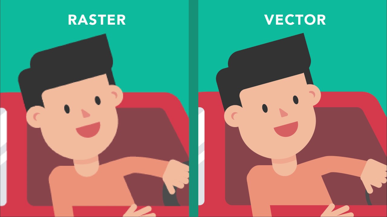
Vector files describe every shape with anchor points and Bezier curves. Because the printer recalculates each curve at the output size, vector graphics keep clean edges however far you enlarge them.
Raster files work differently. These bitmap images record one color value per pixel and nothing about what lies between pixels, so quality depends entirely on how many pixels land on each inch of paper.
Logos, type and line art lean vector. Photographs and anything continuous tone lean raster. That covers most jobs.
| Feature | Vector | Raster |
|---|---|---|
| Built from | Paths, anchor points, curves | Grid of pixels |
| Scaling | Resolution independent | Fixed pixel dimensions |
| File size | Follows path complexity | Follows pixel count and compression |
| Best content | Logos, type, line art, dielines | Photographs, textures, continuous tone |
| Weak spot | Photographic detail | Enlargement past the source pixels |
What happens at the raster image processor
Every page headed for a press or a large-format printer goes through a raster image processor (RIP), which converts the page description into the dots the device lays down.
Vector paths get rasterized in that step too, at the device’s resolution and the final print size. PostScript, the page description language behind EPS files, describes shapes as curves and fills, and the RIP does the rest. Which is why timing is the whole story here.
How each type fails when scaled
Enlarge a raster image and every pixel grows into a visible square, so curves and diagonals go jagged. Shrink one and the effective ppi climbs. Nothing breaks, the file just carries more data than the print uses.
Vector survives both directions because the RIP recalculates the paths each time.
Sharpening hides softness for a moment but cannot add pixels. Once a raster is too small for its print size, the fix is a larger source file.
What resolution does a raster image need for print?
Flyers and brochures want 300 ppi at final size, and so do business cards. Large format drops far below that, because the viewer stands farther away.
The number that decides quality is effective ppi, not the value stored in the file.
PPI, dpi and effective ppi
PPI counts pixels per inch in the image file. Printer resolution is measured in dots per inch, which counts the ink dots a device places, so it is a different number entirely.
Effective ppi equals the pixel width divided by the printed width in inches. Place the image bigger and the ppi falls. Place it smaller and it climbs.
- 3000 x 2000 pixels at 300 ppi prints 10 x 6.67 inches
- The same file at 150 ppi prints 20 x 13.33 inches, with half the detail per inch
- A 3.5 x 2 inch business card photo needs 1050 x 600 pixels at 300 ppi
InDesign’s Links panel can show effective ppi for each placed image, and a Preflight profile can flag anything below a set minimum.
Resolution targets at a glance
- Small-format print runs at 300 ppi at final size (Smartpress)
- Offset work has a stated minimum of 240 dpi for raster graphics (Olympus Press)
- Large format is more forgiving, with 100 dpi for photographic images on canvas and 200 dpi for line images (Smartpress)
- Billboards viewed from beyond 25 feet get by on 30 ppi (Premier Press)
Printers use dpi and ppi loosely in their specs. Read the number as pixels per inch of the placed image.
Why vendors disagree on 300 ppi
Adobe’s Photoshop user guide ties image resolution to the press at 1.5 to 2 times the screen frequency. A 150 lpi halftone, for example, calls for 225 to 300 ppi.
That makes 300 ppi the top of the range for a 150 lpi screen, not a floor for every job.
Each printer publishes its own print resolution standards for its own presses, and the spread between 240 and 300 fits Adobe’s rule. When a file is tight, ask the printer for its screen ruling instead of defaulting to 300.
Large format and viewing distance
Large format breaks the 300 ppi habit.
Premier Press points out that large-format inkjet output behaves close to continuous tone and gets viewed from farther away, which pushes the required resolution down. A 24 x 36 inch poster at 100 ppi needs 2400 x 3600 pixels, against 7200 x 10800 at 300 ppi.
Vector elements in the same file stay sharp regardless, so only the photos set the pixel budget.
Why upscaling does not add detail
Upsampling a 150 ppi file to 300 ppi doubles the pixel dimensions, which quadruples the pixel count. The software builds the new pixels by averaging their neighbors, though, so no detail comes back.
When a placed image falls short, replace it with a larger source or shrink the frame.
File formats printers accept for vector and raster artwork
Vector artwork travels as AI, EPS, SVG or vector PDF, and raster artwork as TIFF, JPEG, PNG or PSD. A PDF can carry both in one file.
AI is Illustrator’s native format. EPS is PostScript-based, a legacy format that still turns up in print workflows. SVG is XML-based and built for the web, though plenty of design tools read it. A PDF counts as vector when it was exported from vector artwork.
On the raster side, TIFF is lossless and the usual choice for print production. JPEG is lossy, which gives small files and is why it is best kept for photos. PNG is lossless and handles transparency. PSD is a layered Photoshop file.
Files saved as JPEG throw away detail to shrink, and every re-save adds compression artifacts.
The W3C describes SVG as an XML-based language for two-dimensional vector and mixed vector/raster graphics (SVG 2, W3C Candidate Recommendation, 4 October 2018). So an SVG can carry a photo inside it.
Is a PDF vector or raster?
Both. Adobe’s Creative Cloud guidance states that a PDF can contain raster and vector graphics together.
Text and line art usually stay vector while embedded photos stay raster, so the resolution rules apply only to the images inside.
PDF/X adds printing-related requirements that standard PDF does not have. ISO 15930-4:2003 defines PDF/X-1a for CMYK and spot color data, and ISO 15930-7:2010 defines PDF/X-4.
Ask the printer which version it wants, since the preference differs from shop to shop.
Which software produces each type
Adobe Illustrator is the vector workhorse. It saves AI and exports EPS, SVG and PDF. CorelDRAW is a vector editor too, exporting PDF and EPS, and Inkscape is the free, open source option that uses SVG natively.
Adobe Photoshop handles raster work, saving PSD, TIFF, JPEG and PNG, and it can also hold vector shape layers. GIMP is a free, open-source raster editor for photo work.
Adobe InDesign sits in the layout slot. It places linked vector and raster files and exports the print PDF.
Color handling in vector and raster artwork
Vector objects carry a defined color per fill and stroke, either process color or a named spot color. Raster pixels each carry their own color value, and those have to be converted from RGB to CMYK before anything reaches the press.
Vector color: process and spot
A spot color is one premixed ink.
It is identified by number and mixed as its own ink instead of being built from cyan, magenta, yellow and black. The Pantone Matching System is the standard reference, and Pantone’s Formula Guide (2022 edition) lists 2,390 spot colors.
Templi’s print artwork guide treats vector as the requirement for spot color jobs and says CMYK jobs can run on raster. Vector shapes separate cleanly into one plate or screen per ink.
Raster color: RGB to CMYK
Photos arrive in RGB from cameras and screens, and an ICC profile maps those values into the press’s CMYK range. Colors with no CMYK equivalent land on the nearest printable value, which is why saturated shades look duller on press.
Adobe’s Illustrator help notes that some RGB colors, neon shades among them, cannot be printed because they have no equivalent in CMYK. Illustrator flags them with an alert triangle in the Color panel.
Setting the color mode
Set the document color mode before export, not after. In Illustrator it sits under File > Document Color Mode > CMYK Color.
Working in CMYK from the start keeps the screen preview closer to what the press produces.
Which artwork type fits which print method?
Jobs that get cut or stitched favor vector, and so does anything separated into inks. Continuous-tone photos favor raster. Offset and digital presses take both, so the choice there follows the content, not the press.
| Job | Recommended type | Why | Watch for |
|---|---|---|---|
| Screen printing | Vector, spot colors | One screen per ink separates cleanly | Photos need halftone separations |
| Embroidery digitizing | Vector preferred | Clean paths guide stitch placement | The output is a stitch file |
| Vinyl cutting | Vector only | The cutter follows paths | Open or doubled paths |
| Offset and digital | Vector plus raster | Vector for type, raster for photos | Placed image ppi |
| Banners, signs, packaging | Vector plus raster | Vector for logos and dielines | Vendor-specific specs |
Screen printing, embroidery and vinyl cutting
Screen printing needs a screen for every color, so artwork gets separated one ink at a time in a vector program such as Illustrator or CorelDRAW, per Impressions magazine. Photos and process color take the other route, through channel separations built in Photoshop.
Embroidery prefers vector input, and the output is a stitch file (DST, PES), as the Digit-IT knowledge base puts it.
Vinyl cutters follow paths, which is why SAIC’s Service Bureau accepts only AI, EPS or PDF files built from closed vector paths with no overlaps.
Exclaim’s embroidery guide asks for small text at least 0.25 inch tall and avoids lines thinner than 1 point. It names vector files (AI, SVG) as preferred.
Its screen printing guide recommends no more than 6 colors per design, since every color costs a screen.
Offset and digital runs
Mixed files are the norm here.
Type and logos go vector so they stay crisp, and photos stay raster. Smartpress does not require either type in a print-ready file, though it notes vector suits artwork reused across sizes.
Adobe’s Creative Cloud guidance goes further and calls combining raster and vector workflows often necessary for professional results.
Banners, signage and packaging
Sign work follows the same split. In signage design, lettering and logos go vector so they stay crisp at any size, and photos ride along as raster.
Packaging adds a vector layer of its own. A dieline is the outline of a box’s cuts and folds, and PakFactory’s packaging guide pairs vector logos, text and dielines with raster photos, saying neither type wins outright.
How to prepare artwork files for a print vendor
Start with the vendor’s spec sheet. Nearly everything after that depends on it.
- Get the vendor’s spec sheet, which lists accepted formats, color mode, resolution at 100% scale, PDF/X version and font handling
- Build logos, type and line art as vector objects
- Check the effective ppi of every placed raster image in InDesign’s Links panel or Preflight
- Set the document to the color mode the vendor names and convert placed photos to match
- Embed the fonts or outline the text, whichever the vendor asks for
- Add bleed and crop marks to the export
- Export the PDF at the PDF/X version the vendor names, then check it in Acrobat’s Preflight
Bleed and crop marks
Extend backgrounds and images past the trim edge. That margin is called bleed, and it keeps a slightly shifted cut from leaving white slivers.
Crop marks sit outside the bleed and show the cutter where to trim.
Embed fonts or outline text
Vendors split on this.
Durst’s RIP software manual says fonts must be embedded to guarantee error-free print output. It offers conversion to outlines as a separate fixup that can improve reliability in the RIP, but it warns that outlining large amounts of text raises PDF file size, and that text can come out somewhat thicker on output devices below 600 dpi.
SpeedPro Fort Worth West asks for all fonts and text outlined, and wants the font files sent along when outlining fails. Prepress veterans on the Adobe Community forums argue that blanket outlining is unnecessary.
Follow the spec sheet. With no instruction, embed fonts at export (the steps to embed fonts in a PDF differ by app) and outline only short logo wordmarks.
When vendor specs differ
SpeedPro Fort Worth West’s upload requirements set raster files at a minimum of 150 dpi at 100% scale and name Illustrator and Photoshop as preferred for large format.
Treat a vendor’s spec sheet as the tie-breaker over any general rule, including the ones in this guide.
Can you convert a raster image to vector, and back?
Yes, both ways, though not equally. Rasterizing a vector is a clean export. Tracing a raster rebuilds shapes from pixels, and it cannot recover what the pixels never held.
Vector to raster at output size
Rasterizing means exporting vector artwork to TIFF, PNG or JPEG. Export at the final print size and at the ppi the job needs.
The direction is one-way. Once shapes are pixels they stay pixels, so keep the vector master and rasterize copies.
Raster to vector with Image Trace
- Place the raster image in Illustrator
- Open Window > Image Trace and pick a preset
- Adjust the options, then expand the result to edit individual paths
As of Adobe’s February 2026 documentation update, enhanced presets include built-in support for gradients, shapes, transparency and auto grouping, depending on the preset. Legacy presets need those options switched on by hand, and an expanded trace can no longer be re-tuned.
Inkscape and Vector Magic
Inkscape is free, and its Path > Trace Bitmap command offers brightness cutoff, color quantization and multiple scans modes (Inkscape manual).
Vector Magic is a dedicated tracer that picks its settings automatically and outputs SVG, EPS or PDF (the desktop edition adds AI and DXF). Its own tutorial frames the job as converting a digitally rasterized bitmap back into vector art, which is the easy case.
Where tracing breaks down
Auto trace works on flat, high-contrast art from a large source. It struggles with everything else.
Adobe Community answers from experienced users say a low-resolution source gives poor traces, and that clean production-quality logos usually need rebuilding by hand with the Pen tool.
SAIC’s Service Bureau adds a cutting-specific warning: check for double paths, especially after Image Trace.
My own rule is to trace flat art from a large file and redraw logos that are small, blurry or headed for a cutter.
When vector or raster artwork fails in print
Raster artwork fails when the pixels run out. Vector fails in sneakier ways, usually because something in the file quietly turned into pixels or because the paths are wrong for the machine.
Where raster artwork fails
Compression is the quiet failure. A JPEG re-saved a few times picks up artifacts along hard edges, and Adobe Community prepress contributors warn that large output magnifies them.
Keep print masters in a lossless format and export JPEG only for delivery.
Transparency flattening turns vector into raster
Flattening breaks overlapping transparent objects into opaque pieces. When a raster image sits under the overlap, vector text and shapes can be rasterized with it, according to Adobe Community prepress discussions.
PDF/X-1a flattens transparency and layers on export, while PDF/X-4 keeps live transparency and layers until the RIP.
The visible damage shows up as stitching lines or white stripes where flattened pieces meet. Premier Press lists PDF/X-4 as its preferred standard.
Gradients and effects in spot-color jobs
Spot-color and stitch methods have no native way to print a smooth blend.
Screen printers simulate gradients with halftone dot patterns, and Exclaim’s embroidery guide lists gradients among details that may not reproduce in thread.
Semitransparent shapes fare no better. Printable Press says overlapping transparency and multiply blends do not translate to screen-print separations cleanly.
Messy paths on cut jobs
Cutters follow every path in the file, duplicates included, which is why SAIC’s Service Bureau tells users to hunt down double paths before sending a job.
A vector file is not proof of a print-ready file. Open the exported PDF and look.
Vector vs raster graphics for print FAQ
Are JPEG and SVG files vector or raster?
A JPEG is raster. An SVG is vector, with one wrinkle: the W3C describes SVG as a language for vector and mixed vector/raster graphics, so an SVG can carry an embedded photo that stays raster.
How can you tell whether a file is vector or raster?
Zoom in. Edges that turn blocky are raster, edges that stay clean are vector.
In Illustrator, View > Outline shows only paths, so a placed photo appears as a plain box.
Can a logo saved as a JPG or PNG be printed?
Yes, as long as its pixel dimensions cover the print size at the ppi the job needs. Vinyl cutting is the hard exception, since the cutter follows vector paths, and screen printers separate colors more cleanly from vector artwork.
Does PNG work for print?
Yes. PNG is lossless, so it avoids JPEG compression artifacts, and it keeps transparent backgrounds.
Check the effective ppi at print size, and remember PNG has no CMYK mode, so the color conversion happens at export.
Which File to Keep as Your Print Master
For vector vs raster graphics for print, the master is the vector file when you are dealing with logos, type and line art, and the original full-resolution file when you are dealing with photographs. Every print copy gets exported from those and never edited in place.
Size the photo master to the most demanding vendor spec. A 24 x 36 inch poster needs 7200 x 10800 pixels at Smartpress’s 300 ppi but only 3600 x 5400 at SpeedPro’s 150 dpi minimum, so the larger file serves both shops.
The trade-off is disk space, since a master outweighs any single export.
Premier Press lists PDF/X-4 as its preferred standard, and each shop that adopts it removes one flattened copy from the workflow. Each export then follows the steps for setting up a print-ready file.

Renowned for his expertise in logo design and visual branding, Bogdan has developed a multitude of logos for various clients.
His skills extend to creating posters, vector illustrations, business cards, and brochures. Additionally, Bogdan's UI kits were featured on marketplaces like Visual Hierarchy and UI8.
He also wrote in the past years on sites like Design Your Way, WebDesignerDepot, WPDean, Designmodo, Speckyboy, Slider Revolution, and more.
- The Windsurf Logo History, Colors, Font, And Meaning - 10 October 2026
- How to Remove Background From Product Photos (No Photoshop) - 10 October 2026
- How Designers can Build a Stronger Online Creative Identity - 9 October 2026

Bogdan Sandu is a seasoned designer who has been designing websites since 2008. Renowned for his expertise in logo design and visual branding, Bogdan has developed a multitude of logos for various clients. His skills extend to creating posters, vector illustrations, business cards, and brochures. Additionally, Bogdan's UI kits were featured on marketplaces like Visual Hierarchy and UI8. He also wrote in the past years on sites like Design Your Way, WebDesignerDepot, WPDean, Designmodo, Speckyboy, Slider Revolution, and more.
You Might Also Like


