Microsoft Teams uses Segoe UI, a humanist sans-serif font licensed from Monotype Imaging. Microsoft adopted Segoe UI as its primary UI typeface with the release of Windows Vista in 2007, and Teams has used it as its default interface font since the platform launched in 2017.
On Android, the Teams app switches to Roboto as its primary typeface, following Google’s own platform guidelines.
What Type of Font Is Segoe UI?
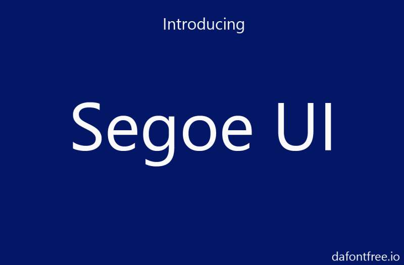
Segoe UI is classified as a humanist sans-serif. That puts it in the same broad category as fonts like Frutiger and Gill Sans, where letterforms draw loose inspiration from calligraphic pen movements rather than strict geometric construction.
A few things stand out about how it looks on screen:
- Open apertures on letters like “e,” “c,” and “a” keep characters readable at small sizes
- Single-story lowercase “g” gives it a cleaner, more modern feel than older humanist designs
- Stroke contrast is low, which helps with rendering clarity on digital displays
- The x-height is generous, making body text comfortable to read in chat messages
Chat messages in Teams typically render at 14px. Navigation and UI labels use smaller sizes, scaled automatically based on system accessibility settings.
On Windows 11, Microsoft introduced Segoe UI Variable, a variable font version that adjusts optical sizing depending on text size. Teams on Windows 11 benefits from this refinement, though Segoe UI (the static version) remains the baseline across the Microsoft 365 ecosystem.
Who Designed Segoe UI?
Segoe UI was designed by Steve Matteson during his time at Agfa Monotype. Microsoft licensed it in the early 2000s, then extended and customized it significantly for screen use.
It is not a fully custom font built in-house by Microsoft. As Simon Daniels, a program manager in Microsoft’s typography group, publicly stated: the original Segoe fonts were an existing Monotype design that Microsoft licensed and then heavily modified for different devices, apps, and processes.
Monotype Imaging formally produced Segoe UI. Microsoft holds US design patents for various Segoe-based fonts, and the Segoe name itself is a registered Microsoft trademark, even though the typeface’s origins trace back to Monotype.
Worth knowing: Segoe UI drew notable controversy in the type design community for its close visual resemblance to Frutiger, Adrian Frutiger’s landmark humanist typeface from 1975. The German foundry Linotype challenged Microsoft’s EU design registration for Segoe, and the EU ultimately revoked Microsoft’s registration. Microsoft did not appeal.
Is Segoe UI Free to Use?
This is where it gets a little tricky. Segoe UI is not freely available for general download or commercial use. It ships as a system font on Windows and, as of 2022, was added to Microsoft Office for non-Windows devices. But it is not distributed through Google Fonts, Adobe Fonts, or any open-source repository.
License type: Proprietary, owned and controlled by Microsoft.
Developers sometimes use it in web projects targeting Windows users (where it loads locally), but embedding or distributing Segoe UI as a web font without a Microsoft license is not permitted. The copyright belongs to Microsoft, and the font is not open-source.
If you need a similar font license for a project where Segoe UI isn’t available, the section below covers the best free alternatives.
What Font Did Microsoft (and Teams) Use Before Segoe UI?
Before Segoe UI became the standard, Microsoft relied on Tahoma as its default Windows UI font. Tahoma was designed by Matthew Carter for Microsoft and shipped as the primary interface typeface starting with Windows 2000, replacing Microsoft Sans Serif.
When Windows Vista launched in 2007, Segoe UI replaced Tahoma. The switch was part of a broader visual update that included the Aero glass interface and ClearType subpixel rendering improvements. Tahoma had been built to survive low-resolution screens. Segoe UI was built to look genuinely good on the higher-resolution displays Vista was targeting.
Since Microsoft Teams was launched in 2017, it has always used Segoe UI. There was no Teams-specific font change. The platform inherited Microsoft’s established UI typeface from the start, consistent with Office 365, SharePoint, and the Fluent Design System introduced that same year.
What Are the Best Free Alternatives to Segoe UI?
Since Segoe UI is proprietary, most designers working outside the Microsoft ecosystem need a stand-in. Here are 5 solid free options, all available for commercial use:
| Font | Similarity | License | Source |
| Noto Sans | Closest match in lowercase forms; massive language support. | OFL (Free) | Google Fonts |
| Open Sans | Same designer (Matteson); shares the “Humanist” DNA. | OFL (Free) | Google Fonts |
| Inter | Screen-optimized; shares the technical “UI” proportions. | OFL (Free) | Google Fonts |
| PT Sans | Humanist with slightly more character/flair. | OFL (Free) | Google Fonts |
| Source Sans Pro | Adobe’s UI workhorse; excellent at tiny sizes. | OFL (Free) | Google Fonts |
If you’re building a web app that needs to look close to Teams or any Microsoft product, Inter is probably the most practical pick right now. It was literally designed for screen UI work and covers a wide range of weights.
For the CSS font stack Teams itself uses (with fallbacks for Mac and Linux), it looks roughly like this:
“ font-family: "Segoe UI", -apple-system, BlinkMacSystemFont, Roboto, "Helvetica Neue", sans-serif; `
On macOS, where Segoe UI is not a system font, the browser falls back to San Francisco via the -apple-system keyword. This is why Teams looks slightly different on Mac versus Windows, even when you're using the same web client.
How to Use a Segoe UI Alternative in Your Design Tools
In Figma
Windows users can access Segoe UI directly in Figma since it reads local system fonts.
Mac users won’t see it in the font list. The easiest workaround: install Inter from Google Fonts locally, then set your typography system to use Inter as the Teams-style equivalent.
In Canva
Canva does not include Segoe UI. Use Noto Sans or Open Sans from Canva’s built-in font library. Both are close enough for mockups and presentations that need a neutral, professional sans-serif.
In a Web Project (CSS)
To embed Inter as a Segoe UI substitute via Google Fonts:
` <link href="https://fonts.googleapis.com/css2?family=Inter:wght@400;600&display=swap" rel="stylesheet"> `
Then in your CSS:
` body { font-family: 'Inter', "Segoe UI", sans-serif; } `
This way, Windows users who have Segoe UI installed locally will see it, and everyone else gets Inter. Clean approach, no licensing issues.
Why Did Microsoft Choose Segoe UI for Teams?

This wasn’t a Teams-specific decision. It was a system-wide Microsoft design standard that Teams inherited when it launched.
Segoe UI became Microsoft’s default UI typeface in 2007 with Windows Vista, and the Fluent Design System that Microsoft introduced in 2017 (the same year Teams launched) made Segoe UI the typographic foundation across all Microsoft products. Teams, SharePoint, Outlook, and the Office web apps all use it for the same reason: consistency across the Microsoft 365 ecosystem.
From a practical standpoint, there are real reasons why Segoe UI works well in a collaboration tool:
- Its open letterforms maintain legibility at small chat message sizes
- System font loading means zero additional network requests, which matters during calls
- It meets accessibility standards (WCAG) for contrast and readability at standard UI sizes
- Cross-platform fallbacks (San Francisco on Mac, Roboto on Android) mean the overall reading experience stays consistent even when Segoe UI isn’t available
Microsoft’s design team has also publicly noted that using a system font stack reduces rendering inconsistencies between operating systems. For a product used in over 300 million daily active workplaces, that kind of reliability outweighs any creative typographic ambitions.
The typography choice, in other words, is boring by design. And in this context, boring is exactly right.
If you’re curious how other communication platforms handle their font choices, check out the Zoom font, the WhatsApp font, or the Microsoft Office font for comparison. Each platform makes slightly different calls when it comes to balancing branding, readability, and cross-platform compatibility.
FAQ on The What Font Does Microsoft Teams Use
What is the default font in Microsoft Teams?
Microsoft Teams uses Segoe UI as its default typeface across the desktop and web app.
It is a humanist sans-serif font licensed from Monotype Imaging and adopted by Microsoft as its standard UI typeface since Windows Vista in 2007.
Can you change the font in Microsoft Teams?
No. Teams does not allow users to change the interface font.
You can apply basic text formatting in messages, such as bold, italic, and bullet points, but the underlying typeface is fixed as Segoe UI across all platforms.
What font does the Teams Android app use?
The Teams Android app uses Roboto instead of Segoe UI.
This follows Google’s platform guidelines for Android. Roboto is a geometric sans-serif typeface designed by Christian Robertson at Google in 2011.
Is Segoe UI free to download and use?
No. Segoe UI is a proprietary Microsoft font and is not available for free commercial use.
It ships as a system font on Windows devices but cannot be legally embedded in web projects or distributed without a Microsoft license.
What font does Teams use on Mac?
On macOS, Teams falls back to San Francisco when Segoe UI is unavailable.
The CSS font stack uses -apple-system as a fallback keyword, which resolves to San Francisco on Apple devices. This is why Teams text looks slightly different on Mac versus Windows.
What font size does Microsoft Teams use for chat messages?
Chat messages in Teams render at approximately 14px by default.
Navigation labels and UI elements use smaller sizes. Teams scales font size automatically based on your system’s display settings and accessibility preferences.
Who designed the Segoe UI font?
Steve Matteson designed Segoe UI during his time at Agfa Monotype.
Microsoft licensed the original design in the early 2000s, then heavily extended and customized it for screen rendering across Windows, Office, Xbox, and the broader Microsoft 365 ecosystem.
What font did Microsoft use before Segoe UI?
Before Segoe UI, Microsoft’s default Windows interface font was Tahoma, designed by Matthew Carter.
Tahoma served as the primary UI typeface from Windows 2000 onward. Segoe UI replaced it with the Windows Vista launch in 2007 as part of a broader visual and rendering overhaul.
What are the best free alternatives to Segoe UI for design projects?
The closest free alternatives are Inter, Noto Sans, and Open Sans, all available via Google Fonts.
Inter is the strongest pick for UI design work. Open Sans was also designed by Steve Matteson, making it structurally similar. Both are licensed under the Open Font License for commercial use.
Does Microsoft Teams use a different font from Microsoft Office?
Not exactly. Teams uses Segoe UI for its interface, and so does most of the Microsoft Office UI shell.
However, Office documents default to Calibri for body text. Calibri is a separate humanist sans-serif and has been the default Office document font since 2007, recently updated to Aptos in newer Office versions.
Conclusion
If you’ve ever wondered what font does Microsoft Teams use, the answer is Segoe UI, a proprietary humanist sans-serif typeface built for screen rendering across the entire Microsoft 365 ecosystem.
The font rendering shifts depending on your platform. Windows gets Segoe UI natively, Mac falls back to San Francisco, and Android uses Roboto.
You can’t change the Teams interface font, but free alternatives like Inter and Noto Sans cover most design and development use cases where Segoe UI isn’t available.

Renowned for his expertise in logo design and visual branding, Bogdan has developed a multitude of logos for various clients.
His skills extend to creating posters, vector illustrations, business cards, and brochures. Additionally, Bogdan's UI kits were featured on marketplaces like Visual Hierarchy and UI8.
He also wrote in the past years on sites like Design Your Way, WebDesignerDepot, WPDean, Designmodo, Speckyboy, Slider Revolution, and more.
- The Windsurf Logo History, Colors, Font, And Meaning - 10 October 2026
- How to Remove Background From Product Photos (No Photoshop) - 10 October 2026
- How Designers can Build a Stronger Online Creative Identity - 9 October 2026

Bogdan Sandu is a seasoned designer who has been designing websites since 2008. Renowned for his expertise in logo design and visual branding, Bogdan has developed a multitude of logos for various clients. His skills extend to creating posters, vector illustrations, business cards, and brochures. Additionally, Bogdan's UI kits were featured on marketplaces like Visual Hierarchy and UI8. He also wrote in the past years on sites like Design Your Way, WebDesignerDepot, WPDean, Designmodo, Speckyboy, Slider Revolution, and more.
You Might Also Like