The San Miguel logo is one of the oldest and most recognized brewery marks in Southeast Asia. It belongs to San Miguel Corporation, a Philippine conglomerate founded in 1890 under a Spanish Royal Charter. The brand’s visual mark, known as the “Escudo” (seal), traces back to the original coat of arms of Manila. Over 130 years, this emblem has gone through several redesigns while keeping its heraldic roots intact.
San Miguel Corporation is the Philippines’ largest company by revenue, with over 24,000 employees across the Asia-Pacific region. Its flagship product, San Miguel Pale Pilsen, ranks among the best-selling beers globally. The logo sits at the center of one of the most diversified conglomerates in Filipino business history, covering food, beverages, energy, infrastructure, and packaging.
The current version of the Escudo was streamlined in 2012. The original designer remains unknown. The logo has gone through at least five major versions since its first use as a trademark in 1893. That makes it one of the longest-running corporate marks in Asia.
What Is the San Miguel Logo?

The San Miguel logo is a heraldic shield-based emblem featuring a rampant lion, a castle tower, a crown, and bold serif typography. It was first adapted as a trademark in 1893 from the Spanish-era coat of arms of Manila. The emblem carries strong ties to colonial history and Filipino national identity, making it both a corporate mark and a cultural symbol.
Design Type: Emblem (combination of shield, heraldic imagery, and wordmark)
Primary Elements: A red shield divided into sections. The upper portion holds a golden royal crown. Below that, a gold rampant lion with blue tongue and claws. A castle tower sits in the upper section of the shield. Four diamonds appear within the design. The company name runs below in capitalized serif lettering.
Official Introduction Date: The seal first appeared on the Spanish Royal Grant document in 1890. It was formally adopted as a trademark in 1893 when the brewery incorporated.
Designer/Agency: The original designer is not documented. The Escudo was adapted from the historic coat of arms of Manila. Later refinements were done internally by San Miguel Corporation’s branding teams.
Trademark Status: Registered trademark of San Miguel Corporation. The emblem is legally protected intellectual property, defending its unique design against unauthorized use across all markets where SMC operates.
Color Palette: Deep red (#C8102E approximate), gold/yellow (#FFD700 approximate), white (#FFFFFF), dark brown/black for text elements. The exact Pantone codes are held proprietary within the company’s internal brand guidelines.
Usage Context: Beer bottle labels, can designs, corporate signage, marketing collateral, product packaging, digital platforms, merchandise, sports team branding (San Miguel Beermen), and all subsidiary communications.
How Has the San Miguel Logo Evolved Over Time?

The San Miguel logo has gone through at least five distinct phases since the brewery’s founding in 1890. Each version reflected the company’s growth from a single Manila brewery into a multinational conglomerate. The Escudo was briefly replaced by an abstract corporate mark in 1975, only to be restored in 1999 as the official symbol of the entire corporation.
Original San Miguel Trademark (1890–1940)
Years Active: 1890–1940
The earliest San Miguel Beer bottles were simply branded with the letters “S” over “M.” That’s it. No shield, no lion. Just initials.
The Escudo seal first appeared on the Spanish Royal Grant document that authorized Enrique María Barretto to brew beer in the Philippines. When the brewery incorporated in 1893, an adaptation of this seal became the company’s official trademark.
The early Escudo was fairly ornate and closely resembled the actual coat of arms of Manila from the Spanish colonial period. It featured a sea lion (not the rampant lion of later versions), a castle, a crown, and five diamonds. The color palette leaned heavily on golds and reds.
For nearly 50 years, this version marked every bottle of San Miguel Beer. It was more of a functional label than a polished corporate identity. But it stuck.
Refined Escudo Era (1940–1975)
Years Active: 1940–1975
In 1940, San Miguel Brewery introduced a more graphic, stylized version of the Escudo. The sea lion transformed into a more defined heraldic figure. Details were sharpened. The overall look moved from hand-drawn colonial art toward something more suitable for mass production and print reproduction.
This version lasted through the company’s name change to San Miguel Corporation in 1963. It was the logo people associated with the brand during its golden age of Philippine market dominance. By the early 1970s, San Miguel held around 90% of the domestic beer market.
The shield’s proportions got tighter. Contrast between the red field and gold elements became sharper. The crown detail grew more elaborate. And the castle tower simplified slightly.
Abstract Corporate Logo (1975–1999)
Years Active: 1975–1999
Here’s where things got weird. By 1975, San Miguel Corporation had diversified well beyond beer into food, beverages, and packaging. Leadership decided the Escudo was too strongly tied to the brewery. They needed something that could represent a modern conglomerate.
The solution? An abstract logo featuring four red drop-like figures separated by white lines. The company name appeared below in a clean sans-serif font. The symbol represented water, life, growth, food, abundance, and progress. SMC even ran an animated TV commercial explaining the concept.
The Escudo was not gone, though. It stayed on the beer labels. The abstract mark handled the corporate side. This split identity lasted 24 years.
Looking back, it was a product of its time. The mid-1970s saw a lot of companies ditching heritage marks for something more “modern.” Most of them regretted it eventually. (Took me a while to understand why companies do this, but it almost always comes down to someone in a boardroom wanting to look forward instead of backward.)
Escudo Restoration (1999–2012)
Years Active: 1999–2012
In 1999, SMC chairman Eduardo Cojuangco Jr. and president Ramon Ang made the call to bring the Escudo back as the official corporate logo. Cojuangco believed the seal represented the company’s strength and drive. His reasoning was that the company needed “focus and identity” to handle economic and political shifts.
The restored Escudo wasn’t a straight copy of the 1940 version. The sea lion’s tongue was removed. The crown became more ornate. Castle tower details simplified. And the five diamonds became four. The design leaned cleaner, more modern, but still unmistakably rooted in the original heraldic source.
This move turned out to be a smart one. Having the same mark across both the corporate entity and the beer brand created a consistent visual hierarchy that made recognition easier across all touchpoints.
Current Streamlined Escudo (2012–Present)
Years Active: 2012–present
The 2012 update kept everything in place but cleaned it up. The shield’s golden sections narrowed. Colors became brighter and more defined on screen. The overall rendering moved from a detailed illustration toward a more graphic, reproduction-friendly form.
San Miguel also adjusts the lettering depending on the product line. Their beer products use a blackletter-style medieval typeface for “San Miguel.” The corporate version uses a formal serif. The San Miguel Food subsidiary wraps the shield in a multicolored circle with the name placed below.
It’s the same core mark adapted for different contexts. Your mileage may vary on which version you prefer, but the flexibility is the point.
What Do the Design Elements of the San Miguel Logo Mean?
Every piece of the San Miguel Escudo carries meaning tied to the brand’s colonial origin and corporate identity. The shield itself comes from the historic coat of arms of Manila, connecting the brand directly to its birthplace.
The rampant lion represents courage and strength. The castle tower stands for protection and stability. The crown signals authority and the royal grant that authorized the brewery’s founding. And the diamonds (originally five, now four) tie back to the heraldic traditions of the Spanish colonial era in the Philippines.
Why Did San Miguel Choose These Specific Colors?

Red dominates the shield. In color psychology, red signals energy, passion, and appetite, which lines up with a food and beverage company.
Gold represents quality, tradition, and premium positioning. Most logos using gold tones aim for exactly this effect. It gives the whole mark a regal feel without being over the top.
White provides breathing room and readability. The text elements sit on white backgrounds to keep the wordmark sharp against the busy heraldic imagery.
Dark brown and black anchor the typography. The CMYK values and RGB codes vary depending on the product line and application. Exact hex values are maintained internally within SMC’s brand style guide, but approximate values are: Red (#C8102E), Gold (#FFD700), White (#FFFFFF), and Black (#000000) for text.
What Typography Style Is Used in the San Miguel Logo?
The corporate version uses a formal, capitalized serif font for “SAN MIGUEL CORPORATION.” The letters are bold, evenly spaced, and designed for clarity at both small and large sizes. The spacing between characters is tight but readable.
The beer label version is completely different. It uses a blackletter (Old English-style) display typeface that gives the product a heritage feel. Fonts similar to Cloister Black or Old English Text have been suggested as close matches by font identification communities.
Over time, the typographic elements have shifted subtly. Letter weights changed. Spacing adjusted. But the core approach stayed the same: formal for corporate, traditional for beer.
What Are the Hidden Meanings in the San Miguel Logo?
The logo’s name comes from the Manila district of San Miguel, where the brewery was founded. “San Miguel” translates to “Saint Michael,” referring to the Archangel Michael, whose feast day (September 29) is when the brewery opened in 1890.
The coat of arms connection means the logo literally carries the identity of Manila itself. That is not something most beer brands can claim.
The reduction from five diamonds to four in later versions was a simplification choice, not a hidden message. But it does show how heritage marks get trimmed over time for practical reproduction reasons. Nothing deeper than that, at least according to what has been publicly stated.
How Does the San Miguel Logo Compare to Competitor Logos?
Most major beer brands lean toward one of two approaches: clean wordmarks or heraldic crests. San Miguel falls firmly in the crest camp, and it does so more authentically than most because its Escudo actually comes from a real historical seal.
Compare it to Budweiser’s logo, which uses a bowtie shape with red and white to push American heritage. Or Heineken, which keeps it minimal with a green background, red star, and clean sans-serif type. Corona goes even simpler, relying on its crown icon and clean lettering to signal premium positioning.
Stella Artois is probably San Miguel’s closest stylistic competitor. Both use heraldic elements, gold and red color schemes, and serif typography. Both tie their brand identity to historical origin stories. But Stella’s mark is more streamlined and symmetrical, while San Miguel’s Escudo keeps more of its raw heraldic detail.
Asian competitors take different paths. Asahi opts for a modern, sharp wordmark. Kirin uses a mythological creature similar to San Miguel’s approach but with a distinctly Japanese aesthetic. Singha from Thailand also uses a mythical figure, the Singha lion, creating an interesting parallel with San Miguel’s rampant lion.
Where San Miguel stands apart is authenticity. The Escudo is not a branding invention. It is an actual historic artifact repurposed as a corporate mark. Few beer brand marks can make that claim.
What Are the Technical Specifications of the San Miguel Logo?
Official Color Codes
Primary Color: Red Hex: #C8102E (approximate), RGB: (200, 16, 46), CMYK: (0, 92, 77, 22)
Secondary Color: Gold Hex: #FFD700 (approximate), RGB: (255, 215, 0), CMYK: (0, 16, 100, 0)
Accent Color: White Hex: #FFFFFF, RGB: (255, 255, 255), CMYK: (0, 0, 0, 0)
Text Color: Black Hex: #000000, RGB: (0, 0, 0), CMYK: (0, 0, 0, 100)
Note: San Miguel Corporation maintains proprietary Pantone values internally. The hex codes above are close approximations based on publicly available renderings. The exact values may differ slightly depending on the product line and print substrate.
Dimensions and Proportions
The shield follows a roughly 3:4 width-to-height ratio. The crown extends above the shield boundary, adding approximately 15-20% to the total vertical height. The company name sits below with clear space equal to roughly the height of the crown element.
Minimum size requirements for the logo vary by application. On beer labels, the Escudo typically occupies the central position with the product name flanking it. Digital uses require a minimum rendering size where the lion and castle details remain distinguishable.
The logo is distributed as vector graphics (SVG, AI, EPS formats) for scalable use across all media. Bitmap versions in PNG and JPEG formats are available for digital applications, though vector is always preferred for print to maintain sharpness at any DPI.
What Cultural Impact Has the San Miguel Logo Had?

The San Miguel Escudo is more than a corporate mark in the Philippines. It is part of the national visual vocabulary. People who have never studied design still recognize the shield with its lion and crown instantly.
The logo appears on merchandise, vintage collectibles, bar signage across Southeast Asia, and sports jerseys (the San Miguel Beermen hold the most championships in the Philippine Basketball Association). It shows up in Filipino art, pop culture, and diaspora communities worldwide.
Being tied to the coat of arms of Manila gives the mark a civic weight that most commercial logos simply do not have. It connects the country’s colonial past with its modern corporate identity in a way that feels earned rather than manufactured.
San Miguel Beer is sold in over 60 countries. In each market, the Escudo functions as both a product identifier and a cultural ambassador for the Philippines. That is a lot of weight for one shield to carry, but it has been doing it for over a century now.
How Does the San Miguel Logo Fit Into the Overall Brand Identity?
The Escudo sits at the top of a brand architecture that covers beer, spirits, food, energy, and infrastructure. It is the parent mark from which everything else flows.
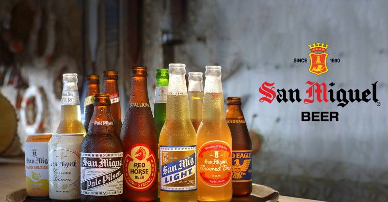
San Miguel Pale Pilsen uses the Escudo paired with blackletter type. San Miguel Light modifies it with lighter tones. Red Horse Beer, another SMC product, has its own completely separate identity. Ginebra San Miguel uses the corporate shield but with spirit-specific packaging.
The San Miguel Food and Beverage subsidiary wraps the Escudo inside a multicolored circle, softening it for consumer food products. This logo system allows each sub-brand to maintain its own personality while staying connected to the corporate parent through the shared shield element.
The core design principles running through all these applications are consistency, heritage signaling, and premium positioning. Every application of the logo reinforces the idea that this is a company with deep roots and serious scope. Whether you are looking at a beer can in Hong Kong or a corporate report in Manila, the Escudo ties it all together.
How Should the San Miguel Logo Be Used?
San Miguel Corporation maintains strict usage rules for its Escudo mark. Here is what is publicly known about their guidelines.
Do: Use the official logo files provided by SMC corporate communications. Maintain the minimum clear space around the shield. Keep the color palette consistent with official specifications. Use the logo on backgrounds that provide enough contrast for all elements to remain visible.
Don’t: Stretch, rotate, or distort the shield in any way. Place the logo on busy backgrounds that obscure the heraldic details. Change the official colors. Remove or alter any element of the Escudo (crown, lion, castle, or diamonds). Use outdated versions of the logo without authorization.
Official logo files are typically distributed through San Miguel Corporation’s corporate affairs department. Third-party use for editorial, educational, or news purposes generally falls under fair use, but commercial use requires explicit licensing from SMC.
The trademark is registered and enforced across all markets where San Miguel Corporation operates. Unauthorized reproduction of the Escudo for commercial purposes is a legal matter that SMC takes seriously. Given the logo’s status as both a corporate trademark and a culturally significant mark, protection extends beyond standard brand enforcement into intellectual property defense at a broader level.
FAQ on The San Miguel Logo
What does the San Miguel logo represent?
The San Miguel logo represents the historic Escudo (seal) from the Spanish-era coat of arms of Manila. It features a rampant lion, castle tower, crown, and diamonds. The emblem ties the brand directly to its 1890 founding under a Spanish Royal Charter in the Philippines.
When was the San Miguel logo first used?
The earliest San Miguel Beer bottles used simple “S over M” lettering starting in 1890. The Escudo seal was formally adopted as the brewery’s trademark in 1893 when San Miguel Brewery incorporated. That makes it one of the oldest design elements in Asian corporate branding.
Who designed the San Miguel logo?
The original designer is unknown. The Escudo was adapted from Manila’s colonial coat of arms, not created from scratch. Later refinements were handled internally by San Miguel Corporation’s branding teams. The 2012 streamlined version was also an in-house update.
What colors are in the San Miguel logo?
The primary colors are deep red, gold, white, and black. Red fills the shield. Gold covers the lion, crown, and accents. These color theory choices signal tradition and premium quality, common in heritage red-based brand marks.
Has the San Miguel logo changed over the years?
Yes, significantly. The logo went through at least five major versions. The biggest shift came in 1975 when SMC replaced the Escudo with an abstract symbol for corporate use. They brought the Escudo back in 1999. The current version dates to 2012.
What is the lion in the San Miguel logo?
The rampant lion is a heraldic figure from the original Manila coat of arms. It represents courage and strength. Earlier versions featured a sea lion with a visible tongue. Modern versions removed the tongue and refined the lion’s posture. The shape communicates authority.
What font does the San Miguel logo use?
Two different approaches exist. The corporate version uses a formal capitalized serif typeface. The beer label uses a blackletter style similar to Old English or Cloister Black. Each serves a different purpose within the San Miguel brand identity system.
Is the San Miguel logo trademarked?
Yes. The Escudo is a registered trademark of San Miguel Corporation and is legally protected across all markets where SMC operates. Unauthorized commercial use is enforced. The mark covers beer products, food and beverage subsidiaries, and all corporate communications.
Why did San Miguel bring back the Escudo in 1999?
Chairman Eduardo Cojuangco Jr. believed the abstract 1975 logo lacked identity. He saw the Escudo as a symbol of the company’s strength and heritage. The restoration gave SMC a unified mark across its beer and corporate branding, improving overall brand consistency.
Can I download the San Miguel logo for free?
Several third-party sites offer vector and PNG versions for reference. But commercial use requires permission from San Miguel Corporation’s corporate affairs department. Editorial and educational use typically falls under fair use. Always check licensing before using any corporate trademark.
Conclusion
The San Miguel logo has survived colonial rule, world wars, corporate restructurings, and a 24-year identity crisis. Not many brewery marks can say that.
Its Escudo carries real historical weight. The heraldic shield, rampant lion, and golden crown are not branding inventions. They come from the actual coat of arms of Manila, which gives the emblem a level of authenticity that most alcohol brand logos simply cannot match.
From beer bottle label design to corporate signage across 60 export markets, the mark holds up. The 2012 streamlined version proved that heritage and modern graphic standards can coexist without losing what makes a visual identity memorable.
Whether you are studying graphic design fundamentals or building a brand refresh strategy, the San Miguel Escudo is worth examining. Few logos carry 130 years of history this well.

Renowned for his expertise in logo design and visual branding, Bogdan has developed a multitude of logos for various clients.
His skills extend to creating posters, vector illustrations, business cards, and brochures. Additionally, Bogdan's UI kits were featured on marketplaces like Visual Hierarchy and UI8.
He also wrote in the past years on sites like Design Your Way, WebDesignerDepot, WPDean, Designmodo, Speckyboy, Slider Revolution, and more.
- Canva vs Midjourney: AI Design Tools Compared - 28 September 2026
- A Brand Identity Is Only Finished When Someone Else Can Use It - 28 September 2026
- Friendly Karla Font Pairing Ideas for Modern Brands - 26 September 2026

Bogdan Sandu is a seasoned designer who has been designing websites since 2008. Renowned for his expertise in logo design and visual branding, Bogdan has developed a multitude of logos for various clients. His skills extend to creating posters, vector illustrations, business cards, and brochures. Additionally, Bogdan's UI kits were featured on marketplaces like Visual Hierarchy and UI8. He also wrote in the past years on sites like Design Your Way, WebDesignerDepot, WPDean, Designmodo, Speckyboy, Slider Revolution, and more.
You Might Also Like