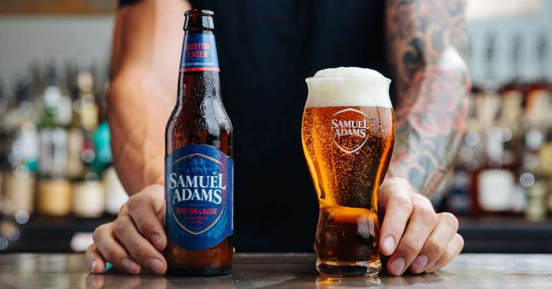
The Samuel Adams logo is one of the most recognized marks in American craft brewing. It belongs to the Boston Beer Company, founded by Jim Koch in 1984 in Cambridge, Massachusetts. The brand takes its name from Founding Father Samuel Adams, who inherited a brewery from his father on Boston’s King Street. Over several decades, the logo has gone through multiple redesigns, but the core identity stays rooted in American heritage, tradition, and the craft beer movement that the brand helped start.
The current version uses a shield-based combination mark with serif typography, a beer glass icon, and a red, white, and navy blue color palette inspired by the American flag. It’s a mark that has evolved from a simple wordmark into a layered emblem that communicates both patriotism and brewing craft. The Boston Beer Company holds the brand as a registered trademark with the United States Patent and Trademark Office.
What Is the Samuel Adams Logo?
![]()
The Samuel Adams logo is a combination mark featuring the brand name in stacked serif lettering inside a shield shape, with a pint glass integrated into a star motif. It was introduced in its current refined form around 2019, designed in partnership with brand agency GBH and illustrator Chris Mitchell. The mark represents American brewing heritage, craft quality, and the revolutionary spirit of its namesake.
Design Attributes
- Design Type: Combination mark (shield emblem with wordmark)
- Primary Elements: Shield shape, stacked “Samuel Adams” typography, pint glass icon within a star, single-line etch illustration of Samuel Adams on packaging
- Official Introduction Date: Original wordmark in 1984, shield version introduced mid-2000s, current refined version circa 2019
- Designer/Agency: Brand agency GBH; illustrator Chris Mitchell created the character portrait
- Trademark Status: Registered with the USPTO under Boston Beer Corporation (Serial Number 87091254, Registration Number 5376175; also Serial Number 88462909, registered February 2020)
- Color Palette: Navy Blue (#002855), Red (#EA002A), White (#FFFFFF), plus Bronze (#B37865) and Brown (#9B5842) on packaging
- Usage Context: Beer bottles, cans, six-pack cartons, tap handles, digital platforms, merchandise, Fenway Park signage, marketing materials
How Has the Samuel Adams Logo Evolved Over Time?
The Samuel Adams logo has gone through three main phases since 1984. It started as a plain serif wordmark, shifted to a shield-and-star emblem in the mid-2000s, then received a significant refresh around 2019 that modernized the shield and made the beer glass more prominent.
Each version kept the serif type. And each leaned further into the brand’s connection to American history.
Original Samuel Adams Logo (1984 to Mid-2000s)
Years Active: 1984 to approximately 2006
The first logo was just a wordmark. “Samuel Adams” set in a classic serif typeface with the lower edges of the letters forming a slight arc. Navy blue and white. That’s it.
Jim Koch launched Boston Beer Company from his kitchen using his great-great-grandfather’s lager recipe. The brand needed to look credible and traditional from day one, so a clean serif wordmark made sense. Nothing flashy, nothing complicated.
It worked. Samuel Adams Boston Lager won “Best Beer in America” at the Great American Beer Festival in 1985, just six weeks after launch. The simple mark carried enough weight on its own.
The color scheme was deliberately minimal. Navy and white. It felt serious, almost like something you’d see on a colonial-era sign. Which, well, was the whole point.
Shield and Star Logo (Mid-2000s to 2019)
Years Active: Approximately 2006 to 2019
This is when things got more complex. A navy shield appeared behind the wordmark, with a star at its center containing a small beer glass shape. The letters turned white against the dark shield, and red was added to the palette for the first time.
The shield gave the logo a badge-like quality. It looked like a crest, which pushed the brand’s identity further toward heritage and authority. The three colors, navy, red, and white, directly echoed the American flag.
The star was a nice touch. Small, but it tied into the Revolutionary War theme without being heavy-handed about it. The beer glass hidden inside? Most people didn’t notice it right away. That’s good design, honestly. Layers that reward attention.
During this period, the Boston Beer Company also commissioned illustrator Steven Noble to create scratchboard-style artwork for seasonal packaging. The brand’s visual language was getting richer.
Current Samuel Adams Logo (2019 to Present)
Years Active: 2019 to present
In the summer of 2019, Samuel Adams rolled out a dramatically refreshed look. The shield stayed, but it became more refined. The star disappeared. The beer glass, which was previously hard to spot, now sits front and center.
Brand agency GBH led the redesign. They also hired illustrator Chris Mitchell to redraw the portrait of Samuel Adams himself using a traditional single-line etch style. That portrait appears on bottles and cans alongside the logo, giving the packaging a more premium, handcrafted feel.
The move was bold. A lot of established brands make tiny adjustments and call it a rebrand. Boston Beer went bigger. They simplified the shield’s internal structure, brought warm tones like bronze and brown into the packaging palette, and generally made the whole thing feel less cluttered.
It reads more modern now, but it still feels rooted. The serif type stayed. The shield stayed. The American color scheme stayed. What changed was the confidence of the presentation.
What Do the Design Elements of the Samuel Adams Logo Mean?
Every piece of the Samuel Adams logo connects back to two things: American independence and the craft of brewing. The shield shape references authority and heritage. The serif type signals tradition. The beer glass, literally placed at the center, makes sure you don’t forget this is a brewery first.
It’s a brand that leans on history without becoming a history lesson. The visual choices are specific enough to feel intentional, broad enough to stay relevant across product lines.
Why Did Samuel Adams Choose These Specific Colors?

The primary colors are Navy Blue (#002855), Red (#EA002A), and White (#FFFFFF). They’re drawn directly from the American flag, which fits a brand named after a Founding Father.
Navy blue carries associations with trust, depth, and stability. Red brings energy and boldness. White provides the breathing room that keeps the whole thing from feeling too heavy. From a color psychology standpoint, it’s a palette that says “reliable but spirited.”
On the packaging side, additional warm tones appear. Bronze (#B37865, Pantone PMS 479 C) and Brown (#9B5842, Pantone PMS 7581 C) add a crafted, earthy quality. They also echo the amber tones you’d see in a poured Boston Lager, which is a smart color theory move.
What Typography Style Is Used in the Samuel Adams Logo?

The logo has always used a serif typeface with classic proportions. The current version stacks “SAMUEL” above “ADAMS” inside the shield, with clean, weighted letterforms that feel traditional but not stuffy.
The font choice has been consistent throughout the brand’s history. Serifs connect the typography to the 18th-century era of its namesake. The kerning is tight enough to feel solid, with strong vertical strokes that give the letters weight and presence on a bottle.
What Are the Hidden Meanings in the Samuel Adams Logo?
The pint glass embedded inside the star element (in the pre-2019 version) was the most notable hidden detail. Most consumers missed it on first glance, but it served a dual purpose: patriotic star and beer icon in one shape.
The shield itself isn’t random either. It’s a heraldic element that suggests legacy and protection, both qualities Boston Beer Company wants associated with the brand. Chris Mitchell’s etched portrait adds another layer. The single-line style references colonial-era engravings, the same kind you’d find on old currency or official documents.
How Does the Samuel Adams Logo Compare to Competitor Logos?
Within the beer industry’s logo landscape, Samuel Adams sits in a unique spot. Most large domestic brands lean toward clean, modern wordmarks. Think about the Budweiser mark with its bowtie shape, or the Miller Lite identity with its stripped-back lettering. They’re trying to look contemporary and mass-market.
Sam Adams goes the other direction. The shield, the serifs, the illustration work. It all says “we’ve been here a while and we take this seriously.” That’s a positioning choice, not just an aesthetic one.
Compare it to imports like Guinness, which also uses a heritage-heavy approach (the harp, the gold, the dense typography). Or Stella Artois, with its chalice and crest. Samuel Adams plays in that same “legacy brand” space, but with distinctly American visual language instead of European.
Among craft competitors, Samuel Adams stands out because it looks more polished and institutional than most small-brewery marks, which tend toward hand-drawn, quirky, or illustrative styles. That’s the tricky balance the brand has always walked. Craft roots with major-brand execution.
What Are the Technical Specifications of the Samuel Adams Logo?
Official Color Codes
- Navy Blue (Primary) – Hex: #002855, RGB: (0, 40, 85), CMYK: (100, 53, 0, 67), Pantone: Prussian Blue
- Red (Primary) – Hex: #EA002A, RGB: (234, 0, 42), CMYK: (0, 100, 82, 8), Pantone: Torch Red
- White – Hex: #FFFFFF, RGB: (255, 255, 255), CMYK: (0, 0, 0, 0)
- Bronze (Packaging) – Hex: #B37865, RGB: (179, 120, 101), CMYK: (27, 56, 59, 6), Pantone: PMS 479 C
- Brown (Packaging) – Hex: #9B5842, RGB: (155, 88, 66), CMYK: (30, 69, 75, 19), Pantone: PMS 7581 C
- Tan (Packaging) – Hex: #DBB49E, RGB: (219, 180, 158), CMYK: (14, 30, 36, 0), Pantone: PMS 7590 C
Dimensions and Proportions
The shield-based logo follows a vertical orientation. The aspect ratio is approximately 1:1.2 (width to height) for the main shield mark. Clear space requirements dictate that no other graphic element should encroach within a distance equal to the height of the “S” in “SAMUEL” on all sides.
Minimum size for legibility on print materials is generally around 1 inch wide for the full mark. For digital use, 120 pixels wide at minimum. The logo is maintained in vector format (SVG, EPS, AI) for scalability, with rasterized versions available at 300 DPI for print.
What Cultural Impact Has the Samuel Adams Logo Had?

Samuel Adams helped kick off the American craft beer movement in the mid-1980s. The logo became a visual shorthand for “craft beer that’s widely available.” It bridged the gap between mass-produced domestics and tiny microbreweries that most people couldn’t find.
The portrait of Samuel Adams on packaging turned a Founding Father into a pop-culture beer icon. You’d see it on tap handles in sports bars, on signage at Fenway Park (since 2018), and on shelves next to brands ten times its age.
For a generation of beer drinkers, the Sam Adams shield was their first introduction to the idea that American beer could be something more than light lagers. That’s a significant piece of brand impact, and the logo carried a lot of that weight.
How Does the Samuel Adams Logo Fit Into the Overall Brand Identity?
The logo is the anchor point of a broader brand guidelines system that includes the etched portrait illustration, seasonal packaging art, a defined color system, and a consistent typographic hierarchy across all materials.
The etched portrait by Chris Mitchell works alongside the shield mark. It shows on bottles and cans, while the logo mark handles everything from tap handles to digital applications. The two elements together create a layered brand identity that feels both modern and historical.
Boston Beer Company uses the Samuel Adams mark across a huge product line. Year-round beers, seasonal releases, the Utopias special edition, and co-branded partnerships (like the Red Sox deal). The shield’s flexibility is key. It works on a 12 oz can and on stadium signage equally well.
How Should the Samuel Adams Logo Be Used?
Official Usage Guidelines
The Samuel Adams name and logo are registered trademarks of Boston Beer Corporation. Usage requires compliance with the company’s brand style guide, which governs color accuracy, minimum sizes, clear space, and approved backgrounds.
Do:
- Use the official color values (Navy Blue #002855, Red #EA002A, White #FFFFFF) exactly as specified
- Maintain clear space around the mark
- Use vector files from official sources for any reproduction
- Reproduce the logo at or above minimum size requirements
Don’t:
- Alter the proportions or stretch the logo
- Change the approved colors or apply unauthorized gradients
- Place the logo on visually busy backgrounds that reduce legibility
- Separate the shield elements from the wordmark in unauthorized configurations
- Use the logo to imply endorsement without a licensing agreement
Access and Licensing
The official logo assets are controlled by Boston Beer Corporation. Third-party use for editorial, journalistic, or educational purposes typically falls under fair use, but commercial applications need written permission. The trademark is actively enforced, and the company monitors use to prevent brand dilution or misrepresentation.
For press or partnership inquiries, the Boston Beer Company’s corporate website provides media contact resources and official brand assets for approved use.
FAQ on The Samuel Adams Logo
What does the Samuel Adams logo look like?
The current Samuel Adams logo features a shield-shaped emblem with the brand name stacked in serif lettering. A beer glass icon sits at the center. The colors are navy blue, red, and white, pulling directly from the American flag.
Who designed the Samuel Adams logo?
Brand agency GBH led the most recent redesign around 2019. Illustrator Chris Mitchell created the etched portrait of Samuel Adams used on packaging. Steven Noble also contributed scratchboard illustrations for seasonal beer labels over a two-year span.
When was the Samuel Adams logo first created?
The original logo appeared in 1984 when Jim Koch founded the Boston Beer Company in Cambridge, Massachusetts. It was a simple serif wordmark in navy and white. The shield element came later, around the mid-2000s.
What do the colors in the Samuel Adams logo mean?
Navy blue (#002855) signals trust and depth. Red (#EA002A) adds energy. White provides contrast. The palette references the American flag, fitting for a brand named after a Founding Father and revolutionary patriot from Boston.
Has the Samuel Adams logo changed over the years?
Yes. Three major versions exist. The 1984 wordmark, the mid-2000s shield with a star and hidden beer glass, and the 2019 refined shield where the glass became the focal point. Each kept the serif typography.
What font does the Samuel Adams logo use?
The logo uses a custom serif typeface with classic proportions and strong vertical strokes. It’s not a publicly available font. The letterforms are designed to feel historical, connecting the craft beer brand to its 18th-century namesake.
Is the Samuel Adams logo trademarked?
Yes. Boston Beer Corporation holds multiple registered trademarks with the USPTO. The shield mark with wordmark is registered under Serial Number 87091254 (Registration Number 5376175). The company actively monitors and enforces its trademark rights.
What is the story behind the Samuel Adams portrait on the bottles?
Chris Mitchell drew the portrait using a traditional single-line etch style. It references colonial-era engravings. The portrait shows Samuel Adams, the historical figure who inherited a brewery on Boston’s King Street and fought for American independence.
Why does Samuel Adams use a shield in its logo?
The shield is a heraldic shape that communicates heritage, authority, and protection. It gives the brewery logo a crest-like appearance. That’s deliberate. It separates Samuel Adams from the hand-drawn, casual look most craft beer brands go for.
Where can I find the official Samuel Adams logo for use?
Official logo assets are controlled by Boston Beer Corporation. Editorial or journalistic use typically falls under fair use. Commercial use requires written permission. The company’s corporate website offers media contact resources for approved brand asset requests.
Conclusion
The Samuel Adams logo has done something few craft beer marks manage. It grew from a plain wordmark into a full brand identity system without losing what made it work in the first place.
That shield, those flag-inspired colors, the etched portrait. They all point back to one idea: American brewing heritage.
Jim Koch’s Boston Beer Company built a visual identity that holds up on a tap handle, a six-pack, and a Fenway Park billboard. The 2019 refresh proved the brand could modernize while keeping its roots intact.
Whether you’re studying logo design principles or just picking up a Boston Lager, the Sam Adams mark is worth a closer look. It tells a story without saying a word.
Renowned for his expertise in logo design and visual branding, Bogdan has developed a multitude of logos for various clients.
His skills extend to creating posters, vector illustrations, business cards, and brochures. Additionally, Bogdan's UI kits were featured on marketplaces like Visual Hierarchy and UI8.
He also wrote in the past years on sites like Design Your Way, WebDesignerDepot, WPDean, Designmodo, Speckyboy, Slider Revolution, and more.
- Canva for Teams Review: Is It Worth the Business Plan? - 24 July 2026
- 5 Brand Compliance Checkpoints Every Enterprise Should Automate - 23 July 2026
- Timeless Open Sans Font Pairing for Any Project - 22 July 2026
Bogdan Sandu is a seasoned designer who has been designing websites since 2008. Renowned for his expertise in logo design and visual branding, Bogdan has developed a multitude of logos for various clients. His skills extend to creating posters, vector illustrations, business cards, and brochures. Additionally, Bogdan's UI kits were featured on marketplaces like Visual Hierarchy and UI8. He also wrote in the past years on sites like Design Your Way, WebDesignerDepot, WPDean, Designmodo, Speckyboy, Slider Revolution, and more.
You Might Also Like