Curated examples of aesthetic website design show something practical: color, imagery, and a deliberate layout can carry a site’s whole identity, without a purely functional structure doing the work instead.
Designers usually pull these from award galleries and inspiration sites rather than static mockups, because a live page under real constraints tells you more than a Photoshop comp ever will. The comparison usually comes down to palette, typography, and grid choices, measured against sites that are already out there in the market.
Awwwards is the platform most often cited for judging this category, and its scoring split says a lot about where the weight actually sits. Design accounts for 40 percent of a submission’s score, usability another 30 percent, creativity 20 percent, and content the remaining 10 percent (Awwwards, 2026).
Visual execution alone outweighs every other factor on that list, which is basically the whole argument for treating aesthetics as its own discipline instead of an afterthought bolted onto UX.
What Is Aesthetic Website Design
Mood, color, and imagery do most of the work in this approach, more than a bare functional layout ever could. It borrows heavily from print and brand work, pulling in core visual design vocabulary like alignment and contrast and applying it to a screen instead of a page.
The term sits close to UI design and brand design, though it’s really answering a narrower question, namely how the page looks and feels the moment someone lands on it.
UI design solves interaction and usability problems. Brand design sets the identity system across every touchpoint a company has, not just the website. Aesthetic website design is narrower than both. It’s about putting that identity onto a page people actually scroll through.
Apple’s product pages get pointed to most often as a reference, built around large imagery and generous spacing, run through a restrained type system.
Speed matters more than most people assume in this category.
Lindgaard et al. (2006, Behaviour & Information Technology) found that people size up a page’s visual appeal in about 50 milliseconds, before they’ve read a single word of copy.
What catches someone’s eye in that sliver of time comes down to visual hierarchy, the order in which a page’s elements are arranged to be seen.
What Are the Main Aesthetic Website Design Styles
Minimalist, maximalist, brutalist, glassmorphism, neumorphism, and retro cover most of what actually shows up in aesthetic website design examples, and none of them appeared out of nowhere. Each one traces back to a real design movement, in some cases decades older than the web itself.
| Style | Defining trait | Common on |
|---|---|---|
| Minimalist | Restrained palette, heavy whitespace | Portfolios, SaaS |
| Brutalist | Raw type, exposed structure | Agencies, art sites |
| Glassmorphism | Layered translucency, blur | Product marketing pages |
| Retro | Grain, bold color blocking | Fashion, music brands |
Minimalist sites lean on minimalist design principles that were around long before anyone had a browser to put them in, most of it borrowed from Bauhaus and Swiss design schools.
Medium and Muji both lean on this approach, letting type and space carry the page instead of imagery.
Brutalist sites go the other way entirely.
Brutalist design movement in web work keeps default system fonts, visible grid lines, and rough edges on purpose, not by accident.
Balenciaga’s website has used this look for years, treating rawness as a brand statement rather than a mistake.
Minimalist pages tend to load fast since there’s less to render, and they age well, since a restrained page from five years ago rarely looks dated the way a trend-heavy one does. The tradeoff is real too. Without a strong type choice, minimalism reads as generic fast, and there’s nowhere to hide weak content when the whole point is empty space around it.
Brutalist sites don’t have that problem, if only because nobody mistakes one for a template. It signals confidence, mostly for creative and agency brands willing to look a little uncomfortable on purpose. Push it too far, though, and usability suffers, and it’s not going to work at all for a bank or a healthcare provider.
Glassmorphism and neumorphism show up less as full sites and more as UI accents inside product pages, since heavy blur and soft shadow are expensive to render at scale.
Retro pulls from Art Deco and Memphis-style color blocking, and tends to reappear whenever a brand wants to feel nostalgic rather than futuristic.
Color and Typography in Aesthetic Website Design
Color and type carry most of an aesthetic site’s mood, more than layout or imagery.
Both are also the two areas where accessibility rules push back hardest against pure style choices.
Color Palette Approaches

WCAG 2.1 sets a minimum contrast ratio of 4.5 to 1 for normal body text against its background, a rule the W3C enforces at the AA level.
That single number rules out a lot of pastel-on-white and light-gray-on-white combinations that look elegant in a mockup and fail in a browser.
Most palettes on these sites fall into a handful of recurring buckets.
- Monochrome, one hue at varying tints
- High-contrast, dark background against a bright accent
- Pastel, soft and low-saturation across the board
- Duotone, two colors mapped over photography
Brands running large print-to-web rollouts often check their on-screen colors against a Pantone reference first, so the palette stays consistent between packaging and the website.
Stripe’s site is a common reference for a high-contrast, single-accent palette that still reads as calm rather than loud.
Typography Treatments

Type does more work on an aesthetic site than most visitors notice consciously.
Pairing a serif with a sans-serif is still the most common approach, usually a display serif carrying the headlines and a plain sans-serif doing the actual reading work in body copy.
Oversized type has become its own category, with headlines running large enough to fill the hero section on their own.
Getting that pairing right without a background in type design is why pairing fonts correctly has turned into a small industry of its own, generators included.
Variable fonts add another layer on top of that, one file adjusting its own weight and width instead of a page loading five separate font files just to get a bold and an italic.
Mailchimp’s brand system leans on bold, oversized type paired with a simple grotesque body font, a combination that shows up across most of its marketing pages.
How Layout and Grid Structure Shape Aesthetic Website Design
Structure decides how a page reads before a visitor processes a single word of copy.
Grid systems borrowed from print design still form the backbone of most web layouts, even the ones that look freeform on the surface.
| Layout type | Feel it creates | Best fit |
|---|---|---|
| Bento grid | Organized, modular | SaaS feature pages |
| Asymmetric grid | Editorial, dynamic | Fashion, portfolios |
| Full-bleed | Immersive, bold | Photography, agencies |
Apple’s iPhone feature pages popularized the bento grid look for the web, arranging small feature tiles into an uneven but ordered block.
Whitespace does more than create breathing room between sections.
Generous white space around a call-to-action button makes that button the obvious next step, without needing a louder color or a bigger size.
Asymmetric grids trade that order for movement, pushing images and text blocks off-center to keep a page feeling less templated.
One-page layouts compress all of this into a single scroll, which works for a product launch but struggles once a site needs more than four or five sections of content.
How Motion and Interaction Add to Aesthetic Website Design
Motion turns a static layout into something that feels alive without needing new content.
Micro-interactions, cursor effects, scroll-triggered reveals, and page transitions all fall under this attribute.
Most of it traces back to the same design principle used in print and poster work, the idea of movement guiding the eye across a composition.
On a screen, that principle gets executed with libraries like GSAP for scroll animation and Three.js for lightweight 3D elements.
Apple’s AirPods Pro page is the reference most designers cite for scroll-triggered product animation done without feeling gimmicky.
Repeating small motion cues, hover states that behave the same way every time, builds a kind of visual rhythm a visitor picks up on without noticing.
None of this is free.
Google’s own guidance sets a 2.5 second target for Largest Contentful Paint, one of the three Core Web Vitals, and heavy scroll animation is a common reason sites miss it.
Most teams fix it the same way, keeping motion on secondary elements, loading the hero content first, and layering interaction on top only once the page already works without it.
Best Aesthetic Website Design Examples
Galleries like Awwwards, Dribbble, and Land-book are where most designers go to study working examples rather than static mockups.
Each style below tends to solve a different problem, not just look different.
Studio Brave

And Walsh

MIXD

Parsons Branding

George Nakashima Woodworkers

Overflow

Frans Hals Museum

Simply Chocolate

NOWNESS

Protest Sportswear

The Teacher’s Guild

Feed

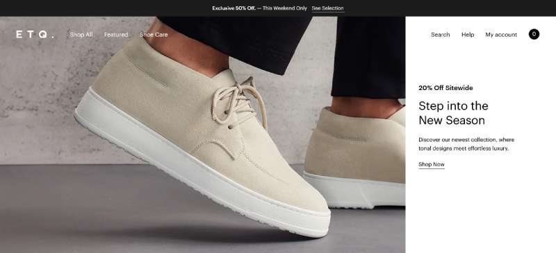
ETQ
Mikiya Kobayashi

World of SWISS

Guillaume Tomasi

Amanda Martocchio Architecture

Which Aesthetic Style Fits Which Industry
The right style depends more on what the business needs a visitor to do than on personal taste.
A style that reinforces visual identity for a fashion label can actively work against a checkout flow for an online retailer.
| Industry | Common style | Typical layout | Main risk |
|---|---|---|---|
| Portfolio | Minimalist, brutalist | One-page, asymmetric | Weak content gets exposed |
| Fashion | Photography-led | Full-bleed | Slow load on mobile |
| SaaS | Bento grid, motion-led | Modular grid | Feature clutter |
| Ecommerce | High-contrast, functional | Grid with clear CTAs | Style overriding usability |
Portfolio and personal brand sites can afford the most risk, since the audience already wants to be there and expects some visual personality.
Fashion and editorial sites lean on full-bleed photography almost by default, prioritizing mood over information density.
SaaS and agency sites tend toward the bento grid and motion-driven layouts covered earlier, since investors and buyers expect a polished, current look.
Ecommerce is the category where aesthetic choices get tested hardest against conversion.
Baymard Institute’s ongoing product page research found that 51 percent of leading ecommerce sites still have mediocre or worse product page usability, often because visual choices crowd out information a buyer actually needs.
Allbirds is a common counterexample, keeping a restrained, minimalist palette on its product pages without sacrificing size charts, reviews, or clear pricing.
Platforms and Tools for Building Aesthetic Websites
The style choices covered so far still need software to build them.
Webflow and Framer sit at the custom end, giving direct control over grid, motion, and typography without writing code from scratch.
| Platform | Customization | Learning curve | Best for |
|---|---|---|---|
| Webflow | High | Moderate | Custom marketing sites |
| Framer | High | Moderate | Motion-heavy pages |
| WordPress | Medium, theme-dependent | Low to moderate | Blogs, small business |
| Squarespace | Low to medium | Low | Portfolios, small shops |
WordPress still runs a large share of the web behind this comparison.
W3Techs puts WordPress at 40.2 percent of all websites as of September 2026, more than every other content management system combined.
That scale is also why so many aesthetic website design examples on WordPress lean on page builder plugins rather than hand-coded templates.
Squarespace and Wix trade some of that flexibility for speed, with built-in templates already tuned for a specific aesthetic out of the box.
Design work itself happens upstream of any of these platforms.
Figma and Adobe XD are where the palette, type system, and layout usually get approved before a single line of code ships.
Figma reported 13 million monthly active users and adoption across 95 percent of the Fortune 500 in its 2025 investor disclosures.
A designer just starting out, without a budget for a full design tool, often reaches for Canva instead, trading some precision for speed.
Keeping a UI design cheat sheet nearby speeds up decisions on spacing and type scale once the build actually starts.
How to Design an Aesthetic Website Step by Step
The order matters more than the tool.
Skipping straight to layout before the mood is set is why so many sites end up looking like a template with a new logo dropped in.
Most teams start by collecting reference images and color swatches into a single mood board, well before opening any design software.
- Lock the palette and type pairing as a small system, not chosen page by page
- Build the grid and hero section using that system instead of default template spacing
- Add motion and interaction last, once the static version already works on its own
- Test load time and contrast before publishing, not after
In practice, the order usually gets flipped.
Teams open Webflow or Figma first, start dragging in sections, and only settle on a color palette once half the page already exists.
Doing it in the right order fixes two problems at once. There are fewer redesign cycles, and the page ends up reading like one coherent decision instead of ten stitched together after the fact.
Getting the basic design elements locked early, before layout, is what separates a page that feels intentional from one that feels assembled.
Airbnb’s design team has spoken publicly about doing brand and mood work before touching any interface, treating the visual system as an input rather than an afterthought.
When Aesthetic-First Design Does Not Work
Not every page benefits from mood and imagery leading the design.
Checkout flows, tax forms, and account settings pages perform better when every visual choice serves speed and clarity instead of atmosphere.
A single confusing form field costs more in abandoned carts than a striking hero image ever earns back.
GOV.UK’s design system is the clearest real-world case against aesthetic-first thinking, built deliberately plain so the widest possible range of citizens can complete a task without friction.
Heavy motion and large imagery also run into hard technical limits.
Interaction to Next Paint, one of Google’s three Core Web Vitals, sets a target of 200 milliseconds or less for a page to feel responsive, a threshold busy scroll effects and animated cursors put at risk.
Contrast and readability choices carry their own limits too.
A few numbers are worth keeping in view here. Google’s target for Interaction to Next Paint sits at 200 milliseconds for a page to feel responsive (web.dev, Core Web Vitals). Globally, 2.2 billion people live with some form of vision impairment (World Health Organization, World Report on Vision), which is not a niche audience to be designing around as an afterthought. And the current mobile-to-desktop traffic split sits at roughly 50.13 percent to 49.87 percent worldwide, essentially a coin flip (StatCounter, August 2026).
That last figure matters more than it looks.
A layout that only performs on a large desktop screen is no longer optimizing for a minority audience. It is optimizing for roughly half of one.
Bandwidth is the other constraint worth naming directly.
A page built around uncompressed video backgrounds and dozens of custom fonts can look extraordinary on a design monitor and still time out on a slower mobile connection in a market with limited infrastructure.
None of this means style should be abandoned on functional pages.
It means the attributes covered earlier, palette, type, grid, and motion, get dialed back rather than removed, keeping enough personality to stay on-brand without slowing down the one task the page exists to complete.
FAQ on Aesthetic Website Design
What Makes a Website Look Aesthetic Instead of Just Functional?
A functional site solves navigation and conversion problems. An aesthetic one adds a deliberate visual identity through palette, typography, whitespace, and imagery.
The real difference comes down to intent. Visual hierarchy guides the eye first, and function follows only once the mood is already set.
How Much Does an Aesthetic Website Cost to Design and Build?
Cost depends on platform and customization, not style. A template build on Squarespace or WordPress costs far less than a custom Webflow or Framer site.
Motion work and a full type system raise the price. Custom builds scale better long term.
What Mistakes Make a Website Design Look Bad Instead of Aesthetic?
Overcrowded layouts and inconsistent type pairing cause most of the damage. Clashing color palettes aren’t far behind, and heavy stock photography without a consistent visual identity rounds out the usual suspects.
Poor contrast ranks highest, since it breaks both accessibility and the visual hierarchy a page depends on.
What Is the Difference Between Aesthetic Design and Generic Template Design?
A generic template applies the same grid, font pairing, and color defaults across thousands of unrelated sites.
Aesthetic design builds a system specific to one brand, from palette to typographic hierarchy, so the page reads as original rather than recycled.
What Are the Current Aesthetic Website Design Trends?
Bento grid layouts and oversized kinetic typography dominate current examples, with dark mode interfaces close behind.
Duotone imagery and scroll-triggered motion keep gaining ground on SaaS and portfolio sites. Minimalist design remains the steadiest trend, resisting the faster cycles elsewhere.
Is Webflow or WordPress Better for an Aesthetic Website?
Webflow gives finer control over grid, motion, and typography without touching code, favoring fully custom builds.
WordPress wins on plugin depth and sheer content volume. Webflow makes more sense for a single polished site, and WordPress tends to win once there’s an actual content operation to run.
What Should You Fix First in Aesthetic Websites?
Aesthetic website design examples tend to break down at the same point every time, when visual polish outruns readability. That’s why the fix sequence always starts with contrast and load speed, not motion or decorative imagery.
Fixing in the wrong order wastes work, since a slow, low-contrast page gets abandoned before the palette even registers.
- Contrast and accessibility first
- Grid, typography, and load speed second
- Motion, imagery, and decorative detail last
That order carries a real trade-off.
A page built this way looks less striking on first load, since the boldest visual moves get layered in only after the functional base holds up.
The payoff shows up in retention rather than in the first screenshot. This kind of site keeps the visitors that a prettier, slower alternative would have lost.
The sequence rests on established graphic design principles more than taste, and reviewing those fundamentals is the logical next step before a build starts.

Renowned for his expertise in logo design and visual branding, Bogdan has developed a multitude of logos for various clients.
His skills extend to creating posters, vector illustrations, business cards, and brochures. Additionally, Bogdan's UI kits were featured on marketplaces like Visual Hierarchy and UI8.
He also wrote in the past years on sites like Design Your Way, WebDesignerDepot, WPDean, Designmodo, Speckyboy, Slider Revolution, and more.
- The Lovable Logo History, Colors, Font, And Meaning - 6 November 2026
- Headless WordPress: What Marketing Teams Gain and Lose - 6 November 2026
- PicCollage Logo: How Colour, Shape and Simplicity Express Creativity - 5 November 2026

Bogdan Sandu is a seasoned designer who has been designing websites since 2008. Renowned for his expertise in logo design and visual branding, Bogdan has developed a multitude of logos for various clients. His skills extend to creating posters, vector illustrations, business cards, and brochures. Additionally, Bogdan's UI kits were featured on marketplaces like Visual Hierarchy and UI8. He also wrote in the past years on sites like Design Your Way, WebDesignerDepot, WPDean, Designmodo, Speckyboy, Slider Revolution, and more.
You Might Also Like