A national tourism board picks drone footage and a stripped down homepage. A three room bed and breakfast picks a page builder and a booking widget from Booking.com. Both count as tourism website design, and looking at what actually works for each one is more useful than any mockup, because someone has already clicked through, filled out the form, or dropped off halfway.
The comparison ground stays fixed no matter the size of the operation: navigation, whether booking connects to real inventory, how destination content gets shown, how fast the pages load, accessibility, and language support.
Most of that fight happens on a small screen now. Mobile devices generated close to 68% of all traffic to travel and hospitality websites in 2023, up 3.6 percentage points from the year before (ContentSquare, via Statista, 2024). Design for the phone first these days, or don’t bother.
What is Tourism Website Design
These aren’t wireframes or design concepts sitting in a folder somewhere. A tourism website design example is a site that’s actually live: built by a board, a hotel group, or a tour operator, with real visitors clicking through it, booking a room, or bouncing off somewhere in the middle.
That’s the difference from a template. A template hasn’t been tested by anyone’s actual vacation planning. A live site has.
The category sits inside the broader field of web design, just narrowed down to destinations, hotels, and travel experiences instead of generic business pages.
Looking good on a laptop isn’t enough. It has to hold up for a family planning a two week trip on a phone with spotty hotel wifi, and it has to hold up for a travel writer scrolling through it on a widescreen monitor at a desk. Different visitors, different conditions, same site.
Core Elements Every Tourism Website Design Includes
A handful of things show up again and again in tourism website design, regardless of the destination or the budget behind it:
- Navigation organized around destinations, activities, or seasons
- A booking engine or widget connected to real inventory
- Destination content such as maps, galleries, itineraries, and video
- Page speed and mobile performance
- Accessibility features covering screen readers and color contrast
- Language switching for international visitors
Mobile carries most of that weight now. Mobile devices generated close to 68% of all traffic to travel and hospitality websites in 2023, up 3.6 percentage points from the year before (ContentSquare, via Statista, 2024).
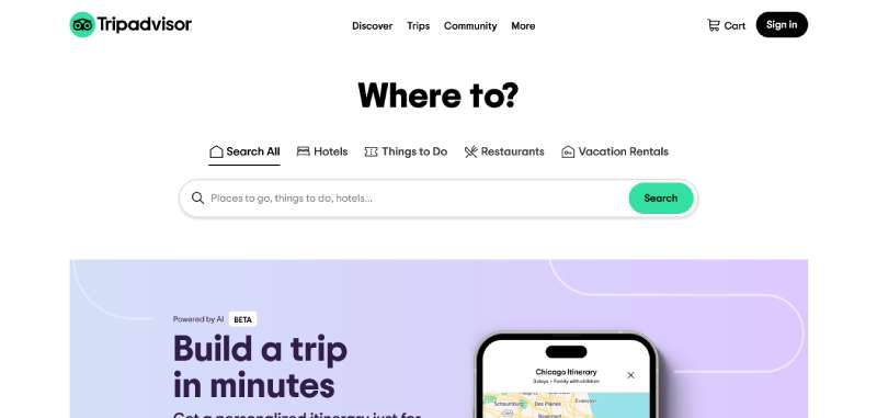
Trust matters just as much as speed does. Tripadvisor alone pulls in more than 150.2 million monthly visits (Statista, 2024), which explains why so many tourism sites just embed its review widget instead of building star ratings from scratch.
None of these pieces work alone, either. Layout choices set the visual hierarchy that pulls a visitor’s eye from the hero image to the call to action, and most homepages lean on grid systems to keep photography, text, and navigation lined up as the layout shrinks down to a phone screen.
Best Tourism Website Design Examples
TripAdvisor
Expedia

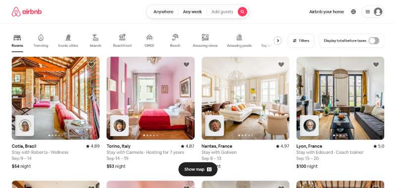
Airbnb
Kayak

Skyscanner

Hotels.com

Priceline

Travelocity

Orbitz

Lonely Planet

Fodor’s Travel

Frommer’s

National Geographic Travel

Conde Nast Traveler

Travel + Leisure

Culture Trip

Atlas Obscura

Visit Europe

Visit California

Visit Florida

Visit New York City

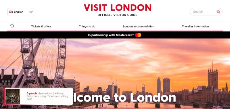
Visit London
Visit Rome

Visit Japan

Visit Australia

Visual Design Styles Used in Tourism Website Design Examples
Minimalist and Editorial Styles

A short headline, one hero image, two or three choices above the fold. That’s the whole homepage on the minimalist end of the spectrum, and it borrows heavily from minimalist design, where restraint does the work instead of decoration.
- Large serif or display type for headlines
- Long form photo essays broken up by short captions
- Muted, earthy color choices rather than saturated brand colors
Visit Iceland is the clearest example of this on a national tourism site.
Immersive Photography and Video Styles

Some sites go the opposite direction and just fill the screen, edge to edge. Full bleed video backgrounds and full screen photography need a strong focal point, or the eye just wanders the frame instead of landing anywhere useful.
- VisitScotland: looping drone footage behind the homepage headline
- 100% Pure New Zealand: cinematic video reels tied to the brand campaign
- Discover Puerto Rico: rotating full screen photo carousels
Navigation Structures in Tourism Website Design
Destination-Based Menu Categorization

Tourism menus rarely look like a standard business site’s menu. Instead of product categories, they get organized around how a traveler actually thinks about a trip: by region or city, by activity type such as hiking, food, or nightlife, by season or trip length.
Visit Iceland groups its content by region first, then lets activity filters narrow things down inside each area.
Sticky and Mega Menu Patterns
Menu style has a real effect on how deep a visitor gets before giving up. A sticky top bar that stays visible on scroll keeps booking and search one tap away at all times. A mega menu opens a large panel on a single click, showing regions, activities, and featured trips together, which cuts down on repeated clicks for sites carrying a lot of destination content.
National tourism boards with large content libraries tend to favor mega menus. Smaller regional or operator sites usually get by fine with a simple sticky bar.
Booking Integration in Tourism Website Design
Native Booking Engines
Some tourism sites keep the whole reservation flow on their own domain instead of sending visitors somewhere else. The operator keeps the customer data and the direct relationship, pays no commission to a third party OTA, and has full control over checkout design and confirmation messaging.
Smaller tour operators and boutique hotel groups tend to run these native systems, mostly because their booking volume doesn’t justify anything heavier.
Third-Party Booking Widgets
Booking.com pulled in an average of 562.6 million visits a month in 2024, making it the most visited travel and tourism website worldwide (Statista/Semrush, 2024). That kind of scale is exactly why so many hotels and tourism sites just embed its widget, or one like it, rather than trying to build traffic to a standalone reservation page from zero.
The appeal is obvious: an existing audience, trust the platform already built, and a much faster launch than a custom checkout flow. The cost is just as real, though. Commission fees eat into margin on every single booking, and the hotel loses a lot of control over what happens to the guest’s data and the relationship after checkout.
Destination Content Presentation in Tourism Website Design
Interactive Maps and Itinerary Tools
Static lists of attractions are getting replaced by tools a visitor can actually plan a trip with: clickable points of interest that open photos and short descriptions, route builders that string stops into a day by day itinerary, filters for activity type, distance, or trip length.
A lot of these run on the same underlying mapping infrastructure as Google Maps API, just restyled to match the site’s own colors and markers. Visit Iceland’s road trip planner is one of the more complete versions of this, and it lets visitors build a route before they’ve booked anything at all.
Virtual Tours and 360 Degree Photography
A photo gallery tells you what a place looks like, flat and fast. Standing inside a 360 degree tour, or watching an embedded video pan across a landscape, is a different kind of convincing, closer to actually being there, and it matters more for destinations selling something remote or hard to picture from a still image.
Good destination storytelling usually pairs that kind of visual with a short narrative thread. Dropping a raw 360 viewer with zero context rarely works as well.
Photo galleries load fast and scan easily, but they don’t give much sense of scale. 360 degree tours load slower and cost more to produce, but they’re far better at conveying distance and terrain.
Page Performance and Technical Standards in Tourism Website Design
Photography sells a destination. Heavy images are also the single biggest reason tourism sites load slowly, which is a frustrating trade-off if you’ve ever tried to get a hero video under two seconds.
Google measures loading, responsiveness, and visual stability through three Core Web Vitals thresholds (Google Search Central, 2024): Largest Contentful Paint (LCP) under 2.5 seconds, Interaction to Next Paint (INP) under 200 milliseconds, Cumulative Layout Shift (CLS) under 0.1.
A hero video or an unoptimized gallery image is usually what blows past that LCP number first. The fixes are pretty standard by now: compress and resize hero images before upload, serve images through a content delivery network like Cloudflare, lazy load galleries below the fold, and reserve fixed space for images so the layout doesn’t jump around as they load.
None of this is optional. Mobile responsiveness and page speed sit right alongside booking and navigation on the list of things that actually matter, and a site that fails on one of them drags down trust in the rest.
Accessibility and Multilingual Support in Tourism Website Design
Nearly 94.8% of the top one million home pages had at least one detectable accessibility failure in 2025 (WebAIM Million, 2025). Tourism sites carry the same exposure as any other public facing business, and the U.S. Department of Justice’s April 2024 rule now requires state and local government sites, including a lot of tourism boards, to meet WCAG 2.1 Level AA.
Font choice matters more here than most redesigns give it credit for. Picking from a decent set of fonts for accessibility solves a chunk of the contrast and legibility failures before development even starts.
Alt text on every destination photo and map marker. Keyboard navigation through menus and booking forms. Color contrast that still holds up against bright outdoor photography backgrounds. Captions on video backgrounds and virtual tour narration. That’s the short list, and it rarely gets shorter in practice.
Language switching usually comes down to a visible selector, often in the header, that swaps text, currency, and sometimes imagery for the visitor’s market. Full translated URL paths for each language matter more than people expect, not just swapped text on the same page. Localized currency and date formats inside the booking flow help too, along with region specific trust signals like local tourism board logos.
The payoff shows up directly in booking behavior. 76% of consumers say they prefer buying from sites that present information in their own language, and 40% say they won’t buy at all from a site in another language (CSA Research, Can’t Read, Won’t Buy).
Travel Oregon treats this kind of accessibility work as core infrastructure rather than an add-on, running ongoing consultations to keep its site’s inclusion work current.
Choosing a Platform for Tourism Website Design
Platform choice decides how much of this a team can actually keep up with in house.
| Platform | Typical cost | Flexibility | Booking plugin support |
|---|---|---|---|
| WordPress | Low to moderate | High, with plugins | Extensive, via plugins |
| Webflow | Moderate | High, visual control | Limited, needs integration |
| Squarespace | Low | Moderate, template based | Basic, built in |
| Wix | Low | Moderate, drag and drop | Basic, built in |
WordPress still runs the largest share of the web, powering 43.6% of all websites and 61.7% of sites that use any content management system (W3Techs, 2025).
A full CMS like WordPress comes with an unmatched plugin ecosystem for booking, reviews, and multilingual support, plus full ownership of hosting and data. The trade-off is ongoing maintenance and security updates, which someone has to actually do.
No-code builders such as Webflow, Squarespace, and Wix launch faster and come with hosting and updates built in. Booking and content flexibility cap out sooner, though, especially once a destination’s content library starts growing past what the builder was designed for.
National tourism boards with large content libraries tend to land on a full CMS. Small regional operators and single property sites usually lean toward a no-code builder instead.
Steps to Design a Tourism Website
Most tourism website builds follow roughly the same sequence, whether the client is a national board or a single hotel.
- Research the audience and the destination’s competitive set before opening a design tool
- Map the content: regions, activities, accommodations, and seasonal campaigns
- Wireframe navigation and page hierarchy around how visitors actually plan a trip
- Choose the platform and set up the booking integration
- Design and build the visual layer, from hero imagery to typography
- Optimize images, test Core Web Vitals, and check accessibility before launch
- Monitor booking conversion and adjust content after launch
Skipping straight to visual design before the research stage even finishes is the most common mistake teams make.
The Slovenian Tourist Board avoided it. Solution providers got a full brief first: site structure, brand guidelines, user personas, all handed over before any design work began (Creatim case study).
That kind of upfront UX design research is what keeps a redesign from turning into a pure visual refresh with no real change in booking behavior.
When Tourism Website Design Examples Do Not Apply
A national tourism board and a two room bed and breakfast are not solving the same problem. Copying a large destination brand’s playbook onto a small operator’s site usually wastes money instead of earning it back.
The full approach breaks down in a few predictable spots. Low booking volume means a custom native booking engine costs more to build and maintain than the direct bookings it ever brings in. Heavy galleries and video backgrounds punish visitors on slow or metered mobile connections, and that describes a large share of international travelers researching on the go.
Full multilingual builds, five languages or more, often cost more to translate and maintain than the incremental bookings from markets that make up a small slice of traffic. Immersive photography styles built for a coastline or a mountain range can look empty, even out of place, on an urban food tour or a single restaurant’s site.
Matching the design to the size of the operation matters more than matching it to whatever the biggest destination brands are doing. A single property site that copies a national tourism board’s homepage usually ends up loading slower and costing more to maintain, without the traffic to justify either one.
FAQ on Tourism Website Design
What makes a tourism website different from a general business website?
Destinations, activities, and seasons drive the organization, not products or services. Destination content, photography, interactive maps, and booking integration all get more weight than they would on a typical business site, since the goal is planning a trip rather than closing a single transaction.
What tools do designers use to build and test tourism websites?
Design teams usually prototype layouts in Figma or Adobe XD first, then build on WordPress, Webflow, Squarespace, or Wix depending on the budget. Once the site’s live, Google PageSpeed Insights and Google Analytics handle performance and traffic testing, alongside whatever heatmap tool the team prefers for watching how people actually behave on the page.
How much does tourism website design typically cost?
Cost depends heavily on the platform and how complex the booking setup needs to be. A no-code build on Squarespace or Wix runs far cheaper than a custom WordPress site with a native booking engine, multilingual support, and interactive maps built from scratch.
What KPIs measure whether a tourism website design is working?
Direct booking conversion rate, mobile bounce rate, and average session length across destination pages are the core numbers to watch. Core Web Vitals scores and accessibility compliance matter too, since both affect whether visitors stick around long enough to convert in the first place.
How often should a tourism website be redesigned?
Most tourism boards and hotel groups revisit their design every two to three years, sooner if page speed, booking conversion, or mobile responsiveness starts falling behind newer competitors in the same category.
What Should You Fix First in Tourism Websites?
Mobile performance is the fix with the widest reach, since Core Web Vitals thresholds decide whether most visitors ever see a destination’s content before bouncing off entirely.
The order that tends to hold up across most rebuilds looks like this: mobile performance and Core Web Vitals first, booking integration and trust signals second, accessibility and multilingual support third.
Mobile carries most of the audience, so a slow load costs a site more visitors on a phone than the same delay ever costs on desktop.
That order accepts a real trade-off. Multilingual work waits, even though matching content to a visitor’s own language moves booking behavior more than most visual polish ever will.
Documented brand guidelines are the natural next step once the design work settles, keeping color, typography, and tone lined up across every future update.

Renowned for his expertise in logo design and visual branding, Bogdan has developed a multitude of logos for various clients.
His skills extend to creating posters, vector illustrations, business cards, and brochures. Additionally, Bogdan's UI kits were featured on marketplaces like Visual Hierarchy and UI8.
He also wrote in the past years on sites like Design Your Way, WebDesignerDepot, WPDean, Designmodo, Speckyboy, Slider Revolution, and more.
- 5 US Ecommerce Migration Companies for Complex Replatforming in 2026 - 17 November 2026
- Taylor Swift Font Generator - 16 November 2026
- How to choose a UX design agency in 2026 by reading its portfolio - 16 November 2026

Bogdan Sandu is a seasoned designer who has been designing websites since 2008. Renowned for his expertise in logo design and visual branding, Bogdan has developed a multitude of logos for various clients. His skills extend to creating posters, vector illustrations, business cards, and brochures. Additionally, Bogdan's UI kits were featured on marketplaces like Visual Hierarchy and UI8. He also wrote in the past years on sites like Design Your Way, WebDesignerDepot, WPDean, Designmodo, Speckyboy, Slider Revolution, and more.
You Might Also Like