Walk through enough university websites and a pattern shows up fast: the ones that actually work were built by studying real school sites, not by guessing what a homepage should look like. Education website design examples are documented builds from real schools, colleges, and universities, and they show how admissions pages, navigation, and branding end up solving different problems for different people at the same time.
Prospective students want programs and deadlines. Current students want a portal that loads fast. Parents want a calendar and a tuition number. Staff want a form they can find without calling IT. Institutions publish these sites knowing all four groups will hit the same homepage, and design teams judge the result against accessibility standards and page speed more than against how pretty it looks. Enrollment conversion gets watched closely too.
College and university websites are the most used source of information across every stage students research, cited by 69 to 82 percent of students depending on the topic (ACT, 2024).
What Is Education Website Design?
Picture three people opening the same college homepage in the same minute: a high school senior comparing tuition, a sophomore trying to log into the portal before an assignment is due, and a parent looking for the spring calendar. Education website design is the discipline that keeps all three from getting lost, built around one job really, get very different audiences to the right page fast.
It borrows tools and layout habits from general web design, but the brief is narrower and the stakes are higher. A prospective student, a current student, and a parent rarely want the same thing on the same visit, which is why the audience list runs longer than most commercial sites ever need:
- Prospective students hunting for programs, tuition, and deadlines
- Current students logging into a portal for grades, schedules, or a learning platform
- Parents and guardians checking tuition, calendars, or safety notices
- Faculty and staff pulling forms, directories, or internal resources
A single course landing page with no institutional branding doesn’t count as education website design, and neither does a social media profile standing in for a homepage. Neither one carries the accreditation seals, multi-department navigation, or compliance obligations that define a real institutional site.
How Do Education Websites Organize Navigation for Multiple Audiences?
Big institutional sites solve this by sorting visitors before they sort departments. Portals get segmented by audience, menus get built wide instead of deep, and the top level stays shallow on purpose, so a deadline or a directory sits within two clicks almost anywhere on the site.
Large universities carry the heaviest load here. Ghent University’s site spanned 120 subsites and roughly 100,000 pages before its redesign, which is why the team rebuilt it around visitor tasks instead of internal departments. Breadcrumb trails and a persistent search bar catch anyone who lands three clicks deep in a subsite straight from a search engine, not from the homepage.
Portal Segmentation by Audience Type
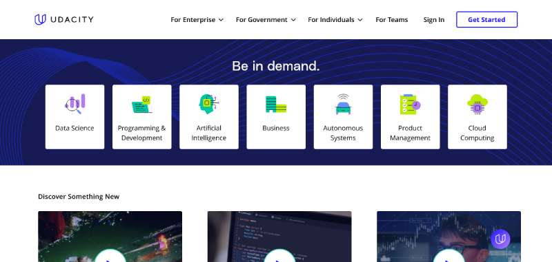
The pattern repeats across nearly every large-institution site once you know to look for it:
- A prospective student portal surfaces programs, tuition, and an apply button
- A current student portal links straight to a learning platform, registration, and billing
- A parent or family portal groups calendars, safety alerts, and payment tools
Segmentation works because it removes decision fatigue. A visitor picks their identity once, on the homepage, and stops seeing content meant for someone else.
Grid systems make this segmentation visible instead of buried in a dropdown. A homepage split into three or four clearly bordered blocks, one per audience, reads faster than a hero image with a paragraph underneath.
Mega Menu Patterns for Large Institutions
Universities with dozens of departments lean on mega menus because a flat dropdown list would run off the screen. A mega menu groups programs by college, then by degree level, so a visitor scanning for nursing or computer science finds it under one heading instead of scrolling through thirty names.
Visual hierarchy decides what a visitor sees first inside that menu. The apply link and search icon usually carry more visual weight than the list of department names sitting below them.
Sitemap depth differs sharply by institution type. A K-12 site might run three levels deep. A research university with graduate programs and alumni chapters routinely runs five or six.
What Accessibility Standards Must Education Websites Meet?
The benchmark everyone designs toward right now is WCAG 2.2 Level AA, even though that’s not technically what’s written into federal regulation yet. The version regulators and courts are actually using today to judge whether a school’s digital content is accessible is WCAG 2.1 Level AA, one full point behind where design teams are aiming.
Public institutions face an added legal layer on top of that. The Department of Justice’s April 2024 final rule, issued under Title II of the Americans with Disabilities Act, requires public colleges and K-12 districts to bring web content up to WCAG 2.1 Level AA. Then in April 2026, the DOJ issued an interim final rule pushing the original compliance dates back by about a year, without touching the WCAG 2.1 AA technical standard itself.
A few numbers explain why this matters so much:
- 21% of undergraduates and 11% of postbaccalaureate students reported a disability in 2019-20, per the National Center for Education Statistics
- Public entities serving 50,000 people or more must now comply by April 26, 2027; smaller entities and special district governments have until April 26, 2028, under the DOJ’s 2026 extension of the original 2024 deadlines
- Section 504 of the Rehabilitation Act sets a parallel nondiscrimination standard for federally funded programs, requiring conformance with WCAG’s technical checkpoints
Section 504 applies wherever federal funding touches a program, and financial aid alone means that covers almost every accredited institution. Section 508 is a related but separate provision. It governs the technology federal agencies themselves develop, procure, or use, not what colleges build.
The World Wide Web Consortium (W3C) publishes and maintains the WCAG standard. Content has to be perceivable, operable, understandable, and robust. That’s the standard’s own language, and it holds up well as a working checklist.
Where schools actually fail an audit isn’t usually dramatic. It’s missing alt text on course thumbnails and faculty headshots, a branded color palette with contrast that looks fine on a designer’s monitor and fails on a phone in sunlight, and mega menus that trap keyboard users because nobody ever tested a focus state.
FERPA adds a separate constraint on top of all this. It limits what student information, grades, disciplinary records, even some directory details, can appear on a page without consent, and that shapes what a student portal can safely show in public view versus behind a login.
Which Content Management Platform Fits an Education Website?
Ask five web directors what CMS they’d choose and the honest answer from most of them is it depends on how many people need to touch the site without breaking it. Institution size, budget, and the number of non-technical staff publishing across departments end up deciding more than any feature comparison chart.
A December 2020 snapshot of US higher education homepages, analyzed by eQAfy, put WordPress at 40.8% of institution sites and Drupal at 19.1%, with those two counted among roughly a dozen platforms that together cover 90% of all institution sites. Dozens of smaller platforms split the remaining 10% between them.
| Platform | Best for | Cost tier | Notable strength |
|---|---|---|---|
| WordPress | Small to mid-size schools | Low to mid | Large plugin ecosystem |
| Drupal | Large universities | Mid to high | Handles complex, multi-department content |
| Webflow | Small colleges, marketing teams | Low to mid | Visual editing without a developer |
| Finalsite | K-12 districts | Mid | Built for school-specific workflows |
| Modern Campus | Enterprise higher ed | High | Deep CRM and admissions integration |
Harvard University runs its main site on WordPress, which gets cited constantly as proof the platform scales well past a small college blog. It’s a fair point, though scale alone doesn’t guarantee the right fit for every school.
Page Builder vs Managed Education CMS
Page builders have real advantages for a school building its first proper site:
- Faster launch, often weeks instead of months
- Lower upfront cost for a single-site school
- Marketing staff can edit pages without a developer
They come with real downsides too, and schools tend to discover these later than they’d like:
- Weaker native support for FERPA-sensitive workflows
- Fewer built-in accessibility checks than education-specific platforms
- Can get unwieldy past a few hundred pages
A managed education CMS like Finalsite, Apptegy, or Modern Campus trades some of that speed for structure built around school calendars, staff directories, and admissions funnels.
Terminalfour and Cascade CMS show up mainly at large universities that need strict governance over hundreds of editors across departments. Blackbaud fits a different niche entirely: nonprofit and independent schools that already run tuition billing or fundraising through its other products.
For one site run by one team, a page builder wins easily on speed and cost. The equation flips once dozens of departments need their own editing permissions without breaking the shared design, and that’s when a managed CMS starts to make sense.
How Does Visual Branding Shape an Education Website’s Design?
Susquehanna University’s 2025 redesign is a good place to start, because it shows the shift happening in real time. The new site leans on River Hawk imagery, real student narratives, and a dark mode toggle, tying the whole thing to a refreshed institutional identity instead of a generic template anyone could have used.
Most design teams start with documented brand guidelines that lock down school colors, logo spacing, and acceptable photography styles before a homepage mockup gets built. Figma and Adobe XD are the two tools that show up most often for building and reviewing those mockups before a developer touches code.
A few branding elements show up on nearly every institutional site once you start looking for them:
- A hero banner or short video loop showing campus life
- A testimonial carousel featuring current students or alumni
- Accreditation seals and school colors repeated across every page footer
Color and Typography by Institution Type
K-12 sites tend to run brighter, higher-contrast palettes built around a mascot color, since the audience skims fast and the design has to compete with a kid’s short attention span. Universities go a different direction, usually settling on two or three core brand colors plus a neutral background and saving bright accents for calls to action.
Typography follows a similar split, though not identically. Research universities often pair a serif display font for headlines with a clean sans-serif for body copy, a practice known as pairing fonts for contrast and readability. Google Fonts supplies most of that type, mostly because it’s free, web-optimized, and already vetted for browser rendering across devices, not because design teams love the selection especially.
What Makes an Admissions or Enrollment Page Convert?
The apply button has to sit above the fold. That’s the short version. The longer version involves a form that asks for the fewest fields needed to follow up and copy that speaks to one specific program instead of the whole institution at once.
Unbounce’s 2024 Conversion Benchmark Report puts the median conversion rate for education landing pages at 8.4%, about 27% higher than the 6.6% baseline across all industries tracked. UNC Charlotte rebuilt its academic pages around accreditation, career outcomes, and program-specific distinctions for each college, rather than running one generic academics page trying to cover all 170-plus majors at once.
Form length is where things get genuinely tricky. Short forms of 3 to 5 fields maximize submissions but give counselors almost nothing to work with. Longer forms of 10 or more fields pre-qualify leads well but risk scaring off anyone just browsing. Most institutions land somewhere between 7 and 12 fields, which is less a magic number than a practical middle ground nobody’s thrilled about.
A tuition calculator or scholarship estimator earns its spot on the page because it answers the question every prospective student is quietly asking without saying it out loud: what will this actually cost me. Generous white space around the form keeps it from competing visually with campus photography or a video hero, and the apply button itself should work as the page’s focal point, the one element a visitor’s eye lands on even when skimming.
Online course and bootcamp pages behave differently. A single, focused program page tends to convert prospects at roughly twice the rate of a general homepage doing the same job, which says something about how much extra friction a homepage adds without meaning to.
How Does Page Speed and Performance Affect Education Websites?
Nobody waits around for a slow site anymore, and prospective students hunting for a deadline are especially quick to bail. Google measures this through Core Web Vitals, three metrics covering loading speed, interaction responsiveness, and visual stability, checked against real Chrome user data rather than a lab test.
The numbers from 2025 aren’t great. Only 62% of mobile origins scored a good Largest Contentful Paint, per the HTTP Archive Web Almanac, and just 56% of desktop origins passed all three Core Web Vitals thresholds, ahead of a 48% pass rate on mobile. A good Largest Contentful Paint score means the main hero image or headline shows up within 2.5 seconds, which sounds generous until you’re staring at a spinning loader on campus wifi.
Campus photo galleries and looping hero videos are the usual culprits on school homepages. Each unoptimized image or autoplay clip adds weight that a visitor on campus wifi or a limited phone plan feels immediately, no analytics dashboard required to notice.
Third-party embeds compound the problem in ways that are easy to miss during a redesign. A course catalog widget, an application portal iframe, and a chat plugin each load their own scripts on top of the page’s existing weight, and none of them show up clearly in a quick visual review.
Google PageSpeed Insights gives a free, page-level diagnostic, and Google Analytics 4 tracks whether slow pages actually correlate with drop-off in the enrollment funnel. The two together tend to catch what a designer’s eye alone would miss. Mobile performance carries extra weight for admissions traffic specifically, since prospective students browsing by phone are the least likely to wait through a slow load just to find a deadline.
What Are the Best Examples of Education Website Design by Institution Type?
The sites worth studying usually solved one specific problem well, rather than trying to look impressive on every single page. New America research found that college websites were the most-used source of information for 63% of prospective and recently enrolled students researching schools, ahead of online search engines at 59%, which says a lot about how much weight an official site still carries.
| Institution | Type | Standout choice | Primary audience |
|---|---|---|---|
| Stanford University | Research university | Search-first homepage over a mega menu | Prospective and current students |
| Yale University | Research university | Interactive, accessibility-tagged campus map | Prospective students, visitors |
| Metro Nashville Public Schools | K-12 district | Bold visuals sized to an 81,000-student district | Families across dozens of schools |
| Plano ISD | K-12 district | Accessible, mobile-first district hub | 47,000 students, 6,300 staff |
University Website Examples
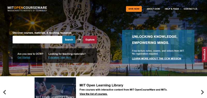
MIT OpenCourseWare
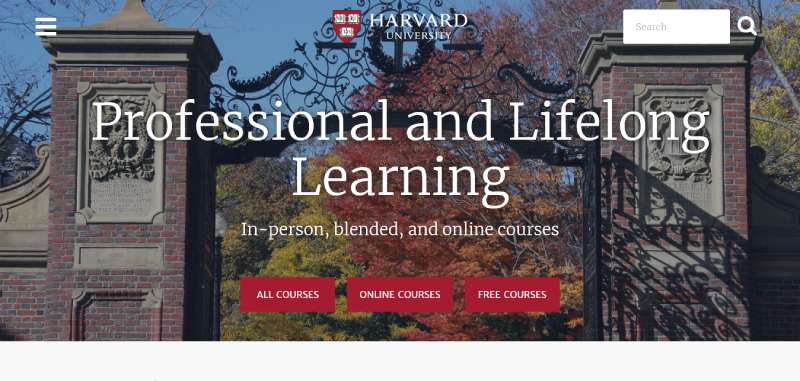
Harvard Online Learning
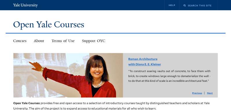
Yale Open Courses
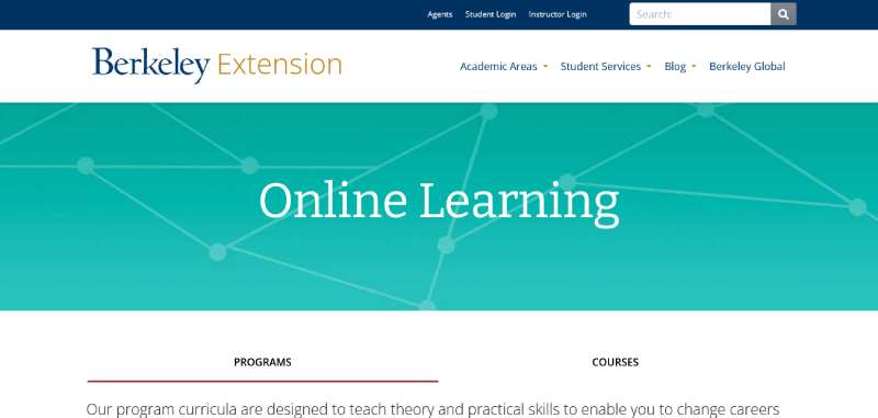
Berkeley Online
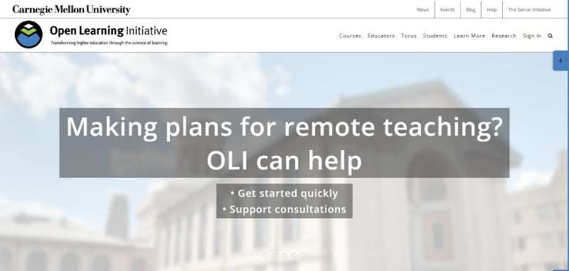
Open Learning Initiative
Stanford handles its size differently than most peers. The homepage reads like one of the cleaner user interface design examples in higher ed, built around a prominent search bar instead of a sprawling menu listing hundreds of programs.
Yale went the other way. Heavy white space, one strong photograph, and a campus map that flags lactation rooms, parking, and accessibility features right alongside the buildings themselves.
Morehouse College opens with a 360-degree virtual tour on the homepage itself, and that detail matters more than it might sound like it should, given the school is competing for students who may never set foot on campus before applying.
K-12 and School District Examples
Metro Nashville Public Schools organizes a site for 81,000 students around bold visuals and audience-first content, built on Finalsite. Plano ISD serves 47,000 students and 6,300 staff through an accessible, mobile-friendly hub with consistent district branding. Both districts keep school-level navigation visible on the homepage instead of burying it in a dropdown, a small choice that saves a lot of frustrated clicking.
Smaller independent schools take a different approach entirely. Brentwood School and Berkeley Carroll lean into motion, scroll-based storytelling, and animated typography, since they’re competing on brand feel rather than sheer navigational scale.
Online Course and E-Learning Examples
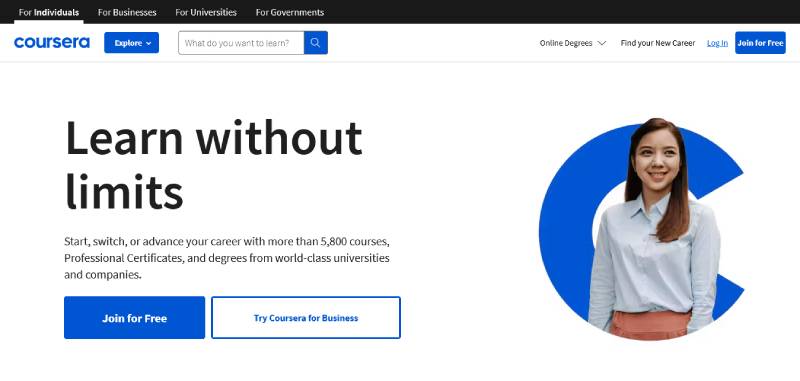
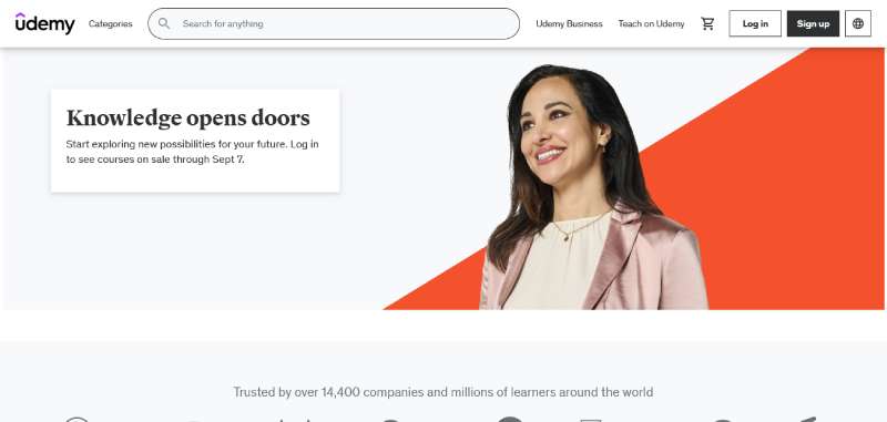
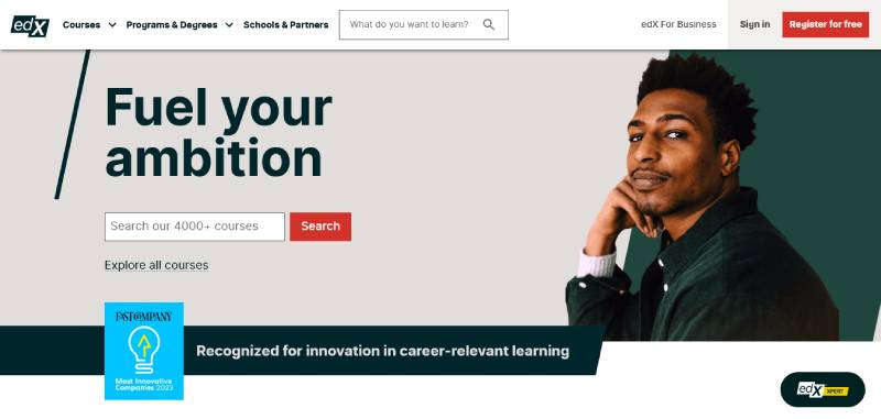
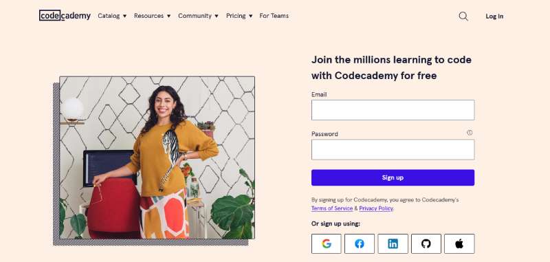
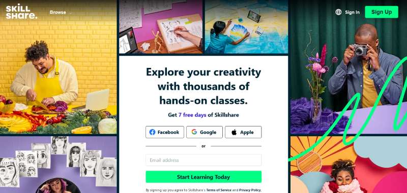
Coursera’s own enterprise site went through a full redesign rather than a visual refresh, after a UX audit showed the existing structure led visitors down inefficient, inward-facing paths instead of toward conversion. The learner-facing dashboard behind platforms like Coursera borrows heavily from dashboard UI design, with resume-progress cards, completion percentages, and a persistent course sidebar.
AI-assisted matching is starting to show up in a few places worth naming. Arizona State University’s Coursera partnership routes learners toward specific programs instead of dumping them into a full course catalog. Deakin University uses a similar natural-language matching tool to shorten the “which course is right for me” browsing loop.
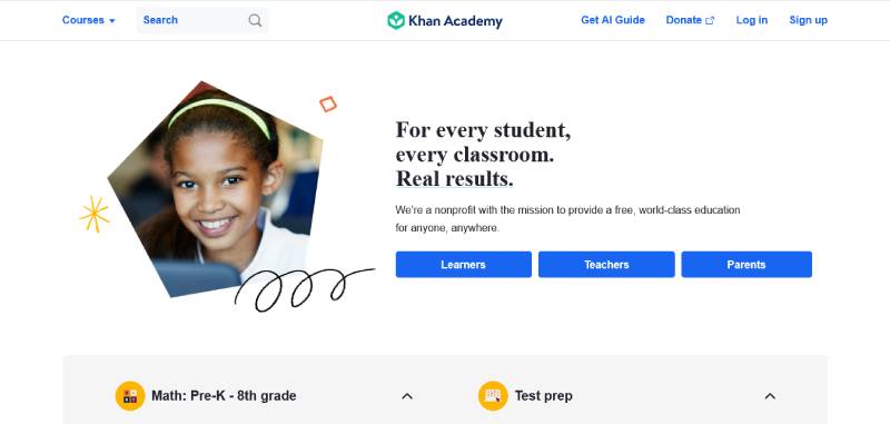
Khan Academy
Coursera
Udemy
edX
Codecademy
Skillshare
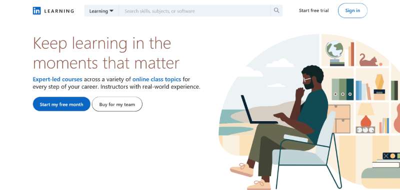
LinkedIn Learning
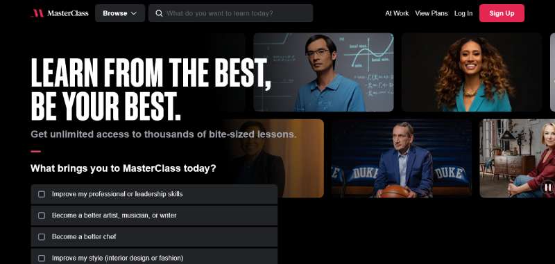
MasterClass
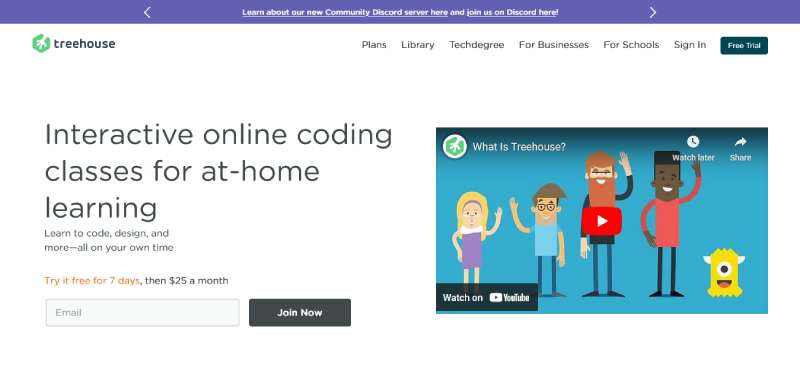
Treehouse
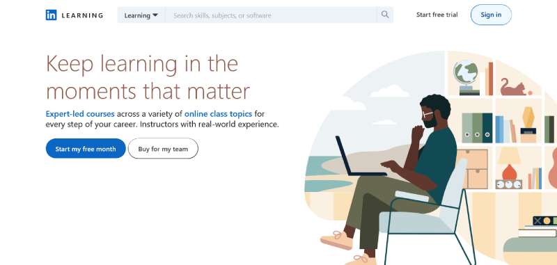
Lynda.com
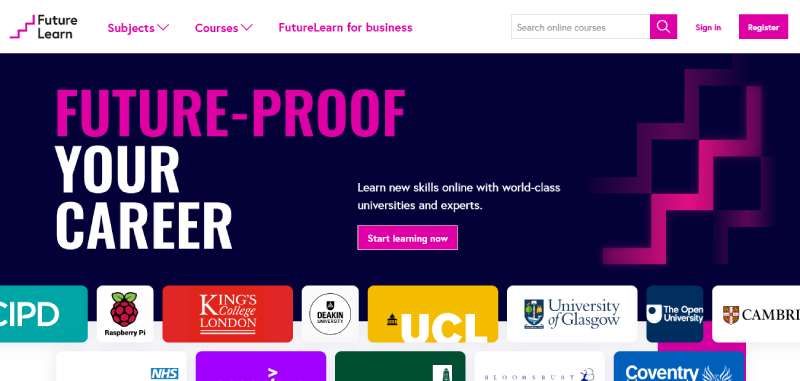
FutureLearn
Language Learning Platforms
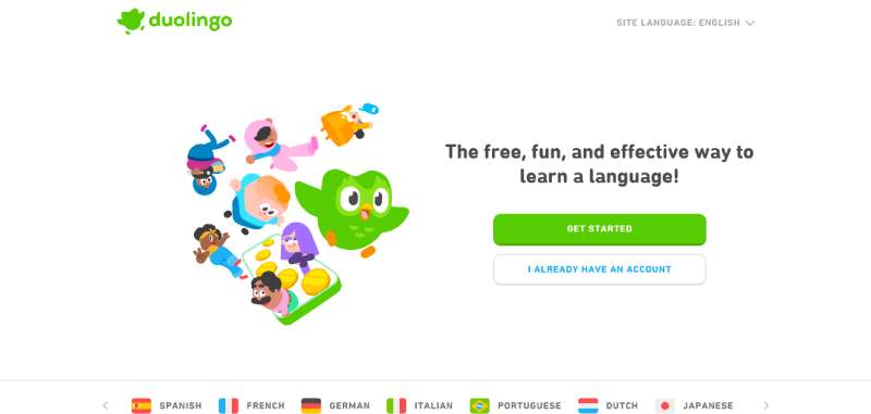
Duolingo
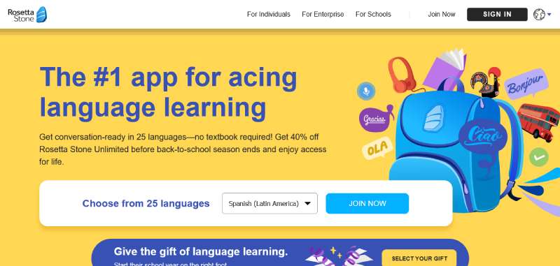
Rosetta Stone
Free and Open Learning Resources
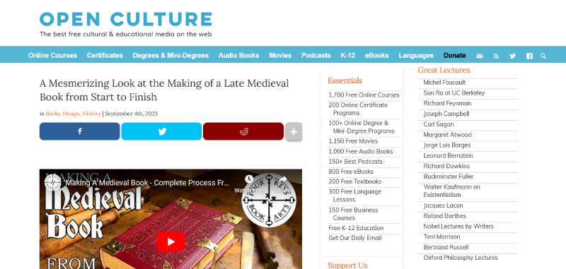
Open Culture
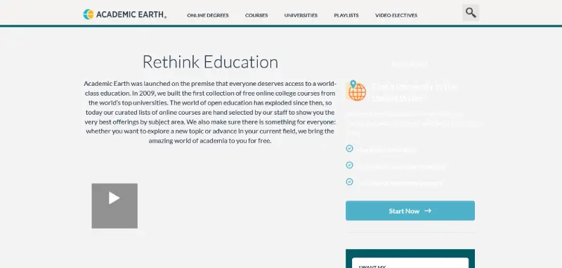
Academic Earth
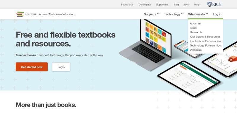
OpenStax
Learning Websites for Kids and Schools
National Geographic Kids

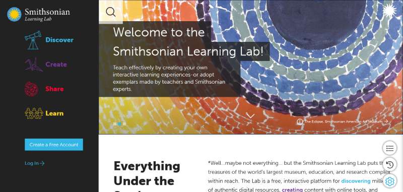
Smithsonian Learning Lab
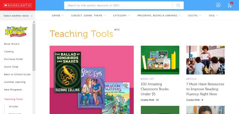
Scholastic
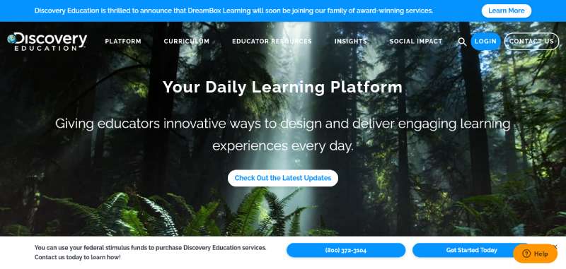
Discovery Education
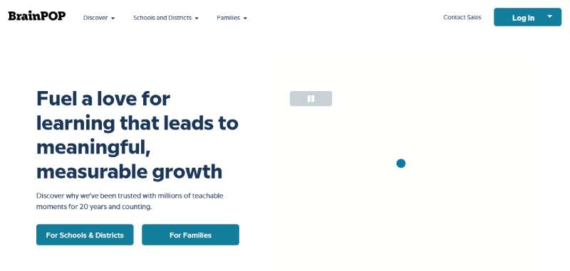
BrainPOP
What Steps Are Involved in Designing or Redesigning an Education Website?
The sequence is fairly fixed even though the calendar time varies enormously by institution size. Modern Campus’s 2026 guidance puts a mid-sized institutional redesign at roughly 9 to 15 months from discovery through launch, with large decentralized systems running 18 to 24 months.
- Discovery and audience research: stakeholder interviews, analytics review, and goals set for each of the three main audiences
- Content audit: inventory of every page, flagging what gets kept, rewritten, or retired
- Information architecture and wireframes: sitemap, navigation testing, and template structure before any color gets chosen
- Visual design, usually starting with a mood board that locks in photography style, color, and tone
- CMS selection or configuration, matched against institution size and staffing
- Development and template build, with content migration running in parallel
- Accessibility and usability testing against WCAG 2.2 AA, following the same UX design research methods used earlier in the project
- Launch, followed by post-launch tracking through Google Analytics 4 to catch drop-off the team missed in testing
Skipping straight from wireframes to development is the fastest way to blow past that 9 to 15 month estimate. Half-finished content forces the build team to guess at layout, and guessing rarely goes well twice in a row.
When Does an Education Website Redesign Fail or Not Apply?
Sometimes the honest answer is that the site isn’t the problem. Content, governance, or staffing gaps don’t get fixed by swapping templates, and nobody owning the job of keeping program pages current or fixing broken links means a redesign just produces a nicer-looking version of the same mess.
A redesign should probably wait, or get skipped outright, in a few situations:
- A site launched within the last two to three years with no major structural complaints
- An institution about to rebrand, merge, or change its academic structure, since the site would need rework again within months
- A budget that only covers half the build, which usually produces a half-finished site rather than a smaller finished one
Redesigns that do go ahead fail more often than people expect, honestly. The Standish Group’s long-running CHAOS research puts the on-time, on-budget, full-scope success rate for software and digital projects at just 31%. Scope is usually the culprit. Industry reporting on redesign projects finds scope, timeline, and budget commonly expand by 40 to 60% past the original plan once work is underway.
Accessibility failures carried over from the old site are a specific and expensive version of this problem. A WCAG 2.1 gap that survives a redesign untouched is a legal exposure that the new visual design does absolutely nothing to fix, no matter how good the new homepage photography looks.
Most institutions plan a full redesign every five to seven years, using smaller component updates in between rather than starting over each time.
FAQ on Education Website Design
What happens if an education website fails an accessibility audit?
ADA demand letters and lawsuits follow, not just a lower internal score. Overlay widgets don’t fix this either: they were cited as barriers in 25% of 2024 accessibility lawsuits, per Modern Campus, since courts require the underlying code fixed rather than patched over.
What tools do designers use to build education website mockups before development?
Figma and Adobe XD lead for higher-fidelity screens, while Balsamiq handles quick, low-fidelity wireframes early in discovery. Teams often pair a mood board with a clickable prototype so stakeholders react to layout and navigation before a developer writes a line of code.
How much does an education website redesign typically cost?
A WordPress build with a premium theme runs $500 to $3,000. Managed platforms like Finalsite or Blackbaud cost roughly $4,000 to $10,000 a year, and custom development for a large district or university often runs well beyond that, frequently into the tens of thousands of dollars or more depending on scope, per pricing data compiled by Muffin Group.
How is the success of an education website design measured after launch?
Application starts, bounce rate, and time on the admissions funnel get tracked through Google Analytics 4, not aesthetics alone. A redesign that raises enrollment conversion while holding page speed steady counts as a win, even without any visual award to show for it.
What Should You Fix First in Education Websites?
Accessibility, not color or layout. A WCAG gap carried through a redesign creates legal exposure that new visual work does nothing to resolve, and fixing it after the fact costs more than fixing it first would have.
That order has a real cost. Remediation testing pushes the visual sign-off back by weeks, and no design freeze happens until it clears.
- Remediate accessibility and content governance
- Rebuild navigation and CMS structure
- Apply branding and visual design last
Only 31% of digital projects finish on time and on budget, and scope commonly expands 40 to 60% once work starts. Adding an accessibility phase without padding the schedule for it is close to the fastest way to miss both numbers at once.
Documenting each fix in a brand style guide keeps the next redesign from repeating the same remediation work all over again.

Renowned for his expertise in logo design and visual branding, Bogdan has developed a multitude of logos for various clients.
His skills extend to creating posters, vector illustrations, business cards, and brochures. Additionally, Bogdan's UI kits were featured on marketplaces like Visual Hierarchy and UI8.
He also wrote in the past years on sites like Design Your Way, WebDesignerDepot, WPDean, Designmodo, Speckyboy, Slider Revolution, and more.
- Neon Font Generator - 8 November 2026
- Best Shopify agencies for 2027 - 8 November 2026
- The Lovable Logo History, Colors, Font, And Meaning - 6 November 2026

Bogdan Sandu is a seasoned designer who has been designing websites since 2008. Renowned for his expertise in logo design and visual branding, Bogdan has developed a multitude of logos for various clients. His skills extend to creating posters, vector illustrations, business cards, and brochures. Additionally, Bogdan's UI kits were featured on marketplaces like Visual Hierarchy and UI8. He also wrote in the past years on sites like Design Your Way, WebDesignerDepot, WPDean, Designmodo, Speckyboy, Slider Revolution, and more.
You Might Also Like