A design team pulls up five or six live fashion sites before anyone writes a line of the creative brief. That is really what “fashion website design examples” means in practice. Not a moodboard, not a screenshot pulled from a theme marketplace, but a site that is actually live right now, loading on someone’s cracked phone screen, taking a real payment.
Founders do the same thing before picking a platform, or before replatforming a store that has quietly stopped converting.
Shopify’s ecommerce fashion industry report puts global fashion ecommerce sales at $957.31 billion in 2026. At that scale, a clumsy checkout step or a font that is too small on mobile is not a cosmetic problem. It is lost revenue, repeated across millions of visits.
You can usually tell a luxury site from a fast fashion one within two seconds, before a single product photo even finishes loading. Typography, color, and how the layout behaves once the screen narrows do most of that work.
What is Fashion Website Design
A screenshot from a theme marketplace does not count. Neither does a PDF lookbook or a moodboard someone put together in Figma over a weekend.
What counts is a site that is live: it loads, it processes an actual payment, and it has to hold up on a five-year-old phone with patchy wifi, not just on a designer’s retina monitor.
This rundown skips print catalogs, PDF lookbooks and social-only storefronts that never became a working site.
Fashion sits inside the wider field of web design, but it leans harder on photography, mood and brand feel than a typical software product page does.
Five categories come up again and again through this piece: luxury fashion, fast fashion, streetwear, sustainable and direct-to-consumer labels, and independent boutiques.
- Luxury fashion sites
- Fast fashion retailers
- Streetwear brands
- Sustainable and direct to consumer labels
- Independent boutiques
Everlane gets cited often for exactly this reason. Its site strips down to product, price and fabric story, with almost nothing else fighting for attention.
What Layout Styles Appear in Fashion Website Design
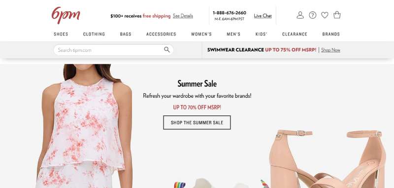
Layout style is the first thing a visitor reads on a fashion site, usually before a single word of copy.
Grid layout follows the same logic as grid systems used across print and digital design, just scaled up to product photography. Asymmetric layout breaks that grid on purpose, usually on a homepage or a campaign page, to slow the eye down for a moment.
Minimalist layouts show up most on capsule and luxury sites, with large gaps between elements that let a single product breathe. Dense catalog layouts do the opposite, packing tight grids to handle retailers carrying thousands of SKUs. Somewhere in between sits the hero banner, one full-width campaign image sitting above the fold, doing the work of a billboard before anyone even reaches a product.
That reliance on open space is why a 40 item capsule brand looks nothing like a 4,000 SKU department store, a contrast rooted in the same principles covered in most guides to white space.
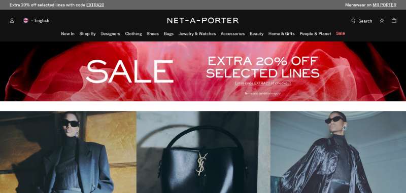
Net-a-Porter runs a strict grid with wide gutters between products, which keeps the garment as the focus rather than the page chrome around it.
What Navigation Patterns Do Fashion Websites Use
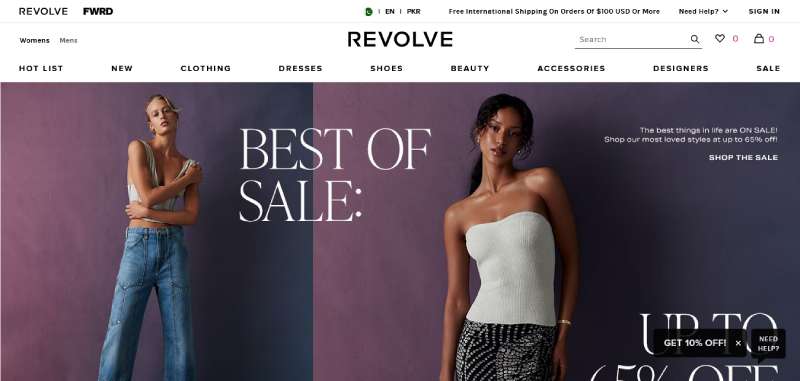
Navigation pattern decides how fast a shopper finds a product, and how many clicks it takes to get there.
A wide category tree needs a different structure than a ten-product capsule drop, so the pattern usually reflects catalog size before anything else.
Retailers with wide category trees tend to lean on mega menus, full width dropdowns that expose the entire catalog structure in one hover. Sticky headers solve a narrower problem, just keeping the nav bar visible while someone scrolls through a long category page. And once the layout drops to phone width, nearly everything collapses into a hamburger icon, regardless of how the desktop version was built.
That collapse is well documented in breakdowns of mobile menus and buttons, where the hamburger pattern trades visible options for saved space.
Filter and sort acts as a second navigation layer inside category pages, letting a shopper narrow by size, color or price without leaving the grid.
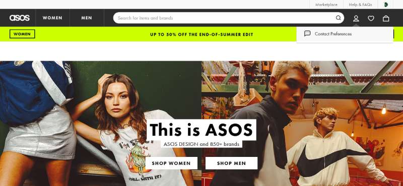
ASOS leans on a mega menu because its catalog spans thousands of items across dozens of categories at once.
How Product Photography Shapes Fashion Website Design
Product photography carries more of a fashion site’s identity than almost any other single element.
Every shot needs a clear focal point, the one spot the eye lands on before it wanders down to the price tag.
Flat Lay vs Lifestyle vs 360 Degree
Product photography on fashion sites tends to fall into flat lay, lifestyle, or 360 degree shots, and each one pushes a shopper toward a different kind of decision.
| Style | What it shows | Best for |
|---|---|---|
| Flat lay | Garment shot flat, no model | Fast comparison across colors and sizes |
| Lifestyle | Garment worn in a real setting | Brand storytelling, mood building |
| 360 degree | Rotating product view | Higher priced items, footwear, bags |
User Generated Content on Product Pages
User generated content now sits right alongside brand photography on a lot of product pages, not tucked away in a separate gallery. Customer photos are showing up near the size guide instead of buried under a reviews tab, influencer imagery gets reused on category landing pages, and some brands push review photos in front of a shopper right before checkout.
Framing decides whether a lifestyle shot reads as candid or staged, and fashion brands tend to lean toward the candid end on purpose.
Reformation mixes flat lay shots with lifestyle imagery on the same product page, pairing fabric detail with a sense of how the piece actually moves on a body.
What Typography and Color Palette Choices Define Fashion Website Design
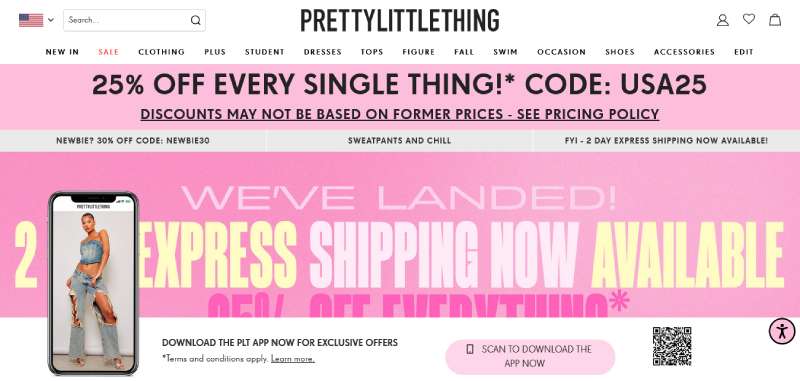
Type and color signal whether a site feels luxury, fast fashion or streetwear before a shopper reads a single word.
Font pairing does a lot of that signaling. Plenty of luxury sites reach for a serif headline over a plain sans body, though just as many settle on one grotesque family and use it everywhere. Weight matters almost as much, since heavier serif weights read as luxury while a condensed sans reads as streetwear.
Palette approach tends to split into two camps too: a named seasonal palette that changes every few months, or a fixed neutral palette locked to one or two hex values that basically never move. Contrast, dull as it sounds, still needs enough separation between text and a bright product photo to stay legible on a phone screen in direct sunlight.
Getting the pairing right comes down to typographic hierarchy, so the eye moves from headline to price without stalling somewhere in between.
Most fashion sites stick to two type families at most, which lines up with the general rules of pairing fonts that apply to any print or digital layout.
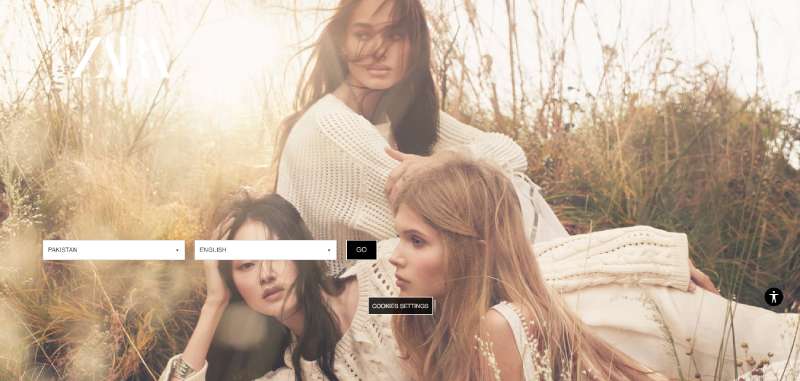
Zara sticks to a near black and white palette with a single bold sans serif logotype, a combination that reads as neutral rather than seasonal.
How Mobile Design Affects Fashion Website Performance
Mobile is not a secondary screen for fashion ecommerce. It is where most of the traffic already sits, and has been for a while.
Breakpoint behavior across phone, tablet and desktop widths decides whether a mega menu still works once the screen shrinks down to a few inches.
The numbers back this up. Mobile devices now account for 81% of fashion ecommerce traffic, according to Statista data (via UniformMarket, 2025). Speed compounds that gap: sites that load in one second convert 2.5 times better than sites taking five seconds, based on Portent’s analysis of over 100 million pageviews (Portent, 2022). Baymard Institute puts mobile cart abandonment at roughly 80%, against 66% on desktop (Baymard Institute, 2025), and that difference is hard to explain away as just people casually browsing on the couch.
Sticky add to cart buttons and thumb reach navigation exist specifically to close that gap between mobile traffic and mobile completion.
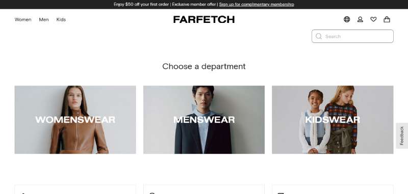
Farfetch built a dedicated mobile app alongside its website once browsing shifted almost entirely to phones, treating the app as a first class channel rather than an afterthought.
Which Platform Fits a Fashion Website Design
Platform choice sets a ceiling on how far a fashion site’s layout and checkout can be customized later on.
| Platform | Best fit | Customization | Typical cost range |
|---|---|---|---|
| Shopify | DTC apparel brands | Moderate, app based | Low to mid |
| WooCommerce | WordPress based boutiques | High, code level | Low, hosting dependent |
| Magento (Adobe Commerce) | Large multi region retailers | Very high | High, enterprise |
| Webflow | Design led, lower SKU brands | High, visual builder | Low to mid |
| Squarespace | Small boutiques, single founder brands | Low, template based | Low |
Shopify’s own regulatory filings put its share of US ecommerce sales at about 12% for 2024, one of the largest concentrations among apparel and DTC merchants on any single platform (Shopify, SEC filing, 2025).
Gymshark runs its storefront on Shopify Plus, a common setup for apparel brands that outgrew a standard plan but do not need Magento’s scale.
What Checkout Flow Works Best for a Fashion Website
Checkout flow decides whether a full cart actually turns into a completed order.
A single page checkout keeps shipping, payment and review on one screen. A multi-step checkout splits that same information across two or three stages instead.
Step count is the first real decision here, single page for speed, multi-step for complicated orders involving multiple shipping addresses. Guest checkout, letting someone buy without creating an account first, matters almost as much. Size guides and wishlists need to appear before payment, never after, and payment itself usually routes through Stripe or something comparable for card and wallet transactions.
Forced account creation drives about 26% of preventable checkout abandonment, according to Baymard Institute’s checkout usability research (Baymard Institute, 2025).
Nordstrom keeps guest checkout as the first visible option on its payment screen, ahead of the sign in fields rather than tucked beside them.
Best Fashion Website Design Examples
Layout, photography and typography choices shift once a brand’s category changes, even when the underlying platform does not.
Comparing a few real sites side by side shows how those choices trade off against each other.
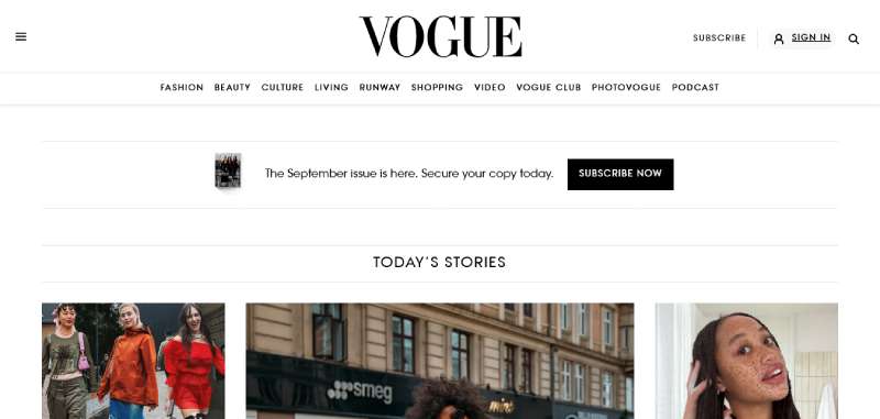
Vogue
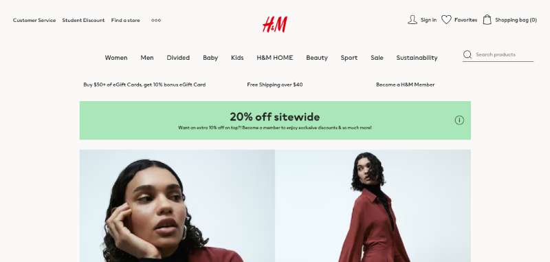
H&M
ASOS
Zara
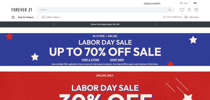
Forever 21
Net-a-Porter
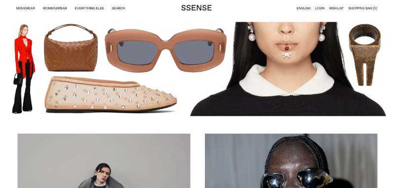
SSENSE
Farfetch
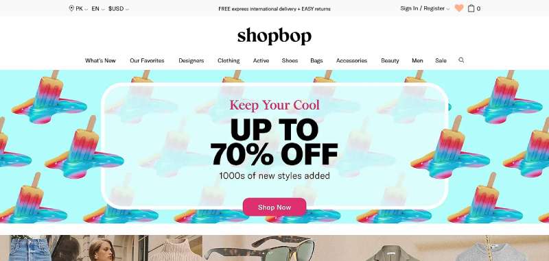
Shopbop
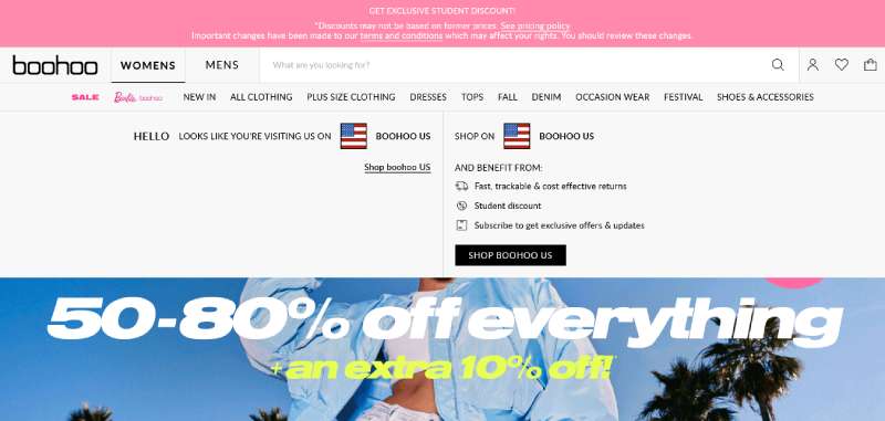
Boohoo
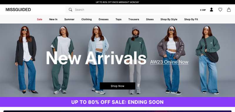
Missguided
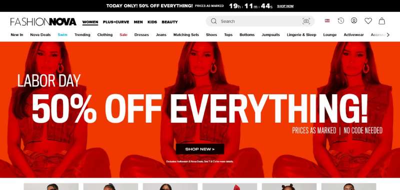
Fashion Nova
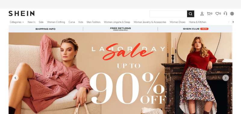
SHEIN
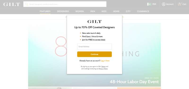
Gilt
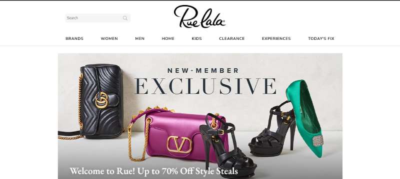
Rue La La
HauteLook
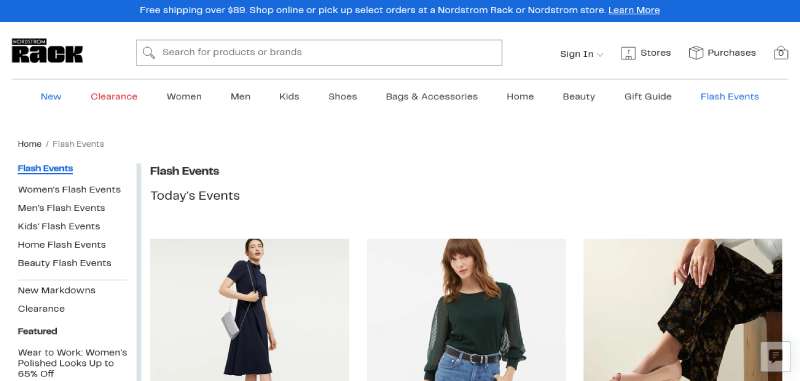
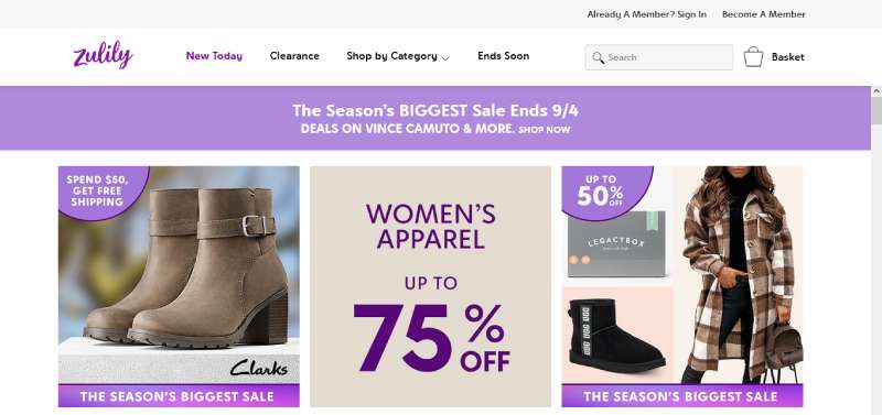
Zulily
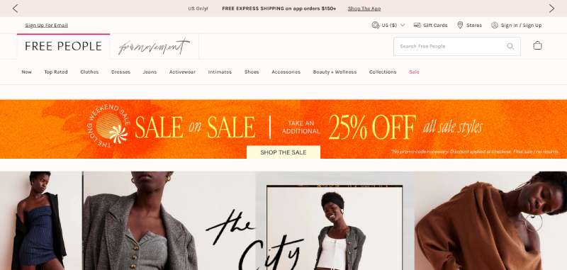
Free People
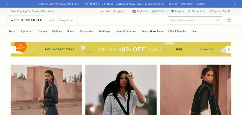
Anthropologie
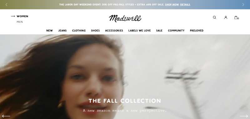
Madewell
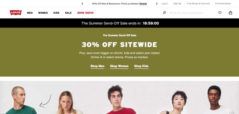
Levi’s
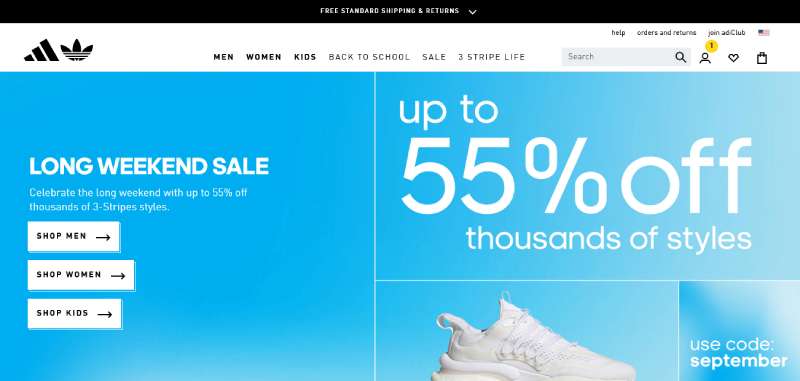
Adidas
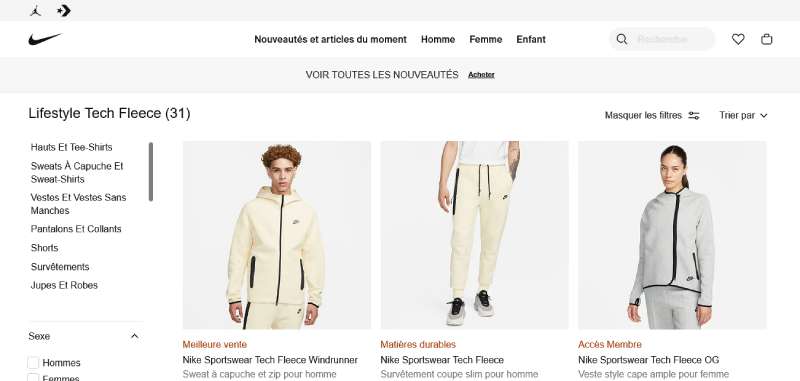
Nike
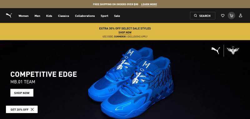
Puma
Reebok
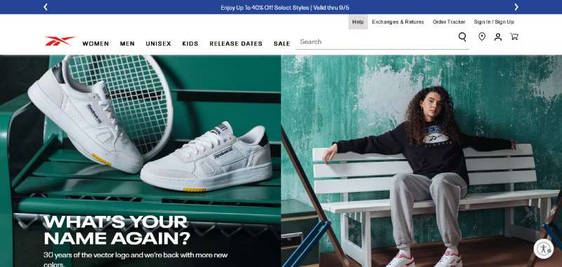
Under Armour
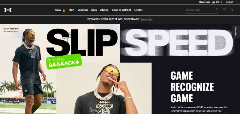
How Much Does Fashion Website Design Cost
Cost tracks platform choice and design scope more than anything else.
| Build type | Typical cost range | Best fit |
|---|---|---|
| Template based | $500 to $3,000 | Single founder boutique, capsule brand |
| Custom build | $8,000 to $30,000 | Growing DTC brand, agency designed |
| Enterprise platform | $50,000 to $250,000+ | Large, multi region retailer |
Shopify’s own guidance puts a custom, 20-page build in the $8,000 to $30,000 range for professional design and development (Shopify, 2026).
A custom brand style guide covering color, type and spacing is usually what pushes a project from the template tier into custom territory.
Ongoing costs stack up separately from the build itself. Hosting, apps, email tools like Klaviyo, and CDN services like Cloudflare all bill monthly no matter which platform sits underneath.
How to Redesign a Fashion Website Step by Step
A redesign works best as a sequence, not one single big reveal.
Baymard Institute’s 2025 ecommerce UX benchmark found that 67% of leading desktop ecommerce sites deliver only mediocre or worse experiences, which is exactly why the audit step matters before anything gets rebuilt (Baymard Institute, 2025).
- Audit the current site, checking layout, visual hierarchy, navigation and checkout flow against the attributes covered earlier in this guide
- Build a rough mood board of layout and photography direction before touching any platform decision
- Select the platform and photography style that match the brand category, luxury, fast fashion, streetwear or sustainable
- Build and test mobile breakpoints before anything goes live, not after
- Run a Lighthouse and accessibility check against WCAG guidelines set by the W3C prior to launch
- Watch Core Web Vitals scores for the first few weeks after launch and fix any regressions that show up
BUFF, the headwear and apparel brand, redesigned its navigation menu and saw ecommerce conversion rates climb 49.8% on desktop and 195.2% on mobile in the first month after launch, alongside a 10% drop in bounce rate (scandiweb case study).
When These Fashion Website Design Examples Do Not Apply
A pattern that works for one brand can actively hurt another one sitting right next to it in the same category.
A mega menu built for a retailer carrying thousands of SKUs turns into clutter on a 30 item capsule brand with nothing to organize.
Heavy lifestyle photography slows load times badly in markets where mobile bandwidth is limited, undoing whatever brand storytelling it was meant to add in the first place.
A minimalist luxury layout, built around asymmetry and open space, tends to suppress conversion with price-driven fast fashion shoppers who want density and visible discounts instead.
Custom built design patterns fail quietly, not loudly.
A small team without a developer on staff often cannot maintain a fully custom build once the original agency moves on, and that is usually when a template based platform becomes the safer long-term choice.
FAQ on Fashion Website Design
What is the difference between a fashion website and a general ecommerce website design
A fashion website leans harder on photography, typography and mood than a general ecommerce website design.
Product pages carry lifestyle imagery and storytelling first, with conversion mechanics like size guides and filters built around that visual priority instead of replacing it.
What accessibility standards should a fashion website follow
Most fashion sites target WCAG guidelines set by the W3C, covering color contrast, alt text on product photography and keyboard navigation.
Meeting accessibility contrast requirements also tends to improve legibility across mobile breakpoints, not just for assistive technology users.
Are template-based fashion websites as good as custom-built ones
Template-based builds handle small catalogs and capsule brands well, and they launch faster at a lower cost.
A custom build earns its price once a brand needs unique layout, animation or checkout logic a theme cannot support, usually somewhere past a few hundred SKUs.
How do you measure whether a fashion website design is actually working
Conversion rate, mobile bounce rate and checkout completion are the core signals, tracked alongside Core Web Vitals scores.
A design that scores well on Google Lighthouse but still loses shoppers at checkout usually has a navigation pattern problem, not a speed problem.
What tools do designers use to build fashion websites
Figma and Adobe XD cover layout and prototyping, while Awwwards, Behance and Dribbble supply design inspiration and benchmarking.
On the build side, Shopify, Webflow and WooCommerce turn those mockups into working product pages and checkout flows.
What Should You Fix First in Fashion Websites?
Fashion website design examples point to one clear fix-first order: mobile load speed and checkout friction outrank visual polish, because a slow or confusing checkout loses revenue before typography or color palette ever get evaluated.
- Fix mobile load speed and image compression
- Simplify checkout to guest-first, fewer fields
- Audit layout and navigation last
Template-based platforms stop scaling cleanly past roughly 300 SKUs, the point where dense catalog navigation and custom grid layout start earning back their build cost.
There is a real trade-off here. Choosing speed and a template first means accepting a narrower design vocabulary until traffic actually justifies a custom rebuild.
Once checkout and speed are solid, UX design principles are the next thing worth reading up on, and they apply across any ecommerce category, fashion included.

Renowned for his expertise in logo design and visual branding, Bogdan has developed a multitude of logos for various clients.
His skills extend to creating posters, vector illustrations, business cards, and brochures. Additionally, Bogdan's UI kits were featured on marketplaces like Visual Hierarchy and UI8.
He also wrote in the past years on sites like Design Your Way, WebDesignerDepot, WPDean, Designmodo, Speckyboy, Slider Revolution, and more.
- The Windsurf Logo History, Colors, Font, And Meaning - 10 October 2026
- How to Remove Background From Product Photos (No Photoshop) - 10 October 2026
- How Designers can Build a Stronger Online Creative Identity - 9 October 2026

Bogdan Sandu is a seasoned designer who has been designing websites since 2008. Renowned for his expertise in logo design and visual branding, Bogdan has developed a multitude of logos for various clients. His skills extend to creating posters, vector illustrations, business cards, and brochures. Additionally, Bogdan's UI kits were featured on marketplaces like Visual Hierarchy and UI8. He also wrote in the past years on sites like Design Your Way, WebDesignerDepot, WPDean, Designmodo, Speckyboy, Slider Revolution, and more.
You Might Also Like