When people search for artisan website design examples, they’re usually looking at how independent makers show off handmade products online. Layout, photography, the fonts picked for a headline, all of it works together to make a shop feel like a person built it instead of a warehouse.
These sites get built by solo makers, small studios, and craft brands who want to sell directly rather than hand a cut to a marketplace. Once live, though, they answer to the same rules every ecommerce page does: load fast, convert, don’t lose the sale at checkout.
Etsy reported 5.6 million active sellers on its marketplace as of December 31, 2025, according to the company’s fourth-quarter results. A good chunk of sellers who outgrow that marketplace end up moving to their own site, mostly so they can own their branding and customer data instead of renting both from Etsy.
What is artisan website design?
Texture, imperfection, a visible human hand behind the product. That’s what separates artisan website design from the glossier small business templates most builders default to.
It sells trust through craft rather than through a mass-market polish.
A handful of traits keep showing up on these sites, enough that you can usually spot the style within a few seconds of landing on a homepage.
- Warm, natural color choices instead of bright, saturated brand palettes
- Hand-drawn or custom illustration in place of stock icon sets
- Serif or script fonts that read as personal rather than corporate
- A visible founder or maker, not a faceless storefront
Font choice matters more here than on a typical brand site, since typography carries most of the handmade signal once color and texture are set.
What it isn’t is a minimalist SaaS interface, and it isn’t a polished corporate identity site either.
Those styles chase efficiency and scale. Artisan design chases storytelling and a sense that a real person made the thing being sold.
How artisan website design differs from standard small business design
Standard small business design chases polish and consistency. Artisan design chases warmth and evidence of a maker’s hand, even where that costs it some symmetry.
| Element | Artisan design | Standard business design |
|---|---|---|
| Color palette | Muted, natural tones | Bold brand colors |
| Typography | Serif or script accents | Clean sans-serif systems |
| Photography | Macro, behind-the-scenes shots | Studio product shots |
| Layout logic | Story-first, single page flow | Category-first navigation |
The two styles still share some ground. Both need clear visual hierarchy so a visitor knows where to look first.
Typography is where the split between the two shows up fastest, honestly.
A generic small business site usually pairs a serif font only for headlines, if at all, and leans on sans-serif for everything else.
Artisan sites tend to do the opposite, using serif or hand-lettered type through the whole page to keep the handmade feel consistent.
What visual elements make a website look artisan
A few numbers explain why these choices carry more weight than they seem to at first glance.
- 94% of a visitor’s first impression comes down to design, not copy (Hostinger, 2026)
- That impression forms in about 50 milliseconds
- 38% of visitors stop engaging with a site they find unattractive (Hostinger, 2026)
Color, texture, and type all have to land inside that narrow window.
Color and texture choices

Artisan palettes favor low-key, muted tones over the saturated brand colors most retailers lean on.
That preference for low saturation keeps the site feeling closer to natural materials than to a manufactured product line.
Beige and cream show up constantly, sage green too, because they all read as natural rather than manufactured.
- Paper-grain or linen-textured backgrounds
- Slightly imperfect, hand-drawn borders and dividers
Typography choices
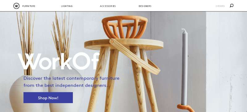
Type carries the handmade signal once color is set.
A script or serif headline paired with a plain body font is the most common formula, and it works because of how fonts trigger association.
Font psychology research links serif and script letterforms to warmth, craft, tradition. Geometric sans-serif goes the other way, reading efficient and corporate.
Most sites settle on a hand-lettered or serif display font for headlines, paired with a plain sans-serif underneath for body copy and product details.
What layout patterns do artisan websites use
Layout choice depends mostly on how many products a maker sells.
A jewelry maker with twelve pieces needs a different structure than a candle brand running forty SKUs.
Single-page layouts
One scrolling page works well for a single maker with a small catalog and a strong story to tell.
The typical flow goes hero image, then a short founder story, a handful of featured products, and finally a contact or newsletter block near the bottom.
Navigation is often reduced to a few anchor links instead of a full menu.
Gallery-first layouts
Product-heavy shops skip the story and lead straight with a grid of items instead.
The grid keeps browsing fast once a catalog runs past a dozen pieces.
- Large, consistent product thumbnails
- Minimal text per item until the product page
- Category filters kept visible, not hidden in a dropdown
- Consistent lighting across every photo in the grid
- Quick-view or hover previews on desktop
This pattern borrows directly from standard ecommerce, since browsing dozens of handmade items works the same way it does for mass-produced goods.
Asymmetrical layouts
Portfolio-style artisan sites sometimes break the grid on purpose.
Off-center hero images and staggered product placement signal craft rather than mass production, since asymmetry reads as intentional and handmade when it’s used with restraint.
Push it too far, though, and scanability suffers, which is why most sites confine the asymmetry to the homepage hero and keep the actual product listing pages in a straightforward grid.
Best artisan website design examples
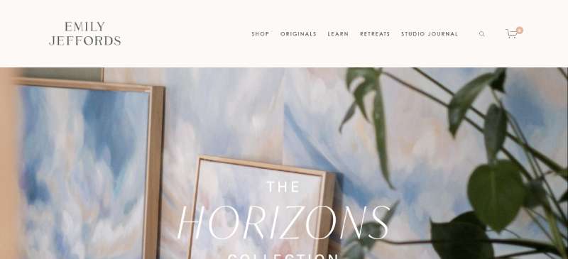
Emily Jeffords
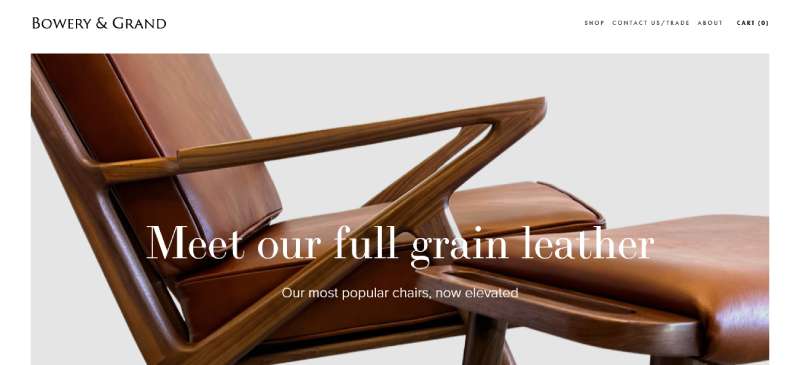
Bowery & Grand
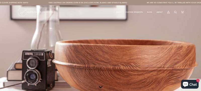
Alexander Designs
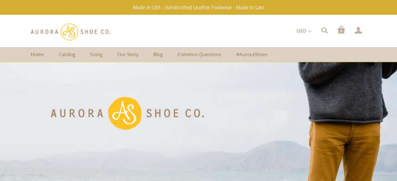
Aurora Shoe Co.
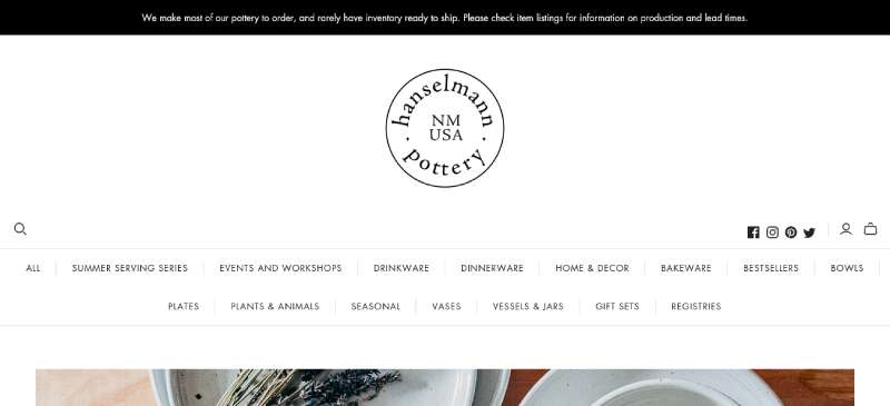
Hanselmann Pottery
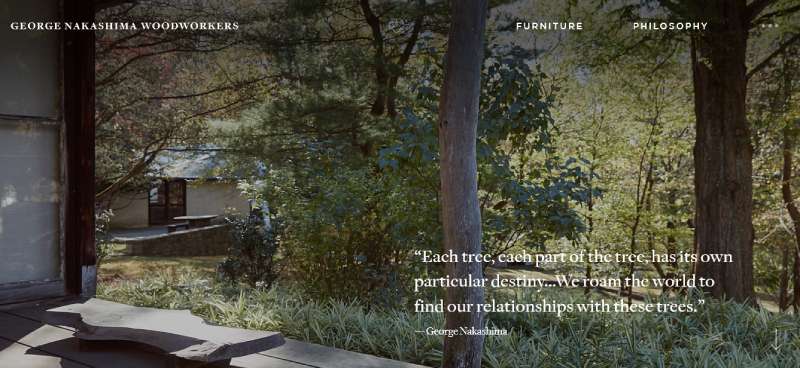
George Nakashima Woodworkers
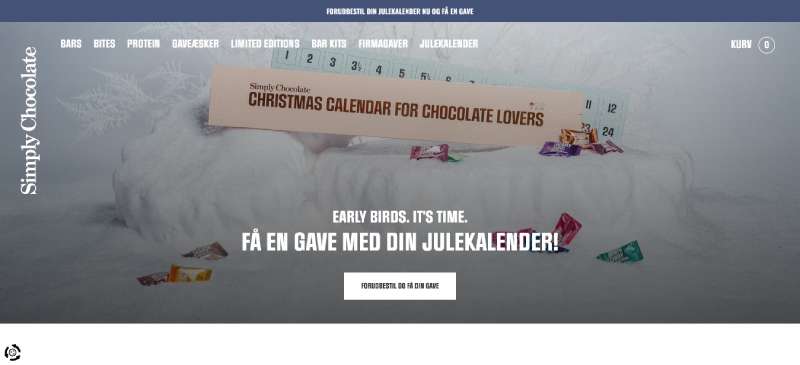
Simply Chocolate
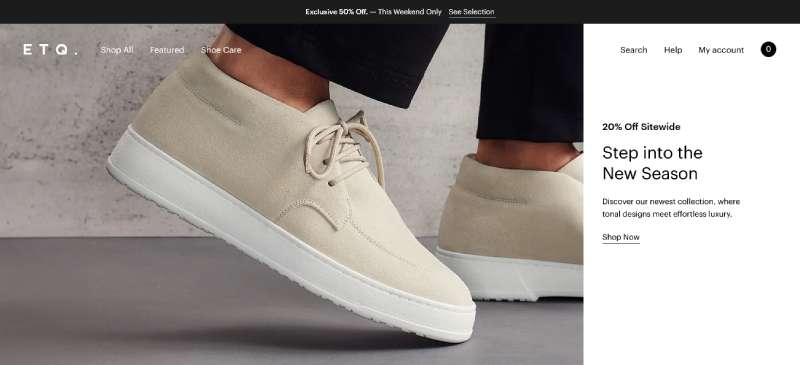
ETQ
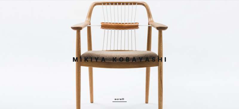
Mikiya Kobayashi
World of SWISS

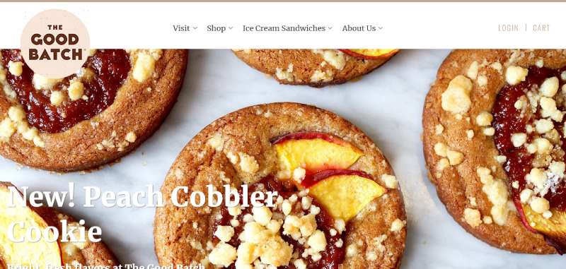
The Good Batch
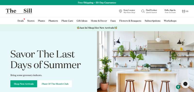
The Sill
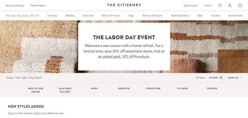
The Citizenry
Which platform to use for an artisan-style website
Platform choice comes down to how much of the business is selling products versus telling a story.
Many makers start on Etsy and move to their own platform once they want full control over branding and customer data.
| Platform | Best for | Learning curve | Ecommerce depth |
|---|---|---|---|
| Shopify | Product-heavy shops | Low | Deep, built-in |
| Squarespace | Story-first single makers | Low | Moderate |
| Webflow | Fully custom layouts | High | Basic, needs add-ons |
| WordPress and WooCommerce | Content-heavy artisan blogs | Moderate to high | Deep, via plugin |
Shopify
Shopify handles checkout, inventory, and shipping well once a catalog passes a few dozen items.
Themes built specifically for handmade brands are common in its template store, so a craft-appropriate starting point rarely needs custom code.
Variants, meaning sizes, colors, whatever combination a product needs, are handled cleanly. Shipping and tax edge cases mostly get covered by the app ecosystem. Storytelling pages are the weak spot though, noticeably thinner than what Squarespace or Webflow can do for long-form content.
Squarespace
Squarespace holds 3.3% of the content management market, and skews toward creative and small business use (sqmagazine, 2026).
It fits single makers and small studios best, the kind who want a polished, story-first site without touching a line of code.
The templates are strong and setup is fast, and blogging comes built in. The checkout is less flexible than Shopify’s, and the app library is thinner too.
Webflow
Webflow trades ease of use for design control.
Every layout style covered earlier, single-page, gallery-first, or asymmetrical, is easiest to build precisely in Webflow, since nothing is locked to a fixed template structure.
The trade-off is ecommerce depth. Features are thinner than Shopify’s, and high-volume sellers tend to outgrow it eventually.
WordPress and WooCommerce
WordPress still runs the largest share of the content management market, holding 61% as of 2026 according to sqmagazine’s CMS data.
It fits makers who publish long-form content regularly and want the blog and the shop living on one codebase.
Paired with the WooCommerce plugin, it adds full ecommerce functionality, though plugin conflicts remain the most common technical headache.
- Requires more ongoing maintenance than a hosted platform
- Full control over hosting, backups, and custom code
How product photography shapes the artisan look
Photography carries more weight in artisan design than in almost any other ecommerce category, since texture and craft quality have to come through a screen.
Professional photography converts 33% higher than low-quality images, according to Shopify’s own merchant research.
Macro shots do most of the persuading. Close crops on grain, glaze, stitching, whatever the material happens to be, show the hand-work that a wide shot just hides.
- Behind-the-scenes process shots build trust before the product shot does
- Natural or warm lighting keeps materials looking authentic rather than clinical
- Consistent framing across a product line makes a small catalog look intentional
File handling matters as much as the shoot itself.
Large, uncompressed images slow page load, so most artisan sites export a compressed JPEG for the web while keeping the original file for print or wholesale use.
There’s a real argument for editing restraint here. Heavy retouching that scrubs out texture or imperfection defeats the whole purpose of the photo.
Contrast and shadow are usually what make a handmade surface read as handmade in a photo.
How to build an artisan-style website step by step
Most successful builds follow the same order, regardless of platform.
Skipping ahead to layout before the brand direction is set is the most common reason a build stalls halfway through.
- Write the founder story and pick three to five words that describe the brand’s visual tone
- Build a mood board pulling color, texture, and photography references before opening any design tool
- Choose a platform based on catalog size and how much custom layout control the brand needs
- Shoot or source product photography before building any page templates
- Assemble the homepage and product pages, then test navigation on mobile first
- Run a speed and Core Web Vitals check before launch
The mood board step gets skipped more than any other, usually because it feels slower than just opening the site builder.
Skipping it tends to cost more time later. Without a locked color and type direction, most builders end up redoing the homepage two or three times anyway.
A short brand style guide, even a one-page version, keeps color and font choices consistent once the site grows past a handful of pages.
Common mistakes that break the artisan aesthetic
Most mistakes come from treating decoration and function as the same thing.
- Layering texture on every section until the page feels cramped
- Mixing three or four handwritten fonts instead of picking one and repeating it
- Using stock photography that contradicts a handmade positioning
- Building a checkout flow that suddenly switches to a generic, corporate tone
The first mistake is the easiest to spot and the hardest to fix once a site is live.
Cutting back to more white space between sections almost always reads as more expensive, not less designed.
The checkout mistake is the costliest one on the list.
Baymard Institute’s ongoing checkout research puts the average cart abandonment rate at roughly 70% across ecommerce sites, and a jarring shift in tone at checkout is one of the trust breaks behind that number.
Consistency beats variety here. Repeating the same one or two fonts across every page reads as deliberate, not lazy.
A different font on every section reads as unfinished, since repetition is what signals a considered design rather than a rushed one.
When artisan website design does not work
The style has real limits, and pretending otherwise wastes a founder’s budget.
| Business type | Why the style struggles |
|---|---|
| High-SKU retailers (200+ products) | Story-first layouts slow browsing at scale |
| Wholesale and B2B sellers | Buyers expect spec sheets, not narrative |
| Comparison-shopping categories | Texture and imagery add friction to price checks |
| Fast-turnaround budget builds | Custom photography and copy take longer to produce |
Retailers with large catalogs run into this first.
A gallery-first layout can absorb a few hundred items, but a story-first, single-page structure cannot, so most sellers past a few dozen SKUs move toward a standard ecommerce layout regardless of how handmade the product is.
Take the B2B case. A wholesale buyer comparing five suppliers wants dimensions, minimum order quantities, and lead times right there on the page, not a story.
Handmade positioning still matters to that buyer, but it belongs on a separate about page, not inside the primary buying flow.
Does artisan website design affect page speed and search visibility
Texture-heavy, image-dense pages carry real technical weight, and Google measures that weight directly.
Google’s Core Web Vitals set the bar every site gets measured against, artisan or not, and the thresholds are specific.
- Largest Contentful Paint (LCP) should load under 2.5 seconds
- Interaction to Next Paint (INP) should respond in under 200 milliseconds
- Cumulative Layout Shift (CLS) should stay under 0.1
Platform choice affects these numbers more than design style does.
Colorlib’s 2026 platform performance data found Squarespace sites pass the INP threshold on 96% of pages, ahead of Shopify, Wix, and WordPress in the same comparison.
Image weight is the part artisan sites get wrong most often.
A hero photo sized for print resolution instead of screen use can add several megabytes to a single page, since every extra pixel beyond what the layout displays is wasted load time.
The fix is straightforward enough: export logos, icons, and hand-drawn dividers as vector graphics instead of large PNG files. They stay sharp at any size without the extra weight.
Rakuten 24 offers the clearest proof that this work pays off outside the artisan niche too.
After focusing engineering effort on Core Web Vitals, the retailer saw revenue per visitor increase by 53.37% and conversion rate rise by 33.13%, according to Google’s web.dev case study.
FAQ on Artisan Website Design
How much does an artisan-style website cost to build
A basic Squarespace or Shopify build with a template theme runs a few hundred dollars.
Custom Webflow work with commissioned photography can reach several thousand. Photography and copywriting usually end up costing more than the platform license itself.
How is founder storytelling built into the site
Founder storytelling usually sits in a dedicated about section or gets woven into a single-page layout near the top.
Workshop photos, a short process video, and a first-person bio build the personal connection that separates artisan design from generic ecommerce.
Can a template be used or does it require custom design
Most small makers start with a template on Shopify or Squarespace and customize colors, fonts, and photography.
Custom design, usually built in Webflow, suits brands with a distinct visual identity and the budget for a dedicated designer.
How do these sites handle checkout without breaking the aesthetic
Shopify and Squarespace let merchants restyle checkout fonts, colors, and buttons without touching code.
Webflow sites often embed a hosted checkout from Shopify or Snipcart, matching typography and color rather than rebuilding the flow.
What accessibility issues come up with artisan designs
Low color contrast between muted palettes and body text is the most common accessibility problem on these sites.
Script fonts used for body copy hurt readability, and skipped alt text on product photos weakens both accessibility and image search visibility.
Is artisan website design worth it for a service-based craftsperson versus a product seller
Product sellers benefit most, since photography and layout directly shape the purchase decision.
A service-based craftsperson taking commissions gets less lift from decorative texture and more from a clear process page and project gallery.
What Should You Fix First in Artisan Websites?
Get photography right first. Then typography. Then checkout tone. Skip that order and you’ll spend budget on visual polish that a weak checkout page undoes anyway.
- Photography quality
- Typographic consistency
- Checkout tone and flow
Photography comes first, mostly because every other fix depends on having real product images to design around instead of placeholders.
Fixing it before layout adds one to two weeks to launch, a trade-off most makers accept once they see how much a proper shoot changes the homepage.
Typography and checkout consistency come after, since both are faster to adjust once the visual direction is locked.
Once the site itself is settled, the next gap most makers hit is the brand behind it, which is where building a full brand identity becomes the more pressing project than another round of homepage tweaks.

Renowned for his expertise in logo design and visual branding, Bogdan has developed a multitude of logos for various clients.
His skills extend to creating posters, vector illustrations, business cards, and brochures. Additionally, Bogdan's UI kits were featured on marketplaces like Visual Hierarchy and UI8.
He also wrote in the past years on sites like Design Your Way, WebDesignerDepot, WPDean, Designmodo, Speckyboy, Slider Revolution, and more.
- The Windsurf Logo History, Colors, Font, And Meaning - 10 October 2026
- How to Remove Background From Product Photos (No Photoshop) - 10 October 2026
- How Designers can Build a Stronger Online Creative Identity - 9 October 2026

Bogdan Sandu is a seasoned designer who has been designing websites since 2008. Renowned for his expertise in logo design and visual branding, Bogdan has developed a multitude of logos for various clients. His skills extend to creating posters, vector illustrations, business cards, and brochures. Additionally, Bogdan's UI kits were featured on marketplaces like Visual Hierarchy and UI8. He also wrote in the past years on sites like Design Your Way, WebDesignerDepot, WPDean, Designmodo, Speckyboy, Slider Revolution, and more.
You Might Also Like