The Teenage Mutant Ninja Turtles logo does not use a single, commercially available font. The iconic “TURTLES” wordmark was drawn as a custom piece of lettering for the 1987 animated series, and has never been released as a standard typeface.
The closest fan-made match to that classic arched green lettering is Turtles, a display font created by Neale Davidson under his foundry Pixel Sagas. The “TEENAGE MUTANT NINJA” banner portion of the original logo most closely resembles a bold condensed geometric sans-serif, with researchers pointing to typefaces like ITC Stone Sans Bold Condensed or Corinthian Bold Condensed as the likely references.
What Type of Font Is the TMNT Lettering?
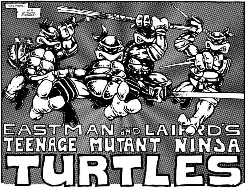
The “TURTLES” portion of the logo is an organic, custom display typeface. Specifically, it reads as a distressed hand-lettered display font with cartoonish, irregular characteristics.
Key visual traits include:
- Heavy weight with exaggerated thick strokes
- Lumps and ridges on letterforms that mimic a turtle shell’s texture
- An upward arc across the full word, peaking at the center
- Thick black outline surrounding all letterforms, typical of comic book lettering
- No consistent baseline, giving letters a hand-drawn energy
The “TEENAGE MUTANT NINJA” banner text is a different story entirely. That section uses a bold condensed geometric sans-serif style, set in white uppercase letters on a red trapezoid shape. The letterforms are rigid, tightly spaced, and read as far more structured than the “TURTLES” text below.
These 2 halves deliberately contrast each other. The banner section communicates authority. The “TURTLES” lettering communicates personality. That tension is a big part of why the logo has stayed recognizable across 40 years of franchise iterations.
Who Created the TMNT Font?
The original TMNT logo lettering was created for Mirage Studios in 1987, when the animated series launched on CBS. It was produced as a custom piece of typography, not a licensed commercial typeface, and was never made publicly available.
The fan-made version most designers use: Neale Davidson of Pixel Sagas released a digital recreation called “Turtles” between 2011 and 2014. It was designed specifically to replicate the original “TURTLES” wordmark and includes a full alphabet, numbers, most punctuation marks, and diacritical characters. Davidson even replaced the “@” symbol with the Foot Clan emblem.
Each major TMNT era introduced its own graphic treatment:
- 1987 original: Custom hand-lettered organic green “TURTLES” with red banner
- 2003 series (4Kids): Darker, sharper redrawn version with gradient style
- 2008 “Back to the Sewer”: Stylized geometric sans-serif “TMNT” abbreviation
- 2012 Nickelodeon series: Smooth, three-dimensional square sans-serif treatment
- 2023 Mutant Mayhem: Freshly drawn scratched lettering with a dripping slime effect
Each of these versions was handled as a custom design project, not a font license purchase. No single typeface spans the full franchise history.
Is the TMNT Font Free to Use?
The original TMNT logo lettering is proprietary. It belongs to the franchise and is not available for download anywhere, legally or otherwise.
The fan-made recreation “Turtles” by Pixel Sagas is free for personal, non-commercial use only. Commercial use requires a paid license directly from Pixel Sagas via their website (pixelsagas.com). The font has been downloaded over 74,000 times from 1001 Free Fonts alone.
Halfshell Hero by Iconian Fonts is another widely used alternative. It is also free for personal use. Commercial use is handled as donationware, with a suggested $20 USD per seat, payable through the Iconian Fonts website.
Bottom line: for fan projects, school work, or personal designs, both fonts are freely available. For anything commercial, a license is needed from the respective foundry.
What Font Did TMNT Use Before the 1987 Logo?
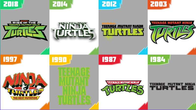
Before the 1987 animated series logo, the franchise used simple black-and-white lettering in the original Mirage Comics run, which launched in 1984. Those early issues from Kevin Eastman and Peter Laird had no polished logo system. The text was basic, functional comic lettering, not a designed brand identity.
The 1987 logo was the first true branded treatment, and it became what most people think of as “the TMNT font.”
After that, the logo changed significantly with almost every reboot. The 2008 “Back to the Sewer” era was arguably the biggest visual departure, dropping the red banner and organic lettering entirely in favor of a blocky “TMNT” abbreviation in a geometric sans-serif. Fans were not exactly thrilled. The 2012 Nickelodeon revival brought back the two-part banner-plus-turtles structure, which was probably a smart move.
What Are the Best Free Alternatives to the TMNT Font?
Since no official TMNT font exists for public use, here are 5 alternatives that each match a different era or visual need.
| Font | Matches | License | Source |
| Turtles (Pixel Sagas) | 1987 “TURTLES” wordmark | Free (personal) | DaFont, FontSpace |
| Halfshell Hero (Iconian Fonts) | 2012 Nickelodeon / 2014 film banner | Free (personal) | FontSpace, 1001 Free Fonts |
| Chlorinar (Caffeen Fonts) | 1987 “TURTLES” organic style | Free (personal) | DaFont |
| Booyakasha (JMK-948) | 2012 series “TURTLES” wordmark | Free | DaFont |
| Teenage Mutant Ninja Font (Alex Fulton) | 2008 “Back to the Sewer” TMNT mark | Free (personal) | FontSpace, FontBolt |
Worth noting: none of these are display fonts you would find on Google Fonts. They live in fan-font territory, which means quality can vary. The Pixel Sagas Turtles font is the most polished of the group, with full diacritical support and a consistent glyph set.
How to Use the TMNT Font in Design Projects
Once you download the Turtles font or Halfshell Hero from DaFont or FontSpace, the installation process is the same as any other font on your system.
On Windows: Right-click the .ttf file and select “Install.”
On Mac: Double-click the .ttf file, then click “Install Font” in Font Book.
After installation, the font shows up in any design application. You can add fonts to Adobe Illustrator, use them in Photoshop (here is how to add fonts to Photoshop), or add them to Figma for web and UI work.
For browser-based tools, uploading fonts to Canva is also straightforward if you are on a Pro plan. Keep in mind that fan-made TMNT fonts are not available on Google Fonts or Adobe Fonts, so you will always need to install them manually.
One practical tip: the Turtles font reads best at large sizes, 48pt and above. At smaller sizes, the organic letterforms lose their character and can become harder to read. It is a display font built for titles, posters, and large-format work, not body copy.
Why Did TMNT Use This Style of Lettering?

The original 1987 logo was designed to sell a cartoon to kids. Full stop. The chunky, textured “TURTLES” lettering reads as fun, approachable, and slightly chaotic, which is exactly what the property is about.
The red trapezoid banner leans forward toward the viewer, creating a sense of motion. Combined with the arching green letters below, the whole logo has a sense of energy and forward momentum that sits flat on nothing. It was built for visibility across a toy store aisle, on lunchboxes, and on cereal boxes, all at once.
From a color theory standpoint, the red, white, and green combination is high-contrast and readable at almost any scale. Red signals energy and urgency. Green ties directly to the characters. The thick black outline borrows from the comic book visual language that the franchise originated from.
The letterforms themselves reference turtle shell geometry. The ridges and lumps in each character are not accidental. That storytelling through design is part of what makes the logo more than just a title card. It communicates the characters without showing them. That is genuinely good logo design, even if it was made for a Saturday morning cartoon in 1987.
Each subsequent redesign tried to hold onto that two-part structure because it works. The 2023 Mutant Mayhem version pushed the organic quality even further, with letters that look almost carved or scratched, which fits the grittier, more hand-drawn aesthetic of that film.
FAQ on What Font Does Teenage Mutant Ninja Turtles Use
Is there an official TMNT font?
No official font exists. The “TURTLES” lettering was custom-drawn for the 1987 animated series and never released commercially. Fan-made recreations like Turtles by Pixel Sagas are the closest publicly available options.
What font is the “TURTLES” wordmark based on?
It is original hand lettering, not based on any existing typeface. The Turtles font by Neale Davidson (Pixel Sagas), released in 2014, is the most accurate fan recreation of that arched green wordmark.
What font is used for “TEENAGE MUTANT NINJA” on the banner?
That portion uses a bold condensed geometric sans-serif style. Typography researchers have pointed to ITC Stone Sans Bold Condensed and Corinthian Bold Condensed as the closest commercial matches to the original banner lettering.
Can I download the TMNT font for free?
Yes, for personal use. The Turtles font by Pixel Sagas and Halfshell Hero by Iconian Fonts are both free for non-commercial projects. Both are available on DaFont and FontSpace. Commercial use requires a paid license from each foundry.
What font does the 2012 Nickelodeon TMNT series use?
The 2012 logo uses a stylized square sans-serif treatment. Fan-made fonts Halfshell Hero by Iconian Fonts and Booyakasha by JMK-948 are the closest available matches to that version’s blocky geometric lettering style.
What font does the 2023 Mutant Mayhem film use?
The Mutant Mayhem title uses custom hand-drawn lettering with a scratched, almost carved appearance. No commercial or fan-made font replicates it exactly. It was created specifically for the film and is not publicly available.
What type of font is the TMNT logo?
It is a distressed display typeface with organic, hand-lettered characteristics. Heavy strokes, irregular letterforms, and a pronounced upward arc classify it clearly as a custom comic book display font, not a standard text or body typeface.
Are there fonts similar to the TMNT logo on Google Fonts?
No direct matches exist on Google Fonts. The TMNT style is too specific and niche for that library. Your best options are fan-made fonts from DaFont and FontSpace, which are purpose-built to replicate the franchise’s various logo treatments.
Who designed the original TMNT logo lettering?
The original lettering was created for Mirage Studios in 1987 when the animated series launched. Kevin Eastman and Peter Laird founded the studio, though the logo itself was a production design piece, not attributed to a single named type designer.
What fonts are used across different TMNT series and films?
Each era used custom lettering. The 1987 original has organic green arched text. The 2003 series used a sharper gradient version. The 2008 era switched to a geometric “TMNT” mark. Each redesign was a standalone custom job, not a font license.
Conclusion
So, what font does Teenage Mutant Ninja Turtles use? No single commercial typeface. The logo lettering across every series and film was custom work, built for each era from scratch.
For practical use, Turtles by Pixel Sagas covers the classic 1987 wordmark, while Halfshell Hero handles the later geometric treatments. Both are free for personal projects.
The TMNT logo typography has always matched the franchise’s attitude: bold, irregular, and impossible to ignore. That is exactly why it still works on a poster, a lunchbox, or a thumbnail decades later.

Renowned for his expertise in logo design and visual branding, Bogdan has developed a multitude of logos for various clients.
His skills extend to creating posters, vector illustrations, business cards, and brochures. Additionally, Bogdan's UI kits were featured on marketplaces like Visual Hierarchy and UI8.
He also wrote in the past years on sites like Design Your Way, WebDesignerDepot, WPDean, Designmodo, Speckyboy, Slider Revolution, and more.
- The Beehiiv Logo History, Colors, Font, And Meaning - 18 September 2026
- Versatile Work Sans Font Pairing for Every Project - 16 September 2026
- Organize Digital Files Like a Pro Before Your Next Client Handoff - 16 September 2026

Bogdan Sandu is a seasoned designer who has been designing websites since 2008. Renowned for his expertise in logo design and visual branding, Bogdan has developed a multitude of logos for various clients. His skills extend to creating posters, vector illustrations, business cards, and brochures. Additionally, Bogdan's UI kits were featured on marketplaces like Visual Hierarchy and UI8. He also wrote in the past years on sites like Design Your Way, WebDesignerDepot, WPDean, Designmodo, Speckyboy, Slider Revolution, and more.
You Might Also Like