Candy Crush Saga uses Gainsborough (a display script typeface) and Brandon Text Bold (a geometric sans-serif) in its poster and promotional materials. Gainsborough was designed by Emil Karl Bertell and published by Fenotype. Brandon Text Bold was designed by Hannes von Döhren and published by HVD Fonts. The in-game logo lettering itself is custom, proprietary lettering created specifically for King and is not publicly available as a downloadable typeface.
King launched Candy Crush Saga in 2012, originally as a Facebook browser game before it expanded to iOS and Android. The visual identity, including its bold candy-colored lettering, has been part of the game’s branding since launch.
What Type of Font Is Gainsborough?
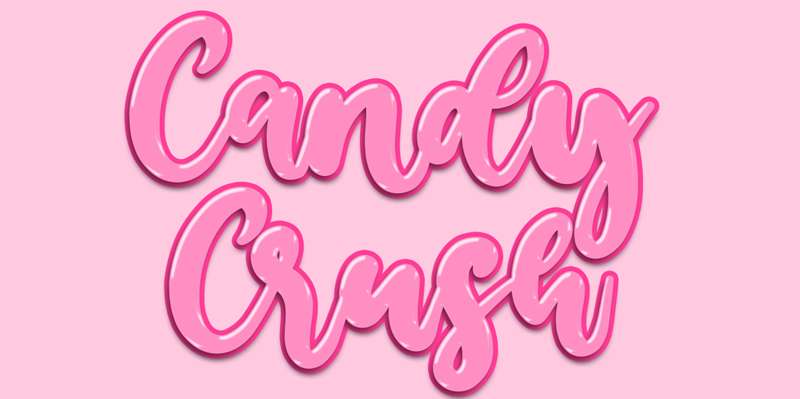
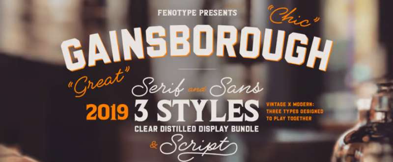
Gainsborough is a display typeface with multiple sub-styles: Gainsborough Pen (a polished script inspired by pigment-pen handwriting), Gainsborough Sans (a geometric, zero-contrast street-style sans), and Gainsborough Serif (which shares the same proportions but adds subtle contrast and round shapes).
The family is built for pairing. Each style is designed to work alongside the others, so you can mix the script with the sans for layered, visually rich compositions. That combination of styles is exactly why it works in a game logo context, where you need something readable at small sizes but still theatrical at large ones.
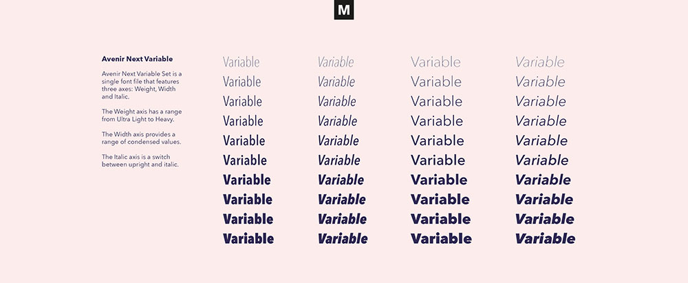
Brandon Text Bold sits in a different category. It’s a geometric sans-serif, part of the broader Brandon family by HVD Fonts. It carries optically corrected letterforms based on 1920s and 1930s geometric sans influences, with a higher x-height than its sibling Brandon Grotesque, making it more suitable for display use at a range of sizes.
Who Designed the Fonts Used by Candy Crush?
Gainsborough: designed by Emil Karl Bertell, a Finnish type designer and the founder of Fenotype. Bertell released his first typefaces while still in high school and has since become one of the most recognized type designers from Nordic countries. Fenotype published Gainsborough as a commercial display family.
Brandon Text Bold: designed by Hannes von Döhren of HVD Fonts in 2012 (with Brandon Text officially released in 2013). HVD Fonts is a German type foundry known for FF Mark, Pluto, and Reklame Script. Brandon Grotesque, the sibling typeface, won the TDC2 Award in 2011.
The actual in-game Candy Crush logo lettering is custom and proprietary. It belongs to King (now owned by Activision Blizzard) and was created specifically for the game’s visual identity. No foundry produced it as a public release.
Are the Candy Crush Fonts Free to Use?
Short answer: no, not for commercial use.
Gainsborough is a paid commercial font available through Fenotype and MyFonts. Licenses cover desktop, web, app, and digital ad usage. There is no free version.
Brandon Text Bold is also a paid commercial font distributed by HVD Fonts and available on Adobe Fonts and MyFonts. It comes in 12 styles across the full family. Like Gainsborough, it offers no free tier.
The actual Candy Crush logo lettering is a proprietary asset of King. It cannot be downloaded, licensed, or used outside of official King materials. Some fan-made fonts named “Candy Crush” exist on sites like DaFont (created by Fikryal Studio), but these are not the actual game font. They are independent creations inspired by the visual style and are available for personal use only unless a commercial license is purchased separately from the designer.
What Font Did Candy Crush Use Before?
The core Candy Crush Saga logo lettering has remained visually consistent since the game launched in 2012. There hasn’t been a documented full rebrand of the logo typeface.
Inside the game UI, however, King did push a notable font update in late 2024. Players on the King Community forum flagged that score numbers and in-game text switched to a noticeably different style, described as larger and less bold compared to the previous “American Type bold” style. Community reactions were mixed: some players found the new version easier to read, while others disliked the change in size and spacing.
King acknowledged the feedback and confirmed it was passed along to the development studio. The update applied across Candy Crush Saga and was not officially named or documented as a font identity change by King.
Best Free Alternatives to the Candy Crush Font Style
If you need a rounded, playful display font that captures the same energy as the Candy Crush visual style, here are 5 solid options.
| Font | Similarity | License | Source |
| Fredoka One | Rounded, bold, friendly letterforms | Free (OFL) | Google Fonts |
| Lilita One | Heavy weight, rounded display style | Free (OFL) | Google Fonts |
| Nunito (ExtraBold) | Rounded terminals, clean geometry | Free (OFL) | Google Fonts |
| Bubblegum Sans | Casual, playful, candy-like texture | Free (OFL) | Google Fonts |
| Cera Round Pro | Geometric rounded sans, close to Brandon | Paid | MyFonts |
Fredoka One and Lilita One are the most practical starting points. Both are free, widely available, and pair well with other free Google Fonts for game UI projects or app design work.
For those who need something closer to the Brandon Text Bold geometry, FF Cocon (available through Adobe Fonts) is worth checking. It has that same warm geometric quality with a rounder touch that suits casual game branding well.
How to Use These Fonts in Your Design Tools
In Canva
Fredoka One and Nunito are available directly inside Canva’s font library without uploading anything. Just search by name in the font selector.
If you purchase Gainsborough or Brandon Text Bold and want to use them in Canva Pro, you can upload fonts to Canva via the Brand Kit section. Free plan users cannot upload custom fonts.
In Figma
Figma pulls directly from Google Fonts, so Fredoka One, Lilita One, Nunito, and Bubblegum Sans are all available by default. For paid fonts, install them on your operating system first and Figma will detect them automatically. The process for this is covered in detail if you need help with how to add fonts to Figma.
In Photoshop and Illustrator
Install the font file (.otf or .ttf) at the OS level and restart the application. Photoshop and Illustrator don’t have their own font managers; they read from your system. Step-by-step instructions for how to add fonts to Photoshop and Adobe Illustrator cover the full process if you run into issues.
Why Did Candy Crush Choose This Typography Style?
The logic is pretty clear when you look at it from a brand positioning angle. Candy Crush targets a broad audience: casual players across all age groups, mostly mobile-first. The typography had to communicate approachability and fun instantly, without any text being required. Rounded, bold lettering does that more efficiently than any other type style.
The use of Gainsborough’s script style for the “Candy Crush” wordmark specifically plays into font psychology. Script and display fonts with flowing, rounded strokes read as warm, playful, and non-threatening. That’s the opposite of a sharp geometric or high-contrast serif, which reads as corporate or serious. For a game about matching colorful candy, that distinction matters a lot.
Brandon Text Bold shows up in promotional contexts because it handles legibility at small print sizes better than Gainsborough. It’s screen-optimized, manually hinted, and built to hold up in app store graphics, banner ads, and marketing posters where the copy needs to be readable fast.
Combined, the two typefaces create a system: the expressive display style for branding, the clean geometric sans for supporting copy. That’s standard practice in game logo and UI design, but Candy Crush executes it with a consistency that’s held up for over a decade. The core visual identity hasn’t needed a significant overhaul, which is actually pretty rare for a mobile game.
If you’re curious how similar design decisions play out in other games, the The Sims font, League of Legends font, and Warcraft font each take very different approaches to game logo typography, and it’s worth comparing them side by side. Also, if you’re choosing fonts for a mobile app, the guide on best fonts for mobile apps is a good next step.
FAQ on What Font Does Candy Crush Use
What font does Candy Crush Saga use in its logo?
The Candy Crush Saga promotional materials use Gainsborough and Brandon Text Bold. The actual in-game logo lettering is custom, proprietary lettering owned by King. It was created specifically for the game and is not available as a public typeface.
Is the Candy Crush font available to download?
No. The official Candy Crush logo font is proprietary and belongs to King. Fan-made fonts inspired by its style exist on sites like DaFont, but those are independent creations. They are not the actual game font and carry their own separate licensing terms.
What type of font style is used in Candy Crush branding?
The branding relies on bold, rounded display typography. This style communicates friendliness and casual fun, which fits the game’s target audience. Rounded letterforms with high visual weight are common across mobile game UI design and casual game logo typography.
Who made the Gainsborough font used in Candy Crush materials?
Emil Karl Bertell designed Gainsborough, and it was published by the Finnish type foundry Fenotype. It comes in 4 styles, including a polished pen script and a geometric sans. It is a paid commercial font available through MyFonts and Fontspring.
What is Brandon Text Bold and who created it?
Brandon Text Bold is a geometric sans-serif designed by Hannes von Döhren and published by HVD Fonts in 2013. It is screen-optimized with a high x-height, making it practical for app store graphics, posters, and promotional materials at small sizes.
Can I use a font similar to Candy Crush for my own project?
Yes. Free alternatives like Fredoka One, Lilita One, and Bubblegum Sans from Google Fonts capture a similar rounded, bold display feel. For commercial projects, always check font licensing terms before using any typeface in client work or published products.
Has Candy Crush ever changed its font?
The core logo lettering has stayed visually consistent since the 2012 launch. Inside the game UI, King pushed a notable font update in late 2024. Players on the King Community forum reported changes to score number style and overall text size, with mixed reactions from the community.
Why did Candy Crush choose a rounded, bold font style?
Rounded bold typography reads as warm and approachable, which directly supports Candy Crush’s casual mobile game identity. Sharp or high-contrast typefaces signal seriousness. For a game targeting broad age groups on mobile, playful lettering is a deliberate brand decision, not just a stylistic preference.
What fonts are used inside the Candy Crush game UI?
King has not publicly documented the exact in-game UI fonts. Community members on the King forum noted a shift in 2024 toward a less bold, larger style for score numbers. The previous style was described as resembling American Type bold, though this was never officially confirmed by King.
Where can I find fonts similar to Candy Crush for free?
Google Fonts is the easiest starting point. Fredoka One, Lilita One, and Bubblegum Sans are all free under the Open Font License. If you want something closer to the geometric sans used in Candy Crush materials, check the best Google Fonts for websites list for rounded sans-serif options.
Conclusion
If you’ve been asking what font does Candy Crush use, the answer comes in layers: Gainsborough for the display script, Brandon Text Bold for supporting promotional copy, and proprietary custom lettering for the core logo identity.
None of it is freely available. But the rounded, bold display style it represents is easy to replicate using open-source alternatives like Fredoka One or Bubblegum Sans.
King’s mobile game branding has held up for over a decade, which says a lot about how well the Candy Crush typography was chosen from the start. Good casual game font design doesn’t need reinventing every few years. It just needs to be right the first time.

Renowned for his expertise in logo design and visual branding, Bogdan has developed a multitude of logos for various clients.
His skills extend to creating posters, vector illustrations, business cards, and brochures. Additionally, Bogdan's UI kits were featured on marketplaces like Visual Hierarchy and UI8.
He also wrote in the past years on sites like Design Your Way, WebDesignerDepot, WPDean, Designmodo, Speckyboy, Slider Revolution, and more.
- How to Build an Online Store That Sells in Every Country and Currency - 3 September 2026
- Serif Italic Font Generator - 2 September 2026
- How To Use AI In Graphic Design Without Losing Creativity - 31 August 2026

Bogdan Sandu is a seasoned designer who has been designing websites since 2008. Renowned for his expertise in logo design and visual branding, Bogdan has developed a multitude of logos for various clients. His skills extend to creating posters, vector illustrations, business cards, and brochures. Additionally, Bogdan's UI kits were featured on marketplaces like Visual Hierarchy and UI8. He also wrote in the past years on sites like Design Your Way, WebDesignerDepot, WPDean, Designmodo, Speckyboy, Slider Revolution, and more.
You Might Also Like