League of Legends uses Beaufort for LoL as its primary display typeface and Spiegel as its body text font, both licensed by Riot Games for use across the game’s interface and websites.
Beaufort for LoL is a modified version of Nick Shinn’s Beaufort, customized and extended by Monotype Imaging, Inc. specifically for Riot Games. Spiegel was designed by Lucas de Groot and originally created for the German magazine Der Spiegel.
What Type of Font Is Beaufort for LoL?

Beaufort for LoL is a glyphic serif typeface, meaning its letterforms draw from classical Roman inscription lettering rather than calligraphic or pen-drawn traditions.
It carries strong vertical strokes, moderate stroke contrast, and sharp serif terminals that read well at large display sizes. This is important in a game context where headlines, champion names, and menu titles all need to feel weighty and authoritative without becoming illegible.
The typeface comes in 5 weights (Light, Regular, Medium, Bold, Heavy), each with a corresponding italic. According to Riot’s brand guidelines, headings always use Beaufort in bold capital letters. It is never used for body copy or small-print contexts.
Spiegel, by contrast, is a humanist sans-serif. Lucas de Groot based it on American industrial gothic proportions, similar to News Gothic, but softened with humanist details. It handles body text, labels, and supporting content across the LoL UI.
Who Designed the Beaufort for LoL Font?
Nick Shinn designed the original Beaufort typeface and published it through his Shinn Type Foundry.
Monotype Imaging, Inc. then customized and extended it specifically for Riot Games, expanding the character set and making stylistic adjustments, including a flat-topped “3” that distinguishes it from the base Beaufort Pro.
Beaufort for LoL is therefore a proprietary, custom-commissioned typeface. It is not the same as Beaufort Pro, which remains available commercially through Shinn Type Foundry.
Spiegel was designed by Dutch type designer Luc(as) de Groot, operating through his foundry LucasFonts (also known as FontFabrik). De Groot originally created it as a custom typeface for the German weekly magazine Der Spiegel. He is also known for designing Calibri and Consolas for Microsoft.
Is Beaufort for LoL Free to Use?
No. Beaufort for LoL is a proprietary typeface licensed exclusively to Riot Games. It is not available for public commercial use.
Some sites offer file downloads of it, but these are distributed without authorization. Using those files in commercial work creates real font licensing risk, especially for anything that generates income.
Beaufort Pro (the base version by Nick Shinn) is available for purchase through Shinn Type Foundry and Monotype. Spiegel is also a commercial typeface, not available on free platforms like Google Fonts.
The closest thing to a “free” official option is the fan-made League font, available on FontGet for personal use only. It approximates the LoL logo lettering but is not an official Riot Games product.
What Font Did League of Legends Use Before?
Before Beaufort, League of Legends used Friz Quadrata for headlines and display text, alongside Gill Sans for supporting UI copy.
Friz Quadrata is a glyphic serif designed by Ernst Friz and Victor Caruso, first released in 1965 through Visual Graphics Corporation and later revised in 1973. It remains the basis for the LoL logo even now, though the in-game and web typography moved away from it around 2015.
Why did it change? Beaufort was chosen as a replacement largely because it offered a wider range of weights and fewer idiosyncratic features that could distract at smaller sizes. Friz Quadrata works at logo scale. It gets tricky in menus and UI panels.
Gill Sans was phased out at the same time, though traces of it reportedly lingered in some older info panels within the game. Colfax, a geometric sans-serif designed by Erik Olson and released by Process Type Foundry in 2012, was later added to the mix specifically for the LoL Championship Series esports branding.
What Are the Best Free Alternatives to Beaufort for LoL?
You can’t get Beaufort for LoL legally for free. But there are solid alternatives that capture a similar glyphic serif feel, which is useful for anyone building fan art, esports graphics, or fantasy-themed game UI work.
| Font | Similarity | License | Source |
| Cinzel | Roman inscription serif, strong capitals | Free (OFL) | Google Fonts |
| Trajan Pro | Classical all-caps serif, similar weight contrast | Free (Adobe Fonts) | Adobe Fonts |
| EB Garamond | Old-style serif, fantasy-adjacent feel | Free (OFL) | Google Fonts |
| MedievalSharp | Fantasy display lettering, strong fantasy game aesthetics | Free (personal use) | DaFont |
Cinzel is probably the most practical pick. It’s available directly from Google Fonts, works at large and small sizes, and shares Beaufort’s inscriptional quality without feeling like a knockoff.
For body text alternatives to Spiegel, News Gothic (the typeface that inspired Spiegel) is the closest match. Source Sans Pro on Google Fonts is another reasonable option. If you want something with a similar humanist sans feel, check out the humanist font category as a starting point.
How to Use These Fonts in Design Tools
Cinzel and EB Garamond are both on Google Fonts, so getting them into most tools is straightforward.
Figma: Install the Figma font installer app on your desktop, then search for Cinzel directly in the font picker. No manual upload needed.
Photoshop: Download the font files from Google Fonts, unzip, and install them system-wide. Photoshop picks them up on restart. Full steps available in this guide on how to add fonts to Photoshop.
Canva: Canva has Cinzel in its built-in library. If you’re using a Pro account, you can also upload fonts to Canva directly for custom typefaces.
CSS embed (for web projects):
“ @import url('https://fonts.googleapis.com/css2?family=Cinzel:wght@400;700;900&display=swap');
h1, h2 { font-family: ‘Cinzel’, serif; font-weight: 700; text-transform: uppercase; letter-spacing: 0.05em; } `
Letter-spacing helps Cinzel read more like Beaufort at headline sizes. Worth bumping up slightly compared to your default settings.
Why Did Riot Games Choose These Fonts?
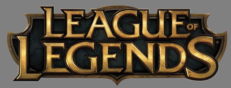
The choice of Beaufort comes down to what kind of world the game is trying to sell. League of Legends is set in a high-fantasy universe with ancient empires, mythical champions, and centuries of lore. A glyphic serif with Roman inscription roots fits that world the same way stone carvings fit a temple wall.
Friz Quadrata did the same job initially, but it has more personality quirks that become distracting in UI contexts. Beaufort is calmer at small sizes while still carrying that same sense of weight and history.
Spiegel pairs well with Beaufort precisely because it doesn’t compete with it. It’s a workhorse sans-serif. It handles the practical side of the game’s interface, stat blocks, item descriptions, patch notes, all the text that needs to be read quickly without the reader noticing the typeface at all.
This is a fairly classic approach to game typography: a strong display font that establishes atmosphere, paired with a neutral body font that gets out of the way. The typographic hierarchy between Beaufort and Spiegel also creates clear visual hierarchy across every screen in the client.
Riot has never published a formal statement explaining the exact reasoning behind the switch from Friz to Beaufort. The consensus among typography observers is that it was a practical decision: more weights, fewer quirks, better performance at screen resolutions that were changing rapidly around 2015 when the shift happened.
For anyone curious about how font choices shape brand perception, League of Legends is a useful case study. The psychology of a font matters even in contexts where players aren’t consciously reading it. Beaufort signals permanence. Spiegel signals clarity. Together they support the idea of a game world that feels both epic and accessible.
Other games have taken similar approaches. The Overwatch font system uses a similar logic of display plus utility pairing, and the Warcraft fonts lean even harder into the fantasy inscription tradition. Even the Fortnite font follows this same two-tier approach, though it goes for a much more aggressive display style.
FAQ on the What Font Does League of Legends Use
What is the main font used in League of Legends?
League of Legends uses Beaufort for LoL as its primary display typeface for headlines and titles.
Spiegel handles all body text and UI labels. Both are licensed by Riot Games and used across the game client and official websites.
What font is used for the League of Legends logo?
The logo is based on Friz Quadrata, a glyphic serif designed by Ernst Friz and Victor Caruso.
The current logo uses a custom-modified version. The original Friz Quadrata is a commercial font, not freely available.
Did Riot Games make their own font?
Not from scratch. Riot commissioned Monotype Imaging to customize Nick Shinn’s Beaufort typeface into Beaufort for LoL.
Spiegel was an existing custom font by Lucas de Groot, originally designed for the German magazine Der Spiegel.
Is the League of Legends font free to download?
Beaufort for LoL is a proprietary typeface and not officially available for public download or commercial use.
Unofficial file downloads exist online, but using them in commercial projects carries real licensing risk you’d want to avoid.
What font does League of Legends use for body text?
Spiegel, a humanist sans-serif font designed by Luc(as) de Groot, is used for all body copy, stat labels, and supporting UI text.
It is never used for headlines. That role belongs strictly to Beaufort.
What font is closest to the League of Legends font?
Cinzel on Google Fonts is the closest free alternative, sharing Beaufort’s Roman inscription character and strong uppercase presence.
Trajan Pro on Adobe Fonts is another solid match. Both work well for fantasy game branding and esports typography projects.
What font did League of Legends use before Beaufort?
Before Beaufort, the game used Friz Quadrata for display text and Gill Sans for UI copy, both active until around 2015.
Beaufort replaced Friz because it offered more weights and performed better at varying screen sizes and resolutions.
Is Beaufort for LoL a serif or sans-serif font?
Beaufort for LoL is a serif font, specifically classified as a glyphic serif based on Roman inscription lettering.
It is distinct from calligraphic or slab serif styles. Its sharp terminals and moderate stroke contrast make it readable at large display sizes.
What font does League of Legends use for esports broadcasts?
The League of Legends Championship Series uses Colfax, a geometric sans-serif designed by Erik Olson and released by Process Type Foundry in 2012.
Colfax handles team names, scores, and schedule data in broadcast graphics, alongside Beaufort and Spiegel.
How do I use a font similar to League of Legends in my designs?
Download Cinzel from Google Fonts for headlines, and pair it with Source Sans Pro or News Gothic for body text.
Bump up tracking slightly and set headings in all caps to get closer to the LoL game UI look.
Conclusion
If you’ve ever wondered what font does League of Legends use, the answer comes down to two typefaces working together: Beaufort for LoL for display text and Spiegel for body copy.
The Riot Games design system pairs a glyphic serif with a humanist sans-serif, creating clear typographic contrast across every screen in the client.
Friz Quadrata still anchors the logo, but Beaufort handles everything else, from champion names to patch note headers.
For anyone building esports graphics or fantasy-themed designs, Cinzel on Google Fonts is your most practical free alternative to the LoL brand identity typeface.

Renowned for his expertise in logo design and visual branding, Bogdan has developed a multitude of logos for various clients.
His skills extend to creating posters, vector illustrations, business cards, and brochures. Additionally, Bogdan's UI kits were featured on marketplaces like Visual Hierarchy and UI8.
He also wrote in the past years on sites like Design Your Way, WebDesignerDepot, WPDean, Designmodo, Speckyboy, Slider Revolution, and more.
- Versatile Georgia Font Pairing for Timeless Layouts - 24 October 2026
- How to Turn Inconsistent UI into One Design System (Without a Full Redesign) - 24 October 2026
- Beautiful Fonts Similar to Poppins You Should Try - 22 October 2026

Bogdan Sandu is a seasoned designer who has been designing websites since 2008. Renowned for his expertise in logo design and visual branding, Bogdan has developed a multitude of logos for various clients. His skills extend to creating posters, vector illustrations, business cards, and brochures. Additionally, Bogdan's UI kits were featured on marketplaces like Visual Hierarchy and UI8. He also wrote in the past years on sites like Design Your Way, WebDesignerDepot, WPDean, Designmodo, Speckyboy, Slider Revolution, and more.
You Might Also Like