


Not every print finish earns a second look. Metallic inks in print design do.
From luxury packaging to premium brand identity, metallic ink printing creates a reflective sheen that standard CMYK process colors simply cannot replicate. The effect comes down to physics: aluminum flake and bronze powder pigments reflect light rather than absorb it.
But getting that effect right requires more than choosing a Pantone metallic code. Substrate compatibility, print method, file setup, and proofing all affect the final result.
This guide covers everything from ink composition and printing techniques to environmental considerations and production-ready file setup.
What Are Metallic Inks
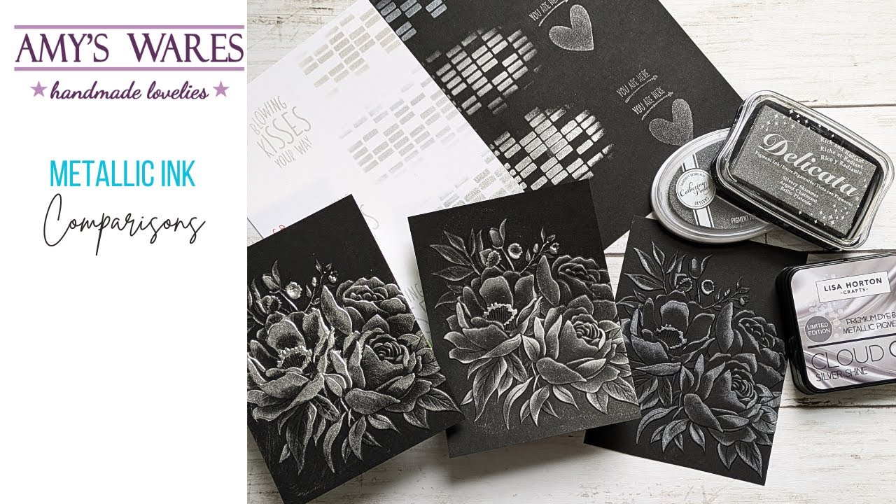
Metallic inks are print inks that contain fine metallic particles suspended in a carrier vehicle (varnish or solvent). When the ink dries, those particles rise to the surface and align flat, creating a reflective, metal-like sheen.
They are not the same as standard CMYK process inks. CMYK absorbs light. Metallic inks reflect it. That’s the whole point.
The global metallic printing inks market is forecast to reach $2.8 billion by 2030, growing at a CAGR of 5% (IndustryARC, 2024). Packaging is the primary driver.
Core Composition
Every metallic ink has two main parts: metallic pigment and a carrier varnish. The pigment is what creates the optical effect. The varnish controls flow, drying, and adhesion to the substrate.
The pigment starts as raw metal. Aluminum, bronze (a copper-zinc alloy), or brass is atomized into fine particles, then ground in mills until the spheres become flat, platelet-shaped flakes. Those flakes are what catch and bounce light.
- Aluminum flakes: Used for silver tones. Ground wet with a waxy lubricant to prevent oxidation during milling
- Bronze/brass flakes: Used for gold tones. Can be ground dry. Gold shade varies by the copper-to-zinc ratio
- VMP pigments (vacuum metallized): A more refined aluminum method. Aluminum is vapor-deposited onto foil in a vacuum, then separated into ultra-thin, ultra-smooth particles. The result is closer to a stamping foil than a standard metallic ink
The flake size matters more than most designers realize. Coarser flakes deliver higher brilliance but are harder to transfer through fine screens. Finer flakes transfer easily but sacrifice some sheen. Getting that balance right is the pigment manufacturer’s job, not the printer’s.
True Metallic vs. Metallic-Effect Inks
True metallic inks contain actual metal particles. The reflective quality comes from physics: flat metal surfaces reflecting incident light.
Metallic-effect inks (including pearlescent and iridescent) use synthetic or natural mica coated with titanium dioxide or iron oxide. They produce shimmer and color-shift effects, but the base material is not metal.
| Ink Type | Pigment Base | Optical Effect | Best Use |
| True metallic | Aluminum or bronze flakes | Direct light reflection, flat sheen | Gold/silver branding, packaging |
| Pearlescent | Mica + titanium dioxide | Soft, multi-angle shimmer | Cosmetics, stationery, labels |
| Iridescent | Mica + iron oxide layers | Color shift by viewing angle | Premium packaging, limited editions |
Pearlescent inks are often confused with metallics in briefs. They are translucent, not reflective, which changes how they interact with the substrate color beneath them. Worth clarifying with clients before going to press.
Types of Metallic Inks Used in Print
The category is broader than most designers expect. “Gold ink” is not one product. Depending on the printing method, substrate, and intended effect, you will work with several distinct ink types.
Gold and Silver Inks
Gold inks are bronze-based (copper and zinc). Silver inks use aluminum. Both are available in multiple particle sizes, which directly affects the final sheen level on press.
Gold shade is controlled by adjusting the copper-to-zinc ratio in the alloy:
- Higher copper content produces richer, redder golds
- Higher zinc shifts the tone toward a pale, greenish gold
- Tinted varnishes layer over the flake to further modify color
One thing that catches people out: gold metallic inks are prone to oxidation over time. The copper in the flake reacts with humidity, dulling the brilliance and, in bad cases, producing a greenish cast. Silver (aluminum) oxidizes differently. It turns dull and whiter. Storage conditions and overcoating with a protective varnish matter more than most print briefs account for.
Pantone Metallic System
PMS 871-877 covers the core gold-to-silver range, pre-mixed and ready to run. Pantone’s broader metallic range includes over 655 colors, all carrying codes that start with 8 and end with C (coated only, no uncoated version exists).
A few things the color guide does not tell you:
- Metallic Pantone codes cannot be reproduced in CMYK. They must be printed as spot colors
- UV-curable metallic Pantone inks need a separate UV-compatible formulation. Conventional offset metallics do not cure under UV lamps
- Premium packaging metallics use a five-digit code series (10xxx), which have better coating tolerance for post-press varnishing
Delta E between a Pantone swatch and a CMYK approximation typically runs between 2 and 5. For metallic tones, that gap is effectively uncloseable through process printing alone.
Pearlescent and Iridescent Inks
These get lumped in with metallics but behave very differently on press. Both are translucent, which means the substrate color shows through and influences the final appearance.
Pearlescent: Consistent shimmer regardless of viewing angle. Soft, elegant. Common in cosmetics and stationery packaging.
Iridescent: Color shifts as the viewing angle changes. The effect comes from interference between thin layers of coating on each mica particle. Harder to proof accurately because the color the press operator sees at arm’s length differs from what a consumer sees turning the package in their hand.
UV-Curable Metallic Inks
UV-curable formulations cure instantly under UV lamps rather than drying through oxidation or absorption. This changes everything about the print run: faster throughput, immediate finishing, no set-off issues between sheets.
Specialty metallic inks (including UV metallics) grew over 15% in 2023, partly driven by demand for low-VOC alternatives (Market Reports World, 2024). UV-curable metallics reduce volatile organic compound emissions by over 50% compared to solvent-based systems.
The tradeoff: UV metallics tend to produce a slightly different sheen profile than oil-based metallics. The rapid curing locks particles in place before they can fully leaf out, which can reduce brilliance on smooth coated stocks. Worth testing on your target substrate before committing to a long run.
How Metallic Inks Are Printed
Not every press handles metallic inks well. The printing method shapes the final result as much as the ink formulation itself.
Offset Lithography
Offset is the most widely used commercial printing method, but metallics are tricky on an offset press. The ink train involves multiple rollers, and metallic flakes can be damaged or misaligned as they pass through. Shear forces in the nip points between rollers break up larger flakes and reduce brilliance.
Common workarounds:
- Run metallic inks through fewer roller passes where possible
- Use a shorter ink train configuration when the press allows it
- Print metallics last in the color sequence, after CMYK layers
- Apply a white or silver base coat first to prevent substrate color from showing through flake gaps
Lithography still dominates the printing inks market by volume. The segment held the highest market share in 2024, driven by high-volume production runs where per-unit cost matters (Precedence Research, 2025).
Screen Printing
Screen printing is genuinely the best method for heavy metallic coverage. The ink is pushed through a mesh directly onto the substrate in a thick, even layer. Metallic flakes have room to lie flat and leaf out fully.
That thick ink film is the key difference. Screen-printed gold looks richer and more mirror-like than the same gold run through an offset press, assuming the mesh count is matched to the particle size. Too fine a mesh and the coarser flakes get trapped. Too coarse and fine detail suffers.
Ink Layering and Opacity
Metallic inks are not fully opaque out of the can. The gaps between flakes let the substrate color bleed through, creating a visual shift that can make the final print look different from the press proof.
The standard fix for offset and screen printing is a base coat:
- White base: Neutralizes dark substrate colors before metallics go down
- Silver base: Boosts reflectivity for gold tones, adding depth
- Double hit: Running the metallic color twice through the press (two separate passes) increases opacity and sheen without changing the formulation
Double-hit printing adds cost and time but is standard practice for high-end packaging design where the metallic effect needs to read strongly across shelf environments with inconsistent lighting.
Digital Metallic Printing
Most digital presses cannot run true metallic inks. The exception is the HP Indigo range, which uses liquid ElectroInk and can print on metalized substrates and foil boards. The process transfers ink via a heated blanket, melting and blending particles into a smooth film before contact with the substrate.
HP Indigo’s ElectroInk reaches up to 97% of Pantone colors and supports more than 2,500 certified substrates, including coated, uncoated, and metallic media. For short-run premium work, this is genuinely useful. For true spot metallic ink effects at high volume, offset or screen remains the better path.
Flexography
Flexo is the dominant method for packaging and label runs. Metallic inks in flexo use lower-viscosity formulations than offset, allowing them to transfer through the flexible plates and anilox rollers that define the process.
Water-based metallic flexo inks have improved significantly. These allow silver and gold effects previously limited to solvent-based systems, with much better environmental compliance for food-contact packaging applications.
Substrate Compatibility
Substrate choice is where metallic ink projects most often go wrong. The ink can be perfect; the press setup can be flawless. If the substrate is wrong, the sheen will disappoint.
Coated vs. Uncoated Stock
Coated stock provides ink holdout: the surface coating prevents ink from absorbing into the paper fibers. Metallic particles stay on the surface, lie flat, and reflect light as intended.
On uncoated stock, the same metallic ink absorbs into the fibers. The particles sink, lose their flat orientation, and the reflective effect dulls significantly. Imagine paying for premium silver ink and getting a muted grey.
| Stock Type | Metallic Sheen | Typical Use | Notes |
| Gloss coated | Highest | Luxury packaging, labels | Best ink holdout |
| Silk/satin coated | High | Brochures, folding cartons | Good holdout, less glare |
| Uncoated smooth | Medium-low | Stationery, offset litho | Some absorption, softer effect |
| Uncoated textured | Poor | Not recommended for metallics | Particles cannot leaf flat |
Rough-textured uncoated stocks are the worst case. The surface topography physically prevents metallic flakes from lying flat. The result is a broken, spotted metallic layer rather than a continuous reflective surface.
Specialty Substrates
Foil boards and metalized stocks are a different approach entirely. Rather than relying on the ink to create the metallic effect, the substrate itself is pre-metalized. CMYK or Pantone colors are then printed over the metallic surface, and the metallic base shows through wherever ink coverage is light.
This produces a different visual result from metallic ink. The effect is more uniform and mirror-like, but less flexible, since you cannot selectively apply the metallic quality to specific areas.
Kraft paper is occasionally used with metallic inks for craft and artisanal brand aesthetics. The result is a deliberately muted metallic with visible texture. Works well for specific brand positioning. Not a substitute for full-sheen metallic on coated stock.
Plastic and Synthetic Substrates
Polypropylene, polyester, and other synthetic films need ink formulations with adhesion promoters. Standard metallic inks do not bond reliably to non-porous plastics without either a primer or a UV-curable formulation that polymerizes on the surface rather than drying by absorption.
Adhesion failure on plastics is a real production risk. A metallic label that looks fine off the press can scratch, peel, or smear in transit if the ink-to-substrate bond is not properly tested. Always run adhesion tape tests on synthetic substrates before sign-off.
Metallic Inks vs. Foil Stamping
This is the question that comes up in almost every luxury print brief. Both produce metallic effects. They get there through completely different processes, at different costs, with different creative constraints.
How They Differ
Foil stamping uses heat and pressure to transfer a thin metallic film from a carrier roll to the substrate. The result is a continuous, mirror-bright metallic surface with zero gaps between particles. No ink involved.
Metallic ink deposits pigment particles in a carrier. The surface has microscopic gaps between flakes, which gives a slightly more organic, less mirror-perfect appearance. That is not a flaw. For many applications it is actually preferable.
| Factor | Metallic Ink | Foil Stamping |
| Visual output | Reflective, slightly textured | Mirror-bright, continuous |
| Setup cost | Low (spot color on press) | High (custom die required) |
| Unit cost at volume | Lower | Higher |
| Fine detail | Good (screen-dependent) | Limited (die tolerance) |
| Large coverage areas | Works well | Technically challenging, costly |
| Color range | Wide (655+ Pantone metallics) | Wide, but fixed to foil stock colors |
When to Use Metallic Ink
Metallic ink is the practical default for most print runs. It runs inline on standard offset or screen presses with no additional tooling cost. Large coverage areas, fine text, and intricate linework all print more reliably in metallic ink than through foil stamping.
Brands like mid-range spirits, cosmetics, and FMCG food packaging frequently use Pantone metallic inks as the primary finish. The per-unit economics at print runs over 10,000 sheets strongly favor ink over foil.
When Foil Is Worth the Extra Cost
Foil makes sense when the design calls for an unmistakable, premium mirror effect that metallic ink simply cannot match. High-end spirits packaging (think Johnnie Walker Blue Label or Chanel’s boxes) often uses foil precisely because the tactile and visual quality signals a price point that metallic ink does not quite reach.
Foil also performs better on embossed or debossed areas, where the three-dimensional surface makes the metallic effect read as sculptural rather than flat. That combination of foil plus emboss is a go-to technique in luxury book cover design and high-end retail packaging.
Short print runs complicate the calculation. Foil stamping requires a custom die, and that tooling cost is fixed regardless of quantity. For runs under 1,000 units, the die cost alone can make foil uneconomical unless the budget supports it.
Color Accuracy and Proofing Challenges
Metallic inks are notoriously difficult to proof. The reflective quality that makes them valuable in print is the same quality that makes them impossible to represent accurately on screen or on a standard inkjet proof.
Why Standard Proofs Fail
A RGB screen displays color through emitted light. A metallic ink reflects ambient light off physical particles. These are fundamentally different optical phenomena, and no screen calibration or soft-proofing workflow bridges that gap.
Standard inkjet contract proofs use CMYK process inks. Metallic Pantone colors have a Delta E gap of 2 to 5 against their CMYK approximation (SIM Printing Supplies, 2025). For vivid metallics, that difference is visible to the naked eye.
What actually works for metallic proofing:
- Drawdown proofs: A small amount of the actual ink drawn across the actual substrate with a hand proofer or small roller. Fast, cheap, and genuinely representative
- Press strike-offs: A short run on the production press before the full job is approved. The gold standard, but adds cost and schedule time
- Pantone swatch book on the actual stock: Imperfect, because the swatch was printed on a different substrate, but better than a screen-based reference
Metamerism and Lighting Conditions
Metallic inks are especially susceptible to metamerism, which is when a color appears to shift under different light sources. A gold ink that looks warm and rich under incandescent light can appear cold and slightly green under fluorescent office lighting.
This matters for retail packaging, where shelf lighting varies enormously between stores. A press approval done under D50 viewing conditions can look noticeably different under the cool LED lighting typical of modern grocery or pharmacy environments.
The practical response is to evaluate metallic proofs under multiple light sources before sign-off. Most professional print shops have a viewing booth with switchable illuminants. If yours does not, that is a real gap in the approval workflow.
Managing Client Expectations
Took me a while to figure out a reliable way to handle this in client workflows. The most effective approach: show a physical drawdown on the target substrate at the brief stage, not after the design is finalized. Clients who approve a color from a screen mockup and then see the printed result for the first time at delivery have reasonable grounds for disappointment, even when the press matched the specification correctly.
The color proofing process for print for metallic work needs a physical component. There is no way around it.
Metallic Inks in Packaging Design
Packaging is where metallic inks do most of their real work. The luxury spirit packaging market was valued at $8.5 billion in 2024 and is projected to reach $12.3 billion by 2033 (Strategic Packaging Insights). Metallic print finishes are a core driver of that premium positioning.
Cosmetics, spirits, and FMCG food brands all use metallic inks for the same reason: shelf presence. A gold or silver ink on a package creates a visual hierarchy that pulls attention before the consumer reads a single word.
Premium Packaging Applications
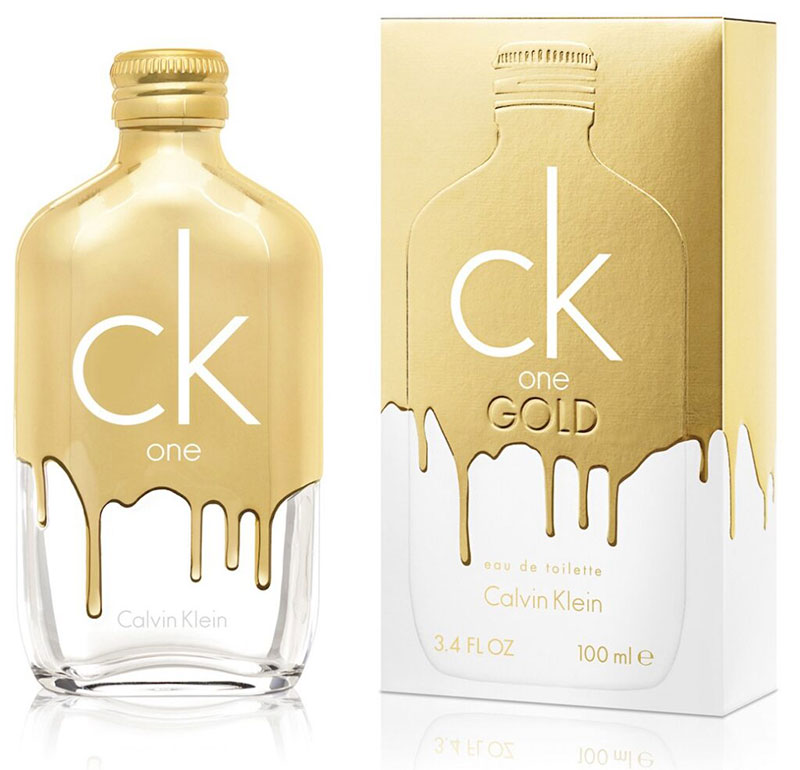
Cosmetics and beauty: Pearlescent and metallic inks are standard on folding cartons and labels for fragrance, skincare, and makeup. Brands like Dior and Charlotte Tilbury use metallic spot colors as a consistent brand signal across all packaging touchpoints.
Spirits and beverages: Gold Pantone metallics on label stock are the default finish for mid-to-premium whisky and gin brands. The cost per unit stays manageable at high volumes, unlike foil.
FMCG food: Metallic inks are used selectively here, often for limited editions or seasonal variants. A standard product line may run full CMYK, while its holiday version adds a spot metallic to the same dieline at minimal incremental cost.
Spot Metallic vs. Flood Metallic Coverage
Spot metallic applies ink to specific design elements only: a logo, a border, a text line. Flood metallic covers the entire printable area in metallic ink.
Flood coverage is harder to execute well. Large metallic areas are more likely to show streaking, uneven leafing, or opacity variation across the sheet. A white or silver base coat under the flood area is almost always required.
Spot metallic is more forgiving and usually more effective visually. A focal point of metallic ink surrounded by matte or uncoated areas reads as premium precisely because the contrast is doing the work. Covering everything in metallic removes that contrast entirely.
FDA Compliance in Food Packaging
Metallic inks used on food-contact packaging are regulated under Title 21 of the Code of Federal Regulations (21 CFR). The FDA evaluates printing inks both for intentional exposure from the outside of packaging and for potential migration to food-contact layers through offset during manufacturing.
Bronze-based gold inks (containing copper and zinc) require particular attention. The key compliance questions:
- Is the ink applied to the non-food-contact side only?
- Has migration testing been done for the specific substrate and food type?
- Does the formulation meet the relevant 21 CFR clearance or Food Contact Notification?
UV-curable metallic inks have a lower migration risk than solvent-based formulations, which is one practical reason they appear more frequently in food-adjacent packaging applications. Always confirm compliance with your ink supplier before specifying a metallic for any food-contact packaging design project.
Environmental and Health Considerations
Metallic inks carry a more complicated sustainability profile than standard process inks. The pigments are actual metals. The solvents can be significant VOC sources. And the printed output often cannot be recycled through standard paper streams.
Heavy Metal Content and Worker Safety
Conventional petroleum-based inks contain high levels of VOCs and heavy metals that can leach into soil or water if disposed of improperly (Paper Papers, 2024). Metallic inks are a specific case of this: bronze powders contain copper and zinc, and aluminum pigments carry explosion risk in dry powder form.
Aluminum pigment reacts with water and humidity, releasing hydrogen. In powder form, it is genuinely dangerous. Print shops should store silver/aluminum pigment in paste or ink form only, in temperature-controlled, dry conditions. No powder on the shop floor.
Oxidation affects both worker environment and print quality over time. Gold metallic inks can develop a greenish cast as copper particles oxidize. Silver inks turn dull and white. Proper ink storage and press-side management matter.
VOC Emissions and Lower-Emission Alternatives
Specialty metallic inks grew over 15% in 2023, and a significant part of that growth came from water-based and UV-curable reformulations driven by tightening VOC regulations (Market Reports World, 2024).
In Europe, permissible VOC content is capped at 2%. In North America, the cap sits at 1.5%. Solvent-based metallic inks regularly exceed these thresholds in conventional formulations, pushing printers toward alternatives.
UV-curable metallic inks reduce VOC emissions by over 50% compared to solvent-based systems. Natural-based low-VOC formulations from suppliers like INX reduce CO2 emissions by 25-30% compared to conventional inks (INX International, 2025). The sheen profile differs slightly from solvent-based systems, but for most packaging applications the tradeoff is acceptable.
Recyclability of Metallic-Printed Paper
Metallic-printed paper is a recycling challenge. The metallic pigments do not break down in standard paper pulping processes. Metal particles contaminate the pulp and require removal, adding cost and reducing the recyclability rate of the overall waste stream.
Key recyclability considerations:
- Spot metallic on small areas: lower contamination impact than flood coverage
- Foil board substrates: essentially non-recyclable through standard paper streams
- Water-based metallic inks: better recyclability profile than solvent-based
- FSC-compatible ink certifications: available from suppliers like Sun Chemical and INX
According to the EPA, 30% of premium packaging materials remain non-recyclable (UK Packaging Federation/EPA, 2024). Metallic finishes are a significant contributor to that figure. Brands with sustainability commitments need to factor end-of-life recyclability into material specifications before approving metallic ink use on high-volume packaging.
Preparing Files for Metallic Ink Print Production
File setup is where metallic ink projects fall apart most often. The press can be dialed in perfectly, but if the spot color channel is named incorrectly or the overprint setting is wrong, the job fails.
Spot Color Channel Setup in Illustrator and InDesign
Metallic inks must be set up as spot colors, not CMYK approximations. Both Adobe Illustrator and InDesign handle this through the Swatches panel.
Standard setup in Illustrator:
- Open Window > Swatches > Color Books > Pantone+ Metallic Coated
- Select the required PMS code (871 C for standard gold, 877 C for standard silver)
- Confirm the Color Type is set to Spot Color in Swatch Options
- Keep the swatch name as the exact PMS number. Do not rename it
In InDesign, the same swatch imports automatically when you place an Illustrator file containing a named spot color. The name carries over. If you rename the swatch inside InDesign, you break the link to the PMS reference the printer will look for when setting up separations.
Layer Naming and Separation Structure
Separate metallic artwork onto its own layer, named exactly as the spot color swatch. “METALLIC” or “Silver” as layer names. Case sensitivity matters here.
The printer’s RIP reads spot color names to generate the correct separation plate. A layer named “metallic silver” when the swatch is “PMS 877 C” creates a mismatch that will require manual intervention at the print shop, delay the job, and potentially generate a second proof round.
| Setup Step | Illustrator | InDesign |
| Add swatch | Pantone+ Metallic Coated library | Same library, or import from .ai file |
| Color type | Set to Spot Color in Swatch Options | Automatic when importing spot swatch |
| Layer naming | Match exactly to swatch name | Match exactly to swatch name |
| PDF export | Export as PDF/X-4, preserve spot colors | Export as PDF/X-4, check Ink Manager |
Overprint and Knockout Settings
This is the setting that causes the most expensive mistakes. Overprint vs. knockout determines whether the metallic ink layer sits on top of existing CMYK colors or replaces them.
Overprint on: The metallic ink prints over whatever CMYK colors are beneath it. The resulting mixed color can look muddy or shift the metallic tone unexpectedly.
Knockout (default): The metallic ink knocks out the CMYK beneath it, printing on the substrate (or base coat) only. This is usually the correct setting for metallic inks where you want clean, full-sheen output.
There are deliberate cases for overprinting metallics: printing transparent pearlescent over a color to add shimmer without replacing it, or running a metallic tint over a dark CMYK background for a specific mixed effect. In those cases, overprint is intentional. The problem is unintentional overprint left on from a previous file state. Always check Overprint Preview in Illustrator or InDesign before sending to the printer.
Minimum Sizes and Type Handling
Metallic inks do not hold fine detail as cleanly as standard CMYK process inks. The metallic flake particle size creates a physical lower limit on how small a printed element can be before it starts to lose definition.
Practical minimums for metallic ink elements:
- Text: no smaller than 8pt for positive metallic type; 10pt minimum for reversed metallic out of a dark background
- Stroke weight: 0.5pt absolute minimum; 1pt recommended for reliability
- Fine linework: avoid hairlines entirely
Outline all fonts before sending print-ready files. Metallic type that relies on live font data can shift in rendering if the printer’s RIP handles the font differently than your design application.
Understanding how print resolution standards interact with metallic ink particle size is also worth flagging to clients. A design that looks razor-sharp in a screen mockup can show soft edges in the physical metallic layer at 300 DPI if fine detail is involved. Request a physical proof on any job with small metallic type or intricate linework before approving the full run.
FAQ on Metallic Inks in Print Design
What are metallic inks made of?
Metallic inks contain fine metallic pigments, typically aluminum flake for silver tones and bronze powder (copper-zinc alloy) for gold, suspended in a carrier varnish. The flat particle shape is what creates the reflective, light-bouncing sheen on the printed surface.
Can metallic inks be printed with CMYK?
No. Metallic inks must be printed as spot colors, separate from the CMYK process. CMYK absorbs light; metallic pigments reflect it. No combination of cyan, magenta, yellow, and black can replicate a true metallic sheen.
Which printing method works best for metallic inks?
Screen printing delivers the richest metallic sheen because the thick ink film lets flakes lie flat and leaf out fully. Offset lithography works but requires more care. Flexography handles metallic inks well for packaging and label runs.
Does substrate choice affect metallic ink quality?
Significantly. Coated paper stock keeps metallic particles on the surface, maximizing reflectivity. Uncoated stock absorbs the ink, causing flakes to sink into fibers and dulling the effect. Rough-textured stocks are the worst case for metallic printing.
What is the difference between metallic ink and foil stamping?
Foil stamping transfers a pre-made metallic film using heat and pressure, producing a mirror-bright, continuous surface. Metallic ink is printed directly onto the substrate. Foil costs more but delivers a sharper, more premium finish on small coverage areas.
How do I set up metallic inks in Adobe Illustrator?
Open the Pantone+ Metallic Coated swatch library and select your PMS code, such as PMS 871 C for gold or 877 C for silver. Set the color type to Spot Color. Keep the swatch name exactly as the PMS number. Never rename it.
Why do metallic inks look different on screen versus in print?
Screens emit light using RGB values. Metallic inks reflect ambient light off physical particles. These are different optical phenomena. No screen can simulate the sheen. Always evaluate metallic colors from a physical drawdown proof on the actual substrate.
Are metallic inks safe for food packaging?
It depends on the formulation and placement. Bronze-based gold inks contain copper and zinc, which require FDA compliance review under 21 CFR regulations. UV-curable metallic inks carry a lower migration risk and appear more frequently in food-adjacent packaging applications.
Are metallic inks recyclable?
Not easily. Metallic pigment particles do not break down in standard paper pulping. They contaminate the pulp stream and require removal. Spot metallic on small areas is less problematic than flood coverage. Water-based metallic formulations have a better recyclability profile than solvent-based alternatives.
What is the Pantone metallic color range?
Pantone offers over 655 metallic colors, all coded with numbers starting with 8 and ending in C (coated only). The core gold-to-silver range runs from PMS 871 to 877. A separate premium packaging series uses five-digit codes in the 10xxx range for better post-press coating tolerance.
Conclusion
This conclusion is for an article presenting metallic inks in print design as a technical discipline, not just a visual trend.
Getting the result right means understanding ink composition, choosing the correct substrate, matching the print method to the job, and setting up production files without shortcuts.
Bronze powder and aluminum flake pigments behave differently from process inks at every stage, from coated versus uncoated paper stock decisions to overprint settings and press approvals.
Environmental compliance and recyclability now factor into material choices too, particularly for food-adjacent packaging where FDA regulations apply.
Treat metallic ink printing as a specialty process. Plan for physical proofs, confirm substrate compatibility early, and the results will consistently justify the extra effort.

Renowned for his expertise in logo design and visual branding, Bogdan has developed a multitude of logos for various clients.
His skills extend to creating posters, vector illustrations, business cards, and brochures. Additionally, Bogdan's UI kits were featured on marketplaces like Visual Hierarchy and UI8.
He also wrote in the past years on sites like Design Your Way, WebDesignerDepot, WPDean, Designmodo, Speckyboy, Slider Revolution, and more.
- The Cursor Logo History, Colors, Font, And Meaning - 24 September 2026
- Top 7 Web Design Subscription Services That Replace Full-Time Hires - 24 September 2026
- Canva vs PowerPoint: Which Is Better for Presentations? - 22 September 2026

Bogdan Sandu is a seasoned designer who has been designing websites since 2008. Renowned for his expertise in logo design and visual branding, Bogdan has developed a multitude of logos for various clients. His skills extend to creating posters, vector illustrations, business cards, and brochures. Additionally, Bogdan's UI kits were featured on marketplaces like Visual Hierarchy and UI8. He also wrote in the past years on sites like Design Your Way, WebDesignerDepot, WPDean, Designmodo, Speckyboy, Slider Revolution, and more.
You Might Also Like


