


One wrong setting in your print file and white text disappears entirely on press. That is the practical reality of overprint vs knockout, two ink layering instructions that look identical on screen but behave completely differently in CMYK color separation.
Understanding the difference matters whether you are prepping a packaging file in Adobe InDesign, setting up a spot color in Illustrator, or sending a print-ready PDF to an offset press.
This guide covers how each setting works, how they affect color output and ink density, when to apply each one, and how to check your files before a single sheet hits the press.
What is Knockout in Print Design

Knockout is what happens when the top object removes the color beneath it. The background is cleared out, leaving only the topmost ink to print. No mixing, no blending.
It is the default behavior in virtually every major design application. Open InDesign or Illustrator, place a colored shape over a background, and knockout is already active. You have to deliberately switch it off.
How Knockout Works in CMYK
Core behavior: When a file goes to the press, each ink gets its own plate. With knockout, the area beneath your object is literally cut out of the background plate. Only one ink prints in that zone.
- Each CMYK plate carries a “hole” where the knocked-out object sits
- The top color prints alone, with no ink underneath affecting it
- Color accuracy is preserved because inks never interact
- Any slight misalignment between plates can leave a thin white gap at the edge
That last point matters a lot on press. Even a fraction of a millimeter of color separation shift can cause visible gaps where the knockout meets the background.
When Knockout Produces Problems
According to Wikipedia’s documentation on printing registration, misregistration in a graphical workflow can be caused by human error, inaccuracies in the image setter, or instability of the image carrier. These issues can be minimized, but not eliminated, given that any mechanical process produces some degree of error.
Most vulnerable scenarios:
- Small text knocked out of a multi-color background
- Fine lines and thin rules at knockout boundaries
- Two adjacent spot colors with a knockout edge between them
White knockout objects are the most dangerous. A white shape set to knockout looks correct on screen. Set it to overprint by mistake and it disappears entirely on press, because the white ink is never applied and the background shows through.
—
What is Overprint in Print Design

Overprint is the opposite instruction. Instead of removing the background color, overprint layers ink on top of whatever is already there. The two inks mix.
With overprint enabled on a red object sitting over a blue background, the result is not red. It is some combination of red and blue, depending on the specific ink values and the substrate. That can be intentional or a costly surprise.
Why Overprint Exists
Overprint fill was originally a practical solution to misregistration. If your black text knocks out of a colored background and the plates shift even slightly, you get a white halo around every letter. Overprinting the black text eliminates that gap entirely because the black ink just prints over whatever is underneath.
| Scenario | Default | Recommended |
| 100% black text | Knockout (software default) | Overprint |
| White text on dark background | Knockout | Knockout (never overprint) |
| Thin black rules | Knockout | Overprint |
| Multi-color logo | Knockout | Knockout |
| Spot varnish / UV coating | Knockout | Overprint |
Most prepress professionals follow a simple rule: almost always overprint black, never overprint white. The reasoning is straightforward. Black ink is dark enough that whatever is beneath it has minimal visual impact. White has zero coverage, so if it overprints, the background simply shows through and the white disappears.
How Overprint Affects the Final Color Output
Overprint does not just “add” ink. It multiplies the color values of the two inks on the printed substrate.
A 100% cyan object overprinting a 100% magenta background produces a blue-purple color. Neither the designer nor the client may have intended that. This is why the Overprint Preview mode in InDesign and Acrobat Pro exists. The screen rendering without that mode active shows the top color as it appears in isolation, not as it will print.
Key difference: screen view lies. Overprint Preview shows the truth.
—
How Knockout and Overprint Affect Color Output
The color shift from overprint can be dramatic or subtle depending on the inks involved. With two dark process colors stacking, the result often goes muddier than either original color. Lighter colors mixing can produce interesting effects, but unpredictable ones.
Rich Black and Overprint
Rich black in CMYK is typically a mix of C60 M40 Y40 K100 or similar builds. It looks deeper and denser than single-channel K100.
When rich black is set to overprint, the underlying colors stack on top of an already heavy ink build. Total ink coverage can exceed what the press can handle, causing setoff, slow drying, or ink cracking on certain substrates. That is why prepress teams check total area coverage limits before signing off on files.
Safe practice: K100 text on colored backgrounds should overprint. Rich black headline text over complex backgrounds should not, unless the ink coverage has been calculated and the print vendor has confirmed the press can handle it.
Spot Colors and Knockout
Spot colors, including Pantone colors, are opaque by nature. That opacity changes the overprint math considerably.
When an opaque spot color overprints a process color, the spot color tends to dominate. The process ink beneath barely shows through. But when two translucent process colors overprint each other, both contribute equally to the result. This is why the trapping rules for spot colors differ from process color trapping.
- Spot-to-spot: first ink printed spreads under the second
- Spot-to-process: lighter color is always spread under the darker
- Process-to-process: both CMYK values interact based on ink transparency
According to Wikipedia’s documentation on trapping, when two colors are process colors, the trap contains the highest value of each CMYK component. This trap color is always darker than the two adjacent colors.
—
Overprint vs Knockout in Adobe InDesign

InDesign applies black overprint automatically by default. Any swatch defined as 100% K will overprint unless you override it. Most designers never touch this setting and it works fine. The problems start when someone creates a “black” swatch using C0 M0 Y0 K100 in the color panel but then applies it differently from the default black swatch.
Attributes Panel Settings
Where to find it: Window > Output > Attributes. The panel has two checkboxes: Overprint Fill and Overprint Stroke.
Checking Overprint Fill applies overprint to the object’s fill color. Overprint Stroke applies it to the stroke only. These are independent, which is useful. You might want a stroke to overprint for trapping purposes while the fill knocks out cleanly.
Common InDesign trap: Designers sometimes create white objects to mask parts of underlying artwork. If that white object accidentally has Overprint Fill checked, it becomes invisible on press while looking perfectly fine on screen.
Separations Preview
The Separations Preview panel (Window > Output > Separations Preview) lets you turn individual ink plates on and off.
- Click the eye icon next to each CMYK channel to hide that plate
- Hiding the K plate reveals whether black objects are knocking out or overprinting correctly
- Spot color channels appear as separate rows below the four process inks
- Any unexpected color behavior usually becomes obvious when toggling plates individually
This panel, combined with Overprint Preview mode (View > Overprint Preview), is the most reliable way to catch overprint errors before sending a file to the printer. The U.S. Bureau of Labor Statistics projects prepress technician employment will decline 25% from 2022 to 2032. That means more designers are doing their own prepress checks, and knowing these panels is no longer optional.
—
Overprint vs Knockout in Adobe Illustrator
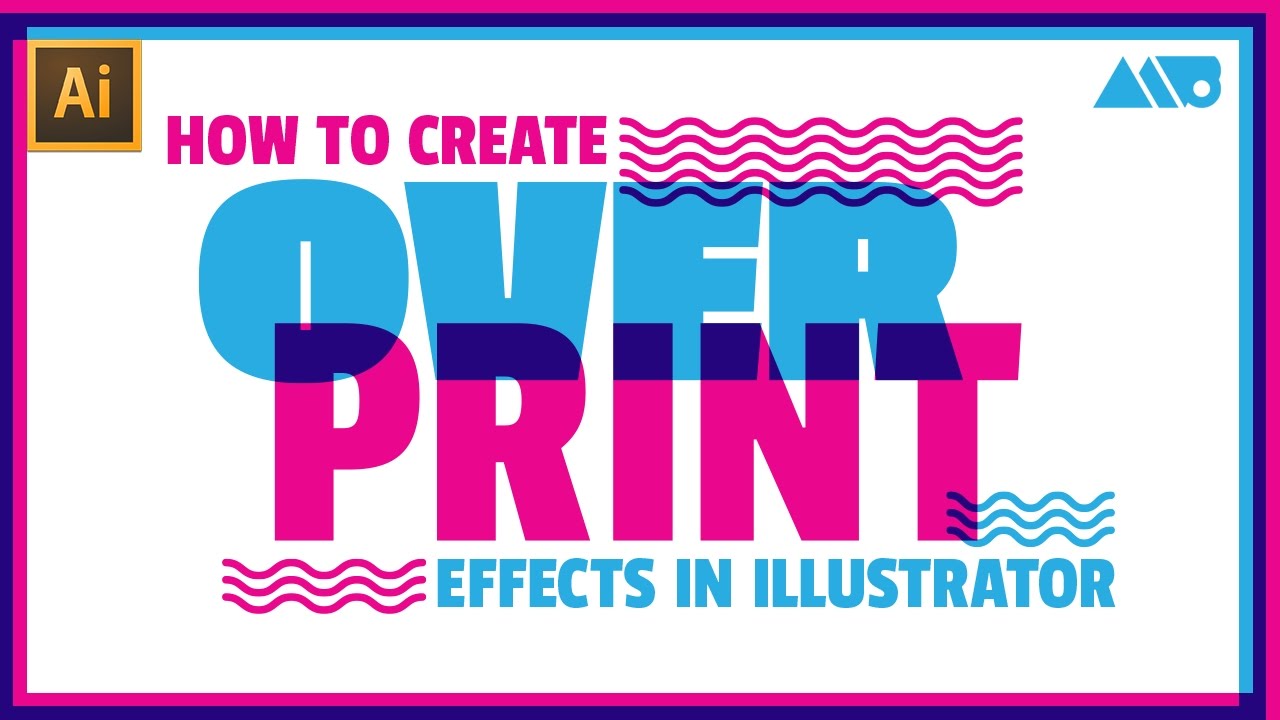
Illustrator handles overprint differently from InDesign, and that difference catches people out regularly. InDesign automatically overprints 100% black swatches. Illustrator does not. In Illustrator, everything knocks out by default, including 100% K objects, unless you manually set them to overprint.
Setting Overprint in Illustrator
The Attributes panel in Illustrator (Window > Attributes) carries the same Overprint Fill and Overprint Stroke checkboxes as InDesign. But because there is no automatic black overprint, small black text in Illustrator files is at higher misregistration risk when sent to press without a manual check.
Practical workflow: Select all 100% K objects, open the Attributes panel, and check Overprint Fill before exporting to PDF. It takes two minutes and prevents the white halo problem entirely.
| Setting | InDesign Default | Illustrator Default |
| 100% K fill | Overprints automatically | Knocks out |
| White fill | Knocks out | Knocks out |
| Spot color | Knocks out | Knocks out |
| Stroke | Knocks out | Knocks out |
One thing both applications share: overprint settings travel with the file into PDF exports. If you check overprint in Illustrator and then place that file into InDesign, the overprint attribute stays active. This can cause double overprint issues if InDesign then also applies its automatic black overprint on top.
Checking Output in Illustrator
Illustrator’s Overprint Preview mode lives under View > Overprint Preview, same as InDesign. It is off by default.
Turn it on before doing any final review of a file destined for offset press. Checking it after a client sign-off but before PDF export is a habit worth building. More than a few expensive reprints have happened because someone skipped this step.
Export note: When exporting PDF/X-1a from Illustrator, overprint settings are preserved in the output. PDF/X-4 handles overprint differently due to its transparency support. Always confirm with your print vendor which PDF standard they need and whether their RIP will handle overprint the way you intend.
—
Trapping and Why Overprint Matters
Trapping is the reason overprint exists in professional print production. Without it, any slight movement of the press sheets between ink stations creates visible gaps at color boundaries. You cannot fully prevent misregistration on an offset press. You can hide it.
What Trapping Actually Does
A trap is a small overlap between two adjacent colors, typically between 0.25pt and 1pt depending on the press and substrate. The overlap means that even if the plates shift slightly, there is no gap between the colors because each one extends a little into the territory of the other.
Two trap types:
- Spread: The lighter foreground object expands into the darker background
- Choke: The lighter background shrinks inward, contracting around a darker object
Both create the overlap using overprint. The expanded or contracted edge is set to overprint so that the trap color blends with the adjacent color rather than knocking it out. If the trap knocked out, it would create a hard edge and defeat the purpose.
Manual Trapping vs. InDesign’s Built-In Engine
InDesign includes an automatic trapping engine called Adobe In-RIP Trapping. It handles most standard cases without manual input.
Manual trapping is still useful for complex files, particularly packaging designs with tight registration requirements. According to Adobe’s official Illustrator documentation, the Trap option in the Pathfinder panel identifies the lighter-colored artwork and overprints it into the darker artwork. The same principle applies to manual trapping in InDesign.
When to let the printer handle it: If you are sending to a commercial offset printer with a full prepress department, they often prefer to apply trapping themselves. Their trapping settings are calibrated to their specific presses. Ask before you apply manual traps, or you risk double-trapping the file.
Spot PMS colors always need trapping into process CMYK colors. This is one area where getting it wrong is especially visible on press, because Pantone inks tend to be opaque and any gap between a Pantone area and a CMYK area shows as a white line rather than a subtle color shift.
When to Use Overprint vs Knockout
Most decisions here are not judgment calls. They follow clear rules based on ink color, object type, and print method.
The tricky cases come from edge conditions: duotones, varnish layers, spot UV, and files that cross from offset to digital. Those need a conversation with the print vendor before you lock the file.
| Element | Use | Reason |
| 100% K text | Overprint | Prevents white halo from misregistration |
| White objects | Knockout | Overprint makes white disappear entirely |
| Multi-color logos | Knockout | Color accuracy depends on isolation |
| Spot varnish / UV | Overprint | Must layer over existing ink |
| Thin black rules | Overprint | Too small to trap reliably |
Always Knockout
White objects, light colors on dark backgrounds, and brand-critical spot colors all need knockout without exception.
A light yellow knocked out of a dark navy background will print as clean yellow. Set it to overprint and the navy bleeds through, shifting the yellow toward green. No amount of preflight checking fixes an intentionally wrong setting.
- White text or shapes: knockout always, no exceptions
- Pastel tones over dark backgrounds
- Logo colors where brand accuracy is non-negotiable
Typically Overprint
Bergen County Printers confirms the standard: use overprint for small black text, specialty finishes like spot UV or foil stamping, and creating rich black by layering inks.
The black rule: 100% K objects below roughly 36pt should overprint. Above that size, the slight color shift from underlying inks becomes visible even with overprint enabled, so rich black builds with knockout are sometimes preferred for large display type.
Spot varnish and foil stamping both require overprint. These finishing effects are applied on top of existing printed ink. If they knock out, the finish has nothing to adhere to where the knockout hole appears.
Edge Cases: Digital vs. Offset
Plum Grove notes a key limitation: avoid applying overprint to any elements in artwork intended for digital print, as digital employs knockout printing methods by default.
Why this matters: Digital presses process overprint through a RIP (Raster Image Processor), which simulates the ink mixing rather than physically layering wet inks. The simulation is not always identical to what an offset press produces with the same settings.
- Offset: wet ink physically mixes on press, overprint is real ink interaction
- Digital: RIP simulates overprint mathematically before sending to the print engine
- Screen printing: ink layering order is the press operator’s call, not a file setting
Always confirm with the vendor which press your job will run on before finalizing overprint decisions.
How to Check Overprint Settings Before Sending to Print
Preflight catches errors before they become reprints. The cost of a reprint is not just materials. DelightAd notes it involves prepress technicians identifying the problem, contacting the design team, waiting for revised files, and rerunning proofs, which can add days to the production timeline.
Overprint Preview in InDesign and Acrobat
InDesign: View > Overprint Preview. Turn it on before any final review. It is off by default.
TypeTogether’s preflight guide confirms a practical workaround for applications without built-in Overprint Preview: export the PDF first and then check it in Acrobat with Overprint Preview turned on.
Acrobat Pro: Open the PDF, go to Tools > Print Production > Output Preview. This panel shows each separation and simulates overprint behavior. It is more reliable than the InDesign preview because it reflects what the RIP will actually process.
Separations Preview and Preflight Profiles
Printing Impressions confirms that Overprint Preview is turned off by default in both Acrobat and the free Adobe Reader. It must be activated manually in each application’s preferences.
Three-step check before sending any file to press:
- Turn on Overprint Preview in InDesign and scan for disappearing white objects or unexpected color shifts
- Export PDF, open in Acrobat Pro, run Output Preview with each separation toggled off and on
- Run InDesign’s built-in Preflight (Window > Output > Preflight) using a custom profile that flags overprint usage
Third-Party Preflight Tools
Adobe Acrobat Pro’s built-in preflight engine handles most standard checks. For packaging-heavy workflows, dedicated tools go further.
Markzware FlightCheck can check a wider range of file formats beyond PDF, including native InDesign and Illustrator files. Enfocus PitStop and callas pdfToolbox are common in high-volume prepress environments and can auto-fix certain overprint errors, including forcing white objects to knockout automatically.
According to Prepressure, Acrobat Preflight includes a single fixup called “Set white text and vector objects to knock out.” Running this on any incoming file catches the most common overprint disaster before it reaches the press.
Overprint vs Knockout in Digital vs. Offset Printing
The print method changes how overprint behaves in a fundamental way. Offset is wet ink on plates. Digital is toner or inkjet driven by a RIP. The file setting is the same. What happens at the press is not.
| Print Method | How Overprint Works | Risk Level |
| Offset lithography | Physical ink mixing on substrate | Predictable if calibrated |
| Digital (toner) | RIP simulates overprint | Variable by RIP vendor |
| Digital (inkjet) | RIP interprets, sprays mixed result | Can differ from offset output |
| Screen printing | Ink layers in stencil order | Order of printing is decisive |
Offset Printing and Overprint
Offset is where overprint was designed to live. Wet inks physically interact on the substrate, and the result is consistent across a press run once color profiles are locked.
Trapping matters most here. Misregistration between plates is a physical reality on any offset press. The Wikipedia article on printing registration notes that misregistration can be caused by human error, inaccuracies in the image setter, or instability of the image carrier, and these issues can be minimized but not eliminated. Overprint on black text and trap edges is how you manage that physical reality.
Digital Printing and Overprint
Digital presses do not have separate ink plates. A RIP converts the entire file into a single composite image before printing. Overprint is simulated during that conversion, not applied physically on press.
The result is often close to offset output but not identical. Color mixing values calculated by a RIP depend on the vendor’s color engine, the ICC profile in use, and the substrate’s color profile. Two digital presses from different vendors can produce different results from the same overprint setting in the same PDF.
Practical takeaway: If a file was set up with overprint for offset press and then redirected to digital for a short run, always request a proof before approving the full run. The overprint simulation can shift certain color combinations enough to matter.
PDF Settings and Overprint Flattening
PDF flattening during export can affect overprint behavior, particularly when transparency is involved. Adobe’s official InDesign documentation confirms that if artwork contains transparency, including overprints and drop shadows, previewing the effects of flattening using the Flattener Preview panel before saving is recommended.
PDF/X-1a flattens all transparency during export. Overprint settings are preserved but transparency is resolved. PDF/X-4 preserves live transparency and passes overprint decisions to the output device’s RIP. Which standard to use depends entirely on what the printer’s workflow supports.
Ask the vendor before exporting. A file that looks correct in PDF/X-4 can behave differently when a legacy RIP interprets it as PDF/X-1a.
FAQ on Overprint vs Knockout
What is the difference between overprint and knockout?
Knockout removes the background ink beneath an object so only the top color prints. Overprint layers inks on top of each other, causing them to mix. Knockout preserves color accuracy. Overprint creates blended results that can surprise you on press.
What is the default setting in Adobe InDesign?
Knockout is the default for almost everything. The one exception is 100% black, which InDesign automatically sets to overprint. That default exists to prevent white halos around black text caused by slight misregistration on an offset press.
Why does white text disappear when printed?
White set to overprint tells the press to print nothing, because white ink has zero coverage. The background shows through and the white object vanishes. White objects must always knockout. There are no exceptions to this rule.
Should black text overprint or knockout?
Small black text should always overprint. If it knocks out of a colored background and the CMYK plates shift even slightly, a white halo appears around every letter. Overprint fill on 100% K text eliminates that risk entirely.
Does overprint work the same in digital printing as offset?
No. Offset presses physically mix wet inks on the substrate. Digital presses use a RIP to simulate overprint mathematically before printing. The results are often close but not identical, and they vary by press vendor and color profile.
How do I check overprint settings before sending a file to print?
Turn on Overprint Preview in Adobe InDesign under View > Overprint Preview. Export your PDF and run Output Preview in Acrobat Pro. Toggle each CMYK separation off and on to spot unexpected color mixing or disappearing objects.
Can overprint cause color shifts in spot colors?
Yes. Spot colors are typically opaque, so overprint behavior differs from process inks. Two spot colors overprinting each other produce a mixed result neither color alone would show. Always confirm Pantone overprint intentions with your print vendor before going to press.
What is overprint used for in trapping?
Trapping uses overprint to create a small overlap between adjacent colors, hiding gaps caused by press misregistration. The trap edge is set to overprint so it blends with the neighboring color rather than cutting a hard line. Both choke and spread trap types rely on this.
Does overprint affect rich black differently than 100% K?
Yes. Rich black already carries a heavy ink build across multiple CMYK channels. Adding overprint stacks even more ink beneath it. This can exceed the press’s total ink coverage limit, causing slow drying, setoff, or cracking on certain paper stocks.
Do overprint settings carry through when exporting to PDF?
Yes. Overprint attributes travel with the file into PDF exports from both InDesign and Illustrator. PDF/X-1a flattens transparency but preserves overprint. PDF/X-4 passes live overprint decisions directly to the output RIP. Confirm which standard your printer’s workflow requires before exporting.
Conclusion
Getting overprint vs knockout right is not optional in professional print production. Wrong ink layering decisions cause disappearing text, unexpected color mixing, and costly reprints that push back launch dates.
The rules are consistent once you know them. Overprint your 100% K objects. Knockout white. Confirm spot color behavior with your vendor. Check every file using Separations Preview before the PDF leaves your hands.
Print method matters too. An offset press and a digital RIP handle overprint attributes differently, and assuming they behave the same is where packaging files and brand color accuracy tend to fall apart.
Check your print-ready file setup and run Overprint Preview before every handoff. One habit saves hours.

Renowned for his expertise in logo design and visual branding, Bogdan has developed a multitude of logos for various clients.
His skills extend to creating posters, vector illustrations, business cards, and brochures. Additionally, Bogdan's UI kits were featured on marketplaces like Visual Hierarchy and UI8.
He also wrote in the past years on sites like Design Your Way, WebDesignerDepot, WPDean, Designmodo, Speckyboy, Slider Revolution, and more.
- The Cursor Logo History, Colors, Font, And Meaning - 24 September 2026
- Top 7 Web Design Subscription Services That Replace Full-Time Hires - 24 September 2026
- Canva vs PowerPoint: Which Is Better for Presentations? - 22 September 2026

Bogdan Sandu is a seasoned designer who has been designing websites since 2008. Renowned for his expertise in logo design and visual branding, Bogdan has developed a multitude of logos for various clients. His skills extend to creating posters, vector illustrations, business cards, and brochures. Additionally, Bogdan's UI kits were featured on marketplaces like Visual Hierarchy and UI8. He also wrote in the past years on sites like Design Your Way, WebDesignerDepot, WPDean, Designmodo, Speckyboy, Slider Revolution, and more.
You Might Also Like


