Filippo Tommaso Marinetti published a manifesto in 1909 that told artists to burn museums and worship machines. That single document launched one of the most aggressive visual movements in design history.
So what is Futurism in graphic design, exactly? It’s a style built on speed, fragmented geometry, and typography that refuses to sit still on the page. Born from the Italian Futurist art movement, it reshaped how designers think about composition, motion, and visual energy.
This article covers Futurism’s origins, its core visual characteristics, the key designers behind it, how it influenced modern graphic design, and the political controversy that still complicates its legacy. You’ll also learn how to spot Futurist influence in contemporary work and apply its principles without falling into common traps.
What Is Futurism in Graphic Design
Futurism in graphic design is a visual language rooted in the early 20th-century Italian Futurist art movement, built around speed, technology, motion, and a total rejection of the past. It didn’t ask permission. It smashed classical composition rules and replaced them with diagonal lines, fragmented forms, and aggressive typography that screamed across the page.
The movement started with Filippo Tommaso Marinetti’s Manifesto of Futurism, published in 1909. Marinetti wanted to burn museums, forget tradition, and build a new visual culture obsessed with machines and industrial energy.
Futurism in fine art focused on painting and sculpture. Futurism in graphic design focused on how visual communication itself could be torn apart and rebuilt. The printed page became a weapon.
Think of it this way: where most graphic design movements of that era still respected the grid, Futurists treated the grid like something to destroy. Letters flew at angles. Sizes shifted wildly within a single word. Images overlapped and collided.
The core visual DNA looks like this:
- Diagonal lines that force your eye to move
- Fragmented geometric shapes suggesting speed and collision
- Mixed typefaces crammed together at different scales
- High contrast between bold forms and open space
According to NextMSC research, the global graphic design market reached $52.32 billion in 2024, and within that market, historical design movements like Futurism continue to shape how designers approach composition and movement in their work.
Origins of the Futurist Visual Language
It all traces back to one very loud Italian poet.
Marinetti published his Manifesto of Futurism on February 5, 1909, first in La gazzetta dell’Emilia, then reproduced in Le Figaro in Paris. The manifesto called for the destruction of libraries, the celebration of war, and the worship of speed. Not exactly subtle.
But the real shift for graphic design came in 1914 with Zang Tumb Tumb.
Marinetti’s Typographic Breakthrough

Zang Tumb Tumb was Marinetti’s account of the Battle of Adrianople during the Balkan War. He’d been there as a reporter. The book used what he called “parole in libertà” (words in freedom), a concept that threw out every rule of traditional book layout.
According to Wikipedia, this work became better known than Cubism before World War I, and its typographic approach influenced artists from Hugo Ball and Dada to El Lissitzky and Jan Tschichold. Letters changed size mid-sentence. Words arced across the page to mimic the sounds of gunfire and explosions.
Tisdall and Bozzola described it as using different typefaces, forms, and graphic arrangements to express a range of moods and speeds beyond just battlefield chaos.
Depero and Commercial Futurism
Then came Fortunato Depero, who took Futurist ideas and put them to work in advertising.
His Campari poster campaigns brought Futurist energy into commercial spaces. In 1927, he created Depero Futurista, now called “The Bolted Book” because its 240 pages were held together by two aluminum industrial bolts. The University of London describes it as a landmark avant-garde example of the “book as object,” packed with bold typographic experiments.
Depero designed the Campari Soda bottle in 1932, and that bottle is still in production today. That’s almost a century of one designer’s commercial output staying relevant.
Cross-Pollination With Other Movements
Futurism didn’t exist in a vacuum. According to Wikipedia, it influenced Art Deco, Constructivism, Surrealism, and Dada. Vorticism in the UK borrowed heavily from Futurist ideas about energy and dynamism.
The Russian Futurists ran parallel experiments with their own political flavor. These movements traded techniques and arguments. Sections of Zang Tumb Tumb were even reproduced in Cabaret Voltaire, the first Dada journal.
Visual Characteristics of Futurist Graphic Design
Spotting Futurist graphic design isn’t hard once you know what to look for. Everything is moving. Or at least trying to look like it is.
| Characteristic | What It Looks Like | Purpose |
|---|---|---|
| Diagonal composition | Text and shapes placed on aggressive angles | Suggests speed and forward motion |
| Fragmented imagery | Overlapping geometric planes, photomontage | Shows multiple perspectives at once |
| Bold color palettes | High-contrast reds, blacks, metallics | Creates urgency and energy |
| Mixed typefaces | Different sizes and styles within one layout | Breaks reading expectations |
| Destroyed grid | No traditional alignment structure | Rejects classical order |
The whole point was to make static pages feel kinetic. Futurist designers used overlapping shapes and sharp angular lines to suggest that objects were literally in motion.
G2 research indicates that 94% of first impressions a client gets of a business are design-related. Futurist designers understood this instinctively, even a hundred years ago. Every piece was built to hit you before you had time to think about it.
Typography in Futurist Design
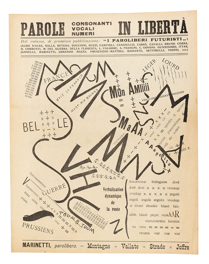
“Words in freedom” was more than a slogan. It was a complete rethinking of how text works on a page.
Marinetti’s 1913 manifesto on typographic revolution called for the destruction of “the typographic harmony of the page.” He wanted mixed letter sizes, bold type, italics, and what he called “typographical fantasies,” all crammed together to create visual noise.
This approach to type elements directly influenced concrete poetry decades later. It also shows up in punk zine design from the 1970s and Jamie Reid’s work for the Sex Pistols. David Carson’s deconstructivist layouts in Ray Gun magazine during the 1990s owe a clear debt to these Futurist experiments.
The Estorick Collection notes that parole in libertà was specifically designed to free words from the traditional page grid, and its influence on later graphic design was profound.
Even today’s kinetic typography in motion graphics traces a direct line back to Marinetti’s experiments with text that moved (or at least looked like it wanted to).
Futurism vs. Retrofuturism in Design
These two get confused constantly. Clients ask for “Futurism” and mean something completely different from what a design historian would recognize.
Original Futurism: early 1900s Italian movement, tied to industrialism, machines, and a violent break from tradition. Forward-looking. Aggressive. Political.
Retrofuturism: a late 20th and 21st-century aesthetic that reimagines past visions of the future. Think 1950s space-age diners, chrome surfaces, and flying car advertisements. Backward-looking with affection.
According to Shutterstock, a 2025 Deloitte survey found that more than six in ten younger workers worry AI will eliminate their jobs, which partly explains why retrofuturism resonates so strongly right now. It lets people engage with technology through a warmer, more optimistic lens.
Lummi identifies retro-futurism as one of the most popular graphic design trends heading into 2026, which tells you how much staying power this aesthetic has.
| Original Futurism | Retrofuturism | |
|---|---|---|
| Era | 1909–1944 | 1970s–present |
| Mood | Aggressive, destructive | Nostalgic, playful |
| Technology | Trains, cars, factories | Space ships, robots, neon |
| Palette | High-contrast blacks and reds | Chrome, pastels, neon gradients |
| Grid | Destroyed | Stylized but present |
Retrofuturism became especially popular in the early 2020s across culture, transport, architecture, and entertainment (Wikipedia). Brands like Glossier and Tesla have used retrofuturist aesthetics in recent campaigns.
If a client says “Futurist,” ask which one they mean. Your mileage may vary, but I’ve found most people actually want retrofuturism. The original is harder to sell commercially because it’s so raw and confrontational.
Key Designers and Works in the Futurist Tradition

A handful of names carry the weight of this entire movement. Some are well-known figures in design history, and others you might not have heard of at all.
Filippo Tommaso Marinetti
Founder. Chief propagandist. The man who published the Manifesto of Futurism at age 32 and spent the rest of his life promoting it through every medium he could reach.
His key contribution to graphic design was the concept of parole in libertà and its execution in Zang Tumb Tumb (1914). MoMA holds a copy in its permanent collection. It’s a 225-page book that depends entirely on industrial typography for visual impact, making it one of the first artist’s books to reject craftsmanship in favor of raw mechanical production.
Fortunato Depero
The commercial Futurist. Depero bridged fine art and advertising in ways that wouldn’t become common until Andy Warhol decades later.
His Bolted Book (1927) is recognized as the first modern-day artist’s book. He designed the still-iconic Campari Soda bottle in 1932. He created covers for Vanity Fair. He was the only Futurist to live and work in the United States for a sustained period.
TypeRoom describes his work as visual-verbal experiments with type that aimed to free language from conventional rules. The 2017 facsimile reprint raised over $250,000 on Kickstarter. People still want to own this thing.
Giacomo Balla and Others
Balla created phonovisual constructions following Marinetti’s lead and is best known for paintings like Dynamism of a Dog on a Leash (1912). His textile and graphic work applied Futurist principles of motion and rhythm to everyday objects.
Luigi Russolo experimented with noise music alongside his visual work. Umberto Boccioni’s sculpture Unique Forms of Continuity in Space (1913) became the movement’s most recognizable icon. Tullio Crali focused on the “aeropainting” phase, depicting flight and aerial landscapes during the 1930s.
Mordor Intelligence reports that logo and brand identity design held 31.35% of graphic design market share in 2025, a segment that directly benefits from the strong visual identity thinking that Futurist designers like Depero pioneered in commercial work.
How Futurism Influenced Modern Graphic Design
The line from 1909 Italy to your screen right now is shorter than you’d think.
The Swiss Connection
Swiss design (the International Typographic Style) valued grid systems, clean type, and rational composition. That sounds like the opposite of Futurism. But both movements shared a belief that typographic choices carry meaning beyond the words themselves.
Jan Tschichold, one of the architects of modern typography, was directly influenced by Marinetti’s typographic experiments according to Wikipedia’s entry on Zang Tumb Tumb. He took the energy and channeled it into structure.
Punk and New Wave
Jamie Reid’s work for the Sex Pistols in the 1970s. Neville Brody’s layouts for The Face magazine in the 1980s. Both borrowed Futurism’s disregard for conventional alignment and its willingness to make type aggressive and confrontational.
David Carson pushed this further at Ray Gun magazine in the 1990s, creating editorial layouts where readability was secondary to visual impact. Took me a while to appreciate his work, honestly. At first it just looked like chaos. But once you see the Futurist DNA in it, the intention becomes clear.
Digital Motion and Branding
Kinetic typography in video and web animation traces back to Futurist ideas about text in motion. Motion graphics as a field owes a lot to the Futurist obsession with capturing speed and energy in visual form.
Tech branding borrows Futurist energy too. Angular logos, speed-suggesting forms, and fragmented compositions show up in everything from gaming brands to crypto startups.
Kentley Insights reports the U.S. graphic design industry reached $17.5 billion in 2024, with an 8.6% annual growth rate over the previous three years. Within that growth, motion design and digital branding (both areas with clear Futurist roots) are expanding fastest.
The visual hierarchy techniques that Futurists pioneered, using scale and proportion to direct attention, are now standard practice. Every designer uses them, whether they know where the ideas came from or not.
Futurist Principles Applied in Contemporary Design Projects
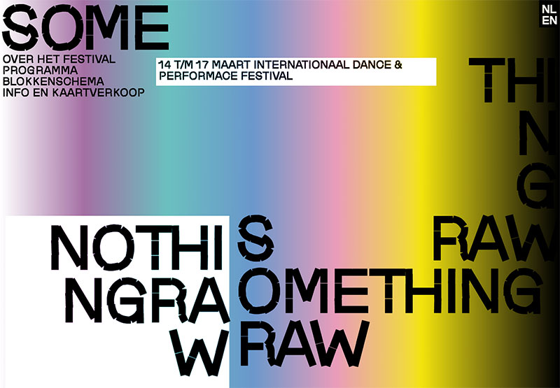
Futurist ideas didn’t stay locked in 1914. They keep showing up in work that most people wouldn’t even associate with an Italian art movement from over a century ago.
The LA Design Festival chose “Design Futurism” as its 2025 theme, inviting designers to explore connections between past, present, and future through poster design. That’s a direct nod to how alive these ideas remain in professional practice.
Event and Festival Branding
Music festivals and tech conferences lean hard on Futurist composition when they want to project high energy. Diagonal text, fragmented layouts, and aggressive color psychology borrowed straight from Marinetti’s playbook.
Coachella festival posters regularly use oversized type paired with abstract geometric shapes, a technique GDJ identifies as a top graphic design trend heading into 2025.
The difference between “inspired by” and “copying” matters here. Good festival branding takes the Futurist energy and filters it through a modern color palette. Bad festival branding just slaps diagonal text on everything and calls it done.
Digital Interfaces and UX Experiments
Parallax scrolling: creates depth and simulates motion as users navigate, a direct descendant of Futurist ideas about layered movement.
Kinetic type on landing pages: text that animates, scales, and rotates to grab attention before the user reads a single word.
Non-linear navigation: experimental layouts that reject the standard top-to-bottom scroll, pushing users to explore space more freely.
Envato Elements reports that retro futurism (which builds on original Futurist principles) is one of the eight styles shaping visual culture in 2026, with steady growth of 51% for “bold” and 49% for “electric” search terms across graphics and textures.
Packaging and Album Art
Futurist aesthetics in packaging design help products stand out. Striking geometric shapes, high-saturation color, and angular compositions signal that a product is forward-thinking.
Depero understood this in 1932 when he designed the Campari Soda bottle, still in production today. Companies like Tesla and SpaceX carry that same Futurist energy in their branding, using sharp lines and angular forms to communicate speed and progress (Align.vn).
| Application | Futurist Technique Used | Tools |
|---|---|---|
| Event posters | Diagonal composition, fragmented type | Illustrator, InDesign |
| Album artwork | Overlapping planes, photomontage | Photoshop, After Effects |
| UI/UX experiments | Kinetic typography, parallax layers | After Effects, CSS animations |
| Streetwear graphics | Bold geometric abstraction, high contrast | Illustrator, Procreate |
Criticism and Limitations of Futurism in Design
Every designer who borrows from Futurism should know what comes with it. The movement’s legacy is split right down the middle, between genuine visual innovation and some deeply uncomfortable politics.
The Fascism Problem
This is the big one. And no article about Futurism that skips it is being honest with you.
Marinetti founded the Futurist Political Party in 1918. It was absorbed into Mussolini’s Fasci Italiani di Combattimento in 1919, making Marinetti one of the first members of the National Fascist Party (Wikipedia).
The Gallerease research team notes that Futurism and fascism shared rhetoric around the glorification of war and violence, the primacy of Italian identity, and a general embrace of aggression as a creative force. Philosopher Benedetto Croce called Futurism the ideological origin of fascism.
Poster House in New York opened an exhibition in late 2025 called “The Future Was Then: The Changing Face of Fascist Italy,” exploring how Mussolini’s government used bold design and Futurist imagery to shape public opinion. The show featured 75 works and directly addressed how propaganda can hide behind eye-catching visuals.
The relationship was complicated, though. Marinetti eventually called Mussolini “a megalomaniac who will bit by bit turn into a reactionary.” He walked out of the 1920 Fascist party congress. But he also supported Italian fascism until his death in 1944. It’s a mess, and pretending otherwise doesn’t help anyone.
Readability vs. Visual Impact
Futurist display typography looks incredible. It also frequently sacrifices readability.
A 2024 study published in the journal Displays (ScienceDirect) found that text readability drops significantly when text is set at diagonal and vertical angles compared to horizontal layouts. The more directional variation, the worse the reading performance.
That’s a direct problem for Futurist-inspired work, where text regularly flies off at angles. Research from Adoc Studio confirms proper line spacing can improve reading accuracy by up to 20% and reduce eye strain by 30%. Futurist layouts tend to ignore both.
Toner Buzz research shows 85% of websites use sans-serif fonts for readability, and 94% of designers prioritize larger font sizes for emphasis. Futurist typography does the opposite of both these conventions on purpose.
Style Without Substance
The biggest trap: applying Futurist visuals without understanding the philosophy behind them.
Slapping diagonal lines and fragmented shapes onto a corporate brochure doesn’t make it Futurist. It makes it confusing. The original movement was driven by a specific worldview about speed, machines, and modernity. Strip that context away, and you just have decoration that makes things harder to read.
Some design educators treat Futurism as historically significant but practically limited. Your mileage may vary, but there’s a real risk of misplacing emphasis when the aesthetic is separated from the intent.
How to Identify Futurist Influence in a Design Piece
Recognizing Futurism when you see it is a practical skill. It comes up in portfolio reviews, client presentations, and design critiques more than you’d expect.
The Visual Checklist
Look for these when evaluating whether a piece draws from Futurist traditions:
- Text set on diagonals or arranged in non-linear patterns
- Motion lines or speed-suggesting forms
- Overlapping geometric planes and fragmented imagery
- Mechanical or industrial imagery (gears, vehicles, cityscapes)
- Deliberate rejection of traditional balance and symmetry
Not every piece with diagonal text is Futurist. The key difference is intentional disruption of the reading experience to create a sense of energy and forward motion.
Common Misattributions
People mix up Futurism with related movements all the time. Here’s a quick way to tell them apart:
| Movement | Key Difference from Futurism |
|---|---|
| Bauhaus | Functional, rational, grid-based. Order over chaos. |
| Art Deco | Decorative, luxurious, harmonious color. Elegance over aggression. |
| Constructivism | Political (Soviet), geometric, structured propaganda. |
| Grunge design | Textural decay, anti-corporate. Destruction without speed. |
If the piece feels organized and rational, it’s probably Bauhaus or Swiss-influenced. If it feels luxurious and symmetrical, lean toward Art Deco. Futurism specifically combines fragmentation with a sense of aggressive forward motion.
Using These Ideas in Design Critique
When reviewing a portfolio piece: ask whether the diagonal elements serve the concept or just fill space. Genuine Futurist influence means the composition is doing something, not just sitting there looking “edgy.”
G2 data shows 50% of internet users say website design shapes their brand opinions. If Futurist principles are applied well, they create energy and memorability. Applied poorly, they just create confusion.
At least in my experience, the best way to talk about Futurist influence in a critique is to reference specific elements and explain what they’re doing. “The diagonal type creates a sense of urgency” is useful feedback. “It looks Futuristic” is not.
The difference between deliberate variety and random chaos is always intent. And that’s true for design principles in general, not just Futurism.
FAQ on What Is Futurism In Graphic Design
What is Futurism in graphic design?
Futurism in graphic design is a visual style rooted in the early 20th-century Italian Futurist art movement. It uses diagonal composition, fragmented geometric shapes, and experimental typography to express speed, technology, and modernity. Filippo Tommaso Marinetti launched the movement in 1909.
What are the main characteristics of Futurist graphic design?
The main characteristics include dynamic typography, overlapping geometric forms, bold color palettes with high contrast, diagonal lines suggesting motion, and a deliberate rejection of traditional grid-based layouts. Everything is designed to feel kinetic.
Who were the most influential Futurist designers?
Filippo Tommaso Marinetti created the movement’s typographic foundation. Fortunato Depero brought Futurist ideas into advertising and commercial design. Giacomo Balla, Umberto Boccioni, and Luigi Russolo contributed across painting, sculpture, and graphic work.
How did Futurism influence modern graphic design?
Futurism shaped punk zine design, David Carson’s deconstructivist editorial layouts, and Neville Brody’s new wave work. Its ideas about kinetic typography directly influenced today’s motion graphics. Swiss design also absorbed its typographic energy into more structured form.
What is the difference between Futurism and Retrofuturism?
Original Futurism (1909-1944) was aggressive, political, and tied to Italian industrialism. Retrofuturism is a late 20th-century aesthetic that reimagines past visions of the future with nostalgia. Think 1950s space-age imagery versus Marinetti’s machine worship.
Why is Futurism controversial?
Italian Futurism had direct ties to fascism. Marinetti co-founded the Futurist Political Party, which merged into Mussolini’s movement in 1919. The glorification of war and violence in Futurist manifestos complicates its artistic legacy for many designers and historians.
What is parole in libertà in Futurist design?
Parole in libertà means “words in freedom.” Marinetti coined this concept to describe typography freed from linear layouts. Letters shift in size, fly at angles, and mix typefaces. His 1914 book Zang Tumb Tumb is the most recognized example.
How is Futurism used in contemporary design projects?
Designers apply Futurist principles in event posters, tech conference branding, album artwork, and experimental UI/UX layouts. Parallax scrolling, kinetic type on landing pages, and angular logo design all draw from Futurist ideas about motion and energy.
What tools do designers use to create Futurist-inspired work?
Adobe Illustrator handles geometric fragmentation and angular compositions. After Effects is the go-to for kinetic typography and motion work. Photoshop supports photomontage techniques. CSS animations bring Futurist energy into web interfaces.
Can Futurist design principles hurt readability?
Yes. Diagonal and multi-directional text significantly reduces reading performance, according to a 2024 study in the journal Displays. Futurist typography prioritizes visual impact over legibility, so designers must balance energy with clarity when applying these techniques.
Conclusion
Understanding what is Futurism in graphic design means grasping a movement that rewired how designers approach visual communication. From Marinetti’s parole in libertà to Depero’s Campari advertisements, the Futurists proved that the printed page could carry the energy of a speeding train.
Their ideas about asymmetric composition, dynamic typography, and fragmented imagery still shape how we build poster layouts, brand identities, and digital interfaces today.
The political baggage is real. You can’t separate the visual innovation from the fascist connections without being dishonest about history.
But the design principles themselves remain powerful tools. Diagonal lines still create urgency. Overlapping planes still suggest depth. Kinetic type still grabs attention faster than anything sitting flat on a grid.
Use the techniques deliberately. Know where they came from. And always make sure the energy serves the message, not the other way around.

Renowned for his expertise in logo design and visual branding, Bogdan has developed a multitude of logos for various clients.
His skills extend to creating posters, vector illustrations, business cards, and brochures. Additionally, Bogdan's UI kits were featured on marketplaces like Visual Hierarchy and UI8.
He also wrote in the past years on sites like Design Your Way, WebDesignerDepot, WPDean, Designmodo, Speckyboy, Slider Revolution, and more.
- Minecraft Font Generator - 8 October 2026
- How Top Meta Ad Creative Is Designed for E-commerce Brands - 8 October 2026
- How photo recovery software works and when to use it - 7 October 2026

Bogdan Sandu is a seasoned designer who has been designing websites since 2008. Renowned for his expertise in logo design and visual branding, Bogdan has developed a multitude of logos for various clients. His skills extend to creating posters, vector illustrations, business cards, and brochures. Additionally, Bogdan's UI kits were featured on marketplaces like Visual Hierarchy and UI8. He also wrote in the past years on sites like Design Your Way, WebDesignerDepot, WPDean, Designmodo, Speckyboy, Slider Revolution, and more.
You Might Also Like