The Thor logo is one of the most recognized symbols in Marvel Comics and the Marvel Cinematic Universe, representing the Asgardian god of thunder across decades of comic books, films, and merchandise. Built around Mjolnir, Thor’s legendary hammer, the logo captures power, myth, and heroic identity in a single visual mark. Its design has shifted across different media, but the core identity stays consistent: bold, forceful, unmistakably Norse-inspired. Within the broader history of superhero logos, Thor’s mark holds a distinct place, rooted in mythology rather than pure comic-book convention.
Current version: Updated for Thor: Love and Thunder (2022)
Iterations: Multiple versions across comics (1962-present) and MCU films (2011-2022)
Original designer: Jack Kirby (comic origins), various Marvel Studios designers for film adaptations
What is the Thor Logo?
The Thor logo is a Marvel Comics emblem centered on Mjolnir, the mythological Norse hammer, paired with bold stylized typography. First introduced in Journey into Mystery #83 in August 1962, the logo was initially shaped by Jack Kirby’s signature style. It functions as a symbol of divine power, Norse heritage, and Asgardian warrior identity across comics and film.
- Design Type: Combination mark (icon + wordmark), also used as standalone emblem
- Primary Elements: Mjolnir hammer symbol, bold serif-influenced lettering, lightning motifs
- Official Introduction Date: August 1962 (comic), 2011 (MCU film version)
- Designer/Agency: Jack Kirby (original), Marvel Studios Design Team (MCU adaptations)
- Trademark Status: Registered trademark of Marvel Entertainment, LLC (subsidiary of The Walt Disney Company)
- Color Palette: Primary silver/grey (#A8A9AD), dark navy (#1B2A4A), gold (#C9A84C), with red accents (#C0392B) in select versions
- Usage Context: Comic book covers, film title cards, merchandise, digital platforms, theme park branding, promotional materials
How Has the Thor Logo Evolved Over Time?
The Thor logo has gone through significant changes since 1962, moving from Jack Kirby’s raw, energetic comic style through Walt Simonson’s heavier Norse-influenced redesigns, and eventually into the sleek MCU treatment built for global film audiences. Each phase reflects both the creative direction of the era and shifting expectations around superhero branding.
Original Thor Logo (1962-1966)
- Years Active: 1962-1966
- Design Description: Hand-lettered bold serif title treatment with dynamic, slightly irregular letterforms; Mjolnir depicted realistically as a short-handled war hammer
- Color Scheme: Primary red, yellow, and black typical of Silver Age comics printing
- Designer: Jack Kirby (with lettering by Artie Simek)
- Context: Introduced in Journey into Mystery #83 during Marvel’s Silver Age explosion; Thor was positioned as a mythological counterpart to purely sci-fi characters
- Key Changes from Previous: N/A, first version
- Cultural Significance: Established the visual connection between Norse mythology and American superhero comics; Kirby’s design gave the character immediate visual authority
Bronze Age Redesign (1966-1983)
- Years Active: 1966-1983
- Design Description: Title lettering became more standardized as Marvel moved toward consistent house styles; Mjolnir imagery became more prominent on covers
- Color Scheme: Wider use of blue and silver alongside the red and yellow base
- Designer: Various Marvel bullpen artists and letterers
- Context: Marvel standardizing its visual identity across titles during rapid expansion
- Key Changes from Previous: More polished lettering, less raw energy than Kirby’s originals
- Cultural Significance: Helped anchor Thor as a top-tier Marvel character alongside Spider-Man and the Fantastic Four
Walt Simonson Era (1983-1987)
- Years Active: 1983-1987
- Design Description: Heavier, more aggressive logo treatment reflecting Simonson’s Norse-influenced art direction; runic textures and stronger hammer iconography
- Color Scheme: Deeper blues, iron greys, and gold accents
- Designer: Walt Simonson
- Context: Simonson’s legendary run pushed Thor deeper into Norse mythology, and the visual identity followed
- Key Changes from Previous: More mythological weight; heavier stroke widths; Mjolnir given near-symbolic prominence
- Cultural Significance: Widely considered the definitive Thor era; Simonson’s design sensibility still influences Thor branding today
Modern Marvel Comics Logo (1987-2010)
- Years Active: 1987-2010
- Design Description: Cleaner, more commercially polished treatment; Marvel’s evolving house style took over with more standardized type; lightning motifs introduced more prominently
- Color Scheme: Silver, blue, and red; more metallic finishes as printing technology improved
- Designer: Marvel Comics Design Department
- Context: Marvel navigating bankruptcy, recovery, and eventual acquisition by Disney; branding needed to work across more media
- Key Changes from Previous: Loss of Simonson’s raw Norse aesthetic; more corporate and consistent with other Marvel titles
- Cultural Significance: Bridged the gap between comic-only identity and the emerging multimedia Marvel brand
MCU Film Logo (2011-present)
- Years Active: 2011-present
- Design Description: Cinematic title treatment using custom letterforms with a chiseled, stone-carved quality; Mjolnir rendered in photorealistic 3D for promotional materials; lightning integrated directly into letterforms in later film iterations
- Color Scheme: Dark navy (#1B2A4A), silver-grey (#A8A9AD), with gold (#C9A84C) highlights; Thor: Ragnarok (2017) introduced more vibrant, retro color treatment
- Designer: Marvel Studios Design Team (various leads across productions)
- Context: Chris Hemsworth’s casting and the MCU’s global reach required a logo that worked across film, merchandise, theme parks, and digital platforms simultaneously
- Key Changes from Previous: Fully 3D-capable design; metallic finish replacing flat comic color; typography with chiseled weight suggesting stone and iron
- Cultural Significance: The MCU version became the globally dominant Thor visual identity, recognizable across dozens of countries and age groups
What Do the Design Elements of the Thor Logo Mean?
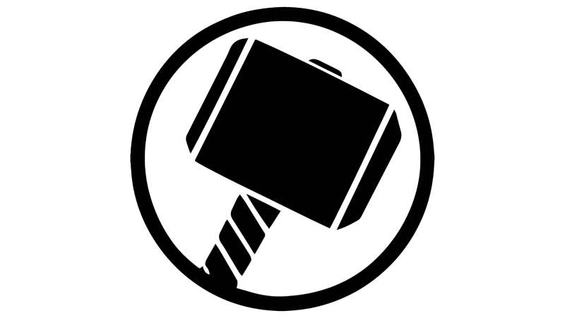
Every part of the Thor logo connects back to Norse mythology, Marvel’s storytelling legacy, or both. The hammer, the letterforms, the color palette – none of it is arbitrary. Kirby’s original instinct to ground Thor’s identity in mythological iconography rather than purely comic-book convention turned out to be a long-term design decision that every subsequent version has respected.
Mjolnir sits at the center of the logo’s symbolism. In Norse mythology, it represents divine protection, elemental power, and the right to rule. Marvel took that directly and kept it intact.
The visual emphasis always falls on either the hammer symbol or the word “Thor” itself, depending on the version. The two elements compete for attention in a way that actually works – the tension between text and symbol creates energy rather than confusion.
What Does the Mjolnir Symbol Represent in the Thor Logo?
Mjolnir is the anchor of the entire visual identity.
In Norse tradition, the hammer was a tool of protection – worn as amulets across Scandinavia for centuries. Marvel kept that protective symbolism and layered in the idea of worthiness, which became central to Thor’s character arc.
The short, thick handle and oversized head give Mjolnir an immediately readable silhouette. It works at any size, which is partly why it became the go-to standalone mark for Thor merchandise.
Why Did Thor’s Designers Choose These Specific Colors?
- Silver/Grey (#A8A9AD)
- Symbolic meaning: Iron, steel, Asgardian armor, divine craftsmanship
- Psychological impact: Strength, reliability, timelessness
- Brand connection: Differentiates Thor from warm-toned heroes like Iron Man; suggests myth over technology
- Dark Navy (#1B2A4A)
- Symbolic meaning: The night sky, cosmic scale, Asgardian depth
- Psychological impact: Authority, gravitas, mystery
- Brand connection: Creates visual separation from Marvel’s brighter red-dominant branding
- Gold (#C9A84C)
- Symbolic meaning: Royalty, Asgardian wealth, divine status
- Psychological impact: Prestige, warmth, power
- Brand connection: Ties to Thor’s role as a prince of Asgard; connects to gold logos historically used for premium or regal identity systems
- Red (#C0392B) – accent in select versions
- Symbolic meaning: Thor’s signature cape, battle energy, danger
- Psychological impact: Urgency, action, heroism
- Brand connection: Aligns Thor with Marvel’s broader red-dominant superhero color language
Understanding how these colors interact requires some grounding in color theory – the silver-gold pairing specifically relies on a near-complementary relationship that reads as both regal and industrial at the same time.
What Typography Style Is Used in the Thor Logo?
The original Kirby-era lettering was hand-drawn, with thick strokes and slightly rough edges that matched the kinetic energy of Silver Age comics.
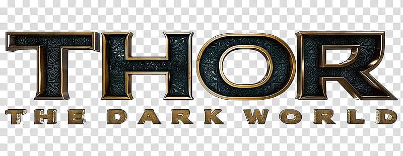
MCU versions shifted toward custom letterforms with a chiseled quality – each letter looks like it was carved from stone or cut from metal. No standard commercial typeface fits this description exactly; Marvel Studios consistently uses bespoke or heavily modified type for major character titles.
The letterforms sit somewhere between a serif font and a slab construction – the serifs, when present, are thick and squared rather than delicate. This gives the wordmark weight and presence even at small sizes. The tracking is tight, keeping the word compact and powerful rather than spread out.
Thor: Ragnarok broke this pattern deliberately, using a retro, almost psychedelic treatment that reflected the film’s Jack Kirby homage and its more playful tone.
What Are the Hidden Meanings in the Thor Logo?
The most discussed “hidden” element isn’t exactly hidden – Mjolnir’s design intentionally mirrors the shape of a cross when viewed straight on.
This wasn’t accidental. Kirby and the Marvel team were aware of the Christian-pagan overlay in Norse myth, and the hammer-as-cross silhouette reinforces Thor’s divine protector role without stating it directly.
In later MCU versions, lightning is sometimes embedded within the letterforms themselves, specifically in the crossbar of the “H” and the top stroke of the “T.” Most people don’t notice it consciously, but it registers.
The focal point of the hammer design places the head slightly off-center when combined with the handle – this subtle asymmetry creates a sense of motion, as if Mjolnir is mid-swing rather than static.
How Does the Thor Logo Compare to Competitor Logos?
Among Marvel characters, Thor’s logo is the most mythologically grounded. Most superhero marks lean on geometry, initials, or abstract shapes – Thor uses an actual artifact from a specific cultural tradition, which gives it a different kind of authority.
Compare it to a few direct counterparts within the MCU and broader superhero space:
- vs. Captain America logo: Cap’s shield is purely geometric – symmetrical, simple, flag-coded. Thor’s Mjolnir is asymmetrical, myth-coded, and culturally specific. Cap signals patriotism; Thor signals antiquity.
- vs. Iron Man logo: Iron Man’s arc reactor mark is tech-forward and futuristic. Thor’s hammer is the opposite – ancient, hand-forged, mythological. The contrast is intentional within the Avengers ensemble.
- vs. Spider-Man logo: Spider-Man’s spider mark is simpler, more universally readable, and functions better as a pure icon at micro sizes. Thor’s Mjolnir has more cultural specificity but slightly less instant recognition outside its fanbase.
- vs. Wonder Woman logo: Both characters draw from mythology (Norse vs. Greek), and both logos reflect that. Wonder Woman’s WW eagle mark is more abstract; Thor’s hammer is more literal. Both work, but Thor’s is more grounded in a specific object.
- vs. Black Panther logo: Black Panther’s claw mark uses negative space and animal symbolism. Thor’s uses artifact symbolism. Black Panther’s reads more modern; Thor’s reads more ancient. Different audiences, different emotional registers.
Within the broader set of superhero logo designs, Thor’s stands out for being both object-based and mythology-specific – a combination very few other marks pull off.
What Are the Technical Specifications of the Thor Logo?
Official Color Codes
- Primary Color: Silver/Grey
- Hex: #A8A9AD
- RGB: (168, 169, 173)
- CMYK: (3, 2, 0, 32)
- Pantone: Cool Gray 6 C
- Secondary Color: Dark Navy
- Hex: #1B2A4A
- RGB: (27, 42, 74)
- CMYK: (64, 43, 0, 71)
- Pantone: 289 C
- Accent Color: Gold
- Hex: #C9A84C
- RGB: (201, 168, 76)
- CMYK: (0, 16, 62, 21)
- Pantone: 124 C
- Accent Color: Red (select versions)
- Hex: #C0392B
- RGB: (192, 57, 43)
- CMYK: (0, 70, 78, 25)
- Pantone: 485 C
For print applications, these values should be converted to CMYK to maintain accuracy. Digital use runs on RGB, with the hex values above as the reference. For brand-critical print work, the Pantone references ensure color consistency across different printers and substrates.
Dimensions and Proportions
- Aspect ratio: Varies by version; the standalone Mjolnir mark is approximately 1:1.3 (width to height); the full wordmark with hammer runs approximately 3:1
- Minimum size requirements: Mjolnir standalone icon: minimum 24px digital / 0.5 inch print; full wordmark: minimum 80px digital / 1.5 inch print
- Clear space specifications: Minimum clear space equal to the height of the “T” in the wordmark on all sides
- Official usage guidelines: Governed by Marvel Entertainment’s trademark guidelines; any commercial use requires licensing through Disney/Marvel; fan use permitted for non-commercial personal projects under Marvel’s fan policy
- File formats: Official assets distributed as vector graphics (EPS/SVG) for scalable use; raster versions available as high-DPI PNG files
What Cultural Impact Has the Thor Logo Had?
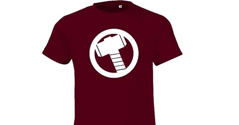
The Thor logo crossed from comic branding into genuine cultural iconography well before the MCU arrived. Mjolnir reproductions – rings, necklaces, patches, tattoos – have existed as non-Marvel products for decades, simply because the hammer is an ancient symbol that predates the comics by over a thousand years.
The MCU amplified this massively. After 2011, Mjolnir merchandise became one of Marvel’s top-selling categories globally, competing directly with Spider-Man’s spider symbol and Captain America’s shield for retail dominance.
The logo also became a touchstone in discussions around Norse pagan revival communities, some of whom had complicated feelings about seeing their religious symbol commodified at Disney scale. That tension adds a layer of cultural weight that most superhero logos simply don’t carry.
Thor: Ragnarok’s redesigned logo – brighter, more retro, clearly Kirby-homage – sparked genuine conversation in design communities about how far a franchise could flex its visual identity without losing recognition. The answer, apparently, is quite far.
The Mjolnir symbol also shows up in unexpected places: military unit patches, sports team fan gear, fitness brand logos, and tattoo studios worldwide. Most of these uses have nothing to do with Marvel. The symbol has genuine life outside the franchise, which is rare for superhero branding.
How Does the Thor Logo Fit Into the Overall Brand Identity?
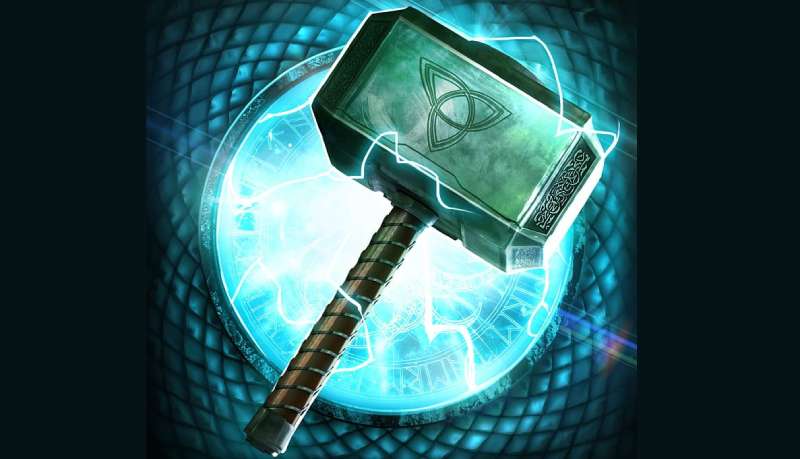
Thor’s logo doesn’t exist in isolation. It operates within a layered network of connected identities – the Avengers ensemble, the broader Marvel Cinematic Universe, and Marvel Entertainment as a whole.
Within the Avengers group, each character’s logo is designed to be distinct enough to stand alone but coherent enough to work together on ensemble merchandise. Thor’s silver-and-navy palette sits comfortably next to Cap’s red-white-blue and Iron Man’s red-gold without clashing.
The Mjolnir symbol functions as a modular element across the brand. It appears on its own without the “Thor” wordmark on much of the merchandise, because it’s recognizable enough to carry the identity solo. That’s a sign of strong logo design – when the icon works independently of the text.
Thor’s visual identity also connects upward to the Marvel Studios master brand. The visual hierarchy in film marketing typically places the Marvel Studios logo at the top, followed by the film-specific Thor title treatment, with Mjolnir as a supporting graphic element. This hierarchy is consistent across all MCU properties.
The brand guidelines governing Thor’s logo sit within Marvel’s broader trademark and licensing framework, managed by Disney. This means the logo adapts across different contexts – from packaging design to poster design to digital platforms – while maintaining core consistency in the Mjolnir symbol and color palette.
How Should the Thor Logo Be Used?
Official Usage Guidelines
Do’s:
- Use official Marvel-supplied logo files, not fan recreations, for any licensed commercial application
- Maintain the clear space specifications around the logo on all materials
- Use the correct color versions – dark backgrounds call for the silver/gold version; light backgrounds require the navy-dominant version
- Reproduce the logo at or above minimum size requirements to maintain legibility
- Follow Marvel’s brand style guide for any officially licensed product
Don’ts:
- Don’t distort, rotate, or stretch the logo outside its established proportions
- Don’t apply unapproved color treatments or overlays
- Don’t combine the Thor logo with other brand marks without explicit Marvel approval
- Don’t use the logo on commercial products without a valid Marvel/Disney license
- Don’t reproduce the logo as a bitmap trace from low-resolution sources – always start from official vector files
- Don’t use JPEG format for logo files when transparency is required; use PNG or SVG instead
Where to Access Official Logos
- Licensed partners: Marvel’s official licensing portal provides approved assets to verified commercial partners
- Press/media: Marvel’s press site (marvel.com/press) offers approved media assets for editorial coverage
- Fan/personal use: Marvel permits non-commercial fan use under its stated fan policy; assets should still be sourced from official channels where possible
Licensing and Trademark Details
- Trademark holder: Marvel Entertainment, LLC (The Walt Disney Company)
- Trademark registration: Filed across multiple international jurisdictions covering apparel, entertainment, publishing, and digital goods
- Licensing inquiries: Directed through Marvel’s official licensing department via marvel.com
- Fan art policy: Marvel generally tolerates non-commercial fan art and personal use; commercial fan art using trademarked elements without a license remains a legal risk
FAQ on The Thor Logo
What is the Thor logo based on?
The Thor logo is built around Mjolnir, the hammer of Norse mythology.
Jack Kirby introduced this visual identity in 1962, pulling directly from Viking iconography and Asgardian warrior tradition rather than inventing a purely fictional symbol.
Who designed the original Thor logo?
Jack Kirby created the original Thor visual identity for Marvel Comics in 1962.
Lettering was handled by Artie Simek. The MCU film versions were developed by the Marvel Studios design team across multiple productions starting with the 2011 film.
How many times has the Thor logo changed?
The logo has gone through at least five distinct phases.
These include Kirby’s Silver Age original, the Bronze Age standardization, Walt Simonson’s Norse-heavy redesign in 1983, the modern Marvel comics treatment, and the MCU cinematic version introduced in 2011.
What colors are in the Thor logo?
The primary color palette uses silver-grey (#A8A9AD), dark navy (#1B2A4A), and gold (#C9A84C).
Some versions include red accents tied to Thor’s cape. The saturation levels shift between comic and film versions, with MCU designs leaning toward deeper, more metallic tones.
Is the Mjolnir symbol trademarked?
Marvel’s specific Mjolnir design and the Thor character branding are registered trademarks of Marvel Entertainment, LLC.
The hammer symbol itself predates Marvel by over a thousand years as a Norse cultural artifact, so the ancient symbol isn’t owned – but Marvel’s particular rendering of it is protected.
What font is used in the Thor logo?
There is no standard commercial font used. Marvel Studios uses custom letterforms with a chiseled, stone-carved quality built specifically for each film’s title treatment.
The kerning is tight, giving the wordmark a compact, forceful presence rather than an open, approachable feel.
How does the Thor logo compare to other Avengers logos?
Thor’s mark is the most mythologically specific among the Avengers ensemble logos.
Where the Hawkeye logo uses a simple arrow motif and the Black Widow logo leans on a graphic hourglass shape, Thor’s design draws from a real cultural artifact with centuries of meaning behind it.
Can I use the Thor logo for fan art?
Marvel generally tolerates non-commercial fan use under its stated fan policy.
Using the Thor comic logo or Mjolnir symbol on items you sell is a different matter. That requires a valid Marvel license, and enforcement varies. Personal, non-commercial projects sit in a much safer space.
What makes the Thor logo unique among superhero logos?
Most superhero logos use abstract shapes, initials, or animal symbols. Thor’s uses a real mythological artifact.
The Mjolnir symbol carries genuine cultural weight in Norse pagan tradition, which gives the logo a layer of meaning that purely fictional marks like the Green Lantern ring symbol simply don’t have.
Where can I download the official Thor logo?
Official assets are available to licensed commercial partners through Marvel’s licensing portal.
For press and editorial use, Marvel’s press site provides approved files. Fan use should pull from official sources where possible, avoiding low-resolution pixel-based recreations that degrade at scale.
Conclusion
The Thor logo is more than franchise branding – it’s a visual identity built on a thousand years of Norse warrior symbolism, refined across six decades of Marvel Comics and MCU film production.
Few superhero marks carry that kind of cultural depth. The Mjolnir hammer design works because it connects to something real, not just a fictional universe.
From Jack Kirby’s raw Silver Age lettering to the cinematic Asgardian emblem seen in Thor: Love and Thunder, every iteration has respected the core mythology while adapting to its era.
That balance between consistency and flexibility is exactly what makes the logo last.

Renowned for his expertise in logo design and visual branding, Bogdan has developed a multitude of logos for various clients.
His skills extend to creating posters, vector illustrations, business cards, and brochures. Additionally, Bogdan's UI kits were featured on marketplaces like Visual Hierarchy and UI8.
He also wrote in the past years on sites like Design Your Way, WebDesignerDepot, WPDean, Designmodo, Speckyboy, Slider Revolution, and more.
- The Windsurf Logo History, Colors, Font, And Meaning - 10 October 2026
- How to Remove Background From Product Photos (No Photoshop) - 10 October 2026
- How Designers can Build a Stronger Online Creative Identity - 9 October 2026

Bogdan Sandu is a seasoned designer who has been designing websites since 2008. Renowned for his expertise in logo design and visual branding, Bogdan has developed a multitude of logos for various clients. His skills extend to creating posters, vector illustrations, business cards, and brochures. Additionally, Bogdan's UI kits were featured on marketplaces like Visual Hierarchy and UI8. He also wrote in the past years on sites like Design Your Way, WebDesignerDepot, WPDean, Designmodo, Speckyboy, Slider Revolution, and more.
You Might Also Like