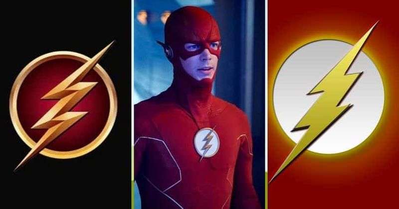
The Flash logo is one of the most recognizable symbols in comic book history. A bold yellow lightning bolt set against a red or white circular background, it has represented DC Comics’ fastest hero since the Golden Age of comics. The symbol has gone through several changes across decades, TV shows, and films, but its core idea has stayed the same: speed, power, and forward motion. As a piece of logo design within the broader world of superhero logos, it stands apart for how much meaning it packs into such a simple shape.
The character first appeared in 1940, and the lightning bolt emblem has been attached to his identity almost from the start. Over the decades, different versions of the Flash, including Jay Garrick, Barry Allen, and Wally West, each carried slight variations of the mark. That’s a long run for any symbol.
What Is the Flash Logo?
The Flash logo is a stylized yellow lightning bolt centered on a white or red circular field, stitched onto the chest of the hero’s suit. It was first introduced in its modern form during the Silver Age of comics in 1956 with Barry Allen, though Jay Garrick’s 1940 version carried a winged helmet as his primary mark. The symbol represents raw speed and electrical energy, directly tied to the Speed Force, the fictional energy source that powers the character.
- Design Type: Emblem / icon mark
- Primary Elements: Stylized lightning bolt, circular background field
- Official Introduction Date: 1956 (Silver Age Barry Allen version); 1940 (Jay Garrick original)
- Designer/Agency: Carmine Infantino (Silver Age redesign); Harry Lampert (original 1940 design)
- Trademark Status: Trademarked by DC Comics / Warner Bros. Discovery
- Color Palette: Red (#CC0000), Yellow (#FFD700), White (#FFFFFF)
- Usage Context: Comic books, TV series costumes, film productions, merchandise, licensed apparel, digital platforms
How Has the Flash Logo Evolved Over Time?
The Flash symbol has gone through several distinct phases, tracking closely with changes in the comics industry and the different characters who wore the suit. From a winged helmet in 1940 to a sleek TV-ready chest emblem in 2014, the design has shifted with each era.
Original Flash Logo (1940–1956)
- Years Active: 1940–1956
- Design Description: Jay Garrick’s version used a winged Mercury helmet rather than a chest bolt. When a lightning bolt appeared on his shirt, it was relatively simple and unrefined by later standards.
- Color Scheme: Red and yellow, with a blue shirt in early appearances
- Designer: Harry Lampert, Gardner Fox
- Context: Created during the Golden Age of comics when superhero visual identity was still being worked out
- Key Changes from Previous: First version; no prior iteration
- Cultural Significance: Established the idea of a speed-based hero with a visually distinct symbol tied to electricity
Silver Age Flash Logo (1956–1985)
- Years Active: 1956–1985
- Design Description: Barry Allen’s version introduced the clean, pointed yellow lightning bolt on a white circle against a red suit. This is the version most people picture when they think of the Flash.
- Color Scheme: Red suit, yellow lightning bolt, white circular field
- Designer: Carmine Infantino
- Context: Part of DC’s Silver Age relaunch of classic characters with modernized looks
- Key Changes from Previous: Moved away from the winged helmet as the primary mark; introduced the chest emblem as the central identity symbol
- Cultural Significance: Defined the visual identity of the Flash for generations and became the template for every version that followed
Wally West Era Logo (1985–2000s)
- Years Active: 1985–2000s
- Design Description: Wally West took over as the Flash after Crisis on Infinite Earths. His suit kept the same lightning bolt emblem but was rendered with slightly more dynamic proportions in different artists’ hands.
- Color Scheme: Red and yellow, consistent with Barry Allen’s palette
- Designer: Various DC Comics artists
- Context: Wally became the primary Flash following Barry Allen’s death in Crisis on Infinite Earths (1985)
- Key Changes from Previous: Minimal changes to the core emblem; some costume details varied by artist
- Cultural Significance: Kept the symbol alive and culturally relevant through the 1990s and 2000s
New 52 and DCEU Logo (2011–Present)
- Years Active: 2011–present
- Design Description: The New 52 relaunch and later the DC Extended Universe both pushed the logo into harder, more angular territory. The lightning bolt became sharper. The DCEU version worn by Ezra Miller features intricate texturing and a more complex suit with the bolt integrated into armor-style design.
- Color Scheme: Darker red tones, gold rather than pure yellow
- Designer: DC Comics design team; costume design by various film production designers
- Context: Driven by a push toward darker, more cinematic superhero aesthetics
- Key Changes from Previous: More angular bolt, darker overall palette, integration with textured suit design
- Cultural Significance: Reflects the modern trend of grounding comic book visuals in a more realistic aesthetic
CW Television Series Logo (2014–2023)
- Years Active: 2014–2023
- Design Description: Grant Gustin’s TV version used a clean, classic lightning bolt on a red suit, closer to the Silver Age original than the DCEU version. It felt deliberately accessible and faithful to the comic source.
- Color Scheme: Bright red, yellow-gold lightning bolt
- Designer: CW/WB costume design department
- Context: Part of the Arrowverse TV universe, designed to appeal to both longtime fans and new viewers
- Key Changes from Previous: Pulled back from the complexity of the New 52 look; cleaner and more traditional
- Cultural Significance: Introduced the Flash symbol to an entirely new TV audience over nearly a decade
What Do the Design Elements of the Flash Logo Mean?
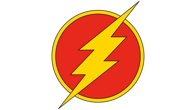
The lightning bolt is the whole story. It communicates speed, electricity, and decisive action in a single glance, which is exactly what a superhero emblem needs to do. The circular frame grounds it, giving the bolt a focused focal point rather than letting it scatter visually. Together, they create something that reads clearly at any size, on a comic page or a piece of merchandise across a room.
What Does the Lightning Bolt Symbolize in the Flash Logo?
Lightning has carried meaning across cultures for thousands of years. It’s fast, unpredictable, and powerful.
In the context of the Flash, it directly maps to the character’s core ability: moving faster than anything else.
It also connects to the Speed Force, the energy field that gives the Flash his power, which is described in the comics as a kind of living lightning.
Beyond the fictional lore, the bolt is just effective design. Sharp, directional, instantly readable.
What Is the Historical Context Behind the Symbol?
Lightning as a symbol predates comics by a long time. Ancient mythologies from Zeus to Thor used it to represent divine power and speed.
When Golden Age comic creators needed a visual shorthand for the fastest man alive, lightning was the obvious choice.
It also fit neatly within the graphic design movements of the 1940s, where bold, simple symbols were standard practice for hero branding.
What Cultural References Does the Logo Draw From?
The winged helmet of Jay Garrick’s original Flash was a direct nod to Hermes, the Greek messenger god associated with speed and communication.
Barry Allen’s chest bolt moved away from mythology and toward a more modernist, minimalist design sensibility.
That shift reflected the broader cultural turn in the 1950s toward clean, functional design over decorative symbolism.
Why Did the Flash Choose These Specific Colors?
- Red
- Hex: #CC0000 / Pantone: 186 C
- Symbolic meaning: Urgency, action, danger
- Psychological impact: Triggers alertness and attention; the eye moves to red quickly
- Brand connection: Reinforces the sense of speed and high energy
- Yellow / Gold
- Hex: #FFD700 / Pantone: 116 C
- Symbolic meaning: Energy, electricity, optimism
- Psychological impact: Reads as bright and fast; high contrast against red makes the bolt pop immediately
- Brand connection: Directly references the electrical nature of the Speed Force
- White
- Hex: #FFFFFF
- Symbolic meaning: Clarity, precision
- Psychological impact: Creates a clean separation between the bolt and the suit
- Brand connection: Keeps the emblem readable across different background contexts
The red and yellow combination is one of the most high-contrast pairings in color theory. It’s not accidental that fast food brands and warning signs use the same combination. Your brain processes it fast, which is fitting.
What Typography Style Is Used in the Flash Logo?
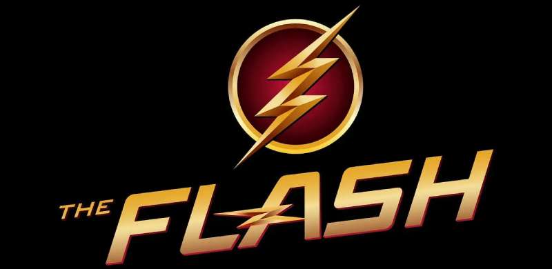
The Flash logo is almost entirely symbol-based, so typography plays a secondary role in the emblem itself.
When wordmarks or title treatments appear, they typically use bold, italicized letterforms with strong forward lean, reinforcing the motion and speed of the character.
The CW series used a custom italic sans-serif font in its title card, sharp and angled, leaning slightly right to suggest forward motion.
DC Comics title treatments over the decades have varied, but the consistent thread is weight and forward lean. Nothing upright, nothing slow-looking.
What Are the Hidden Meanings in the Flash Logo?
The directional lean of the lightning bolt points forward and slightly downward, which subliminally suggests forward motion and descent, like something moving faster than it can stop.
The pointed tip of the bolt is often designed to break out of the circular frame slightly, a subtle detail that reinforces the idea of the Flash breaking through limits.
Infantino’s Silver Age design also built a sense of visual hierarchy into the emblem: the wider top of the bolt draws the eye first, then pulls it downward, mimicking the feeling of acceleration.
Whether all of that was intentional is hard to say. But it works.
How Does the Flash Logo Compare to Competitor Logos?
Within DC’s own roster, the Flash logo is more kinetic than most. Superman’s S-shield carries weight and stability. Batman’s symbol projects fear through its sharp wings. The Flash bolt is all forward energy, no stillness. Among Marvel equivalents, the Spider-Man logo uses a similarly simple motif but relies on the full body silhouette rather than a chest emblem.
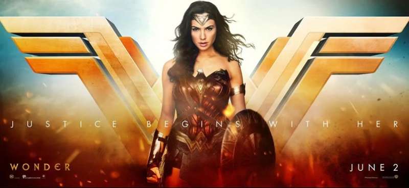
Compared to the Wonder Woman logo, which uses an eagle-wing double-W, the Flash emblem is simpler and more abstract.
The Captain America logo, a circular shield with a star, shares the circular containment strategy but reads as defensive rather than offensive.
The Iron Man logo centers on technology and geometry. The Flash logo, by contrast, feels organic despite its simplicity, more like a force of nature than a machine.
Among red logos across entertainment and branding, the Flash emblem is unusual in how much it relies on a secondary color (yellow) to carry the actual symbol. The red is costume; the yellow is identity.
What Are the Technical Specifications of the Flash Logo?
Official Color Codes
- Primary Color: Red
- Hex: #CC0000
- RGB: (204, 0, 0)
- CMYK: (0, 100, 100, 20)
- Pantone: 186 C
- Secondary Color: Yellow/Gold
- Hex: #FFD700
- RGB: (255, 215, 0)
- CMYK: (0, 16, 100, 0)
- Pantone: 116 C
- Accent Color: White
- Hex: #FFFFFF
- RGB: (255, 255, 255)
- CMYK: (0, 0, 0, 0)
- Pantone: White
Dimensions and Proportions
- Aspect ratio: Approximately 1:1 (circular emblem field)
- Minimum size requirements: The emblem should not be reproduced smaller than 0.5 inches in diameter in print contexts to maintain legibility of the bolt shape
- Clear space specifications: A minimum clear space equal to the radius of the circular emblem should be maintained on all sides
- File formats: Officially distributed as vector graphics for scalability; raster versions provided as JPEG and PNG for digital use
- Resolution: Print assets require minimum 300 DPI; digital assets typically at 72–96 PPI
- Official usage guidelines: Governed by DC Comics / Warner Bros. Discovery brand and licensing teams
What Cultural Impact Has the Flash Logo Had?
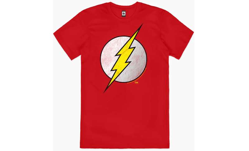
Few symbols travel as far as the Flash lightning bolt has. It shows up on Halloween costumes worn by kids who have never read a comic, on t-shirts in countries where the CW show never aired, on phone cases and tattoos and fan art across every platform.
That reach is partly because the symbol is so simple.
A lightning bolt on a red circle doesn’t need context to read as “the Flash” to anyone who grew up with the character. That’s the mark of genuinely effective logo design principles at work.
The Grant Gustin TV run from 2014 to 2023 gave the emblem a nine-year stretch of weekly visibility that no comic run could match. An entire generation grew up associating the bolt with Gustin’s version of Barry Allen specifically.
The symbol also crosses into non-comics spaces regularly. You’ll see it referenced in motion graphics, sports branding, and general pop culture whenever someone wants a visual shorthand for “fast.”
How Does the Flash Logo Fit Into the Overall Brand Identity?
The Flash emblem doesn’t exist in isolation. It connects to DC’s broader visual identity, which relies on bold, iconic chest symbols as the primary mark for its heroes. The system creates instant recognition across characters while still allowing each one a distinct personality through shape and color.
Within that system, the Flash bolt sits at one end of a spectrum. Superman’s shield carries authority and tradition. Batman’s cowl symbol projects menace. The Flash’s lightning bolt projects movement. Each fills a different emotional role within the same brand family.
The bolt also connects to DC’s brand guidelines for licensed merchandise, where the symbol must maintain its proportions and color accuracy across everything from action figures to apparel.
Related entities in the brand network include the Speed Force (narrative), Central City (setting), the Justice League (team affiliation), and Scarlet Speedster (character alias). All of these connect back to the bolt as the visual anchor of Flash identity.
Other color palette choices across DC’s character roster tend to be intentional. The Flash’s red and yellow reads as distinctly warm and energetic next to the cooler blues of Superman or the near-monochrome of Batman. That contrast helps each character stand apart even when they appear together.
How Should the Flash Logo Be Used?
Official Usage Guidelines
- Do’s:
- Use official licensed assets provided by DC Comics / Warner Bros. Discovery
- Maintain the original color ratios (red field, yellow bolt, white circle)
- Preserve the emblem’s proportions when scaling
- Follow clear space requirements around the emblem
- Don’ts:
- Do not alter the bolt shape or color for unofficial use
- Do not reproduce the logo on commercial products without a license
- Do not stretch, skew, or apply unauthorized effects to the emblem
- Do not use low-resolution bitmap versions in print contexts
Where to Access Official Logos
Official Flash logo assets are available through DC Comics’ licensing portal and Warner Bros. Discovery’s brand licensing division. Fan art and personal use fall under different informal conventions, but any commercial application requires a formal licensing agreement.
Licensing and Trademark Protection
The Flash logo and all associated character trademarks are the property of DC Comics, a subsidiary of Warner Bros. Discovery. The symbol is protected under trademark law in the United States and internationally. Unauthorized commercial use, including on merchandise, apparel, or digital products sold for profit, constitutes trademark infringement.
Fan artists and cosplayers generally operate in a tolerated gray area for non-commercial personal use, but DC has historically enforced its trademarks against commercial infringers.
If you’re creating something for commercial purposes, get a license. That’s the short version.
FAQ on The Flash Logo
What does the Flash logo represent?
The Flash logo is a yellow lightning bolt on a circular red field. It represents speed, electrical energy, and the Speed Force that powers Barry Allen.
It’s one of the most instantly readable symbols in DC Comics history.
Who designed the original Flash chest emblem?
Carmine Infantino redesigned the scarlet speedster’s emblem during the Silver Age in 1956. Harry Lampert created Jay Garrick’s original 1940 version, which relied more on a winged helmet than a chest symbol.
What colors are used in the Flash logo?
The core color palette is red (#CC0000), yellow-gold (#FFD700), and white (#FFFFFF).
The red and yellow pairing is high-contrast by design. Your eye processes it fast, which fits the character perfectly.
How many versions of the Flash logo exist?
There are at least five distinct versions: Jay Garrick’s Golden Age mark, Barry Allen’s Silver Age chest bolt, Wally West’s iteration, the New 52 redesign, and the separate CW television series and DCEU film versions.
Is the Flash logo copyrighted?
Yes. The Flash symbol is a registered trademark of DC Comics, a subsidiary of Warner Bros. Discovery.
Commercial use without a license is infringement. Fan art for personal, non-commercial use sits in a tolerated but legally gray area.
What font is used in the Flash logo title treatments?
The emblem itself is symbol-based with no typography. Title card treatments across comics and TV use bold, forward-leaning letterforms. The CW series used a custom italic sans-serif angled to suggest motion.
How does the Flash logo differ across comic book eras?
The Golden Age version was looser and less defined. Infantino’s Silver Age redesign gave it clean geometry and sharp angles.
Later iterations, including the New 52 and DCEU versions, pushed toward darker tones and harder edges throughout.
What makes the Flash logo different from other superhero logos?
Most superhero chest emblems signal identity or authority. The Flash bolt signals pure motion. Compared to the Black Panther logo or the Deadpool logo, the lightning bolt is uniquely kinetic and directional.
Where can I find the official Flash logo for use?
Official assets are available through DC Comics’ licensing portal and Warner Bros. Discovery’s brand division.
For print, always use vector graphics to maintain quality at any size. Raster formats work for digital only.
Why is the Flash logo shaped like a lightning bolt?
Lightning is a universal symbol for speed and electrical power. It connects directly to the Speed Force lore and fits within a long tradition of DC Comics character branding that ties visual symbols to core powers.
Conclusion
The Flash logo has held up across eight decades, multiple comic eras, TV runs, and film franchises without losing its core identity.
That’s not luck. A lightning bolt emblem built on high-contrast red and yellow, clean geometry, and direct symbolism doesn’t need reinvention, just occasional refinement.
From Jay Garrick’s Golden Age roots to Barry Allen’s Silver Age chest symbol, the scarlet speedster’s mark has always communicated the same thing: speed, energy, and forward motion.
Few pieces of comic book insignia carry that kind of consistency across the DC extended universe and beyond.

Renowned for his expertise in logo design and visual branding, Bogdan has developed a multitude of logos for various clients.
His skills extend to creating posters, vector illustrations, business cards, and brochures. Additionally, Bogdan's UI kits were featured on marketplaces like Visual Hierarchy and UI8.
He also wrote in the past years on sites like Design Your Way, WebDesignerDepot, WPDean, Designmodo, Speckyboy, Slider Revolution, and more.
- The Cursor Logo History, Colors, Font, And Meaning - 24 September 2026
- Top 7 Web Design Subscription Services That Replace Full-Time Hires - 24 September 2026
- Canva vs PowerPoint: Which Is Better for Presentations? - 22 September 2026

Bogdan Sandu is a seasoned designer who has been designing websites since 2008. Renowned for his expertise in logo design and visual branding, Bogdan has developed a multitude of logos for various clients. His skills extend to creating posters, vector illustrations, business cards, and brochures. Additionally, Bogdan's UI kits were featured on marketplaces like Visual Hierarchy and UI8. He also wrote in the past years on sites like Design Your Way, WebDesignerDepot, WPDean, Designmodo, Speckyboy, Slider Revolution, and more.
You Might Also Like