The Aquaman logo is one of DC Comics’ most recognizable superhero emblems, built around a trident symbol and a bold orange-and-green color scheme that ties directly to the character’s Atlantean identity. It has appeared across comic books, animated series, and blockbuster films, shifting in detail and complexity each time. The current cinematic version, introduced with Jason Momoa’s portrayal, is heavier and more intricate than anything that came before it. Arthur Curry has been around since 1941, and the logo has gone through more changes than most people realize.
What Is the Aquaman Logo?
The Aquaman logo is a DC Comics superhero emblem centered on a stylized trident symbol, primarily rendered in gold and orange tones. The current cinematic version was introduced in 2018 for the standalone film directed by James Wan. It represents Aquaman’s role as king of Atlantis and his connection to the sea.
- Design Type: Emblem / icon-based mark
- Primary Elements: Stylized trident, angular geometric framing, occasionally paired with an “A” letterform in promotional materials
- Official Introduction Date: The modern cinematic logo debuted in 2018; comic-based versions date back to the 1960s
- Designer/Agency: No single publicly credited designer; developed internally through DC Entertainment and Warner Bros. creative teams
- Trademark Status: Registered trademark of DC Comics, a subsidiary of Warner Bros. Discovery
- Color Palette: Orange (#F4931F), deep green (#1A5C3A), gold (#D4AF37), black (#000000)
- Usage Context: Film marketing, comic book covers, merchandise, theme park attractions, digital platforms, and licensed apparel
How Has the Aquaman Logo Evolved Over Time?
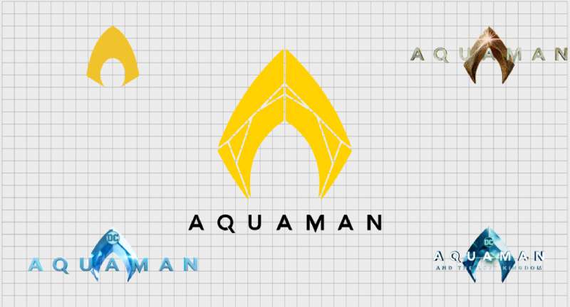
The Aquaman logo has changed significantly across eight decades, moving from simple comic shorthand to a detailed cinematic emblem. Early versions were functional and flat. The DCEU era pushed it into something more sculptural and layered.
Original Aquaman Logo (1941-1950s)
- Years Active: 1941 through the early 1950s
- Design Description: No dedicated logo symbol in the modern sense. Aquaman appeared as illustrated text treatment on comic covers, with no standalone emblem on his costume
- Color Scheme: Orange and green, established from the very first appearance
- Designer: Paul Norris (character co-creator), with Mort Weisinger as editor
- Context: Aquaman debuted in More Fun Comics #73. The visual identity was minimal by today’s standards
- Key Changes from Previous: N/A, this was the starting point
- Cultural Significance: Established the orange-and-green palette that would define every version that followed
Silver Age Comic Logo (1960s-1980s)
- Years Active: Approximately 1959 through the mid-1980s
- Design Description: A simple “A” emblem began appearing on Aquaman’s costume. Clean, flat, and minimal with no decorative framing
- Color Scheme: Bright orange and yellow-green, consistent with Silver Age DC color conventions
- Designer: Various DC Comics house artists
- Context: Aquaman received his first solo title in 1962, making a consistent visual identity more necessary
- Key Changes from Previous: Introduction of a chest emblem that readers could identify at a glance
- Cultural Significance: This is the version most associated with the Superfriends animated series, cementing Aquaman in mainstream pop culture
Modern Comics and Animation Logo (1986-2010s)
- Years Active: Mid-1980s through the early 2010s
- Design Description: The trident became the central visual identity marker. The “A” emblem stayed in some iterations, but the trident took over as the primary symbol, especially after DC’s The New 52 relaunch in 2011
- Color Scheme: Deeper greens and metallic golds replaced the flat Silver Age palette
- Designer: Multiple artists across DC’s publishing history, with Ivan Reis notably redefining Aquaman’s look during the Geoff Johns run
- Context: DC’s multiple continuity relaunches (Crisis on Infinite Earths, Infinite Crisis, The New 52, DC Rebirth) each prompted visual refreshes
- Key Changes from Previous: More detailed rendering, darker tones, stronger emphasis on the trident as symbol rather than accessory
- Cultural Significance: The Geoff Johns and Ivan Reis era (2011-2014) is widely credited with restoring Aquaman’s credibility as a serious character, and the visual identity shifted to match
DCEU Cinematic Logo (2016-Present)
- Years Active: 2016 (first appearance in Batman v Superman: Dawn of Justice) through the present
- Design Description: A heavily detailed trident emblem with angular, almost armored framing. Textured, three-dimensional in appearance, built to work on film posters and merchandise at scale. The 2023 film Aquaman and the Lost Kingdom retained the same core design language
- Color Scheme: Rich gold and amber tones dominate, with deep teal and black as supporting colors
- Designer: Developed through Warner Bros. and DC Films’ internal creative process
- Context: Jason Momoa’s casting fundamentally changed how the character was presented visually. A heavier, more warrior-like aesthetic replaced the clean comic look
- Key Changes from Previous: Far more ornate and textured than any previous version. The trident emblem became more of a crest than a simple icon
- Cultural Significance: This is the version that introduced Aquaman to a global mainstream audience, with the 2018 film grossing over $1.1 billion worldwide
What Do the Design Elements of the Aquaman Logo Mean?
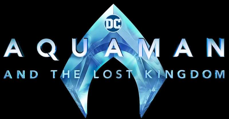
The trident is the central design element, and it does a lot of work. It signals authority, maritime power, and mythological depth all at once. The angular framing around it adds an armored quality that matches how Jason Momoa’s Aquaman is written and performed.
The color choices aren’t random. They connect directly to the ocean and to royalty, both of which are core to who Arthur Curry is.
Why Does the Trident Anchor the Logo Visually?
The trident has centuries of cultural weight behind it. It’s the weapon of Poseidon in Greek mythology, of Neptune in Roman tradition.
Placing it at the center of the logo immediately communicates rulership over the sea without needing any text to explain it.
The Trident of Atlan, specifically, is Aquaman’s most important artifact in DC lore. Building the logo around it ties the visual identity directly to the character’s mythology rather than just his appearance.
Why Did Aquaman’s Designers Choose These Specific Colors?
The orange-and-green pairing has been with the character since 1941. It’s unusual for a superhero palette. Most lean into primary colors or black. The combination works because it reads as distinctly oceanic without being predictable.
- Orange (#F4931F): Warm, high-visibility, associated with bioluminescent deep-sea life. Psychologically it reads as bold and energetic. It also contrasts sharply against ocean blues and greens in any background context
- Deep Green (#1A5C3A): Grounded, natural, tied visually to underwater environments and sea vegetation. It balances the intensity of the orange. In color theory, orange and green sit as analogous neighbors to complementary pairs, giving the combination a natural tension
- Gold (#D4AF37): Added prominently in the DCEU version. Gold signals royalty and authority. For a king of Atlantis, it’s the logical choice. Among gold logos in pop culture, Aquaman’s cinematic mark is one of the more ornate examples
- Black (#000000): Used as a grounding tone, especially in cinematic versions, to add weight and contrast
The color psychology at work here is straightforward. Orange grabs attention. Green signals nature and depth. Gold confirms status. Together they build a color palette that feels both elemental and regal.
What Typography Style Is Used in the Aquaman Logo?
The Aquaman wordmark, when used in film titles and promotional materials, typically uses a bold, condensed display typeface with sharp geometric edges.
The DCEU title treatments have used custom or heavily modified letterforms that echo the angular, armored quality of the trident emblem. No standard commercial font has been officially confirmed as the basis.
Readability at large scale is prioritized. These logos appear on billboards and IMAX posters, so the letterforms need to hold up at extreme sizes. The typography choices lean into weight and emphasis rather than elegance or subtlety.
Earlier comic-based title treatments used more conventional serif font styles common to DC publishing in the Silver Age. The shift to angular, heavy letterforms in the cinematic era matches the broader visual overhaul of the character.
What Are the Hidden Meanings in the Aquaman Logo?
The trident’s three prongs have been read as representing the three realms Aquaman bridges: land, sea, and the deep. That’s probably more fan interpretation than designer intention, but it holds up.
The angular framing in the DCEU version echoes Atlantean architecture as depicted in the films, specifically the sharp, crystalline structures used to visualize the underwater kingdom.
The overall shape of the emblem, when viewed at a distance, reads as a crown just as much as a trident. That dual reading seems deliberate given how much the DCEU version emphasizes Arthur Curry’s role as king rather than just hero.
How Does the Aquaman Logo Compare to Competitor Logos?
Within DC’s own lineup, Aquaman’s logo sits in an interesting position. It’s more ornate than the Batman logo or Superman logo, but less immediately iconic. The trident is a strong symbol, but it requires more context than a bat or an “S” shield to decode at a glance.
Compared to Marvel equivalents like the Captain America logo or the Iron Man logo, Aquaman’s cinematic emblem is significantly more textured and complex. Marvel’s film-era logo designs tend toward cleaner, more geometric forms. The Aquaman approach is more heraldic.
Against other DC heroes, the Wonder Woman logo is a useful comparison. Both use mythological symbolism (eagle vs. trident), both lean into gold in their cinematic versions, and both represent ancient-world power structures translated into superhero branding. Wonder Woman’s is more minimal. Aquaman’s is more elaborate.
The Green Lantern logo and the Flash logo both prioritize simplicity and instant readability. The Aquaman logo trades some of that immediacy for visual richness. Whether that’s the right tradeoff depends on what the brand is trying to do, and for a character positioned as an underwater king, richness probably wins.
Among superhero logos broadly, Aquaman’s sits in the middle ground: not as universally recognized as Batman or Spider-Man, but far more visually interesting than many secondary characters.
What Are the Technical Specifications of the Aquaman Logo?
Official Color Codes (Cinematic/DCEU Version):
- Primary Color: Orange
- Hex: #F4931F
- RGB: (244, 147, 31)
- CMYK: (0, 40, 87, 4)
- Pantone: Pantone 137 C (approximate)
- Secondary Color: Deep Green
- Hex: #1A5C3A
- RGB: (26, 92, 58)
- CMYK: (72, 0, 37, 64)
- Pantone: Pantone 349 C (approximate)
- Accent Color: Gold
- Hex: #D4AF37
- RGB: (212, 175, 55)
- CMYK: (0, 17, 74, 17)
- Pantone: Pantone 871 C (approximate)
- Base Color: Black
- Hex: #000000
- RGB: (0, 0, 0)
- CMYK: (0, 0, 0, 100)
- Pantone: Pantone Process Black C
Dimensions and Proportions:
- Aspect Ratio: The trident emblem typically fits within a roughly 1:1.2 to 1:1.5 width-to-height ratio depending on the specific version
- Minimum Size Requirements: DC’s official brand guidelines (not publicly released) generally require superhero emblems to remain legible at no smaller than 1 inch in print contexts
- Clear Space: Standard DC brand practice maintains clear space equal to the height of the emblem on all sides
- File Formats: Official licensed files are distributed as vector graphics (SVG, AI, EPS) for scalable use, and as high-DPI PNG files for digital applications. Bitmap or JPEG formats are used for specific web and social media applications only
- Usage Guidelines: Official DC usage guidelines prohibit distortion, color alteration, or application on backgrounds that reduce legibility
What Cultural Impact Has the Aquaman Logo Had?
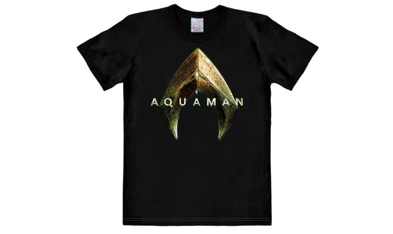
Before 2018, Aquaman was widely treated as a punchline. The logo didn’t carry much cultural weight outside of dedicated comic readers. The 2018 film changed that considerably.
A $1.1 billion global box office and a sequel in 2023 put the trident emblem on merchandise, theme park rides, and Halloween costumes worldwide. The logo went from niche recognition to genuine mainstream visibility in about two years.
The orange-and-green color combination is now strongly associated with the character in a way it wasn’t before. That’s partly the films and partly Jason Momoa’s personal brand, which carried significant cultural momentum into the role.
The logo has appeared on everything from Funko Pop packaging to official Warner Bros. theme park installations. It’s part of the broader Justice League visual identity system, appearing alongside Batman, Superman, and Wonder Woman in group marketing materials.
Among orange logos in the entertainment space, the Aquaman mark is now one of the more widely recognized examples. It’s also notable within the green logos category for its unusual orange-green combination, which stands out from the more typical all-green environmental or nature branding that color usually signals.
How Does the Aquaman Logo Fit Into the Overall Brand Identity?
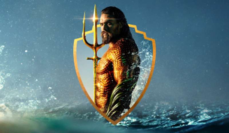
The Aquaman logo doesn’t exist in isolation. It’s part of DC’s broader superhero visual identity system, which has to balance individual character recognition with group coherence across the Justice League lineup.
DC has used a consistent approach of character-specific emblems that each work independently but also read as a family when placed together.
The Aquaman trident fits this system well. It’s distinct enough to stand alone, but the gold and black tones it shares with the DCEU’s overall visual treatment connect it to the wider DC cinematic aesthetic.
The logo also connects to what DC Films calls its “brand style,” where each hero’s emblem functions almost as a heraldic crest within the fictional world. Brand guidelines for the DCEU aren’t publicly available, but the visual consistency across film marketing materials suggests a tightly managed system.
The trident symbol also appears in Atlantean architecture and design throughout the films, so it functions as both a character logo and a fictional cultural symbol. That double duty gives it more narrative weight than most superhero emblems carry.
The visual hierarchy in DC’s group marketing materials typically places the character emblems in a balanced arrangement, with Aquaman’s trident sitting alongside Batman’s bat signal, Wonder Woman’s eagle, and Superman’s “S” as equal visual anchors. The symmetry of the trident itself helps it hold its own in those compositions.
How Should the Aquaman Logo Be Used?
Official Usage Guidelines:
- Do: Use only official files sourced directly from DC Comics, Warner Bros. licensing, or authorized brand asset portals
- Do: Maintain the original color relationships and proportions in all applications
- Do: Use vector formats for any print or large-format application to preserve sharpness
- Don’t: Alter colors, stretch proportions, add drop shadows, or place the emblem on low-contrast backgrounds
- Don’t: Use the logo as part of any commercial product, merchandise, or promotional material without a valid licensing agreement
- Don’t: Recreate the logo from memory or from a JPEG screenshot. Quality loss compounds quickly in bitmap formats, and an unofficial recreation creates trademark exposure
Where to Access Official Logo Files:
Official Aquaman logo assets are available through DC Comics’ licensing division and the Warner Bros. Discovery brand portal. Press and editorial assets can sometimes be accessed through official Warner Bros. press sites for review and coverage purposes.
Licensing Information:
The logo is a registered trademark of DC Comics, a subsidiary of Warner Bros. Discovery. Commercial use requires an official licensing agreement. Non-commercial fan or editorial use may qualify under fair use, but this varies significantly by jurisdiction and context.
FAQ on The Aquaman Logo
What does the Aquaman logo represent?
The Aquaman logo centers on a trident symbol, representing Arthur Curry’s authority as king of Atlantis and his connection to the sea.
It pulls from Greek and Roman mythology, specifically Poseidon and Neptune, grounding the character in ancient maritime power.
What colors are used in the Aquaman logo?
The core palette is orange (#F4931F), deep green (#1A5C3A), gold (#D4AF37), and black (#000000).
This combination has stayed consistent since 1941, though the cinematic version pushed the gold tones much harder than earlier comic iterations.
When was the Aquaman logo first introduced?
Aquaman debuted in More Fun Comics #73 in 1941, created by Paul Norris and Mort Weisinger.
The orange-and-green color identity was established from that first appearance, though a dedicated chest emblem didn’t arrive until the Silver Age comics of the 1960s.
Who designed the Aquaman logo?
No single designer has been publicly credited for the current cinematic version.
It was developed through Warner Bros. and DC Entertainment’s internal creative teams. The original character look came from co-creator Paul Norris in the 1940s.
How has the Aquaman logo changed over time?
It started as a simple color identity with no chest emblem, gained a basic “A” symbol in the Silver Age, then shifted to a trident-focused design during DC’s New 52 relaunch in 2011.
The DCEU version, introduced in 2016, is the most ornate iteration yet.
What font is used in the Aquaman logo?
The cinematic title treatment uses a bold, condensed display typeface with sharp geometric edges.
No standard commercial font has been officially confirmed. The letterforms appear to be custom or heavily modified to match the angular, armored aesthetic of the trident emblem.
Is the Aquaman logo copyrighted?
Yes. The Aquaman logo is a registered trademark of DC Comics, a subsidiary of Warner Bros. Discovery.
Commercial use requires an official licensing agreement. Fan and editorial use may fall under fair use depending on jurisdiction, but this varies case by case.
Where can I download the official Aquaman logo?
Official logo files are available through DC Comics’ licensing division and the Warner Bros. Discovery brand portal.
Press assets for editorial coverage are sometimes accessible via official Warner Bros. press sites. Avoid unofficial sources, as low-quality bitmap files are widespread and often inaccurate.
How does the Aquaman logo compare to other DC superhero logos?
It’s more ornate and heraldic than most DC emblems. The Batman and Superman logos prioritize instant recognition through simplicity.
Aquaman’s trident emblem trades some of that immediacy for visual richness, which suits a character positioned as an ancient king rather than a street-level hero.
What are the official color codes for the Aquaman logo?
The primary orange is #F4931F (RGB 244, 147, 31). Deep green is #1A5C3A. Gold is #D4AF37. Black is #000000.
These are the DCEU cinematic values. Earlier comic versions used brighter, less saturated tones consistent with Silver Age DC printing standards.
Conclusion
The Aquaman logo has come a long way from a simple orange-and-green color identity in a 1941 comic to a detailed cinematic crest that carried a billion-dollar film franchise.
The trident symbol does real work. It communicates Arthur Curry’s Atlantean kingship, his mythological roots, and his place within the DC Extended Universe without needing a single word.
Whether you’re looking at the sea king emblem on a comic cover or a film poster, the design logic behind it holds up.
That kind of consistency across eight decades of visual identity isn’t easy to pull off.

Renowned for his expertise in logo design and visual branding, Bogdan has developed a multitude of logos for various clients.
His skills extend to creating posters, vector illustrations, business cards, and brochures. Additionally, Bogdan's UI kits were featured on marketplaces like Visual Hierarchy and UI8.
He also wrote in the past years on sites like Design Your Way, WebDesignerDepot, WPDean, Designmodo, Speckyboy, Slider Revolution, and more.
- Jujutsu Kaisen Font Generator - 12 October 2026
- The Windsurf Logo History, Colors, Font, And Meaning - 10 October 2026
- How to Remove Background From Product Photos (No Photoshop) - 10 October 2026

Bogdan Sandu is a seasoned designer who has been designing websites since 2008. Renowned for his expertise in logo design and visual branding, Bogdan has developed a multitude of logos for various clients. His skills extend to creating posters, vector illustrations, business cards, and brochures. Additionally, Bogdan's UI kits were featured on marketplaces like Visual Hierarchy and UI8. He also wrote in the past years on sites like Design Your Way, WebDesignerDepot, WPDean, Designmodo, Speckyboy, Slider Revolution, and more.
You Might Also Like