The Wolverine logo is one of the most recognized symbols in comic book history. It represents the Marvel Comics character James “Logan” Howlett, a mutant anti-hero known for his retractable adamantium claws and fierce, almost feral fighting style. The mark has appeared across decades of comics, films, merchandise, and fan art.
Within superhero branding, few symbols carry the raw, aggressive identity that Wolverine’s emblem does. Where other superhero logos lean into sleek geometry or patriotic imagery, Wolverine’s visual identity has always been built around tension. It sits somewhere between a battle scar and a warning sign.
The current design is centered on a stylized “W” formed by three claw marks, rendered in yellow and black. It has gone through several interpretations since the character’s debut in 1974, with the most iconic version solidified during the X-Men animated series era of the 1990s.
Wolverine first appeared in The Incredible Hulk #181 in November 1974, co-created by Roy Thomas, Len Wein, and John Romita Sr. Since then, the logo has gone through at least four major visual iterations across comics, film, and merchandise.
—
What Is the Wolverine Logo?
The Wolverine logo is a stylized emblem built around three diagonal claw slashes forming a “W” shape, typically rendered in yellow and black. It was developed through Marvel Comics beginning in the mid-1970s and refined over decades to represent the character’s mutant identity, raw power, and connection to the X-Men.
- Design Type: Emblem / icon-based mark
- Primary Elements: Three claw slash marks forming a “W” shape, sometimes combined with a cowl or mask silhouette
- Official Introduction Date: Character debut November 1974; iconic claw “W” emblem popularized in the 1990s
- Designer/Agency: Originally designed by John Romita Sr. (character design); refined by various Marvel Comics art directors over the decades
- Trademark Status: Registered trademark of Marvel Entertainment, LLC (subsidiary of The Walt Disney Company)
- Color Palette: Primary yellow (#F5C900), black (#000000), with occasional blue (#003399) variations depending on costume era
- Usage Context: Comic book covers, animated series, merchandise, film promotional materials, digital platforms, and licensed products
How Has the Wolverine Logo Evolved Over Time?
The Wolverine logo started as a simple costume emblem in 1974 and grew into a globally recognized icon through comic runs, animated adaptations, and Hugh Jackman’s film portrayals. Each era brought visual refinements that reflected both the character’s evolving story and shifts in pop culture design.
Original Wolverine Logo (1974–1981)
- Years Active: 1974–1981
- Design Description: The earliest visual identity was tied directly to the costume. Yellow cowl with black accents, no standalone claw mark emblem. The “W” formed by the pointed mask ears was the main visual identifier.
- Color Scheme: Yellow and black
- Designer: John Romita Sr.
- Context: Wolverine was introduced as a Canadian government operative with a largely mysterious backstory. The visual design needed to feel both wild and militaristic.
- Key Changes from Previous: N/A (debut version)
- Cultural Significance: Established the yellow-and-black color pairing that has defined the character ever since
Classic Comics Era Logo (1982–1991)
- Years Active: 1982–1991
- Design Description: Chris Claremont’s landmark run on Uncanny X-Men pushed the character to prominence. The costume design stayed consistent, but the claw mark motif began appearing more deliberately in cover art and merchandise.
- Color Scheme: Yellow, black, occasional brown costume variant
- Designer: Various Marvel Comics artists including Frank Miller (for the 1982 solo miniseries)
- Context: Frank Miller’s 1982 solo miniseries gave Wolverine his own standalone story for the first time, shaping the character’s brooding, samurai-influenced identity.
- Key Changes from Previous: Deeper character development led to more deliberate visual storytelling around the mask and claws
- Cultural Significance: The brown-and-tan costume variant introduced here became a fan favorite and influenced later logo color explorations
Animated Series Logo (1992–2000)
- Years Active: 1992–2000
- Design Description: The X-Men: The Animated Series (1992) locked in the most iconic version of the Wolverine visual identity. The three-claw slash mark forming a “W” became the dominant emblem used across all merchandise.
- Color Scheme: Bright yellow (#F5C900) and black (#000000)
- Designer: Marvel animation design team
- Context: The animated series reached millions of new fans, most of whom were children encountering the character for the first time. The logo needed to be instantly readable at small sizes on T-shirts, lunchboxes, and sticker sheets.
- Key Changes from Previous: Formalized the claw-slash “W” as a standalone mark independent of costume context
- Cultural Significance: This is the version most people picture when they think of Wolverine’s logo. It shaped an entire generation’s visual association with the character.
Film Era Logo (2000–Present)
- Years Active: 2000–present
- Design Description: The 20th Century Fox X-Men films shifted Wolverine into dark, tactical-style black leather suits, largely dropping the yellow costume. The logo used in film marketing materials became more typographic and grittier, often using metallic textures to reference adamantium.
- Color Scheme: Black, steel grey, metallic silver; yellow reintroduced in Deadpool & Wolverine (2024)
- Designer: Fox marketing and Marvel Studios design teams
- Context: Hugh Jackman’s portrayal redefined the character for mainstream audiences. The return of the yellow suit in Deadpool & Wolverine was a deliberate fan service moment that generated massive buzz.
- Key Changes from Previous: Moved away from bright yellow; adopted darker, more cinematic visual language
- Cultural Significance: Bridged the gap between comic book readers and mainstream moviegoers; made Wolverine one of the most recognized fictional characters globally
What Do the Design Elements of the Wolverine Logo Mean?
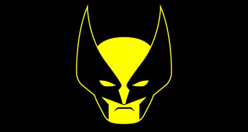
The core of the Wolverine logo, three slash marks forming a “W,” is one of the most direct pieces of visual communication in superhero design. It doesn’t try to be subtle. Every element references something specific about the character: his mutation, his violence, his identity.
The three lines immediately read as claw marks. They also spell out the character’s name initial. That double function is what makes the mark so efficient from a design standpoint.
What Does the Claw Symbol Represent?
The three claw marks are Wolverine’s defining physical trait. They reference his retractable bone claws, later coated in adamantium. The diagonal slash direction suggests movement, aggression, and speed. It’s not a passive symbol. It reads like something has already happened.
What Is the Historical Context Behind the Design?
The claw-as-logo concept draws from a long tradition of warriors marking their identity through their weapon. Wolverine’s claws are both his tool and his trauma, central to decades of storytelling about identity and control. The logo captures that duality without a single word. It works equally well as a pride symbol for fans and as a warning sign within the fiction.
What Cultural References Does the Logo Draw From?
The three-slash motif has loose connections to Japanese mon (family crest) design, which fits given Wolverine’s deep ties to Japanese culture established in the 1982 Frank Miller miniseries. The mark also echoes imagery from predatory animals, bears, big cats, which reinforces the feral, instinct-driven side of the character. There’s something primal about it that works across cultures.
How Does the Logo Connect to Marvel’s Brand Values?
Wolverine’s emblem sits within a broader tradition of superhero logo design where the symbol functions as shorthand for the character’s entire moral and physical identity. Compare it to the Captain America logo (a shield, protection) or the Spider-Man logo (a web, connection). Wolverine’s mark is a wound. That’s intentional.
Why Did Marvel Choose These Specific Colors?
- Yellow (#F5C900)
- Color Name: Wolverine Yellow / Canary Yellow
- Symbolic Meaning: Energy, visibility, danger (as used in warning signs)
- Psychological Impact: High contrast against black; commands immediate attention; associated with alertness
- Brand Connection: Ties to the original comic costume; instantly differentiates from darker X-Men teammates
- Black (#000000)
- Color Name: Black
- Symbolic Meaning: Danger, the unknown, raw power
- Psychological Impact: Creates sharp contrast with yellow; grounds the design; adds weight and severity
- Brand Connection: Reinforces the darker, more violent aspects of the character
- Blue (#003399, alternate version)
- Color Name: Marvel Blue
- Symbolic Meaning: Team allegiance to the X-Men
- Psychological Impact: Cooler tone softens the aggressiveness; used in team-branded contexts
- Brand Connection: Aligns Wolverine with the broader X-Men visual identity
Understanding color psychology helps explain why yellow-and-black works so well here. It’s the same pairing used in hazard tape, traffic warnings, and predatory animals like wasps. The visual system reads it as “dangerous, pay attention.” That’s exactly the message.
What Typography Style Is Used in the Wolverine Logo?
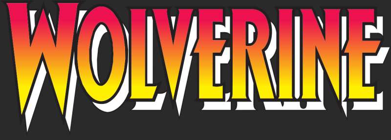
When text appears alongside the Wolverine emblem, it typically uses condensed, heavy sans-serif or slab-serif styles. The typography leans aggressive, tight spacing, sharp angles, high weight. Nothing decorative or delicate. Film-era treatments often added metallic textures or distressed effects to the letterforms, reinforcing the adamantium / battle-worn concept. The slab serif style appears in some merchandise treatments, adding a sense of blunt force to the wordmark.
What Are the Hidden Meanings in the Wolverine Logo?
The obvious read: three claw marks, one letter. Less obvious: the slash direction (lower-left to upper-right) implies an upward strike, suggesting the character’s survivability and refusal to stay down. The gaps between the slashes also form negative space that vaguely suggests a face or mask, though this may be more accidental than deliberate depending on the version. Some fan analyses have noted that the three marks reference Wolverine’s three-claw configuration on each hand, though only one hand’s worth appears in the logo.
How Does the Wolverine Logo Compare to Competitor Logos?
Within Marvel’s roster, Wolverine’s emblem is one of the few that functions as both a character symbol and an action graphic. Most superhero marks are static. This one implies motion.
Compared to the Iron Man logo, which relies on mechanical, geometric precision, Wolverine’s mark feels hand-torn. Against the Black Panther logo, which uses fluid, feline curves and regal geometry, Wolverine’s design is deliberately rougher. The Deadpool logo leans into irreverence and symmetry. Wolverine’s doesn’t bother with symmetry. The Thor logo uses hammer iconography tied to mythology and formality. Wolverine’s claw mark is rawer, more immediate.
On the DC side, the Wonder Woman logo uses an eagle-inspired “WW” with classical proportions. The Daredevil logo is built around a double-D horn shape, controlled and precise. Wolverine’s mark stands apart because it looks like evidence of something, not a badge.
Among black logos in superhero branding, Wolverine’s yellow-on-black combination is one of the most visually distinct. The high-contrast pairing is rare in this category, where most competitors lean on red, blue, or metallic tones.
What Are the Technical Specifications of the Wolverine Logo?
Official Color Codes
- Primary Color: Wolverine Yellow
- Hex: #F5C900
- RGB: (245, 201, 0)
- CMYK: (0, 18, 100, 4)
- Pantone: PMS 116 C (closest match)
- Secondary Color: Black
- Hex: #000000
- RGB: (0, 0, 0)
- CMYK: (0, 0, 0, 100)
- Pantone: Black C
- Accent Color: Marvel Blue (alternate costume version)
- Hex: #003399
- RGB: (0, 51, 153)
- CMYK: (100, 67, 0, 40)
- Pantone: PMS 286 C (closest match)
Dimensions and Proportions
- Aspect Ratio: Approximately 1:1 for the standalone claw mark emblem; varies by application
- Minimum Size Requirements: Marvel licensing guidelines generally require a minimum of 1 inch (72px at screen resolution) for the emblem to remain legible
- Clear Space: Standard Marvel brand practice requires clear space equal to the height of the “W” on all sides
- File Formats: Official licensed assets are distributed as vector graphics (AI, EPS, SVG) for scalability; JPEG and PNG versions for digital use
- DPI Requirements: 300 DPI minimum for print applications; 72–96 DPI for screen
What Cultural Impact Has the Wolverine Logo Had?
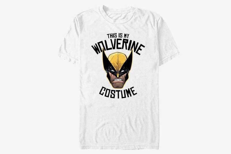
Few comic book symbols have crossed over into broader culture the way Wolverine’s has. The claw mark emblem appears on everything from tattoos to vehicle decals, often stripped of any Marvel branding context and used purely as personal expression. That kind of adoption is rare. It means the symbol has taken on meaning beyond its source material.
The character’s popularity through Hugh Jackman’s 17-year portrayal in the X-Men film series (2000–2024) turned the logo into a globally recognized mark, particularly strong in North America, Australia, and Japan. The yellow suit’s return in Deadpool & Wolverine (2024) generated significant media coverage specifically because of what the costume’s logo represented to longtime fans.
The logo also lives in the tattoo community in a significant way. More so than most superhero logos, the Wolverine claw mark is treated as a personal identity symbol, adopted by people who connect with themes of resilience, survival, and controlled aggression. That’s a specific cultural function that most brand marks never achieve.
How Does the Wolverine Logo Fit Into the Overall Brand Identity?
The Wolverine logo sits within a layered brand network that connects the character to Marvel Comics, the X-Men franchise, 20th Century Studios (historically), and now Marvel Studios under Disney. Each of those parent entities has its own visual language, and Wolverine’s mark has had to coexist with all of them across different eras.
Within the X-Men visual system, Wolverine’s yellow-and-black contrasts sharply with the team’s blue-and-gold palette. That’s intentional. He’s always been a difficult fit within the team, and the branding reflects it. His emblem doesn’t look like a team player’s badge. It looks like a loner’s mark.
The character’s logo connects to broader Marvel brand identity through consistent use of the shield logo in co-branding, shared typography systems in film marketing, and coordinated merchandise design. But the Wolverine mark specifically is one of the few Marvel character symbols that functions independently, without the Marvel wordmark, and still reads clearly. The Punisher logo is another example of this. Both have escaped their source material and become standalone cultural symbols.
From a brand guidelines perspective, the Wolverine emblem is controlled by Marvel Entertainment’s licensing division. Licensed partners (apparel brands, game developers, merchandise manufacturers) receive official asset packages with usage rules tied to Marvel’s broader brand standards.
How Should the Wolverine Logo Be Used?
Official Usage Guidelines
- Do: Use official licensed assets from Marvel’s licensing partners; maintain original color values; respect minimum size and clear space rules; use vector formats for print
- Don’t: Alter the color palette without licensing approval; stretch or distort the emblem; combine with unofficial imagery; use on products without proper licensing agreements
Where to Access Official Logos
- Official Marvel licensing inquiries: marvel.com/licensing
- Licensed merchandise partners receive assets through Marvel’s official brand portal
- Press and editorial use: Marvel’s press site provides approved assets for media use
Licensing Information
- The Wolverine logo and all associated character marks are the property of Marvel Entertainment, LLC, a subsidiary of The Walt Disney Company
- Commercial use requires an active licensing agreement with Marvel
- Fan art and non-commercial use exists in a grey area; Marvel has historically tolerated non-profit fan creations but actively enforces against commercial infringement
- Font licensing for any custom typefaces used in official materials is handled separately through Marvel’s design vendors
Trademark Protection Details
- Wolverine (character) and associated logos are registered trademarks in multiple jurisdictions including the United States, European Union, and Japan
- The character name “Wolverine” and the claw mark emblem are both protected marks
- Infringement claims are actively managed by Disney’s legal division on Marvel’s behalf
- The Deadpool & Wolverine (2024) film brought renewed trademark activity as the yellow suit design was reintroduced in officially licensed merchandise at significant scale
FAQ on The Wolverine Logo
What does the Wolverine logo look like?
Three diagonal claw slashes forming a “W” shape, set in yellow and black.
It’s one of the most direct logo designs in Marvel Comics history. No wordmark needed. The claw mark does all the work.
Who designed the Wolverine logo?
The original character design came from John Romita Sr. in 1974, working alongside co-creators Roy Thomas and Len Wein.
The iconic claw-slash “W” emblem was refined over time by Marvel’s in-house art teams, particularly during the X-Men animated series era.
What colors are used in the Wolverine logo?
The primary colors are yellow (#F5C900) and black (#000000).
Some versions include blue (#003399) tied to X-Men team branding. The color theory here is simple: high contrast, instant recognition, aggressive energy.
When was the Wolverine logo first introduced?
The character debuted in The Incredible Hulk #181 in November 1974.
The standalone claw mark emblem as a recognizable symbol became widely used in the early 1990s, driven by X-Men animated series merchandise.
Is the Wolverine logo trademarked?
Yes. It’s a registered trademark of Marvel Entertainment, LLC, a subsidiary of The Walt Disney Company.
Both the character name and the claw mark symbol are protected. Commercial use requires an active licensing agreement with Marvel.
What is the meaning behind the Wolverine claw symbol?
The three slashes reference the character’s retractable adamantium claws, his defining mutation.
The diagonal direction implies an upward strike, movement, aggression. It reads less like a badge and more like evidence. That’s what separates it from most superhero logos.
How has the Wolverine logo changed over the years?
It started as a costume emblem in 1974, evolved through the Frank Miller miniseries era, and got fully codified in the 1990s animated series.
Film adaptations shifted the palette toward black and grey. The yellow suit returned in Deadpool & Wolverine (2024), bringing the original color scheme back to mainstream attention.
What font is used in the Wolverine logo?
There’s no single official typeface. Depending on the era, condensed heavy sans-serif or distressed slab-serif styles have been used in film and merchandise treatments.
The claw mark emblem typically stands alone without any accompanying wordmark.
How does the Wolverine logo compare to other X-Men logos?
Most X-Men branding uses blue and gold as the team’s core color palette.
Wolverine’s yellow-and-black stands apart deliberately. He’s never been a natural team player, and the visual identity reflects that. It works as a standalone symbol in a way few team member logos do.
Where can I find the official Wolverine logo for use?
Official assets are available through Marvel’s licensing program at marvel.com/licensing.
Press and editorial use is handled through Marvel’s media portal. Fan and non-commercial use exists in a grey area. Selling products with the Marvel character logo without a license is trademark infringement.
Conclusion
The Wolverine logo is more than a Marvel Comics emblem. It’s a symbol that has outlasted costume redesigns, film reboots, and decades of shifting pop culture.
The three-claw “W” mark works because it’s honest about what it represents: a mutant hero built on survival, rage, and identity.
From John Romita Sr.’s original character design to the X-Men franchise merchandise that followed, every iteration has kept that core tension intact.
Few comic book icons manage that kind of consistency across fifty years of storytelling.

Renowned for his expertise in logo design and visual branding, Bogdan has developed a multitude of logos for various clients.
His skills extend to creating posters, vector illustrations, business cards, and brochures. Additionally, Bogdan's UI kits were featured on marketplaces like Visual Hierarchy and UI8.
He also wrote in the past years on sites like Design Your Way, WebDesignerDepot, WPDean, Designmodo, Speckyboy, Slider Revolution, and more.
- Jujutsu Kaisen Font Generator - 12 October 2026
- The Windsurf Logo History, Colors, Font, And Meaning - 10 October 2026
- How to Remove Background From Product Photos (No Photoshop) - 10 October 2026

Bogdan Sandu is a seasoned designer who has been designing websites since 2008. Renowned for his expertise in logo design and visual branding, Bogdan has developed a multitude of logos for various clients. His skills extend to creating posters, vector illustrations, business cards, and brochures. Additionally, Bogdan's UI kits were featured on marketplaces like Visual Hierarchy and UI8. He also wrote in the past years on sites like Design Your Way, WebDesignerDepot, WPDean, Designmodo, Speckyboy, Slider Revolution, and more.
You Might Also Like