The Punisher logo is one of the most recognized symbols in comic book history: a stark white skull set against black, worn on the chest of Frank Castle, Marvel’s ruthless vigilante. It doesn’t just identify a character. It makes a statement. Since its first appearance in 1974, the skull has taken on a life far beyond the pages it came from, showing up on military gear, police uniforms, tattoos, and merchandise worldwide.
Within superhero logos, the Punisher’s skull stands apart. Most hero symbols communicate protection or power in an aspirational sense. This one communicates something rawer. It sits in a category of its own, closer to a warning than a badge.
The current version of the skull emblem has remained largely consistent since artist Mike Zeck refined it in the early 1980s. No agency is officially credited. The design is owned by Marvel Comics (now under Disney), and it’s one of the most merchandised symbols in the company’s catalog.
The logo has gone through relatively few structural changes since its introduction, which is unusual for a character whose comics have been relaunched multiple times. That consistency is part of what makes it so culturally sticky.
What is the Punisher Logo?
The Punisher logo is a white skull emblem worn on Frank Castle’s black costume, first introduced in The Amazing Spider-Man #129 in 1974. Designed without a credited agency, the icon-style mark uses high contrast and aggressive bone geometry to signal threat and vigilante justice.
- Design Type: Icon / emblem mark
- Primary Elements: Stylized human skull with elongated teeth, no separate wordmark
- Official Introduction Date: 1974 (first appearance); refined version circa 1982 (Mike Zeck era)
- Designer/Agency: No single officially credited designer; Mike Zeck is most associated with the refined skull shape
- Trademark Status: Registered trademark of Marvel Characters, Inc. (subsidiary of Disney)
- Color Palette: White skull (#FFFFFF) on black (#000000); no official secondary colors in the core mark
- Usage Context: Comic book costumes, merchandise, apparel, patches, tattoo art, digital platforms, and real-world military/law enforcement gear (unofficial)
How Has the Punisher Logo Evolved Over Time?
The skull has stayed remarkably stable across five decades. Early versions were rougher and less geometric. The Zeck-era refinement in the early 1980s locked in the proportions most people recognize today, and subsequent artists have worked within those boundaries rather than redefining them.
Original Punisher Logo (1974–1981)
- Years Active: 1974–1981
- Design Description: A rough, hand-drawn skull worn on the chest; proportions varied significantly between artists
- Color Scheme: White on black
- Designer: Ross Andru (first appearance art), Gerry Conway (co-creator)
- Context: Introduced during Marvel’s early 1970s push into darker, more violent characters
- Key Changes from Previous: N/A (first version)
- Cultural Significance: Marked Marvel’s move toward morally complex anti-heroes during a period when comics were pushing against the Comics Code Authority
Zeck-Era Punisher Logo (1982–1995)
- Years Active: 1982–1995
- Design Description: More geometric and deliberate skull; elongated lower teeth became the defining characteristic; cleaner lines across the whole form
- Color Scheme: White on black
- Designer: Mike Zeck
- Context: Coincided with the Punisher’s rise from supporting character to solo star; the skull needed to hold up as a standalone symbol
- Key Changes from Previous: Standardized proportions, more aggressive tooth shape, removed anatomical irregularities from earlier versions
- Cultural Significance: This is the version that entered pop culture. It defined what the Punisher skull “looks like” for most people
Modern Punisher Logo (1995–Present)
- Years Active: 1995–present
- Design Description: Slight variations across comics, films, and TV adaptations, but the core Zeck-era shape remains the reference point
- Color Scheme: White on black (core); occasional red, grey, or distressed treatments in merchandise
- Designer: Various Marvel artists; Netflix adaptation refined it for screen use
- Context: The Netflix Punisher series (2017–2019) starring Jon Bernthal brought new attention to the symbol and introduced a slightly more stylized screen version
- Key Changes from Previous: Minor digital refinements for scalability; no structural overhaul
- Cultural Significance: The symbol moved well beyond comics into military culture, law enforcement controversy, and mainstream merchandise
What Do the Design Elements of the Punisher Logo Mean?
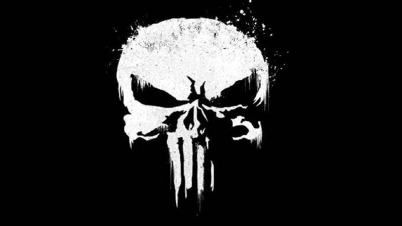
The skull is doing a lot of work in a very small space. It’s not decorative. Every part of it, the hollow eyes, the bare teeth, the absence of a lower jaw in some versions, points at death and the threat of it. That’s intentional. Frank Castle wears it so his enemies see it first.
The focal point of the design is the teeth. Specifically those elongated lower teeth, which give the skull an almost predatory look. They make it feel less like a medical illustration and more like something that bites.
What Does the Skull Shape Symbolize?
Skulls have been used as symbols of death, danger, and defiance across cultures for centuries.
In the context of Frank Castle, a war veteran turned vigilante, the skull represents mortality weaponized. He’s not afraid of death. He uses the fear of it.
The shape also taps into a long tradition of military death symbolism, from Prussian hussar units to the Totenkopf insignia, which is part of why it resonates so strongly with military and law enforcement communities, for better or worse.
What Are the Historical References Behind the Design?
Gerry Conway has said the character was partly inspired by pulp vigilante heroes like Mack Bolan (The Executioner).
The skull itself draws from a much older visual tradition. Jolly Roger flags, poison warning labels, biker culture, and wartime nose art all fed into the cultural meaning the symbol carries before anyone even knows it’s the Punisher.
What Cultural References Does It Draw From?
The skull sits at the intersection of comic book iconography and real-world subcultural imagery.
Biker gangs, heavy metal bands, military units, and outlaw culture all used skull imagery before the Punisher existed. The logo absorbed all of that meaning and added a specifically American vigilante layer on top of it.
That cross-cultural resonance is why it spread outside comics so fast and so far.
Why Did the Punisher’s Creators Choose These Specific Colors?
- White (#FFFFFF)
- Symbolic meaning: Bone, death, visibility against darkness
- Psychological impact: High contrast creates instant recognition; white on black is one of the highest-contrast combinations possible
- Brand connection: The starkness reinforces the character’s lack of ambiguity. No grey areas, literally or figuratively
- Black (#000000)
- Symbolic meaning: Death, stealth, mourning, absence
- Psychological impact: Black as a background makes the skull feel like it’s emerging from darkness
- Brand connection: Black is the Punisher’s operational color. It’s not a costume choice, it’s camouflage for someone who works at night
Worth noting: the monochrome color approach is part of what makes the logo so versatile. It works on any surface, at any size, without needing a color system to support it.
What Typography Style Is Used in the Punisher Logo?
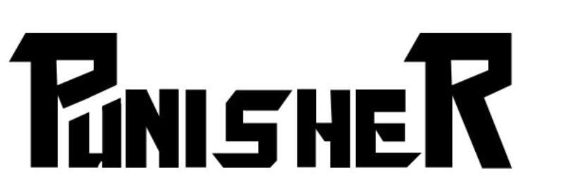
There’s no standard typography in the core Punisher logo. The symbol stands alone.
When type does appear alongside it, in comics, merch, or the Netflix series, it tends toward condensed, heavy sans-serif styles that match the skull’s aggressive geometry. Nothing decorative. Nothing that softens the overall impression.
The Netflix adaptation used a stark, condensed sans-serif font in marketing materials, which paired cleanly with the skull without competing with it.
What Are the Hidden Meanings in the Punisher Logo?
There’s an argument that the elongated teeth aren’t just stylistic. They push the skull away from realistic human anatomy toward something more predatory, almost animal.
That’s probably intentional on Zeck’s part, even if unstated. The Punisher isn’t meant to read as a person in that moment. He’s meant to read as a threat.
Some designers have pointed out that the skull’s proportions, wide cranium, narrow jaw, align loosely with the golden ratio in how the upper and lower sections divide. Whether that was deliberate or a natural result of aesthetic refinement is unclear.
How Does the Punisher Logo Compare to Competitor Logos?
Most superhero symbols communicate aspiration. The Punisher’s skull is the exception. Where other Marvel and DC icons use shields, lightning bolts, and letters, this one uses a death symbol with no softening elements.
Compare it to the Captain America logo, which uses a star inside a shield. That’s protective, patriotic, forward-facing.
The Daredevil logo uses a stylized “DD” that reads as athletic and precise. Still dark in tone, but not threatening.
The Spider-Man logo is a spider, which carries some menace, but it’s balanced by the character’s lighter personality.
The Punisher skull doesn’t balance anything. It’s all threat, no reassurance, which is why it’s been adopted by real-world groups looking for exactly that signal. No other superhero symbol has made that crossover in quite the same way.
Among black logos specifically, it’s one of the most copied shapes in tattoo and merchandise culture, which says something about how effectively the design communicates.
What Are the Technical Specifications of the Punisher Logo?
The logo exists primarily as a two-color mark. Official merchandise and licensing materials use the following:
Official Color Codes:
- Primary Color: White (Skull)
- Hex: #FFFFFF
- RGB: (255, 255, 255)
- CMYK: (0, 0, 0, 0)
- Pantone: White
- Secondary Color: Black (Background/Costume)
- Hex: #000000
- RGB: (0, 0, 0)
- CMYK: (0, 0, 0, 100)
- Pantone: Process Black C
Dimensions and Proportions:
- Aspect ratio: Roughly 1:1.2 (width to height) in most official versions
- Minimum size requirements: Marvel’s brand guidelines require legibility at small scales; the skull must retain its tooth detail
- Clear space specifications: Standard Marvel licensing requires clear space equal to the height of the skull on all sides
- Official usage guidelines: Governed by Marvel’s trademark licensing program; unauthorized commercial use is prohibited
- File formats: Available as vector graphics through official Marvel licensing channels; fan-made versions circulate widely in SVG and PNG formats
What Cultural Impact Has the Punisher Logo Had?
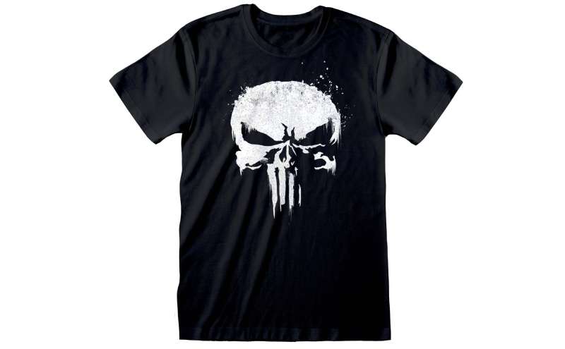
Few fictional symbols have crossed into real-world use as aggressively as this one. U.S. military units, particularly special operations forces, began adopting the skull in the mid-2000s during the wars in Iraq and Afghanistan. Chris Kyle, the Navy SEAL whose story became American Sniper, used it extensively, which pushed it further into mainstream awareness.
Law enforcement adoption followed, which created significant controversy. The skull’s original creator, Gerry Conway, has publicly criticized police and military use of the symbol, pointing out that the Punisher is explicitly a character who operates outside the law, not within it.
The Blue Lives Matter movement’s adoption of the skull specifically highlighted the tension between the symbol’s fictional meaning (a vigilante who ignores legal authority) and how it was being used by people who represent that authority.
Marvel has addressed this in the comics directly. A 2022 storyline gave Frank Castle a new symbol after the skull became too politically charged. Whether that sticks long-term is uncertain.
Beyond politics, the skull appears on an enormous range of merchandise. It’s one of the most tattooed comic book symbols in the world, which puts it in a category alongside much older cultural symbols like anchors and eagles.
How Does the Punisher Logo Fit Into the Overall Brand Identity?
Within Marvel’s broader brand system, the Punisher skull operates almost independently. Most Marvel characters connect visually to a shared design language. The Punisher doesn’t really participate in that.
It connects to the character’s identity rather than the publisher’s.
Frank Castle’s brand, if you can call it that, is built on a specific set of values: revenge, self-reliance, operating outside systems. The skull communicates all of that without needing a wordmark or color system to support it. That’s genuinely unusual in logo design. Most marks need context to carry meaning. This one brings its own.
The visual hierarchy of the Punisher’s costume puts the skull at center chest, which is exactly where your eye goes when facing someone. That’s not an accident. It’s meant to be the first thing an enemy sees.
In terms of brand guidelines, Marvel treats the skull as a licensed property with strict commercial controls, but its spread into unofficial use has been so extensive that enforcement is complicated. The symbol exists in two parallel ecosystems: the official Marvel licensing world and a much larger unofficial cultural space where it operates on its own terms.
How Should the Punisher Logo Be Used?
Official usage guidelines:
- Commercial use requires a license from Marvel Characters, Inc. (a Disney subsidiary)
- The skull cannot be used on products, apparel, or marketing materials without explicit written permission
- Law enforcement and military use has been a grey area legally, though Marvel has not actively pursued these cases in court
- Fan art for personal, non-commercial use generally falls outside active enforcement, but this is not a formal permission
Where to access official logos:
- Marvel’s official licensing portal for commercial partners
- Licensed merchandise through authorized retailers
- Marvel’s press kit for editorial/media use
Design do’s and don’ts:
- Do: Maintain the white-on-black color relationship in official contexts
- Do: Preserve the tooth proportions that define the mark’s recognizability
- Don’t: Add gradients, drop shadows, or decorative elements that soften the mark’s hard-edged character
- Don’t: Reverse the color relationship (black skull on white) for official use without authorization
- Don’t: Combine the skull with other symbols, particularly political or ideological imagery, outside of officially sanctioned contexts
Trademark protection: The Punisher skull is a registered trademark. Its reproduction for commercial gain without a Marvel license is a trademark infringement, regardless of how widespread unofficial use has become.
FAQ on The Punisher Logo
What Does the Punisher Skull Symbol Actually Represent?
The skull represents death used as a weapon of fear.
Frank Castle wears it so criminals see it before they see him. It’s not a hero’s badge. It’s a threat, deliberately designed to intimidate rather than inspire.
Who Designed the Punisher Skull Logo?
No single designer is officially credited for the original.
Ross Andru drew the first version in 1974. Artist Mike Zeck refined it in the early 1980s into the geometric, elongated-tooth version that most people recognize today.
When Did the Punisher Logo First Appear?
The skull chest symbol debuted in The Amazing Spider-Man #129, published in February 1974.
Co-creators Gerry Conway and Ross Andru introduced Frank Castle in that issue. The skull logo meaning was clear from the start: this character operates outside normal superhero conventions.
Why Do Military and Police Use the Punisher Symbol?
The skull logo’s association with lethal force and operating outside the system made it appealing to certain military and law enforcement groups.
Chris Kyle’s use during his Navy SEAL service pushed it mainstream. Gerry Conway has publicly criticized this, noting the Punisher symbol belongs to a character who actively fights against institutional authority.
Is the Punisher Logo Copyrighted?
Yes. The Punisher skull is a registered trademark owned by Marvel Characters, Inc., a Disney subsidiary.
Commercial use without a license is trademark infringement. Fan art for personal use generally isn’t pursued, but that’s not formal permission. Official Punisher logo merchandise goes through Marvel’s licensing program.
What Are the Official Colors of the Punisher Logo?
The core mark is strictly two colors: white skull (#FFFFFF) on black (#000000).
That’s it. No gradients, no secondary palette. The RGB values are (255,255,255) for the skull and (0,0,0) for the background. Some merchandise uses distressed or grey treatments, but those aren’t the official spec.
How Has the Punisher Logo Changed Over the Years?
Less than you’d expect for a 50-year-old character.
The early 1974 skull was rougher and varied between artists. Mike Zeck’s 1982 refinement standardized the proportions. Since then, the core skull logo design has stayed remarkably consistent across comics, films, and the Netflix series.
What Makes the Punisher Logo Different from Other Superhero Logos?
Most superhero emblems signal protection or power in an aspirational way.
The Punisher skull signals death. Compare it to Captain America’s shield or Spider-Man’s spider: those communicate defense and agility. The Punisher’s comic book iconography is pure threat, which is why it crossed into real-world use in ways no other Marvel symbol has.
Where Can I Download the Punisher Logo Legally?
Official files are available through Marvel’s press kit for editorial and media use.
Licensed commercial use requires going through Marvel’s formal licensing portal. Fan-made Punisher logo PNG and SVG versions circulate widely online, but using those for commercial purposes without a Marvel license is infringement regardless of the file’s source.
What Is the Cultural Significance of the Punisher Skull Today?
It’s one of the most recognized comic book symbols in the world, and one of the most debated.
Its adoption by military units, biker culture, and political movements has pulled it far from its Marvel Comics origins. A 2022 storyline actually retired the skull within the comics partly because of how politically loaded the vigilante symbol had become outside the page.
Conclusion
The Punisher logo is a rare case where a comic book emblem outgrew its source material entirely.
What started as a Frank Castle chest symbol in 1974 became a cultural shorthand for lethal intent, showing up on military patches, tattoos, and merchandise far removed from Marvel Comics.
The skull logo meaning hasn’t changed. What’s changed is who’s using it and why.
That tension between the vigilante justice symbol and its real-world adoption is what keeps this design relevant decades after Mike Zeck standardized its proportions.
Few comic character symbols carry that kind of weight.

Renowned for his expertise in logo design and visual branding, Bogdan has developed a multitude of logos for various clients.
His skills extend to creating posters, vector illustrations, business cards, and brochures. Additionally, Bogdan's UI kits were featured on marketplaces like Visual Hierarchy and UI8.
He also wrote in the past years on sites like Design Your Way, WebDesignerDepot, WPDean, Designmodo, Speckyboy, Slider Revolution, and more.
- The Cursor Logo History, Colors, Font, And Meaning - 24 September 2026
- Top 7 Web Design Subscription Services That Replace Full-Time Hires - 24 September 2026
- Canva vs PowerPoint: Which Is Better for Presentations? - 22 September 2026

Bogdan Sandu is a seasoned designer who has been designing websites since 2008. Renowned for his expertise in logo design and visual branding, Bogdan has developed a multitude of logos for various clients. His skills extend to creating posters, vector illustrations, business cards, and brochures. Additionally, Bogdan's UI kits were featured on marketplaces like Visual Hierarchy and UI8. He also wrote in the past years on sites like Design Your Way, WebDesignerDepot, WPDean, Designmodo, Speckyboy, Slider Revolution, and more.
You Might Also Like