A brand’s visual identity can make strangers trust you before you say a word.
These corporate identity examples show how the world’s most recognized companies built that trust through deliberate design choices: logo systems, color palettes, typography, and brand voice.
Some of these rebrands cost millions. Others came from a single smart creative decision. All of them have something to teach.
Here you’ll find real-world case studies covering brand identity design across industries: tech, food, retail, nonprofits, and consumer goods. Each one breaks down the visual system, the messaging strategy, and what made the identity work.
Corporate Identity Examples
Airbnb
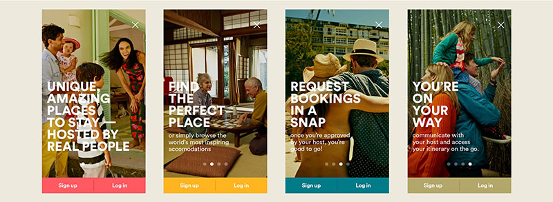
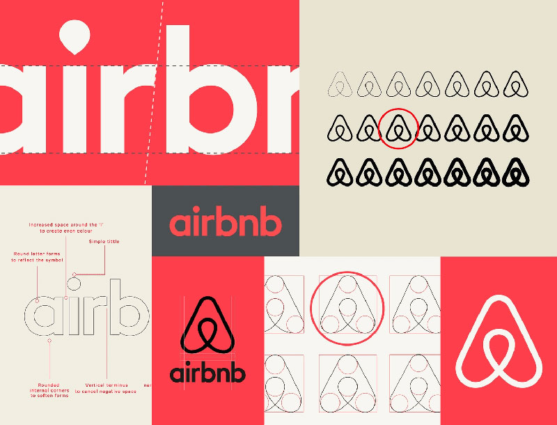
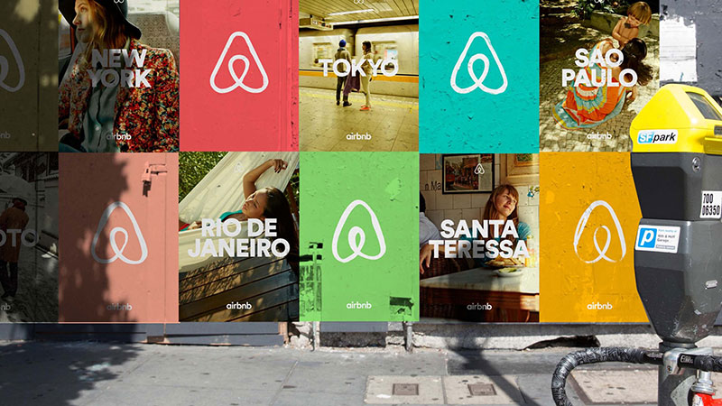
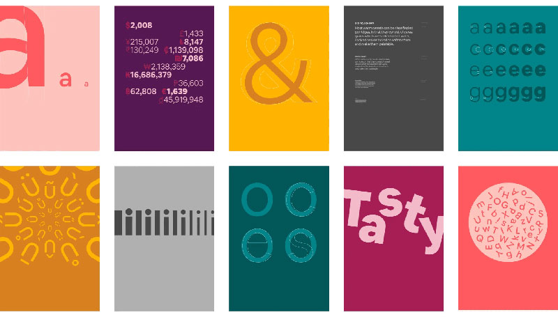
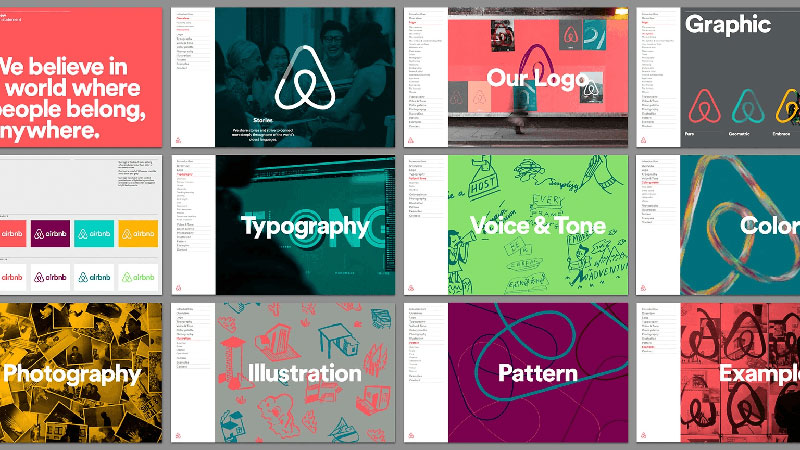
Airbnb operates in the short-term rental and travel industry, connecting hosts and guests across over 220 countries. Its corporate identity is one of the most recognized in the sharing economy, built around a single, emotionally loaded concept: belonging.
Visual Identity System
The centerpiece is the Bélo, a custom logomark designed by DesignStudio in 2014. It merges four ideas (people, places, love, and Airbnb) into one abstract shape that resembles both a location pin and the letter “A.”
The primary brand color is “Rausch,” a warm coral-pink that Airbnb guards closely in its trademark guidelines. Typography leans clean and approachable, with consistent use across digital and print. The visual system extends to photography that foregrounds real people and real spaces, not staged stock imagery.
Brand Voice and Messaging
Airbnb’s tone is warm, personal, and community-driven. The core tagline, Belong Anywhere, shifts the conversation away from price or logistics toward emotional connection.
Messaging consistently addresses hosts and guests as part of a shared community rather than as transactional users. Even legal and policy language is written to feel less corporate than competitors.
Identity Consistency Across Touchpoints
From the app interface to host welcome books to out-of-home advertising, the Bélo and Rausch palette appear consistently. The brand guidelines explicitly restrict how partners and hosts can use Airbnb’s name and visual assets, protecting brand consistency at scale.
Campaigns like Belong Anywhere and Live There maintained visual and tonal coherence across TV, digital, and social.
What the Identity Communicates
The corporate identity signals inclusivity, trust, and human warmth. These were non-obvious choices for a tech platform. Rather than leaning into the usual startup aesthetic, Airbnb positioned itself as a cultural movement around belonging.
This works because the identity matches the product’s actual value proposition: strangers opening their homes to other strangers requires an unusual level of trust, and the brand signals that trust at every step.
Lessons and Takeaways
The Bélo is a lesson in how a single, conceptually rich symbol can carry enormous meaning without complexity. The decision to anchor the entire brand around belonging rather than travel or accommodation is worth studying. It’s a positioning move executed through design, not just marketing copy.
Zendesk

Zendesk is a customer experience (CX) software company, primarily serving businesses that manage customer support operations. At 15 years in, its 2023 brand refresh addressed a real problem: competitors had copied enough of its original visual language that the brand was losing distinction.
Visual Identity System
The 2023 identity, developed in-house by Zendesk’s creative team over 18 months, moved toward what they described as “quiet confidence.” The color palette shifted to jewel tones, deeper and richer colors than what’s typical in the CX software category. A serif typeface was introduced alongside the existing sans-serif, adding maturity and editorial feel.
The illustration style is handcrafted and organic, a deliberate contrast to the polished, corporate look common in B2B software. Photography focuses on realistic customer service moments rather than aspirational, staged scenarios.
The original “Relationshapes” logomark (abstract geometric shapes representing human connections) was refined and remains core to the visual system.
Brand Voice and Messaging
The tone shifted toward clarity and directness with what the team called a “caring yet opinionated” lens. The 2023 tagline: The intelligent heart of customer experience.
Previous brand voice leaned into charm and quirkiness to the point where it was hard for teams to apply consistently. The refresh prioritized message clarity while retaining warmth.
Identity Consistency Across Touchpoints
The refresh rolled out across social media, the website, campaigns, and Zendesk Relate (its annual conference), which served as the public debut. Motion guidelines ensure that animation feels cohesive and not decorative. Internal brand education was rebuilt from scratch after audits showed the guidelines were scattered and hard to apply.
What the Identity Communicates
Zendesk’s identity now signals market leadership in a mature, considered way. It doesn’t try to look scrappy or startup-adjacent. Jewel tones and editorial typography suggest a company that has arrived, not one still proving itself.
For a B2B audience, that confidence reads as reliability.
Lessons and Takeaways
The challenge Zendesk faced (competitors eroding your visual language) is a real risk for any brand with a distinctive aesthetic. The decision to go more sophisticated rather than more bold (or more whimsical) is a strategy worth noting. Also: the investment in internal brand education and guidelines tooling is often what separates a rebrand that sticks from one that fades within months.
Patagonia
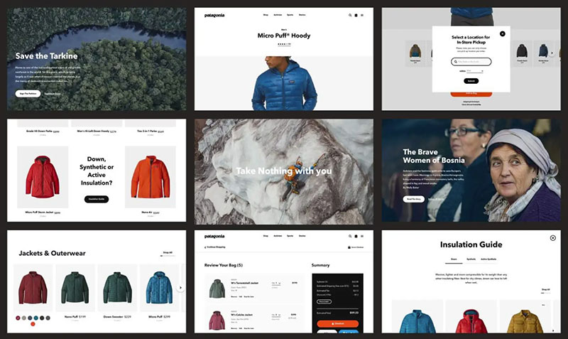
Patagonia is an outdoor apparel brand founded in 1973, with one of the most coherent corporate identities in consumer goods. The identity is inseparable from the company’s environmental mission, to the point where brand and values are the same thing.
Visual Identity System
The logo uses a modified version of Belwe Condensed, a typeface designed by Arno Drescher, combined with a silhouette of the Fitz Roy massif in Patagonia, Argentina. This logo has remained essentially unchanged since the 1970s. That consistency is intentional. Stability signals permanence and trust.
The color palette is earthy and neutral: muted greens, browns, and natural tones. Photography shows real outdoor enthusiasts in actual conditions, not models in curated environments. The visual language across the website, catalogs, and advertising is stripped back and purposefully unglamorous.
Brand Voice and Messaging
Patagonia’s tone is direct, earnest, and occasionally confrontational. The “Don’t Buy This Jacket” campaign is the clearest example: a full-page ad in the New York Times that literally told consumers not to buy the product unless they needed it.
Messaging consistently addresses environmental responsibility and the cost of consumption. This is not a soft “green” message. It’s specific and, at times, uncomfortable for the category.
Identity Consistency Across Touchpoints
The brand runs the same tone from product hangtags to legal press releases. When founder Yvon Chouinard transferred ownership of Patagonia to a trust and non-profit in 2022, the announcement read like a Patagonia ad: personal, direct, and mission-driven.
Retail stores, the website, and campaigns all operate within the same earthy, functional visual system. No department appears to be running a different version of the brand.
What the Identity Communicates
The corporate identity communicates that Patagonia’s values are real, not performed. Decades of consistency on the same environmental message means audiences trust it in a way that’s hard to manufacture quickly.
Wearing a Patagonia jacket has become a statement about values, something the brand identity actively encourages.
Lessons and Takeaways
Patagonia demonstrates that brand consistency over decades builds a kind of trust that advertising spend cannot replicate. The deliberate anti-marketing tone of campaigns like “Don’t Buy This Jacket” works precisely because it’s consistent with everything else Patagonia does. The lesson: if your values are authentic, build your identity around them completely, not selectively.
Lego
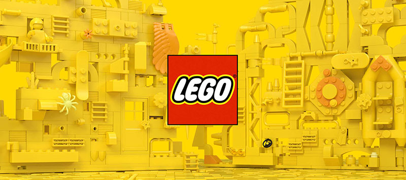
Lego is a Danish toy company founded in 1932, now one of the most recognized brands globally. Its 2024 identity refresh, developed with Interbrand and Lego’s in-house agency OLA, was the first comprehensive design system the company had ever built from scratch.
Visual Identity System
The iconic red logo remained unchanged. It didn’t need to move. What the team built was everything around it.
The core of the new system is the “clutch system” (named LEGO Brick Pro), a font of 130 brick-shaped glyphs that mirrors the geometry of actual Lego pieces. Anything built digitally with this system shares the same proportions as a real physical build. A new text typeface, Typewell (co-designed with Colophon Foundry), features flat endings on curved letters that echo the modular logic of bricks.
The color palette includes Lego’s signature red and yellow alongside an expanded range: blue, green, pink, purple, and orange. Action Graphics, a suite of comic-book inspired visual tools, give the system storytelling capability.
Brand Voice and Messaging
Messaging centers on the idea of “joy of building, pride of creation.” The brand targets children learning to read, so the visual language does heavy lifting. Comic panels, speech bubbles, and minifigure characters replace blocks of text as primary communication tools.
The five design principles guiding all brand decisions: design for your audience, build from its System-in-Play, tell stories, be playful and optimistic, and keep it simple.
Identity Consistency Across Touchpoints
Before the 2024 refresh, Lego’s brand was spread across 23 separate guidelines documents with over 110 individual principles. The new system consolidated all of this and applied it across physical packaging, in-store displays, digital platforms, and marketing campaigns simultaneously.
The Clutch System ensures that a digital button and a physical store display can share the same underlying geometry. That’s rare and worth studying.
What the Identity Communicates
Lego’s identity communicates play as serious, structured, and creative all at once. It doesn’t talk down to children and doesn’t exclude adults. The brick logic embedded in the design system communicates that Lego’s physical and digital worlds are one continuous thing, not two separate experiences.
Lessons and Takeaways
Building a design system around what your product actually is (in Lego’s case, modular interlocking pieces) is a smarter move than borrowing a visual language from somewhere else. The Clutch System is brilliant because it’s structurally tied to the product. Also worth noting: 23 guidelines documents is a maintenance nightmare for any brand. Consolidation is an underrated strategic priority.
United Sodas of America
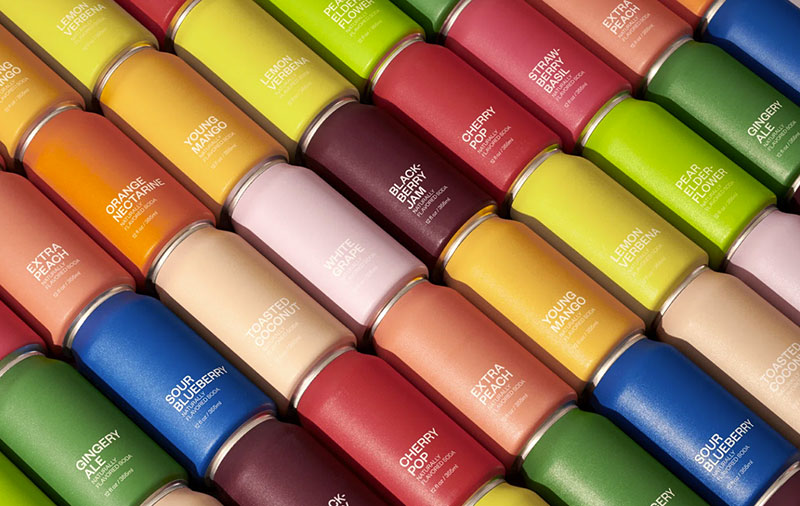
United Sodas of America (now rebranded to United Sodas) is a direct-to-consumer soda company launched in 2020 by founders who asked a simple question: “What if soda was invented today?” The brand was designed entirely by Brooklyn studio Center, led by Alex Center.
Visual Identity System
The approach was radical minimalism. The design strips the can down to three elements: shape, type, and color. No imagery. No characters. No flags or stars-and-stripes clichés.
The typeface is Klim Type Foundry’s Founders Grotesk, chosen for what Alex Center described as “just the right amount of trustworthiness and directness, but also some quirk.” It’s used in multiple weights to create hierarchy between the brand name, flavor name, and supporting details.
The color system is where the real concept lives. Twelve flavors, twelve distinct colors, each selected not just for the fruit it represents but for the personality and feeling of that flavor. Colors were drawn from American midcentury color-field painters: Ellsworth Kelly, Mark Rothko, Helen Frankenthaler. No red-white-and-blue in sight.
Brand Voice and Messaging
The brand’s central idea is variety as unity: “In a world that sees just red and blue, variety unites.” Copy is dry, direct, and slightly irreverent, consistent with the design’s confidence.
The tone avoids the health-brand earnestness common in the better-for-you food space, and it avoids the sugar-rush nostalgia of legacy soda brands. It occupies a space between fashion and food.
Identity Consistency Across Touchpoints
The minimalist system extends to the website, social media, and packaging design for limited drops. The “zipper” logo was retained in the brand refresh, maintaining the pared-back aesthetic while improving shelf visibility.
3D-rendered campaign visuals, used when photography wasn’t practical, maintained the same flat, color-first logic of the cans themselves.
What the Identity Communicates
United Sodas communicates that restraint is a form of confidence. In a category full of visual noise, choosing to show almost nothing is a bold statement. The color system turns each flavor into a distinct personality without needing mascots, characters, or slogans to do it.
Lessons and Takeaways
The design concept here came from taking the brand name literally and solving it visually. “United Sodas” suggested diversity without hierarchy, which is exactly what a multicolor, no-hero system delivers. Asking “what if this product was invented today?” is a useful brief for any brand stuck in category conventions.
Spotify
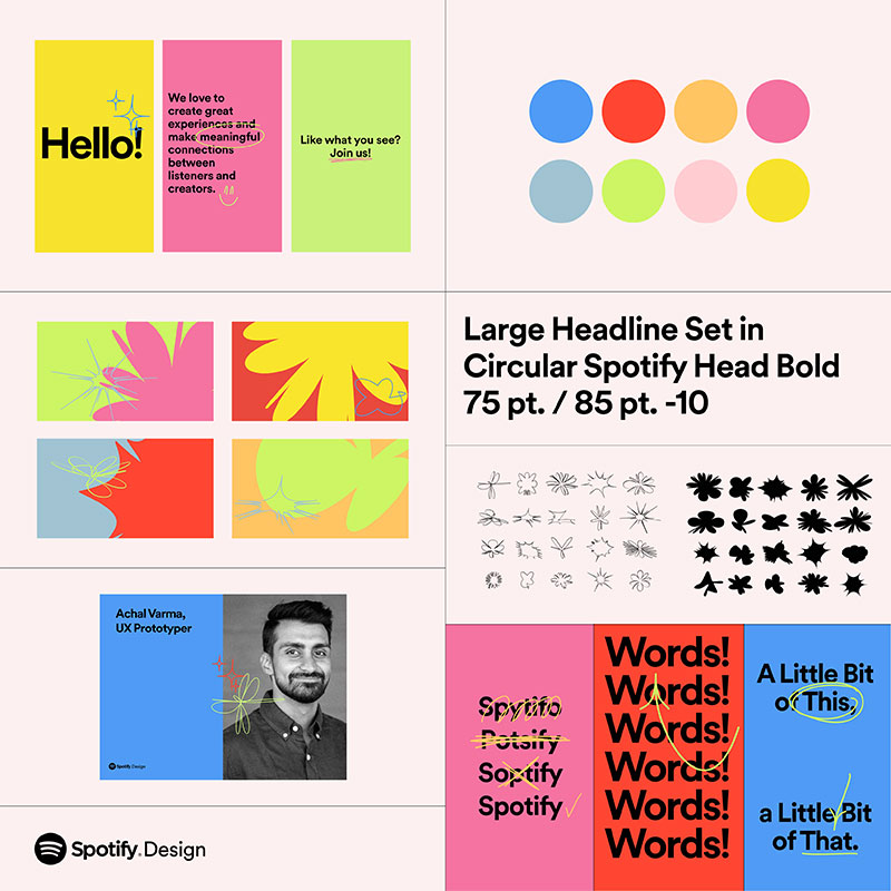
Spotify is a Swedish audio streaming platform launched in 2008, now operating in 184 markets. Its corporate identity has evolved from a scrappy startup with inconsistent visuals into one of the most recognized and deliberately managed design systems in tech.
Visual Identity System
The primary mark is the three-arc soundwave icon in a green circle, immediately recognizable and reproduced everywhere. The signature green (#1DB954) is one of the most distinctive brand colors in digital products: bright, energetic, and rare in a category dominated by red, blue, and black.
The custom typeface Circular (and more recently Spotify Mix, introduced in 2024) carries the brand across app interfaces, marketing campaigns, and editorial content. The design system, internally called GLUE (Global Language Unified Experience), was built from 2014-2015 and has governed design consistency across platforms since.
For Spotify Wrapped 2024, the team used Spotify Mix as a graphic element, treating the letterforms as shapes to build bold, abstracted compositions. The overall palette for Wrapped 2024 was brights and pastels on dark backgrounds: vibrant, celebratory, and very shareable.
Brand Voice and Messaging
The brand tone is playful, culturally aware, and data-informed. Spotify leans into cultural commentary. Campaigns reference streaming numbers, listening habits, and cultural moments in a tone that feels like a knowing friend, not a corporation.
The Wrapped campaign, launched annually, is the clearest example: it turns individual listening data into cultural conversation, with its visual language refreshed each year while staying unmistakably Spotify.
Identity Consistency Across Touchpoints
The GLUE design system ensures consistency across the mobile app, web player, developer tools, marketing materials, and partner assets. Developer-facing brand guidelines cover everything from minimum logo sizes to color application on artwork backgrounds.
Wrapped is deployed across the in-app experience, social media, and physical billboards globally, all from the same design system, scaled accordingly.
What the Identity Communicates
Spotify’s identity says: music is personal, culture is collective, and this platform sits at the intersection of both. The green signals energy and youth. The design system signals precision and care. Together, they communicate a platform that takes both the product and the user seriously.
Lessons and Takeaways
Spotify Wrapped is a masterclass in turning a data feature into a brand asset. The decision to treat Wrapped’s visual identity as a fresh creative brief each year, rather than locking it down, keeps the campaign culturally relevant. The use of typography as graphic form, rather than just as text, is a technique worth borrowing.
Fatso
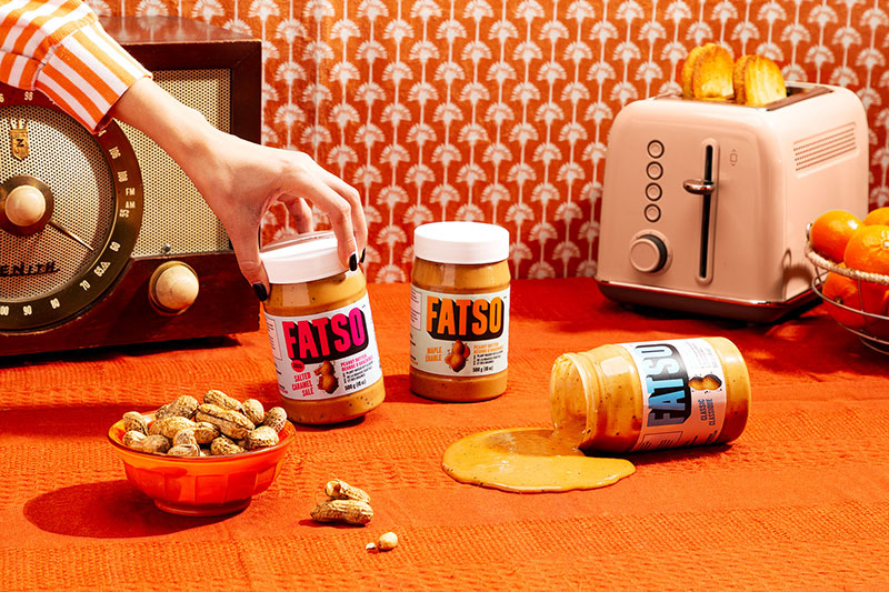
Fatso is a Canadian peanut butter brand founded in 2016 by Jill Van Gyn. It’s built around a simple idea: add healthy fats (coconut oil, MCT oil, chia, flax) to peanut butter and price it competitively against premium nut butters. The brand identity, designed by Vancouver agency Crew, went through a significant rebrand in 2022.
Visual Identity System
The rebrand went deliberately bold and retro. A custom condensed wordmark with a deep drop shadow sits front and center. The name “FATSO” in large type, unapologetic and impossible to miss.
The color system pairs vibrant primaries with pastels, creating a look that’s part vintage diner, part health food store. Flavor illustrations of the hero ingredients (peanuts, seeds, coconut) appear prominently on packaging, replacing the previous generic look that Van Gyn herself described as not living up to the brand’s energy.
The overall visual tone is confident and slightly irreverent, matching both the product name and the founder’s personality.
Brand Voice and Messaging
Copy is casual, conversational, and lightly irreverent. The “Dense AF!” campaign (referencing the product’s nutrient density) is a good example of the tone: direct, a little cheeky, and honest.
Messaging positions Fatso against conventional peanut butters rather than against premium competitors, making the value proposition immediately clear.
Identity Consistency Across Touchpoints
The retro-bold visual system carries through jars, website, social media, and retail packaging. Because the brand is sold across Canadian grocery chains and online, the packaging needs to work in both contexts, and the high-contrast, saturated design does.
Crew’s campaign work extended the visual language into advertising without diluting it.
What the Identity Communicates
Fatso’s corporate identity communicates that healthy food doesn’t have to be austere or expensive. The boldness of the design rejects the “clean label” minimalism common in the health food category, signaling that this is a brand with a personality, not just a product with better ingredients.
Lessons and Takeaways
The alignment between the brand name and the visual identity is unusually tight here. “Fatso” is a risky name. The design had to commit to it fully rather than soften it. Crew’s decision to lean into bold, retro confidence rather than health-food minimalism made the name an asset rather than a liability. The lesson: don’t design around a challenging brand name. Design with it.
Pandora
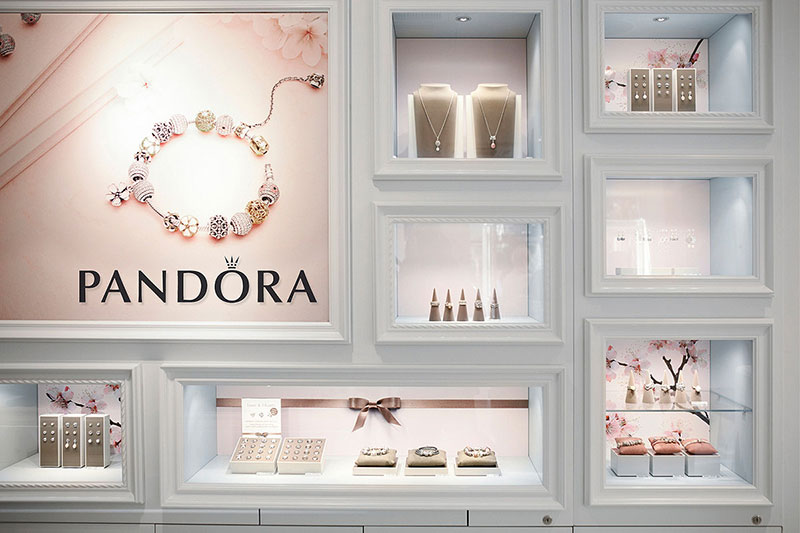
Pandora is a Danish jewelry company founded in 1982 by Per and Winnie Enevoldsen. It’s best known for its customizable charm bracelets and is now one of the largest jewelry brands in the world by volume. Its 2019 identity refresh introduced a significantly more confident and modern visual system.
Visual Identity System
The wordmark uses a custom typeface (close to Optima Demi Bold but distinct) rendered in all caps with a subtle, almost imperceptible serif. The crowned “O” is the brand’s most ownable element: a circle with a miniature crown that references both royalty and the circular form of Pandora’s signature charms.
Post-2019, bubblegum pink became the primary brand color, described by Pandora as “the new main marker and recognisable statement across all consumer touchpoints.” The crowned O was adopted as the social media avatar and is used as a large-scale graphic pattern across retail and campaign materials.
The logo appears only in black or white; the pink functions as the background and context, not the logo color itself.
Brand Voice and Messaging
The brand purpose is “giving a voice to people’s loves.” Campaigns like BE LOVE center on emotional storytelling, featuring diverse talent and presenting love as something lived and practiced, not just worn.
The tone aims to be aspirational but not exclusive, reflecting the brand’s positioning as accessible luxury: fine jewelry at a price point accessible to a broad audience.
Identity Consistency Across Touchpoints
The crowned O and pink appear across stores, packaging, social media, and campaign imagery globally. The brand book specifies that the O icon should always be used at a bold, “iconic scale”, never small or decorative. Retail environments are heavily pink, making Pandora stores immediately recognizable in a mall context.
What the Identity Communicates
The identity communicates accessible luxury with a feminine, modern sensibility. Pink is a decisive choice in a jewelry category that often defaults to gold, black, or white. It signals that Pandora is not trying to compete with high jewelry houses, but occupying its own distinct position.
The focus on personalization (the charm bracelet concept) is mirrored in the identity’s core message: jewelry as personal expression.
Lessons and Takeaways
Pandora’s use of a single letter as the primary brand icon (the crowned O) is an interesting alternative to using the full wordmark everywhere. It’s compact, flexible, and product-relevant. The pink decision is worth studying: choosing a color that many luxury brands would avoid was a deliberate positioning tool that made Pandora’s retail presence immediately distinct.
City of Melbourne
The City of Melbourne is the municipal government of Melbourne, Australia. Its 2009 identity, developed by Landor Associates, is one of the most studied examples of dynamic branding in civic design, and one of the earliest at that scale.
Visual Identity System
The previous logo was a leaf, designed in the mid-1990s and widely considered outdated. Landor spent seven months on research before creating anything, auditing 27 existing sub-brands, conducting stakeholder interviews, and reviewing the city’s long-term strategic plan.
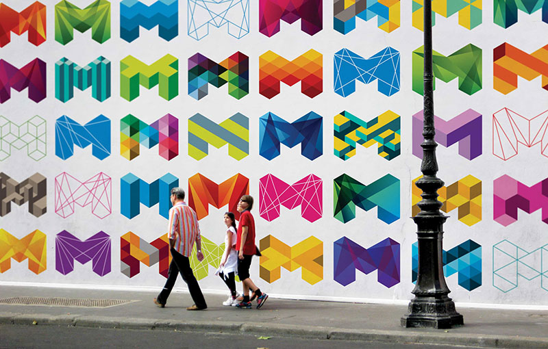
The result was a bold, geometric “M” built from angular, faceted forms. Not a fixed logo, but a system. Over 100 variations of the M were created, each using the same underlying geometric logic but different colors, orientations, and fill patterns. The system was designed to be extended indefinitely, with new variations being added over time.
Color usage is flexible and bold, ranging from deep blues to vibrant multicolor fills. The typography used alongside the M is sharp and angular, reinforcing Melbourne’s positioning as a cutting-edge city rather than a heritage one.
Brand Voice and Messaging
Melbourne’s identity communicated ambition, creativity, and urban energy, positioning it as a world-class, liveable city. The messaging frame was forward-looking rather than heritage-focused, which suited a city that topped the Economist Intelligence Unit’s Global Liveability Index for seven consecutive years from 2011.
Identity Consistency Across Touchpoints
The M system unified 27 previously fragmented sub-brands under a coherent visual framework. Each municipal body could adapt the M’s color and pattern to their context while maintaining the underlying geometric logic of the parent identity.
The system applied to the council’s website, stationery, signage, city collateral, and eventually cultural campaigns.
What the Identity Communicates
The fractured, geometric M communicates that Melbourne is complex, diverse, and hard to reduce to a single image, which is precisely the point. It says the city contains multitudes. That’s a difficult idea to express in logo design, and Landor’s solution solved it through system design rather than symbol design.
Lessons and Takeaways
Melbourne’s identity established that a visual identity doesn’t need a single fixed logo to be coherent. It needs a logic. The M system’s underlying geometry kept every variation recognizably “Melbourne” without requiring rigid uniformity.
This is particularly relevant for institutions, cities, and organizations that need to serve many different audiences and contexts simultaneously. The 7-month research process that preceded any design decision is also worth flagging: for complex brand systems, the strategic work is where the identity is actually built.
Deliveroo
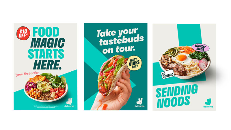
Deliveroo is a British food delivery company founded in London in 2013 by Will Shu and Greg Orlowski. It operates across 10 markets globally, connecting customers with restaurants through a network of independent riders. Its corporate identity is one of the more studied examples of design keeping pace with a fast-scaling startup.
Visual Identity System
The original identity had a literal kangaroo logo and a teal color. It worked fine for a website and some business cards. Then the company expanded to 12 countries and the identity had to work on rider jerseys, billboards, apps, and city streets simultaneously. That’s when they brought in DesignStudio (the same agency behind Airbnb’s Bélo) to redesign the whole thing in 2016.
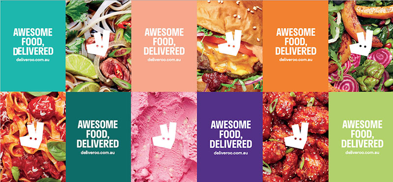
The result was an abstracted Roo Head, a geometric, angular mark that preserves the kangaroo reference while stripping away any detail that doesn’t scale. Teal stayed as the hero color. DesignStudio ran a semiotics analysis across Deliveroo’s key markets before finalizing the mark, checking what the kangaroo symbol meant in each culture.
In 2023, Deliveroo’s in-house team built on the 2016 foundation with a more comprehensive refresh. Two additions stand out: the Rooute (a teal graphic device representing the rider’s journey from restaurant to door) and a set of typographic stickers shaped like the Roo’s imperfect, hand-drawn eyes. Typography is angled at 6 degrees, matching the exact angle of the Roo’s nose.
Brand Voice and Messaging
The tone is playful and food-obsessed rather than corporate. The positioning “It’s All On Your Doorstep” centers the brand as a connector between people and local food culture, not just a logistics company.
Copy leans into the passion for food. The 2023 refresh pushed the tone to be “even more playful,” showing what the team described as Deliveroo’s passion for “the tastiest food in the neighbourhood.”
Identity Consistency Across Touchpoints
The Roo Head appears on rider jackets, the app icon, packaging, billboards, and digital ads. The original DesignStudio system was designed with rider visibility in mind, using flash material and high contrast that made riders safer on the road, especially at night.
The 2023 Rooute graphic device runs through all creative work, serving as a consistent visual reminder of Deliveroo’s brand codes across 10 different markets.
What the Identity Communicates
The Roo is warm but not childish. Geometric but not cold. It communicates speed (the angular, tilted forms), local knowledge (the food-first positioning), and approachability (the rounded, character-driven eye shapes in the stickers). For a service that relies on trust between strangers, that balance matters.
Lessons and Takeaways
Deliveroo’s approach to the semiotics review before designing is worth noting. Most brands skip the cultural analysis step, especially under time pressure. The decision to retain the Roo across both rebrands rather than starting fresh shows smart brand equity thinking. Building on what already exists is often harder than starting over, but it protects the recognition you’ve already earned.
Coca-Cola
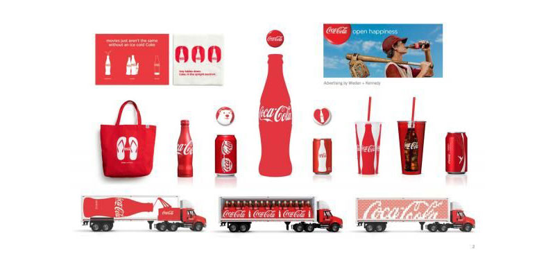
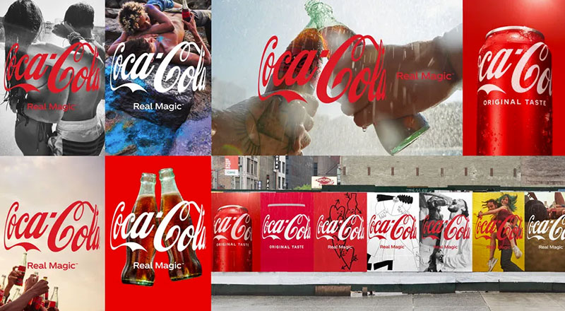
Coca-Cola is the world’s most recognized soft drink brand, founded in 1886 in Atlanta, Georgia. Its corporate identity is one of the oldest continuously managed brand systems in consumer goods, built on a small number of fiercely protected visual assets that have stayed remarkably consistent for over a century.
Visual Identity System
The Spencerian script wordmark is the brand’s oldest and most protected asset. Designed in 1887 by Frank Mason Robinson, it has been refined but never replaced. The script appears in white against the brand’s signature red on virtually every application globally.
The Dynamic Ribbon (also called the “contour wave”) is the secondary visual element: a flowing, wave-like device derived from the shape of the contour bottle. It appears as a decorative band across packaging, advertising, and retail.
In 2020, Coca-Cola introduced a comprehensive global design system developed around three principles: Scale (own red), Color Restraint (edited and crafted), and Consistency. The system introduced a unified custom typeface called Unity, designed to work alongside the Spencerian script across digital and print. The primary palette is Coca-Cola red (#F40009) and white, with black as a secondary. The iconic red disc, featuring the script in white, functions as the master logo across 120 countries.
Brand Voice and Messaging
Coca-Cola’s tone is consistently optimistic, warm, and inclusive. The brand has cycled through many taglines across its history, but all share a common emotional register: joy, togetherness, and refreshment. “Open Happiness,” “Taste the Feeling,” and “Real Magic” are recent examples.
The brand rarely makes functional product claims. The identity is built around feeling, not specification.
Identity Consistency Across Touchpoints
Color psychology is central to how Coca-Cola manages global consistency. The 2020 system explicitly specifies color restraint as a design principle, with red used as the dominant primary and other colors introduced sparingly.
Campaigns, vending machines, trucks, packaging, uniforms, and retail signage all operate within the same red-and-white system. This is not an accident. Coca-Cola has consistently invested in brand training for its hundreds of licensees and partners to prevent deviation.
What the Identity Communicates
The identity communicates continuity, optimism, and global familiarity. The script wordmark says: “we have been here longer than most things in your world.” That longevity is itself a brand value. And the red is so deeply associated with Coca-Cola that the company has legally challenged uses of similar shades in the beverage category.
Lessons and Takeaways
Coca-Cola is the case study for brand equity protection. The constraint not to change the core wordmark, even as everything around it was modernized, is a discipline most brands don’t have. The lesson is not “never change anything” but rather “know which assets carry irreplaceable equity and protect them absolutely.” Everything else can evolve.
Bumble

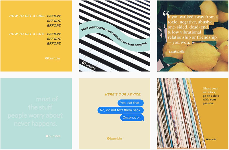
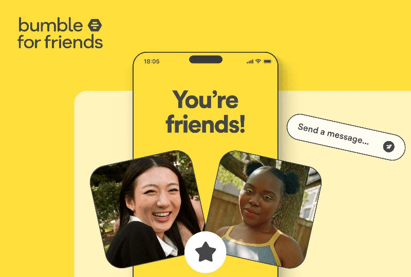

Bumble is a women-first dating app founded by Whitney Wolfe Herd in 2014, with headquarters in Austin, Texas. It operates across Bumble Date, Bumble BFF (friendship), and Bumble Bizz (networking). The brand’s 2024 visual refresh, executed entirely in-house by Bumble Creative Studio, was tied to a new feature launch and a global campaign.
Visual Identity System
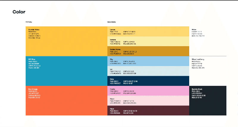
Bumble’s identity is built on a distinctive black-and-yellow palette (Bumble Yellow: #FFC629, Bumble Black: #1D252C). The yellow is a deliberate reference to honey, hives, and the queen bee, tying back to the brand name and its women-first positioning.
The central mark is the hexagonal hive icon, a honeycomb shape that references community and structure. In the 2024 refresh, the hex was subtly refined for better symmetry and cleaner proportions without losing recognition. The wordmark moved to a sharper, more modern typeface, stepping away from the previous rounded, bubbly letterforms.
Bold fonts replaced the earlier casual style across all materials, including the app interface, giving the brand a more confident presence on-screen.
Brand Voice and Messaging
The tagline is “The Home Of Make The First Move.” The 2024 campaign tagline “We’ve changed so you don’t have to” captures a brand voice that is self-aware, a bit wry, and designed to resonate with women tired of the standard dating app experience.
The tone is empowering without being preachy, and often leans into humor. The campaign launch featured Renaissance-style imagery of exhausted women, poking fun at dating fatigue.
Identity Consistency Across Touchpoints
The black-and-yellow system runs through the app, social media, OOH advertising, and marketing materials across 10+ countries. The 2024 campaign included projection mapping on landmark buildings and augmented reality activations. Bumble’s data showed 75% of women surveyed said the look and feel of a dating app matters to their experience, which drove the design investment.
What the Identity Communicates
The identity signals: this is a platform with a specific point of view. The boldness of the yellow, the sharpness of the updated typography, and the women-first messaging are all designed to make Bumble feel different from competitors that default to reds, flames, and generic heart iconography.
The hex pattern also communicates community structure, which reinforces the brand’s push beyond dating into friendship and networking.
Lessons and Takeaways
The 2024 refresh shows how a product feature launch (Opening Moves) and a visual identity update can work together as a single narrative. The design didn’t just refresh the aesthetics. It communicated that the product had genuinely evolved. Tying a rebrand to real product changes is a stronger message than a rebrand alone.
Kodak
Kodak is an American imaging technology company founded in 1892 by George Eastman in Rochester, New York. Its identity is one of the most studied examples of brand equity recovery in design history, following the company’s bankruptcy in 2012 and re-emergence in 2013.
Visual Identity System
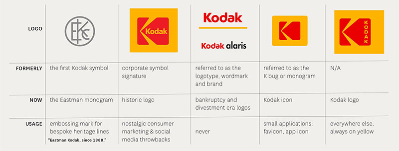
The 2016 rebrand, developed by New York studio Work-Order, returned to the K-in-a-square logo the company used during the 1970s and 80s. The previous logo (a red sans-serif wordmark used since 2006) had stripped out virtually everything distinctive about the brand.
Work-Order’s brief was clear: don’t bring back the old logo, because in people’s hearts and minds, it never really went away. The iconic Kodak K (a stylized camera shape built into the letter) was reinstated and refined. The wordmark was reworked to integrate more naturally with the icon.
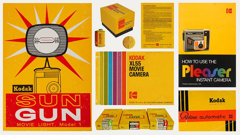
The Dress Red and Dress Yellow color palette returned as the central brand colors, after years of red-only branding. Yellow lettering runs vertically along the right side of the red K graphic. The updated system covered brand architecture, packaging guidelines, and positioning principles for Kodak’s licensees.
Research conducted during the rebrand found 58% of respondents recognized the brand from the outline of the K alone, without the wordmark or color. That’s a significant brand recognition figure to build from.
Brand Voice and Messaging
Kodak’s brand positioning shifted toward creative professionals: photographers, filmmakers, and image-makers. The messaging framed Kodak as “a system of scientifically organized resources for creativity,” combining heritage authority with contemporary relevance.
The tone appeals to both nostalgia (the film aesthetic, the cultural weight of Kodak moments) and creative ambition.
Identity Consistency Across Touchpoints
The K mark appears on Kodak’s digital channels, product packaging, and was embossed on the back of the Ektra smartphone launched alongside the rebrand. Work-Order unified previously fragmented brand materials, creating consistent guidelines across Kodak’s licensing business.
What the Identity Communicates
The Kodak identity communicates that history is a competitive advantage, not a liability. The revival of the K mark doesn’t feel retro in a cheap way. It feels authoritative. The red-and-yellow combination has decades of recognition built in, and the 2016 work treated that as an asset rather than a problem to modernize away.
Lessons and Takeaways
Kodak is a direct argument for the value of brand equity research before designing anything. The insight that 58% of people could identify the brand from the outline of the K alone made the direction obvious. Brands that abandon their most recognized assets in the name of modernization often spend years rebuilding what they destroyed. Kodak’s rebrand showed what it looks like to modernize without erasing.
Boy Smells
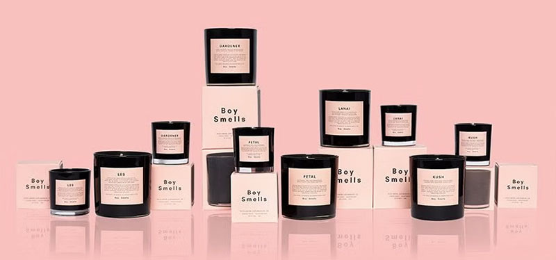
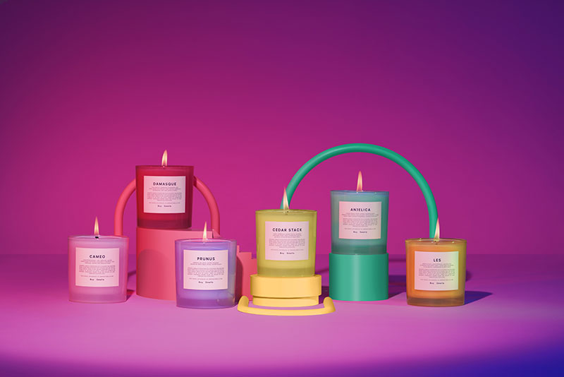

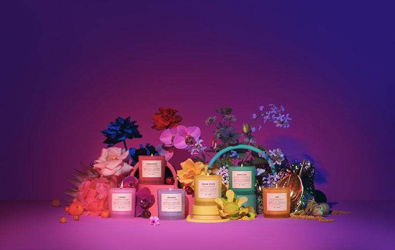
Boy Smells is a Los Angeles-based fragrance and candle brand founded in 2016 by Matthew Herman and David Kien, a couple who started making candles in their kitchen. The brand positioned itself from the start as gender-inclusive, rejecting binary fragrance categories in favor of what they called “genderful” scents. Both founders came from the fashion industry, and that background is visible in every design choice.
Visual Identity System
The original visual identity was spare and considered: a millennial-pink label on a clean cylindrical jar, with minimal typography and a focus on the jar’s silhouette. The name “Boy Smells” printed on a pink label was itself the brand statement. It worked because the dissonance was intentional.
The packaging design became so associated with the brand that the pink label alone was recognizable on social media. The oblong cap design, the understated type, and the monochromatic palette gave the line a fashion-editorial sensibility in a category that typically leans either clinical or rustic.
In 2025, the brand launched “Boy Smells 2.0,” a significant packaging overhaul with softer finishes, rounder shapes, and a dual-toned palette aimed at a broader, younger audience. The response was split. Longtime fans felt the androgynous edge had been traded for a look closer to mass-market beauty.
Brand Voice and Messaging
The brand’s voice is direct and identity-aware: “We’re rooted in genderfulness, where binaries dissolve.” Names like Cowboy Kush, Hinoki Fantôme, and Slow Burn signal that the scents are high-concept and slightly provocative.
The brand’s messaging has consistently centered on the idea that identity is complex, fluid, and worth celebrating through everyday objects like candles and fragrance.
Identity Consistency Across Touchpoints
Pre-2025, the pink-and-black system ran through jars, fragrance bottles, website, and social media with strong discipline. The limited-edition collaborations (including two with Kacey Musgraves) maintained the aesthetic while adding moments of creative variety.
The 2025 rebrand introduced visual inconsistency between the Classics collection (retaining the original pink-and-black) and the new Essentials line, which uses the updated softer aesthetic.
What the Identity Communicates
The original identity communicated that beauty can be subversive, inclusive, and sophisticated at the same time. The name did a lot of work, but the design made the name land correctly. Pink on a brand called “Boy Smells” only works if everything else is sharp and intentional.
Lessons and Takeaways
Boy Smells is a study in how brand identity and product positioning are inseparable. The 2025 rebrand faced backlash not because the new design is bad, but because the design signals a shift in values that the core audience didn’t want to see. When your identity is built on a specific cultural stance, any visual softening reads as a stance change. That’s the risk of a values-based identity: it earns fierce loyalty and equally fierce reaction when it shifts.
Heart & Stroke Foundation
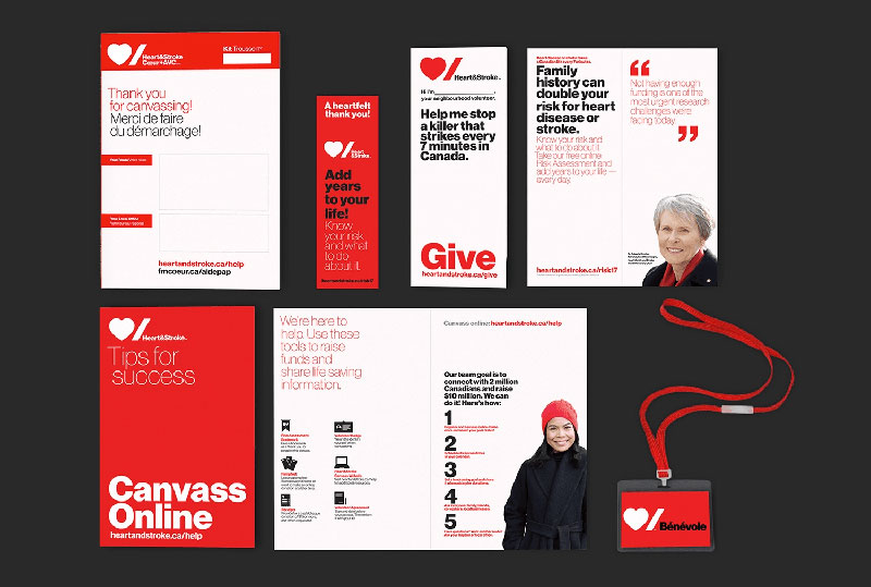
The Heart & Stroke Foundation is Canada’s leading heart and stroke health charity, founded in 1952. By 2011, the previously federated organization of 10 provincial bodies had unified into a single national organization, raising over $1.45 billion for research and contributing to a 75% decline in heart disease death rates across Canada. The 2016 rebrand, designed by Pentagram’s Paula Scher, was the organization’s first in over 60 years.
Visual Identity System
The old identity reinforced Heart & Stroke’s authority as a healthcare institution but did little to motivate action, particularly among younger donors. The brief to Pentagram was specific: create something more modern and relevant that could connect with younger generations while honoring the seriousness of the mission.
Scher’s solution was a rebus logo: a bold heart icon paired with a literal stroke mark (a thick diagonal slash). Together, they spell out “heart + stroke” through image rather than words. The stroke symbol was a specific design decision. As Scher noted, the diagonal line represents the abrupt interruption that a stroke causes, an experience anyone affected by one would instantly recognize.
The system uses Neue Haas Grotesk in multiple weights to shift between urgency (heavier weights) and empathy (lighter weights). The core palette is red, black, and white, with provision for expansion into additional colors for sub-programs.
One practical constraint shaped the design: Canada’s official bilingualism requirements. The symbols transcend language, allowing the logo to function equally in English and French without text dependency.
Brand Voice and Messaging
The tone balances medical seriousness with emotional urgency. Messaging focuses on life’s seemingly insignificant moments, the brief pauses that can mark the difference between health and crisis.
Sub-brands for fundraising events like Big Bike and Jump Rope for Heart could now be anchored to the parent identity through consistent use of the logo framework.
Identity Consistency Across Touchpoints
The system rolled out across publications, campaigns, community event materials, corporate sponsorships, and lottery programs. Comprehensive graphic guidelines were developed for the full range of applications. The ability to create custom icons for individual initiatives, while maintaining the parent logo framework, gave the organization flexibility without fragmentation.
What the Identity Communicates
The identity communicates that Heart & Stroke is both scientifically credible and humanly accessible. The rebus logo is serious but not clinical. The stroke mark especially carries emotional weight: it is simultaneously a medical term, a graphic form, and a felt experience for millions of Canadians.
Lessons and Takeaways
Paula Scher’s rebus solution to the bilingualism constraint is a lesson in turning a limitation into a creative advantage. The brief demanded language-neutral communication. The solution was to express the brand name entirely through symbols, resulting in a more powerful and universally readable identity than a wordmark alone would have been. The lesson: constraints, handled well, often produce better design.
Glossier
Glossier is a direct-to-consumer skincare and beauty brand founded by Emily Weiss in New York in 2014, growing out of her beauty blog Into the Gloss. The brand built its identity on community feedback and a “no-makeup makeup” aesthetic, positioning itself against the aspirational, heavily styled world of traditional beauty advertising.
Visual Identity System
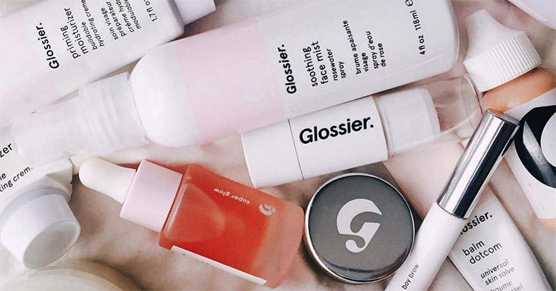
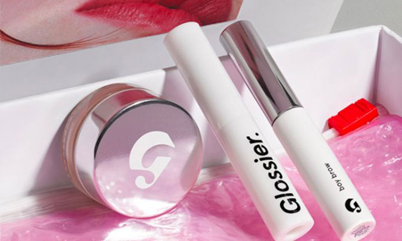
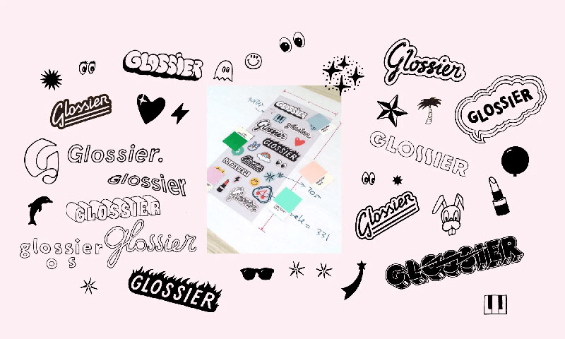
The signature visual elements are immediately recognizable: a sans-serif wordmark in clean, confident lettering (with a calligraphic “G” used as a secondary mark), a consistent use of soft pinks, whites, and pastels, and minimalist design across all packaging.
The baby-pink bubble wrap pouch that accompanies every order has become so iconic that many people describe the color simply as “Glossier pink.” Sticker sheets included with each order invite customization and make the unboxing experience shareable by design. Packaging text is kept minimal, letting the color and form carry the brand signal.
The global brand identity and art direction for the launch were developed in collaboration with French designer Leslie David and illustrator Charlotte Delarue, with playful illustrations and a mix of practical minimalism and personal detail baked in from the beginning.
Brand Voice and Messaging
The tagline “You look good” is three words that do a lot of work. It positions Glossier not as a brand telling you what to buy to become beautiful, but as one affirming that you already are. The tone throughout is conversational, direct, and non-prescriptive.
Glossier’s voice grew out of Into the Gloss’s editorial style: real people talking honestly about beauty routines rather than brand-sanctioned aspirational messaging.
Identity Consistency Across Touchpoints
The pink and white palette appears across every touchpoint: the website, the pink-lined shipping boxes, the in-store design of Glossier’s flagship locations, social media, and campaign photography. Photography consistently features real-looking skin, natural lighting, and diverse casting.
Glossier’s head of design noted that the pink bar on a moisturizer was so ownable that removing all the copy would still leave something instantly recognizable as Glossier. That level of color ownership is rare and deliberate.
What the Identity Communicates
Glossier communicates that beauty should be accessible, simple, and personal. The identity rejects the intimidation of traditional beauty counter aesthetics in favor of something that feels like a recommendation from a friend. This made the brand’s products highly shareable on Instagram and its packaging something customers kept on display rather than tucking away.
Lessons and Takeaways
Glossier’s packaging is a lesson in the intersection of brand style guide discipline and deliberate shareability. The brand understood early that packaging appearing in user-generated content was a distribution channel, not just a box. Every design decision was made with that context in mind. The “happy face” printed inside the box that most customers would never notice is exactly the kind of detail that builds cult identity over time.
McDonald’s
McDonald’s is the world’s largest fast-food chain, founded in 1940 and operating over 40,000 locations across 120 countries. Its corporate identity is built almost entirely around a single visual asset: the Golden Arches. The 2019 identity overhaul, developed by Turner Duckworth in partnership with Dalton Maag, was the most significant redesign the company had undertaken in years.
Visual Identity System
The Golden Arches began as architectural features on the original California restaurant buildings in 1952, designed by architect Stanley Clark Meston. Designer Jim Schindler formalized them into the overlapping “M” logo in 1962. They have not fundamentally changed since.
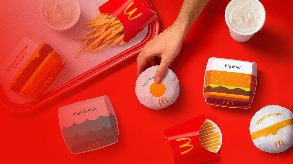
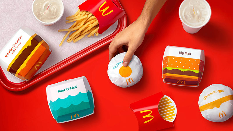
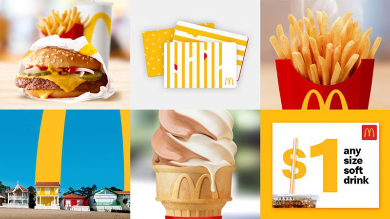
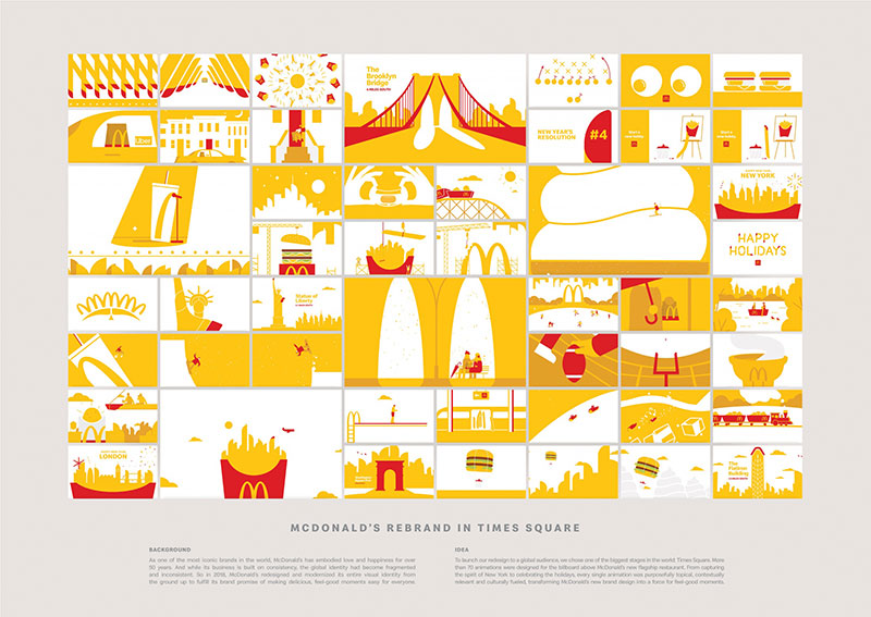
What Turner Duckworth addressed in 2019 was how the arches were being used, not the arches themselves. The previous system had become “cluttered and disparate,” with the iconic mark “completely under-utilized” and a tendency to create new logos for every initiative. Turner Duckworth developed a system called “Archery” that unlocked the arches as a flexible graphic device: oversized, cropped, angled, implied. Used big and unapologetically.
The Speedee typeface, developed with Dalton Maag, took inspiration from the curves of the Golden Arches themselves and the typography of the 1971 “You deserve a break today” campaign. It comes in three weights and replaced the previous mix of multiple fonts.
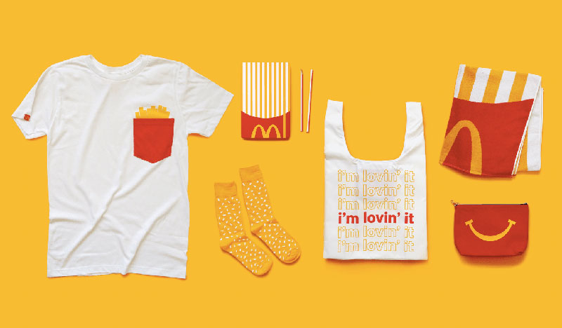
Color palette discipline was a core part of the brief. The previous system allowed “basically any color.” The 2019 system reduced this to McDonald’s gold and red, with a specified proportion ratio between the two. Gold became the more dominant primary choice.
Brand Voice and Messaging
McDonald’s tone has become warmer and more conversational in recent years, with campaigns like “I’m Lovin’ It” running globally since 2003. The brand leans into nostalgia (the Happy Meal, the Big Mac), familiarity, and comfort.
The 2019 identity shift supported this by moving away from being “logo-tastic” toward letting the food and cultural moments do more of the communicating.
Identity Consistency Across Touchpoints
Turner Duckworth replaced the traditional 200-page PDF brand guidelines with “Cheatsheets,” a small set of focused pages that made global rollout more manageable across 40,000+ locations. A digital hub (the McDonald’s Design Hub, developed with Reach Creative) gave teams and agency partners global access to assets, guidelines, and creative inspiration.
The system extends to sub-brands: McCafé, Happy Meal, loyalty programs, and corporate conventions all operate within the same Archery visual logic.
What the Identity Communicates
The Golden Arches communicate comfort, consistency, and scale. Across cultures, the “M” reads the same. That kind of global legibility is the result of 60+ years of consistent application and billions spent in advertising. The 2019 system didn’t try to reinvent that. It tried to make better use of it.
Lessons and Takeaways
The Archery system is a lesson in making the most of what you already own. Many brands with highly recognizable assets use them small and timidly. Giving the arches permission to be oversized, cropped, and graphic turns a logo into a design system. The Speedee typeface is also worth studying: it was built from the curves of the arches, so typographic hierarchy and logo geometry share the same underlying logic. That’s the kind of internal coherence that makes a design system feel unified rather than assembled.
FAQ on Corporate Identities
What is a corporate identity?
Corporate identity is the visual and verbal system a company uses to present itself consistently. It includes the logo, color palette, typography, tone of voice, and any other design elements that signal who the brand is across all touchpoints.
What is the difference between corporate identity and brand identity?
Corporate identity focuses on the visual design system: logo, colors, and typography. Brand identity is broader, covering personality, values, and emotional positioning. The two overlap significantly, but corporate identity is the tangible, designed expression of brand identity.
Why do corporate identity examples matter for designers?
Studying real examples shows how strategic decisions translate into design outcomes. You learn why certain color choices work, how typography signals trust or playfulness, and how the best brands build recognition through consistency rather than complexity.
What makes a corporate identity successful?
Consistency and relevance. A strong corporate identity reflects the company’s actual values, works across every touchpoint from packaging to digital, and stays recognizable at any scale. It also needs to be simple enough for internal teams to apply correctly without constant oversight.
How often should a company rebrand its corporate identity?
There’s no fixed rule. Most major brands refresh every 10 to 15 years to stay current without losing recognition. The trigger is usually a shift in audience, a new competitive threat, or a business model change, not a desire for novelty.
What are the key elements of a visual identity system?
A complete visual identity system typically includes:
- Logo and logomark variations
- Primary and secondary color palette
- Typography (typefaces, weights, hierarchy)
- Photography and illustration style
- Iconography and graphic devices
- Usage guidelines for all applications
What is the role of color in corporate identity?
Color is one of the fastest recognition signals a brand has. It works before typography or messaging registers. Brands like Coca-Cola (red), Bumble (yellow), and Glossier (pink) have built such strong color ownership that their palette alone identifies them without a logo.
Can a small business have a strong corporate identity?
Absolutely. Corporate identity is about consistency, not budget. A small brand with a clear logo, a defined color palette, and a consistent tone of voice can build strong recognition over time. Many cult brands started with minimal design investment and sharp creative direction.
What is a dynamic identity in corporate branding?
A dynamic identity uses a flexible visual system instead of a single fixed logo. The City of Melbourne’s geometric “M” is a well-known example: over 100 variations share the same underlying geometry, keeping the brand coherent while adapting across different contexts and audiences.
How do corporate identity examples help with rebranding decisions?
They provide a reference for what’s possible and what tends to go wrong. Studying rebrands like Kodak’s heritage revival, Zendesk’s category differentiation, or Bumble’s in-house refresh shows how strategy shapes design decisions, and how the reasoning behind a rebrand determines whether it sticks.
Conclusion
These corporate identity examples cover a wide range of industries, budgets, and design philosophies. But they share one thing: every strong identity starts with a clear understanding of what the brand actually stands for.
The visual identity system is just the output. The strategy comes first.
Whether you’re studying brand consistency across decades like Patagonia, or learning from a dynamic logo system like Melbourne’s geometric M, the underlying lesson is the same. Good design decisions are grounded in purpose, not aesthetics alone.
Use these case studies as a reference point. Study the reasoning behind the choices, not just the visual results. That’s where the real value is.
Also, you can check the version of this article about corporate identity examples in German.

Renowned for his expertise in logo design and visual branding, Bogdan has developed a multitude of logos for various clients.
His skills extend to creating posters, vector illustrations, business cards, and brochures. Additionally, Bogdan's UI kits were featured on marketplaces like Visual Hierarchy and UI8.
He also wrote in the past years on sites like Design Your Way, WebDesignerDepot, WPDean, Designmodo, Speckyboy, Slider Revolution, and more.
- The Windsurf Logo History, Colors, Font, And Meaning - 10 October 2026
- How to Remove Background From Product Photos (No Photoshop) - 10 October 2026
- How Designers can Build a Stronger Online Creative Identity - 9 October 2026

Bogdan Sandu is a seasoned designer who has been designing websites since 2008. Renowned for his expertise in logo design and visual branding, Bogdan has developed a multitude of logos for various clients. His skills extend to creating posters, vector illustrations, business cards, and brochures. Additionally, Bogdan's UI kits were featured on marketplaces like Visual Hierarchy and UI8. He also wrote in the past years on sites like Design Your Way, WebDesignerDepot, WPDean, Designmodo, Speckyboy, Slider Revolution, and more.
You Might Also Like