The Crumbl Cookies logo has become one of the most recognizable marks in the dessert franchise industry. Since the company launched in 2017, its pink and white visual identity has spread across shopping centers, social media feeds, and those now-famous pink boxes.
What makes this logo interesting is how quickly it achieved mainstream recognition. Most bakery brands take decades to build that kind of visual equity. Crumbl did it in about five years.
The brand sits within a broader wave of millennial and Gen Z-focused food companies that prioritize Instagram-ready aesthetics. Think about how different this approach is from traditional bakeries with their rustic, homey branding. Crumbl went modern, clean, and unapologetically pink.
The current logo version debuted alongside the company’s founding. It has seen minor refinements but no major overhauls. The founders, Sawyer Hemsley and Jason McGowan, developed the initial brand identity themselves before bringing in professional designers for refinement.
What is the Crumbl Cookies Logo?
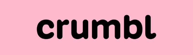
The Crumbl Cookies logo is a combination mark featuring a custom wordmark with a stylized cookie icon. Introduced in 2017 when the brand launched in Logan, Utah, the design uses a signature pink color paired with clean white elements. The logo represents freshness, fun, and premium quality in the cookie market.
Design Type: Combination mark (wordmark plus icon)
Primary Elements:
- Custom “CRUMBL” wordmark in bold lettering
- Stylized cookie bite icon
- Clean geometric shapes
- Signature pink background application
Official Introduction Date: 2017
Designer/Agency: Initially developed by founders Sawyer Hemsley and Jason McGowan, with later professional refinements
Trademark Status: Registered trademark of Crumbl, LLC
Color Palette:
- Crumbl Pink: #FFC0CB (primary)
- White: #FFFFFF (secondary)
- Black: #000000 (accent for text)
Usage Context: Storefronts, packaging (iconic pink boxes), mobile app, social media, merchandise, delivery vehicles, and marketing materials
How Has the Crumbl Cookies Logo Evolved Over Time?

The Crumbl logo has undergone several iterations since 2017, with a major rebrand in 2023. Unlike the original description suggesting “remarkable consistency,” the brand actually evolved through distinct phases before its significant 2023 redesign.
The company’s rapid franchise expansion from a single Utah location to over 950 stores in six years necessitated branding evolution to match its growth.
Original Crumbl Cookies Logo (2017-2018)
Years Active: 2017-2018
Design Description: The first version featured a simple bitten cookie illustration with the word “crumbl” underneath in lowercase letters. The design was done in black and white with a classic, professional look.
Color Scheme: Black and white
Designer: Founders Sawyer Hemsley and Jason McGowan
Context: Created for the first location in Logan, Utah when the cousins were perfecting their chocolate chip cookie recipe.
Cultural Significance: Represented the scrappy startup phase with a straightforward, homemade feeling.
Baker Icon Logo (2018-2020)
Years Active: 2018-2020
Design Description: Introduction of “Bakerhead” – a stylized baker mascot with a chef’s hat that transitions into a bitten cookie. The wordmark featured “Crumbl” in bold, rounded sans-serif font with “cookies” below in a thinner, simpler font.
Color Scheme: Black and white
Key Changes from Previous: Replaced cookie illustration with baker character mascot, two-line wordmark with different fonts
Cultural Significance: Added personality and friendliness to the brand as it began franchising
Refined Baker Logo (2020-2023)
Years Active: 2020-2023
Design Description: The baker icon was placed inside a solid black circle background for more contrast and professionalism. The wordmark structure remained the same.
Color Scheme: Black and white with signature pink packaging
Key Changes from Previous: Added circular black background behind baker icon for improved visibility and weight
Context: Coincided with rapid franchise expansion across the US
Cultural Significance: This version rode the TikTok wave and viral food content trend, with the pink box becoming iconic
Current Crumbl Logo (2023-Present)
Years Active: 2023-Present
Design Description: Minimalist wordmark reading simply “crumbl” in custom Crumbl Sans font. The baker icon and word “cookies” were removed entirely for a cleaner, simplified look.
Color Scheme: Black wordmark on Pantone Crumbl Pink background (proprietary pink shade created in 2023)
Designer: Turner Duckworth with typeface by Kilotype and Alec Tear
Key Changes from Previous: Dropped “Cookies” from name, removed Bakerhead mascot, created custom variable typeface Crumbl Sans, introduced proprietary pink color
Context: Announced November 2023 as brand reached over 950 locations. Designed to stay current and connect with audience while maintaining core values.
Cultural Significance: Represents evolution from cookie-focused brand to broader dessert destination. The simplified, bold design works better across digital platforms and merchandise, embracing the brand’s famous pink box aesthetic.
What Do the Design Elements of the Crumbl Cookies Logo Mean?

Every element serves a purpose. The cookie icon with a bite taken out suggests the product is irresistible.
You cannot help but take a bite. That is the message.
The rounded forms throughout the design create approachability and warmth.
Why Did Crumbl Cookies Choose These Specific Colors?
The pink was a bold move. Most bakeries default to warm browns, creams, or reds. Crumbl went a completely different direction.
Crumbl Pink (Pantone Crumbl Pink)
- Pantone: Proprietary Pantone Crumbl Pink (created in partnership with Pantone Color Institute in 2023)
- Hex: Not publicly disclosed (proprietary color)
- Origin story: Inspired by a pink Cadillac owned by co-founder Sawyer Hemsley’s childhood neighbor. The eye-catching car drew everyone’s attention and felt iconic.
- Symbolic meaning: Sweetness, playfulness, fun, warmth, nostalgia, coming together
- Psychological impact: Creates feelings of playfulness, fun, comfort and invites meaningful moments. Described as “warm and nostalgic and perfectly pink.”
- Brand connection: The pink boxes became a hallmark of the brand, completely differentiating Crumbl from every other cookie company. As Hemsley said: “It was a color that was fun, inviting, and energetic.”
Understanding color psychology explains why this works. Pink triggers associations with treats, celebrations, and special occasions.
Black
- Hex:
#000000 - Symbolic meaning: Sophistication, boldness, contrast
- Psychological impact: Provides visual weight and professional appearance
- Brand connection: Used for logo wordmark and cookie packaging details, balances the playful pink with modern minimalism
White
- Hex:
#FFFFFF - Symbolic meaning: Cleanliness, freshness, purity, simplicity
- Psychological impact: Suggests premium quality and hygiene
- Brand connection: Provides clean backdrop and breathing room in design
The combination puts Crumbl squarely in the pink logos category alongside brands targeting younger demographics, though Crumbl’s proprietary pink shade and the story behind it (inspired by a vintage pink Cadillac) makes it uniquely recognizable and nostalgic.
What Typography Style Is Used in the Crumbl Cookies Logo?
The wordmark uses a custom sans-serif font with bold, rounded characteristics. It feels modern without being cold.
The letters have generous width, which helps readability on storefronts and small mobile screens alike.
No serifs means no fussiness. Just clean, direct communication.
The tracking between letters is slightly loose, giving the word room to breathe.
What Are the Hidden Meanings in the Crumbl Cookies Logo?
The bite mark in the cookie icon is the obvious one. It creates instant recognition and suggests action.
Look closer at the proportions. The cookie shape follows principles similar to the golden ratio, creating visual harmony.
Some fans have noted the “C” in Crumbl echoes the curve of a cookie. Whether intentional or happy accident, it works.
The founders have not publicly discussed hidden symbolism. Sometimes the best logos just feel right.
How Does the Crumbl Cookies Logo Compare to Competitor Logos?

In the dessert franchise space, Crumbl stands alone visually. Competitors like Insomnia Cookies use darker, more traditional palettes.
Nothing else looks quite like it. That pink box is unmistakable from fifty feet away.
The approach shares DNA with tech-forward food delivery brands like DoorDash and Instacart rather than traditional bakeries.
Most cookie companies lean into rustic, homemade aesthetics. Warm colors, script fonts, illustrations of wheat or rolling pins.
Crumbl rejected all of that. The result is a brand that feels more like a tech startup than a bakery. And for their target demographic, that is exactly right.
Within the broader fast food logos landscape, Crumbl demonstrates how newer brands are breaking conventional category design rules.
What Are the Technical Specifications of the Crumbl Cookies Logo?
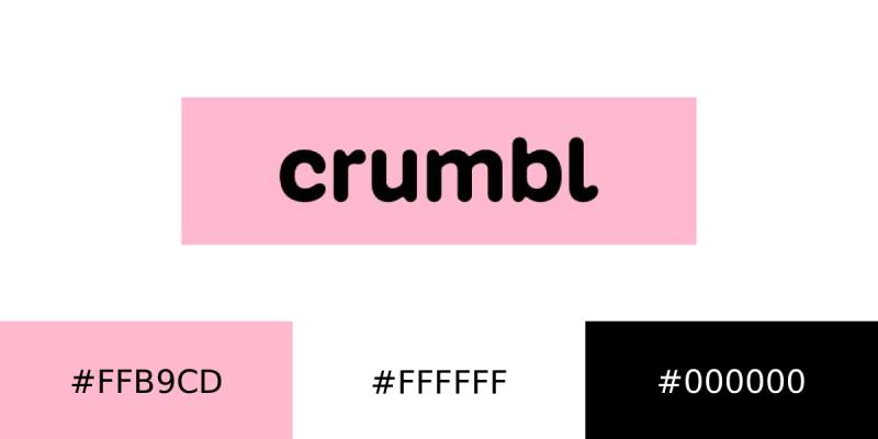
Official Color Codes:
Primary Color: Crumbl Pink
Secondary Color: White
- Hex: #FFFFFF
- RGB: (255, 255, 255)
- CMYK: (0, 0, 0, 0)
Accent Color: Black
- Hex: #000000
- RGB: (0, 0, 0)
- CMYK: (0, 0, 0, 100)
Dimensions and Proportions:
- Aspect ratio: Approximately 4:1 (horizontal wordmark)
- Minimum size: 1 inch width for print applications
- Clear space: Minimum padding equal to the height of the “C” in Crumbl
- The logo must maintain legibility at all sizes per franchise guidelines
What Cultural Impact Has the Crumbl Cookies Logo Had?
The pink box became a social media phenomenon. People film themselves opening it. The unboxing ritual is part of the product now.
On TikTok, videos featuring the distinctive packaging have generated billions of views.
The logo taught other food brands that standing out matters more than fitting in.
Crumbl proved you can build a bakery brand with the visual language of a lifestyle company. That shift influenced how newer food franchises approach their identities.
How Does the Crumbl Cookies Logo Fit Into the Overall Brand Identity?
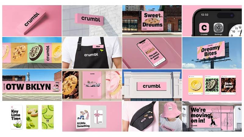
The logo is just one piece. It connects to the pink boxes, the app interface, store design, employee uniforms, and even the company’s social media voice.
Everything matches. That consistency is why the brand recognition happened so fast.
The color palette extends to every touchpoint.
Walk into any Crumbl location and the pink hits you immediately. The stores feel like walking into the logo itself.
Their packaging design is particularly important. Those pink boxes do more marketing work than any billboard could.
How Should the Crumbl Cookies Logo Be Used?

Official Usage Guidelines:
Do:
- Use official logo files provided by corporate
- Maintain minimum clear space around the logo
- Use approved color combinations only
- Keep proportions locked when resizing
Do Not:
- Alter the logo colors
- Stretch or distort the proportions
- Add effects like shadows or gradients
- Place the logo on busy backgrounds that reduce legibility
- Recreate or approximate the logo
Where to Access Official Logos: Franchisees receive brand assets through the corporate portal. Public access is restricted to protect trademark integrity.
Licensing Information: The Crumbl logo is proprietary. Any commercial use requires explicit written permission from Crumbl, LLC.
Trademark Protection: The logo, wordmark, and distinctive pink packaging are all protected under U.S. trademark law. Crumbl actively monitors and enforces against unauthorized use.
FAQ on The Crumbl Cookies Logo
What Does the Crumbl Cookies Logo Look Like?
The Crumbl Cookies logo features a bold wordmark spelling “CRUMBL” alongside a cookie icon with a bite taken out.
The design uses pink and white branding consistently. Clean lines. Modern feel.
It works as a combination mark, blending text and symbol into one cohesive identity.
What Are the Official Crumbl Cookies Logo Colors?
The primary color is Crumbl Pink (hex #FFC0CB). White serves as the secondary color for backgrounds and text.
Black appears occasionally for accent purposes.
This monochrome color approach with pink keeps the brand identity tight and instantly recognizable across all franchise locations.
Who Designed the Crumbl Cookies Logo?
Founders Sawyer Hemsley and Jason McGowan created the original logo when they launched in Logan, Utah.
They handled the initial brand identity themselves.
Professional designers later refined the visual identity as the cookie franchise expanded nationwide. The founders maintained creative control throughout.
When Was the Crumbl Cookies Logo Created?
The logo debuted in 2017 when the first Crumbl location opened in Utah.
It has remained largely unchanged since then.
Minor refinements improved digital applications around 2019. The core cookie brand identity stayed consistent through rapid franchise growth.
Why Is the Crumbl Cookies Logo Pink?
Pink differentiates Crumbl from traditional bakeries using brown and cream tones. The color signals sweetness and playfulness.
It also photographs well for social media.
Understanding basic color theory shows why this works. Pink triggers emotional responses tied to treats and indulgence.
What Font Does Crumbl Cookies Use in Their Logo?
Crumbl uses a custom typeface with bold, rounded letterforms. It is not a publicly available font.
The typography feels modern and approachable.
Wide letters improve readability on storefronts and the Crumbl app. No serifs, no fuss.
Can I Use the Crumbl Cookies Logo for My Own Purposes?
No. The Crumbl trademark protects the logo from unauthorized use.
Commercial usage requires written permission from Crumbl, LLC.
Franchisees receive official assets through corporate channels. Public downloads are restricted. The company actively enforces trademark protection.
Has the Crumbl Cookies Logo Changed Over Time?
The logo has stayed remarkably stable. Only minor refinements occurred since 2017.
Adjustments improved digital rendering and scalability.
Following solid logo design principles, Crumbl avoided dramatic redesigns. Consistency built the brand recognition they enjoy today.
What Does the Crumbl Cookies Logo Symbolize?
The bite mark in the cookie icon suggests irresistibility. You cannot help but take a bite.
Rounded shapes create warmth and approachability.
The overall Crumbl visual identity communicates freshness, fun, and premium quality in the dessert company market.
Where Can I Download the Official Crumbl Cookies Logo?
Official logo files are not publicly available. Crumbl restricts access to protect brand integrity.
Franchisees access assets through the corporate portal.
For media inquiries, contact Crumbl directly. They maintain strict brand guidelines controlling how the logo appears everywhere.
Conclusion
The Crumbl Cookies logo proves that breaking category norms pays off. Pink in a sea of brown bakery branding was a risk. It worked.
This cookie company built brand recognition faster than franchises ten times its age.
The secret? Consistency across every touchpoint. The pink box, the app, the storefronts, the TikTok presence. Everything aligns.
For anyone studying dessert franchise identity or food branding in general, Crumbl offers a masterclass. Simple mark. Bold color choice. Relentless consistency.
That is how you build a cookie business symbol people actually remember.

Renowned for his expertise in logo design and visual branding, Bogdan has developed a multitude of logos for various clients.
His skills extend to creating posters, vector illustrations, business cards, and brochures. Additionally, Bogdan's UI kits were featured on marketplaces like Visual Hierarchy and UI8.
He also wrote in the past years on sites like Design Your Way, WebDesignerDepot, WPDean, Designmodo, Speckyboy, Slider Revolution, and more.
- Jujutsu Kaisen Font Generator - 12 October 2026
- The Windsurf Logo History, Colors, Font, And Meaning - 10 October 2026
- How to Remove Background From Product Photos (No Photoshop) - 10 October 2026

Bogdan Sandu is a seasoned designer who has been designing websites since 2008. Renowned for his expertise in logo design and visual branding, Bogdan has developed a multitude of logos for various clients. His skills extend to creating posters, vector illustrations, business cards, and brochures. Additionally, Bogdan's UI kits were featured on marketplaces like Visual Hierarchy and UI8. He also wrote in the past years on sites like Design Your Way, WebDesignerDepot, WPDean, Designmodo, Speckyboy, Slider Revolution, and more.
You Might Also Like