


The Skittles logo stands as one of the most recognizable candy brand marks in the world. It combines playful typography with a rainbow arc that directly connects to the product’s multicolored nature.
Within the confectionery industry, this logo holds a unique position. Most candy brands go for either whimsical mascots or clean wordmarks. Skittles did something different.
The current version launched in 2023, though the brand itself dates back to 1974 when it first appeared in the United Kingdom. Mars, Incorporated owns the trademark. Over the decades, the logo has seen around five significant redesigns, each one refining rather than completely reinventing the visual identity.
What Is the Skittles Logo?
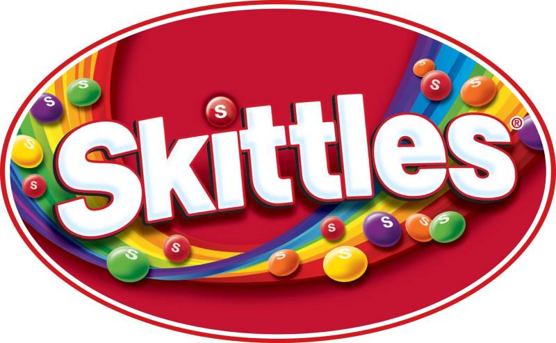
The Skittles logo is a combination mark featuring bold, italicized white lettering set against a red background, topped by a stylized rainbow arc. Introduced in its current form in 2023, the design reinforces the brand’s “Taste the Rainbow” campaign through direct visual symbolism.
Design Type: Combination mark (wordmark plus symbol)
Primary Elements:
- Italicized sans-serif wordmark spelling “SKITTLES”
- Rainbow arc positioned above the text
- Red background field on most applications
- White drop shadow creating depth
Official Introduction Date: The current iteration debuted in 2023
Designer/Agency: Mars internal design team (specific designer not publicly credited)
Trademark Status: Registered trademark owned by Mars, Incorporated through the Wrigley Company subsidiary
Color Palette:
- Primary Red: #E21836
- White: #FFFFFF
- Rainbow colors: Red, Orange, Yellow, Green, Blue, Violet
Usage Context: Product packaging design, television commercials, digital marketing, social media, merchandise, point-of-sale displays, and promotional materials
How Has the Skittles Logo Evolved Over Time?

The Skittles logo has transformed significantly since 1974. Each decade brought refinements that matched changing design trends while keeping the rainbow theme intact.
Five major versions exist in the brand’s history. The shifts moved from simple to complex, then back toward cleaner executions.
Original Skittles Logo (1974-1982)
Years Active: 1974-1982
Design Description: The first logo used a straightforward approach. Block letters in a bold sans-serif font with minimal decoration. No rainbow arc yet.
Color Scheme: Red and white dominated. Simple. Direct.
Context: Skittles launched in the UK market. The branding needed to communicate “fruit candy” quickly on store shelves.
Cultural Significance: This version established the red-and-white foundation that persists today.
Second Generation Logo (1982-1991)
Years Active: 1982-1991
Design Description: The rainbow arc appeared for the first time. Letters gained more personality with subtle curves. The “S” became more distinctive.
Color Scheme: Full rainbow spectrum introduced above the wordmark. The red background became standard.
Key Changes from Previous: Addition of the iconic rainbow element. This connected directly to the “Taste the Rainbow” slogan that launched in 1994 (though the visual came first).
Cultural Significance: This version created the template all future logos would follow.
Third Generation Logo (1991-2004)
Years Active: 1991-2004
Design Description: Bolder, more aggressive styling. The italic slant increased. Letters looked like they were moving forward, creating a sense of movement.
Color Scheme: Deeper red. More saturated rainbow colors. Higher contrast overall.
Designer: Mars internal team
Context: The 1990s pushed brands toward more dynamic, energetic visuals. Skittles followed this trend.
Key Changes from Previous: Increased slant angle. Thicker letterforms. More three-dimensional appearance with enhanced shadows.
Fourth Generation Logo (2004-2023)
Years Active: 2004-2023
Design Description: A cleaned-up version of the previous design. The rainbow arc became more stylized with cleaner color transitions.
Color Scheme: Slightly lighter red. The rainbow gained better color separation.
Key Changes from Previous: Refined edges. Better digital reproduction. The logo worked better across screens and print.
Cultural Significance: This version carried the brand through the social media era. It appeared in countless viral marketing campaigns.
Current Skittles Logo (2023-Present)
Years Active: 2023-present
Design Description: The newest version keeps the italic wordmark but simplifies certain elements. The rainbow arc appears more integrated with the text.
Color Scheme: Primary red #E21836, white lettering, full rainbow spectrum
Key Changes from Previous: Subtle refinements to letter spacing. The overall look feels fresher without losing recognition.
Context: Mars updated the logo as part of broader brand guidelines refresh across their candy portfolio.
What Do the Design Elements of the Skittles Logo Mean?
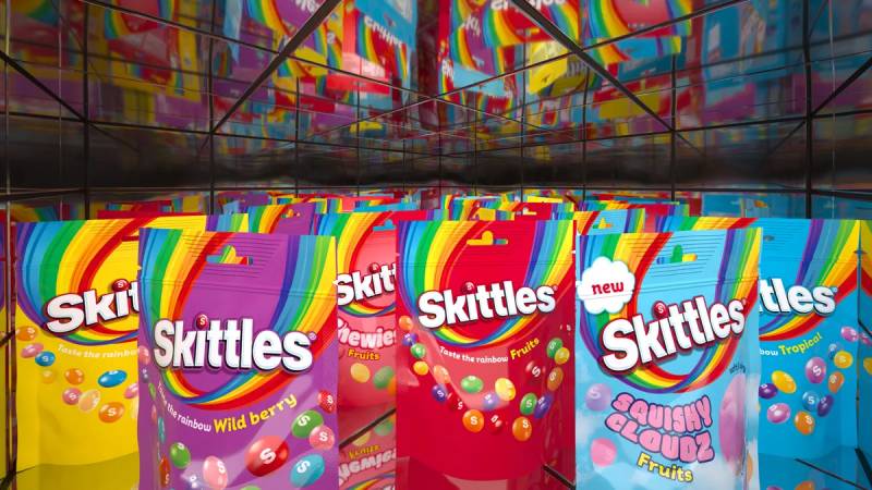
The Skittles logo uses visual elements that directly reference the product experience. The rainbow represents the variety of fruit flavors. The forward-leaning text suggests energy and fun.
Every piece works together to communicate one message: this candy is colorful, exciting, and different from everything else on the shelf.
Why Did Skittles Choose These Specific Colors?
Red Background
- Hex: #E21836
- Symbolic meaning: Energy, excitement, appetite stimulation
- Psychological impact: Red grabs attention faster than any other color. In the candy aisle, this matters.
- Brand connection: Creates urgency and desire
White Typography
- Hex: #FFFFFF
- Symbolic meaning: Purity, clarity, simplicity
- Psychological impact: Maximum readability against the red background
- Brand connection: Clean contrast that makes the wordmark pop
Rainbow Arc Colors
- Red, Orange, Yellow, Green, Blue, Violet
- Symbolic meaning: Variety, joy, inclusivity
- Psychological impact: Multiple colors trigger positive emotional responses. The brain reads it as “more value” and “more fun.”
- Brand connection: Direct representation of the candy’s multicolored nature
Understanding color psychology helps explain why these choices work so well together.
What Typography Style Is Used in the Skittles Logo?
The Skittles wordmark uses a custom typeface that has never been released publicly.
It falls into the bold, italic sans-serif category. The letters slant forward at roughly 12 degrees.
Readability stays high even at small sizes because of the thick strokes and open letter spacing. The tracking between characters gives each letter room to breathe.
Over the years, the typography has been refined for digital screens. Earlier versions looked great on packaging but struggled online. The current version works everywhere.
What Are the Hidden Meanings in the Skittles Logo?
The forward lean of the letters suggests motion and excitement. You’re not just eating candy. You’re having an experience.
The rainbow arc sits above the text like a crown or halo. It positions Skittles as the “king” of colorful candies.
Some people see the curved underline beneath certain versions as a smile. The designers have never confirmed this was intentional, but it creates a subconscious friendly feeling.
The way the rainbow colors transition follows natural light spectrum order. This subtle accuracy makes the logo feel “right” even if you can’t explain why.
How Does the Skittles Logo Compare to Competitor Logos?
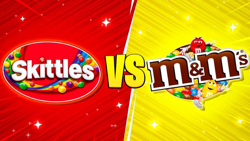
Skittles takes a completely different approach than most candy brands. Where competitors rely on mascots or script fonts, Skittles goes bold and graphic.
The logo stands out because of its simplicity wrapped in color.
Compared to M&M’s: M&M’s uses character mascots as brand ambassadors. Skittles lets the rainbow do the talking. Both work, but Skittles feels more abstract and less personality-driven.
Compared to Starburst: Starburst uses a similar fruity positioning but opts for starburst shapes and less cohesive color use. Skittles has a cleaner system.
Compared to Pringles logo: Both brands use red prominently. Pringles relies on a mascot face while Skittles uses pure graphic elements. Different approaches to shelf presence.
Compared to other fast food logos and snack brands: Most snack brands clutter their logos with taglines, product images, or complex illustrations. Skittles keeps things tight.
What Are the Technical Specifications of the Skittles Logo?
Official Color Codes:
Primary Red
White
- Hex: #FFFFFF
- RGB: (255, 255, 255)
- CMYK: (0, 0, 0, 0)
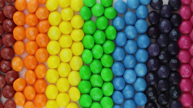
Rainbow Colors (approximate):
- Red: #FF0000
- Orange: #FF7F00
- Yellow: #FFFF00
- Green: #00FF00
- Blue: #0000FF
- Violet: #8B00FF
Dimensions and Proportions:
- Aspect ratio: Approximately 3:1 (width to height)
- Minimum size: 0.75 inches wide for print, 100 pixels for digital
- Clear space: Equal to the height of the letter “S” on all sides
The logo works as vector graphics for scaling. Print materials require high DPI settings for the rainbow gradient to reproduce cleanly.
What Cultural Impact Has the Skittles Logo Had?
The Skittles logo became a pop culture fixture through years of bizarre, memorable advertising. The rainbow theme made it perfect for Pride Month partnerships and inclusivity messaging.
In 2017, Skittles released “all white” packaging and candies during Pride. They removed the rainbow, saying “only one rainbow matters during Pride.” The campaign went viral.
The logo appears in music videos, movies, and memes constantly. Its simple, recognizable shape makes it easy to reference and parody.
Among tech company logos and corporate identities, few candy brands achieve this level of cultural penetration. Skittles managed it through consistent visual identity paired with weird, internet-friendly marketing.
How Does the Skittles Logo Fit Into the Overall Brand Identity?

The logo anchors everything Skittles does. Every advertisement, every package, every social post connects back to that rainbow arc and bold wordmark.
Mars developed a complete brand style guide that dictates exactly how the logo appears across all touchpoints.
The “Taste the Rainbow” slogan only works because the logo already shows you the rainbow. Text and image reinforce each other.
Commercial spots often end with the logo appearing alongside that tagline. The repetition builds recognition over time.
Sound design in advertisements sometimes syncs with the logo reveal, creating multisensory branding that goes beyond just visuals.
How Should the Skittles Logo Be Used?
Official Usage Guidelines:
Do:
- Use official logo files provided by Mars
- Maintain clear space requirements
- Keep the rainbow arc attached to the wordmark
- Use approved color variations only
Don’t:
- Stretch or distort the logo
- Change the colors
- Add effects like extra shadows or glows
- Separate the rainbow from the text
- Place on busy backgrounds without proper contrast
Where to Access Official Logos: Licensed partners receive assets through Mars brand portals. Public use requires written permission from Mars, Incorporated legal team.
Licensing Information: The Skittles name and logo are registered trademarks. Commercial use without licensing agreements results in legal action. Fan art and editorial use fall under different guidelines.
Trademark Protection: Mars actively protects the Skittles trademark worldwide. The rainbow-plus-wordmark combination specifically holds strong legal protection as a distinctive brand identifier.
FAQ on The Skittles Logo
Who Designed the Skittles Logo?
The Mars, Incorporated internal design team created the Skittles logo. No individual designer has been publicly credited.
The Wrigley Company, a Mars subsidiary, manages the brand identity today. Most logo updates happen in-house rather than through external agencies.
When Was the Skittles Logo First Created?
The original logo appeared in 1974 when Skittles launched in the United Kingdom.
The rainbow arc showed up in 1982. That version established the template still used today. The current iteration rolled out in 2023.
What Do the Colors in the Skittles Logo Mean?
The rainbow represents the variety of fruit flavors inside each bag. Red signals energy and appetite.
White text creates maximum readability. Understanding color theory explains why this color palette triggers positive emotional responses in consumers.
Has the Skittles Logo Changed Over the Years?
Yes. The logo evolved through five major versions since 1974.
Each redesign refined the visual identity without losing brand recognition. The italic slant increased over time. The rainbow became more stylized with each logo evolution.
What Font Is Used in the Skittles Logo?
Skittles uses a custom font never released to the public. It falls into the bold italic sans-serif category.
The letterforms slant forward at roughly 12 degrees. Generous font spacing keeps everything readable at small sizes.
Why Does Skittles Use a Rainbow in the Logo?
The rainbow directly connects to the “Taste the Rainbow” slogan and the candy’s multicolored nature.
It creates instant product recognition. You see the arc and immediately think of colorful fruit-flavored candy. Simple and effective.
Is the Skittles Logo Trademarked?
Yes. Mars, Incorporated holds registered trademark protection worldwide.
The rainbow-plus-wordmark combination specifically receives strong legal protection. Using it commercially without permission results in legal action from the confectionery giant.
What Is the Official Skittles Red Color Code?
The primary red is #E21836 in hex format.
For print design work, use Pantone 186 C. The high saturation makes it pop on store shelves against competing candy packaging.
Can I Use the Skittles Logo for My Project?
Commercial use requires written permission from Mars, Incorporated.
Fan art and editorial content fall under different guidelines. Licensed partners receive official assets through brand portals. Always check trademark rules before using any candy brand imagery.
Why Is the Skittles Logo So Recognizable?
Consistency built recognition over 50 years. The bold wordmark and rainbow arc never changed dramatically.
Strong visual hierarchy helps too. The design uses proven logo design principles that create instant recall among consumers worldwide.
Conclusion
The Skittles logo proves that strong branding doesn’t require complexity. A bold wordmark, a rainbow arc, and consistent application across five decades built one of the most recognized candy identities worldwide.
Mars, Incorporated understood something about design elements early on. Keep it simple. Make it colorful. Stay consistent.
The rainbow theme connects product to promise through effective storytelling. Every package reinforces “Taste the Rainbow” without saying a word.
Whether you’re studying confectionery branding or building your own visual identity, Skittles offers a masterclass in unity and brand recognition.

Renowned for his expertise in logo design and visual branding, Bogdan has developed a multitude of logos for various clients.
His skills extend to creating posters, vector illustrations, business cards, and brochures. Additionally, Bogdan's UI kits were featured on marketplaces like Visual Hierarchy and UI8.
He also wrote in the past years on sites like Design Your Way, WebDesignerDepot, WPDean, Designmodo, Speckyboy, Slider Revolution, and more.
- Jujutsu Kaisen Font Generator - 12 October 2026
- The Windsurf Logo History, Colors, Font, And Meaning - 10 October 2026
- How to Remove Background From Product Photos (No Photoshop) - 10 October 2026

Bogdan Sandu is a seasoned designer who has been designing websites since 2008. Renowned for his expertise in logo design and visual branding, Bogdan has developed a multitude of logos for various clients. His skills extend to creating posters, vector illustrations, business cards, and brochures. Additionally, Bogdan's UI kits were featured on marketplaces like Visual Hierarchy and UI8. He also wrote in the past years on sites like Design Your Way, WebDesignerDepot, WPDean, Designmodo, Speckyboy, Slider Revolution, and more.
You Might Also Like
