


The Dutch Bros logo stands as one of the most recognizable coffee chain emblems on the West Coast. Founded in 1992 by brothers Dane and Travis Boersma in Grants Pass, Oregon, the company started with a single espresso pushcart and $12,000.
Today, the brand operates over 900 locations across 18 states. The logo has gone through several iterations since its creation, each reflecting the company’s growth while maintaining its Dutch heritage roots.
The current version features a blue windmill symbol paired with bold typography. This combination mark has become synonymous with drive-thru coffee culture in America.
What is the Dutch Bros Logo?

The Dutch Bros logo is a combination mark featuring a stylized blue windmill above the wordmark “Dutch Bros” with “Coffee” in script lettering. Introduced in its current refined form around 2000, the design pays homage to the founders’ Dutch ancestry. The windmill symbolizes energy, tradition, and the Netherlands’ cultural heritage.
Design Type: Combination mark (symbol plus wordmark)
Primary Elements:
- Blue windmill icon with four angled sails forming an X shape
- Bold sans-serif “DUTCH BROS” text
- Cursive “Coffee” script in red-orange with yellow border
- Horizontal tricolor stripe (red, yellow, blue) representing tulip fields
Official Introduction Date: Original logo 1992, windmill version 1993, current refined version circa 2000
Designer/Agency: In-house design team (specific designer not publicly credited)
Trademark Status: Registered trademark of Dutch Bros Inc.
Color Palette:
- Blue:
#156299| RGB (21, 98, 153) | CMYK (86, 36, 0, 40) - Red:
#DA262E| RGB (218, 38, 46) | CMYK (0, 83, 79, 15) - Yellow:
#F8E316| RGB (248, 227, 22) | CMYK (0, 8, 91, 3) - White:
#FFFFFF| RGB (255, 255, 255) | CMYK (0, 0, 0, 0)
Usage Context: Drive-thru signage, disposable cups, merchandise, mobile app, marketing materials, social media
How Has the Dutch Bros Logo Evolved Over Time?

The Dutch Bros logo has undergone four major design phases since 1992. It started as a simple wordmark, then added the windmill symbol, and has since been refined into a cleaner, more modern emblem.
Each version kept the core identity while adapting to the company’s expansion needs.
Original Dutch Bros Logo (1992-1993)
Years Active: 1992-1993
Design Description: A basic wordmark with “DUTCH BROS Coffee” written between two horizontal lines. The text slanted slightly upward.
Color Scheme: Simple black and red, minimal color application
Designer: Founders (informal design)
Context: Created when the brothers ran a single pushcart. The design was functional, not strategic. They needed something quick for signage.
Key Changes from Previous: First version, no predecessor
Cultural Significance: Represented the grassroots, bootstrap origins of the company. It felt handmade because it was.
Windmill Introduction Logo (1993-2000)
Years Active: 1993-2000
Design Description: Added the windmill graphic above stacked “Dutch” and “BROS.” text. “Coffee” appeared in italic script below. The windmill had more detail, including structural elements.
Color Scheme: Blue windmill, blue text with white outlines, red-orange “Coffee” with yellow border, tricolor stripe added
Designer: Professional design services (specific agency unknown)
Context: The company opened its first drive-thru in 1994 and began franchising. They needed a more professional look that could scale.
Key Changes from Previous: Windmill symbol added, typography restructured, color palette expanded, Dutch heritage made explicit
Cultural Significance: The windmill connected the brand to Netherlands history. It gave customers a story to remember.
Refined Modern Logo (2000-Present)
Years Active: 2000-Present
Design Description: Simplified windmill becomes a solid blue silhouette. Typography unified into clean sans-serif lettering. “Coffee” script repositioned. Vertical blue stripe separates elements.
Color Scheme: Streamlined blue (#003DA5), red-orange (#E35205), yellow (#FFD100), white (#FFFFFF)
Designer: In-house brand team
Context: Rapid expansion required a logo that worked across digital and physical applications. The detailed windmill didn’t scale well at small sizes.
Key Changes from Previous: Windmill simplified to solid shape, shadows removed, typography made uniform, overall cleaner appearance
Cultural Significance: Represented Dutch Bros’ transition from regional chain to national brand. The minimalist approach signaled maturity.
Cup Variations (Ongoing)
Years Active: Various, ongoing
Design Description: Disposable cups feature more detailed windmill artwork. Blue and white color scheme with architectural details like windows, doors, and sail structures visible.
Color Scheme: Two-tone blue (dark and light), white details
Context: Cups allow for more complex artwork since they’re viewed up close. The detailed version adds premium feel to the product experience.
Key Changes from Previous: More intricate than primary logo, used specifically for packaging
Cultural Significance: Creates collectible appeal. Fans share cup photos on social media, extending brand reach organically.
What Do the Design Elements of the Dutch Bros Logo Mean?
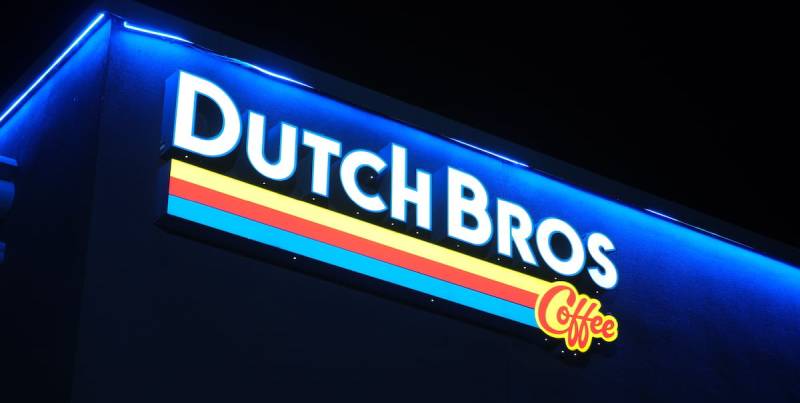
The windmill serves as the central symbol, directly referencing Dutch culture and history. Windmills in the Netherlands pumped water from lowlands back to rivers for centuries.
For Dutch Bros, it represents the founders’ heritage and their family values. The X-shaped sail arrangement suggests energy and movement, fitting for a coffee brand.
Why Did Dutch Bros Choose These Specific Colors?
Blue (Primary):
- Hex:
#156299 - Symbolic meaning: Trust, reliability, professionalism
- Psychological impact: Creates calm, approachable feeling The use of blue in branding communicates dependability. For a drive-thru chain, that matters.
Red:
- Hex:
#DA262E - Symbolic meaning: Energy, warmth, excitement
- Psychological impact: Stimulates appetite and action
Yellow:
- Hex:
#F8E316 - Symbolic meaning: Optimism, friendliness, happiness
- Psychological impact: Attracts attention, creates positive association
Understanding how colors affect perception explains why these choices work so well together.
What Typography Style Is Used in the Dutch Bros Logo?
The primary wordmark uses a bold, geometric sans-serif typeface. The letters are uniform, printed, and without decorative elements.
This choice supports readability at highway speeds. Drive-thru customers need to spot the sign quickly.
The “Coffee” script contrasts deliberately. It’s italicized, hand-drawn in style, with a warm red-orange color and yellow outline.
This combination of font styles balances professionalism with personality. The rigid sans-serif says “reliable business.” The flowing script says “friendly experience.”
What Are the Hidden Meanings in the Dutch Bros Logo?
The tricolor stripe running through the design directly references Dutch tulip fields. Red, yellow, and blue represent the rows of flowers stretching across Netherlands landscapes.
The windmill sails form an X pattern. Some interpret this as a visual representation of two brothers crossing paths, though the company hasn’t confirmed this reading.
Interestingly, some customers initially mistake the windmill for a rabbit or hooded figure. This pareidolia effect has become a running joke among fans on social media.
The designers created a clear focal point with the windmill, but unintended interpretations add to the brand’s playful reputation.
How Does the Dutch Bros Logo Compare to Competitor Logos?

Dutch Bros takes a different approach than most coffee chains. While Starbucks uses a detailed siren illustration and Dunkin’ relies on bold, simple text, Dutch Bros combines both strategies.
The windmill gives them a unique visual hook. No other major coffee chain uses architectural heritage as their primary symbol.
Compared to other quick-service restaurant branding, Dutch Bros stands out with its cultural specificity. Most competitors use generic coffee imagery (cups, beans, steam) or abstract marks.
The color palette also differentiates them. Coffee chains typically lean toward earth tones, greens, or reds. Dutch Bros’ bright blue creates instant recognition, especially against the brown and green of competitors.
Regional chains like Scooter’s Coffee or Black Rock Coffee Bar use simpler wordmarks. Dutch Bros’ combination mark gives them more flexibility in how they present the brand across different applications.
What Are the Technical Specifications of the Dutch Bros Logo?

Official Color Codes:
Primary Blue:
Red-Orange:
- Hex: #E35205
- RGB: (227, 82, 5)
- CMYK: (0, 64, 98, 11)
- Pantone: 1665 C
Yellow:
- Hex: #FFD100
- RGB: (255, 209, 0)
- CMYK: (0, 18, 100, 0)
- Pantone: 116 C
White:
- Hex: #FFFFFF
- RGB: (255, 255, 255)
- CMYK: (0, 0, 0, 0)
Dimensions and Proportions:
- Aspect ratio: Approximately 1:1.2 (windmill plus wordmark)
- Minimum size: Windmill should remain recognizable at 0.5 inches
- Clear space: Equal to the height of the “D” in DUTCH on all sides
- The logo works in both horizontal and stacked configurations
For print applications, resolution requirements typically start at 300 DPI minimum.
What Cultural Impact Has the Dutch Bros Logo Had?

The Dutch Bros logo has become a West Coast cultural marker. Fans tattoo the windmill on their bodies. They collect stickers and merchandise featuring the design.
Social media amplified this effect. The logo appears constantly on Instagram and TikTok, usually attached to colorful drink photos.
The windmill confusion phenomenon created its own viral moments. Videos of people realizing it’s not a rabbit or llama rack up millions of views.
For many customers, the logo represents more than coffee. It signals community, positivity, and the laid-back lifestyle Dutch Bros promotes.
How Does the Dutch Bros Logo Fit Into the Overall Brand Identity?

The logo anchors a broader visual system. It connects to cup designs, store architecture, employee uniforms, and marketing materials.
Everything ties back to the Dutch heritage theme. Store exteriors often feature windmill elements. Interior design uses the blue, orange, and yellow palette.
The brand extends into merchandise heavily. Hats, shirts, stickers, and even lifestyle items carry the windmill mark. This creates walking advertisements.
Proper brand guidelines ensure consistency across 900+ locations. Franchisees must follow strict rules about logo placement, colors, and proportions.
The narrative built around the design reinforces company values. Two brothers, Dutch heritage, community focus. The logo tells that story at a glance.
How Should the Dutch Bros Logo Be Used?
Official Usage Guidelines:
Do:
- Use official logo files from Dutch Bros corporate
- Maintain minimum clear space around the logo
- Use approved color variations (full color, white, blue)
- Keep proportions intact when scaling
Don’t:
- Stretch, distort, or rotate the logo
- Change the official colors
- Add effects like shadows, glows, or outlines
- Place on busy backgrounds that reduce readability
- Recreate or modify the windmill symbol
Where to Access Official Logos:
Franchisees receive logo files through Dutch Bros corporate channels. Media inquiries can contact the company’s PR department for approved assets. The logo is not available for public download due to trademark protection.
Licensing Information:
The Dutch Bros logo is a registered trademark. Unauthorized commercial use is prohibited. Fan art and personal use exist in a gray area, though the company generally tolerates non-commercial fan expression.
Trademark Protection:
Dutch Bros Inc. actively protects its intellectual property. The windmill design, wordmark, and combination mark are all registered. Counterfeit merchandise sellers face legal action.
Understanding foundational logo design concepts helps explain why these protections matter. A strong logo represents significant investment and brand equity.
FAQ on The Dutch Bros Logo
What Does the Dutch Bros Logo Represent?
The Dutch Bros logo represents the founders’ Dutch heritage and family values. Dane and Travis Boersma created the brand in Grants Pass, Oregon.
The windmill symbol connects to Netherlands culture. It signals tradition, energy, and the brothers’ entrepreneurial spirit that started with a single espresso pushcart.
Why Is There a Windmill in the Dutch Bros Logo?
Windmills hold deep cultural significance in the Netherlands. They pumped water from lowlands for centuries.
The Boersma brothers chose this shape for its symbolic power. It honors their Dutch grandparents and creates instant brand recognition across the drive-through coffee chain’s locations.
What Are the Official Colors of the Dutch Bros Logo?
The official color palette includes primary blue (#003DA5), red-orange (#E35205), yellow (#FFD100), and white.
These colors reference Dutch tulip fields. The tricolor stripe design represents rows of flowers stretching across Netherlands landscapes. Blue adds trust and reliability to the visual identity system.
Who Designed the Dutch Bros Logo?
The original 1992 logo came from the founders themselves. It was simple. Functional.
Professional design services refined the windmill version in 1993. The current iteration was developed by Dutch Bros Coffee’s in-house brand team. No specific designer has been publicly credited.
When Was the Dutch Bros Logo Created?
The first logo appeared in 1992 when the company launched. Just a basic wordmark between two lines.
The windmill icon was introduced in 1993. The modern, simplified version emerged around 2000 as the coffee franchise expanded beyond Oregon into multiple states.
Is the Dutch Bros Logo a Rabbit or a Windmill?
It’s a windmill. But you’re not alone in seeing something else.
Many customers mistake the design for a rabbit, llama, or hooded figure. This pareidolia effect went viral on TikTok. The company finds it amusing rather than problematic.
What Font Does Dutch Bros Use in Their Logo?
The primary wordmark uses a bold, geometric typeface without serifs. Clean letters. No decorative elements.
The “Coffee” text contrasts with a flowing script style in red-orange. This mix of bold typography and handwritten script creates personality while maintaining readability at drive-thru speeds.
Can I Download the Dutch Bros Logo?
Official logo files aren’t publicly available. The trademark is protected.
Franchisees receive assets through corporate channels. Media can request approved files from the PR department. Unauthorized commercial use faces legal action from Dutch Bros Inc.
Has the Dutch Bros Logo Changed Over Time?
Yes. The brand identity evolution includes four major phases since 1992.
It progressed from simple wordmark to detailed windmill emblem to today’s streamlined version. Each update reflected company growth while maintaining the Dutch heritage symbol at its core.
What Does the Tricolor Stripe Mean in the Dutch Bros Logo?
The red, yellow, and blue stripe represents Netherlands tulip fields. Rows of colorful flowers.
This detail connects the West Coast coffee chain to its founders’ roots. It adds visual variety and cultural depth to what could otherwise be generic coffee industry branding.
Conclusion
The Dutch Bros logo tells the story of two brothers, a pushcart, and Dutch heritage that shaped an entire coffee franchise. From Grants Pass, Oregon to over 900 locations nationwide, that windmill symbol has become unmistakable.
The blue and orange color scheme works. The bold typography reads well at drive-thru speed.
Every design choice connects back to the Boersma family roots. The tricolor stripe. The simplified emblem. The visual unity across cups, signage, and merchandise.
Good vector-based logo design scales anywhere. Dutch Bros proved that.

Renowned for his expertise in logo design and visual branding, Bogdan has developed a multitude of logos for various clients.
His skills extend to creating posters, vector illustrations, business cards, and brochures. Additionally, Bogdan's UI kits were featured on marketplaces like Visual Hierarchy and UI8.
He also wrote in the past years on sites like Design Your Way, WebDesignerDepot, WPDean, Designmodo, Speckyboy, Slider Revolution, and more.
- Best Visual Regression Testing Tools for Web and App Design in 2026 - 13 October 2026
- Jujutsu Kaisen Font Generator - 12 October 2026
- The Windsurf Logo History, Colors, Font, And Meaning - 10 October 2026

Bogdan Sandu is a seasoned designer who has been designing websites since 2008. Renowned for his expertise in logo design and visual branding, Bogdan has developed a multitude of logos for various clients. His skills extend to creating posters, vector illustrations, business cards, and brochures. Additionally, Bogdan's UI kits were featured on marketplaces like Visual Hierarchy and UI8. He also wrote in the past years on sites like Design Your Way, WebDesignerDepot, WPDean, Designmodo, Speckyboy, Slider Revolution, and more.
You Might Also Like


