


The White Claw logo has become one of the most recognized symbols in the alcoholic beverage industry. It sits at the center of a brand that pretty much redefined what hard seltzer could be in America.
A logo functions as the visual shorthand for everything a company represents. For White Claw, that wave-like mark captures refreshment, simplicity, and a laid-back lifestyle all at once.
Mark Anthony Brands International launched White Claw in 2016. The logo has seen minor refinements since then, but the core wave symbol has remained consistent.
The brand emerged during a shift in drinking culture. Consumers wanted lighter options. The logo needed to reflect that clean, uncomplicated promise from day one.
What Is the White Claw Logo?
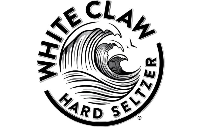
The White Claw logo combines a stylized wave symbol with bold sans-serif typography. Introduced in 2016 alongside the product launch, the design communicates refreshment and purity. The wave doubles as a visual representation of the “claw” in the brand name.
Design Attributes:
- Design Type: Combination mark (symbol plus wordmark)
- Primary Elements: Wave/claw symbol positioned above the brand name
- Official Introduction Date: 2016
- Designer/Agency: Not publicly disclosed
- Trademark Status: Registered trademark of Mark Anthony Brands International
- Color Palette: Primary black and white, with flavor-specific accent colors on packaging
- Usage Context: Cans, merchandise, digital marketing, retail displays, social media
How Has the White Claw Logo Evolved Over Time?
The White Claw logo has remained largely unchanged since its 2016 debut. Minor adjustments have occurred for clarity and reproduction quality.
The brand prioritized consistency over reinvention. This approach helped cement recognition during the hard seltzer boom of 2018-2019.
Original White Claw Logo (2016-Present)
- Years Active: 2016 to present
- Design Description: Three curved lines forming a wave shape above uppercase wordmark
- Color Scheme: Black wave and text on white background (primary), reversed for dark backgrounds
- Designer: Undisclosed internal or agency team
- Context: Created for the U.S. hard seltzer market launch
- Key Changes from Previous: N/A (original version)
- Cultural Significance: Became synonymous with the hard seltzer category itself
The decision to keep things stable was smart. When your product goes viral, you don’t mess with what’s working.
What Do the Design Elements of the White Claw Logo Mean?

The wave symbol carries multiple meanings. It suggests ocean waves, refreshment, and fluid motion.
The three curved lines also hint at claw marks. This creates a subtle visual pun on the brand name.
Clean lines reflect the product’s positioning as a pure, simple beverage choice.
Why Did White Claw Choose These Specific Colors?
Understanding color psychology explains a lot here.
The primary black and white scheme projects cleanliness and sophistication. Black conveys premium quality. White suggests purity and low calories.
Each flavor gets its own accent color on the can. Mango uses orange. Black cherry uses deep red. These follow the natural associations people have with fruit colors.
- Black: Premium positioning, boldness
- White: Purity, cleanliness, health-conscious appeal
- Flavor Accents: Natural fruit associations for quick identification
What Typography Style Is Used in the White Claw Logo?
The wordmark uses a custom sans-serif font with clean geometric qualities.
Letters are uppercase and evenly spaced. The tracking is generous, which adds to the airy feel.
Readability works well at small sizes on cans. The bold weight ensures visibility in crowded retail environments.
What Are the Hidden Meanings in the White Claw Logo?
The three wave lines can be read as stylized claw scratches. Some see them as representing the three main ingredients: water, alcohol, and natural flavors.
The upward curve suggests positivity and energy. There’s no official statement from the brand about deeper symbolism.
Honestly, sometimes a wave is just a wave. But the dual reading as both water and claw marks shows clever design thinking.
How Does the White Claw Logo Compare to Competitor Logos?
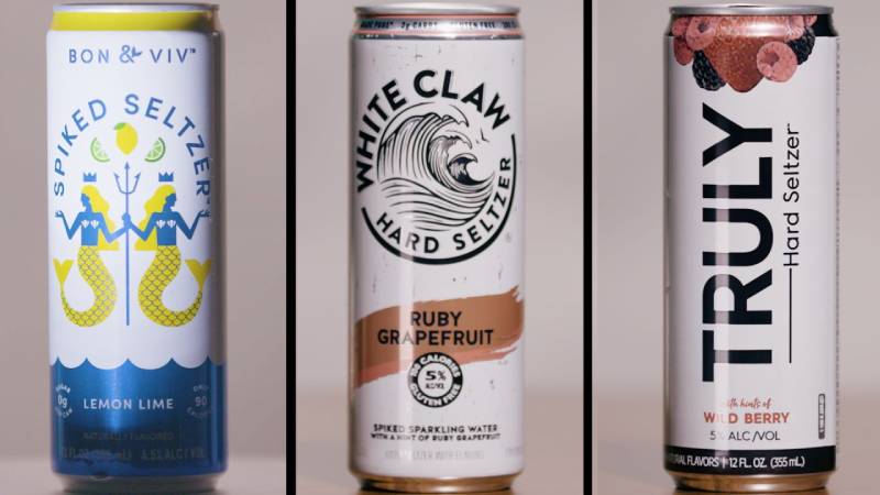
White Claw’s visual identity stands apart from competitors through its simplicity. Truly Hard Seltzer uses a more colorful, playful approach. Bon & Viv leans elegant and feminine.
The minimalist design approach served White Claw well. While others crowded their cans with graphics, White Claw kept things stripped back.
This restraint actually helped the brand feel more premium. Less clutter meant more confidence.
Corona Hard Seltzer borrowed heavily from its parent beer brand’s tropical vibe. Bud Light Seltzer went loud and colorful. White Claw stayed cool and understated.
What Are the Technical Specifications of the White Claw Logo?

Official Color Codes:
- Primary Black: Hex: #000000, RGB: (0, 0, 0), CMYK: (0, 0, 0, 100)
- Primary White: Hex: #FFFFFF, RGB: (255, 255, 255), CMYK: (0, 0, 0, 0)
Dimensions and Proportions:
- Aspect Ratio: The wave symbol maintains consistent proportions relative to the wordmark
- Minimum Size: Specific requirements exist for legibility on packaging
- Clear Space: Adequate margins required around the logo on all applications
- Usage Guidelines: Controlled through internal brand guidelines
What Cultural Impact Has the White Claw Logo Had?

The White Claw logo transcended beverage branding to become a cultural symbol. “White Claw Summer” memes spread across social media in 2019.
That wave mark became shorthand for a certain lifestyle. Beach parties. Casual hangouts. Health-conscious drinking.
People tattooed the logo on their bodies. That’s not normal for a drink brand. The design’s simplicity made it almost icon-like.
How Does the White Claw Logo Fit Into the Overall Brand Identity?
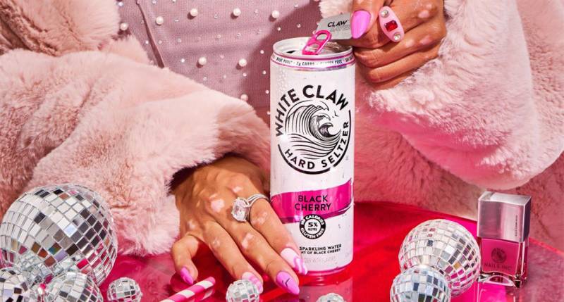
The logo anchors a broader visual system. Packaging design extends the clean aesthetic across all touchpoints.
Every can, advertisement, and social post reinforces the same values. Simplicity. Refreshment. Fun without fuss.
The wave symbol appears on merchandise from hats to coolers. Brand partnerships maintain strict visual consistency.
White Claw’s brand style guide presumably governs how partners and retailers can display the logo.
How Should the White Claw Logo Be Used?
Official Usage Guidelines:
- Do: Maintain clear space around the logo
- Do: Use approved color versions only
- Don’t: Stretch, rotate, or modify the logo proportions
- Don’t: Place on busy backgrounds that reduce legibility
Accessing Official Assets:
Brand assets are typically available through Mark Anthony Brands’ corporate communications team. Retailers and media outlets must request permission for logo usage.
Trademark Protection:
The White Claw name and wave design are registered trademarks. Unauthorized use, particularly on merchandise, faces legal action. The brand actively protects its visual identity.
FAQ on The White Claw Logo
Who Designed the White Claw Logo?
The designer remains officially undisclosed. Mark Anthony Brands International has not publicly credited an agency or individual.
This is common with beverage brands. Internal teams often handle identity work without fanfare.
What Does the White Claw Wave Symbol Represent?
The wave symbol suggests ocean waves and refreshment. It also doubles as a visual pun on “claw” through its curved, scratch-like lines.
Three distinct curves create the mark. Simple but memorable.
What Font Does White Claw Use in Its Logo?
The brand uses a custom typeface with geometric qualities. Bold, uppercase letters define the wordmark.
It’s not a publicly available font. The clean typography works well on seltzer cans at small sizes.
What Are the Official White Claw Logo Colors?
The primary color palette is black and white. This creates strong contrast and clean visual appeal.
Flavor-specific accent colors appear on packaging. Mango gets orange. Black cherry gets deep red.
Has the White Claw Logo Changed Since 2016?
No major redesigns have occurred. The hard seltzer brand maintained its original visual identity since launch.
Minor refinements for reproduction quality happened. The core wave symbol and wordmark stayed consistent throughout the seltzer wars.
Can I Use the White Claw Logo for Personal Projects?
No. The logo is a registered trademark of Mark Anthony Brands. Unauthorized use on merchandise or marketing faces legal consequences.
Request permission through official corporate channels for any legitimate usage needs.
Why Did the White Claw Logo Become So Iconic?
Timing met simplicity. The brand exploded during 2019’s hard seltzer boom. That wave mark became cultural shorthand for a lifestyle.
Memes spread across Instagram and TikTok. The clean aesthetic photographed well.
Is the White Claw Logo Available in Vector Format?
Official vector graphics exist for authorized partners. Media outlets and retailers must request assets directly from the company.
Public downloads aren’t officially available. This protects brand consistency across all touchpoints.
What Makes the White Claw Logo Different From Competitors?
Restraint. While Truly and Bud Light Seltzer went colorful, White Claw stayed minimal. The wave symbol reads instantly.
Less clutter projected more confidence. This logo design approach helped the brand feel premium in a crowded market.
Where Can I Find Official White Claw Brand Assets?
Contact Mark Anthony Brands directly. No public media kit exists online for general download.
The company controls its visual identity tightly. Approved partners receive assets through formal agreements only.
Conclusion
The White Claw logo proves that restraint works. A simple wave symbol and clean wordmark turned a beverage brand into a cultural phenomenon.
Mark Anthony Brands understood something competitors missed. Millennials wanted sophistication without pretense.
That wave mark now represents more than hard seltzer. It signals a lifestyle choice, a summer mood, a certain kind of gathering.
The can design photographs beautifully. Brand recognition came fast and stuck hard.
Few alcoholic beverage brands achieve this level of icon status. The logo’s staying power shows what happens when graphic design principles meet perfect market timing.

Renowned for his expertise in logo design and visual branding, Bogdan has developed a multitude of logos for various clients.
His skills extend to creating posters, vector illustrations, business cards, and brochures. Additionally, Bogdan's UI kits were featured on marketplaces like Visual Hierarchy and UI8.
He also wrote in the past years on sites like Design Your Way, WebDesignerDepot, WPDean, Designmodo, Speckyboy, Slider Revolution, and more.
- Best Visual Regression Testing Tools for Web and App Design in 2026 - 13 October 2026
- Jujutsu Kaisen Font Generator - 12 October 2026
- The Windsurf Logo History, Colors, Font, And Meaning - 10 October 2026

Bogdan Sandu is a seasoned designer who has been designing websites since 2008. Renowned for his expertise in logo design and visual branding, Bogdan has developed a multitude of logos for various clients. His skills extend to creating posters, vector illustrations, business cards, and brochures. Additionally, Bogdan's UI kits were featured on marketplaces like Visual Hierarchy and UI8. He also wrote in the past years on sites like Design Your Way, WebDesignerDepot, WPDean, Designmodo, Speckyboy, Slider Revolution, and more.
You Might Also Like


